Qudos Bank - Brand Identity Refresh
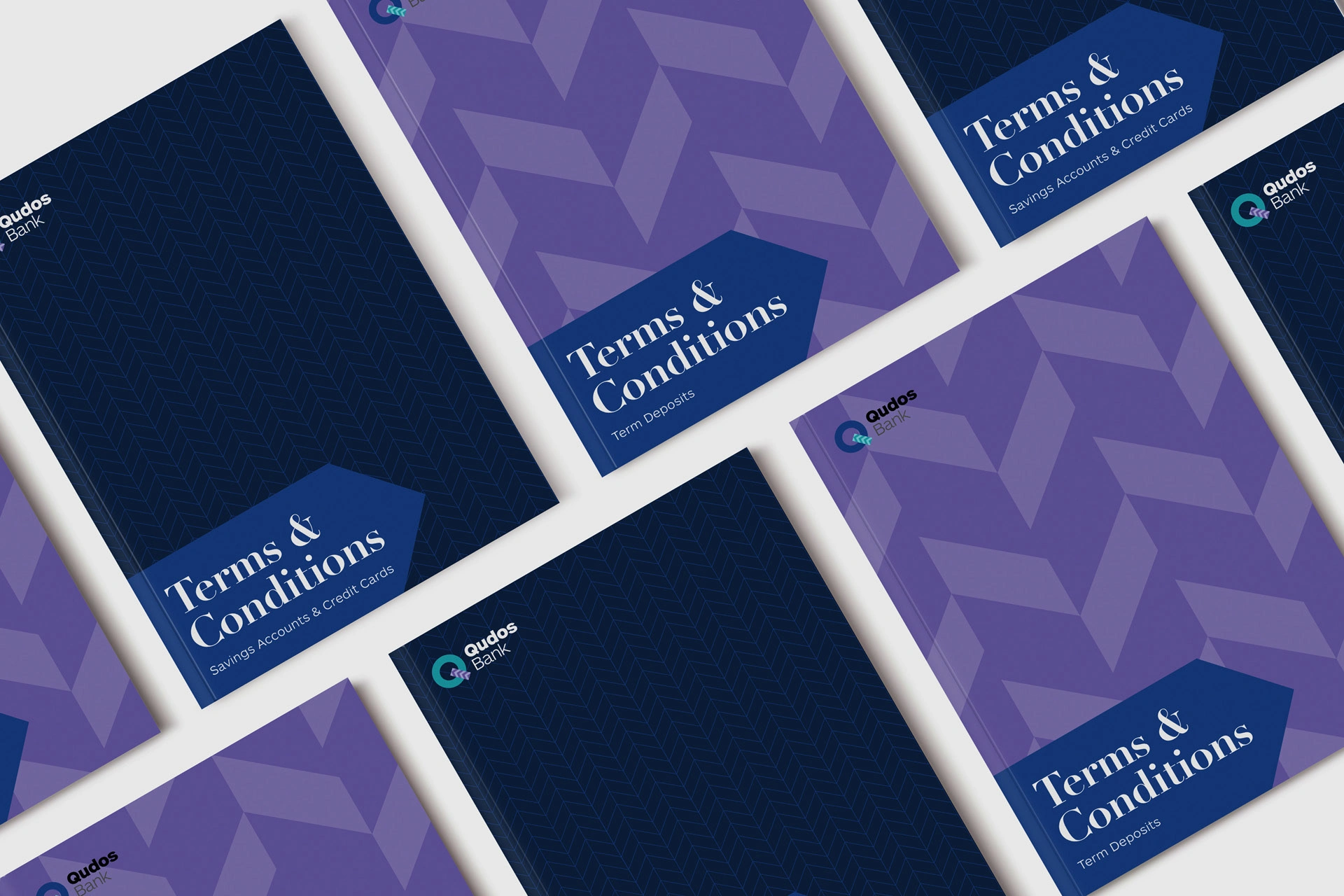

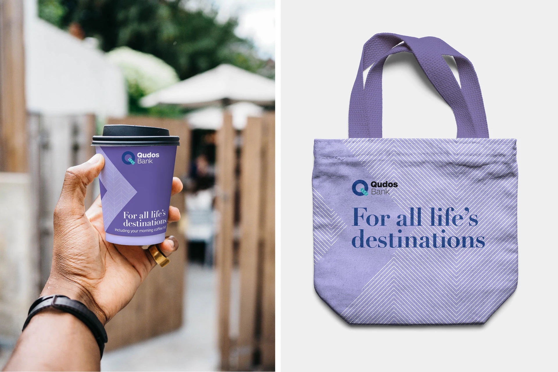
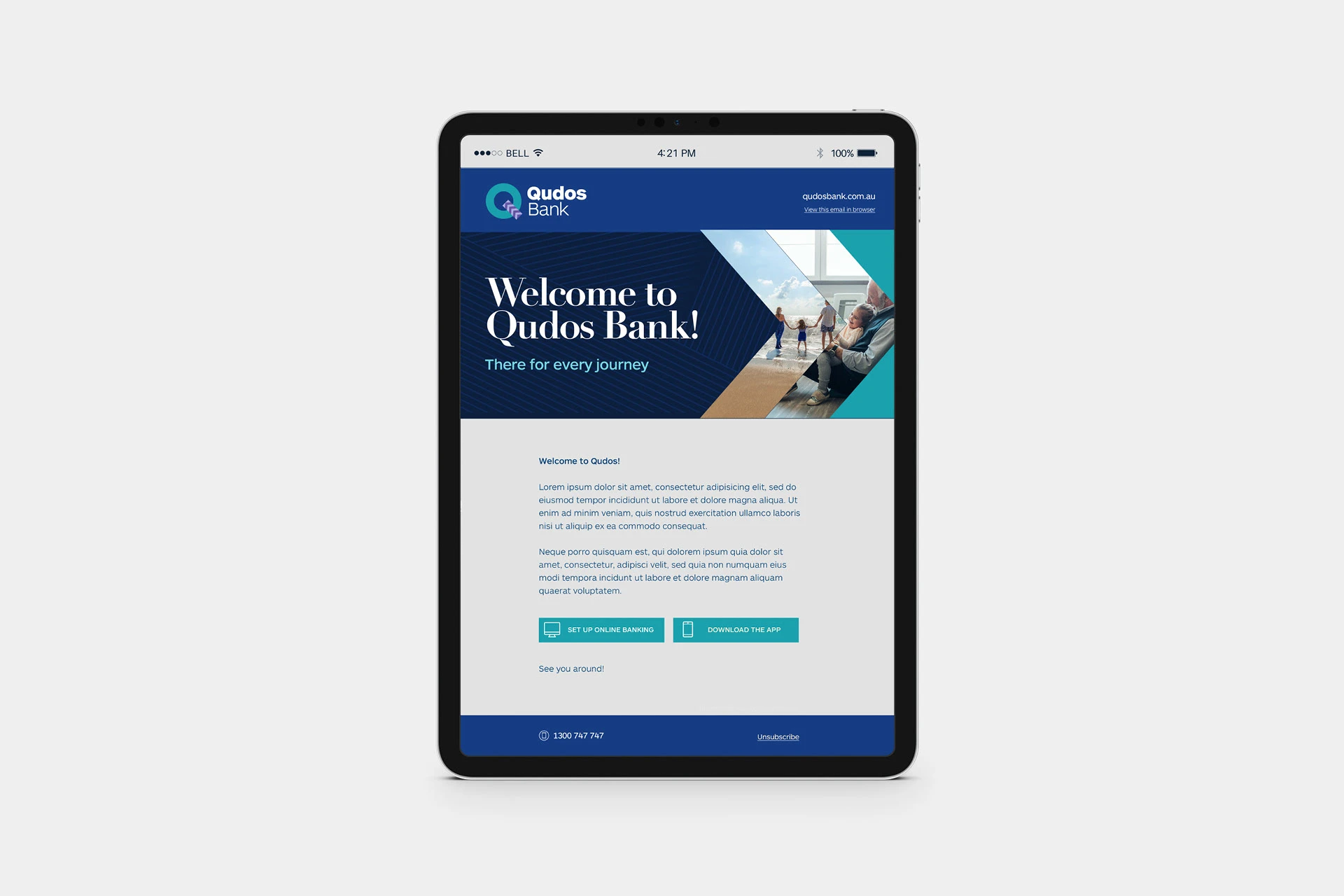
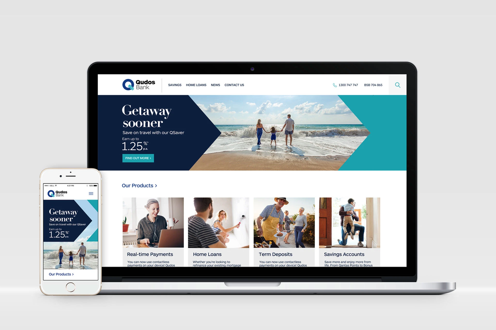
Qudos Bank underwent a rebrand in 2015 (from Qantas Credit Union). However, they had since refocused their vision and target audience. They sought Chello’s expertise to refresh and align their existing brand assets. Their new brand tagline ‘For all life’s destinations’ provided an anchor point for the creative direction.
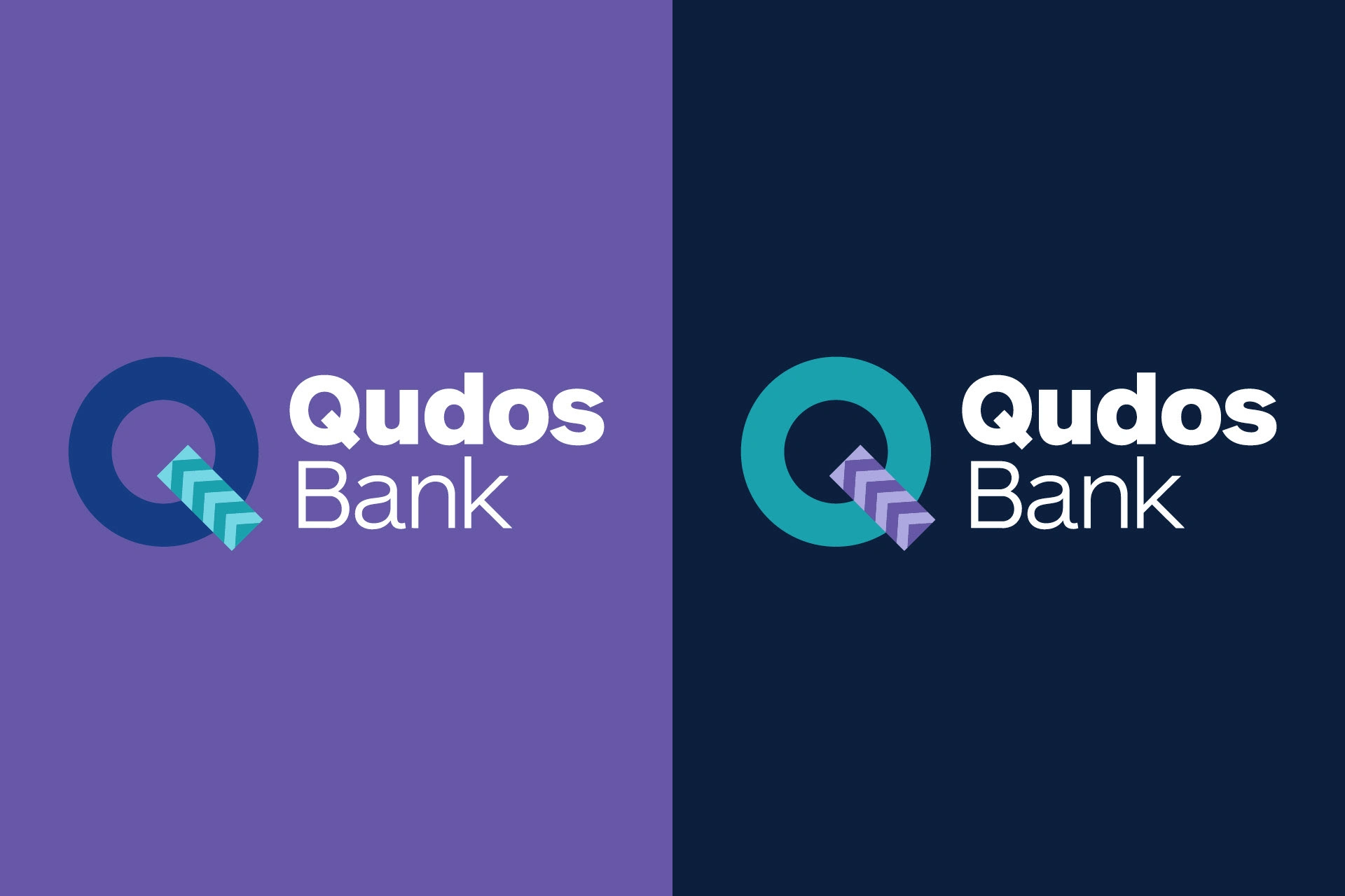
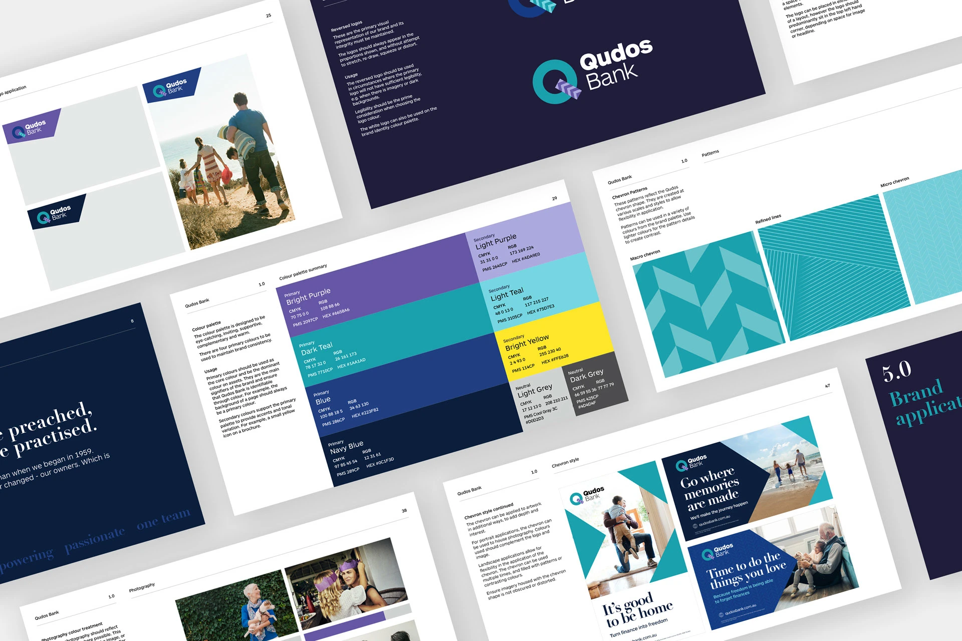
Logo adjustments, a streamlined colour palette & typography created the basis for the visual refresh. A suite of new patterns and a clear system for the ‘chevron’ shape ensured that their new identity was contemporary, dynamic and easy to implement across a wide range of outputs.
Agency: Chello | Client: Qudos
Like this project
Posted Jun 15, 2023
Qudos Bank underwent a rebrand in 2015 (from Qantas Credit Union). However, they had since refocused their vision and target audience. They sought Chello’s exp…


