Edtech Platform Redesign
Alanis Machado

Project Overview
Project: Full redesign of Trade de Valor’s web platform and mobile app
Duration: 2 years (yes, what was supposed to be 10 months turned into a beautiful UX odyssey)
Goal: Elevate the user experience, simplify complex investment content, and align the digital product with current market expectations and visual standards.
Market Understanding as Research
I relied heavily on market research, behavioral trends, and competitive benchmarking to map what users actually need — even if they never told me directly.
I analyzed:
How direct and indirect competitors structure their platforms
Global trends in fintech and digital investment tools
Behavioral insights from market reports and digital behavior studies
Internal usage data (because sometimes, heatmaps speak louder than words)
This helped me build mental models of our users and understand their expectations, frustrations, and secret UX dreams.
Platform Diagnosis: A Visual Detox
Before creating anything new, I needed to understand what was (and wasn’t) working. So I put on my detective hat and got into the weeds of the old system.
What I did:
Heuristic evaluation: the classic Nielsen stuff — because rules exist for a reason.
Heatmaps: to see where users were clicking, hesitating, or totally ignoring everything (ouch).
The Data-Ink Ratio (Edward Tufte’s legacy): used to strip out unnecessary visual noise and focus on the core — what truly matters to the user. Goodbye shiny gradients, hello clarity.
This phase revealed a lot of “dead zones” in the interface and helped guide decisions about layout, hierarchy, and content prioritization.
Before: Heatmap analysis of the original interface
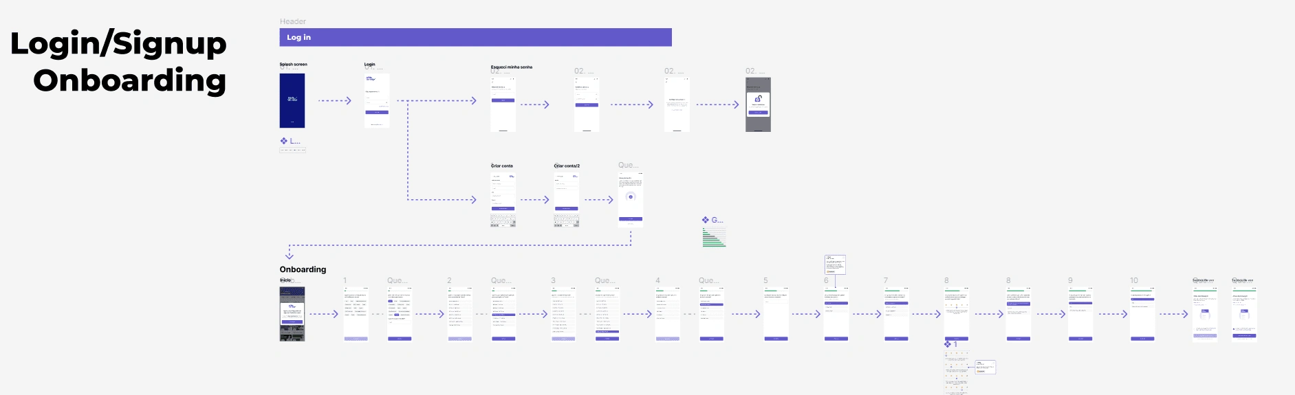
Information Architecture & Navigation
Armed with market insight and behavioral data, I rebuilt the information structure from scratch:
Created clear, logical user flows to reduce cognitive load
Restructured the navigation to reflect real user priorities (not internal org charts)
Built content hierarchies that matched the mental models of both novice and experienced investors
“If a user has to think about where to go, the design has already failed.”
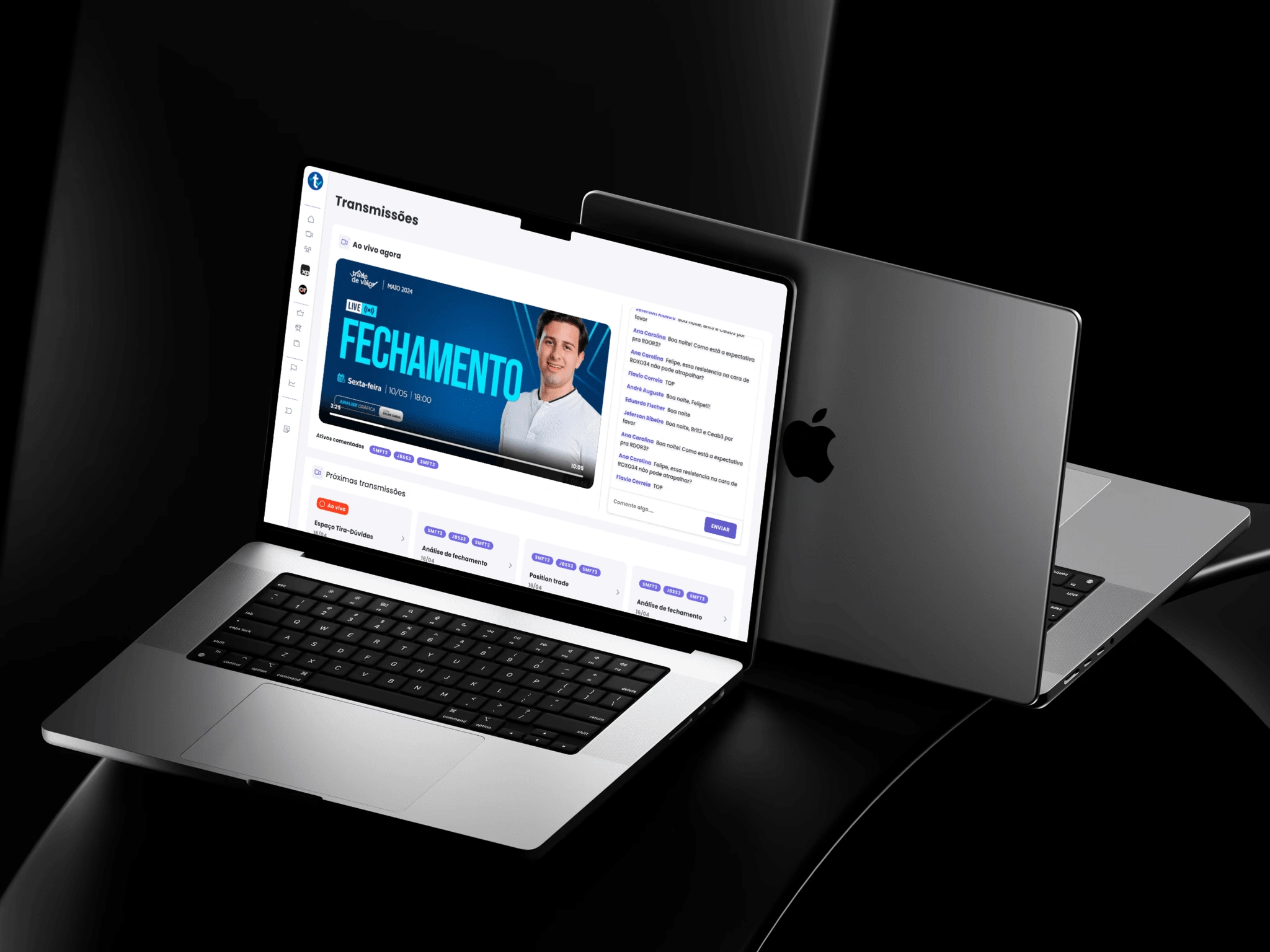
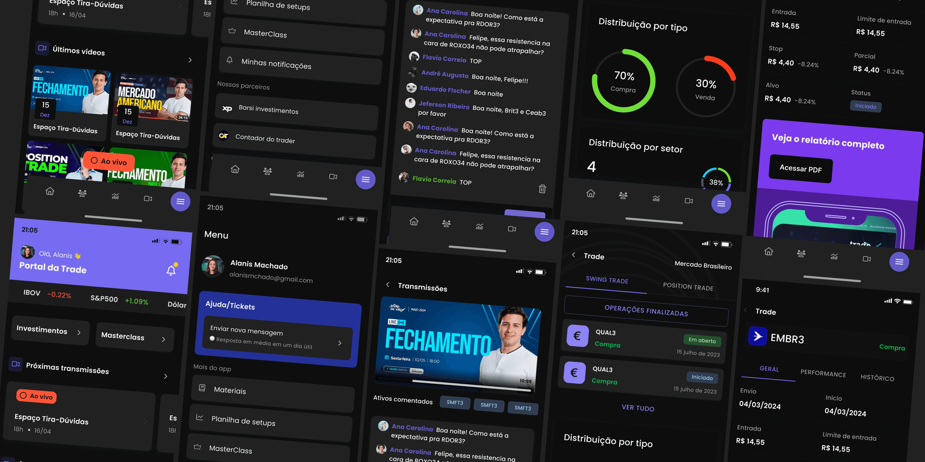
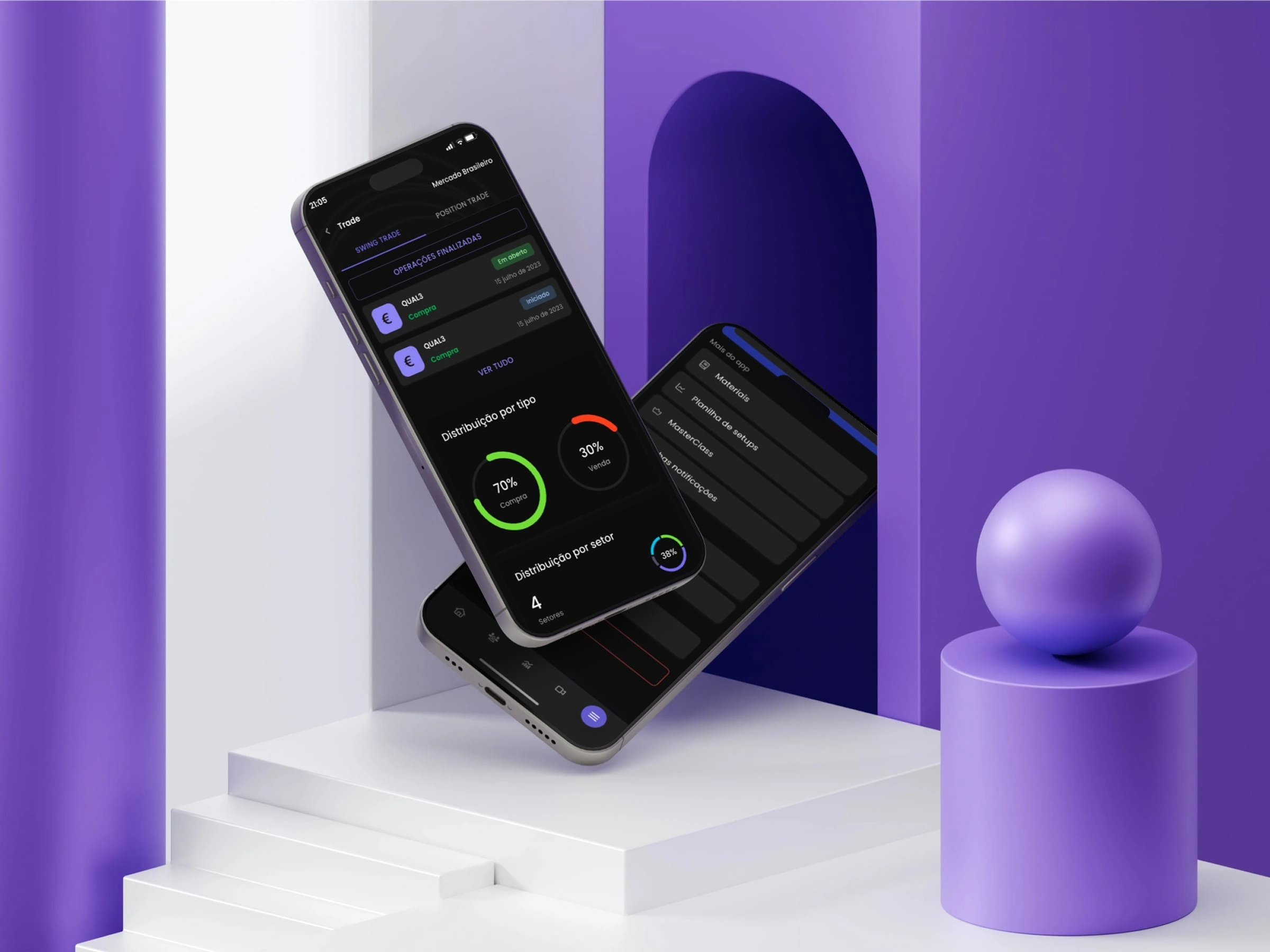
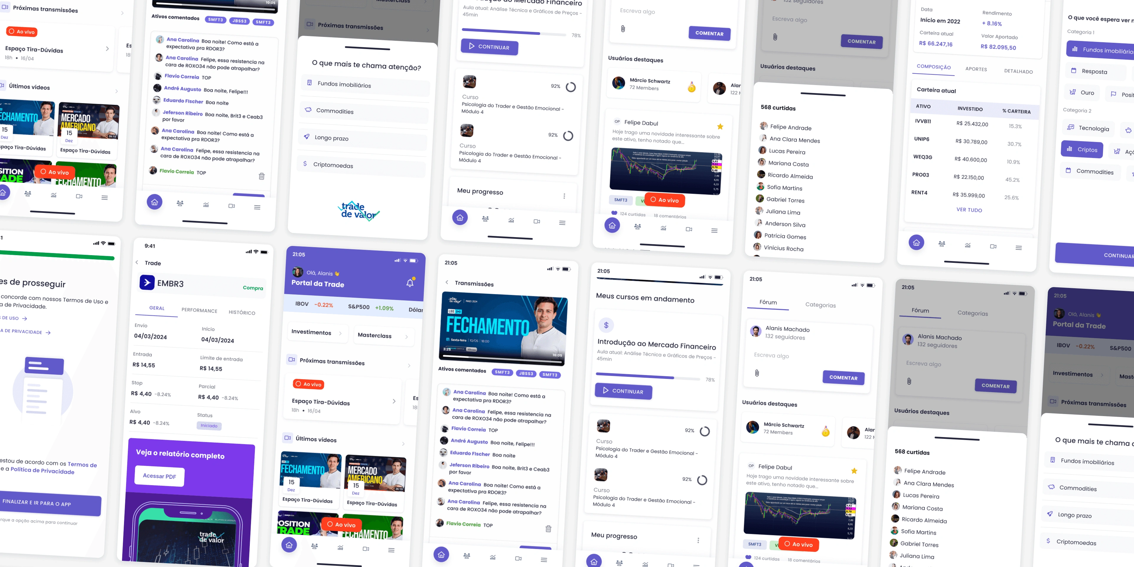
Visual Design & Design System
This was not just a visual refresh — it was a design renaissance.
Built a design system from the ground up to ensure consistency, scalability, and easier handoff to devs
Applied data visualization best practices for dashboards and performance insights
Focused on accessible and responsive components, supporting both light and dark modes (because everyone has a side)
Kept everything aligned with the Data-Ink mindset — decluttered, minimal, and focused on meaning
Iteration Through Internal Feedback
Although we didn’t run formal user testing, the iterative process was alive and well:
Reviews with client and team
Design critiques with the internal design/dev team
Feedback loops from client-facing teams who interacted with real users daily
Constant alignment to technical feasibility and business objectives
Turns out, internal alignment can be just as valuable as user testing — if you listen the right way.
Impact & Results
After launch, we saw noticeable improvements:
Reduction in support tickets and user confusion
Increased time on page and engagement with key investment tools
More intuitive onboarding, especially for first-time investors
And the team finally had a design system they were proud to maintain
It wasn’t just a redesign. It was a shift in how the company saw and delivered value through product.
Reflections & Learnings
Good design takes time — and that’s okay. Growth isn’t linear, and great ideas need breathing room.
You don’t always need a user lab if you know where to look. Market intelligence and indirect data can tell you a lot.
Design isn’t decoration — it’s strategy. And when it aligns with business goals, everyone wins.
Sometimes the real challenge is not creating new screens — it's unlearning old habits.
Like this project
Posted Apr 15, 2025
Redesigned Edtech platform and app to enhance UX and align with market standards.
Likes
0
Views
13
Timeline
Dec 31, 2020 - Dec 31, 2022