Slumber Lane Branding
Client Brief
Slumber Lane aims to make sleepover dreams a reality by offering themed parties for all ages. The client wanted a soft, whimsical brand identity that would appeal to families and children. They emphasized the importance of their three daughters in the business and requested a color scheme of gray and white with soft rainbow accents.
Design Process
After thoroughly analyzing the client's needs, I developed a comprehensive brand style guide and logo that aligned with their vision. My process included:
a) Concept Development:
The Client wanted a logo design in which her 3 daughters can be represented while telling what brand is about.
b) Logo Design:
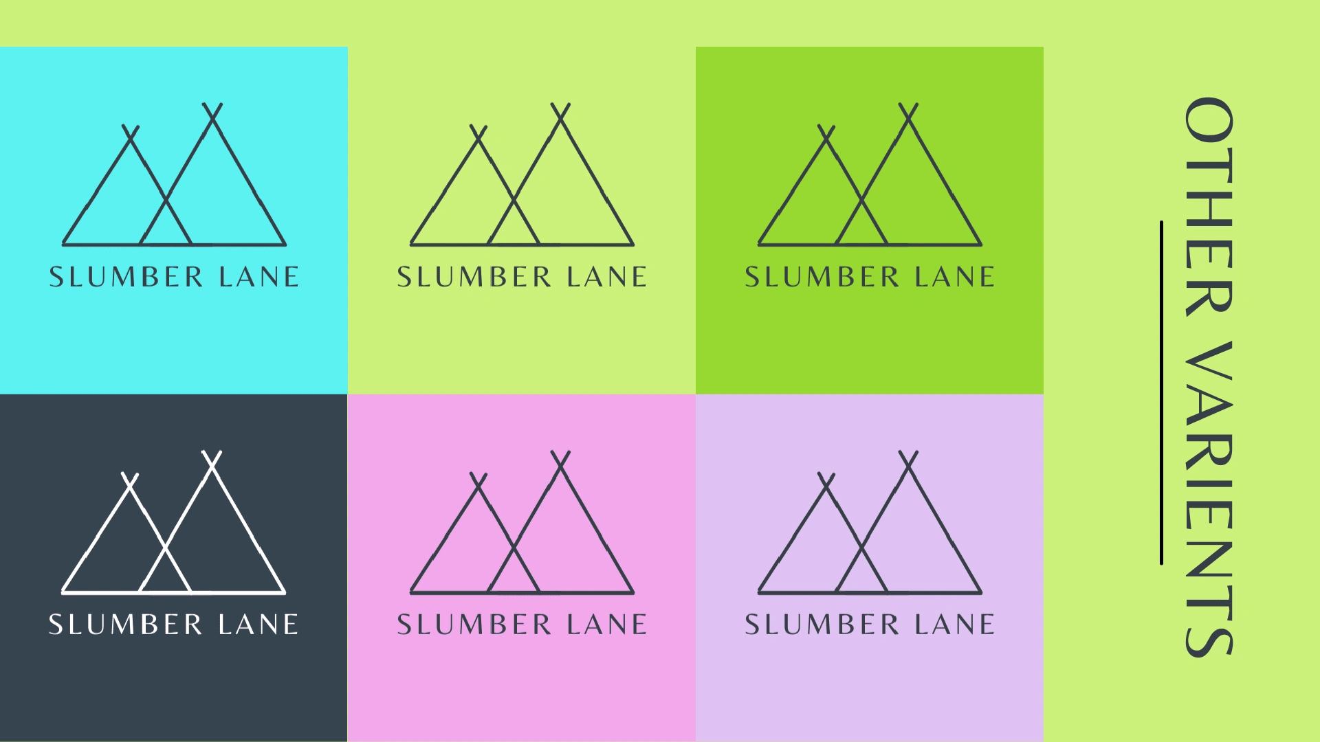
I created a logo that captures the whimsical and dreamy nature of Slumber Lane, incorporating elements that represent sleep, fun, and childhood wonder and most importantly 3 Teepees representing her 3 daughters.
c) Color Palette:
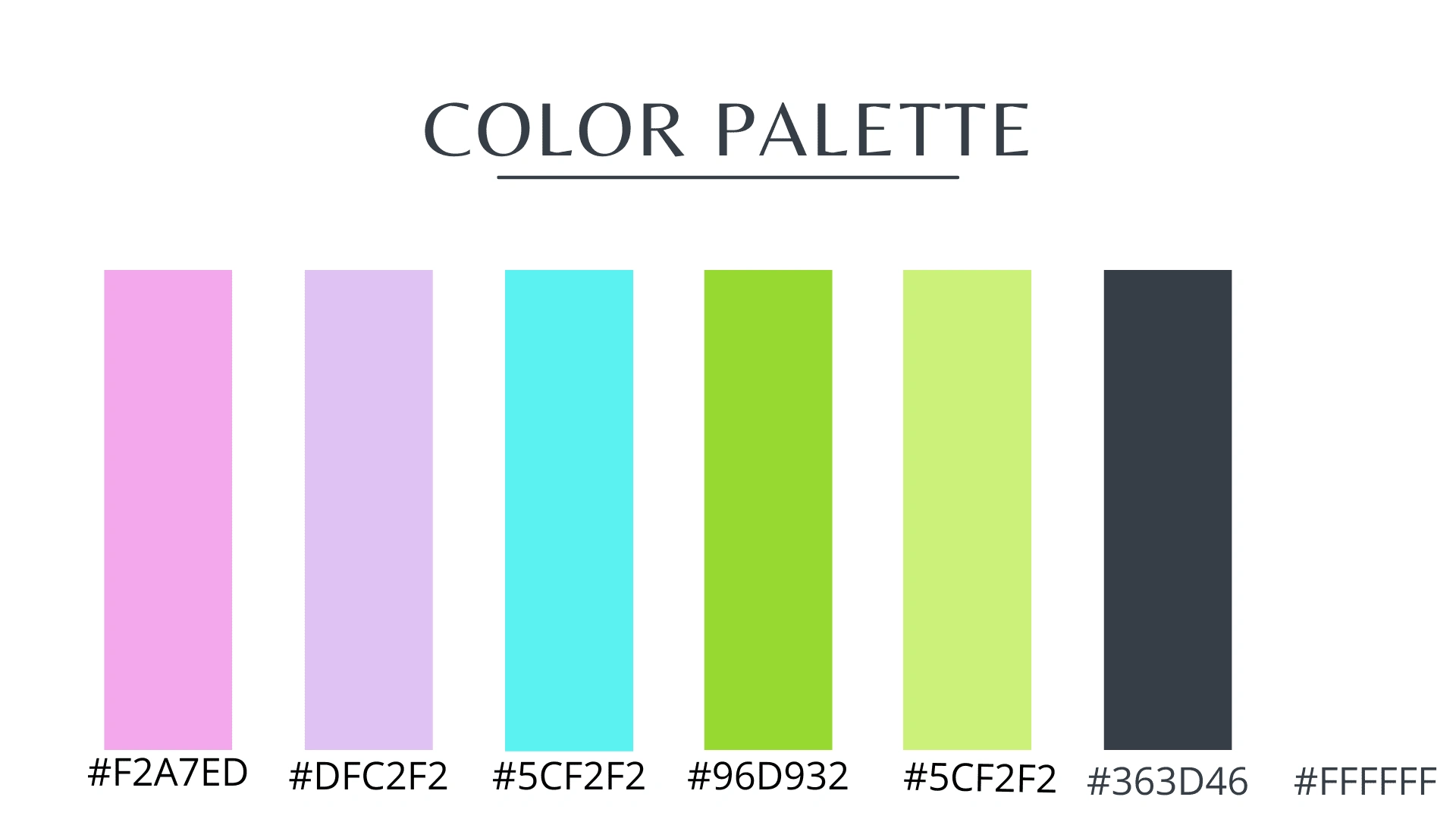
I developed a color scheme using soft grays and whites as the base, complemented by pastel rainbow hues to add a touch of magic and appeal to children.
d) Typography:
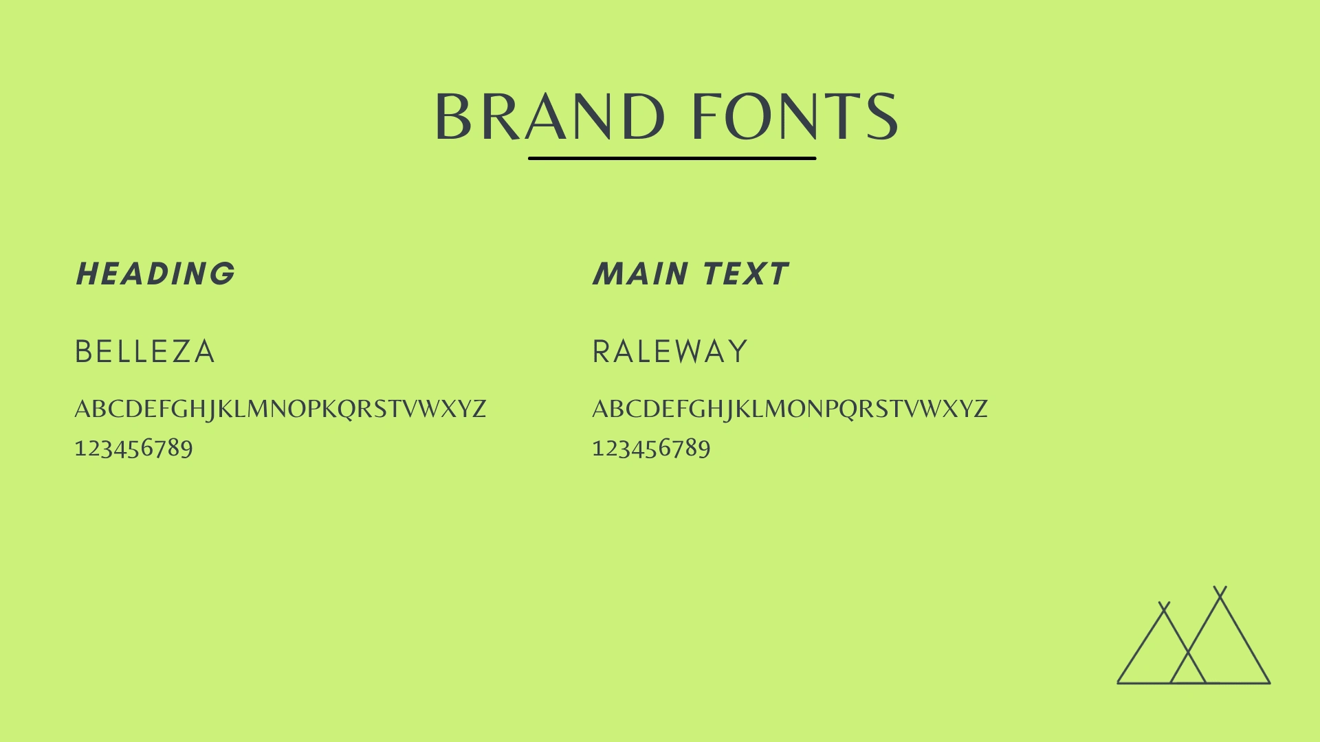
I selected fonts that balance readability with a sense of fun and whimsy, suitable for both digital and print applications.
Logo Design
Primary
Secondary
Brand Fonts
Logo Varients
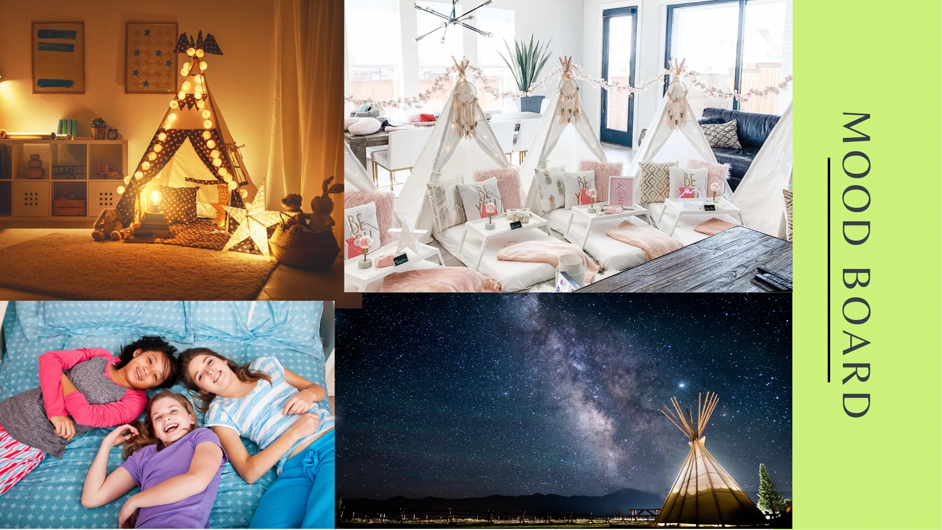
Mood Board
What was included
Logo Concepts
Logo Designs
Brand Style Guide
Color palette
Typography guidelines
Iconography
Unlimited revisions
Client Satisfaction
The client was delighted with the results, praising how well the branding captured their vision and target audience appeal.
"I kept changing my mind on my logo and he patiently and quickly designed something new. He went above and beyond with my brand"
Like this project
Posted Oct 5, 2024
Designed logo & branding for Slumber Lane, a kids' sleepover party service. Created whimsical identity with soft colors, capturing client's vision. Kit includes
Likes
0
Views
11

