FA Secondary Logo
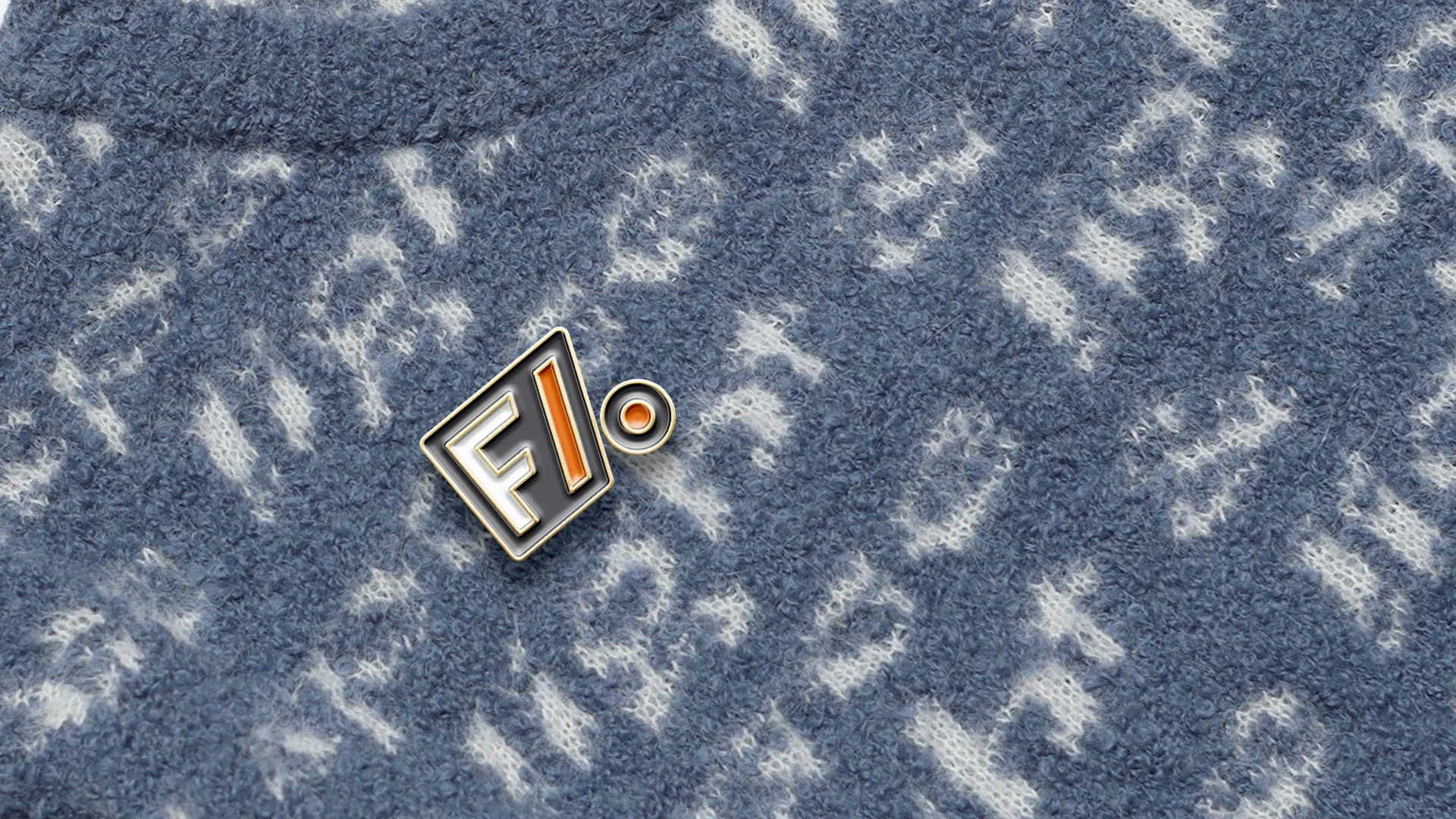
Work with our close clients Far Afield is on going, so naturally, they asked us to design a secondary for their ever growing brand. We were challenged to create a secondary logo that would sit well within the current identity, work along side the Far Afield Global Inspiration feel and of course, its main logo.
We took the most important aspects from the current logo and how the brand was recognized, FA.
The logo takes from the original logo's font adding a slight twist and alteration to become bespoke, a bit like Far Afield's clothing. The simplification of the A was created to build a bridge between global travel and inspiration, like marking a dot on the map for your next trip.

Like this project
Posted Oct 31, 2023
Rebranding of Secondary Logo for Far Afield
Likes
0
Views
12

