Zora Glow Oil | Branding & Packaging
Carol Ugwu
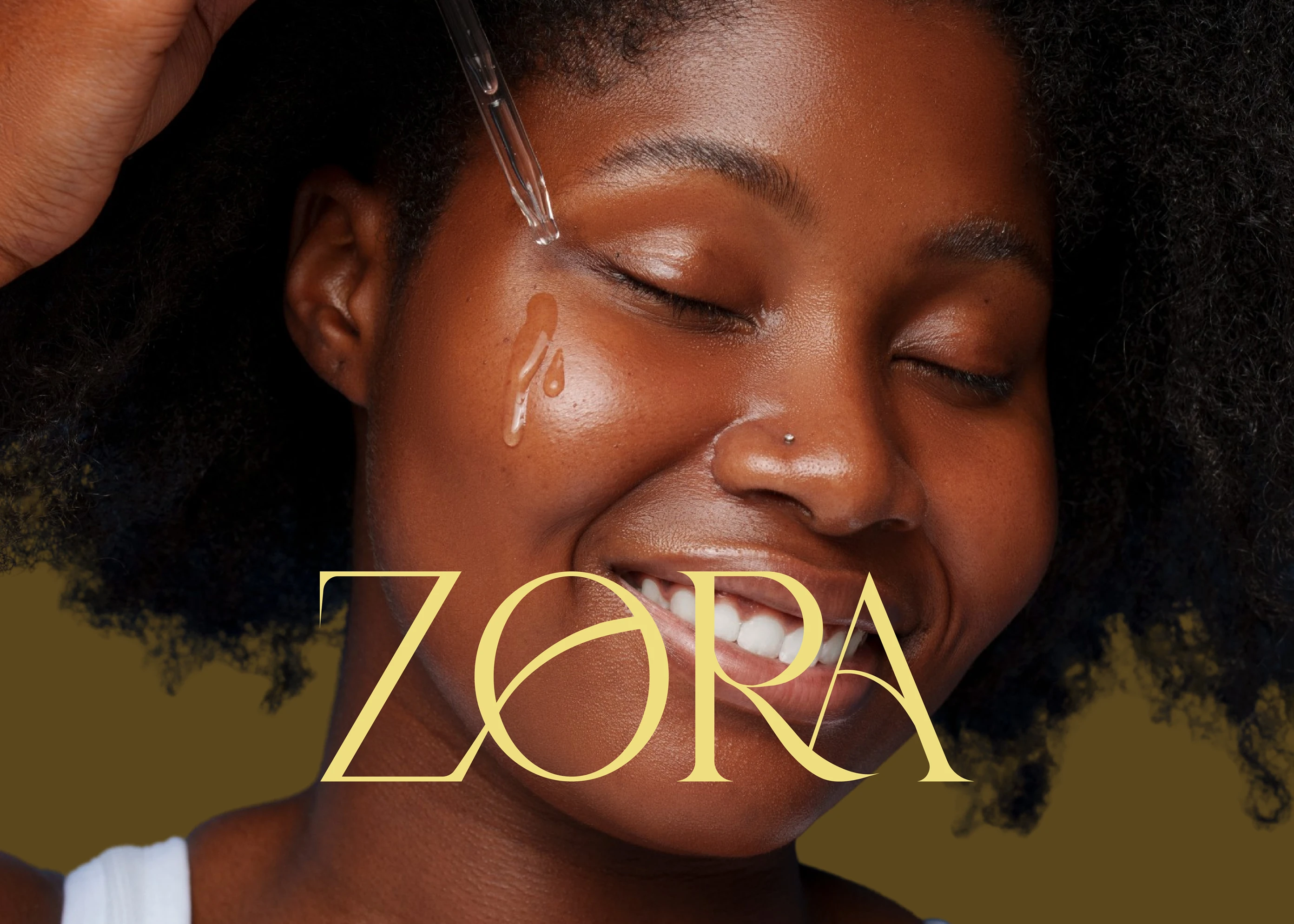
Zora is a premium skincare brand built around a jojoba-based glow oil designed to enhance natural radiance. With a focus on purity, simplicity, and self-care, the brand exists at the intersection of wellness and elegant minimalism. The challenge was to craft a visual identity that reflects both luxury and accessibility, enabling Zora to become a trusted name in clean, effective beauty.
The Challenge
In the crowded skincare market, many brands lean heavily into either purely clinical aesthetics or rich, ornate luxury. Zora’s ambition was different: to emerge as refined yet approachable rooted in natural ingredients but elevated by design. The challenge was to define a distinctive brand story and visual language that conveys elegance and authenticity, making the product feel premium without being intimidating, and minimal without being generic.

Strategy
The creative direction focused on positioning Zora as a harmonious blend of minimal luxury and honest skincare. I anchored the brand in three core values: nourishment, upliftment, and enhancement of natural glow. From there, every design choice typography, palette, packaging, and tone of voice was aligned to reflect gentle sophistication. The narrative emphasized clarity: transparent messaging, refined details, and an experience that felt as good as the product itself.

Design Direction
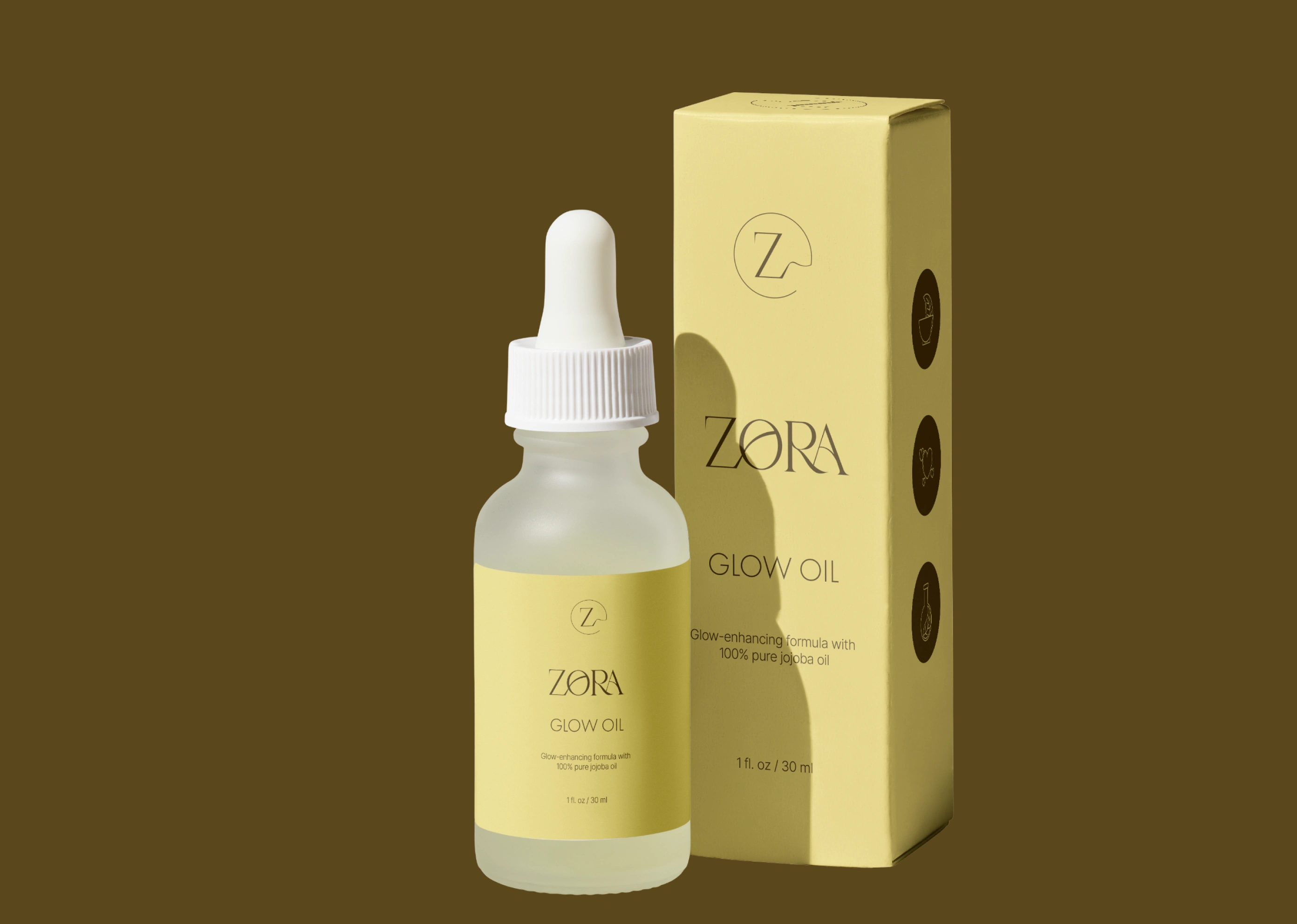
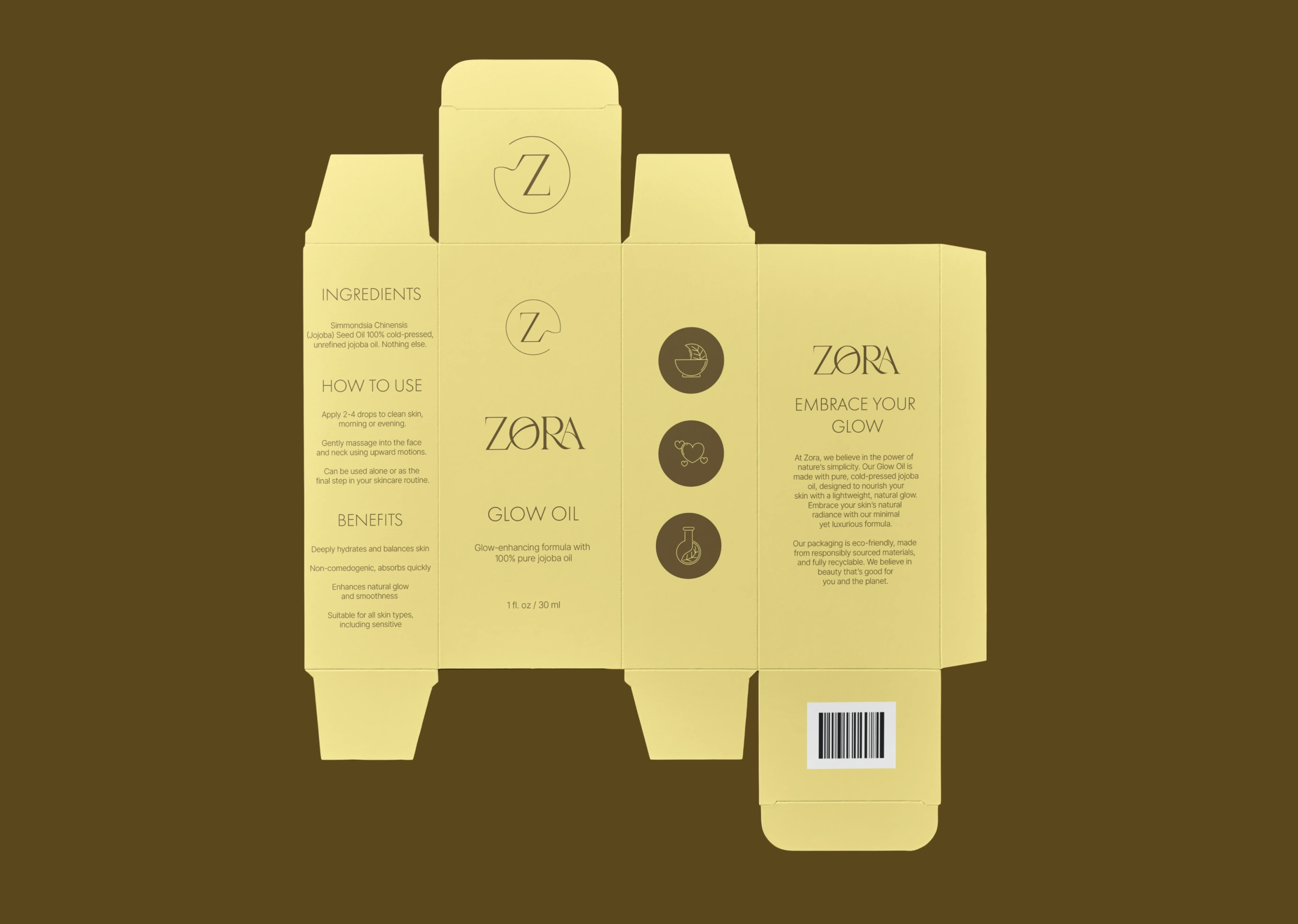
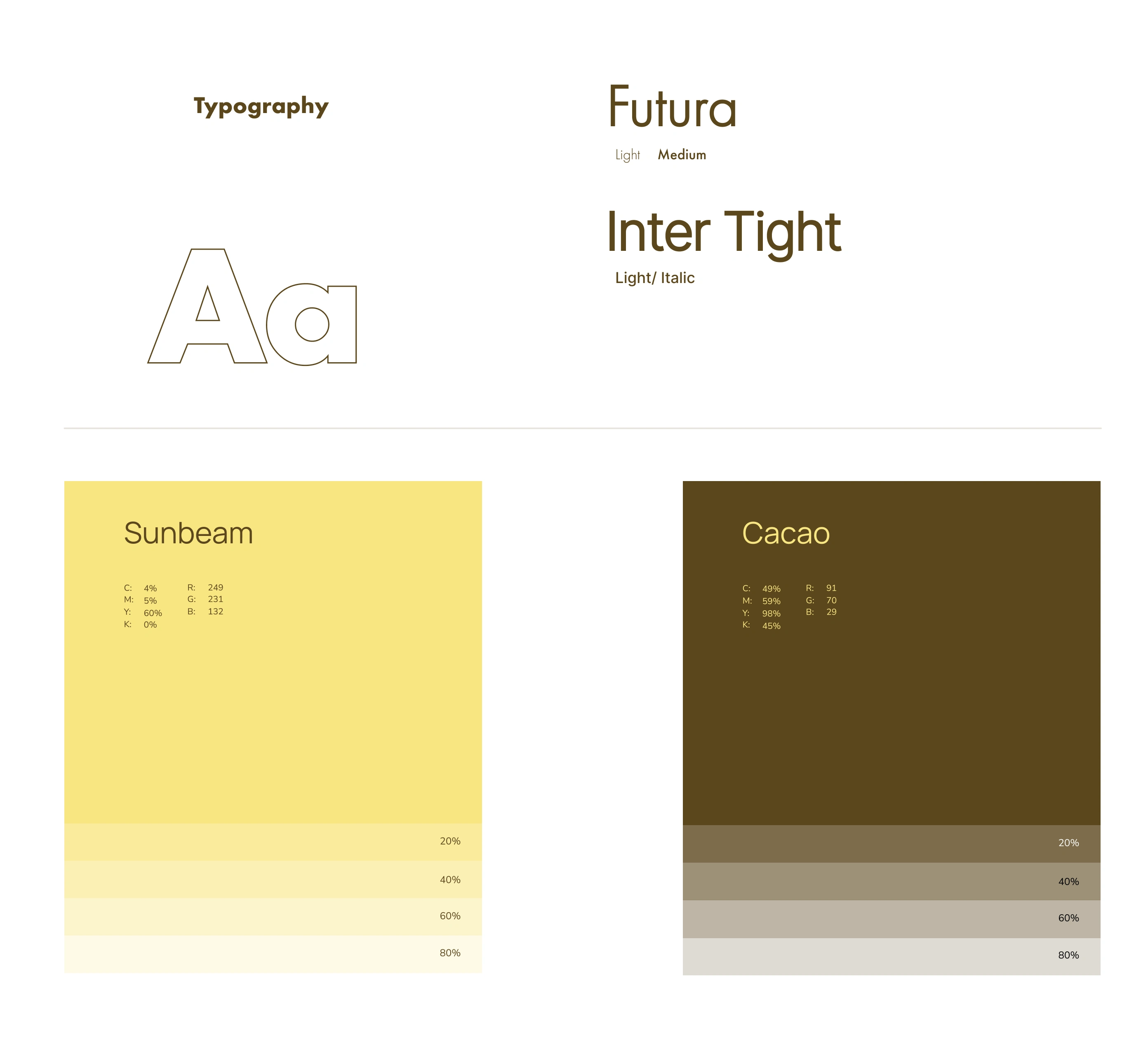
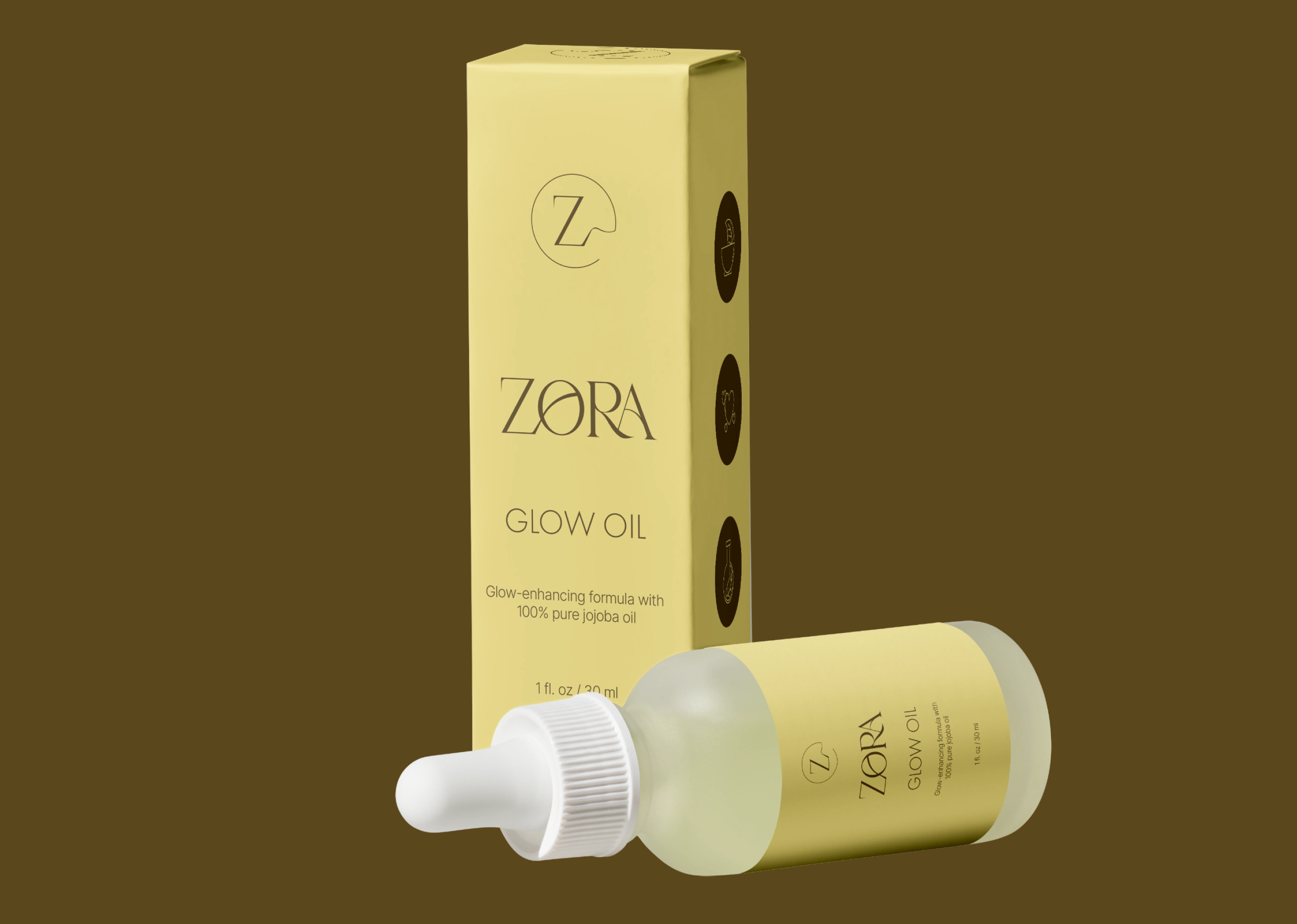
The design system emerged from a refined, minimalist aesthetic. Packaging and branding adopted a warm, elegant color palette that conveys both luxury and organic simplicity. Typography was chosen to be clean and modern emphasizing readability and calm. Visual elements were restrained yet intentional: generous white space, soft textures, and layouts that bring the product forward. The tone of voice is nurturing and confident, encouraging users to engage with skincare as a ritual of care and self-connection.
Implementation
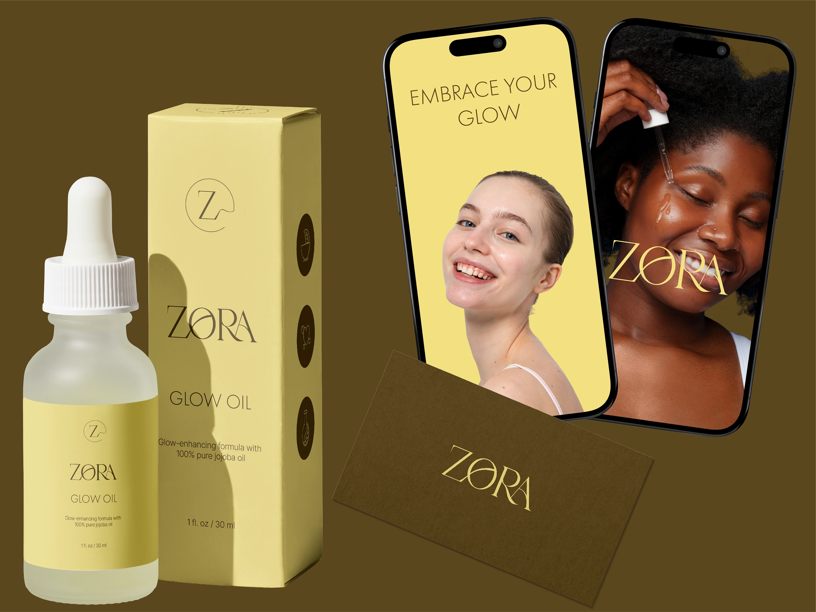
The identity was developed across packaging, digital presence, and marketing materials. The glow oil bottle and outer carton were designed to feel premium in hand, with tactile finishes and a clear hierarchy that highlights benefits without clutter.

Impact
The new brand identity positioned Zora as a confident, modern name in premium skincare. The combination of minimal design and warm sophistication helped the brand build immediate trust and visual recognition, appealing to audiences who value both aesthetics and authenticity. Zora now stands as a complete expression of glow, nourishment, and intentional design a brand that feels timeless from the inside out.
Reflection
Building Zora reminded me that minimalism is not the absence of detail but the art of refinement. Every element in the system color, type, tone had to serve a purpose. Designing for a beauty brand meant creating not just a look, but a feeling: how the bottle feels in hand, how the light hits the logo, how calm the overall experience becomes. With Zora, the result is a brand that is simple yet rich, modern yet warm, and quietly radiant in its promise of natural glow.

Like this project
Posted Oct 7, 2025
Excited to share my latest project: Zora, a clean and radiant skincare brand focused on natural beauty!