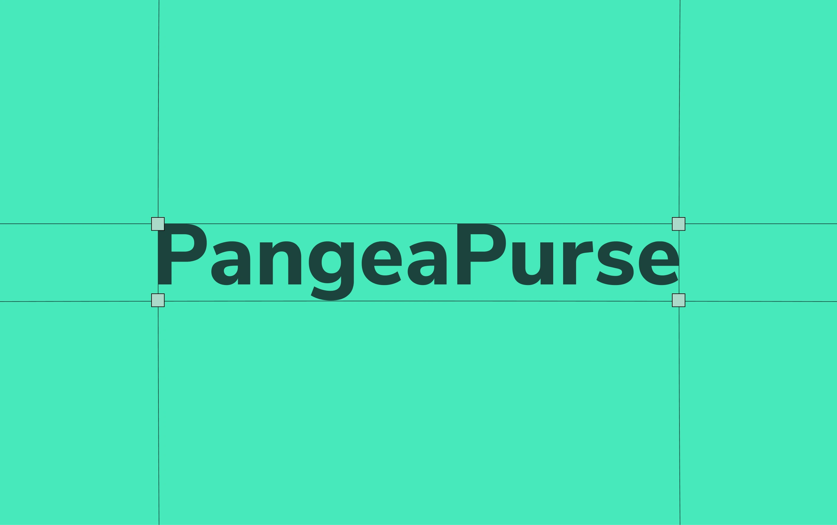
PangeaPurse | Finance App, Logo & Branding
Carol Ugwu
PangeaPurse is a digital finance brand developed from the ground up. Designed to simplify global money-flow and empower users in emerging markets, the brand straddles clarity and innovation. My role encompassed the full visual identity and user-interface design building the look, feel, and interactive experience that make PangeaPurse both trustworthy and forward-thinking.

The Challenge
The fintech space is crowded with apps that look highly technical or cold. PangeaPurse needed to feel modern and capable while remaining accessible and human. The challenge was to craft an identity and UI that communicate security, simplicity, and global reach without sacrificing warmth or clarity. The branding had to reflect a trustworthy finance tool for a diverse, global user base, while the interface needed to deliver a smooth, intuitive experience.
Strategy
I grounded the project in three core pillars: simplicity, trust, and global connection. Every design decision, from iconography and color system to interactive flows and typography, was aligned around these. The brand language was developed to convey reliability and modernity giving users the confidence to manage finances internationally, supported by a UI that makes complex processes feel intuitive and seamless.

Design Direction
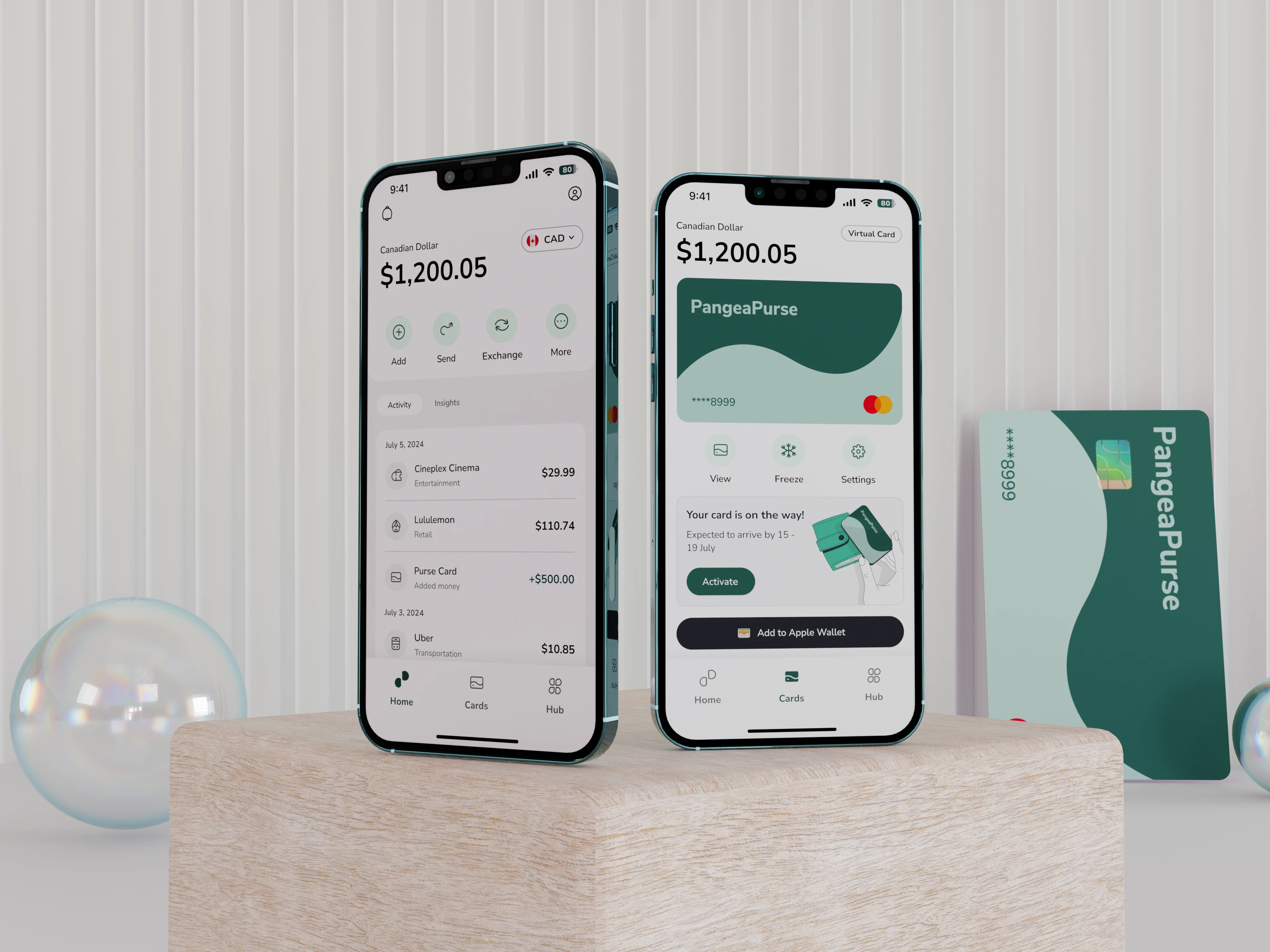
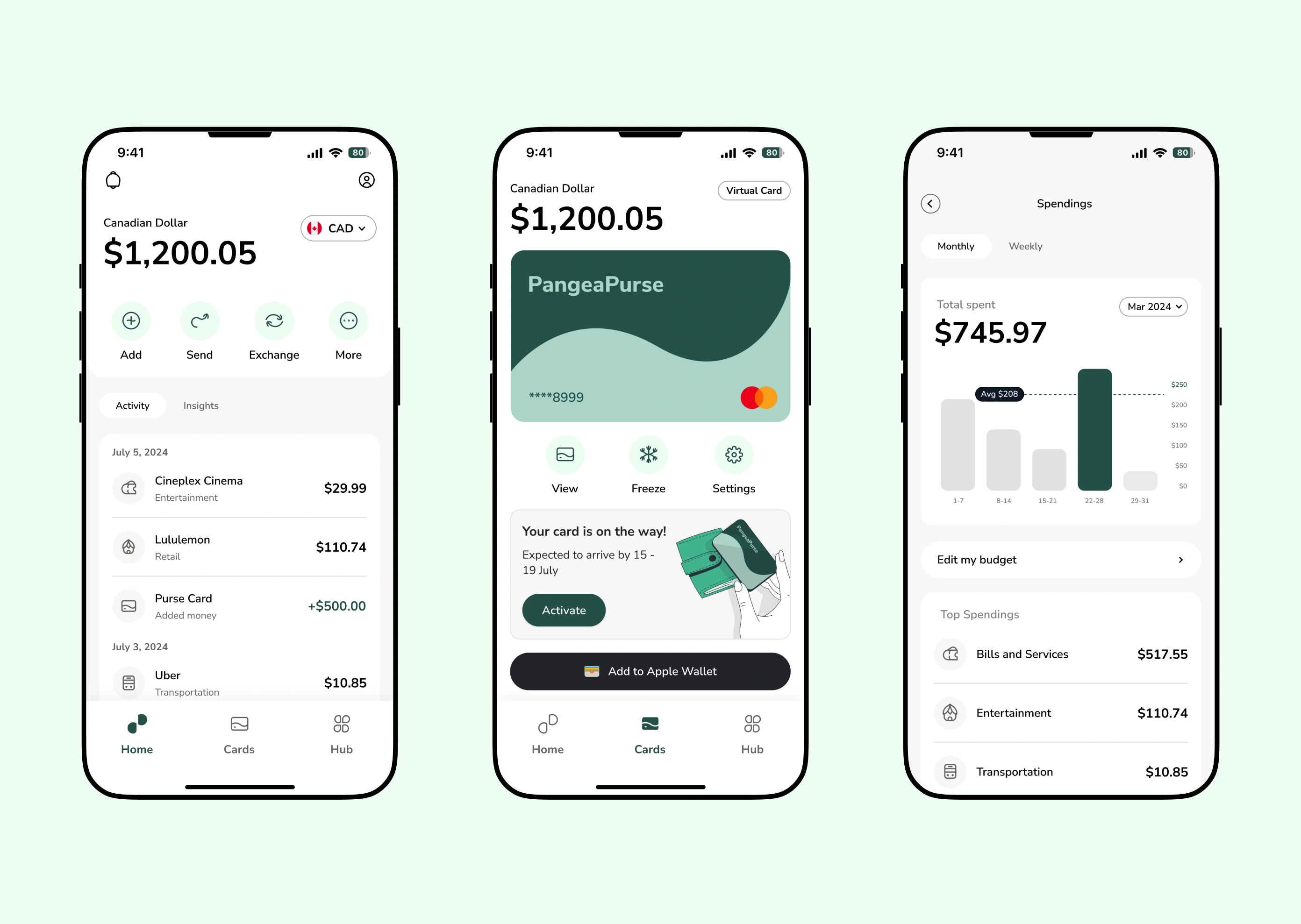
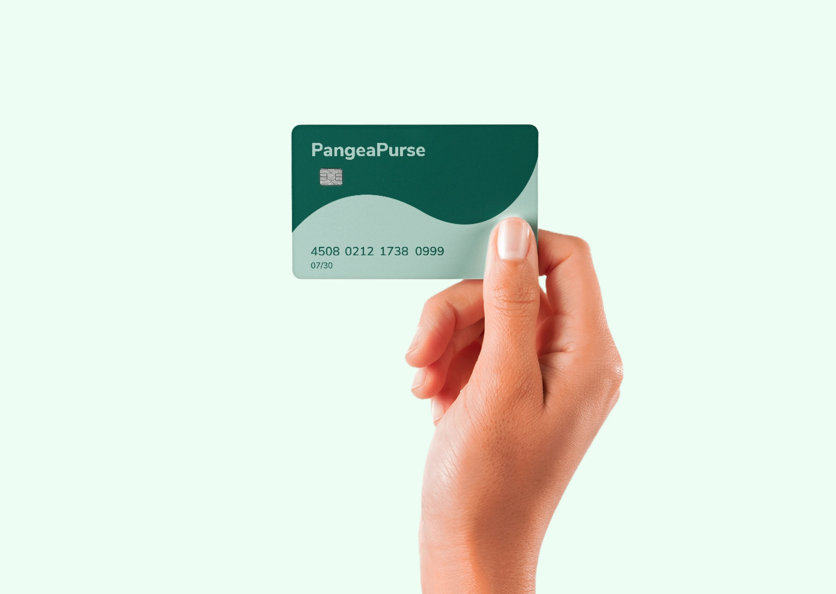
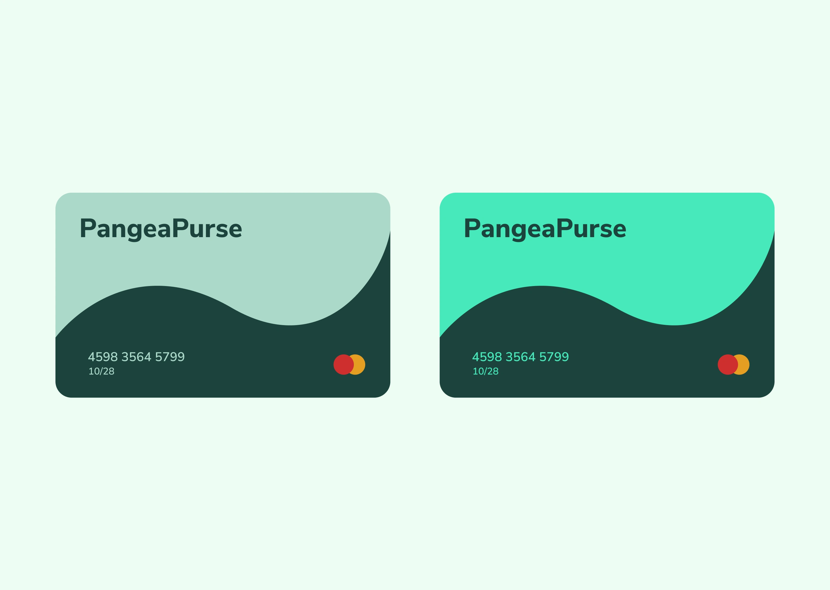
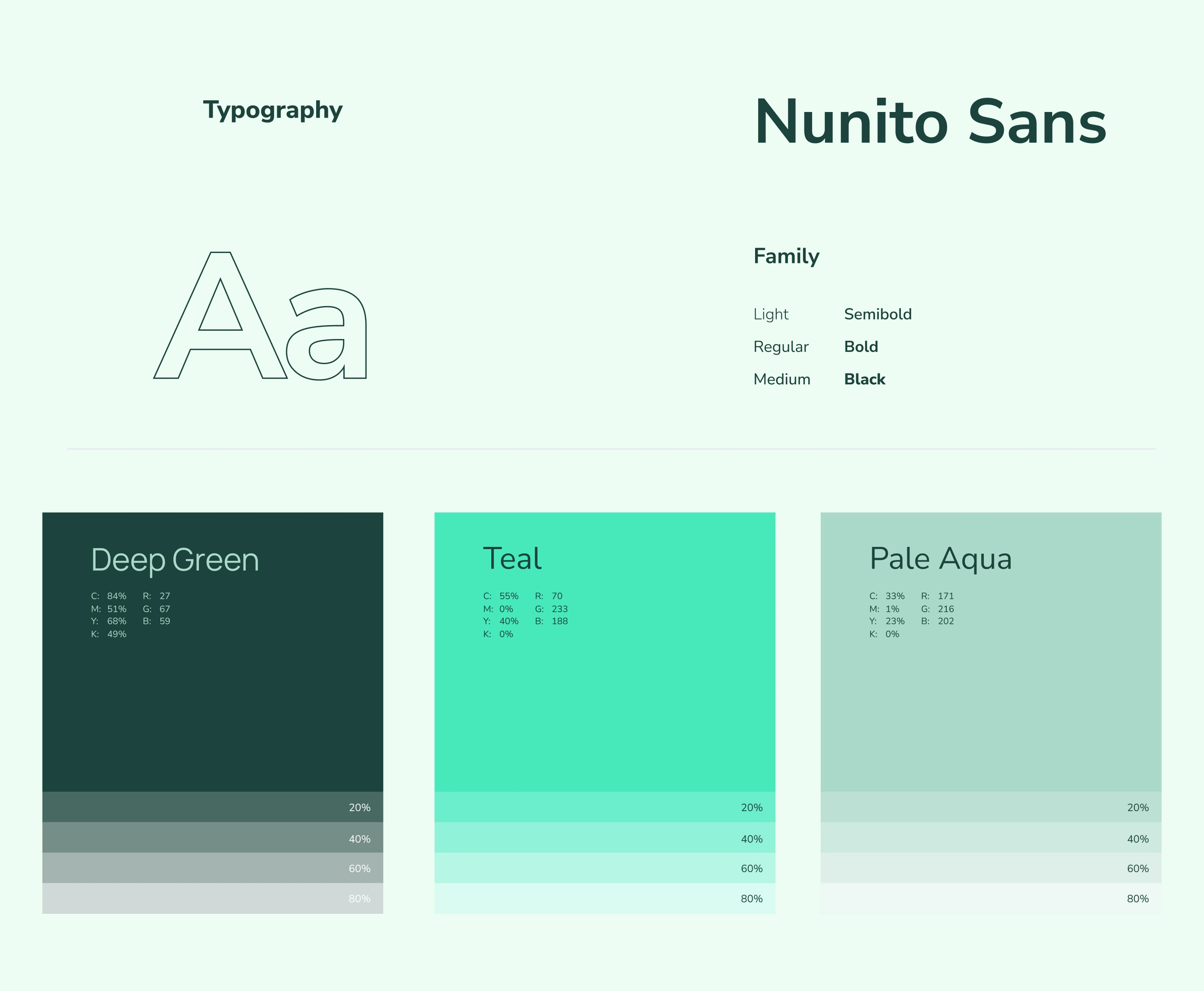
The visual identity uses a balanced color pallete for freshness and approachability. Typography is clean and functional, with generous spacing to enhance readability and calm. In the UI, I designed modular card components and data-visual sections to present financial information clearly and confidently. The brand mark reflects movement and currency flow, hinting at global connectivity, while the overall aesthetic remains crisp, friendly, and contemporary.

Implementation
I executed the identity across both brand assets and UI screens. The branding was applied to logo, stationery, app icon and marketing templates. The UI design included high-fidelity mobile screens showing balance overview, transaction details and card management. Interactive elements use consistent visual language: icon sets, button treatments, and spacing rules. The brand identity and UI together create a coherent ecosystem whether the user encounters PangeaPurse via a marketing email, a card in hand or the mobile app.
Impact
PangeaPurse now presents itself as a credible, modern finance brand that users feel comfortable interacting with across borders. The strong visual identity and thoughtful UI design help differentiate it from the generic fintech pack. The clean experience builds trust, the global-centric brand signals breadth, and the approachable aesthetic opens it to a wider audience all contributing to a brand that is as visually appealing as it is functional.
Reflection
Working on PangeaPurse reinforced how critical the UI is to realizing a brand’s promise. Visual identity alone isn’t enough the interactive layer must embody the same clarity and tone. In this project, I learned that branding and interface must work in tandem: brand speaks to emotion and trust; UI speaks to usability and confidence. Delivering both in one coherent system was hugely rewarding.

Like this project
Posted Oct 7, 2025
PangeaPurse - I designed the brand identity and UI for a fintech platform built to make international transactions feel effortless.