Veloxis - Logo design & Motion brand identity
Carol Ugwu
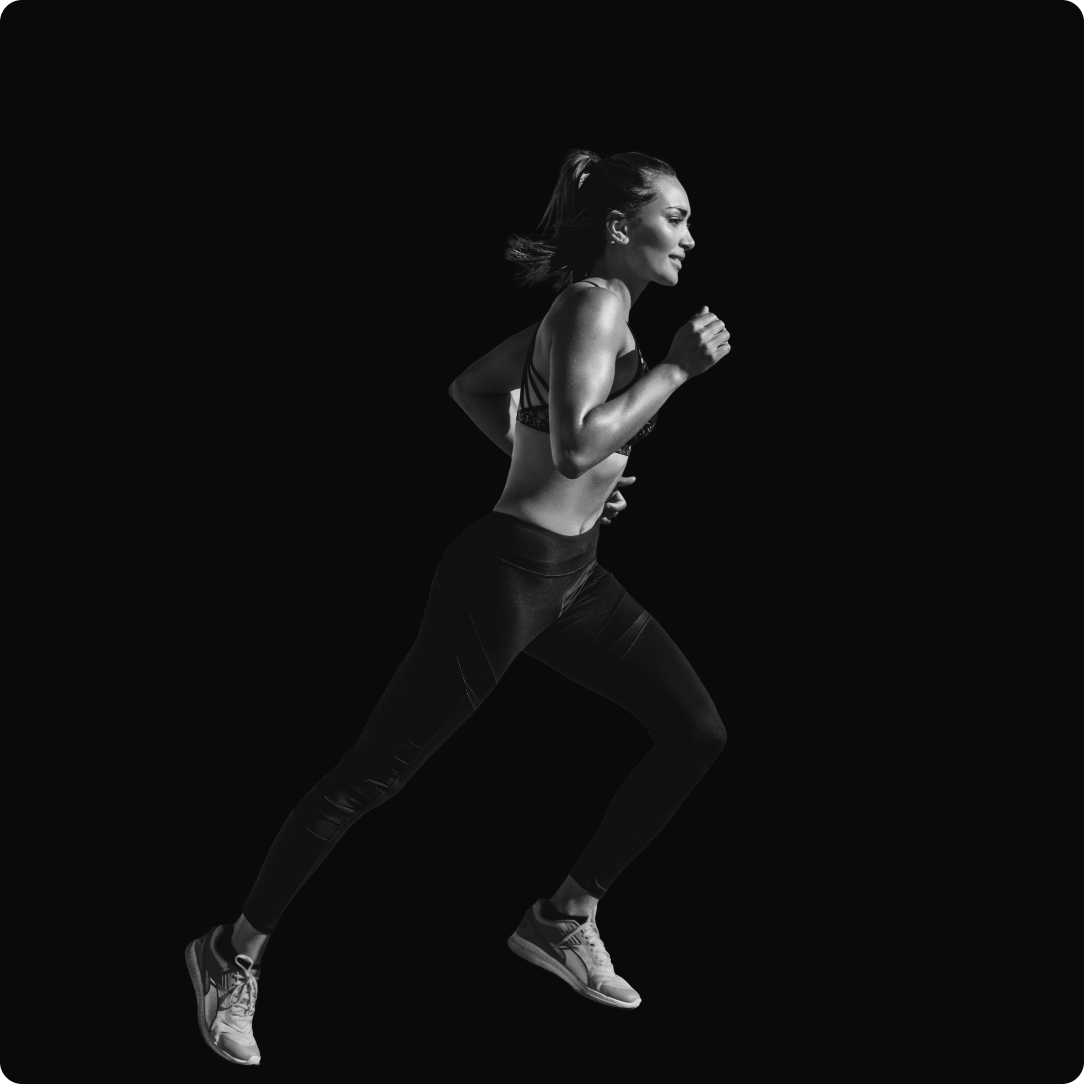
Veloxis: a visual identity created for a high-performance training centre where speed, strength and precision come together. The goal was to craft a brand that feels energetic, refined and future-forward one that embodies movement, agility and elevated performance.
The Challenge
The market for athletic training centres is saturated with bold, loud visuals and clichés of gym culture. Veloxis needed to stand apart by feeling premium without being pretentious, dynamic without being chaotic. The challenge was to design a visual system that could communicate intensity and skill, while remaining clean, structured and thoughtfully designed.

Strategy
I anchored the identity around three guiding themes: motion, clarity and refinement. These themes shaped every design decision from how type moves and anchors on screen, to how the logo mark embodies forward momentum. The strategy was to make the brand feel confident and precise, so that every visual touchpoint speaks to high performance and intentional design.
Design Direction
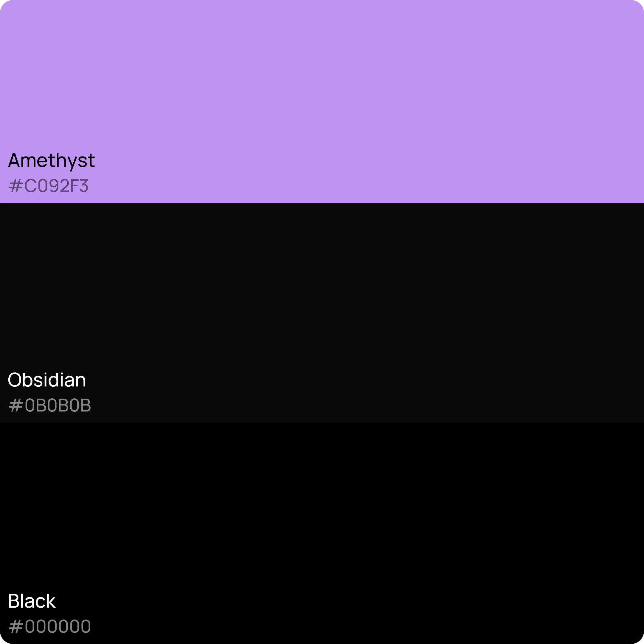
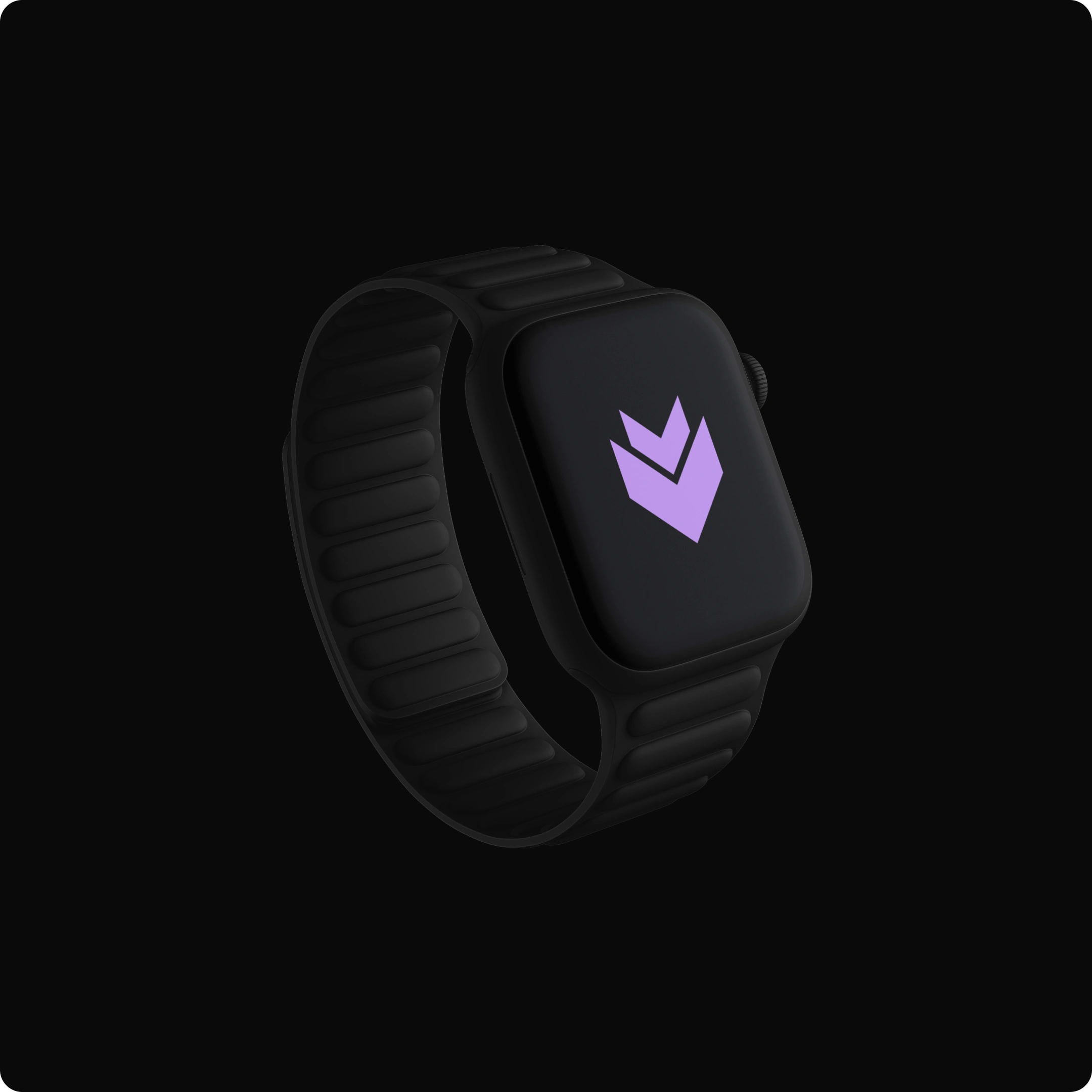
The visual language uses a bespoke mark that hints at speed and direction, paired with modern, minimal typography and a palette that balances boldness with restraint. The logo has sharp geometry to reflect precision; colour accents inject energy; layout grids and ample negative space bring clarity. The result is a system where motion is implied, structure is respected, and brand presence is strong but refined.
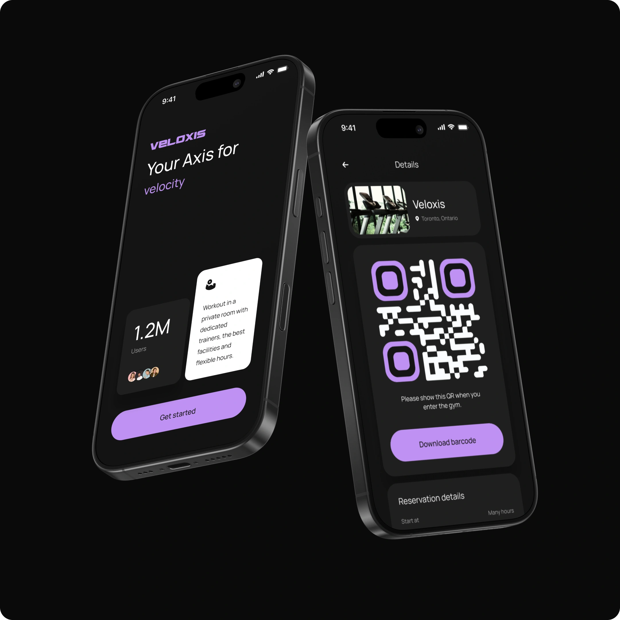
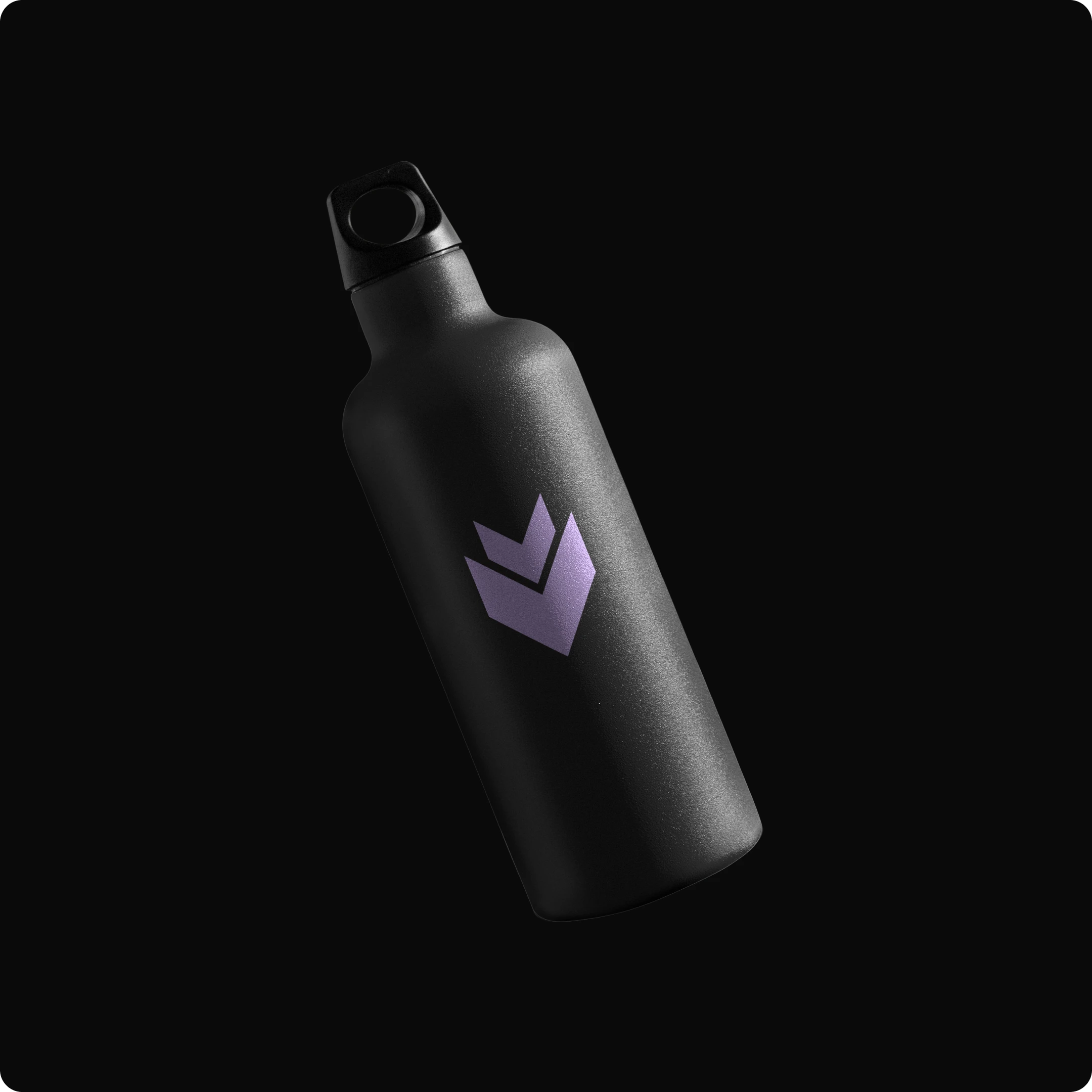
Implementation
I applied the visual identity across brand-moment touchpoints, Each asset was crafted to sustain the brand’s tone the mark animates with subtle forward motion, the palette adapts for print and digital, and typography remains legible in performance contexts. Together they deliver a unified look and feel that matches Veloxis’s ambition.
Impact
With its new visual identity, Veloxis presents itself as a leader in the training space disciplined, dynamic and design-driven. The brand system appeals to discerning users who value both result-oriented performance and refined aesthetics. The visual framework supports the message: high performance delivered with sophistication.
Reflection
Designing Veloxis reminded me that momentum in branding doesn’t require loud visuals it can live in precise geometry, careful type, and a thoughtful colour story. Every element in the system from mark to layout to motion had to contribute to the sense of speed and intent. The end result is a brand that feels premium, dynamic and built to perform.
Like this project
Posted Oct 7, 2025
An athletic training hub built for peak performance where speed, strength, and precision meet to push every athlete beyond their limits.