Real Estate Dashboard

Cansaas Agency


Hi Folks! 👋🏻
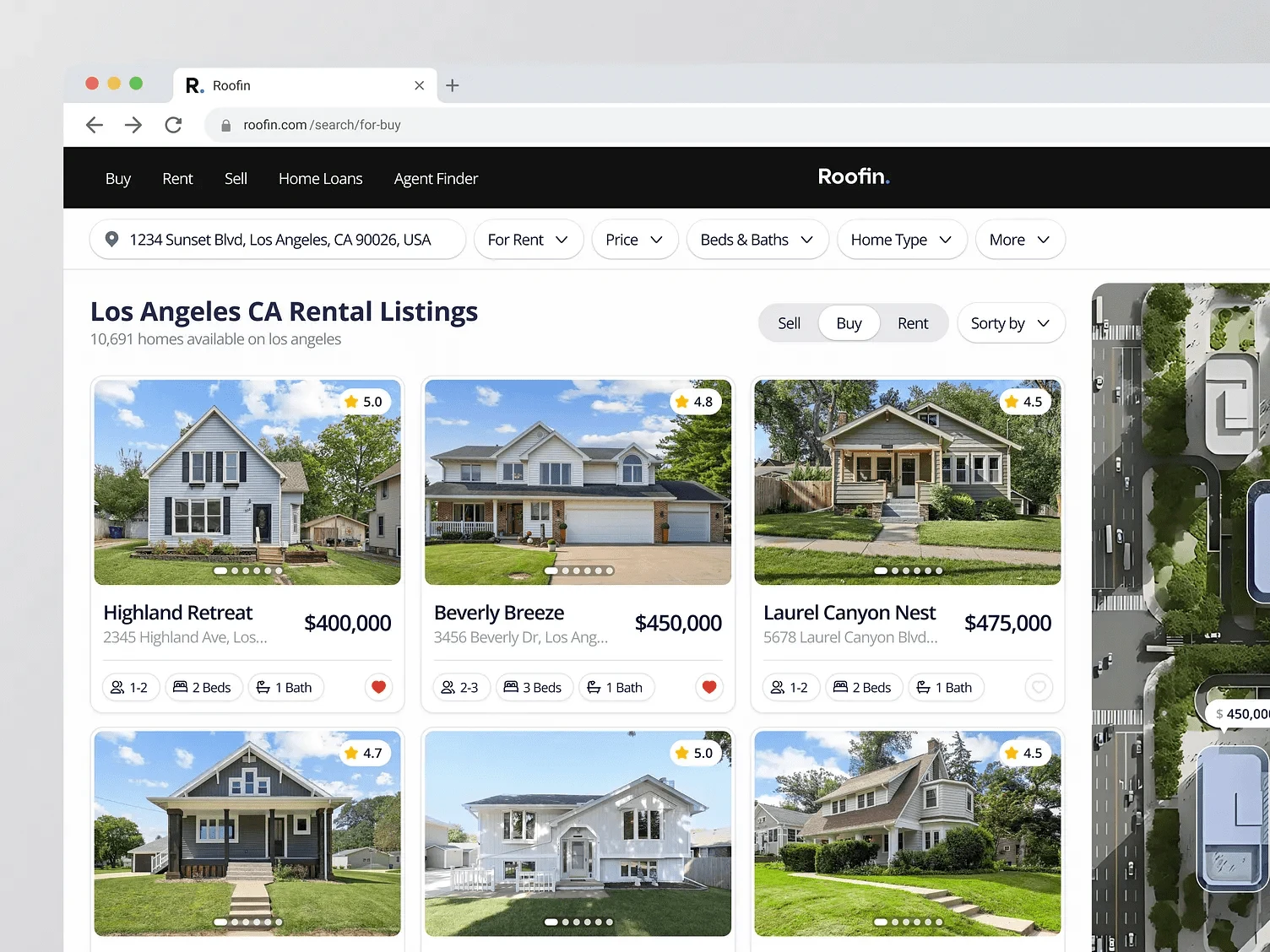
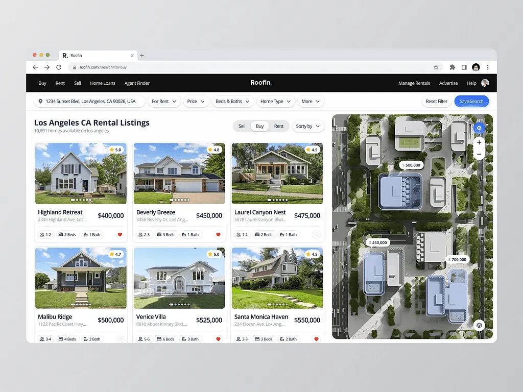
Excited to share my latest design exploration! This real estate dashboard focuses on seamless user experience with intuitive navigation and clean data visualization. My goal was to create a dashboard that simplifies property management and provides key insights at a glance. Feedback and thoughts are always welcome!
The challenge
This real estate platform design faces several challenges that affect both clarity and usability. First, the interface feels visually crowded, with property listings, prices, and a large interactive map all competing for attention at once. While the map is a helpful feature, it can easily overwhelm the listing section, making it harder for users to focus on the homes themselves. Additionally, the property cards feel a bit repetitive in style, making it harder to quickly differentiate between listings. Finally, accessibility needs improvement; some text and color contrasts might not be ideal for users with vision issues or those using assistive tech.
Reflection
This design smartly blends real estate search with a modern, map-first browsing experience. It’s visually intuitive, functionally rich, and well-suited for desktop use. With minor refinements especially around mobile responsiveness and interactivity it can evolve into a powerful real estate browsing tool.
Thanks for checking it out!
Got ideas or interested in collaborating? Send Inquiry
Don’t hesitate to get in touch, we’re always eager to work together!
Like this project
Posted Apr 15, 2025
This real estate dashboard focuses on seamless user experience with intuitive navigation and clean data visualization.


SAAS Dashboard
SAAS Websites

SAAS Responsive Websites
SAAS Landing Pages