SAAS Landing Pages

Cansaas Agency


Project Background
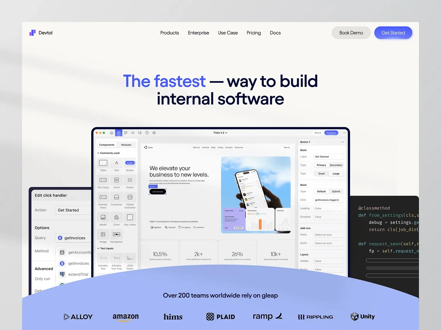
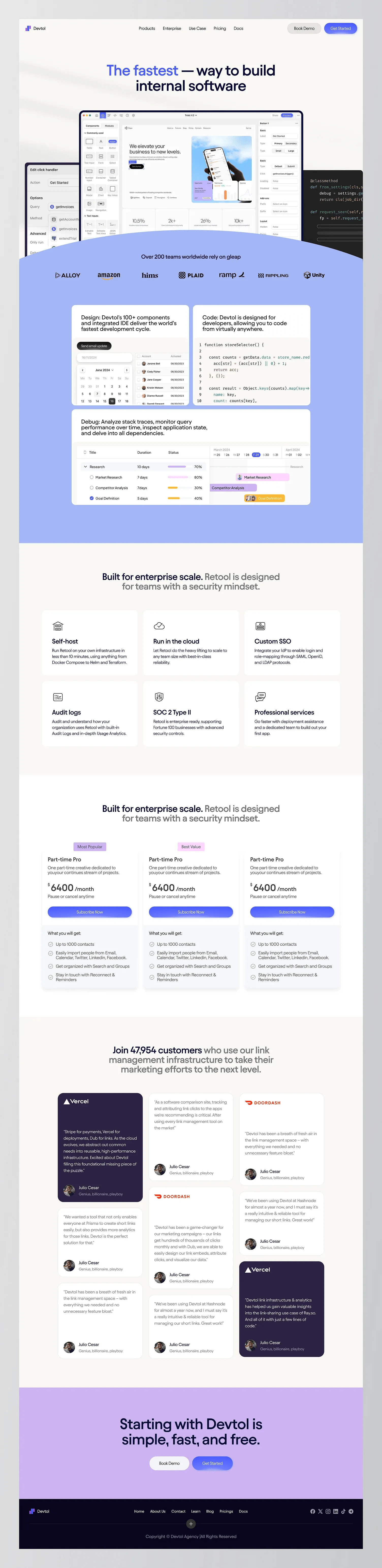
Devtol is a platform that helps teams build internal software faster and more efficiently. The goal was to create a modern, trustworthy landing page that speaks directly to developers and enterprise teams who care about speed, clarity, and control.
What We Wanted to Solve
We needed to take something technical and make it easy to understand at a glance. The challenge was finding the right balance between showing the product’s powerful features while still keeping the experience simple and digestible.
Our Design Approach
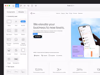
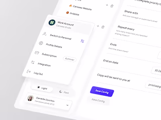
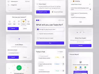
We focused on making the first impression clear and strong by using a bold headline and a real screenshot in the hero section to show what Devtol is all about. To explain the product’s main features, we used a side-by-side layout that highlights both design and coding capabilities, making it easy to understand for different types of users. Real interface screenshots instead of mockups help build trust by showing the actual product experience. We kept the pricing section simple and easy to compare, helping users make decisions quickly. Finally, we added testimonials from well-known companies to give the page a personal and trustworthy touch.
The Result
The final design feels fast, easy, and professional just like the product itself. It helps Devtol clearly communicate their value to teams that want to build faster without losing control. The page is built to convert, scale, and grow with them.
Need help with your SaaS design? Cansaas is here to provide the solution
Thanks for checking it out!
Got ideas or interested in collaborating? Send Inquiry
Don’t hesitate to get in touch, we’re always eager to work together!
Like this project
Posted Apr 15, 2025
The fast way to build internal tools and expands its low-code platform for creating internal apps to support external apps.


SAAS low-code
SAAS Profile
SAAS Productivity

SAAS Responsive Websites