Kazen Branding & Visual Identity Project
Afifudin Zuhri
Branding & Visual Identity
© February 2026
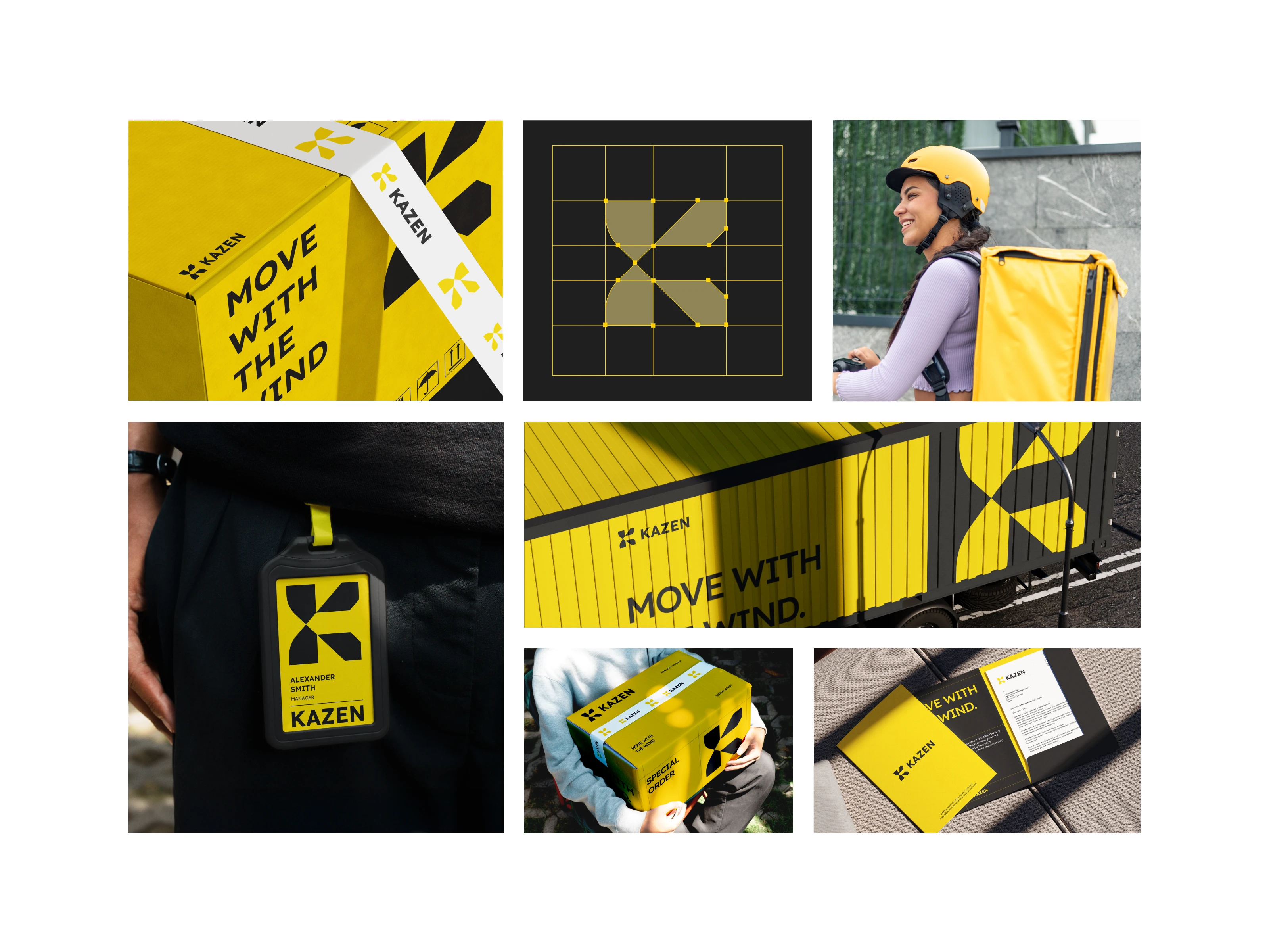
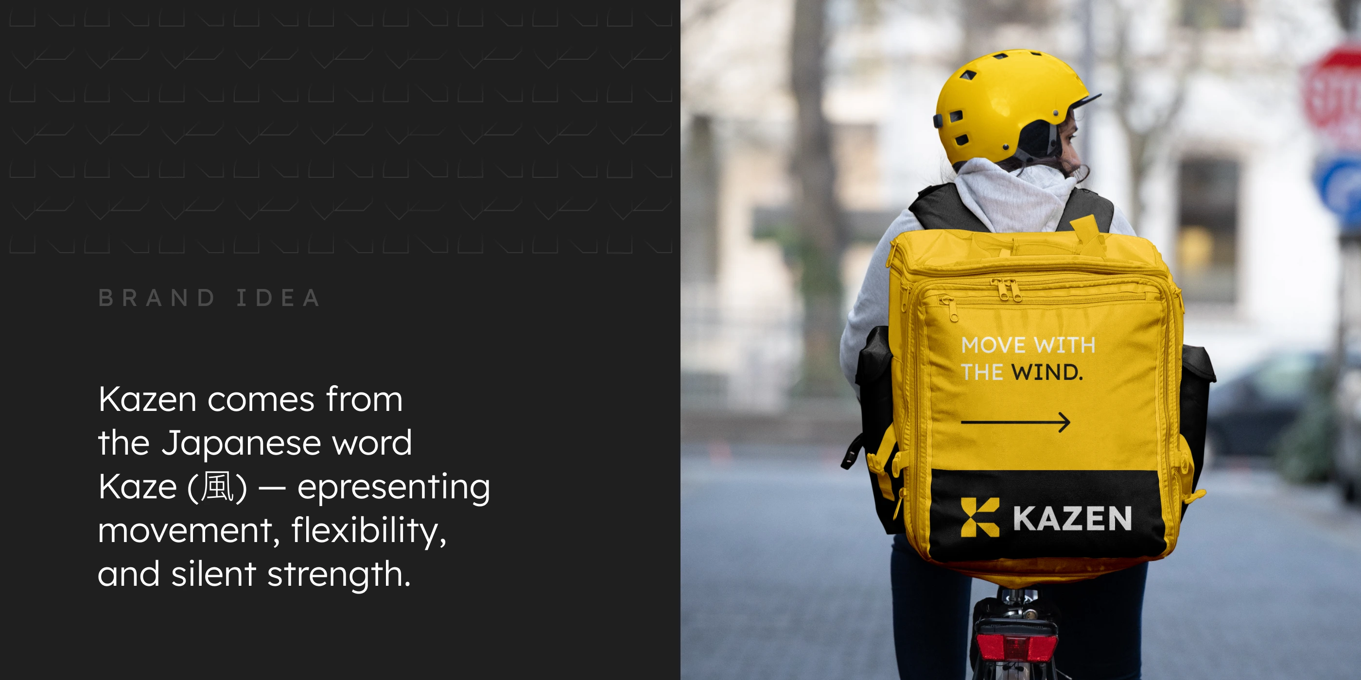
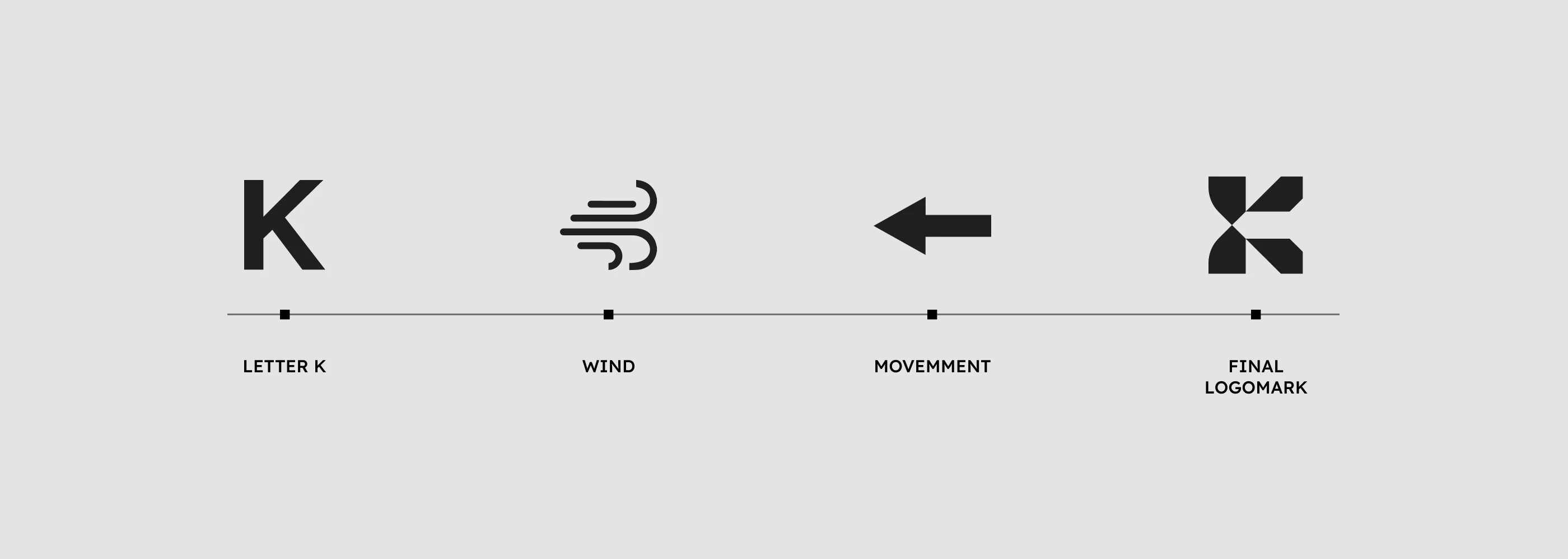
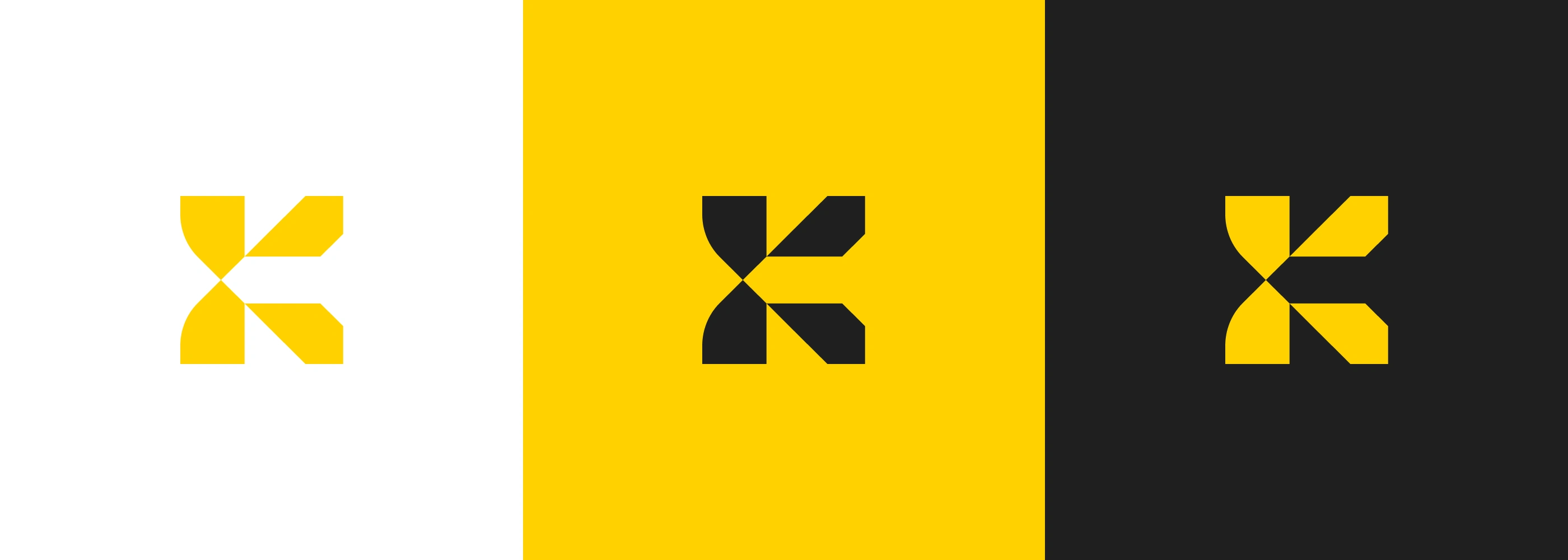
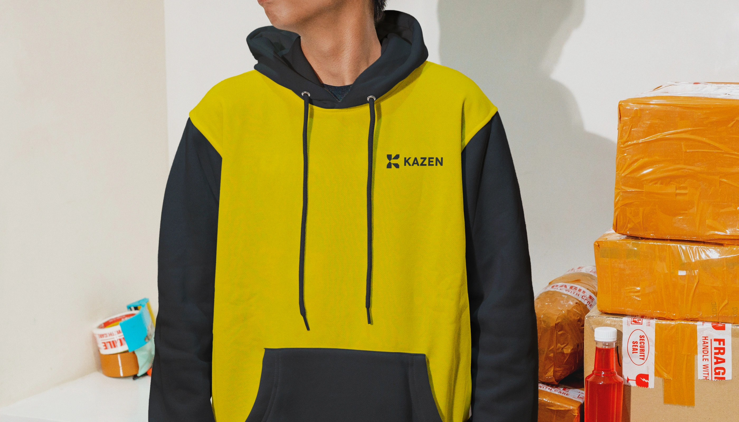
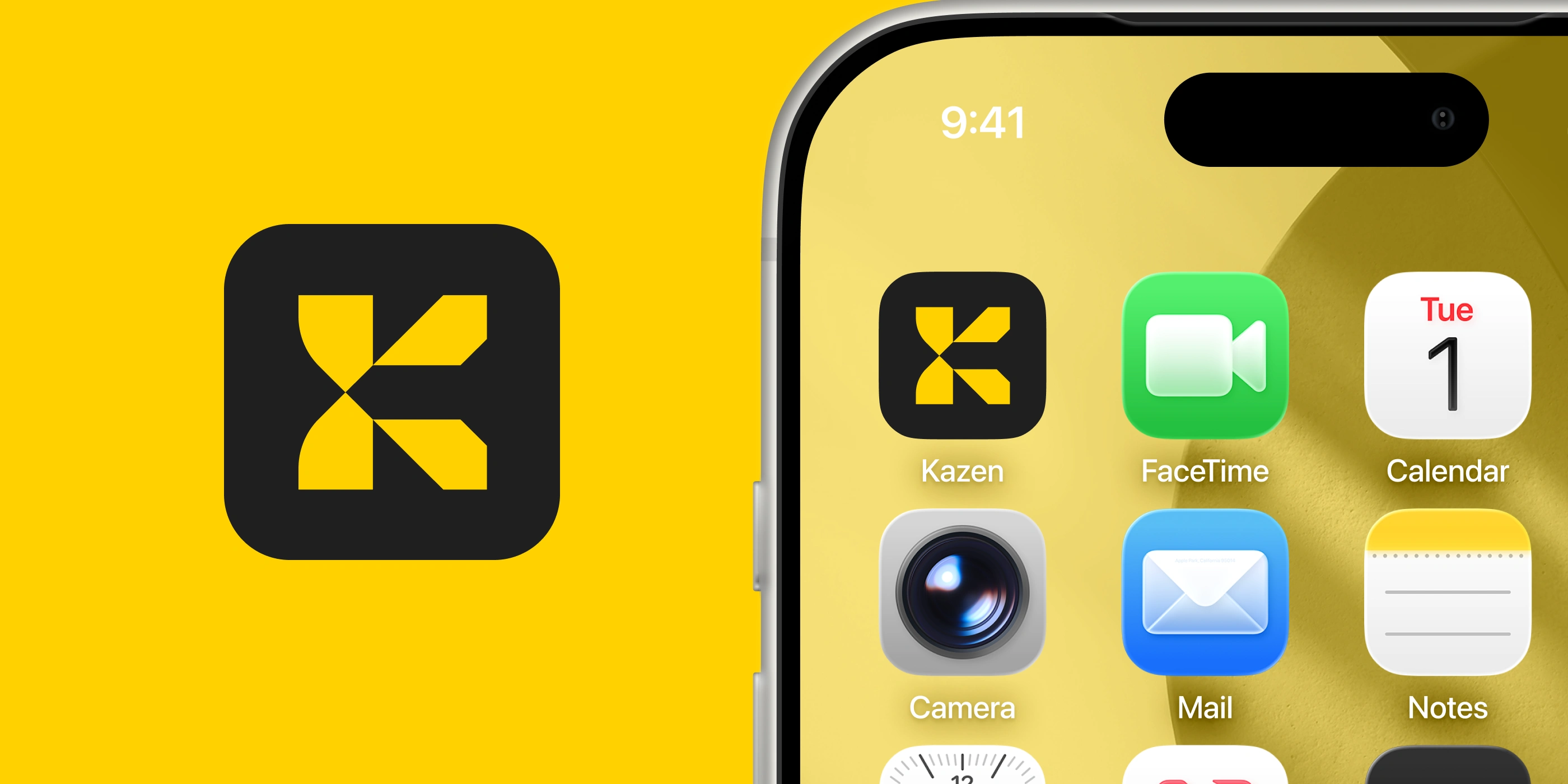
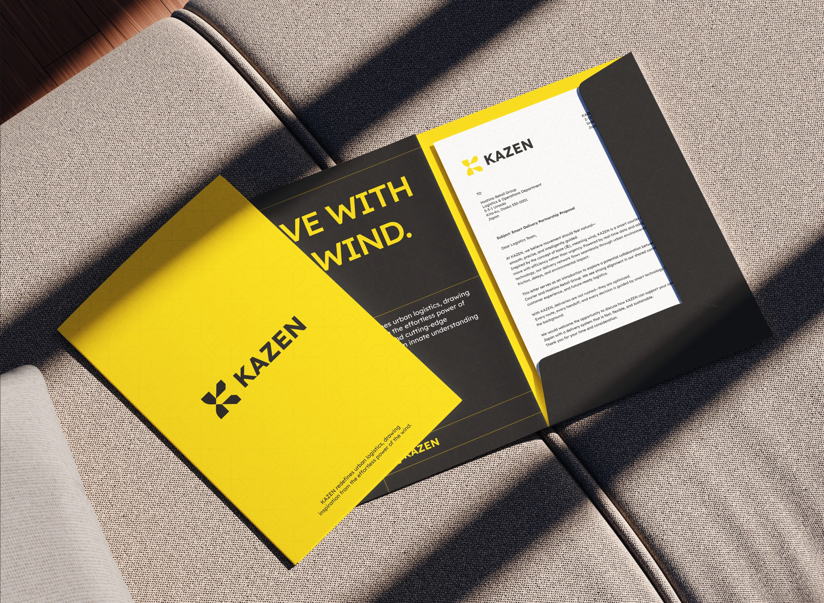
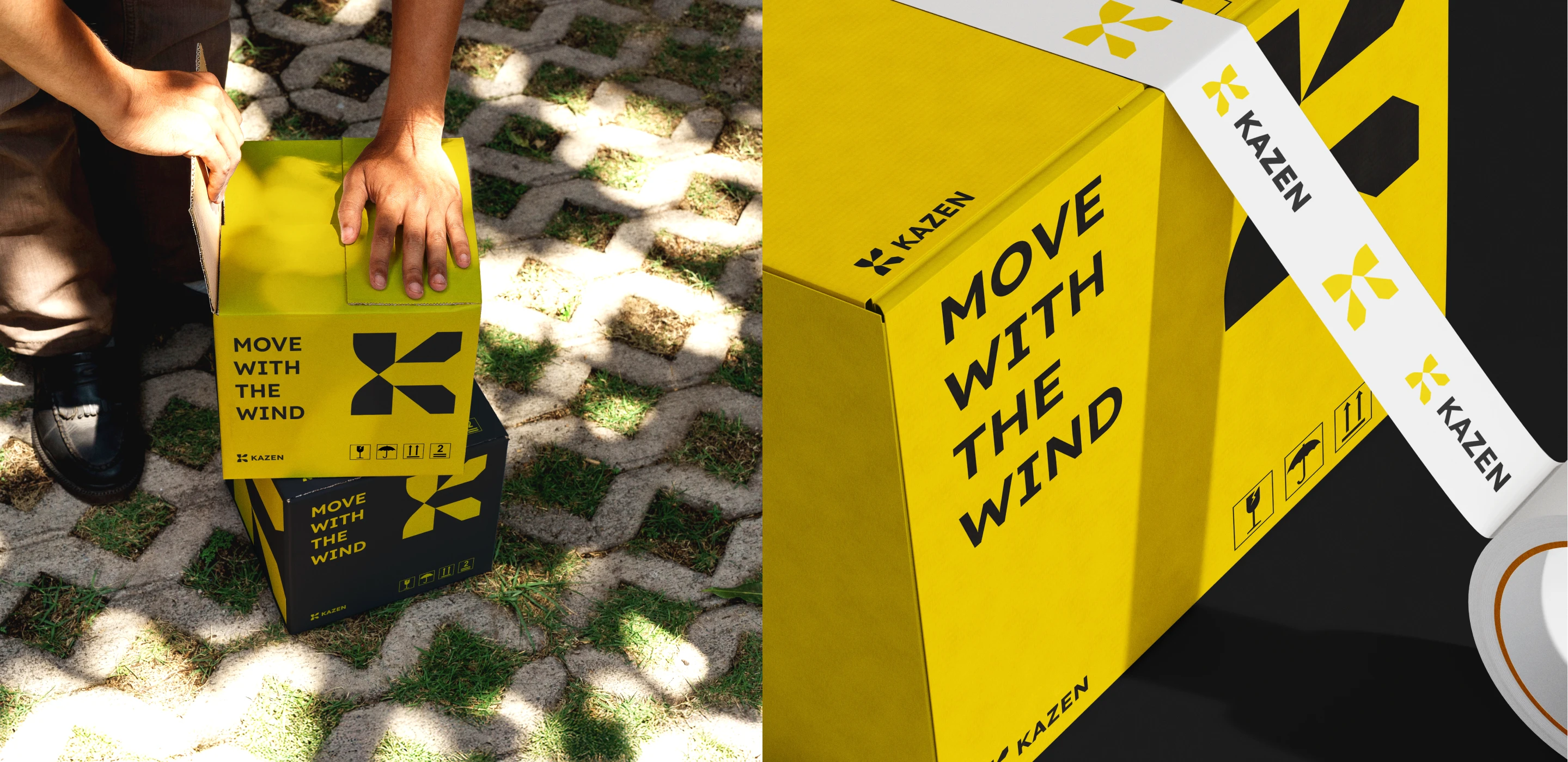
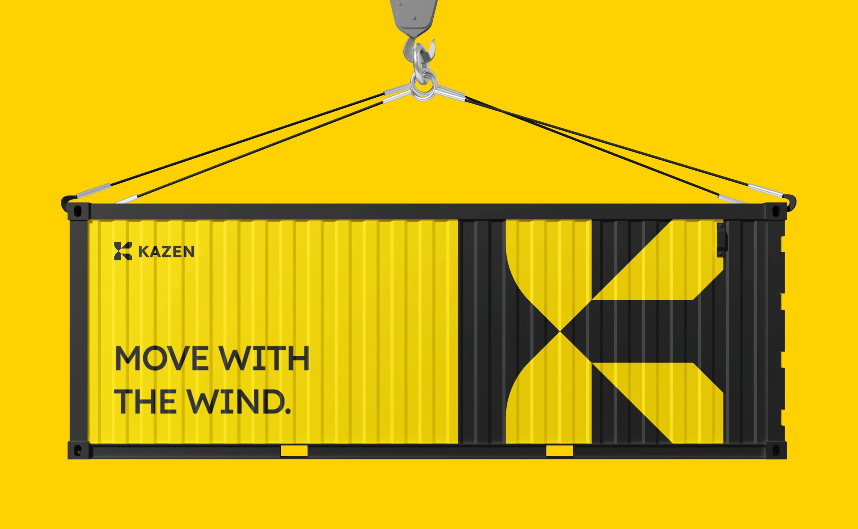
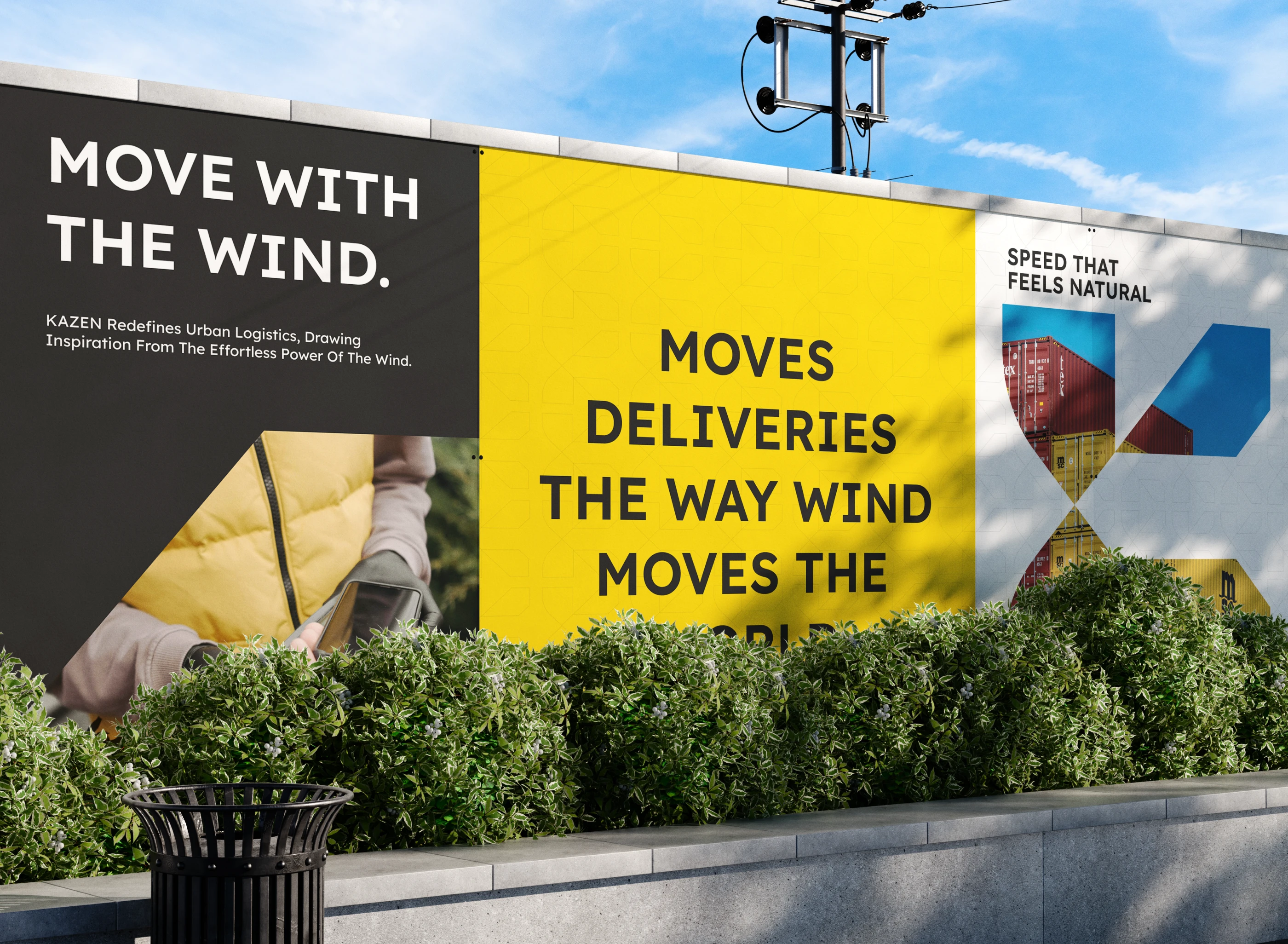
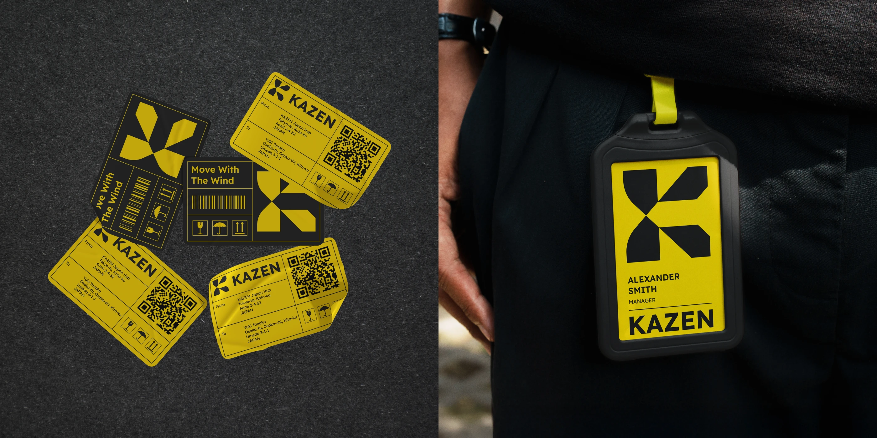
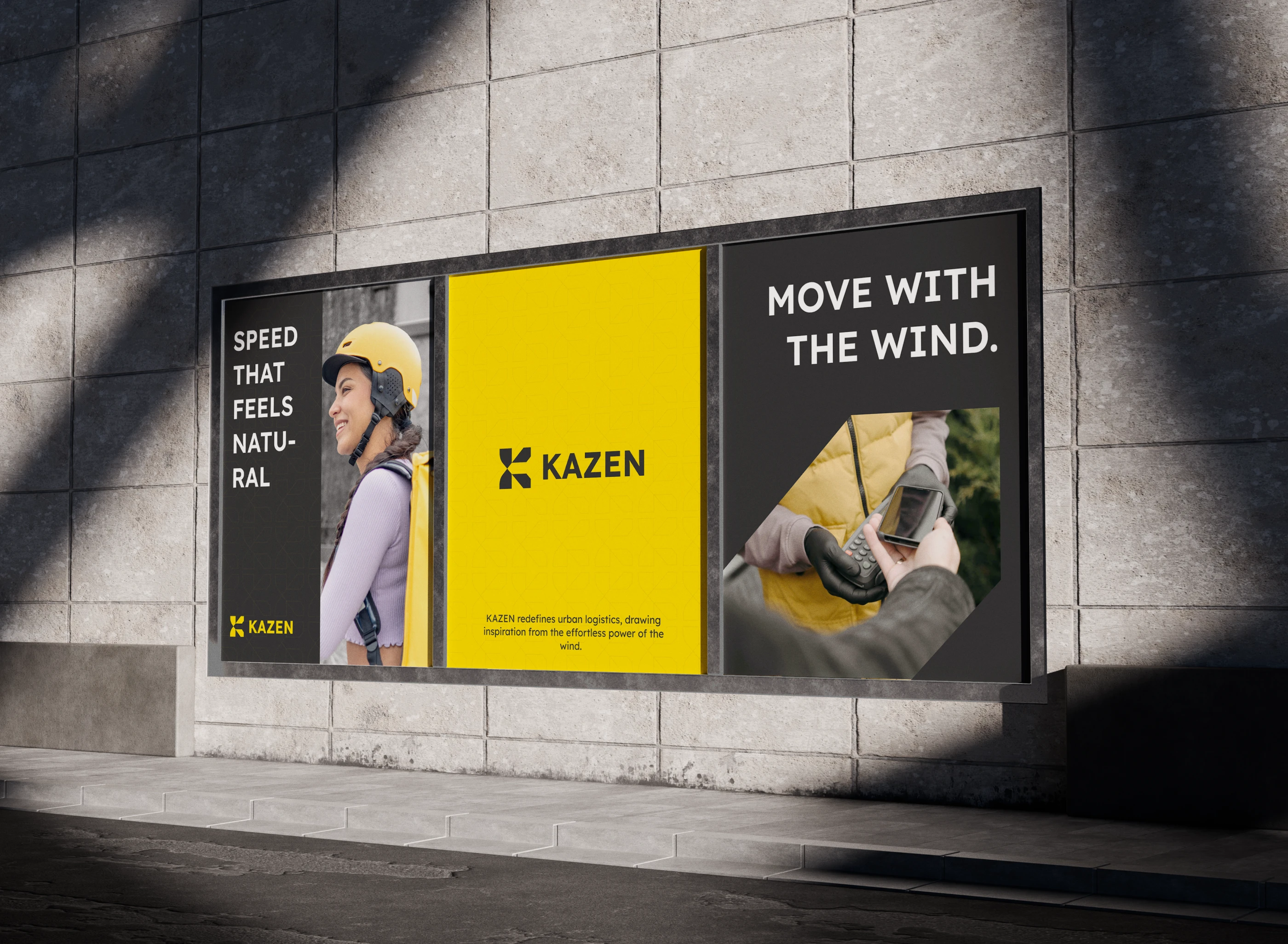
Kazen is a smart courier brand inspired by the natural power of wind that moves fast, adapts seamlessly, and operates with efficiency. The name Kazen comes from the Japanese word Kaze 風 which represents unrestricted movement, flexibility in changing conditions, and quiet strength built on consistency.
Like the wind flowing effortlessly through space and time, Kazen is designed to move smoothly within the modern logistics ecosystem. Every system, process, and technology is developed with a focus on speed, accuracy, and reliability to deliver a controlled and seamless delivery experience.
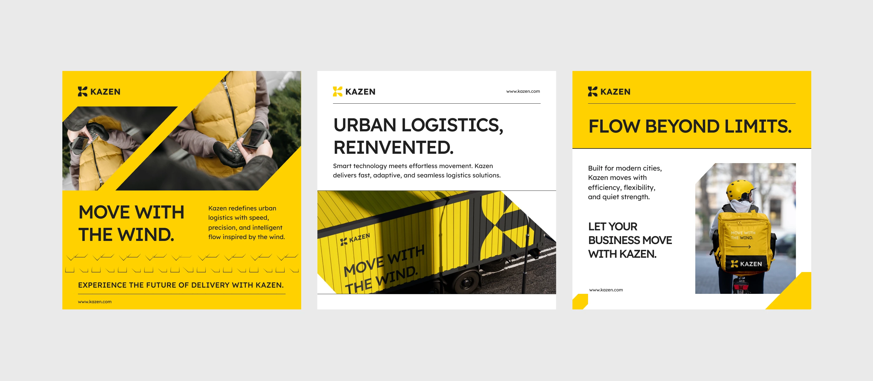
Through an intelligent and adaptive approach, Kazen responds to a wide range of delivery needs from small shipments to complex logistics operations. Operating with subtle power and steady rhythm, Kazen stands as a trusted logistics partner that keeps businesses and everyday life moving forward.
RUKURU STUDIO
Kazen Brand Identity
Creative Director — Afifudin Zuhri
Graphic Designers — Lutfi Alwi, Zainul Khafidz
Motion Designer — Madebynoval
Mockup Assets — Vitora Mockup
Build Brands That Matter.
→ Collaborate with Us!
©2026 Copyright All rights reserved.
Like this project
Posted Feb 25, 2026
Kazen is a smart courier brand inspired by wind, fast adaptive and efficient, delivering seamless precise and reliable logistics for a modern world.
Likes
1
Views
3
Timeline
Feb 1, 2026 - Feb 28, 2026