Built with Jitter
Quartal Branding
Quartal Design Solutions — Simplicity with Purpose
Quartal Design Solutions is a modern architecture firm specializing in clean, minimal, and functional spaces. The rebrand focuses on refining its visual identity to reflect a sense of clarity, balance, and forward-thinking design embodying the essence of modern minimalism.
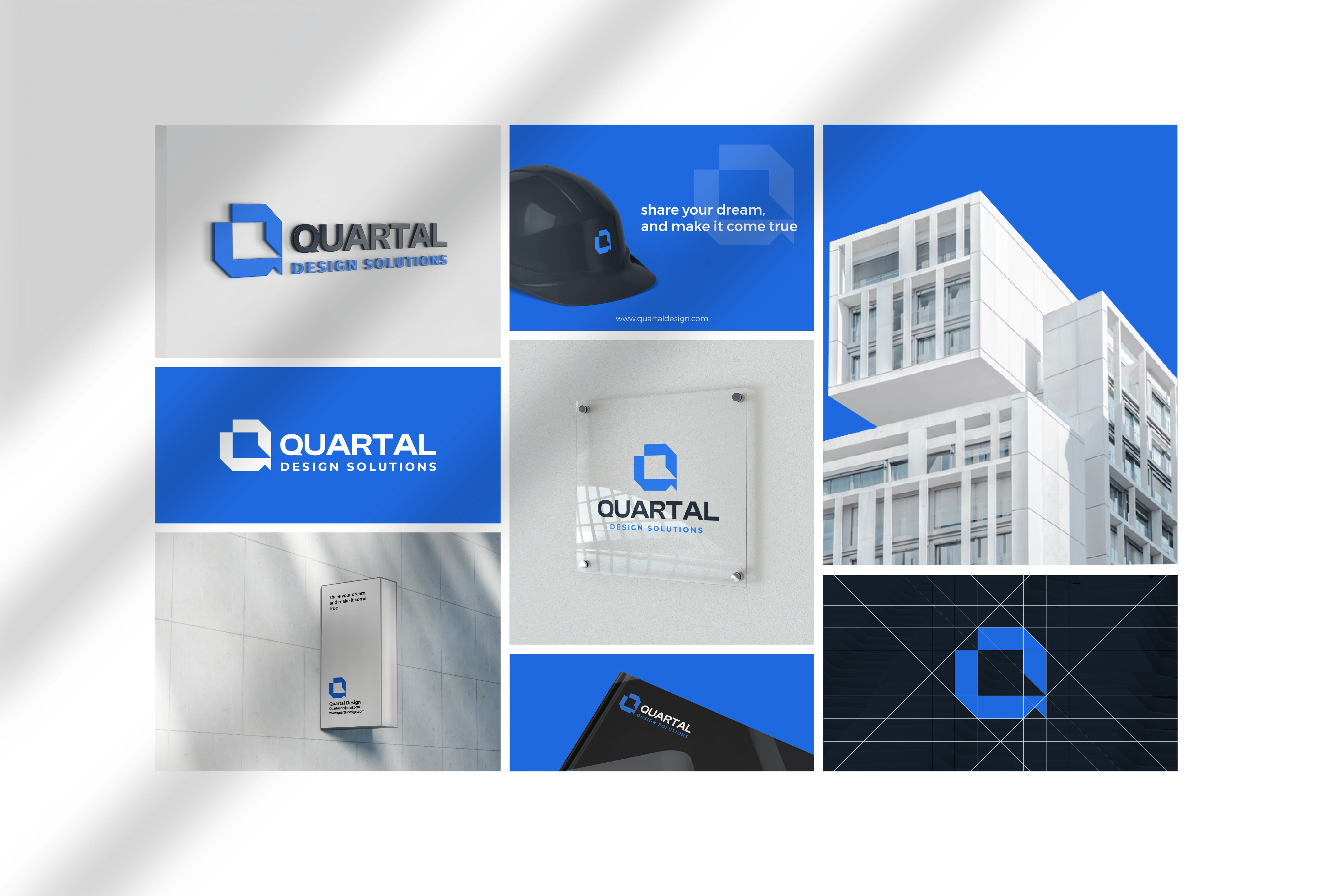
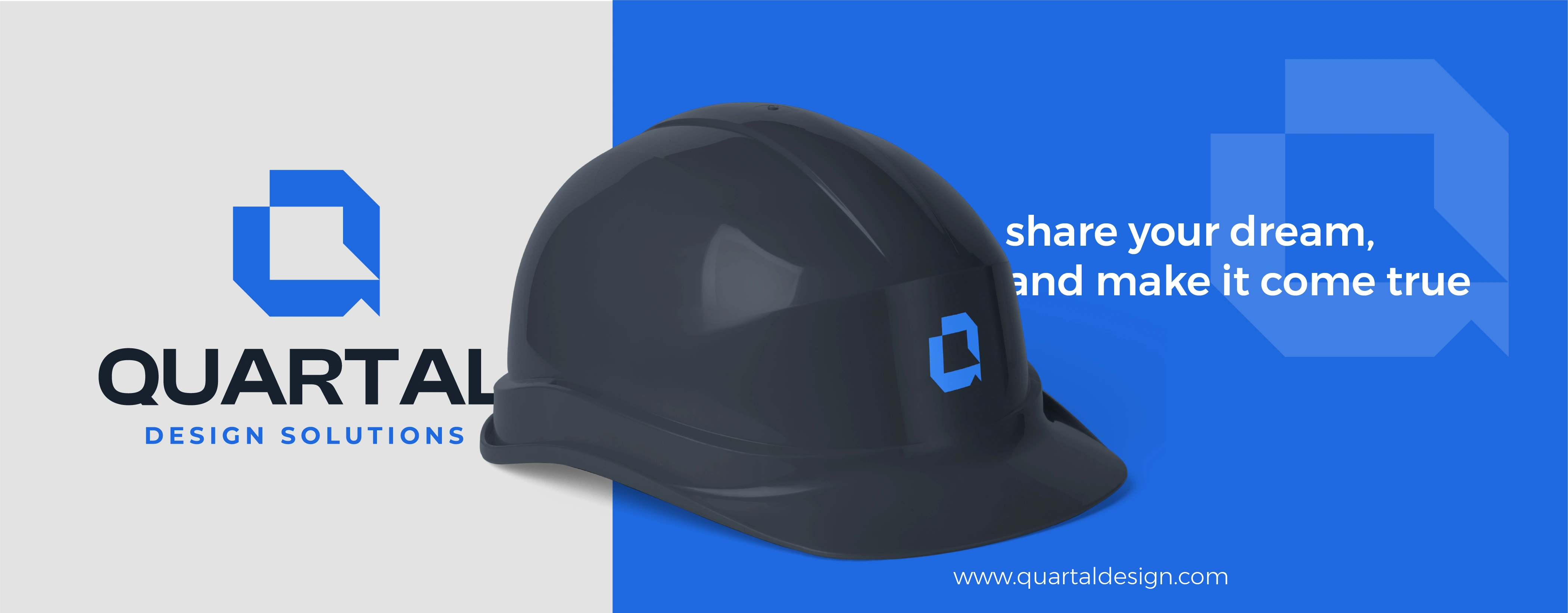
The identity centers around the letter “Q,” modified with a subtle slash to symbolize precision, creativity, and the studio’s design-driven mindset. This minimal gesture becomes a unique visual cue, representing the intersection of structure and creativity the core of Quartal’s philosophy.
Challenge:
The previous logo lacked a distinctive visual element that communicated Quartal’s evolution into a contemporary, design-led studio. The goal was to maintain simplicity while adding a recognizable, meaningful mark that reflects the firm’s modern sensibility.
Solution:
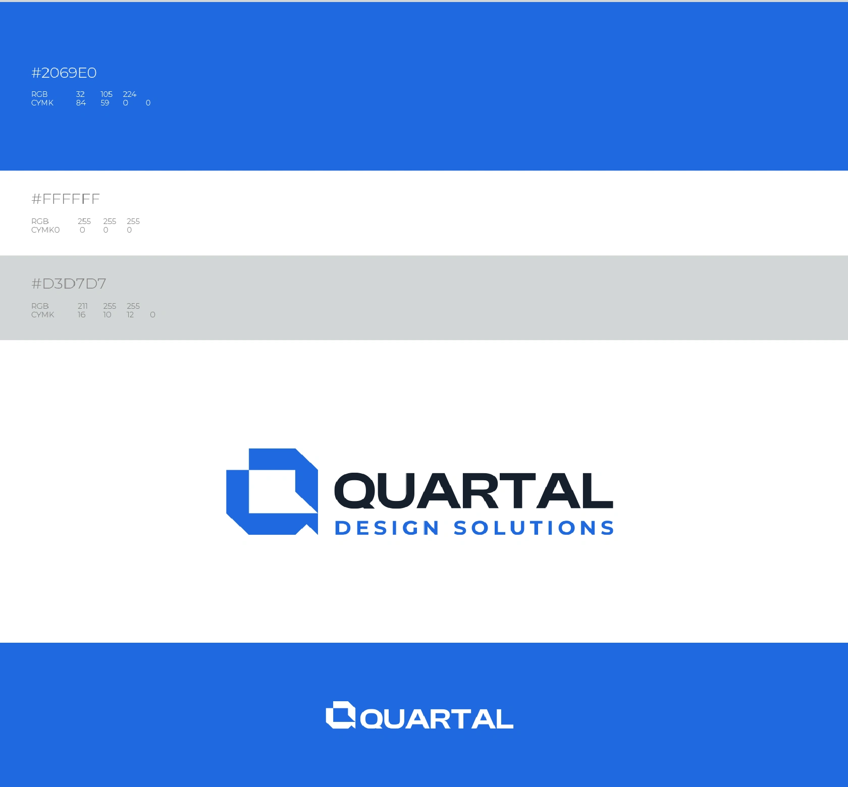
By reworking the “Q” with a refined slash, the new identity feels lighter, more intentional, and timeless. The overall system uses neutral tones, clean typography, and balanced spacing to emphasize architectural clarity — showcasing Quartal Design Solutions as a studio where simplicity becomes sophistication.
Implementation:
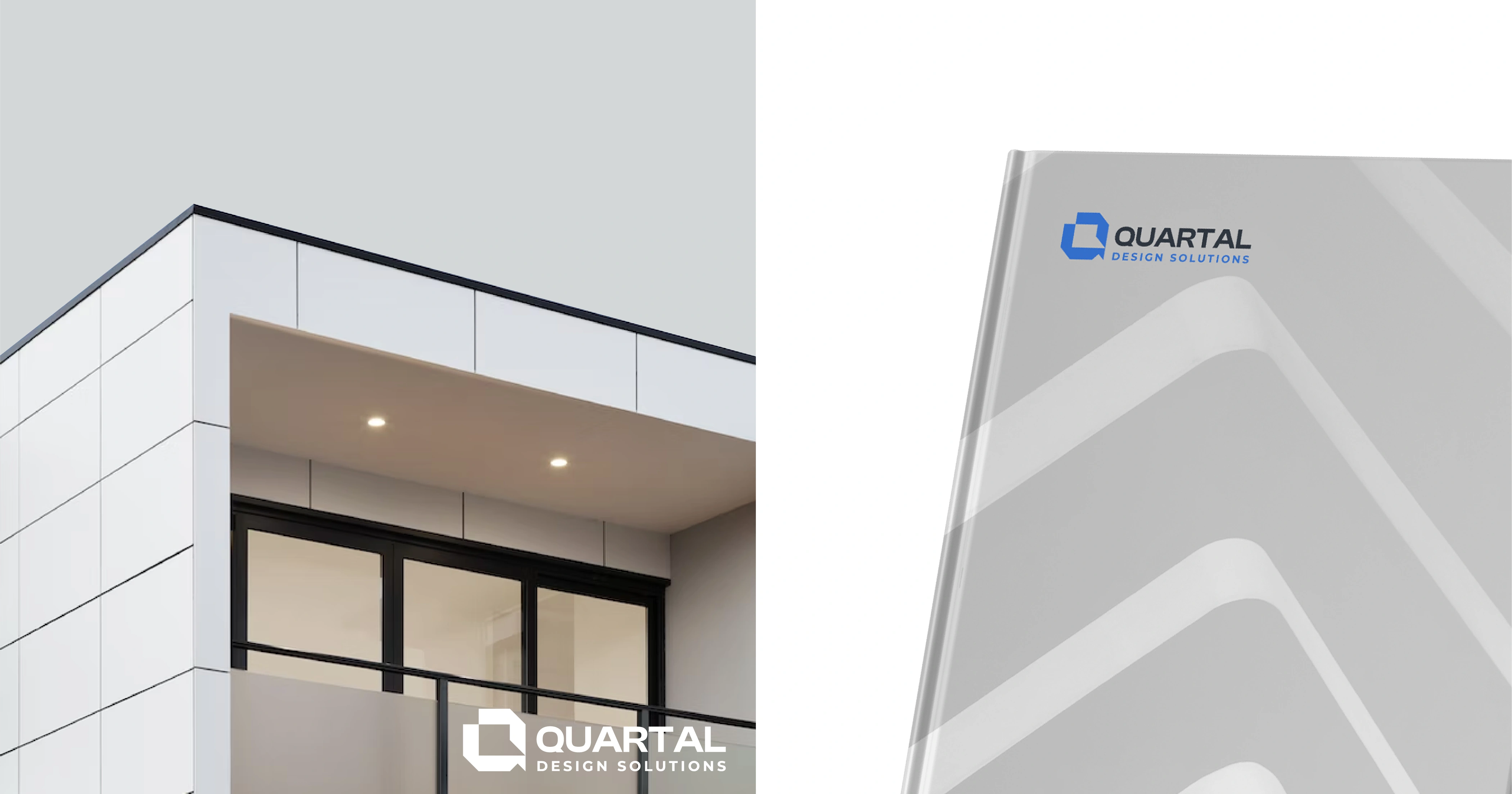
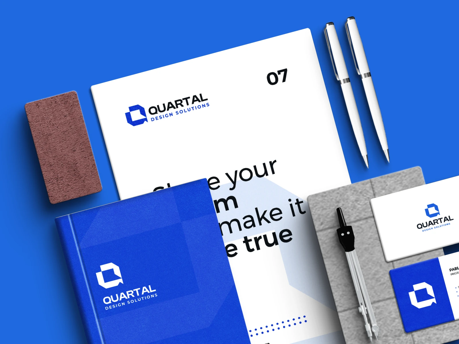
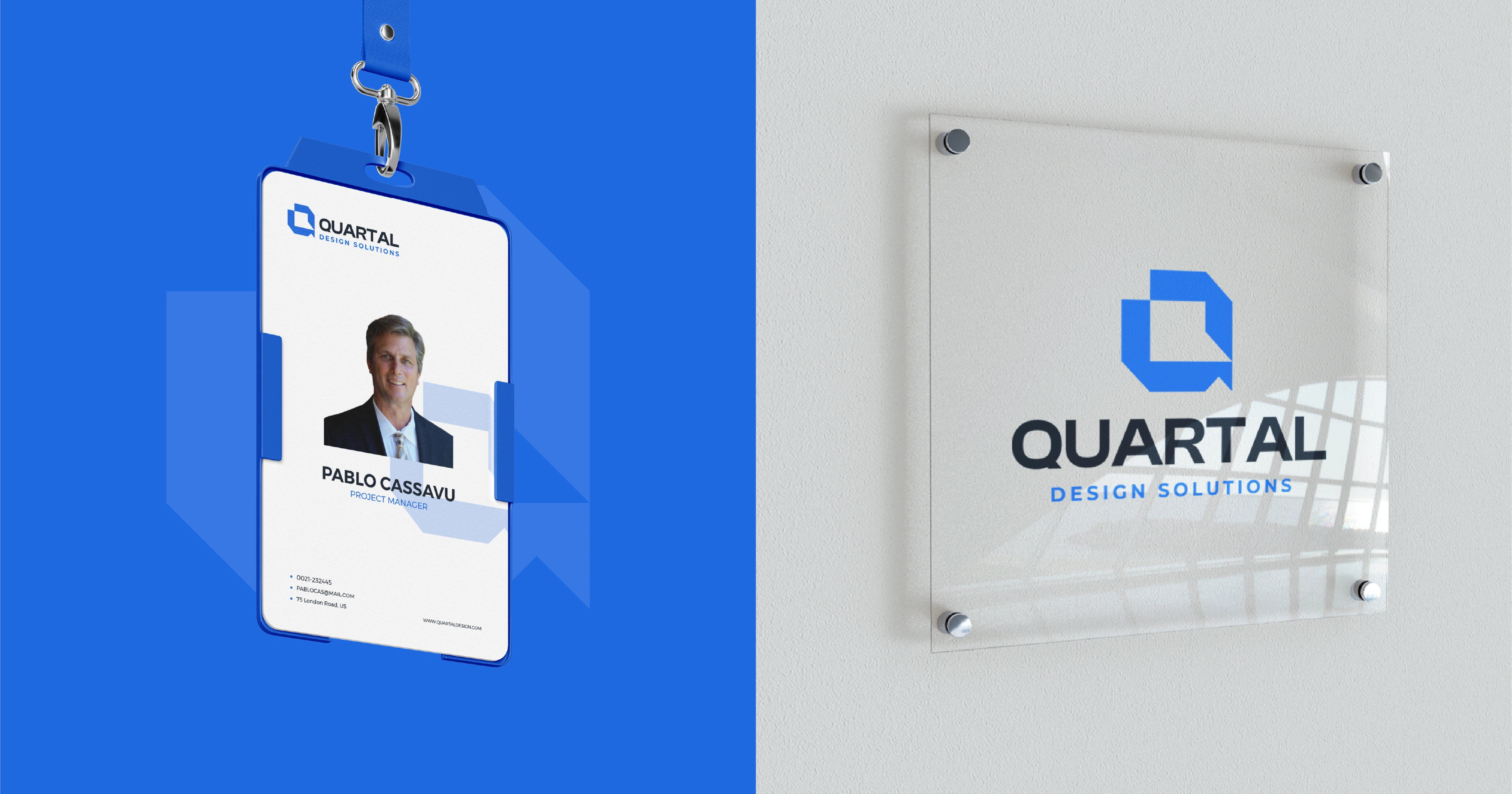
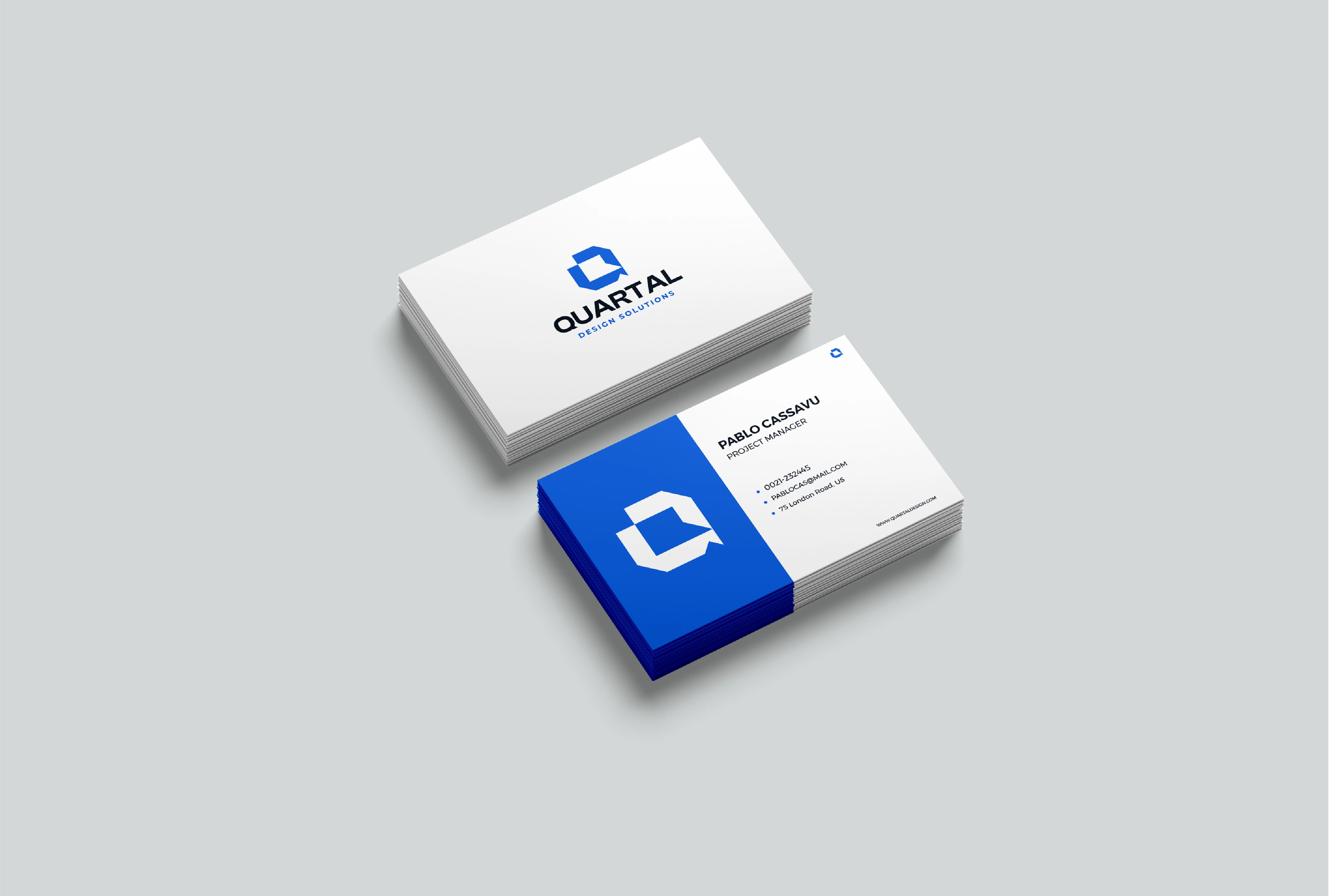
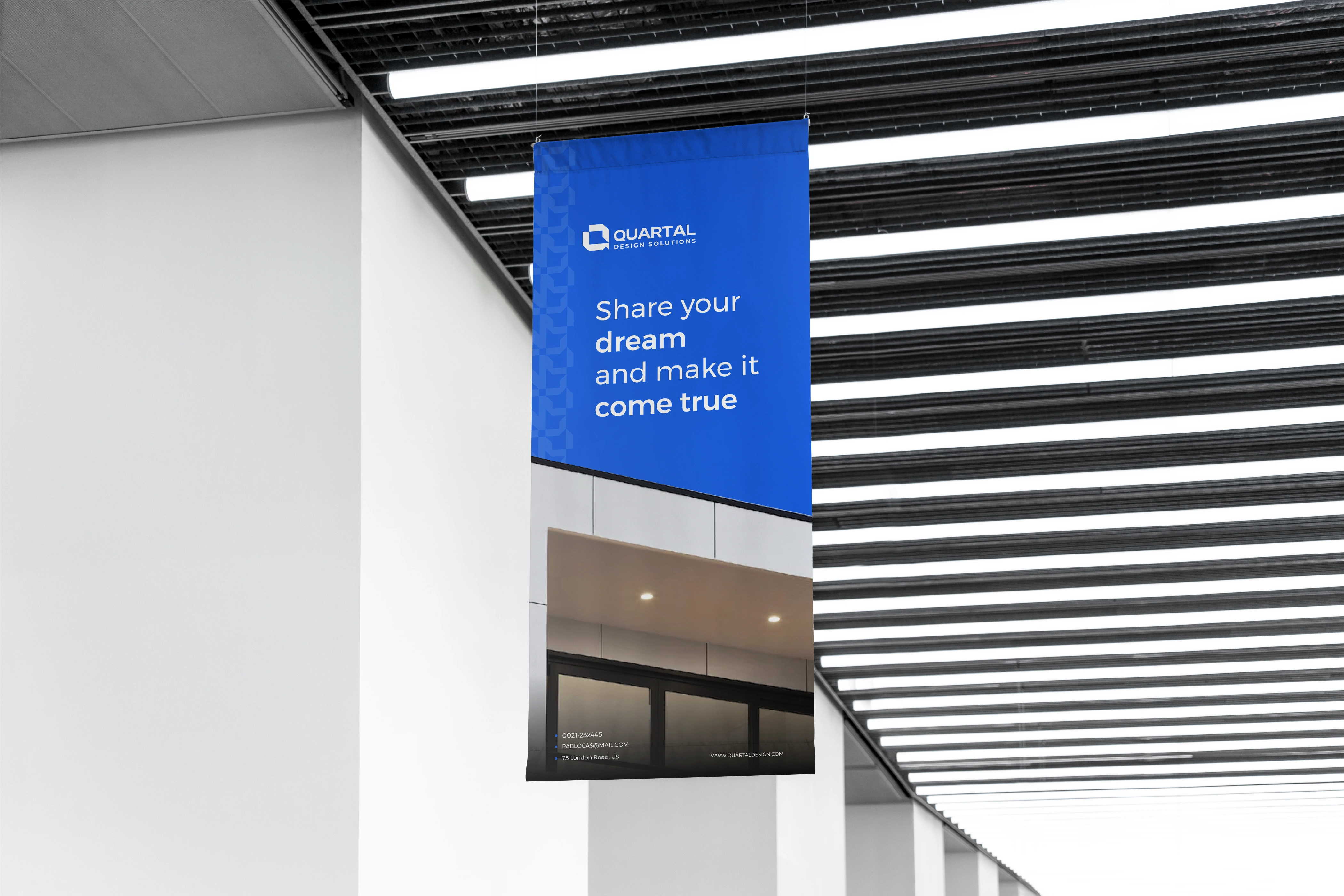
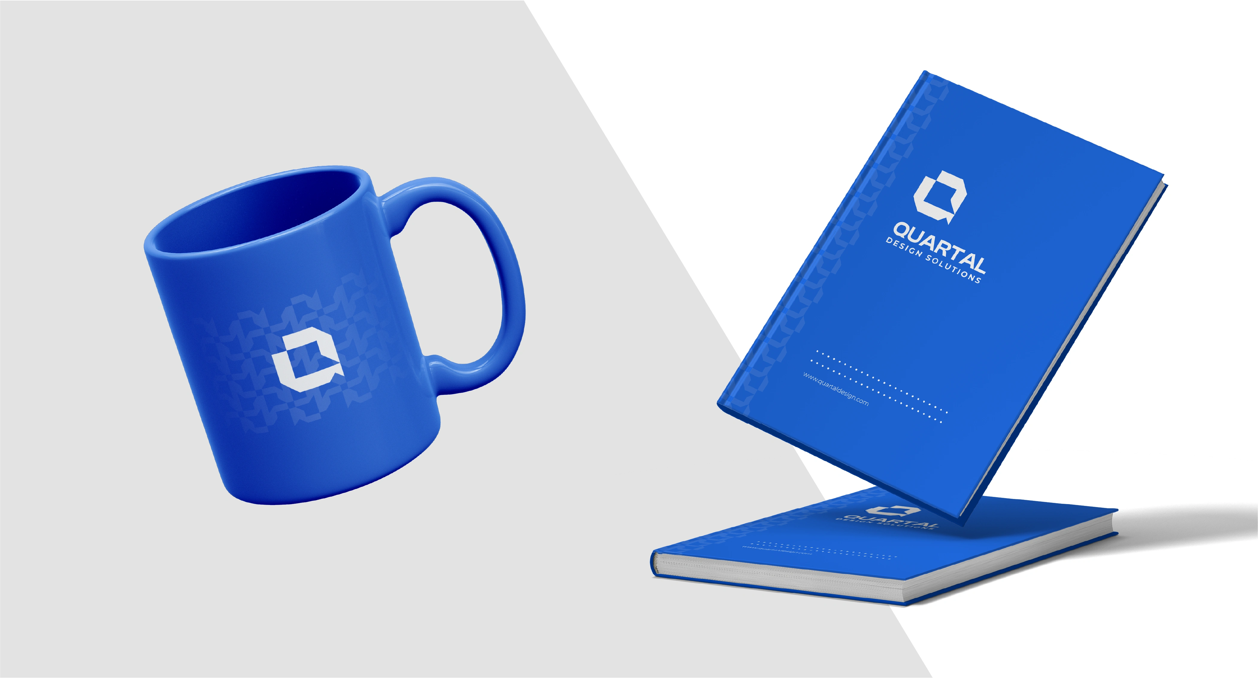
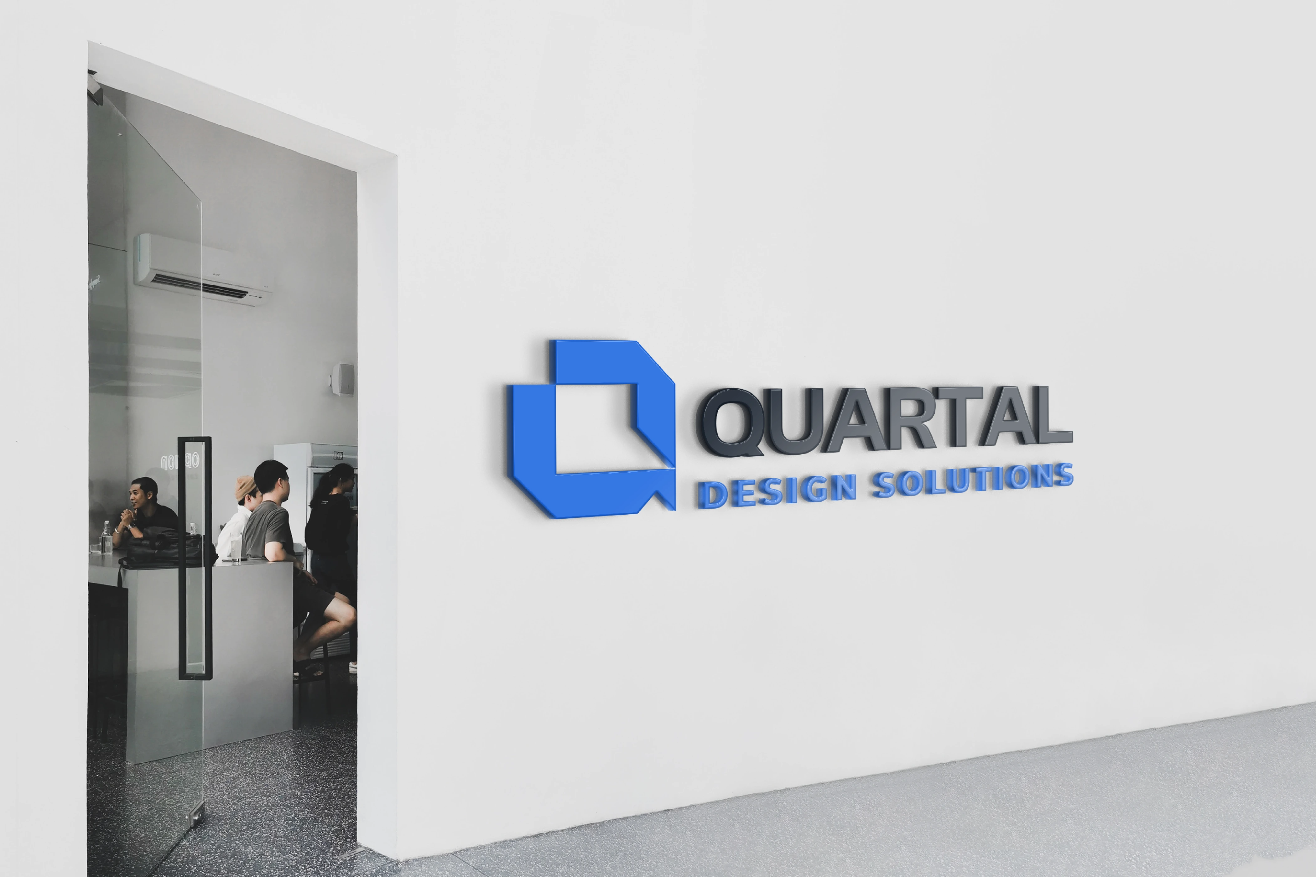
The new identity for Quartal Design Solutions is implemented across multiple media to ensure consistency and reinforce the studio’s refined, modern aesthetic. From stationery and office signage to digital platforms, every element reflects simplicity and precision. Business cards, letterheads, and envelopes highlight the distinctive “Q” with clean layouts and generous white space, while the website and social media feature soft neutral tones and architectural imagery that capture the studio’s minimal design language.
Presentation templates, merchandise, and environmental applications extend the same visual clarity using a balanced grid, understated typography, and tactile materials. Together, these implementations create a cohesive experience that embodies Quartal’s philosophy: modern, minimal, and purposeful, where every detail speaks to the essence of architectural sophistication.

THANKS FOR WATCHING!
We’d love to hear what you think!
Drop your thoughts or feedback in the comments below
Quartal Design Solutions
Brand Identity / Strategy / Motion
©2025 Rukuru Studio. All rights reserved.
Like this project
Posted Nov 13, 2025
Quartal Design Solutions refines its look with modern minimalism. The slash on the “Q” symbolizes creativity and marks it as a forward-thinking design studio.

