Built with Jitter
Tenkei Resort Brand Identity
Afifudin Zuhri
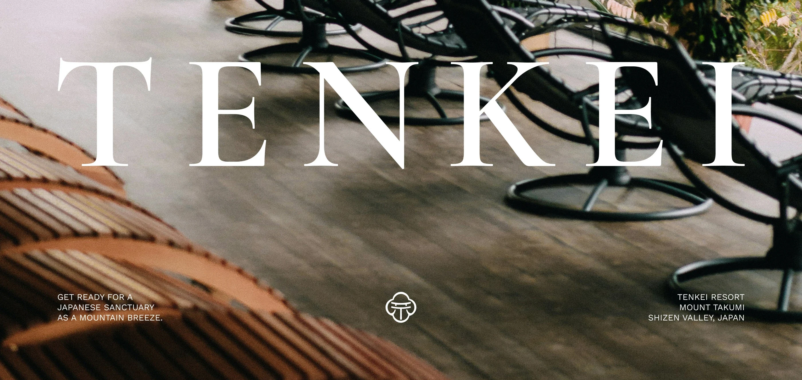
TENKEI RESORT
Brand Identity Concept
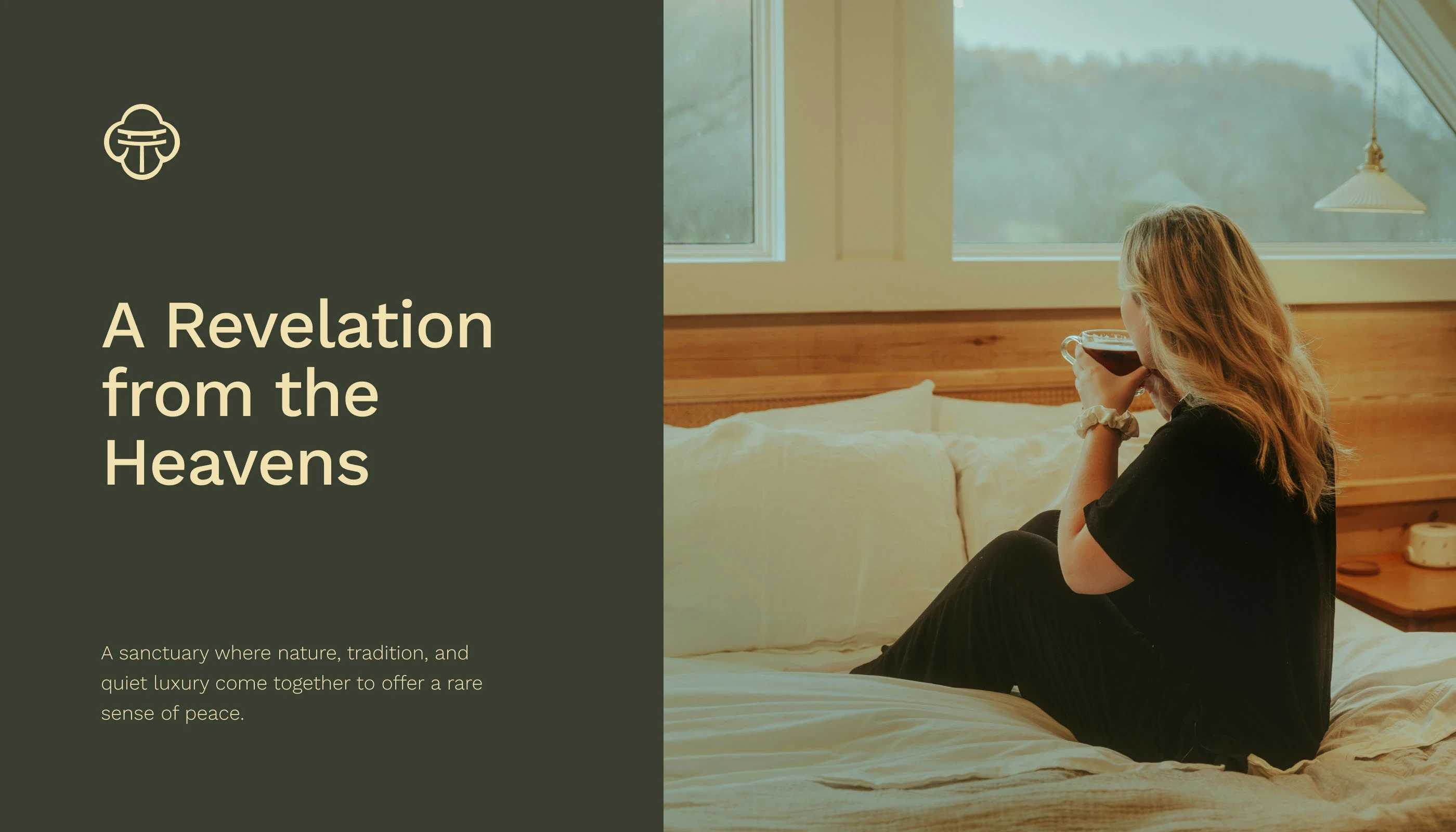
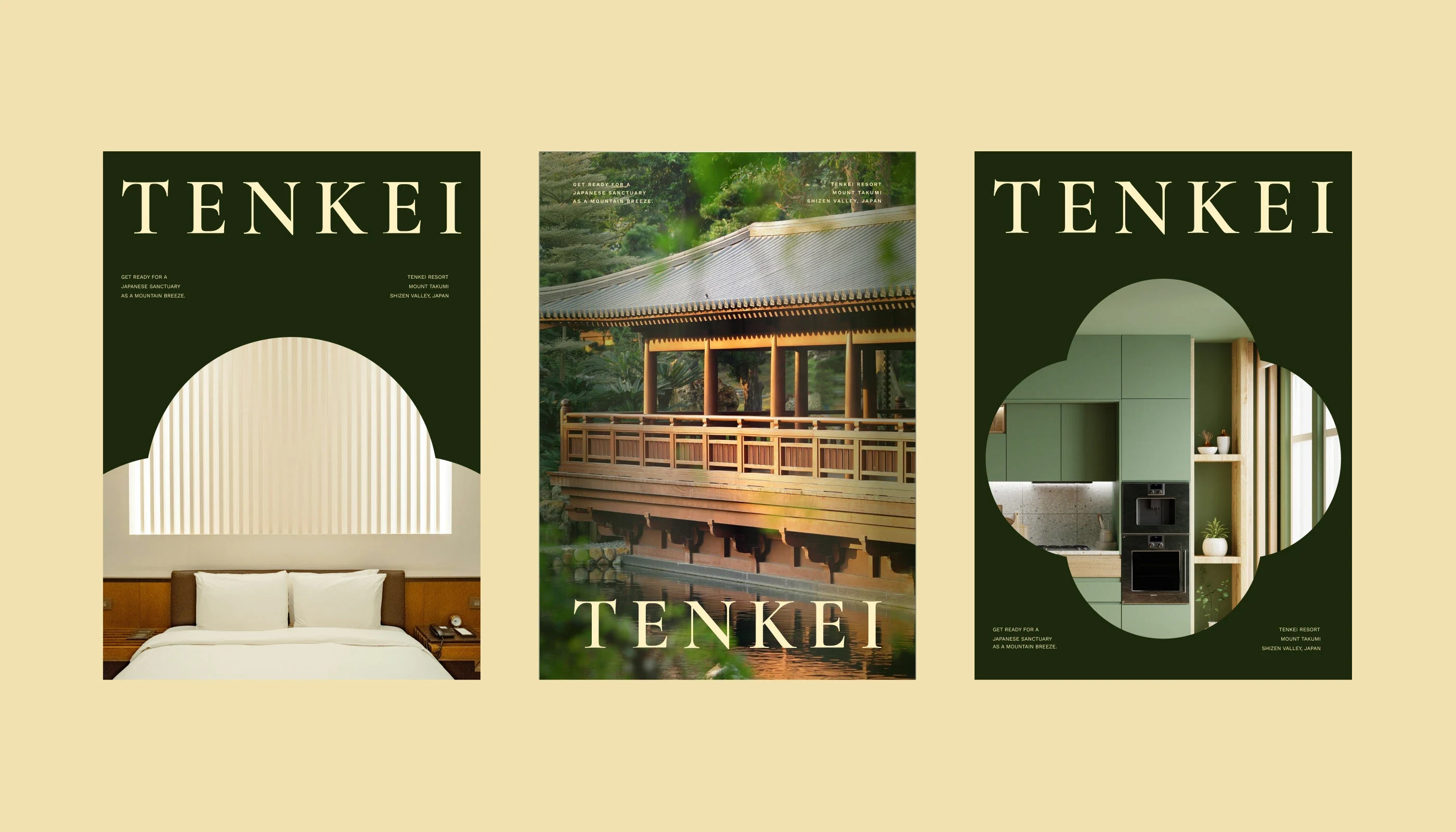
For this peaceful mountain retreat, inspired by the harmony of Japanese philosophy, we were entrusted with creating an identity as calm and refined as the resort itself. The name Tenkei, meaning “revelation from the heavens”, reflects the vision of offering guests a rare moment of clarity, serenity, and natural beauty. The visual identity blends Japanese minimalism with modern elegance.
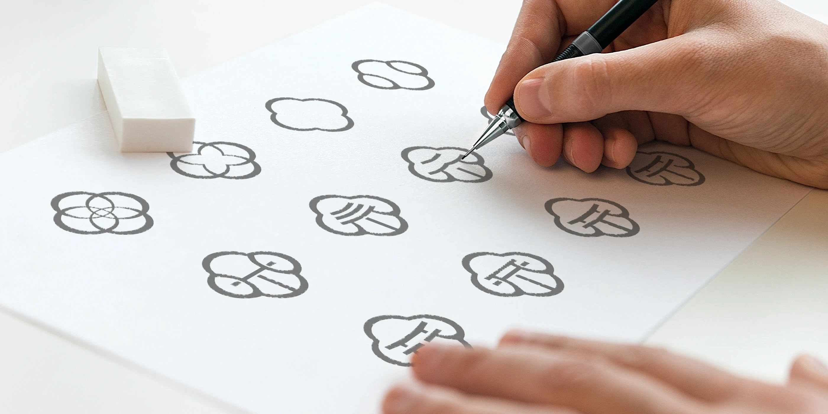
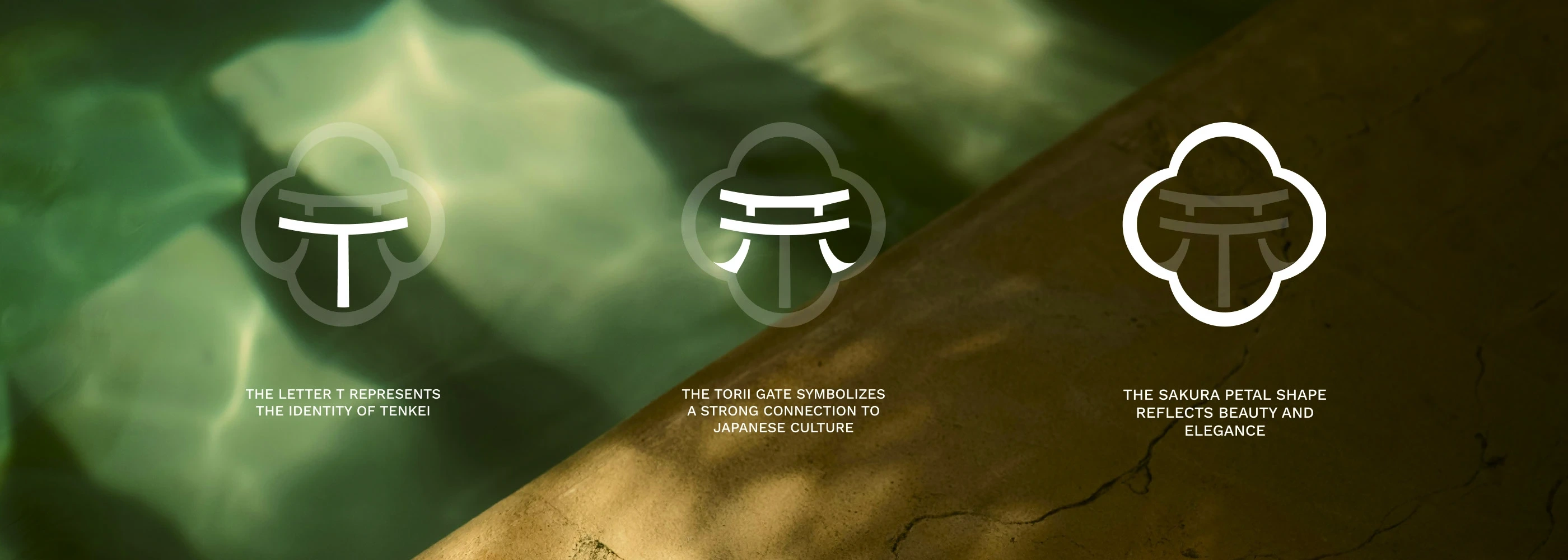
A custom serif wordmark was designed to mimic the gentle rhythm of brushstrokes, while the emblem combining a torii gate, sakura blossom, and the letter “T” symbolizes a sacred welcome and timeless grace rooted in culture and tranquility. Warm textures, deep greens, and soft golds create a palette that feels both luxurious and grounded. Every detail, from typography to signage and printed materials, is crafted with care, embodying the spirit of omotenashi wholehearted hospitality and leaving a lasting impression through quiet, thoughtful design.
Logo Concept & Visual System
The Tenkei logo reflects harmony, balance, and cultural depth. The emblem combines a torii gate, a sakura blossom, and the letter T, symbolizing a sacred welcome and timeless Japanese grace. Designed with precise geometry and guided by a balanced logo grid, it conveys stability and refinement.
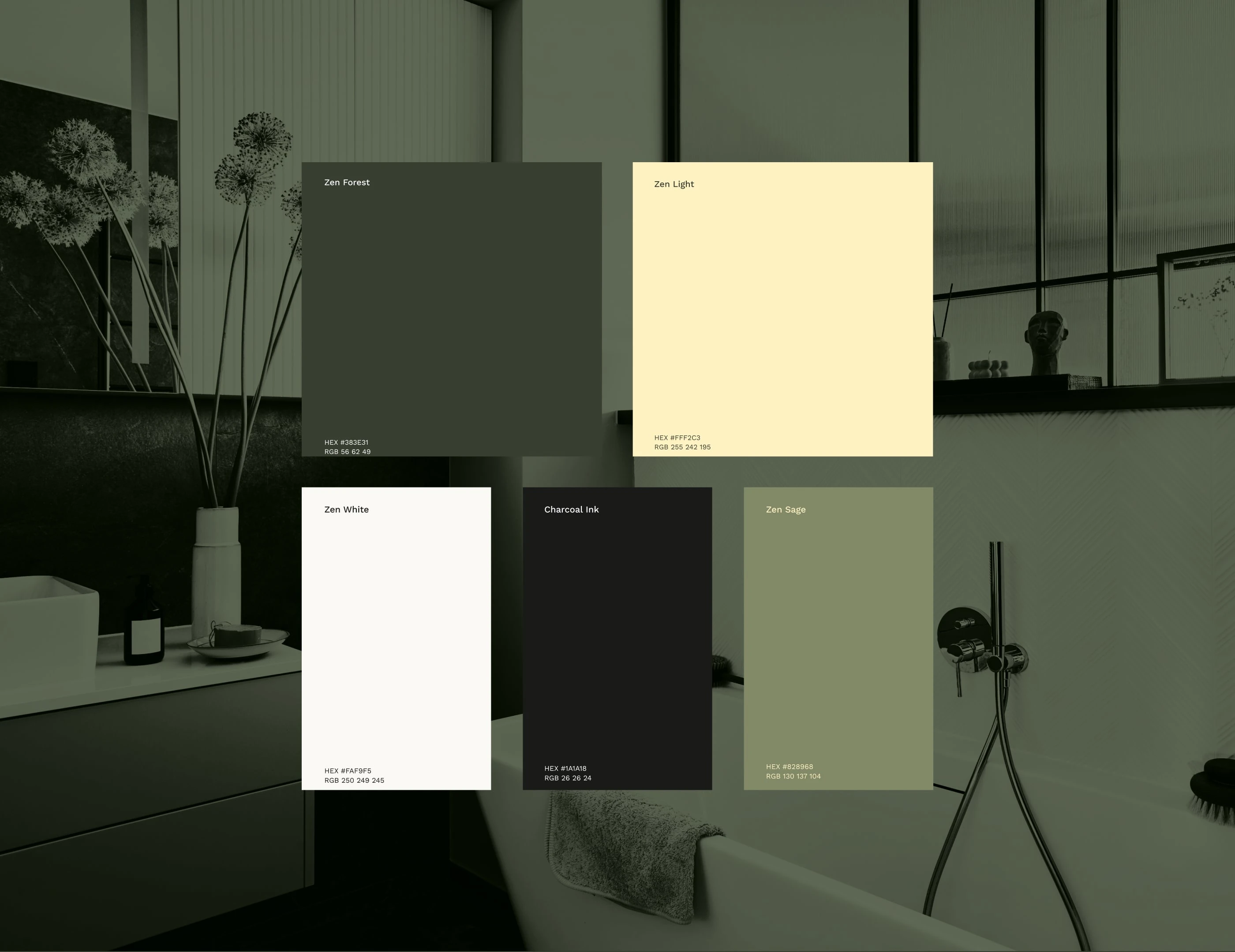
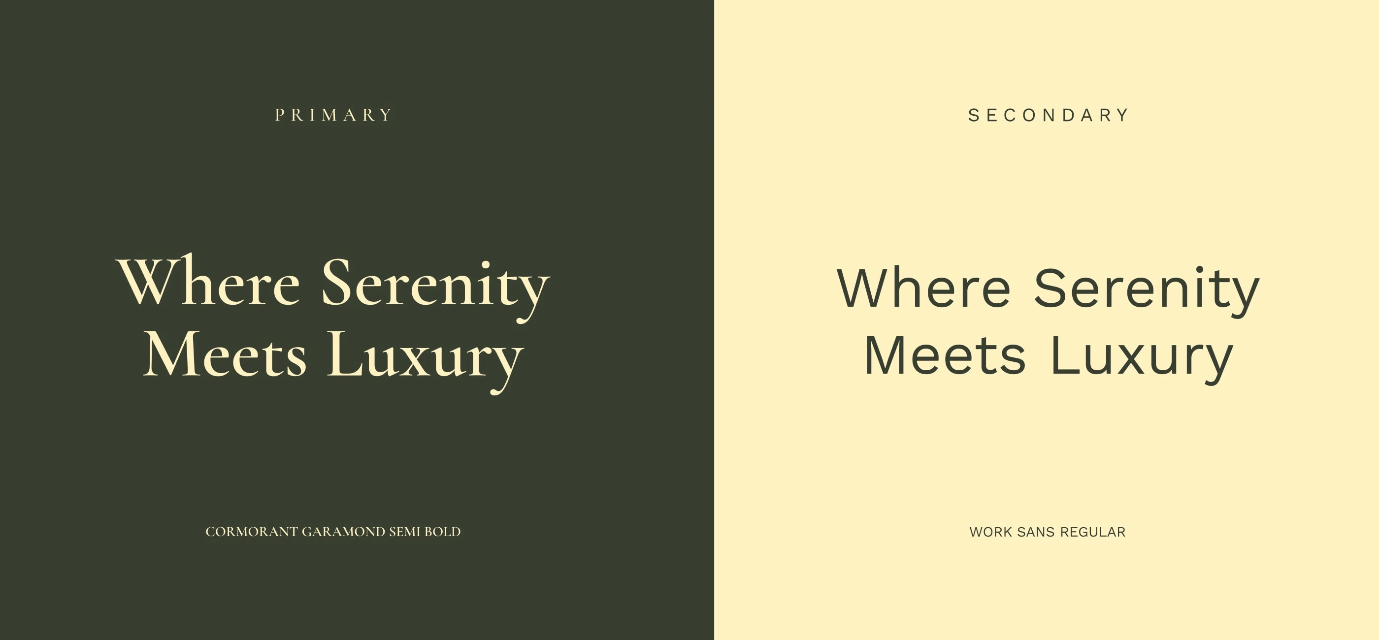
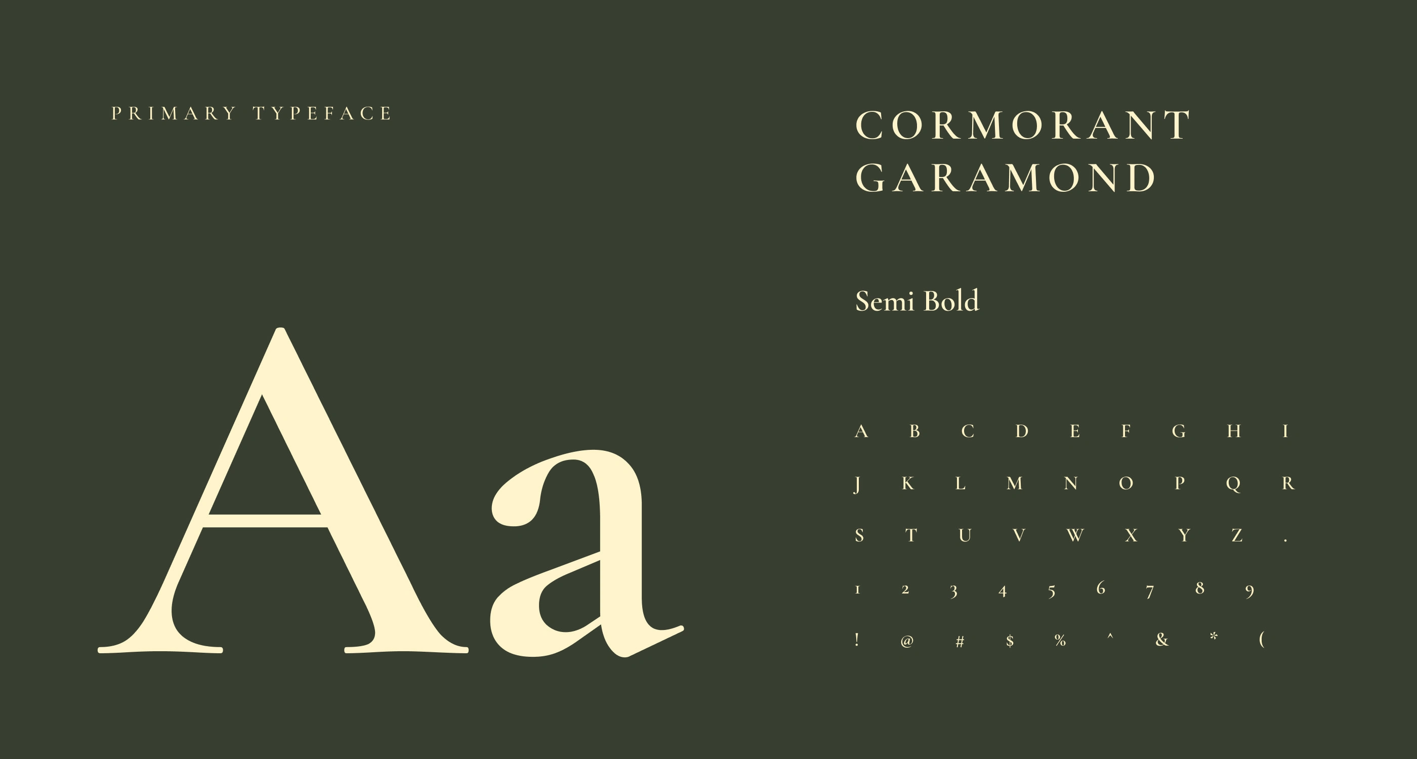
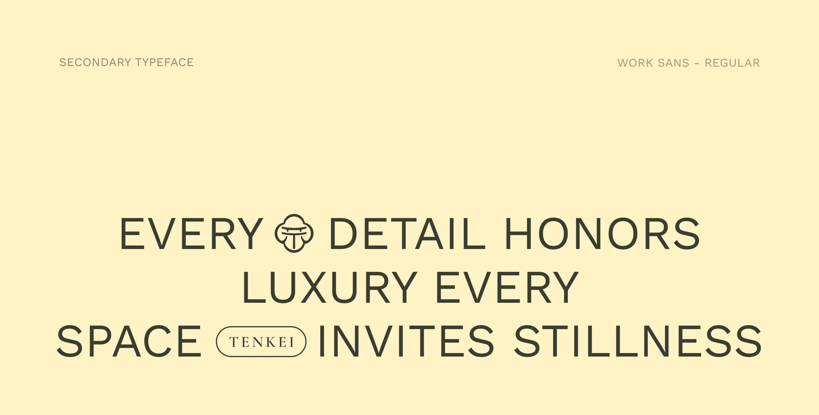
The custom serif wordmark takes inspiration from gentle brushstrokes, expressing elegance and calm. The color palette of deep green, warm neutrals, and soft gold evokes serenity, nature, and understated luxury. Together, these elements create a visual identity that feels peaceful, grounded, and beautifully human.
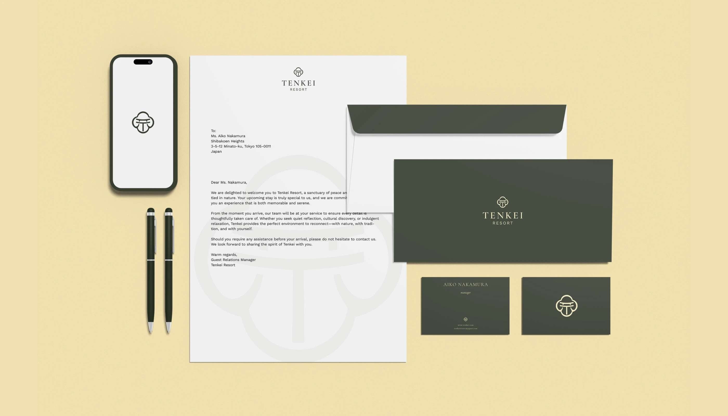
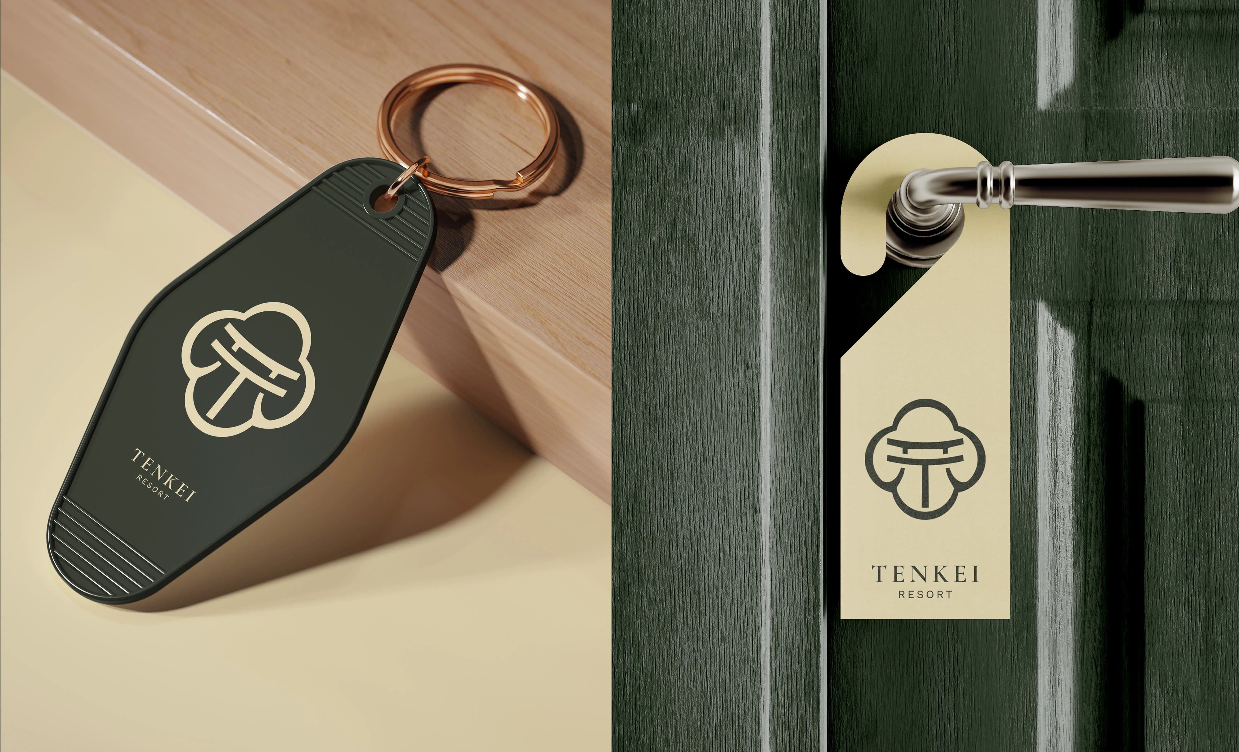
Brand Implementation
The Tenkei identity extends gracefully across every brand touchpoint from print to spatial applications. The logo and emblem are thoughtfully applied to signage, stationery, packaging, key cards, and guest materials, maintaining visual harmony and a sense of refined calm.
Each implementation reflects the brand’s core values of serenity and craftsmanship. The deep green and soft gold palette ensures timeless elegance, while the brushstroke-inspired typography adds a subtle human warmth. Whether embossed on paper, engraved in wood, or displayed in architectural signage, the Tenkei mark embodies a unified aesthetic peaceful, sophisticated, and deeply connected to nature.


THANKS FOR WATCHING!
We’d love to hear what you think!
Drop your thoughts or feedback in the comments below
Tenkei Resort Brand Identity
Brand Identity / Strategy / Motion
Rukuru Studio
Project Team
Creative Director : Afifudin Zuhri
Graphic Design : Lutfi Alwi, Zainul Khafidz
Motion Graphic : Madebynoval
©2025 Rukuru Studio. All rights reserved.
Like this project
Posted Oct 16, 2025
Tenkei is a peaceful mountain retreat inspired by Japanese philosophy, offering moments of clarity, serenity, and natural beauty.