Built with Jitter
Relon Brand Identity Design
Afifudin Zuhri
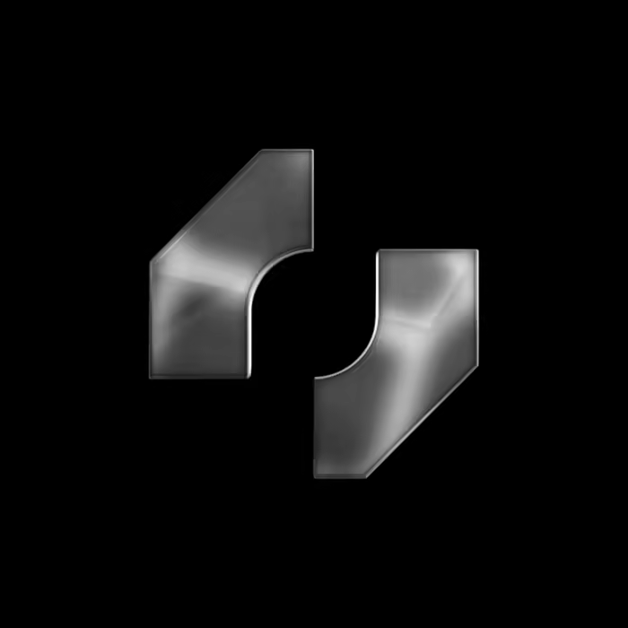
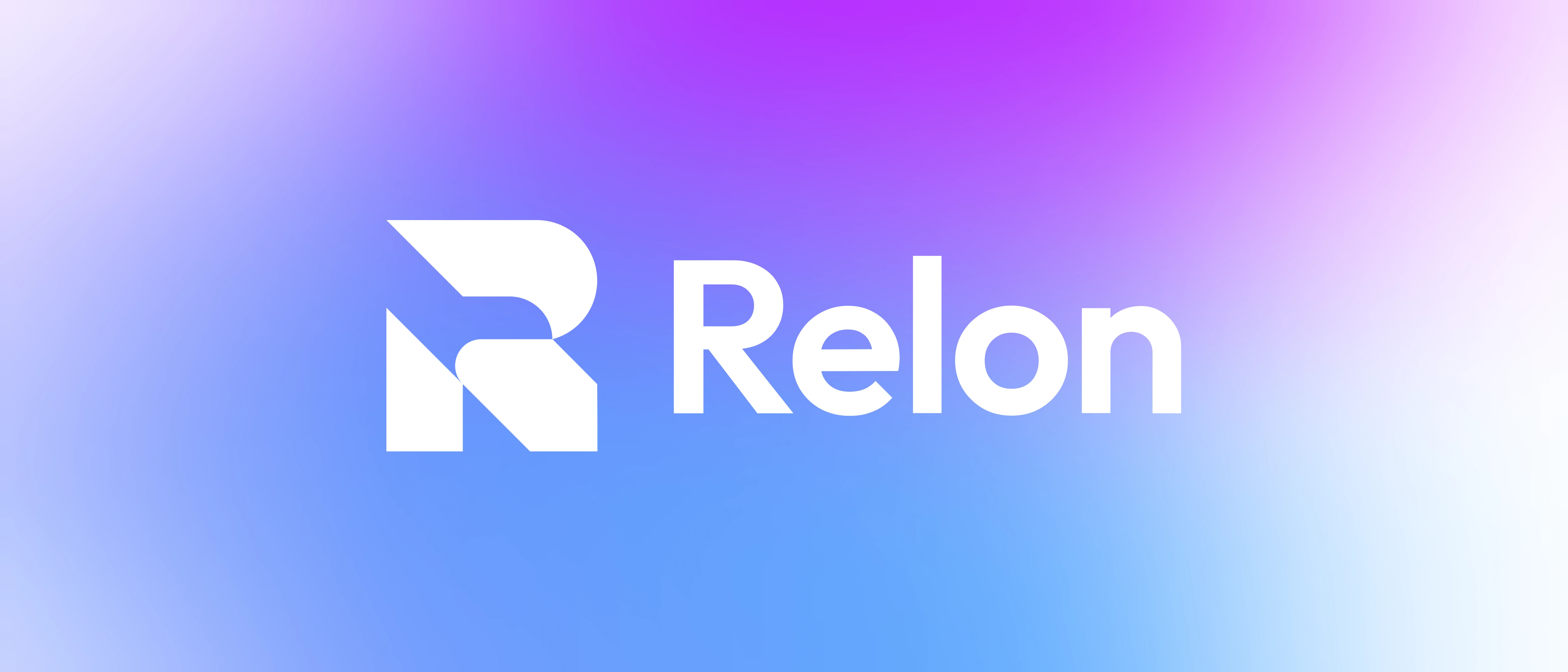
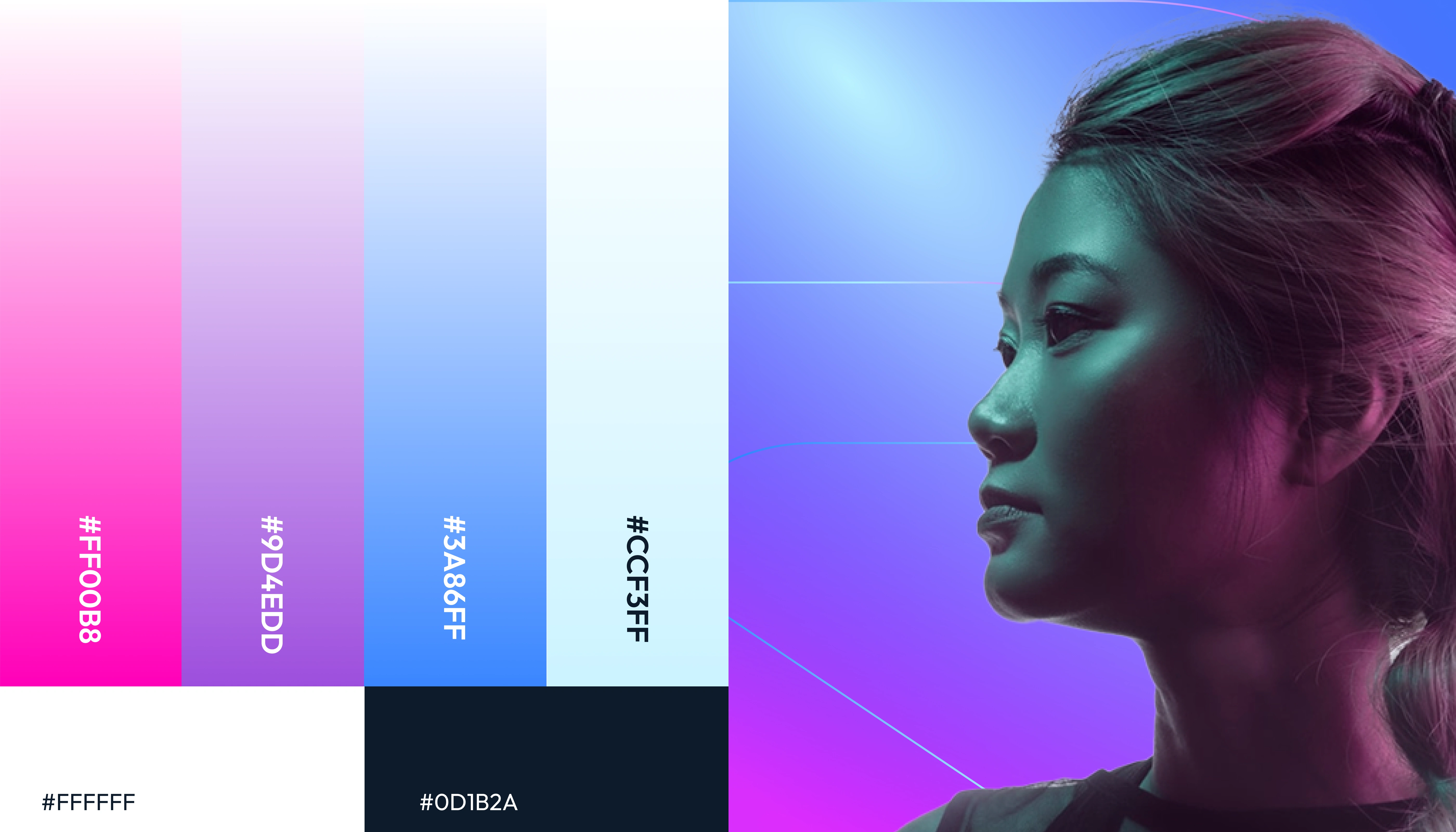
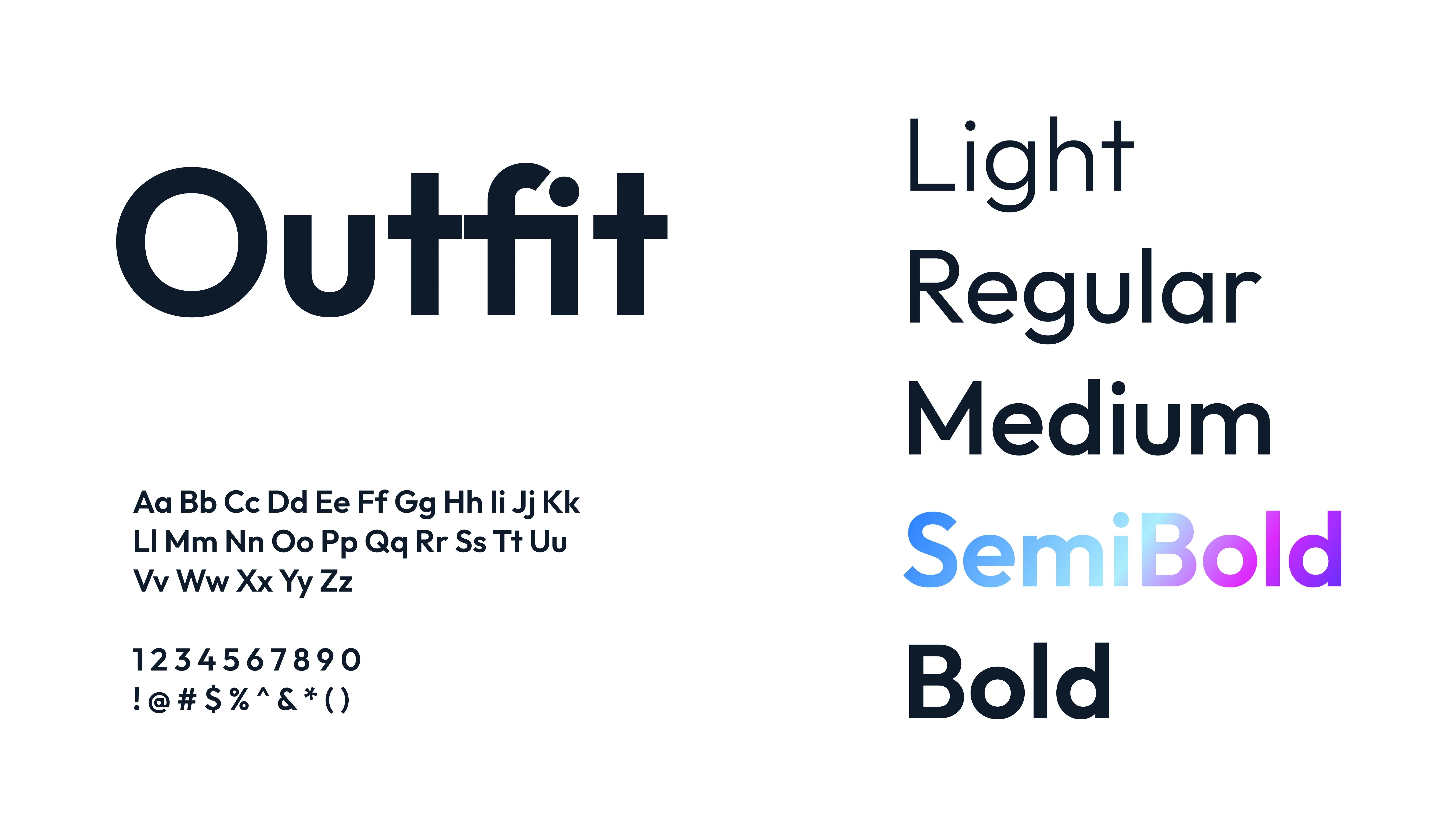
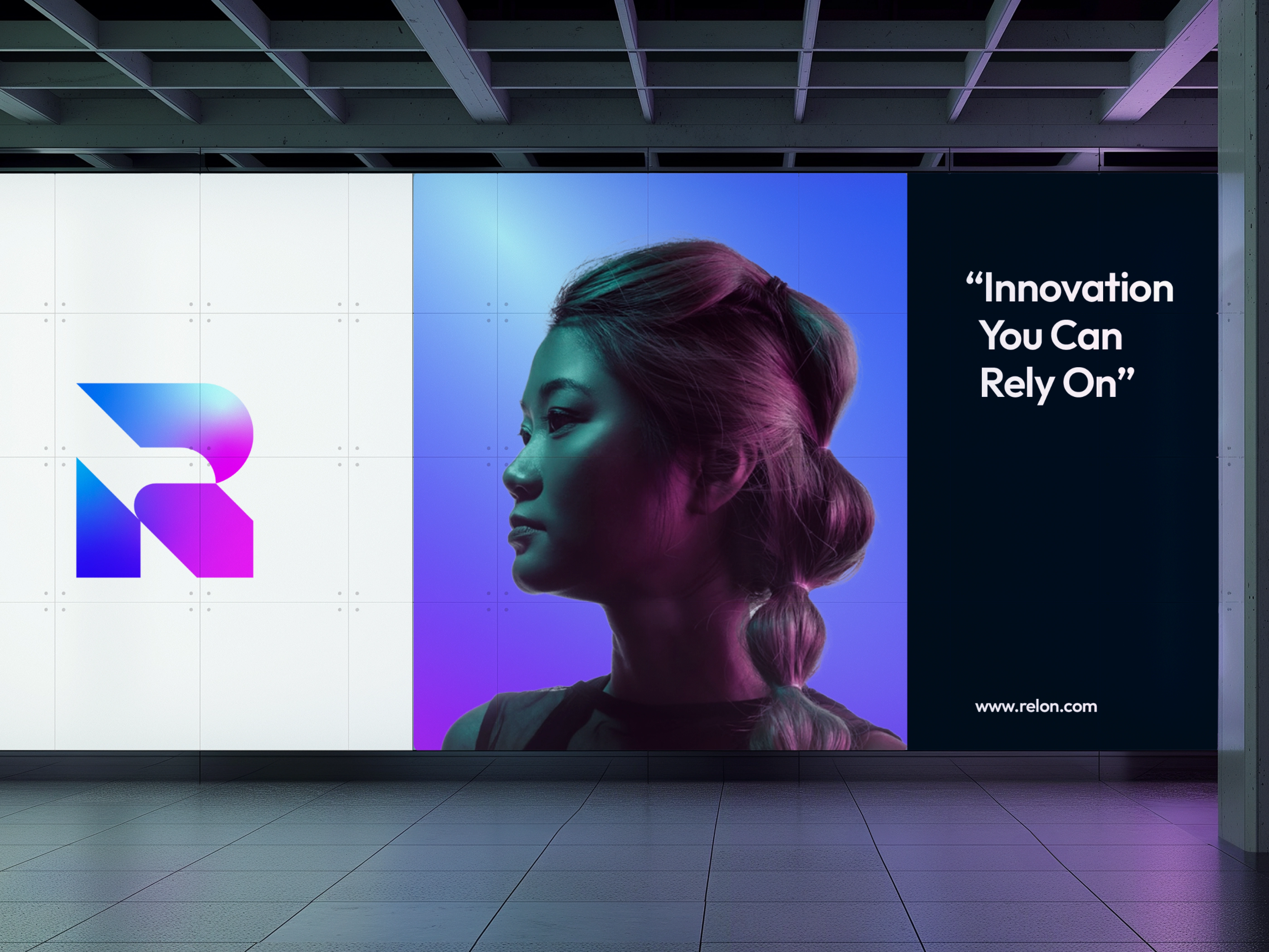
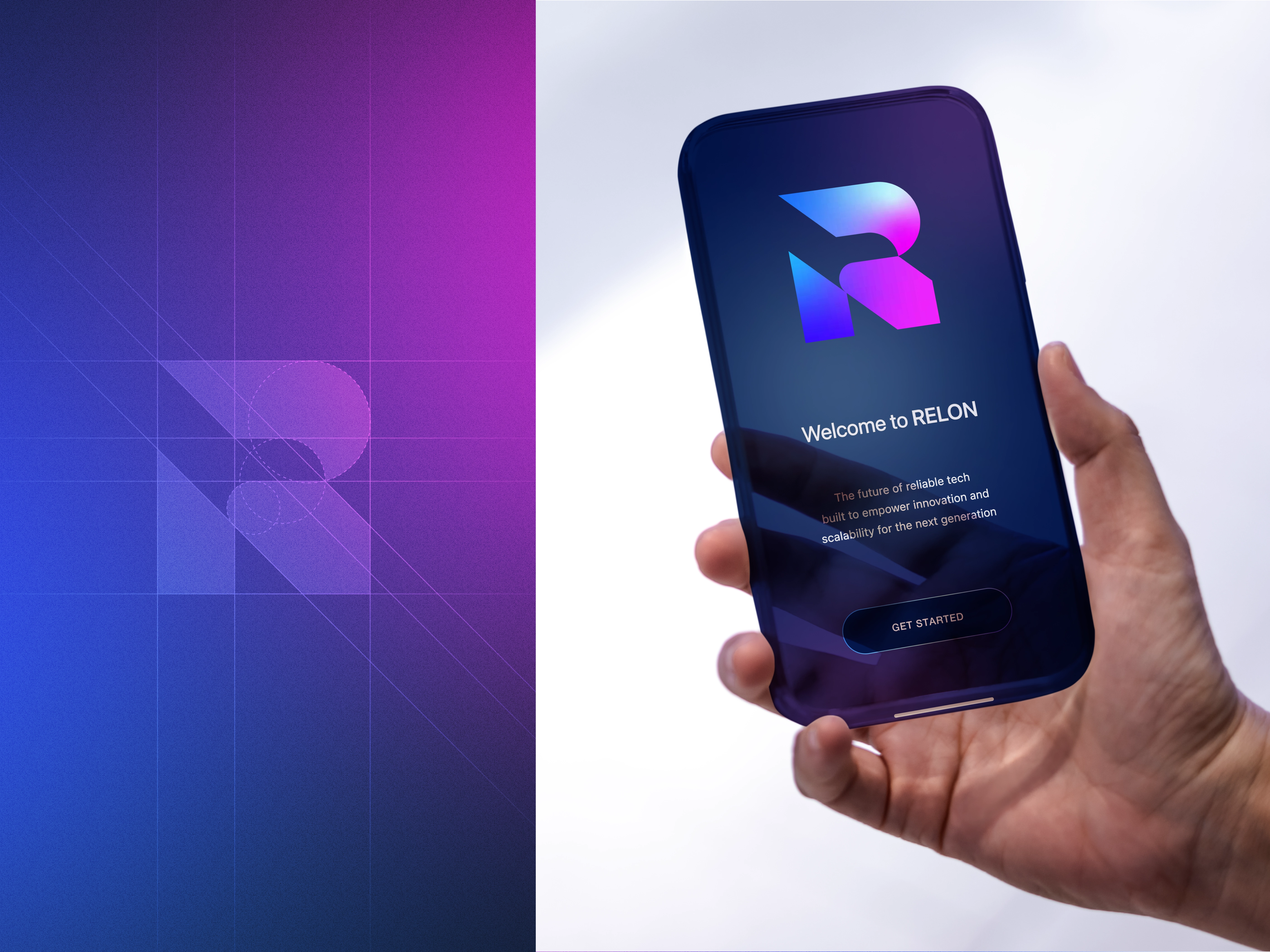
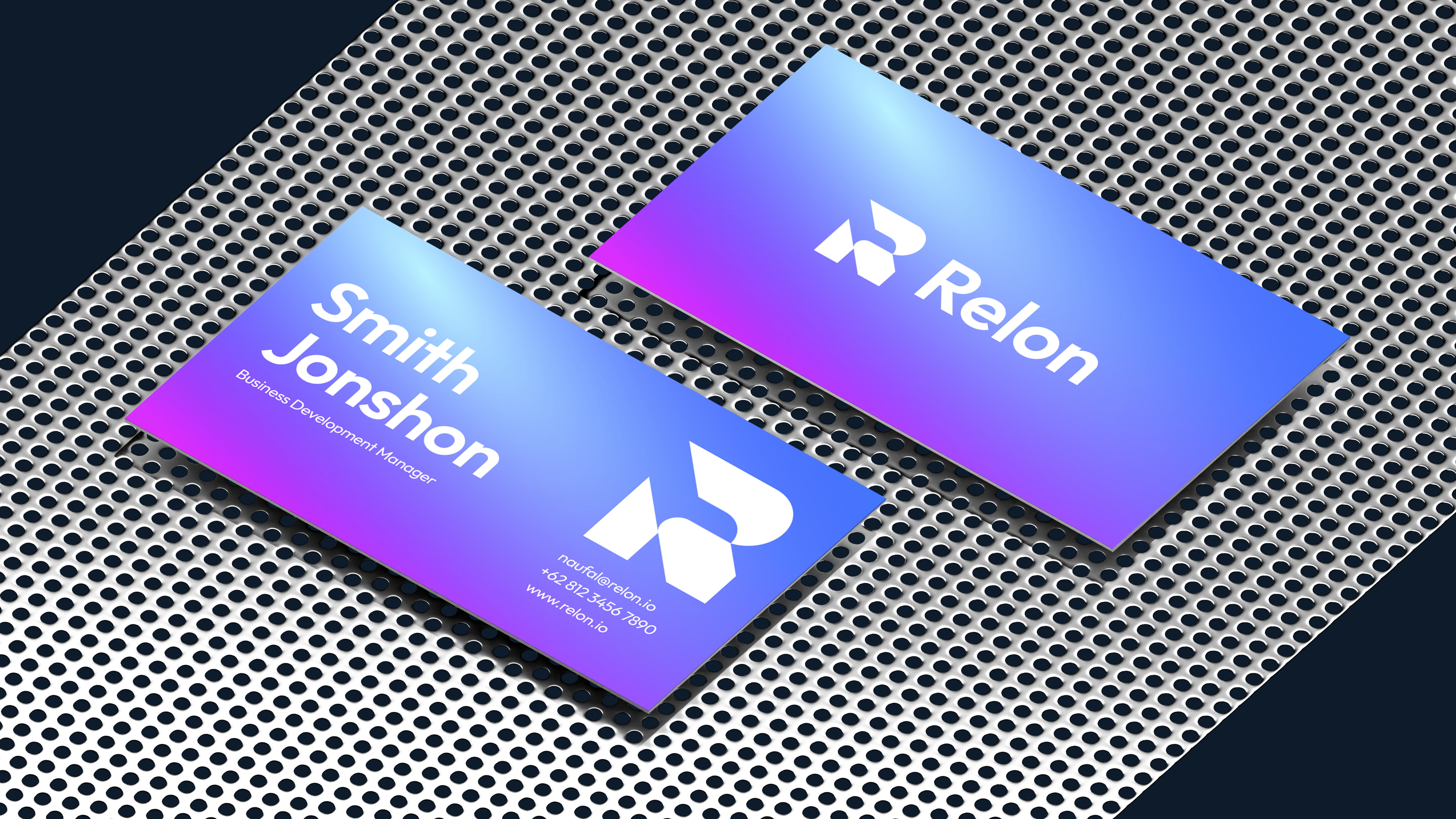
Introducing Relon, a bold and futuristic tech brand built on the core values of reliability, scalability, and innovation. The visual identity combines a vibrant gradient of blue, purple, and pink with a clean lowercase sans-serif wordmark, creating a balance between trust and modern energy. The abstract “R” symbol represents motion, connectivity, and progress reflecting Relon’s mission to power the next generation of technology.
Designed for SaaS, AI, and digital solution companies, Relon’s branding captures the essence of a future-ready platform: dynamic, approachable, and forward-thinking. From the logo hero shot to business cards and app screens, every element reinforces a cohesive identity built for innovators and visionaries.
THANKS FOR WATCHING!
We’d love to hear what you think!
Drop your thoughts or feedback in the comments below
Relon Branding | Tech, SaaS, AI, Digital Solutions
Brand Identity / Strategy / Motion
©2025 Rukuru Studio. All rights reserved.
Like this project
Posted Oct 16, 2025
Relon is a bold tech brand blending reliability, scalability, and innovation with a vibrant gradient and sleek design for future-ready digital companies.