Built with Jitter
Aurea Brand Identity Design
Afifudin Zuhri
Overview
Aurea is a premium brand whose name comes from the Latin word aureus, meaning “golden.” It represents timeless value, elegance, and forward-looking innovation. The visual identity was designed to balance sophistication with modernity, creating a brand presence that feels both global and cutting-edge.
Challenge
The challenge was to craft a brand identity that not only reflects elegance and trust but also communicates adaptability and innovation. Aurea needed a strong yet flexible identity system that could work seamlessly across digital and physical platforms, from web design to print materials.
Solution
We developed a dynamic identity built around a circular form, representing unity and completeness, paired with segmented shapes to convey adaptability and transformation. A glassy blue gradient was introduced to symbolize transparency, intelligence, and modern technology, reinforcing AUREA’s premium positioning.

The Aurea logo combines geometric precision with fluidity. Its circle form embodies trust and harmony, while the subtle segmentation introduces a sense of motion and progress. Together, these elements create a timeless yet future-ready mark.
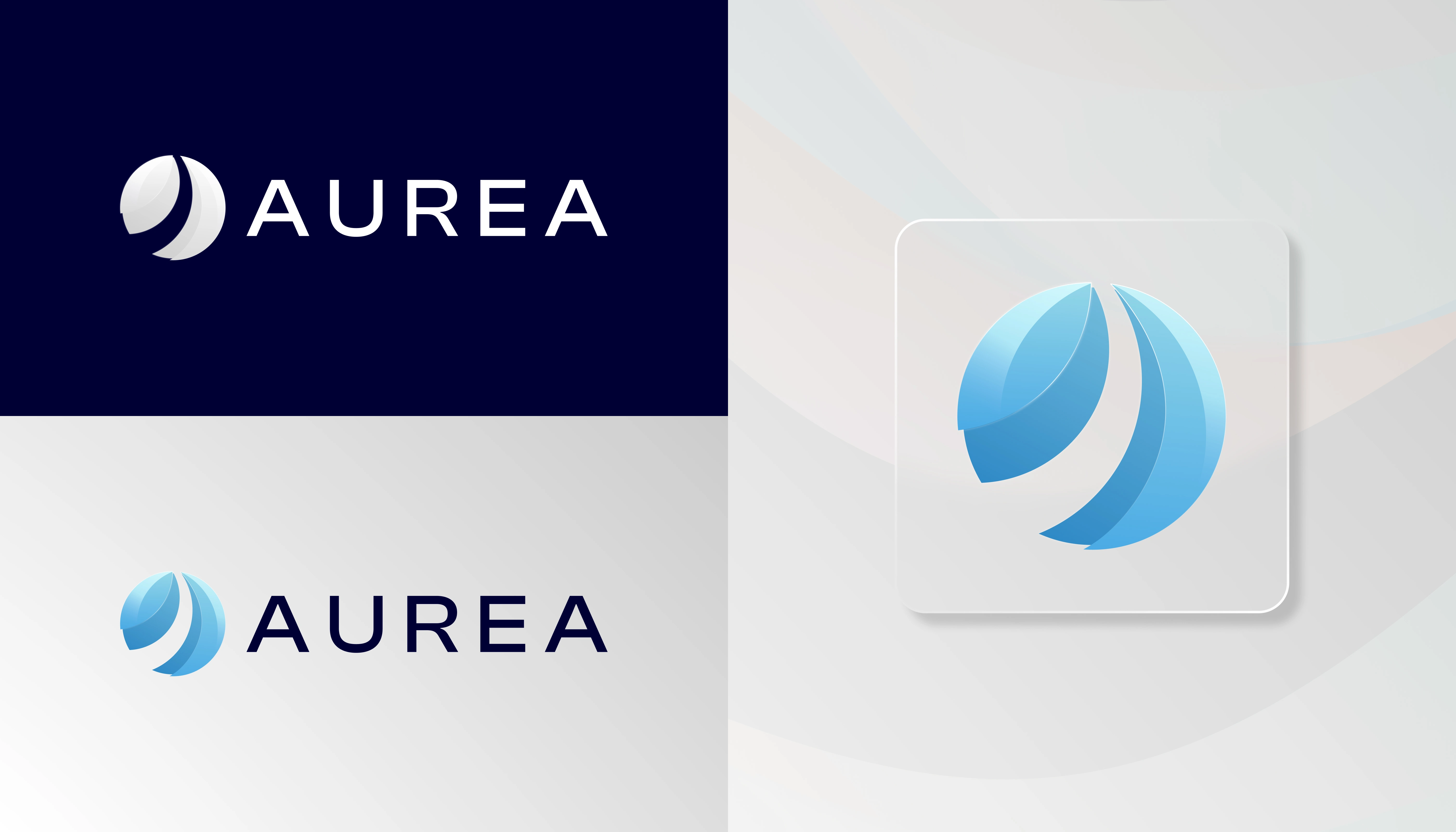
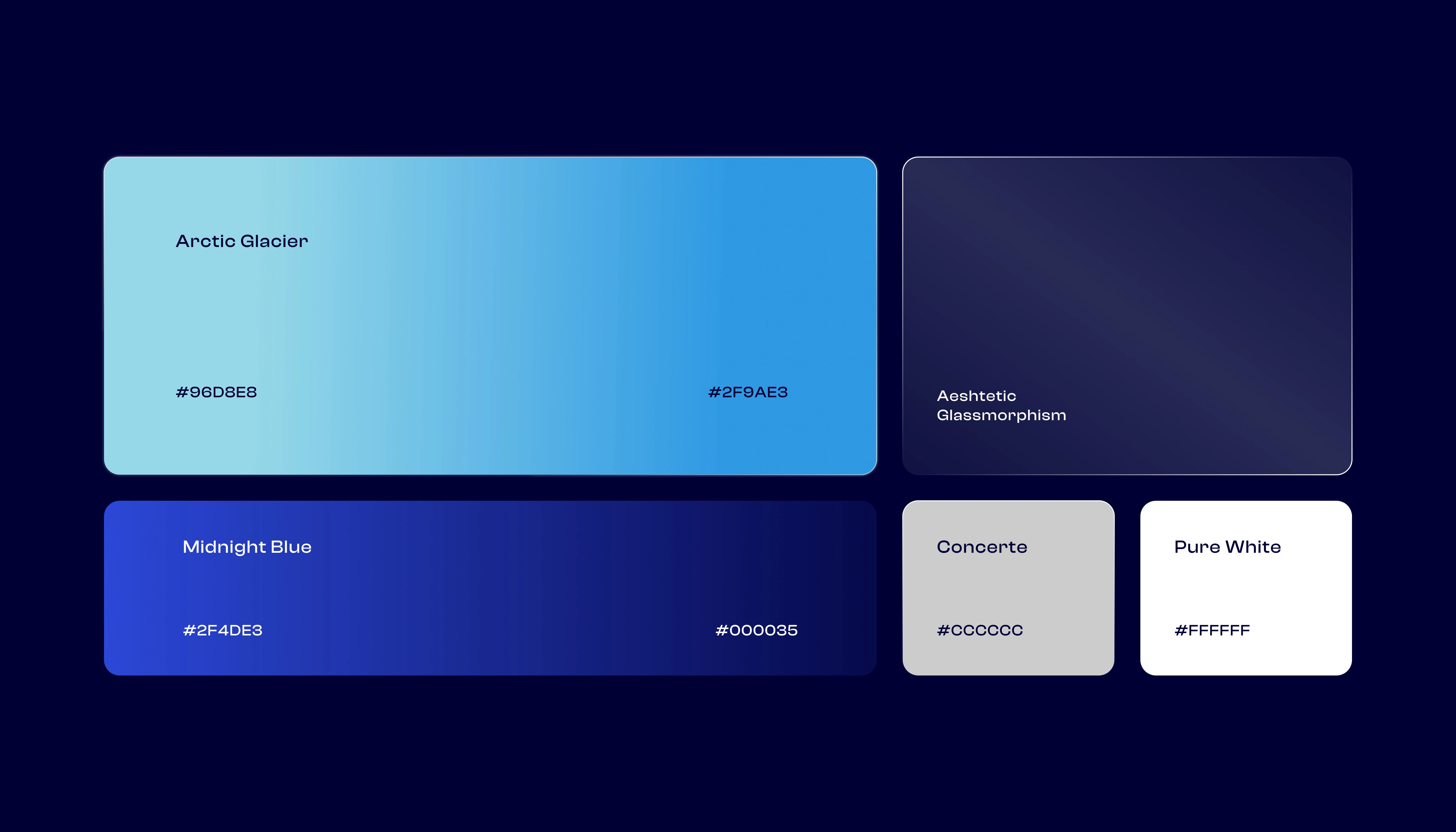
The Aurea color palette blends a glassy gradient blue to represent transparency, intelligence, and innovation with a deep navy tone that conveys trust, stability, and professionalism, balanced by white and light neutrals that bring clarity, openness, and a premium feel creating a modern yet timeless visual harmony.
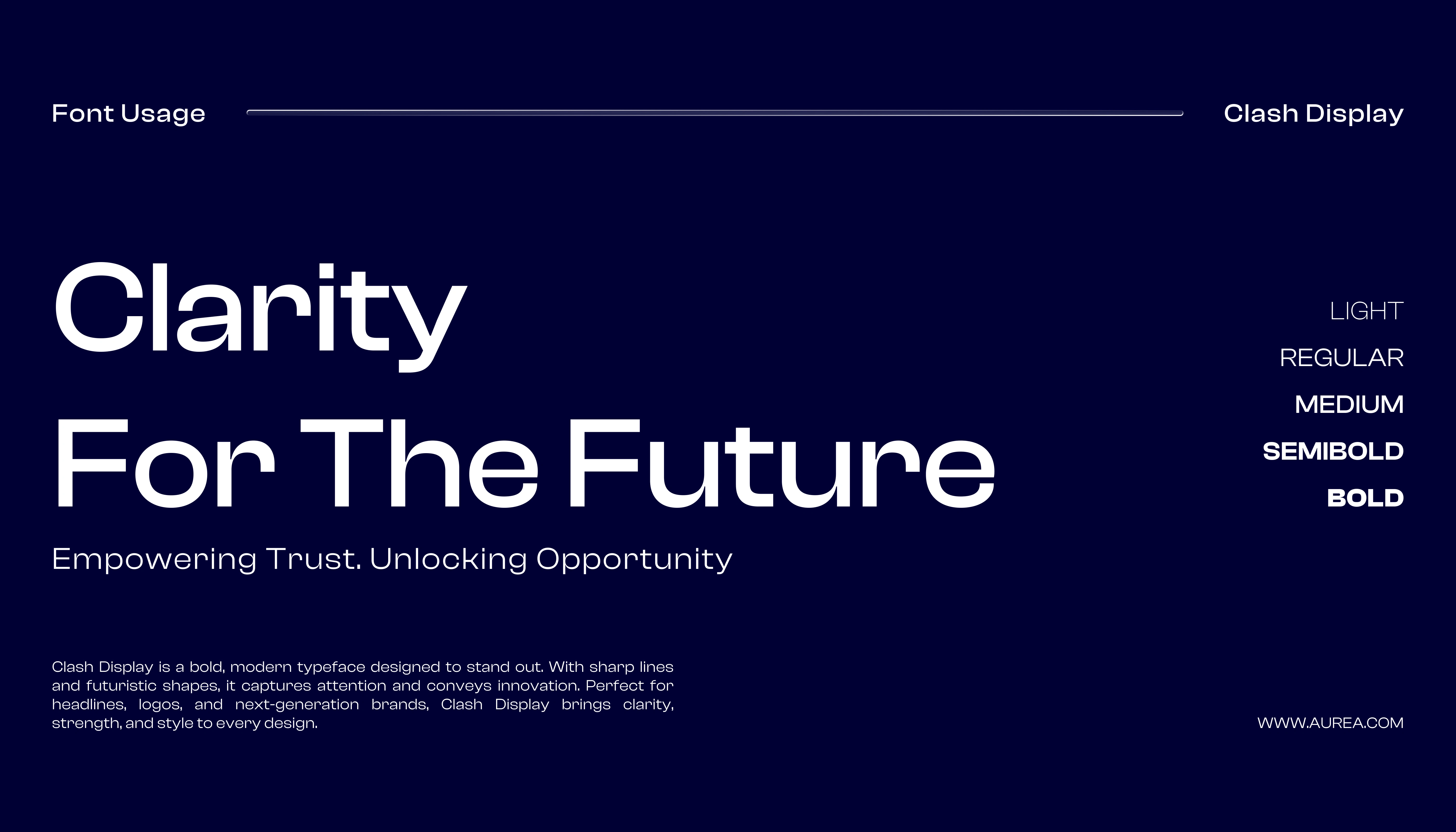
The typography combines a modern sans-serif for clarity and digital readiness with a refined serif accent for elegance. This pairing balances innovation with timeless sophistication, perfectly aligning with AUREA’s positioning.
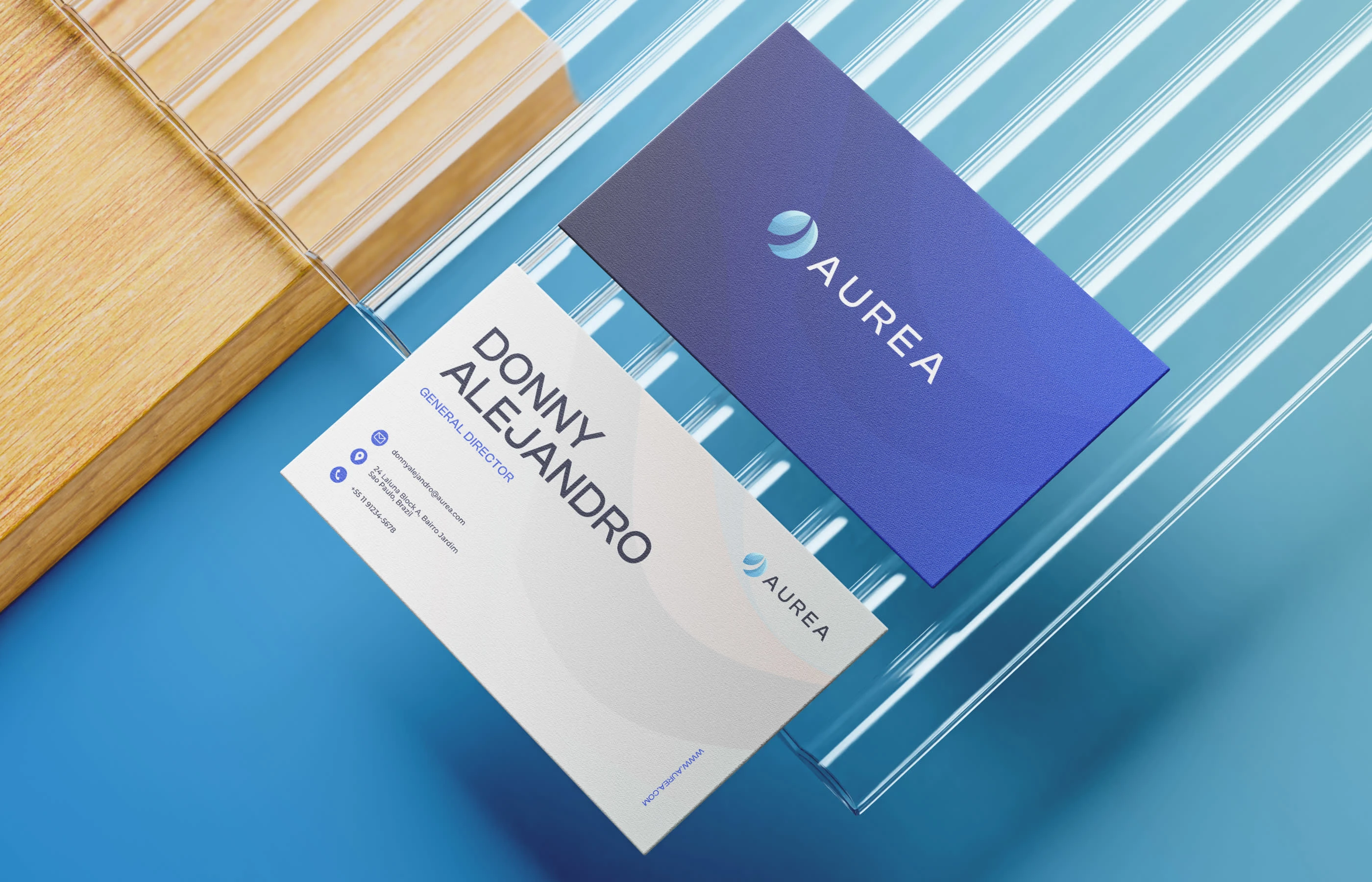
The Aurea identity is applied across multiple touchpoints, including a sleek and modern website, premium business cards and stationery, versatile brand cards and collateral, and cohesive digital assets for social media and UI. Each application highlights the brand’s elegance, clarity, and innovative character while ensuring consistency and adaptability across both physical and digital platforms.
THANKS FOR WATCHING!
We’d love to hear what you think!
Drop your thoughts or feedback in the comments below
©2025 Rukuru Studio. All rights reserved.
Like this project
Posted Oct 2, 2025
Aurea is a premium brand inspired by the Latin aureus (“golden”), blending elegance, innovation, clarity, and trust for a global, future-ready technology brand.
Likes
3
Views
11
Clients
Aurea