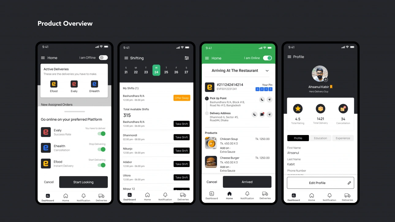
How I designed the delivery app for fastest-growing e-commerce
Saef Design
Overview
EHero is the delivery service of Evaly Ltd. Evaly, an e-commerce platform that provides on average 30-50k goods and products from every sector to every consumer in Bangladesh. Evaly has other subsidiaries like eFood, eHealth, eKhata. There are more than 2500 delivery guys, also known as eHero (The app), who ensure delivery of the ordered products to the consumers.With its fast delivery system, customers usually get their ordered products within 48 days. Evaly Hero aka eHero is an app for Evaly Express Heroes to power that express delivery service.
Problem With Current Experience
eHero app has a lot of bad app ratings, reviews from clients with complaints, and negative feedback from customer support. As Evaly and its subsidiaries are growing rapidly, it was necessary to increase the accessibility and make it more aesthetic.
Getting pick-up location far off from current location.
Unable to contact customers which may result in the delay of the job.
Unable to accept multiple jobs along fairly similar routes for efficiency.
Why Redesigning The App
It’s important to know why we are redesigning this before we start to make our hands dirty. So I started talking with my teams, and stakeholders to understand the history of the platform as well as what we want to achieve in the future. As we have more insights about our users and the market after launch, we have more understanding of the user pain points, so we know the changes that will make the user experience better.
Outdated Aesthetics
A large proportion of the current user base is dissatisfied with the design. The visual aspects of the design (look and feel) are becoming outdated and compare poorly to competitive solutions.
Complex User Flow
A large proportion of the current user base is struggling to complete some major tasks like registration, deliveries, checking balance, dashboard, etc. They are confused about what does what and what they are supposed to do next.
Lack Of Features
The product was developed in the MVP stage. So there are so many important features that have not been designed yet.
Lack Of Consistency
Different aspects of the app are inconsistent in terms of visuals and interaction, which is leading to user confusion and reflecting poorly on the organization’s brand.
Others
The design has a large number of known UX issues that cannot be easily addressed
Understanding The Initial Goals
Identifying the goals we want to achieve was important for the redesign. Evaly’s mission is to build an ecosystem where users can get order anything they need to make their life better through its eCommerce, food, and health platform. Evaly is present across the region, and countless people are using its services every day.In order to understand and relate to challenges associated with delivery men, we also have to understand different areas of the ecosystem they interact with.We have card sorted all the goals we want to achieve. Once we figured out the goals, we started thinking about the tactical efforts that will help us to accomplish those. But before you start designing mock-ups and identifying the perfect onboarding experience, we all agreed that we need to invest in research.
Help users do the job faster or more accurately
Our goal is to keep the user flow simply so that users can easily figure out what does what and which actions lead them to where.
Accommodate new business goals
We want to recruit new eHero to the platform so that the consumers can get their product seamlessly.
Consider the customer’s requirement
We have received large numbers of feedback regarding the UX that need to be fixed. To understand their pain points user testing, interview and survey were crucial.
Process
As we have the resources to do research as part of your design process, we started by observing the customers and how they interact with the product. We map out the experience, bringing the customers into the research phase and having them go through the flow of the current app. We completed the whole redesign process by testing the design with the users.
Analyzing and investing the existing data
As we have active users who are using the app on a daily basis, we have a good amount of data to work with. Just as with any UX design, we started analyzing how users are interacting with the app while performing the major tasks. Then, that has to be measured against the aims of the business and how the app fulfills these.
Low Activation Rate
45% of users are not registering as eHero after downloading the app.
Low Drop-Off Rate
40% of the users hardly deliver a product in a week.
User Satisfaction
Our google play store rating was 2.7 as there are so many technical and UX issues.
Goal Completion
We tested our old app with 10 volunteers and asked them to perform a certain task on the app. The success rate is 65%.
Structuring The User Flow
After receiving feedback on our wireframes, we used these takeaways and iterated on our defining our user flow to reflect the changes we wanted. We received feedback on usability errors and contextual feedback on the overall experience.
Understanding The Users
Before undergoing the redesign, we looked closely at the audience who uses eHero app and gets the most value from it. We learned that our users don’t want to compete head-to-head, they want encouragement, guidance, and motivation. These user insights allowed us to realize it was time to make a change in our appearance and positioning to inspire a more meaningful connection with our community and visually represent these brand attributes.
Newly Registered users
Users who successfully completed their enrolment to evaly delivery service.
Experienced users
Users who have already worked for more than 6 months as eHero.
Both have similar motivations but slightly different needs. More introductory guidance is needed for first time registered users, and more efficiency is needed for the previous users.
User Interview
We have interviewed two types of users and categorized them based on their familiarity with using an app. ‘User 1’ are aspiring eHero who was using the app for the first time whereas, ‘User 2’ is a heavy user who frequently uses eHero app more than thrice a week.The interview was conducted face to face. It was like a friendly conversation to understand how a day in life goes like working as a delivery person. I didn’t want to give them the vibe that I am trying to bring out a solution but my main goal was to get the answer to the following questions:
What makes them work as a delivery person?
What are the challenges they go through while making a delivery?
How do they track their income?
What does a good working day feel like?
How long do they love to work in a day?
The majority of the questions posted were open-ended questions where the user did not give us a Yes/No answer. This was intentional from my side as I did not want to ask dichotomous questions. This eventually, helped me bounce back with follow-up questions which created a good rhythm and I was able to get the answers quickly.
Analyzing The Competitors
Next, we identified the company’s closest competitors and carried out a competitive analysis in the form of a feature comparison matrix. We started to analyze the top current competitors mostly Foodpanda, Daraz, and Pathao. Our goal is to offer all the key features that competitors provide as well as includes a unique value proposition.
What Needs To Be Improved
As the platform has already 2,500+ active users, we started by talking to them and analyzing the pain points they are facing with the current app. The previous app was built without any kind of user research and there was a lot of problem with usability and accessibility. We started our research by analyzing the user feedback on the google play store, and online communities and by doing surveys. We created affinity maps to sort out a different types of problems faced by the users. Our goal is to understand empathy and redesign the app along with introducing new features.
Improving The User Interface
The major reason for redesigning the app is its poor user interface. Our goal is to keep up with the new design trends and also keep the mental model of the previous app in mind. We are open to ideas and creativity. but we always made sure to maintain a certain level of predictability.
Rebranding
All the evaly platform was going through a rebranding, so all channels must stay consistent, and the app redesign becomes necessary that match up with the brand guidelines. Part of this could be focusing on a new target market, better functionality, or more features.
Improve Payment System
There are a large number of customers who prefer digital paymanet platform like Bkash, and Nagad which was not integrated with our app. So integrating that payment method is a must.
Introducing New Subsidiaries
Evaly has other subsidiaries that eHero is not familiar with. With the new design, we want to educate the users about other subsidiaries of evaly as they can deliver products from all subsidiaries of evaly.
Smooth Onboarding
45% of users have abounded the app after downloading it for the first time. So it’s crucial to make an effective onboarding process to guide the users about the value proposition of the app in order to register them as eHero.
Hooked Strategies
We followed some hooked strategies like rewards, and milestones that keep our users engaged with the app.
Design System
Evaly has not had any design system for over one year. So it’s important to create an effective design system.
Like this project
Posted Dec 4, 2022
EHero is the delivery service of Evaly Ltd. I created I design that is used by thousands of delivery persons in the fastest-growing e-commerce in Bangladesh.
Likes
0
Views
353