Amazon Redesign Mobile App
Firuza Aliyeva
About the product
Amazon is the biggest e-commerce service all around the world.
My role
UX/UI Designer
Main project goal
Modernize the visual design to be more user-friendly and modern,
Discovery
Overview
This project focuses on a comprehensive redesign of the Amazon mobile application to reposition Amazon as an innovative leader in the e-commerce space. Currently, Amazon is perceived as a reliable yet unappealing incumbent. The redesign aims to pivot this perception towards one that showcases Amazon's commitment to user experience, innovation, and user-centric design.
Challenge
Modernize the visual design to be more user-friendly and modern, but have the major user flows untouched. The primary focus should be on the major success flow, which includes selecting an item from the catalog, viewing the item's page, and adding it to the cart within 3 days.
Goals and objectives
Business Goals:
Enhanced Customer Loyalty: By improving the user experience, we aim to increase customer retention and repeat purchases.
Sense of Innovation: Position Amazon as a forward-thinking leader in e-commerce, showcasing cutting-edge design and technology.
Building Trust: A user-friendly and aesthetically pleasing app will foster greater trust and reliability among users.
Problem definition
Competitive Analysis
In comparing Amazon with Otto, Trendyol, and AliExpress, Amazon's strengths lie in Prime Shipping, brand recognition, vast product variety, and excellent customer service. However, weaknesses include lacking specific features on category, product, and cart pages. Competitors offer unique strengths: Otto prioritizes a human-first approach; Trendyol focuses on visual identity and sustainability; AliExpress boasts a diverse product range and competitive pricing but lacks brand recognition. Our redesign strategy aims to leverage Amazon's strengths, address identified weaknesses, and prioritize UX principles like consistency, accessibility, visual hierarchy, and user flow optimization.
UX Principles Considered:
Consistency: Ensuring a cohesive experience across all pages.
Accessibility: Prioritizing a human-first approach and innovative features.
Visual Hierarchy: Establishing a clear visual identity for brand recognition.
User Flow Optimization: Streamlining the path from homepage to shopping cart for an intuitive experience.
Auditing
Aligning with UX principles and my perspective, despite tight deadlines, I opted to develop a product category, product details view, and shopping cart. To streamline the pilot scope, I collaborated with fellow designers, incorporating design principles and individual insights for a comprehensive approach.
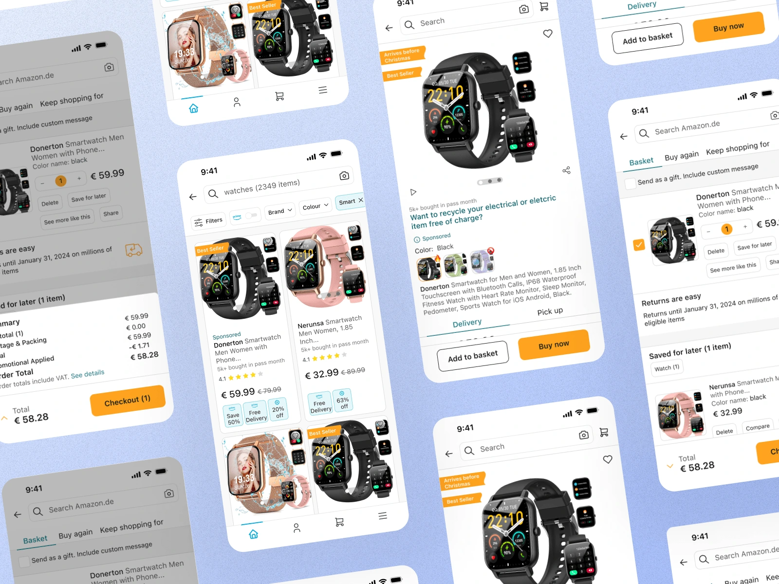
Product category
I conducted a thorough analysis of a mobile app's UI, providing comprehensive feedback and annotations. The feedback addresses design inconsistencies, unclear elements, and improvement suggestions across three key sections: filters, home screen, and contrasting text.
In the 'filters' section, I recommended enhancing filter clarity for user actions and exploring possibilities like highlighting or badges. Additionally, a comment highlighted the need for clarity regarding the number of products found based on search criteria.
For the 'home screen,' I identified a background color inconsistency, with some cards having grey backgrounds and others not, alongside noted inconsistencies in card styles.
In the 'contrasting text' section, I emphasized the need to reconsider the use of red for all contrasting text, as it may convey an error message and create confusion, particularly when paired with light icons.
Product details view
I conducted a focused audit on the Amazon mobile app's product details view, pinpointing key improvements:
Visual Hierarchy: Prioritize visuals for an intuitive user experience.
Icon Clarity: Enhance visibility and purpose clarity for icons.
Review Visibility: Implement horizontal scrolling and color consistency for user-friendly reviews.
Card Styles: Diversify card styles to prevent user fatigue.
UI Refinement: Modernize with consistent background transparency and an updated slide-over style.
Shopping cart
As pervious auditing analyses, I could say mostly, they had the same ui issues that are needed to work on. Below you can see also analysis of the shopping car.
Execution
Mobile design system theme
User feedback highlighted discomfort with UI element sizes and unclear, misaligned text. In response, I swiftly created a UI kit with improved component sets, addressing issues by increasing paddings and font sizes. The redesign focused on modernization and a streamlined UI while maintaining continuity with the initial design. I meticulously defined paddings, text sizes, styles, and tokens for all UI components, ensuring a cohesive and enhanced user experience.
Usability test
I conducted moderated A/B testing with five users, presenting the prototype to gauge their perceptions of the user flow and gather insights. The usability test revealed positive overall feedback. Users expressed satisfaction with the new design, appreciating its cleaner layout and a color hierarchy that is easily comprehensible. While some users raised concerns about excessive on-screen text, the newer versions were acknowledged for improved organization and minimized content
Final designs
The final Amazon redesign boasts a harmonious UI, combining aesthetics and functionality for an intuitive shopping experience. Prototypes showcase improved navigation and refined visual elements, ensuring an engaging and efficient mobile app interface.
Like this project
Posted Jan 12, 2024
This project focuses on a comprehensive redesign of the Amazon mobile application to reposition Amazon as an innovative leader in the e-commerce space.
Likes
0
Views
10