
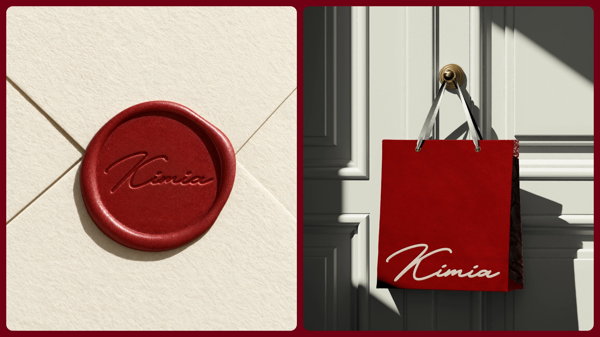
Kimia’s identity begins with a simple truth: if the brand promises peace, it must make that promise felt. Its signature wordmark carries the weight of a personal assurance, as though someone has examined every detail, accepted responsibility and signed beneath the outcome, while the postage-stamp frame marks the moment a giver’s intention passes into Kimia’s care and begins its journey to the recipient.
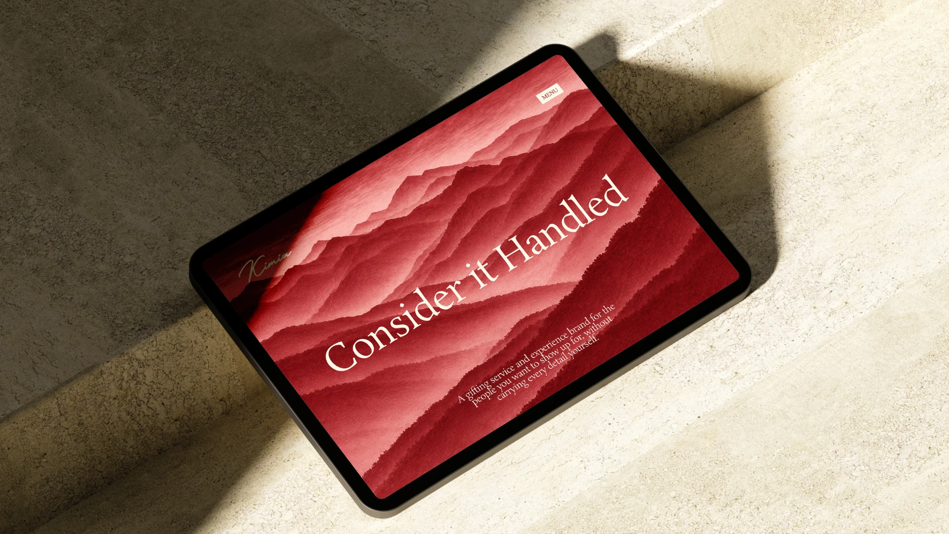
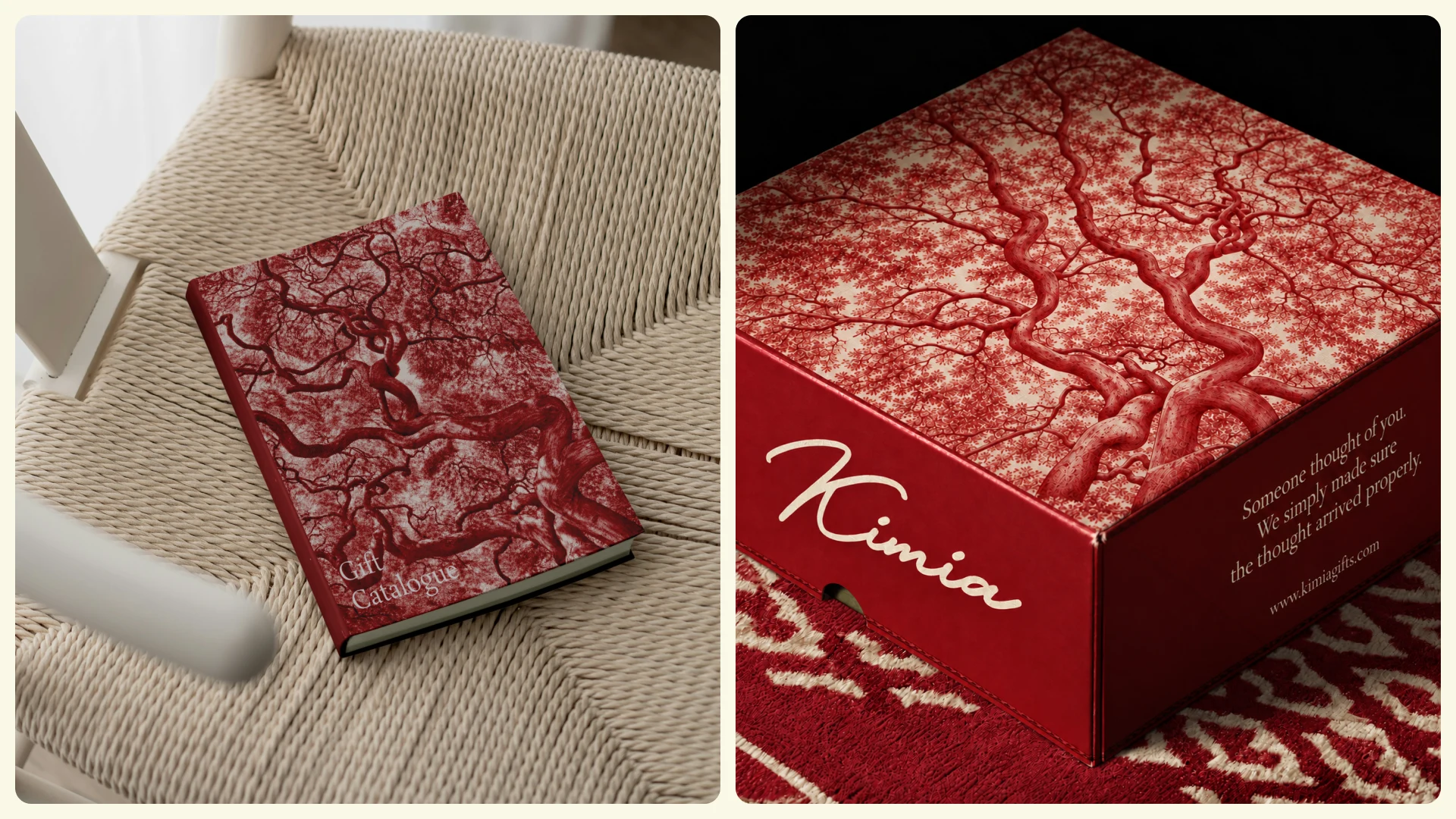
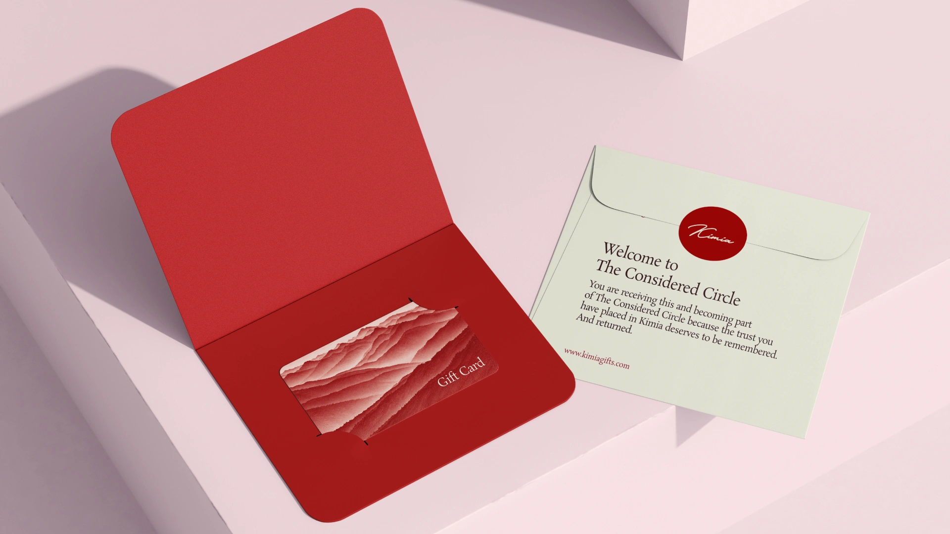
Across boxes, cards, tissue and bags, imagery of light on water, opening petals, resting mountains, leaves and ripples extends the same promise, not as decoration but as a picture of the state Kimia exists to create: everything settled into its proper place.
Together, the postcard intimacy, accountable signature and quiet natural imagery make every gesture feel chosen, sent and worth keeping, so that before the brand ever says Consider It Handled, the design has already made it feel true.

0 likes · 0 views · Nov 5, 2026
Kimia’s identity begins with a simple truth: if the brand promises peace, it must make that promise felt. Its signature wordmark carries the weight of a pers...
Timeline
Aug 22, 2026 - Sep 15, 2026


