
Jonathan Durunguma
I make the market see what your business is really worth.
- 2
- Followers


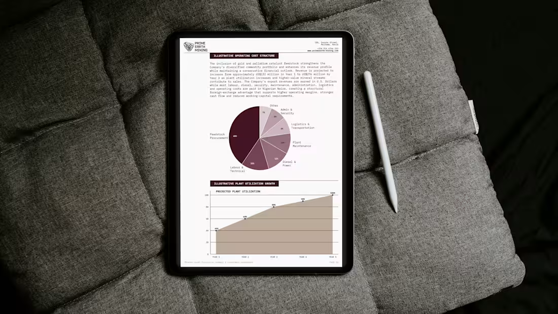
Prime Earth Mining begins with a fact that is easy to overlook: mineral abundance is not the same as mineral value. The distance between them is made of systems—exploration, aggregation, verification, processing and the long route to market. This identity makes that system visible. A pressure-shaped Bedrock mark expands into contours, motion, data and illustration, held together by a palette drawn from earth, mineral and depth. The result is a Nigerian mining brand built without spectacle: precise, integrated and quietly ambitious, designed to show not only what lies beneath the ground, but the discipline required to bring it forward, to continue Unearthing What Matters.
2
49
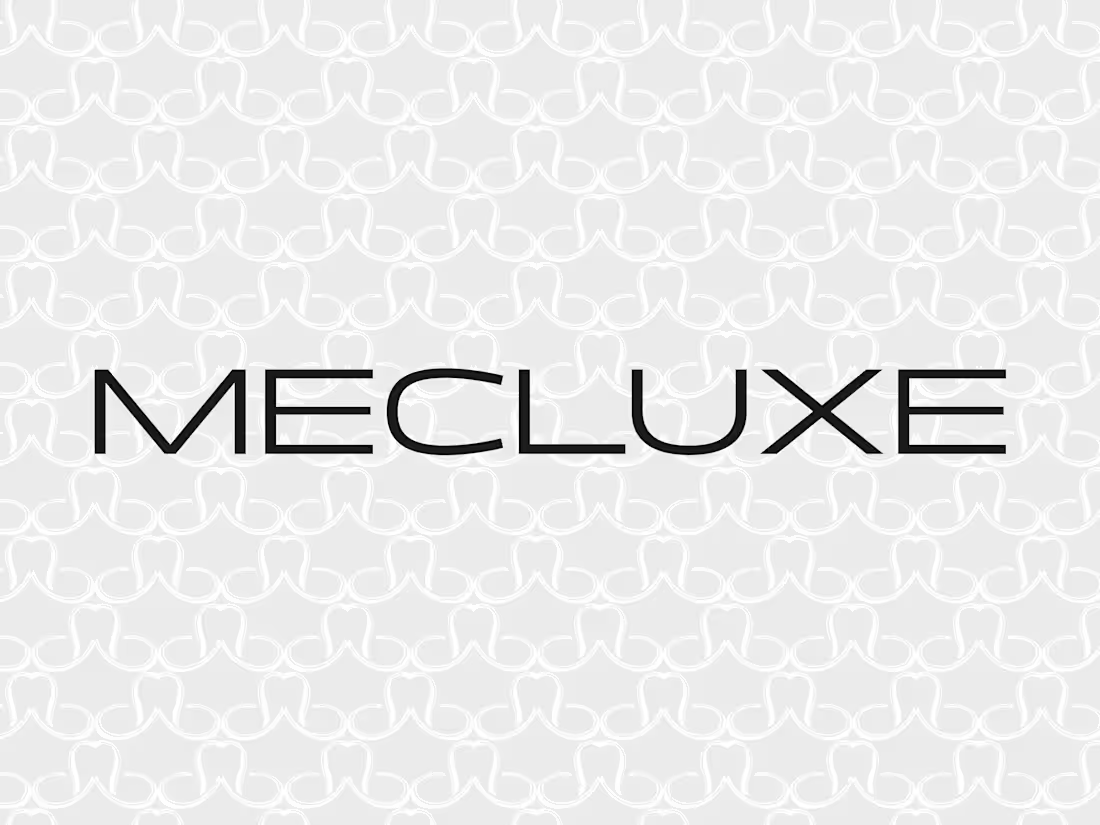
Mecluxe begins at the moment retail fashion stops being a promise on a screen and becomes something you can hold. Built around the idea of First Hand, the identity closes the distance between seeing, choosing, receiving and wearing. Editorial typography, direct photography, restrained packaging and arrival-led campaigns give the brand presence without pretence.
The system does not manufacture exclusivity or borrow the theatre of old luxury; it makes good fashion feel immediate, assured and real. Mecluxe was designed for the pleasure of receiving exactly what caught your eye, with nothing lost between the image and the arrival. So that when sourcing and expecting these fashion pieces here, for the first time in a long while, there would be nothing to question. It was nothing but the real thing.
0
27
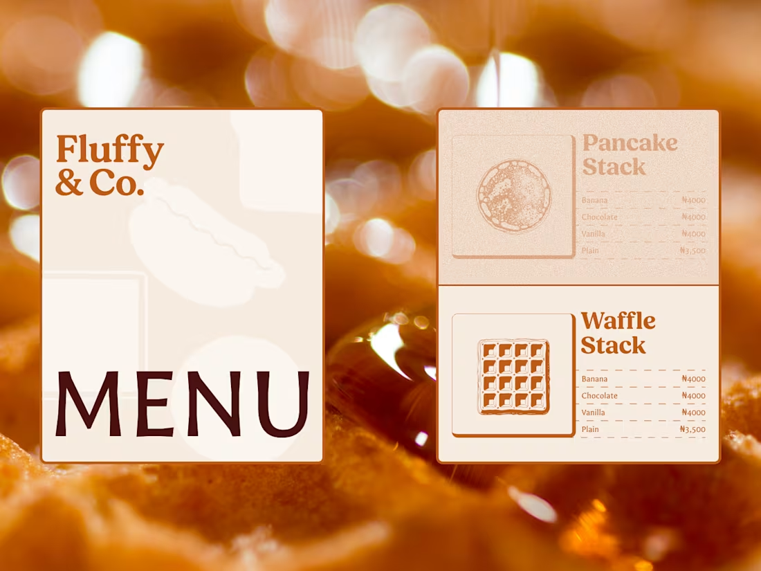
Fluffy & Co. was built around a simple conviction: softness, done properly, is not the easy option but the whole point. Pancakes stack with confidence, waffles stay crisp where they should and give way everywhere else, French toast arrives too golden to be mistaken for ordinary bread, and hotdogs and quesadillas follow the same rule of comfort without compromise. Behind the food is a business built for people whose lives are already full, whether that means lunch between meetings in Wuse or catering a wedding, a wake, and somebody’s cousin’s launch on the same Saturday. The brand brings that generosity into every part of the experience, proving, warm and slightly excessive, that good times really can be flipped into existence.
0
32

Kimia’s identity begins with a simple truth: if the brand promises peace, it must make that promise felt. Its signature wordmark carries the weight of a personal assurance, as though someone has examined every detail, accepted responsibility and signed beneath the outcome, while the postage-stamp frame marks the moment a giver’s intention passes into Kimia’s care and begins its journey to the recipient.
Across boxes, cards, tissue and bags, imagery of light on water, opening petals, resting mountains, leaves and ripples extends the same promise, not as decoration but as a picture of the state Kimia exists to create: everything settled into its proper place.
Together, the postcard intimacy, accountable signature and quiet natural imagery make every gesture feel chosen, sent and worth keeping, so that before the brand ever says Consider It Handled, the design has already made it feel true.
0
49