Brand Identity + Package Design for Sour Joe's [Organic Bakery]

Keren Jamgbadi


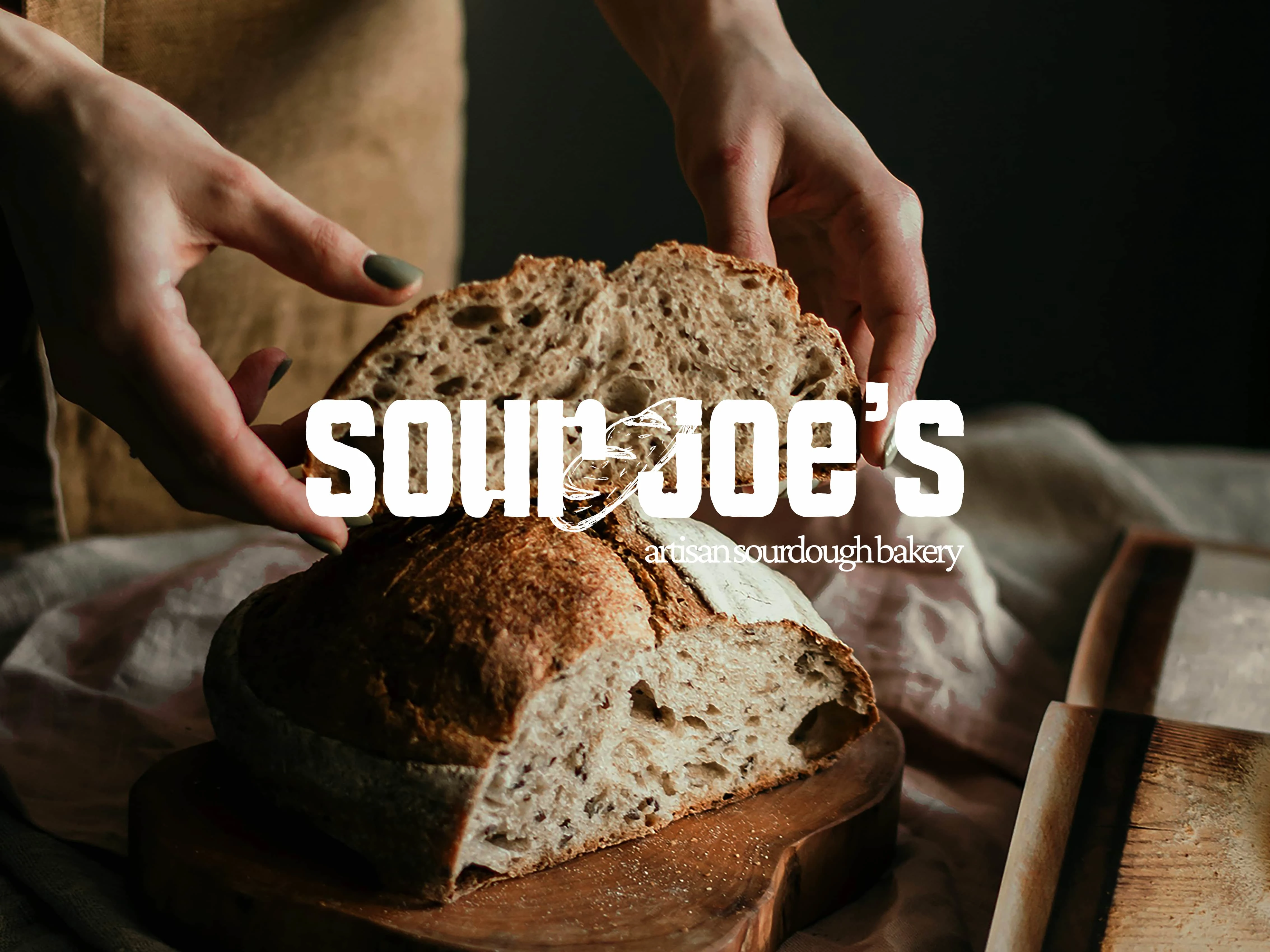
Sour Joe's Brand Identity and Package Design
The job on this project was to design a complete brand identity and various packaging for a family owned bakery.
Sour Joe's is a local bakery that specialize in artisan sourdough bread, as well as other gut healthy pastries.
A big part of the brand is it's roots and use of fresh and sustainably sourced ingredients.
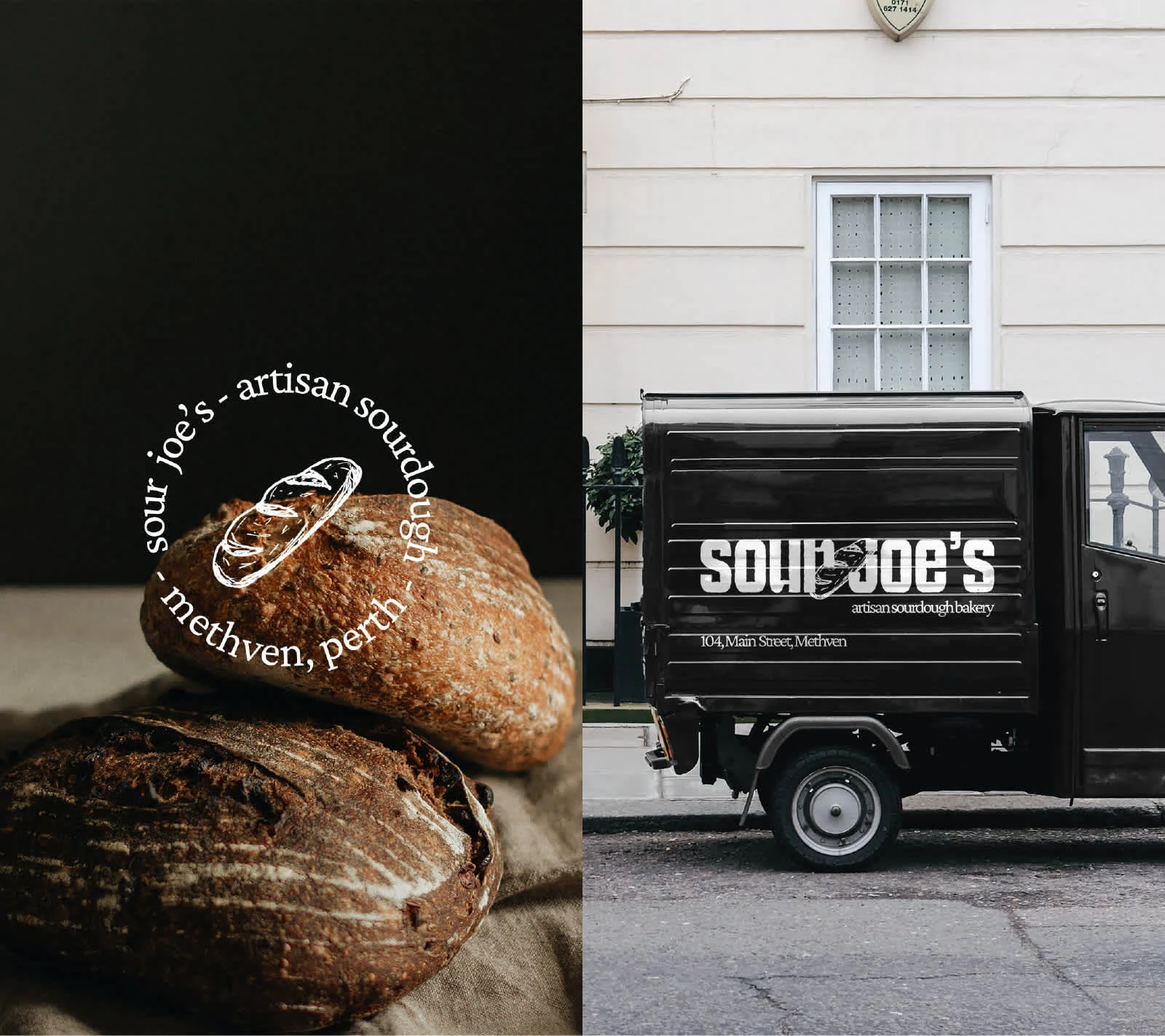
The Logo
The first design that needed to be set up was the logo, as that's typically the face of any brand.
For Sour Joe's, every inch of the brand needed to reflect its "homey" feel and communicate a sense of freshness. Something earthy and organic, while still preserving and reflecting the quality of the bakery.
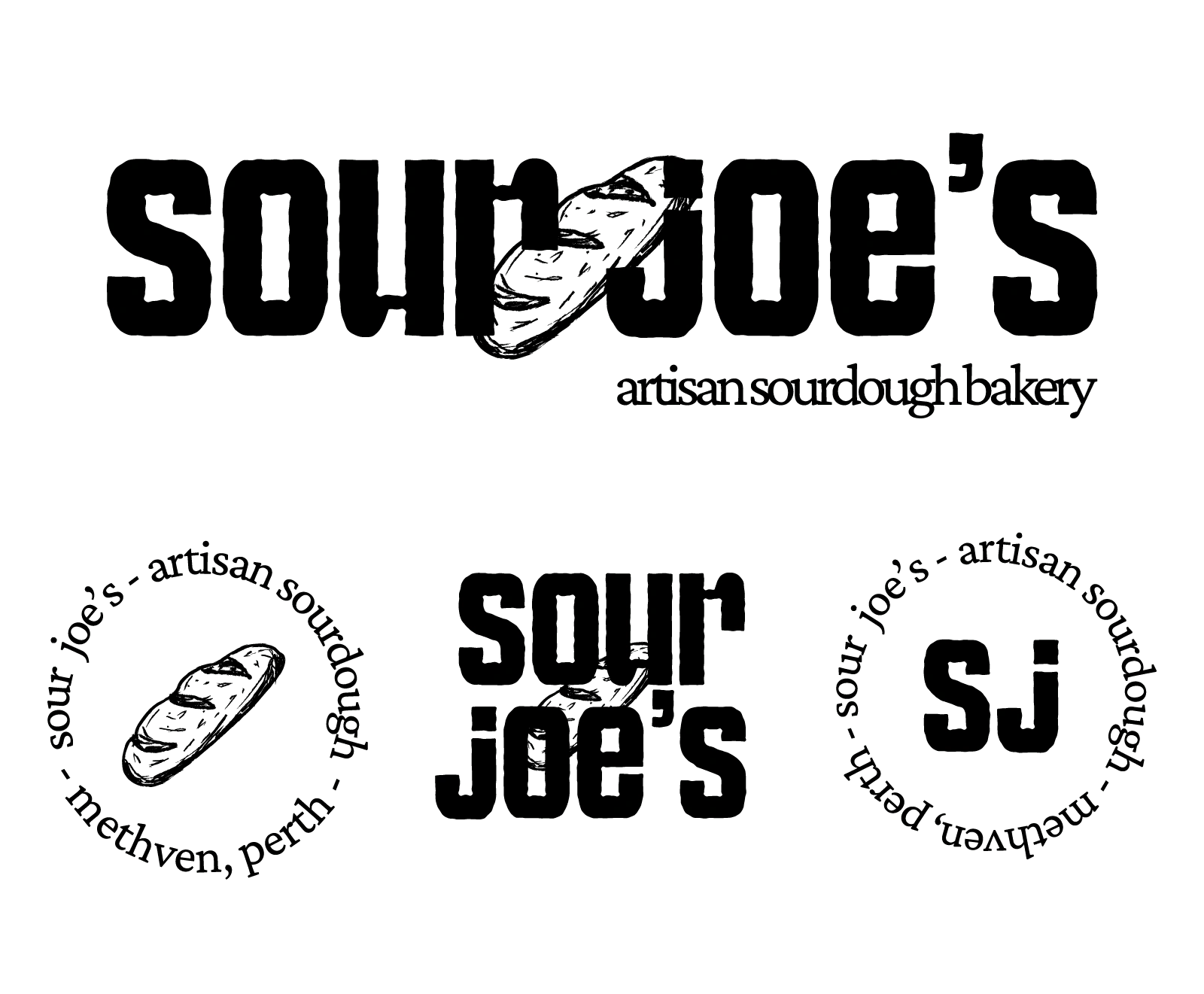
The Sour Joe's logo is designed with a composition of custom lettering and illustration, paired with the brand font.
The words "sour joe's" were intentionally designed in lowercase to communicate a sense of softness, and the entire logo was finished off with rough edges and texture, like it was hand-drawn.
To fully set up the logo for use in all forms of print and digital designs, a logo suite was developed with 3 more variations of the primary logo.
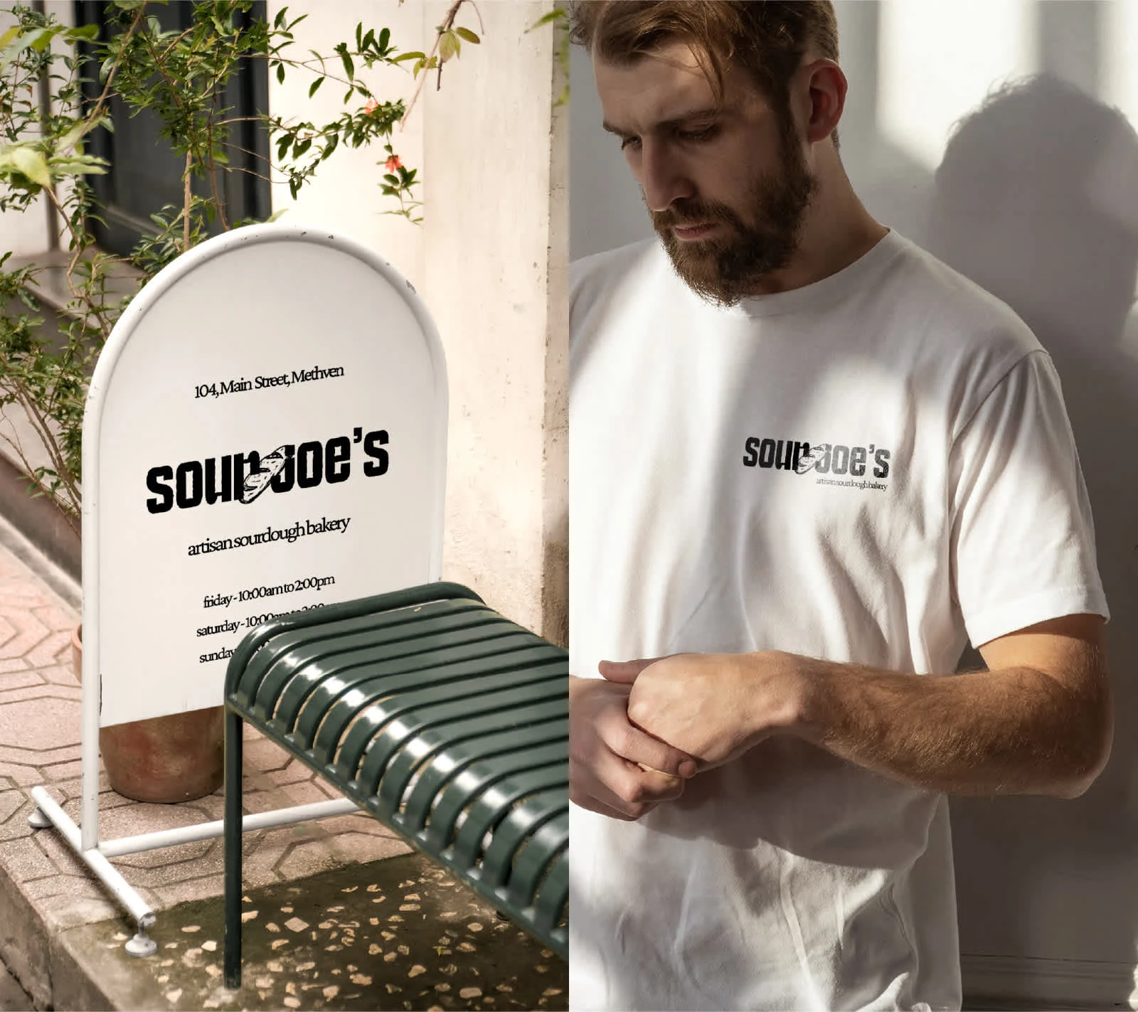
Typography
The brand font is a serif typeface with curved details that make text look somewhat vintage.
Again, reinforcing that sense of a crafted and handmade process and product.
The overall kerning of the font used was adjusted to bring the letters closer together, and maintain the earthy aesthetic.
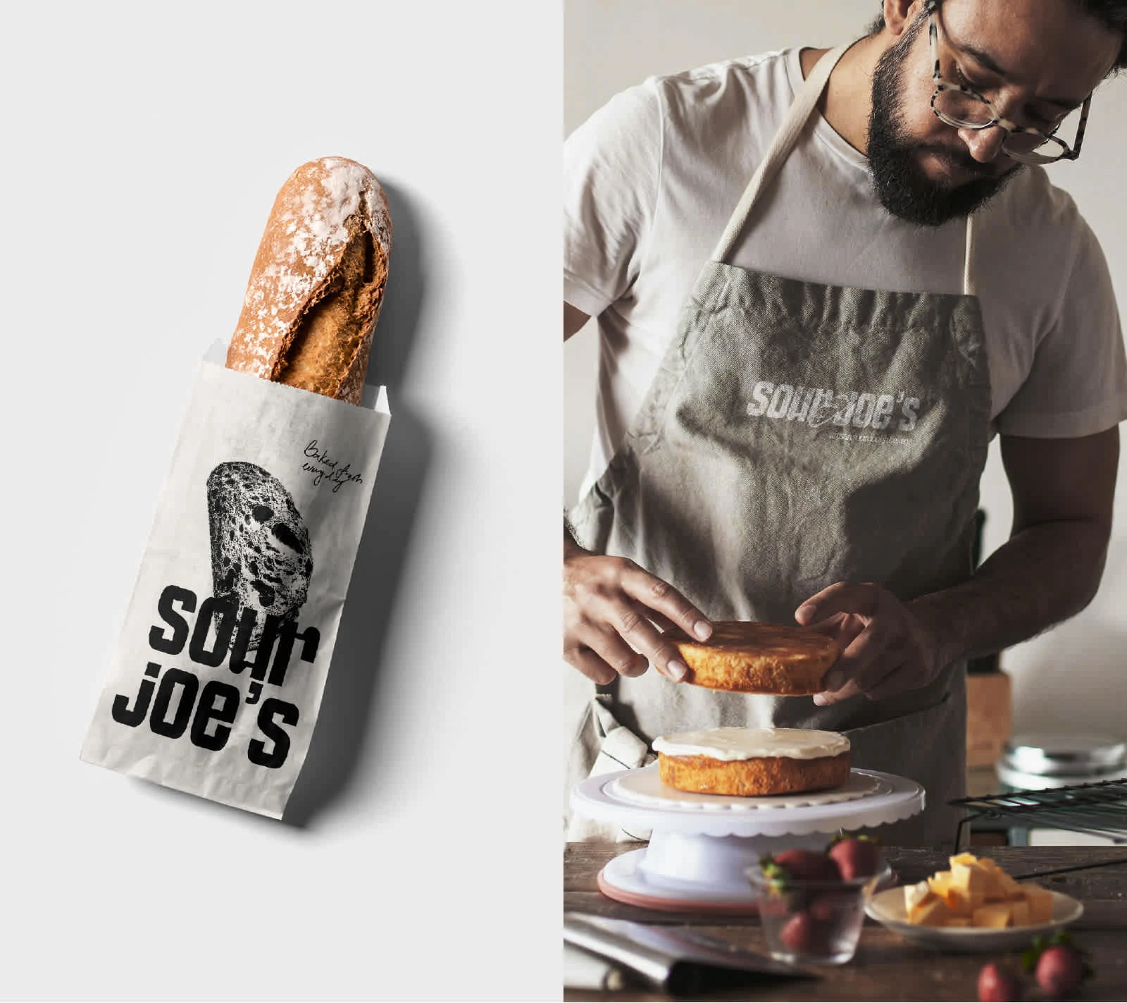
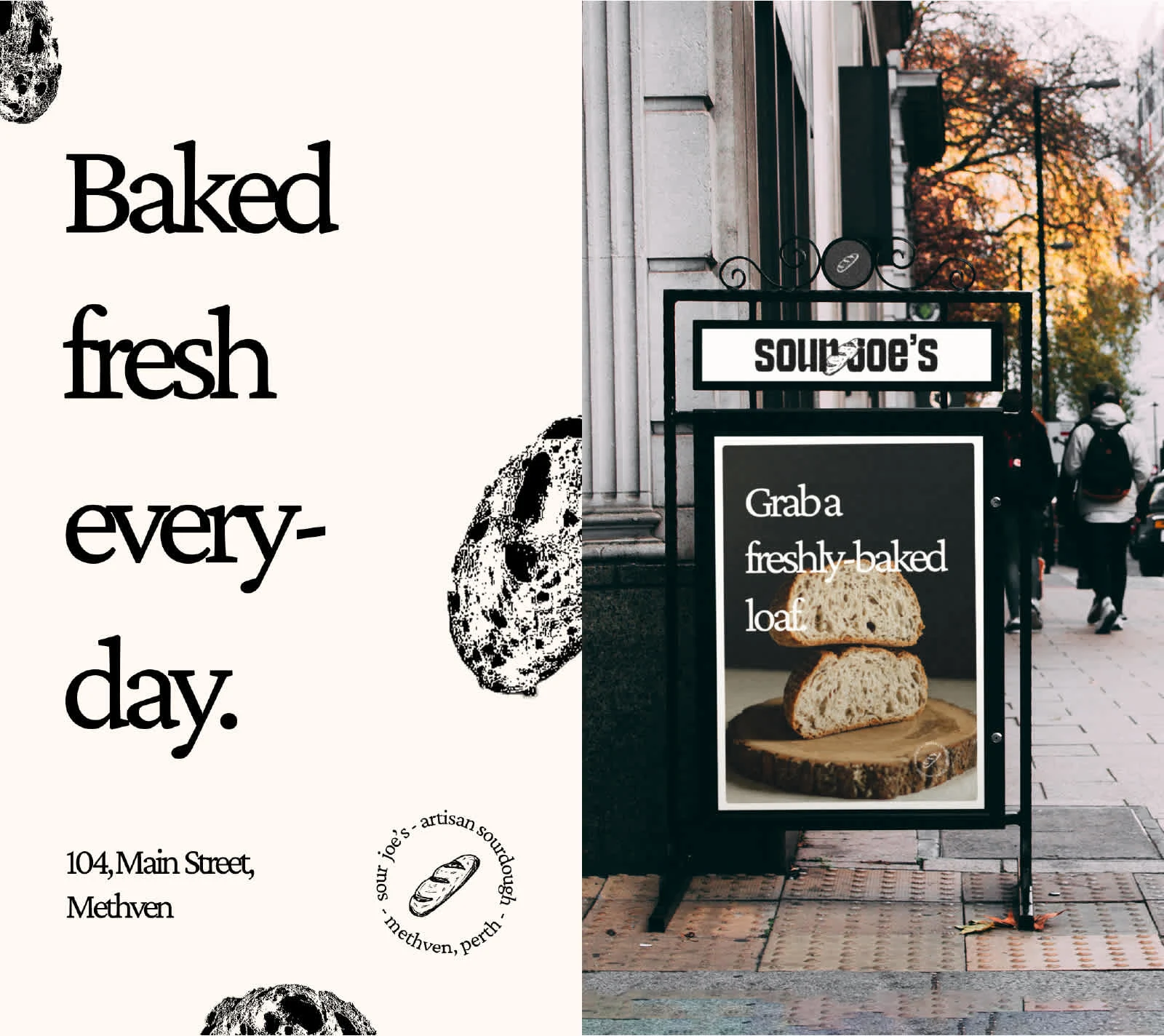
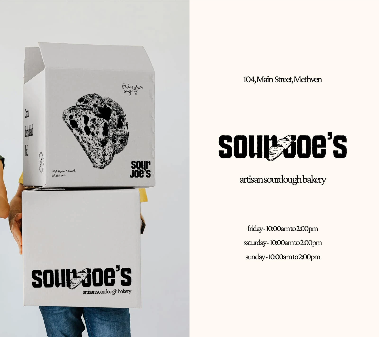
Package Design
The second part of the project was to design the packages.
The goal was to keep it simple with a sort of "raw" feeling.
So I designed the packaging to have various stamp-like illustrations, and handwritten text. Like it was mimicking a recipe book.
Something passed on from generation to generation.
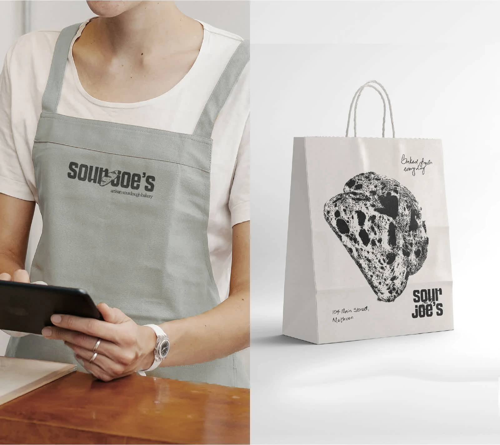
The full application of Sour Joe's' visual identity in display.

Like this project
Posted Apr 7, 2025
Developing a visual identity and various packaging designs for Sour Joe's, a family owned bakery that specializes in sourdough bread and other pastries.
Likes
1
Views
3
Timeline
Jul 11, 2024 - Jul 22, 2024


KAO Cafe & Lounge | Visual Identity Design :: Behance
FIVE - NINE Brand Identity
![Yaji 🔥 [Fast Food Brand Identity]](https://media.contra.com/image/upload/ar_1.333,c_fill,f_avif,h_240,q_auto:good,w_320/tswdaehahs0y2soa4x0c)
Yaji 🔥 [Fast Food Brand Identity]

MUGG Coffee Shop Brand Identity Design :: Behance