ME? OR ME.

Riya Patil
ME? OR ME.
AN ILLUSTRATED ZINE ABOUT
SELF-DOUBT, IDENTITY AND FINDING PURPOSE

( project overview )
( duration )
( deliverables )
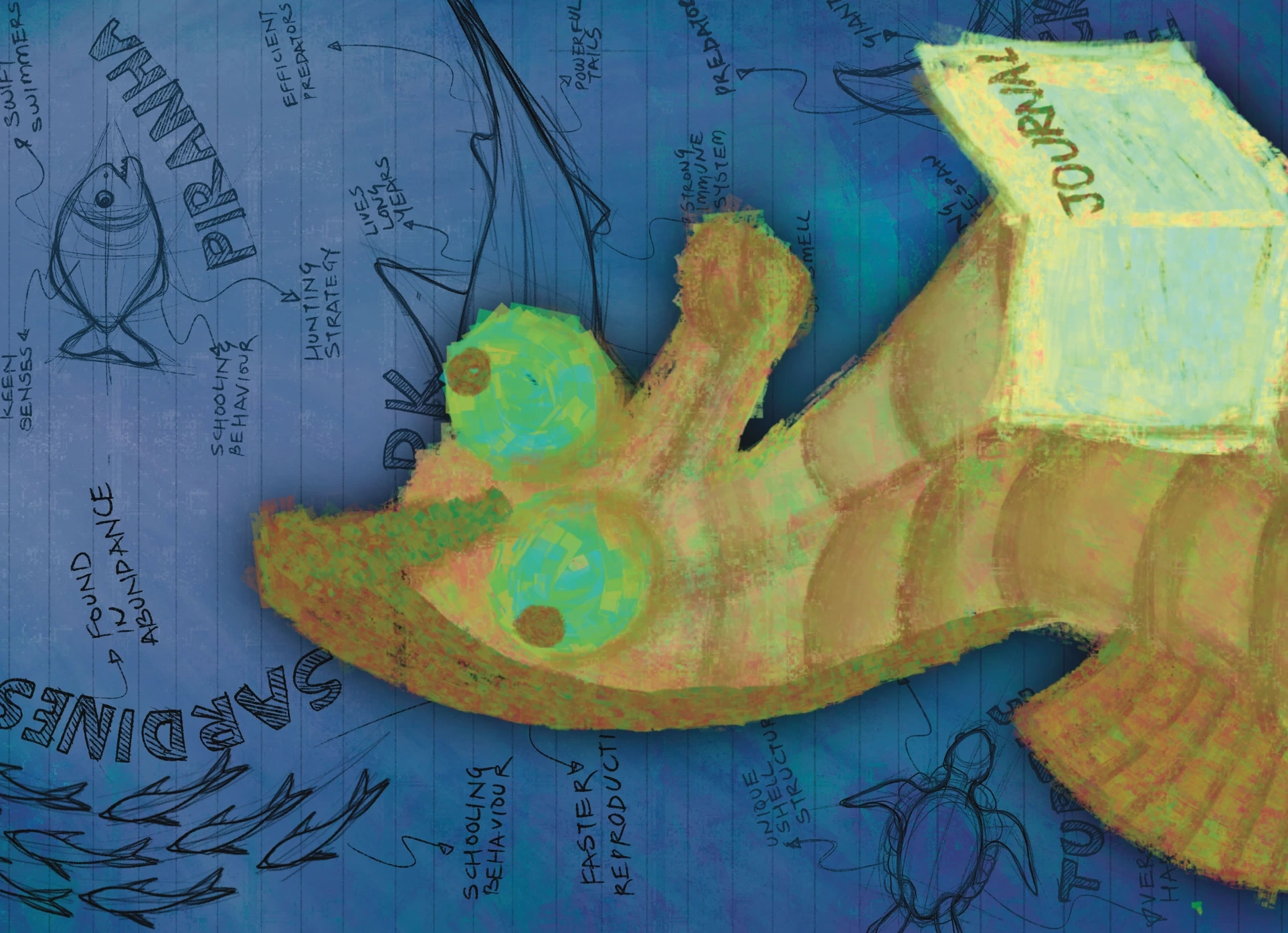
Me? or Me. is an illustrated zine about learning to belong to yourself.Written as a seahorse’s personal journal, it moves from the quiet weight of self-doubt into a vibrant rediscovery of purpose. It’s a story about empathy, embracing unconventional fatherhood, and finding strength in what makes us different.
Concept & Story development
Story in Poetic Form
Zine Design
Character Design
1 Week
All poems and written verses featured in this project are original works by Riya Patil.
( narrative development )
CONCEPT 1: Passing it on
Core idea: A narrative that moves from one spread to the next, following the life cycle of a seahorse.A transparent layer between the double spreads would create continuity between consecutive moments, allowing one spread to visually lead into the next.
01 : Passing eggs from the mother seahorse to the father
02 : Releasing baby seahorses from the father’s pouch
03 : Mating again
CONCEPT 2: Two sides of the same story
Core idea: A translucent layer carries shared characteristics of two contrasting ideas, with illustrations placed beside each other to highlight their differences and similarities.The butter paper acts as a visual bridge between the two sides of each spread.
01 : Courtship / Fertilisation: mating and passing eggs
02 : Pouch Incubation / Embryo Development
03 : Birth / Release & Survival
04 : Maturity: connected back to the opening spread, creating a continuous cycle
CONCEPT 3: Where do I fit?
Core idea: The narrative follows a seahorse questioning where it belongs in the world. The seahorse encounters different environments and attempts to adapt to them, but each one exposes a different limitation:01 : a terrible swimmer.02 : a digestive system inefficiency.03 : a lack of defensive mechanisms.Trying to fit in still unable to adapt.04 : finds his unique traitNo other shape fits. Only the seahorse does.The narrative ultimately shifts from trying to fit in to recognising that its uniqueness gives it value.

( type system )




Font Name: Arbotek Light
Font Name: BD Colonius Regular
Font Name: Neue Kabel Regular
Font Name: Droog Heavy

Font Name: Acier Bat Text Solid
I explored geometric and expressive typefaces before choosing a simple, readable direction that could sit within the geometric visual language without competing with the illustrations.
( sketch explorations )













( illustration style )
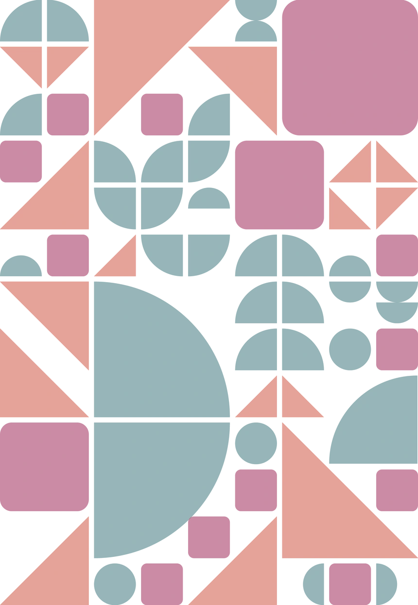
I took inspiration from childhood building-block games, where different shapes are assembled to create a larger structure. I used the same idea to explore the seahorse's struggle to fit into its surroundings.
Fluidity shown using Circles:
Used to represent the graceful movement of fish and the seahorse's relationship with water.
Vulnerability shown using Rounded Square:
Used to represent the seahorse's lack of teeth.
Aggression shown using Triangles:
Used to represent the sharpness and defensive qualities found in other sea creatures.
( colour palette )
Blue/Green:
Calm, depth and immersion in the underwater world.
Pink:
Vulnerability and softness.
Warm Yellow/Orange:
Intensity, tension and the seahorse's growing awareness.
( zine illustrations )
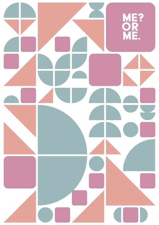
FRONT
BACK
SPREADS
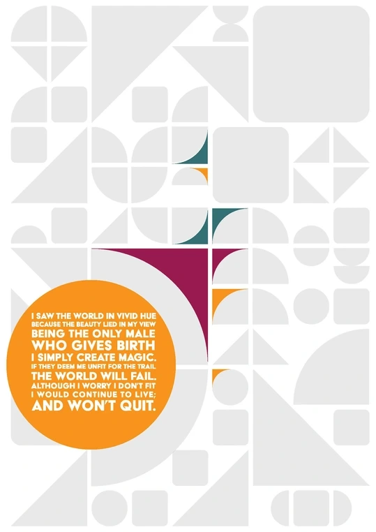
BACK POSTER
Like this project
Posted Oct 2, 2026
Me? or Me.: an illustrated zine about self-doubt and identity, told as a seahorse's journal with narrative development and zine/character design.
Likes
0
Views
0