BLISS

Riya Patil
BLISS
A PREMIUM NUTRITIONAL SUPPLEMENT BRAND DESIGNED TO INSPIRE EVERYDAY WELLNESS

( project overview )
( duration )
( deliverables )
Bliss is a hypothetical nutritional supplement brand created for people who see health as an investment in their everyday lives. The idea was to move away from the typical pharmaceutical look and instead build a visual identity that feels calm, premium, approachable and contemporary. As part of the project, I designed the brand identity and a packaging system for a range of supplement sachets, focusing on creating a clear and trustworthy experience.
Brand Identity
Packaging Design
1 Week
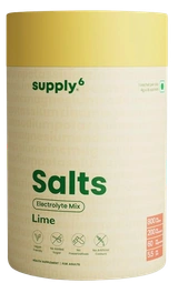
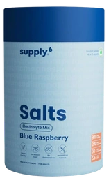
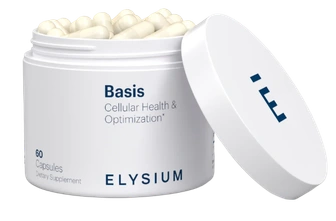
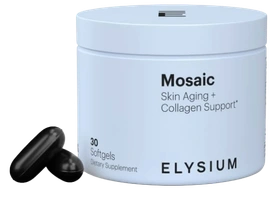
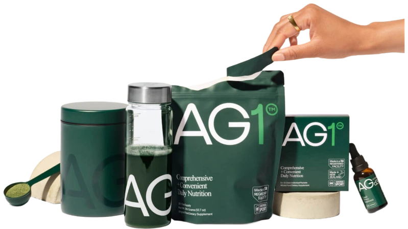
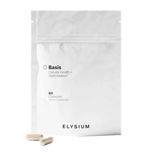
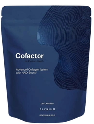
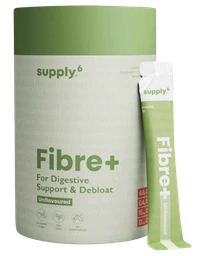
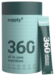
( market study-Elysium )



Minimal | Scientific | Sophisticated | Cool
Supportive | Reliable | Plant-Based
Minimal | Clean | Healthy

( logo development-Bliss )

















Premium | 35-50 Yr | Modern | Geometric | Versatile | Minimal

Font: New Astro Regular
( type system )


Font: New Astro Bold

Font: BC Alphapipe Regular

Font: Sinosans Regular

Font: Brigebe Regular

Font: Sonder Regular

Font: Avenir Book
( colour palette )
















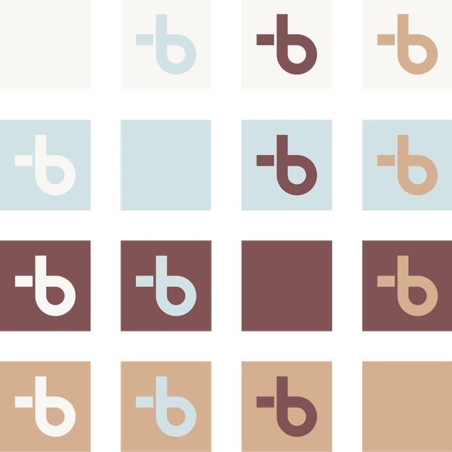





A color palette that evokes calmness and clarity. The soft white and muted blue bring a sense of purity, while the mauve and warm beige add earthiness, and sophistication. This balance makes the brand feel premium, holistic, and wellness-focused.







Warm Ivory | Pale Blue | Dusty Burgundy | Muted Sand
#f8f7f4 | #d1e1e5 | #815355 | #d4af91








( pattern design )






( packaging design ideation )
























( 3 variations )
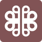
The icons for all three variants, are designed using elements from the Bliss logo to ensure a cohesive and unified brand identity. Each icon incorporates the brand’s signature geometric and minimalistic aesthetic, reinforcing a sense of harmony across the product line.
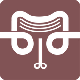

ANTI-AGING
JOINT VITAMIN
MEMORY SUPPORT
Features a stylized wrinkled face, emphasizing skin health and youthful vitality.
Represents a knee joint, symbolizing mobility and joint support.
Depicts a brain, reinforcing the concept of cognitive well-being.
( sachet design )
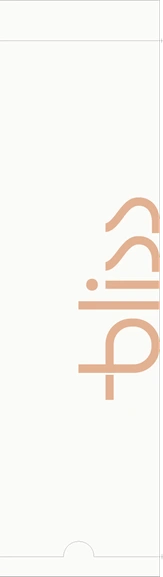
The sachet design follows a minimalistic, elegant, and premium aesthetic. Soft pastel tones create a calming and natural feel, reflecting the purity of ingredients. Tan colour exclusively used for logo and variant name. Each variant features a distinct icon representing its function for intuitive recognition. A subtle, repeating pattern at the bottom adds refinement. The overall aim is to minimize the traditional pharmaceutical look and create a more like a self care design.
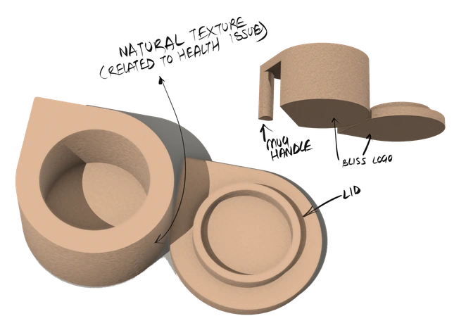
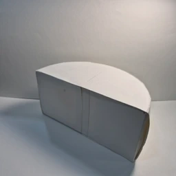
( packaging design-attempt 1)
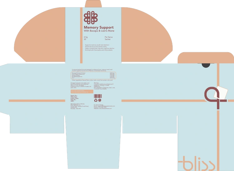
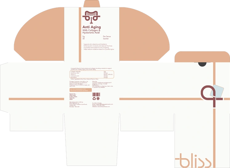
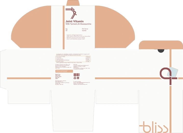
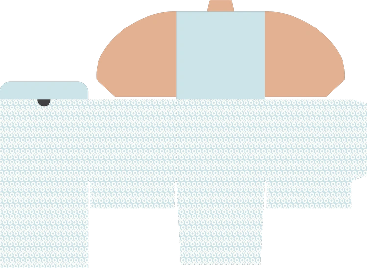
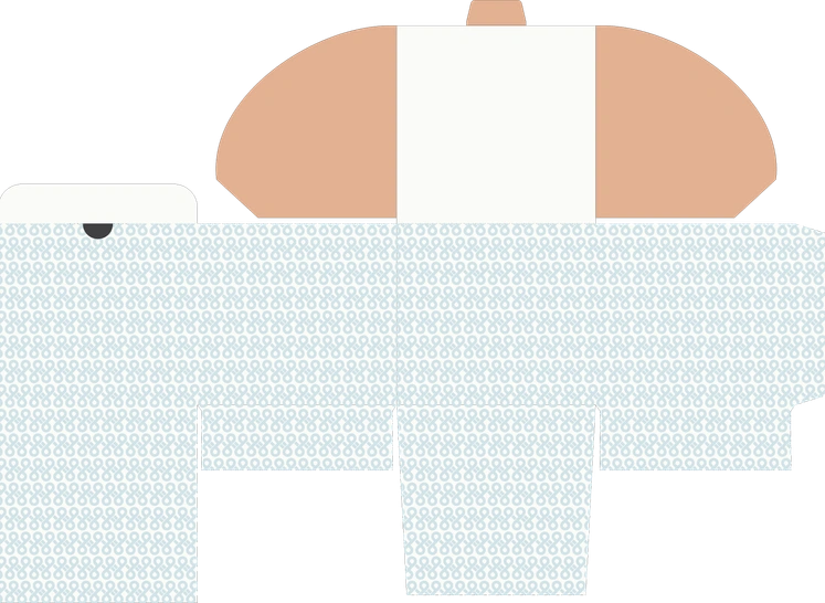
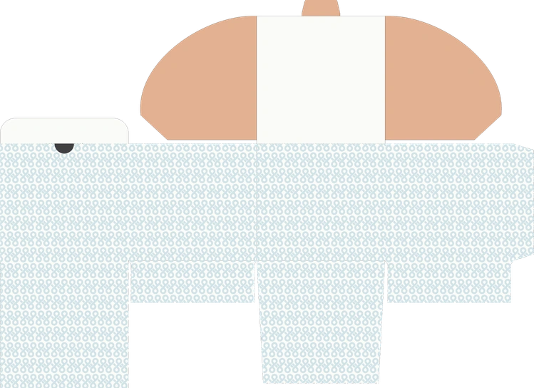
Bulky | Lacks Premium Look | Unorganised | Inadequate Space
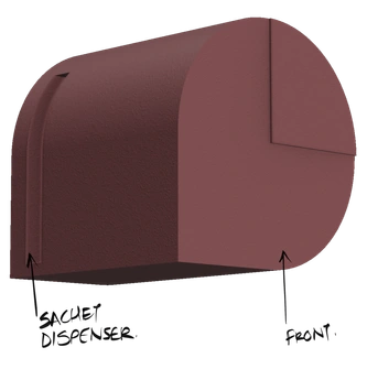
Locking Mechanism | Unconventional | Accessible | Stackable
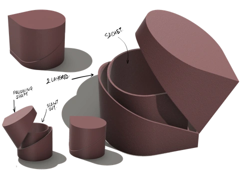
( packaging design-attempt 1)
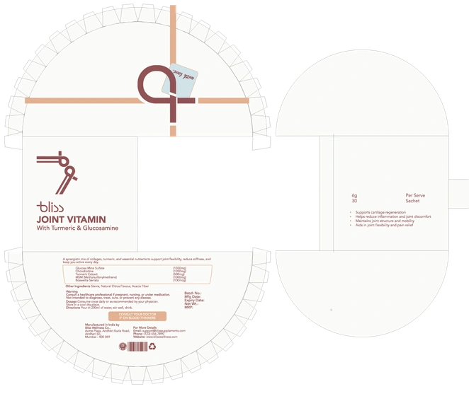
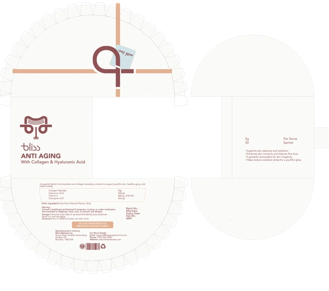
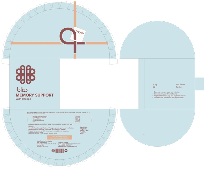
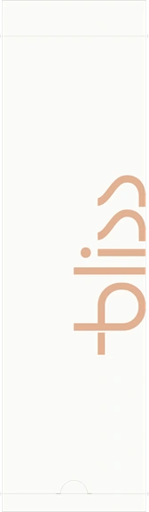
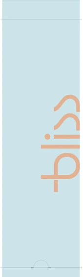
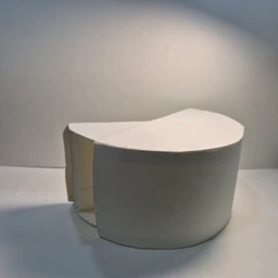
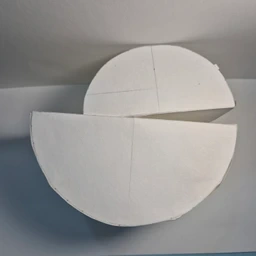
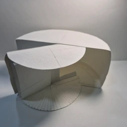
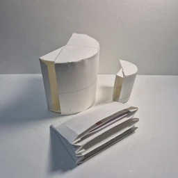
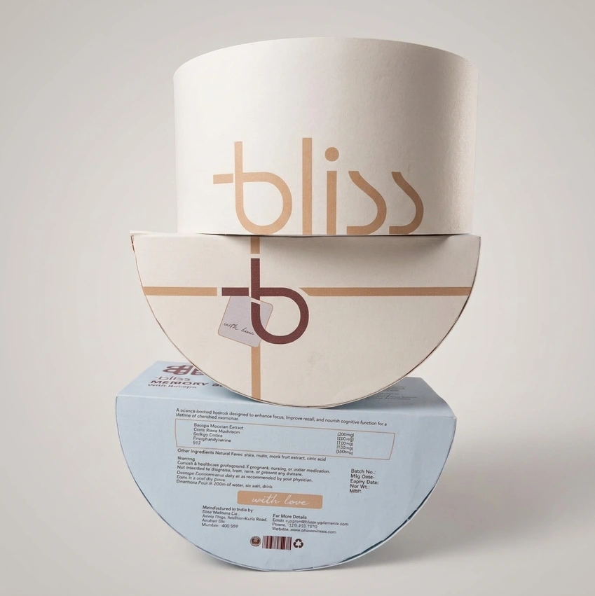
Dynamic | Adequate Space | Sectioned Sachets | Premium | Custom Dieline for Bliss
Like this project
Posted Oct 2, 2026
Hypothetical premium nutritional supplement brand with a calm, contemporary visual identity and packaging system across multiple product variants.
Likes
0
Views
0