Omnivent — Fintech Website & Mobile UX Redesign (Framer)

Ayomitide Fajuru


I redesigned Omniwire’s website to highlight its cutting-edge fintech offerings. Omniwire's aim was to present an attractive and modern to modern clients.
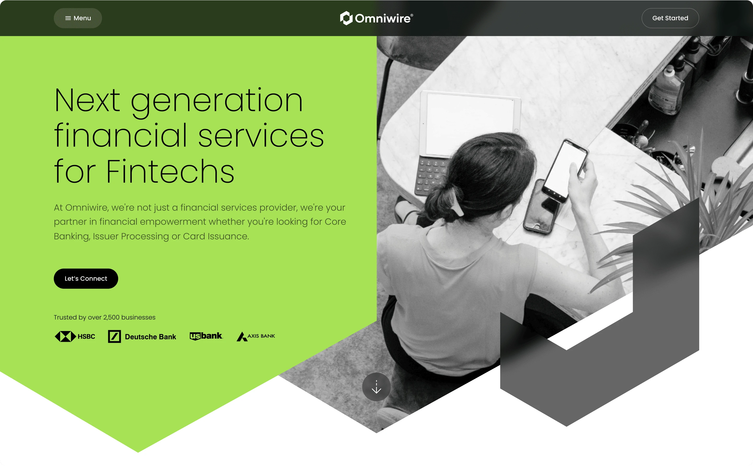
The hero section uses a bold palette: yellow-green, black, white, and a bright accent. My client's colors of choice resonate with innovation, trust, and technical excellence.
The website's layout balances striking images with clean typography for clarity and credibility.
In this section, I combined crisp typography with a balanced layout to communicate value. You can see how the Visual design elements come into play. The angled shapes, yellow-green accents, and contrasting dark backgrounds resonate with innovation and stability.
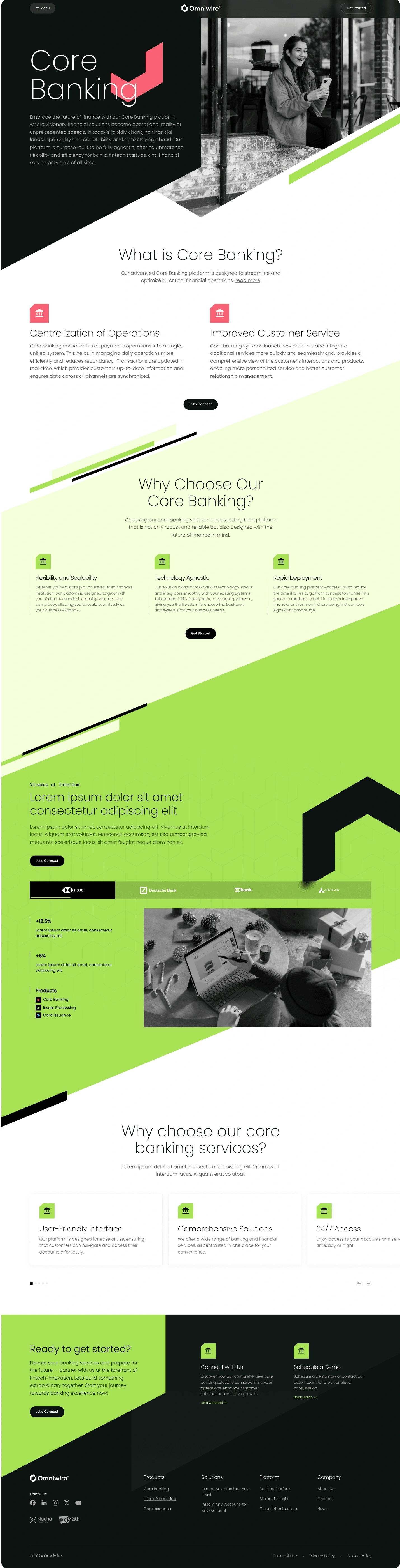
I ensured to optimize Content blocks for easy scanning. My aim was to ensure prospective users understand what Omniwire's Core Banking means.
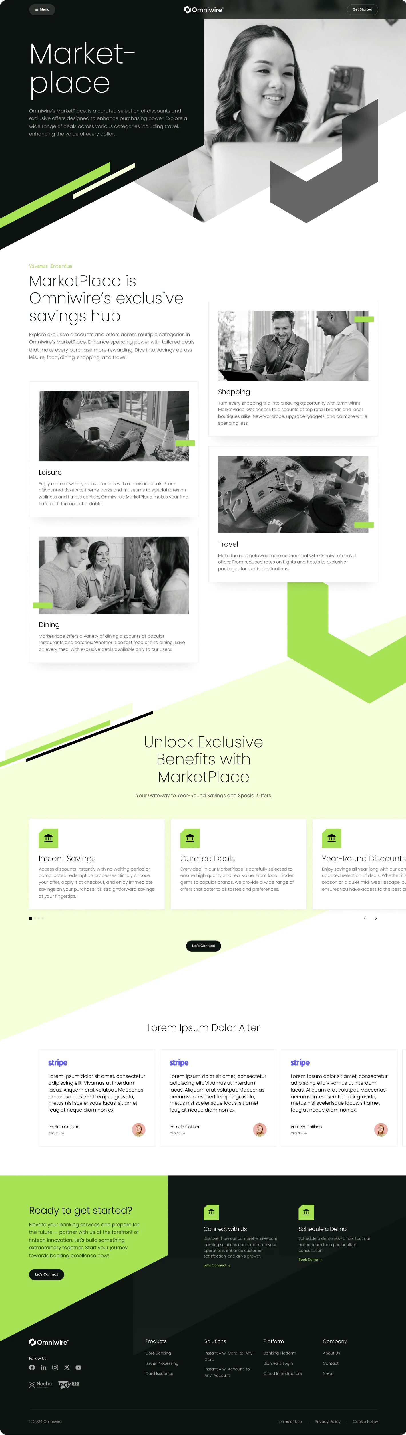
Marketplace
With the use of content cards, visitors see the instant value in each offer. I utilized icons, brief text, and clean imagery to aid quick scanning.
Below the cards, the value propositions are highlighted clearly. This reinforces what makes the marketplace special. I prioritized a readable page by using ample spacing, easy-to-read fonts, and accent color for emphasis.
The “Ready to get started?” CTA is placed where interested users naturally land in this flow. This hack encourages them to connect or explore more.
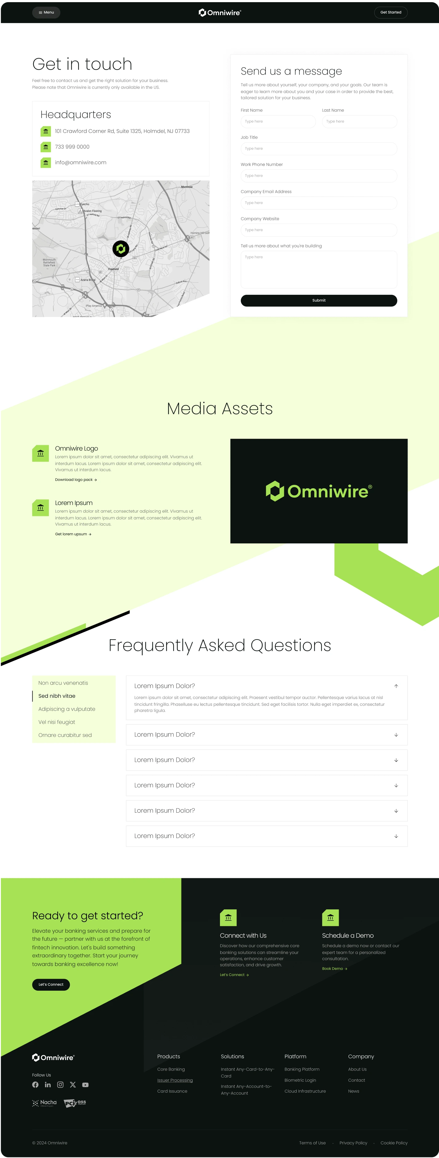
Get in Touch
This section provides clear paths for visitors to reach out, get support, and find essential brand resources all in one place. It starts with a concise “Get in touch” form alongside HQ contact details and a map — for credibility and ease of access.
Below that, “Media Assets” offers downloadable resources (e.g. logo packs), reinforcing professionalism and brand consistency. The FAQ section is laid out with expandable items — making it easy for users to find answers without getting overwhelmed.
Throughout, content blocks are cleanly separated, headings are clear, input fields are labeled properly, and ample white space ensures the layout isn’t too dense. The call-to-action “Ready to get started?” anchors the flow, guiding the user from information into engagement.
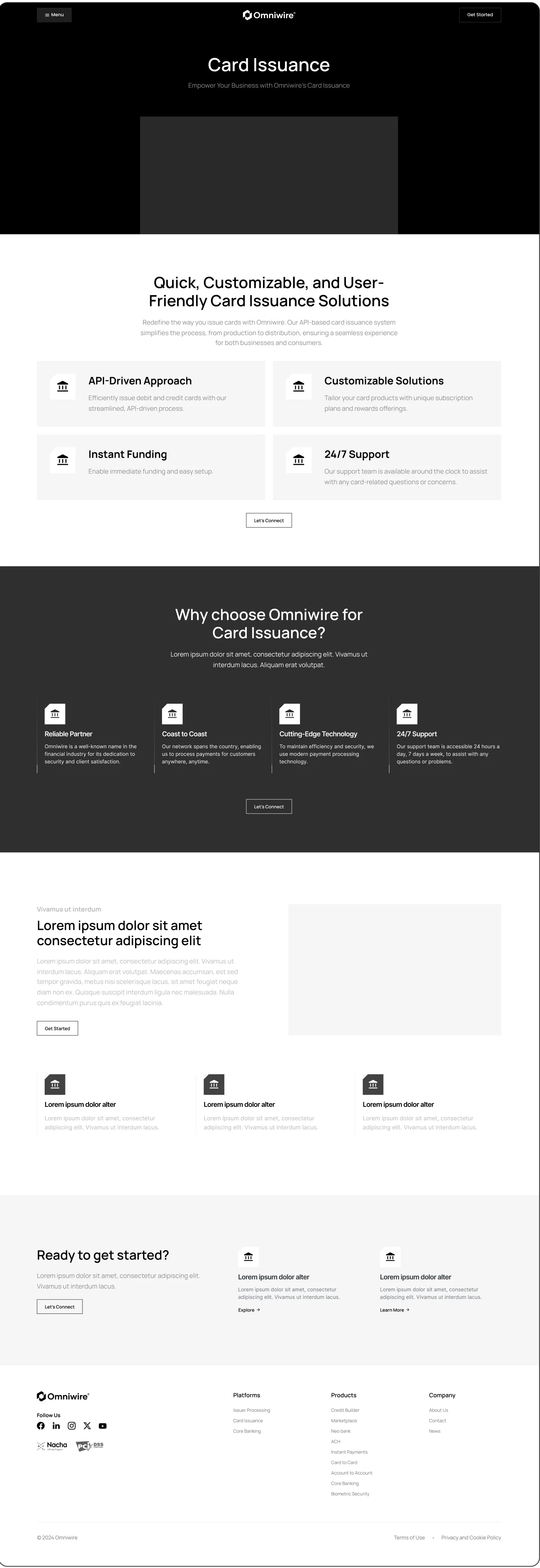
Card Issuance
I applied a design system with reusable components to lay out different offerings. The layout uses whitespace and distinct content blocks so each feature is easy to read. The visual balance helps users understand Omniwire's offers at a glance.
Because the page's components are modular, this structure scales well. You can add or adjust feature blocks without disrupting the overall design.
The call-to-action at the bottom connects it all. Omniwire users know exactly what to do next.

The Mobile Experience
Omniwire’s Mobile UX Refresh
Omniwire aimed for a mobile-first redesign. This would make its product pages, features, and pricing easier to find and use on smaller screens.
I made sure to emphasize clarity and simplicity. The content blocks fit narrow screens. Hero images resize nicely. Buttons are easy to reach with your thumb. Text is clear and easy to read, so no pinch-zoom is needed.
Core Features Shown Clearly
In mobile view, key features like “Core Banking,” “Card Issuance,” and Marketplace are shown as simple cards. Each card has an icon and a short headline.
The information hierarchy is clear. Titles, descriptions, and CTAs stack vertically. This helps users understand what they see as they scroll. The visual style—bold accents, contrast, and geometry—stays true to the desktop brand experience.
Like this project
Posted Sep 13, 2025
Redesigned Omniwire's website and mobile UX for better engagement.


Social Media Management for The Wire: Stripped

Email redesign for Uber

YouTube Content Management for Cars in Reach