Email Campaign for Uber

Ayo Fajuru


The Localization Gap
Uber’s global email templates suffered from a critical "Cultural Disconnect" in the Nigerian market.
The corporate, Westernized tone failed to resonate with the hyper-specific nuances of the Lagosian Millennial/Gen Z demographic,
The Problem: Stagnating Click-Through Rates (CTR) and high churn signals.
Uber’s campaigns were suffering from "Brand Fatigue."
The messaging was too corporate and generic for the vibrant Nigerian youth.
What I Did
UX Research: Lagos lifestyle, Abuja hangouts, cross-state travel, etc.
Refined the header structure, clarified the CTAs, and optimized for mobile.
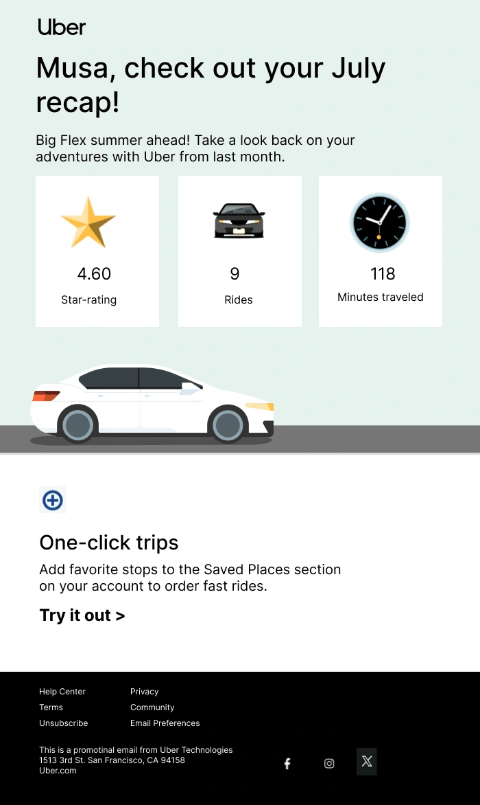
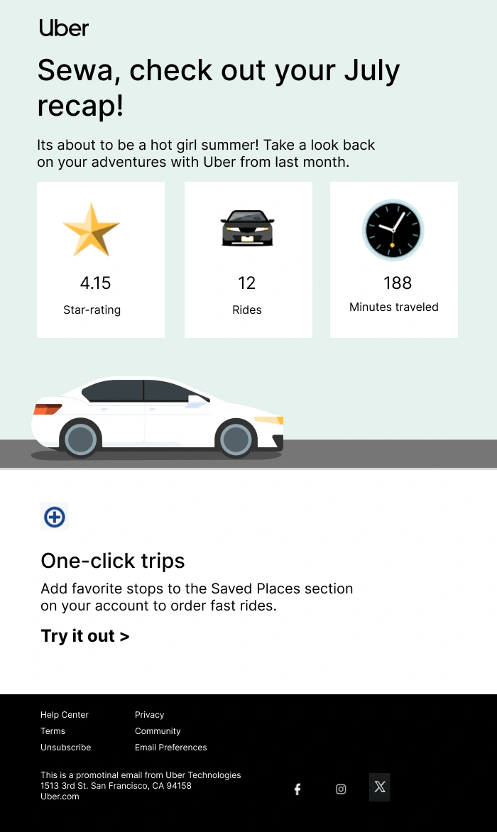
Created brand-centric visuals, that fits youthful style.
Designed thumbnails and templates with consistent color, typography, and branding.
Segmentation and dynamic content. Now, parts of the email change based on what readers do and like.
Optimized for deliverability: fast load times, responsive design, and ensuring readability across devices.
Outcomes:
Engagement: 1.5x lift in engagement by solving the "Cultural Relevance Gap."
25% increase in Click-Through Rate (CTR) by replacing generic copy with culturally specific hooks (Lagosian Gen Z context).
Clarity: Optimized visual hierarchy to prioritize conversion for mobile-first users.
Systemization: Turned a one-off campaign into a Repeatable Content Engine.
Speed: Created a master framework that allows the marketing team to deploy localized campaigns in minutes, not hours.
Scalability: Delivered a "Plug-and-Play" template architecture, ensuring consistency across high-frequency send cycles.
Like this project
Posted Apr 11, 2024
I transformed the Uber campaign into a highly segmented Email that appeals to the young Millennials & Gen Z population of Nigeria, through targeted segmentation
Likes
1
Views
9
Clients
Uber