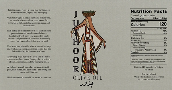
Juthoor Olive Oil company
Abir Odeh
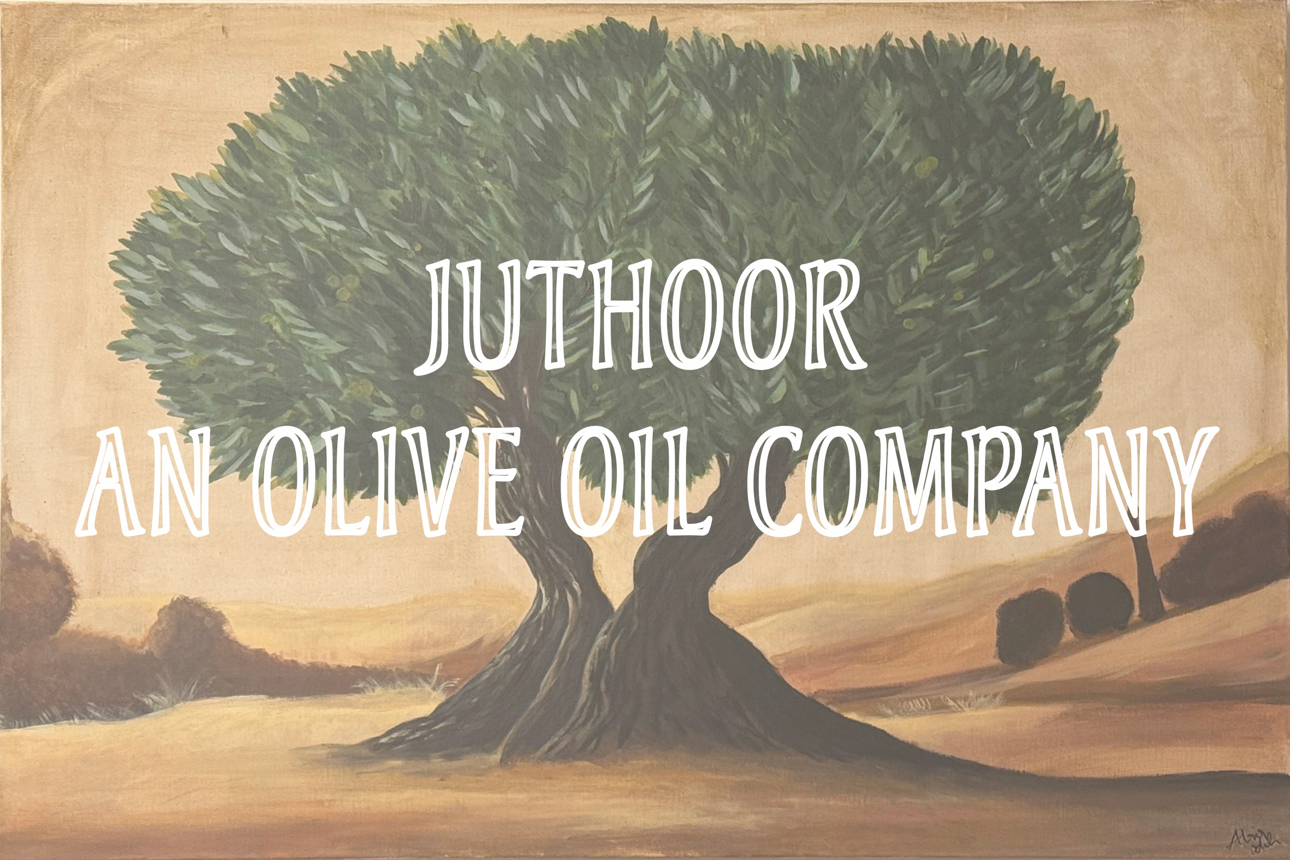
This is an original painting, not created for the brand but painted by me.
Brand Origins
The brand was born from the resilience of a local Palestinian Family who came here seeking safety when war broke out in 2023. Even from afar, their hearts remained rooted in home and in those they left behind.
When the war threatened to close borders and silence the harvest, they looked for a way to keep the lifeline of their people alive. They began bringing olive oil directly from Palestinian Farmers - not as a business at first, but as a way to do their part for their people.
Each bottle carries the stories of families who refuse to let their land or legacy fade. What started simple as sharing "Olive Oil from the Holy Land" has grown into a brand with purpose: to honor the farmers who handpick each olive, to preserve a living heritage, and to sustain the community that continues to nurture these sacred trees even in hardship.
Every drop of oil supports Palestinian farmers and now helps the family's daughter pursue her education - creating a circle of hope from a heartbreaking situation.
Each bottle or tank contains single-source oil to ensure the legacy of the farmers' trees.
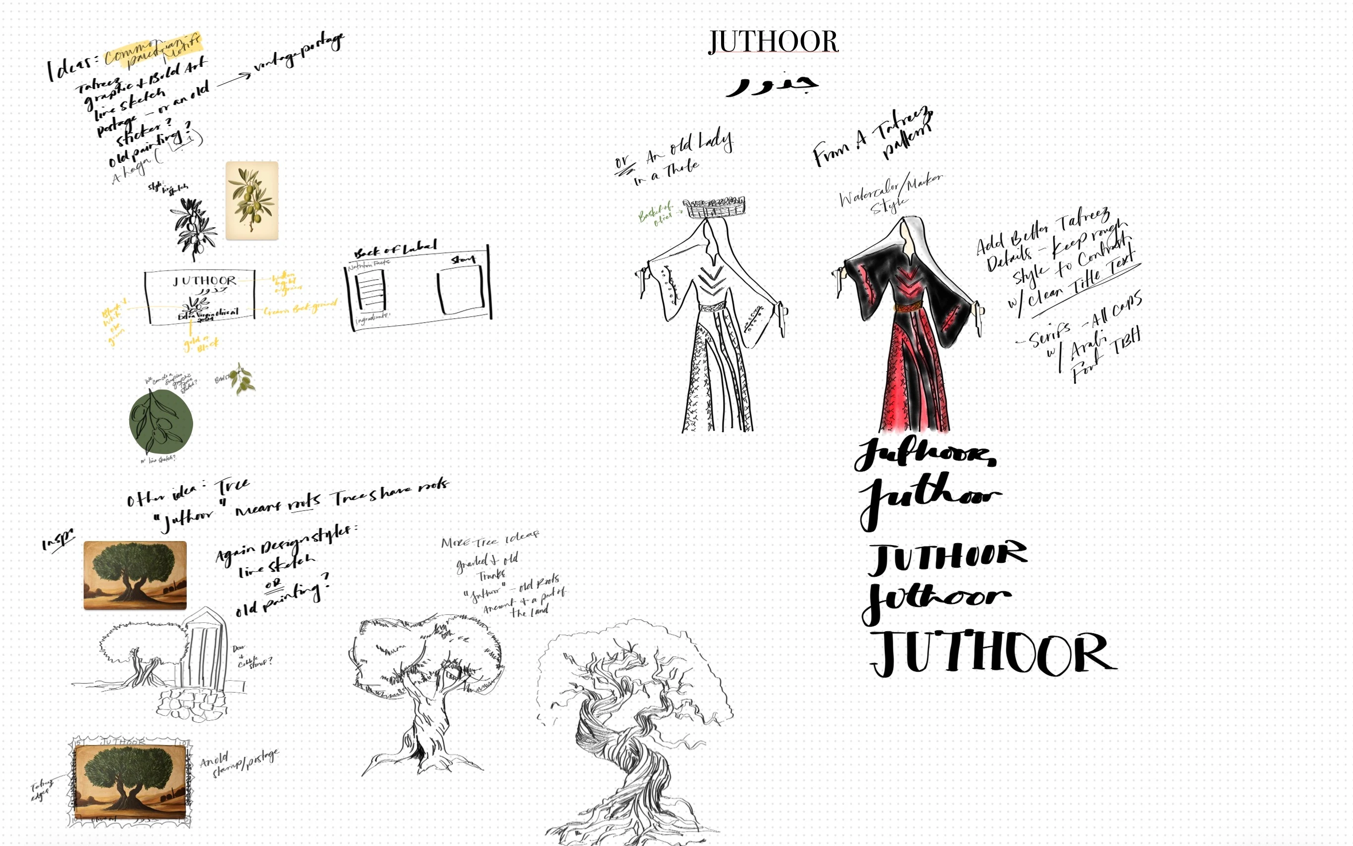
My inspiration was drawn from traditional Palestinian embroidery patterns that are repeated and passed down through each generation.
The logo was illustrated by hand
Our Brainstorming Process
The client wanted a logo that represents the traditions and culture of Palestine - one that shows the meaning and significance of olive oil to its people.
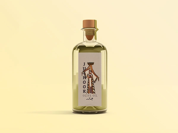
We discussed motifs such as olives, glass bottles, baskets olive trees, and typographic designs inspired by traditional Palestinian embroidery. In the end, we chose to center the design around a woman, known in Arabic as a "Haja."
"Haja" is a term of respect and endearment for an older woman. Literally, it means a woman who has completed her pilgrimage to Mecca, but in everyday use, it also honors women who are accomplished and wise.
In the logo, she is wearing her traditional those, along with a shawl and coin cap, and she balances a basket of olives on her head - just as women once did in the olive harvest seasons of the past.
Thobes are traditional garments worn on special occasions today, but in earlier times, they were part of daily life for Palestinian women, both young and old. Each thobe was handmade and embroidered with motifs that reflected the village or region of the woman who wore it.
The client chose this design over there other because it tells a story - a story of how olives are collected, pressed, cared for, and revered in Palestinian culture.
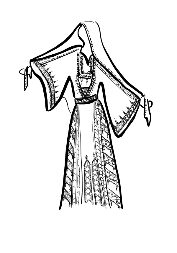
The black and white (pen sketch)
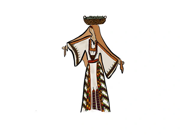
The illustration after I implemented the approved color palette.
Brand Identity
This was written for the the client to use as their story on the product.
Juthoor means roots - a word that carries deep memories of land, legacy, and belonging.
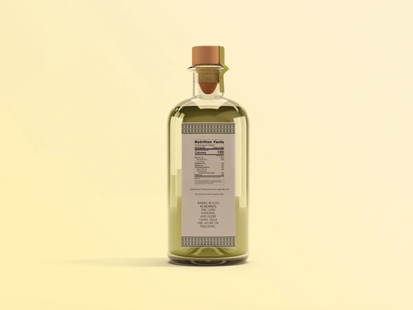
Our story begins in the ancient hills of Palestine, where the olive trees have been rooted for centuries as hallmarks for resilience, peace, and steadfastness.
Each bottle holds the story of those lands and the generations who have harvested them- handpicked with care, cold-pressed in small batches, and poured with intention from family groves that have endured time and turmoil.
This is not just olive oil, it is the taste of heritage and resilience, a living connection to soil that had fed and healed for thousand of years.
Every drop of oil honors the trees and the hands that nurture them, even through the turbulence of war, colonization, and the changing times.
At Juthoor, we press our oil as our ancestors did - pure, unblended, and deliberate - preserving the essence of Palestine.
This is more than olive oil, it's a return to the roots.
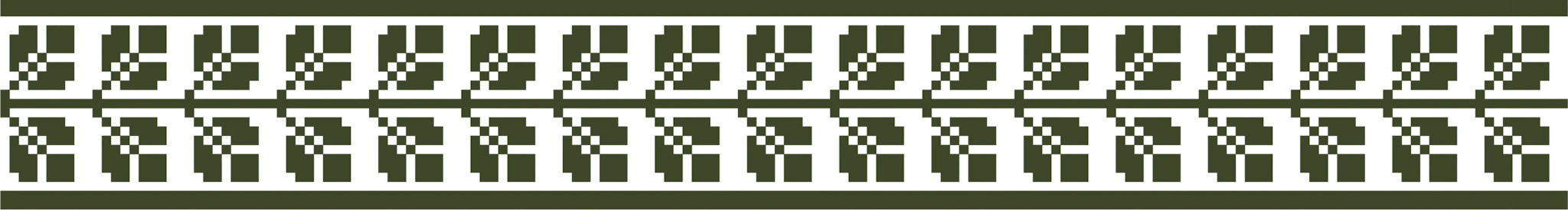
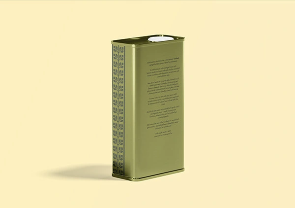
This is a classic Palestinian embroidery motif.
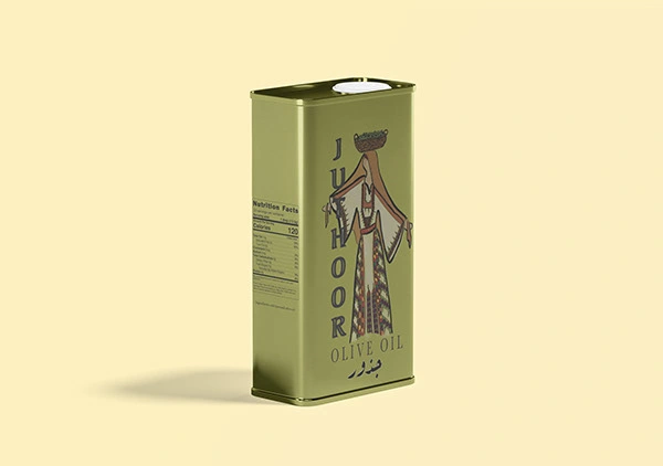
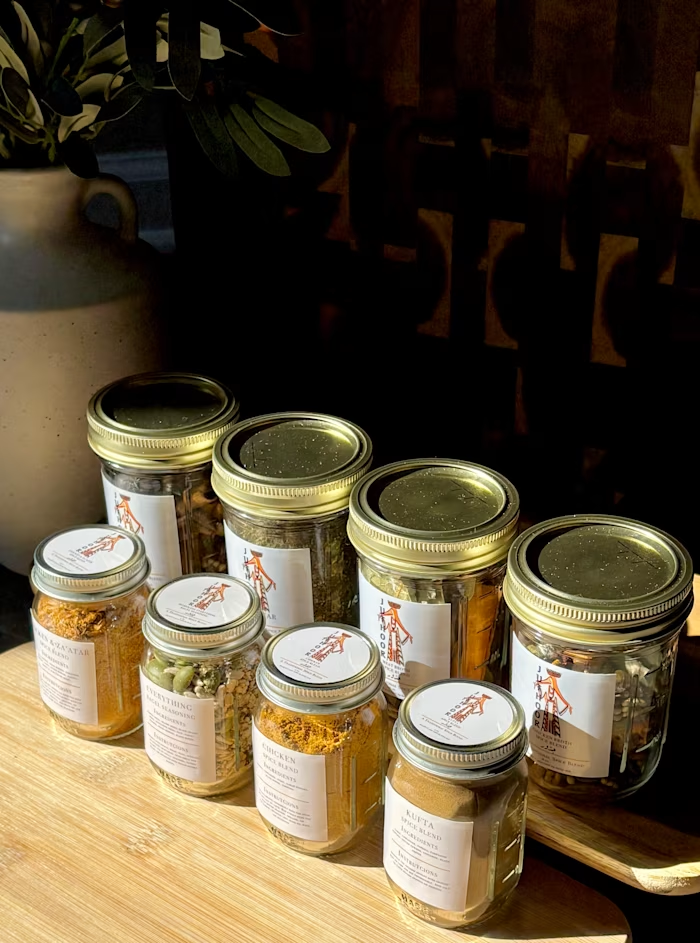
The olive oil is imported in big tins of 4 gallon volume
Like this project
Posted May 7, 2026
Juthoor is a local brand that sources their olive oil directly from Palestinian farmers. The client wanted something that evoked the origins of the product.