Knitty Gritty Witty Fiber Art design project
Abir Odeh
Brand Creation & Rebrand
Knitty Gritty Witty began as a little hobby that expanded into a business venture - an ode to handmade craftsmanship, natural materials, and quiet rebellion. Rooted in tradition but full of playful energy, the brand set out to redefine modern knitwear as: sustainable, soulful, and stitched with meaning.
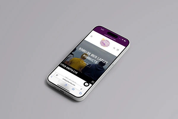
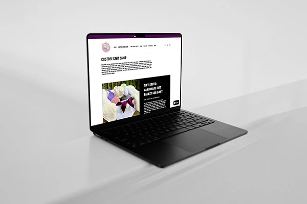
This project captures the full evolution of Knitty Gritty Witty, from its original DIY beginnings to a polished, cohesive brand identity. What started with a homemade logo and ad-hoc visuals grew into a strategic rebrand ground in purpose and personality.
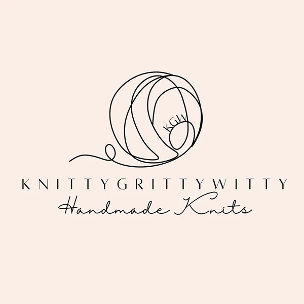
The original logo
Before
Organic, but lacking structure
The original brand leaned heavily into heart and message, but lacked visual consistency. While in conveyed warmth and support for social causes, it didn't fully refelct the witty, vibrant energy behind the products- or the premium, handmade nature of the work. The visual language felt too generic and didn't capture the brand's full story.
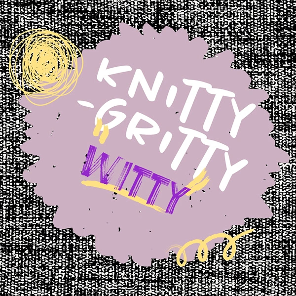
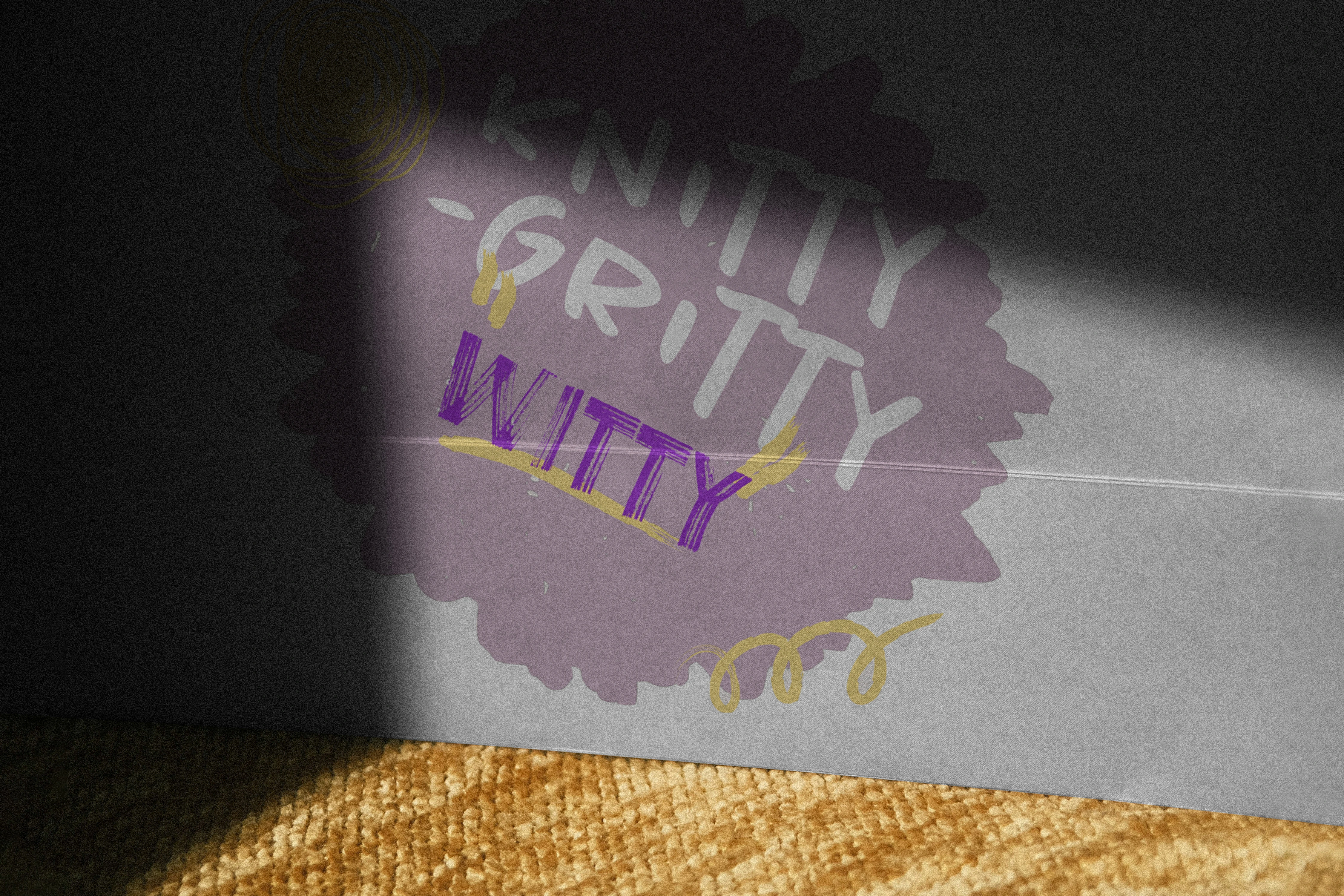
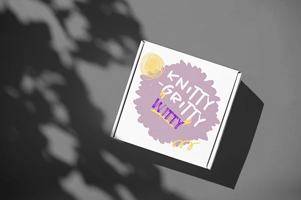
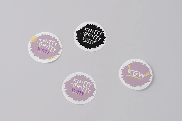
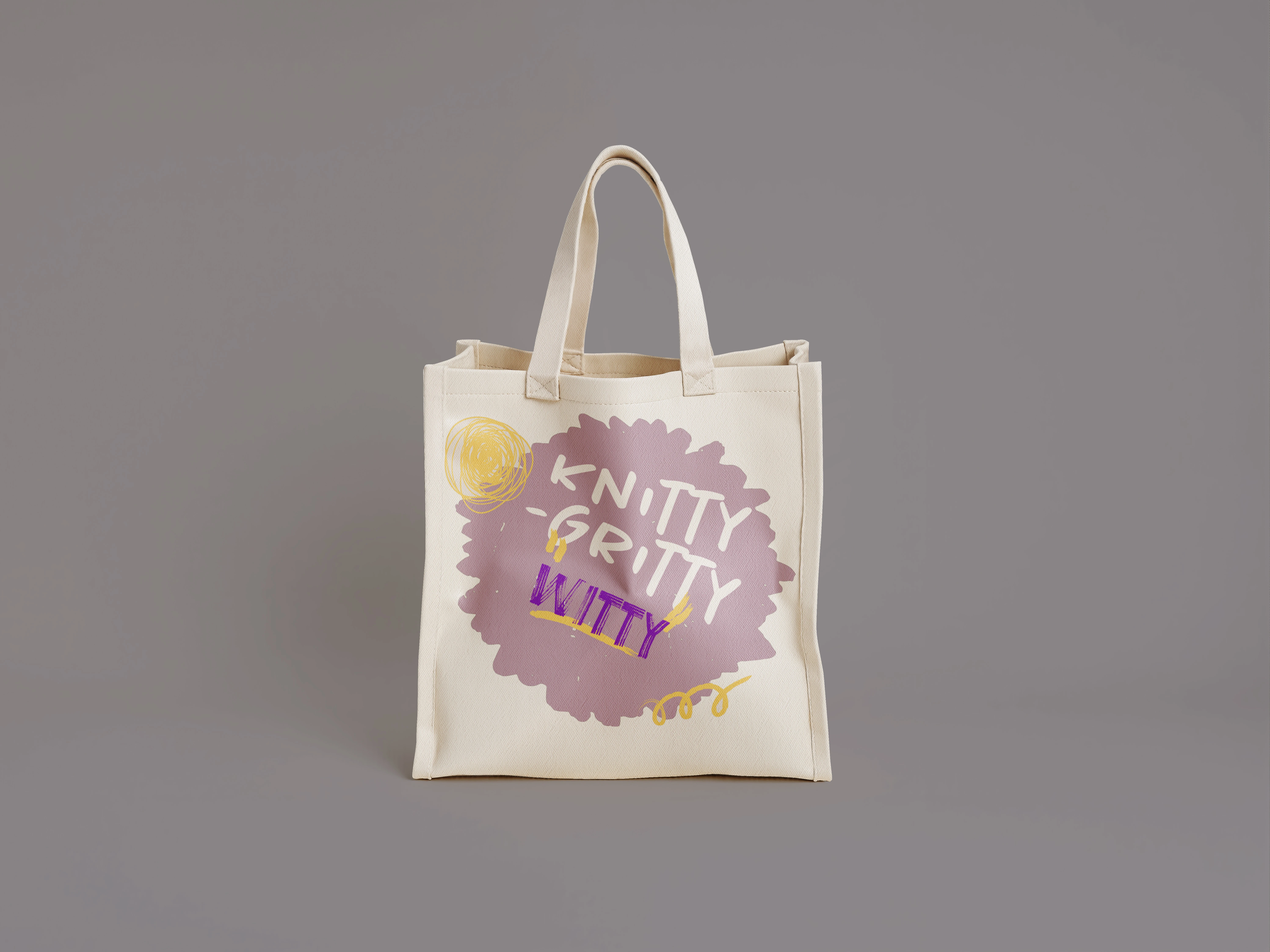
The rebranded logo
After
Playful, purposeful, and hand-touched.
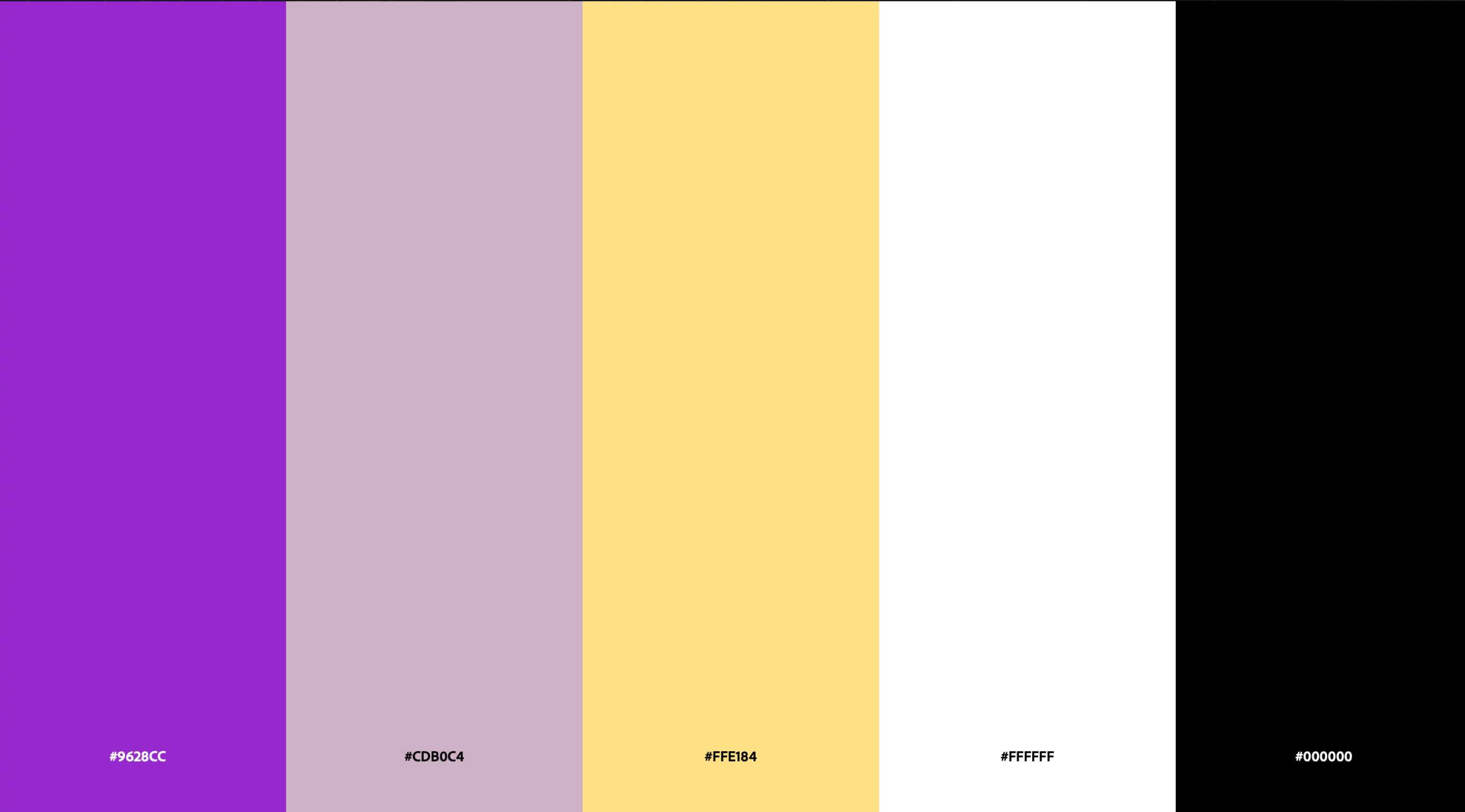
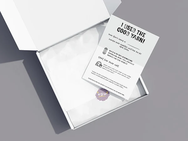
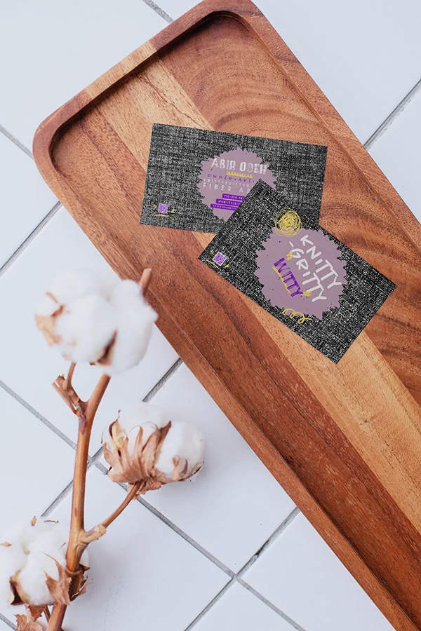
The rebrand brought Knitty Gritty Witty to life. The new logo highlights the handmade spirit through bold typography and organic imperfections. A color palette of soft purples, punchy violets, and energetic yellows expresses both warmth and creative edge. The gritty textured background contrasts with clean layouts to reflect both the "gritty" process and the polished result.
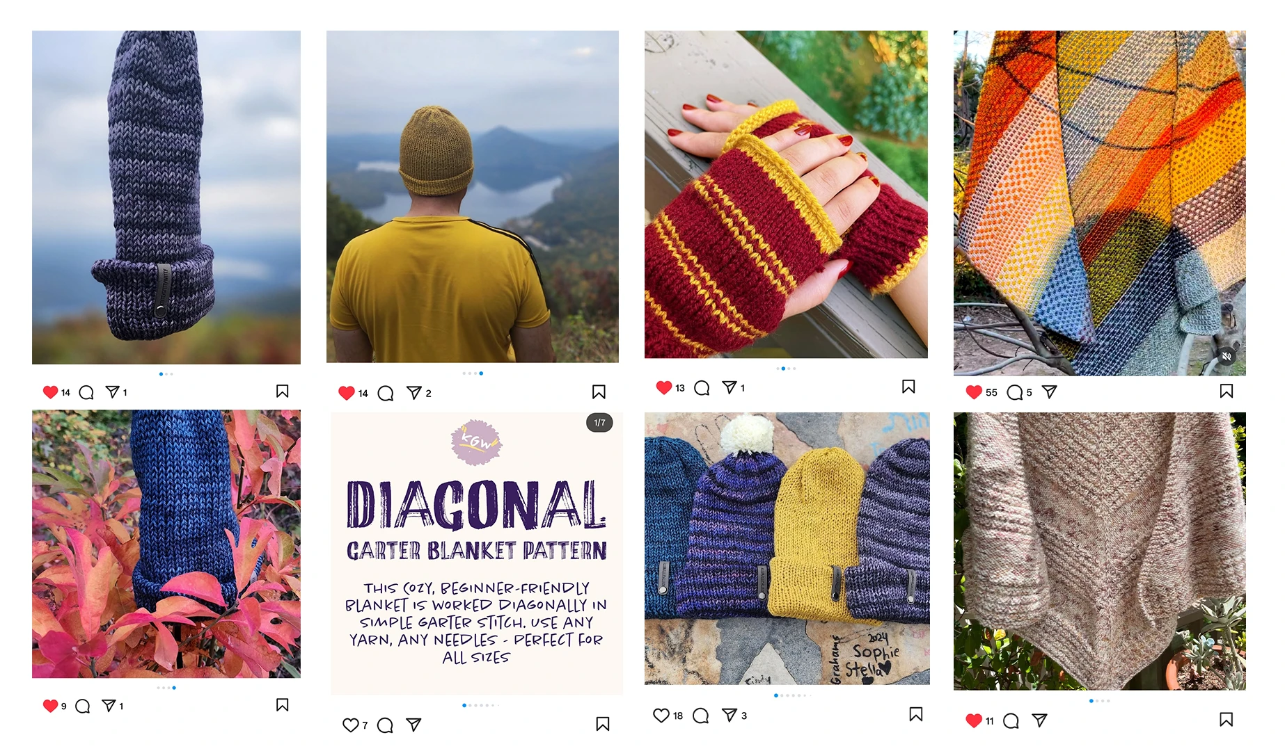
Custom embellishments nod to fiber arts - loops, yarn strands, and tiny motifs- woven subtly into the visual system. Every decision, from type choice to color pairing, was made to reflect the brand's essence: cozy, clever, and little defiant.
Like this project
Posted May 7, 2026
Knitty Gritty Witty, an active small fiber arts business, this project showcases its rebranding to better reflect its unique personality.