QuadLab Brand Identity Development
Zoi Zelo
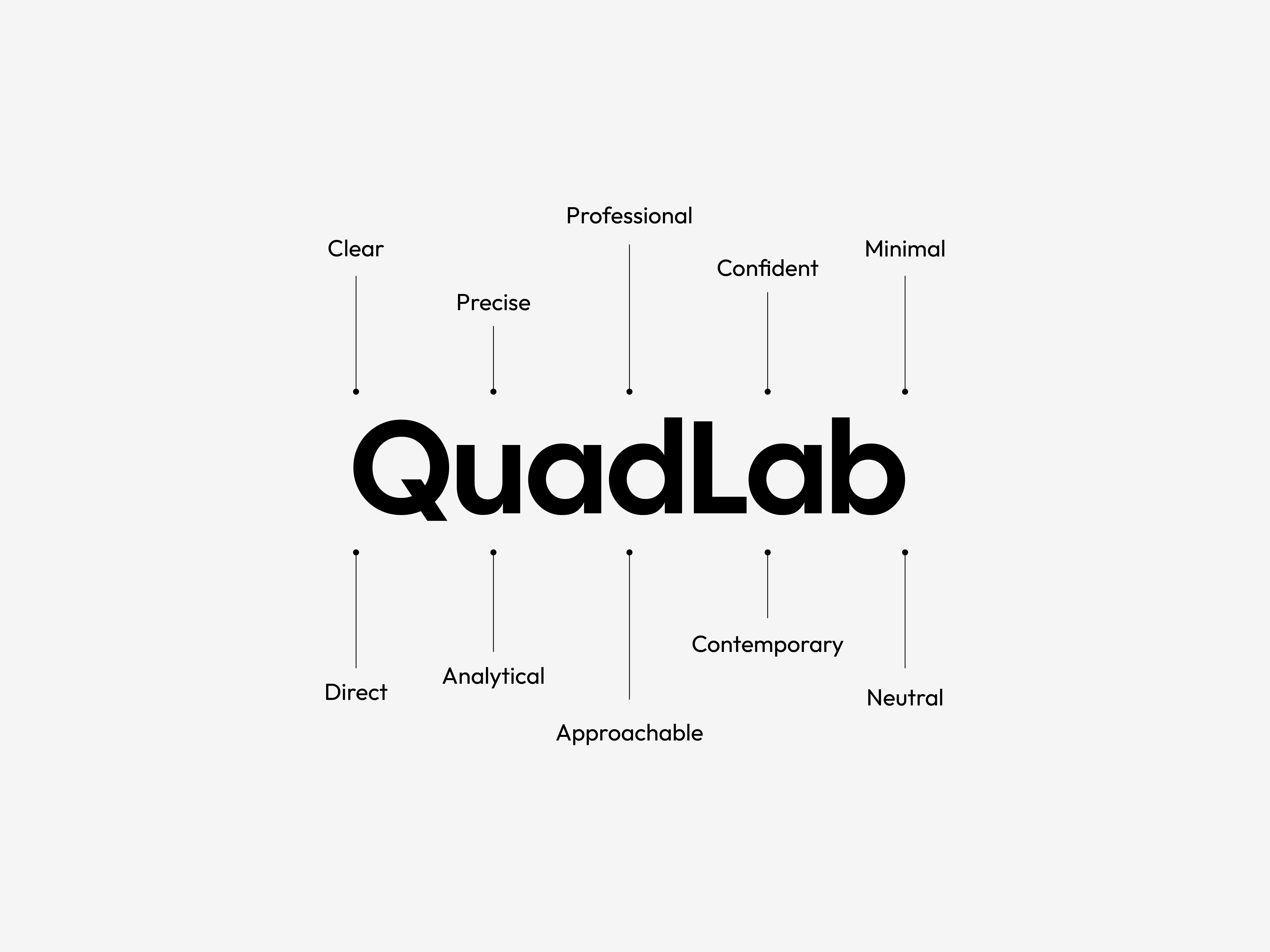
QuadLab — Brand Identity
QuadLab is an architecture studio defined by clarity, precision, and visual structure. The brand identity was developed to reflect an analytical yet approachable character—balancing professionalism with contemporary minimalism.
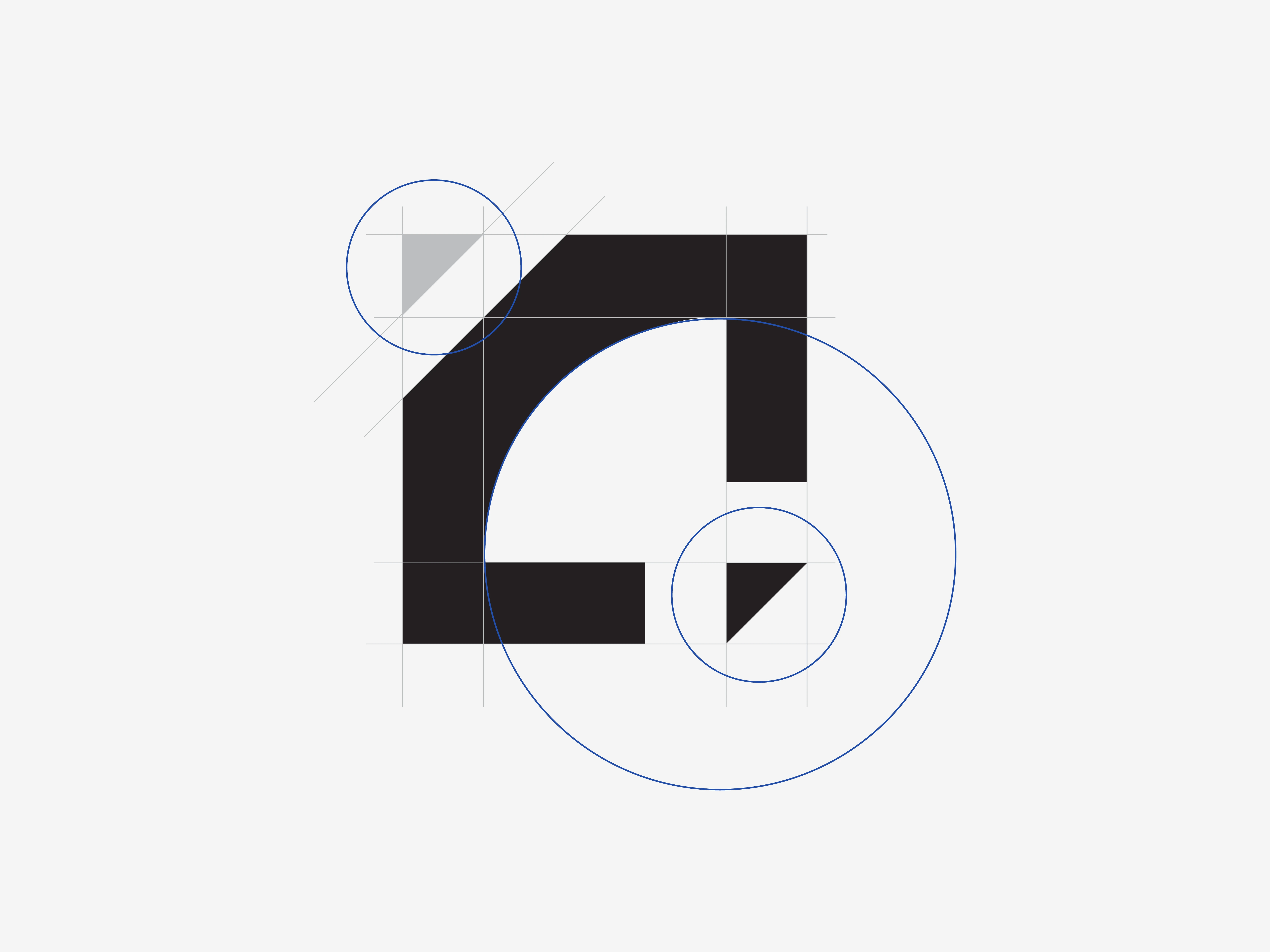
Logo Concept
The visual system is rooted in architectural logic: a strong, structured wordmark, a restrained color palette inspired by blueprints and materiality, and a typographic hierarchy that emphasizes legibility and confidence. Cobalt blue introduces a subtle experimental “lab” energy, while neutral tones provide balance and breathing space.
Every element—from logo variations to typography and layout—was designed to ensure consistency across applications, resulting in a clear, direct, and timeless identity that mirrors QuadLab’s architectural philosophy.
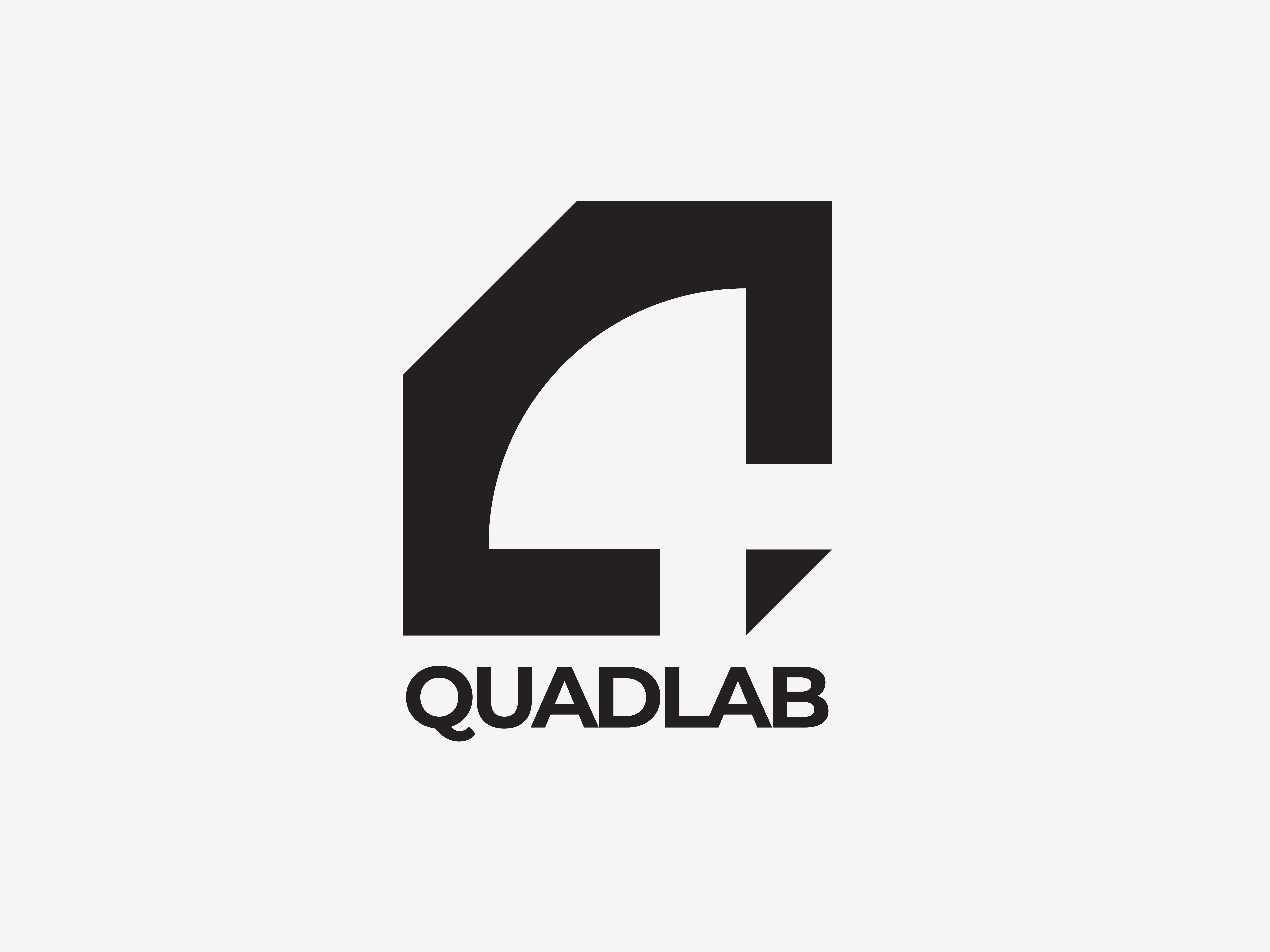
Final Logo
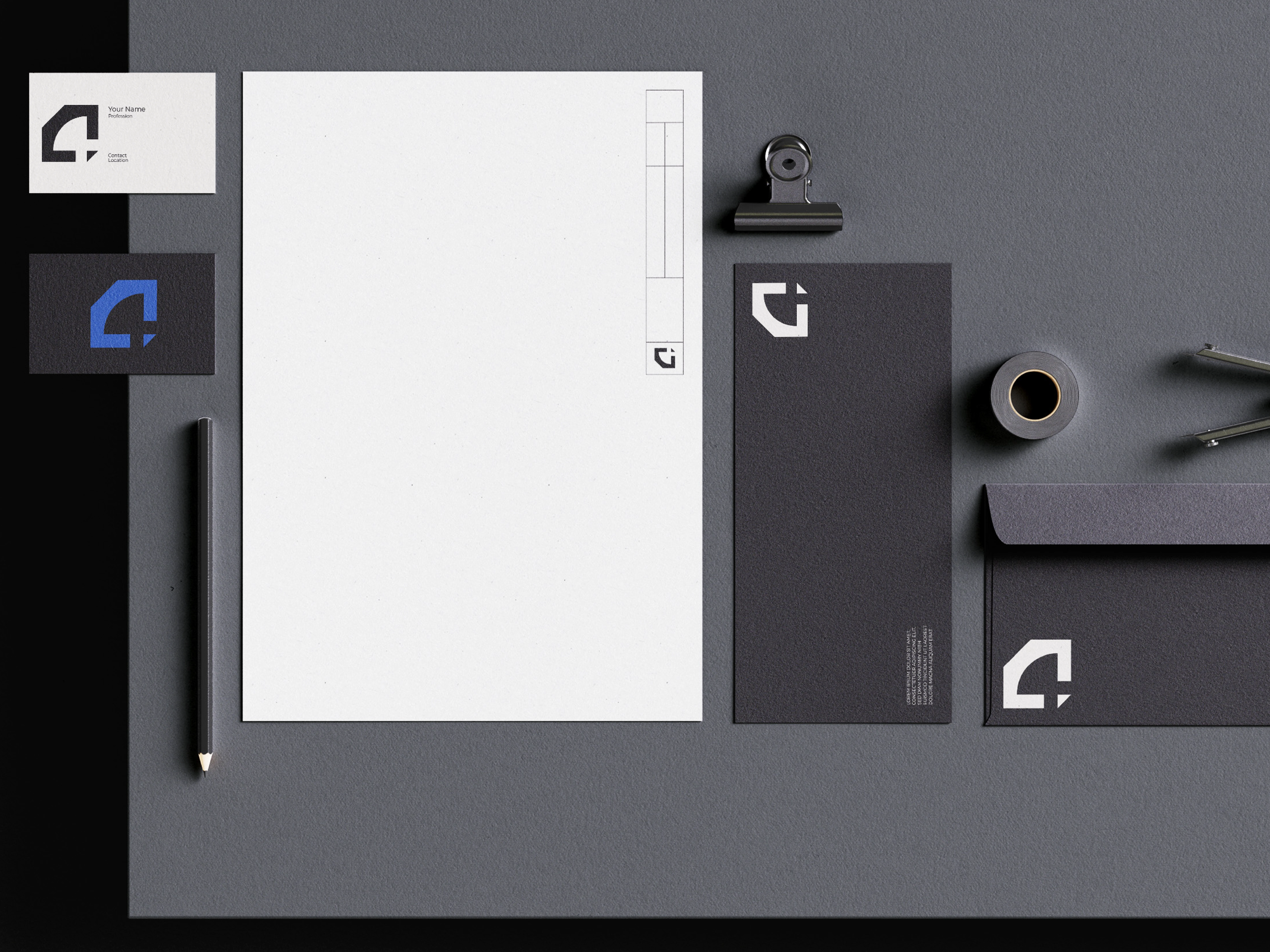
Stationary Design
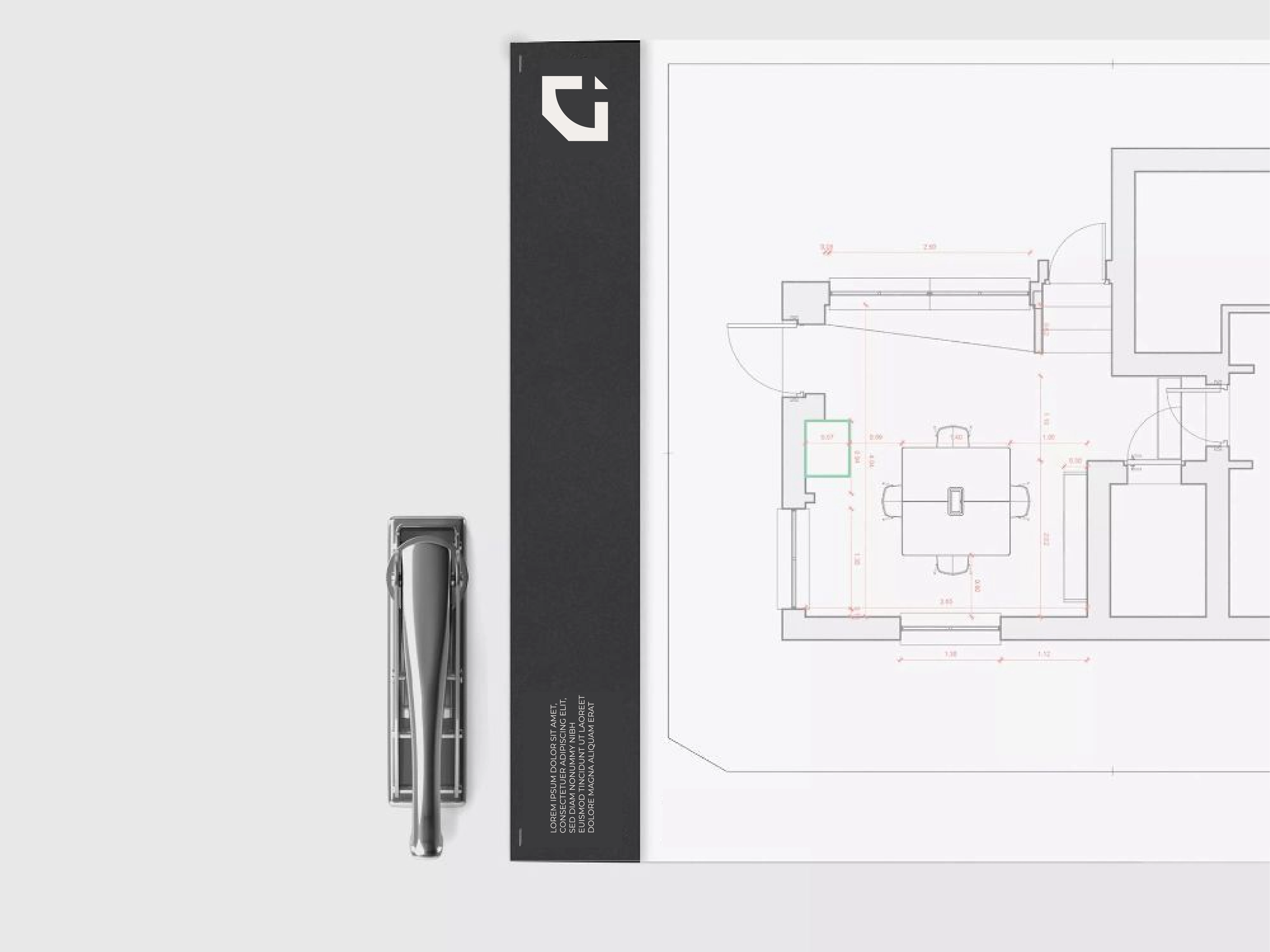
Stationary Design
Like this project
Posted Jan 26, 2026
QuadLab is an architectural brand identity rooted in clarity and precision, using minimal structure, strong typography, and blueprint-inspired color.