Swan & Satin Ballet Academy Brand Identity
Zoi Zelo
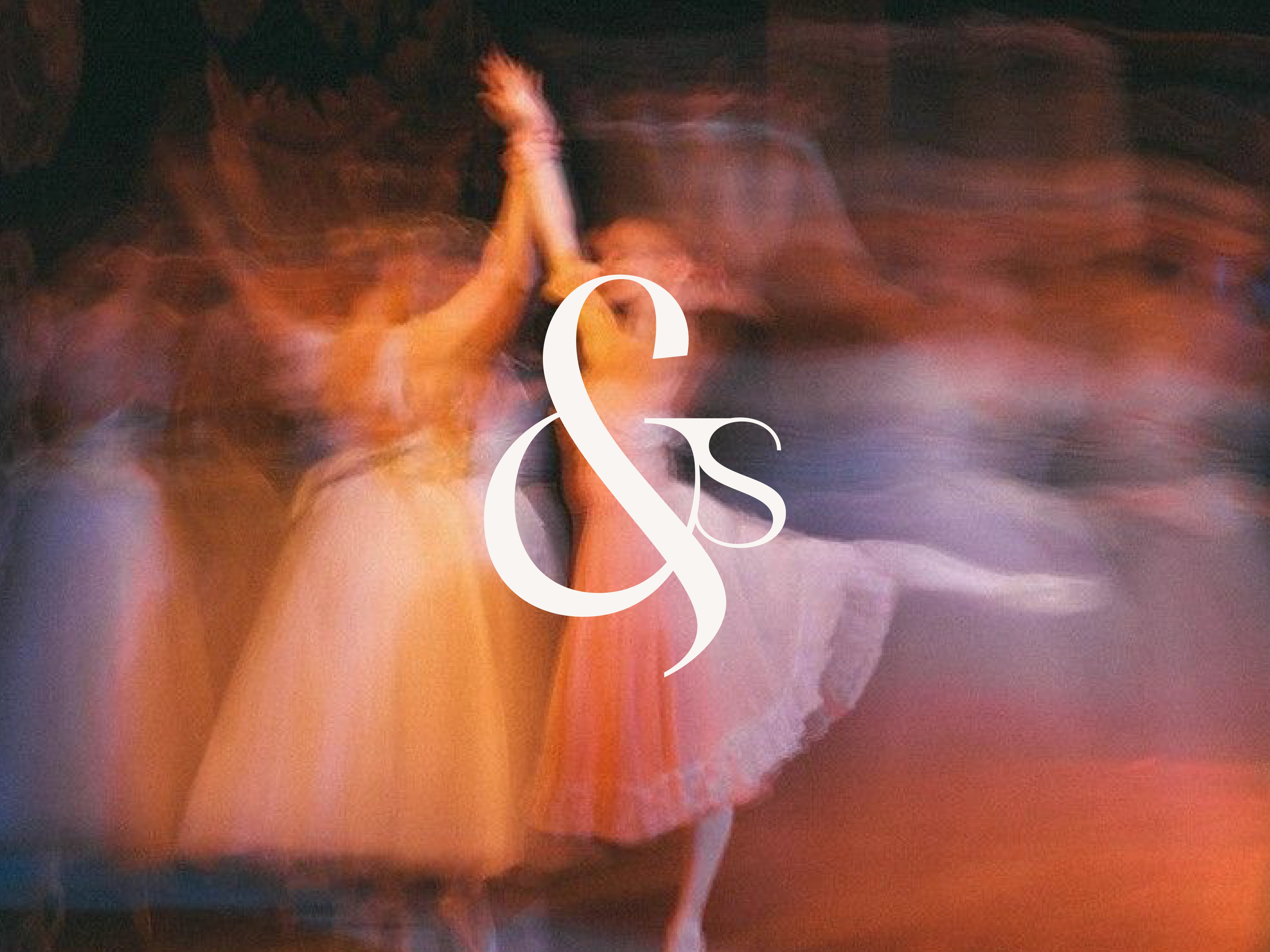
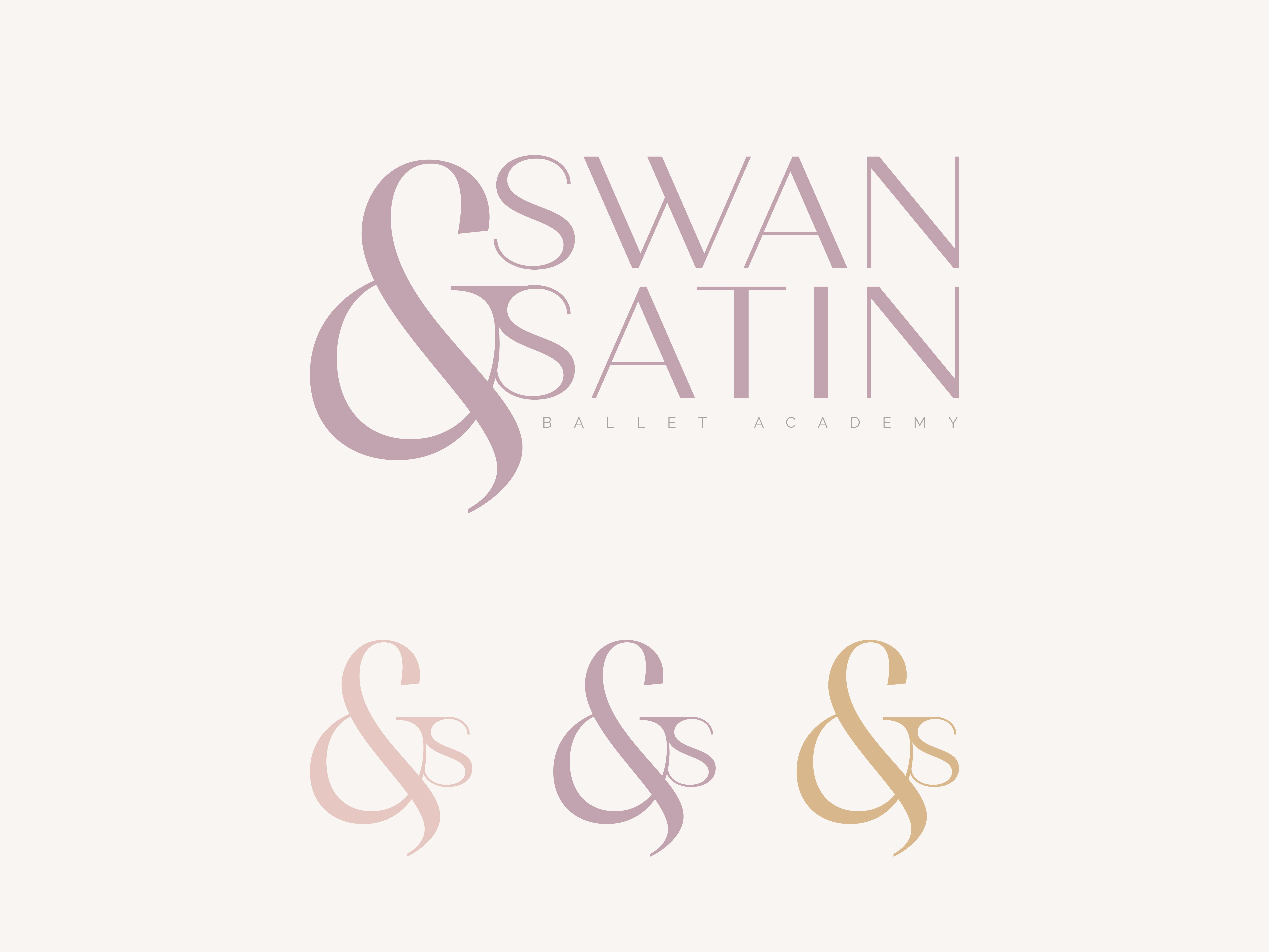
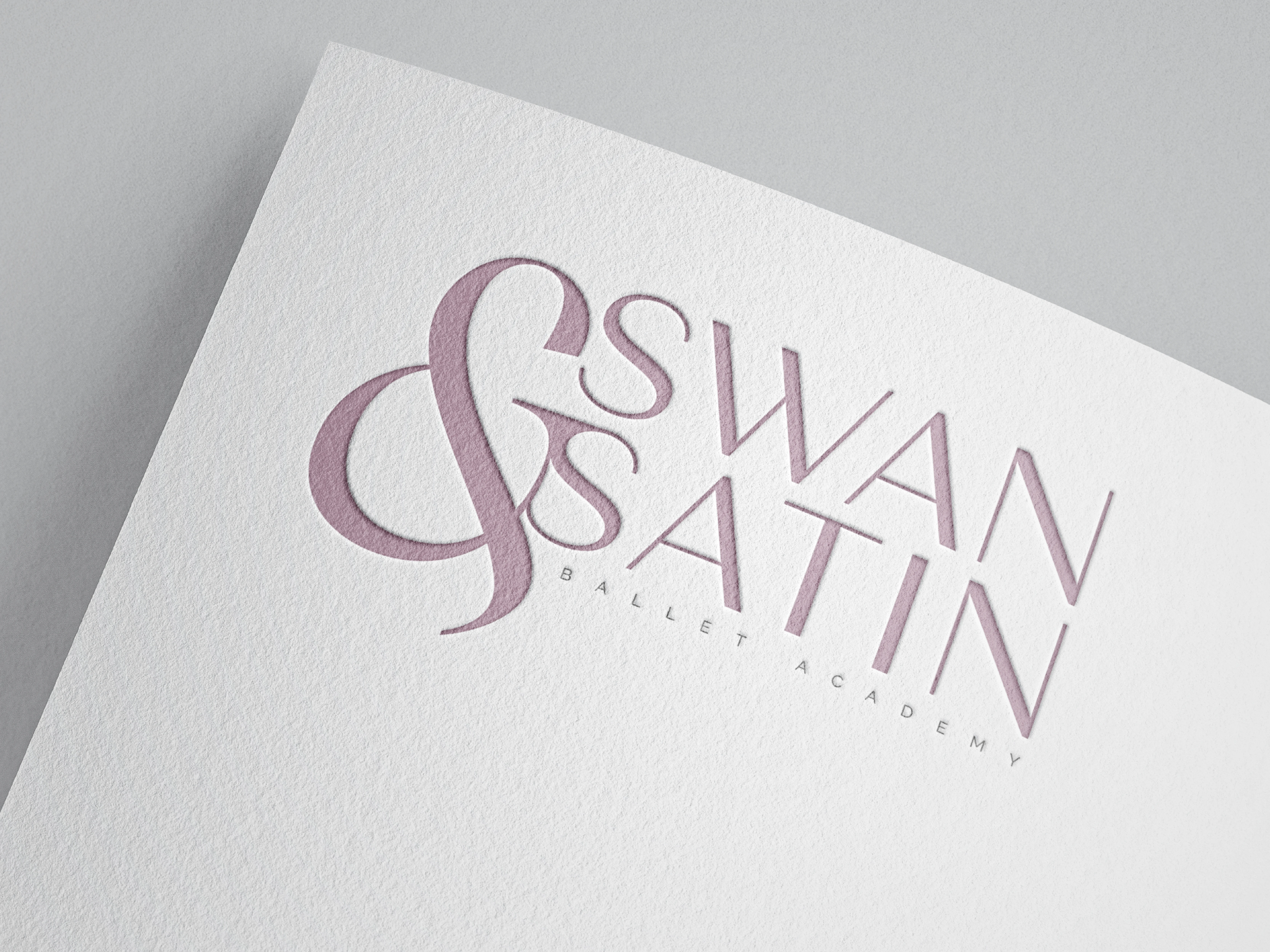
Swan & Satin Ballet Academy
Swan & Satin is a brand identity created for a ballet academy, translating movement, discipline, and softness into a refined visual language. The identity draws inspiration from classical ballet, fabric flow, and the elegance of motion.
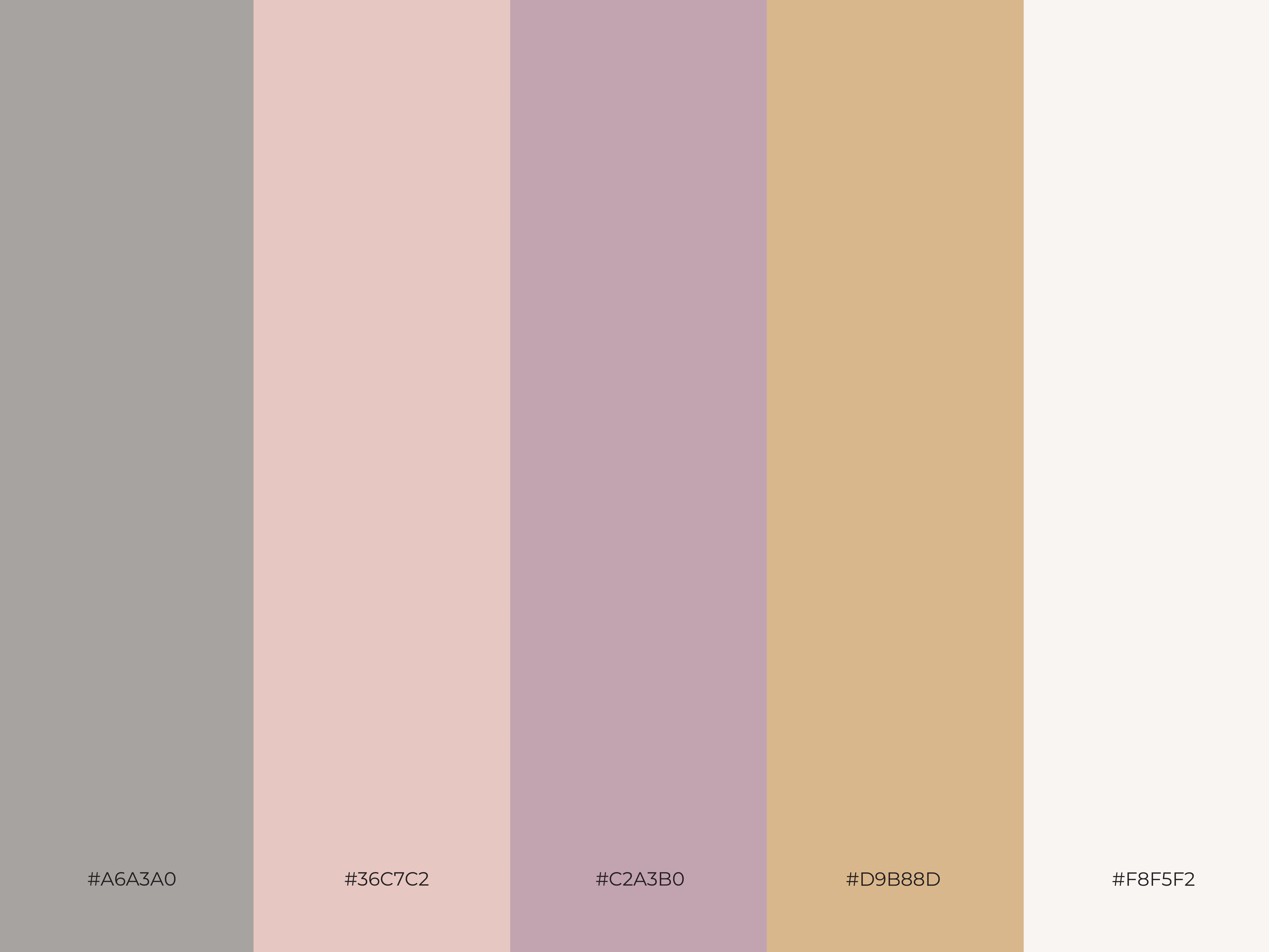
A serif logotype with fluid curves was developed to echo grace and continuity, while the ampersand acts as a central symbol of balance and harmony. The muted pastel palette—soft pinks, lavender, and warm neutrals—reflects delicacy, femininity, and timeless sophistication.
Through logo design, color exploration, and refined applications, the brand establishes a calm yet expressive presence that aligns with the emotional and artistic values of ballet education.
Like this project
Posted Jan 26, 2026
Swan & Satin is a refined ballet academy identity that captures grace, movement, and discipline through soft typography, delicate color, and elegant form.
Likes
0
Views
2