Zesty Soda Can Branding
Zoi Zelo
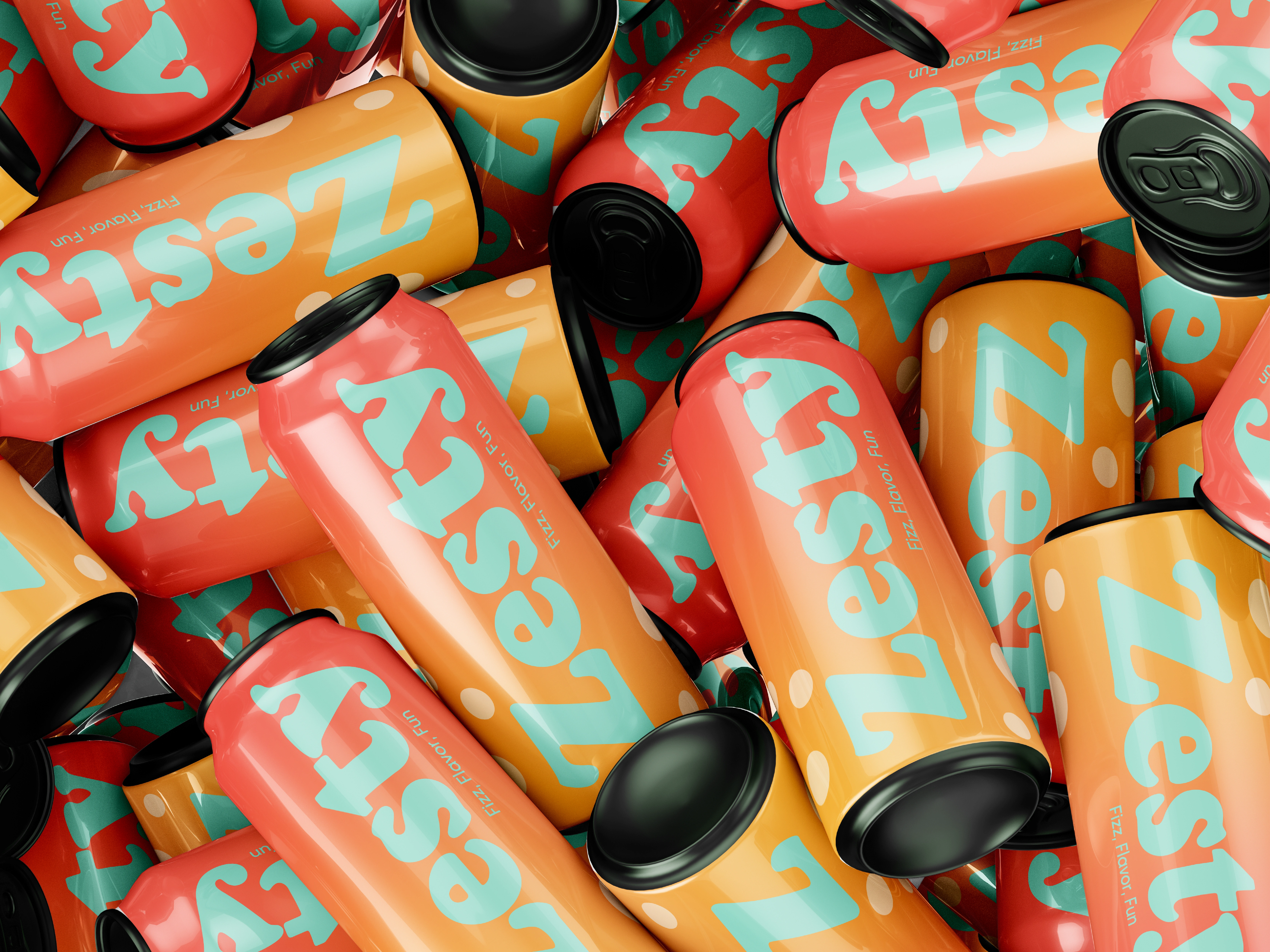
Zesty — Fizz, Flavor, Fun
Zesty is a playful soda can branding concept designed to capture energy, freshness, and joy through bold color, expressive typography, and dynamic composition.
The visual identity is built around the idea of fun in motion. A warm gradient palette transitions from coral reds to golden oranges, evoking fruity flavors and carbonation. The oversized, rounded logotype creates instant shelf impact while reinforcing an approachable, youthful tone.
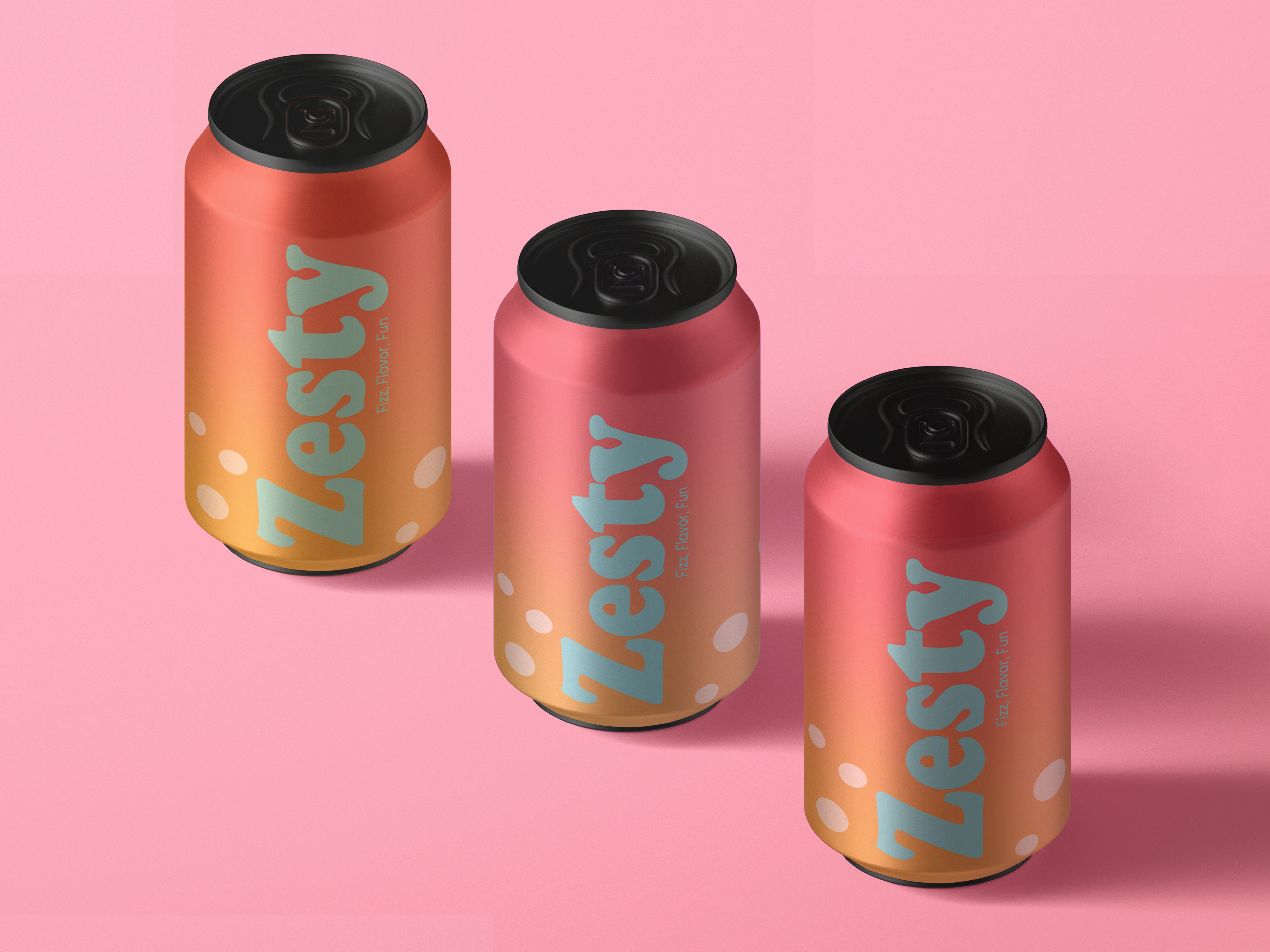
The cans feature a flexible layout system where typography takes center stage, paired with subtle graphic elements that add rhythm without overcrowding the surface. The matte-to-gloss finish contrast enhances depth and realism, making the packaging feel tactile and premium despite its playful character.
Zesty stands out as a bold, modern beverage identity that balances visual excitement with clarity—designed to feel vibrant, memorable, and ready for real-world application across single cans and multipacks.
Like this project
Posted Jan 26, 2026
Playful soda can branding exploring bold typography, warm gradients, and energetic composition—designed to feel fresh, fun, and instantly eye-catching.