Brand Identity Development for Proma
Katman Studio
Overview
Proma is a company operating in the industrial machinery and hardware sector, providing reliable and durable solutions for modern industrial needs. The brand focuses on engineering precision, mechanical strength, and technological efficiency.
The goal of this project was to design a complete brand identity system that reflects Proma’s industrial expertise while presenting the company with a modern and confident visual presence.
I was responsible for developing the logo, brand symbol, color system, typography, and visual language to ensure a cohesive identity across digital platforms, printed materials, and industrial applications.

The Challenge
Industrial brands often rely on outdated visual identities that fail to communicate innovation or technological strength. Proma needed a visual system that could express precision engineering, reliability, and forward-looking technology while remaining simple, recognizable, and scalable.
The identity had to work effectively across multiple contexts, including machinery labeling, documentation, digital platforms, and corporate materials.
Design Strategy
The identity was built around the idea of motion, structure, and precision.
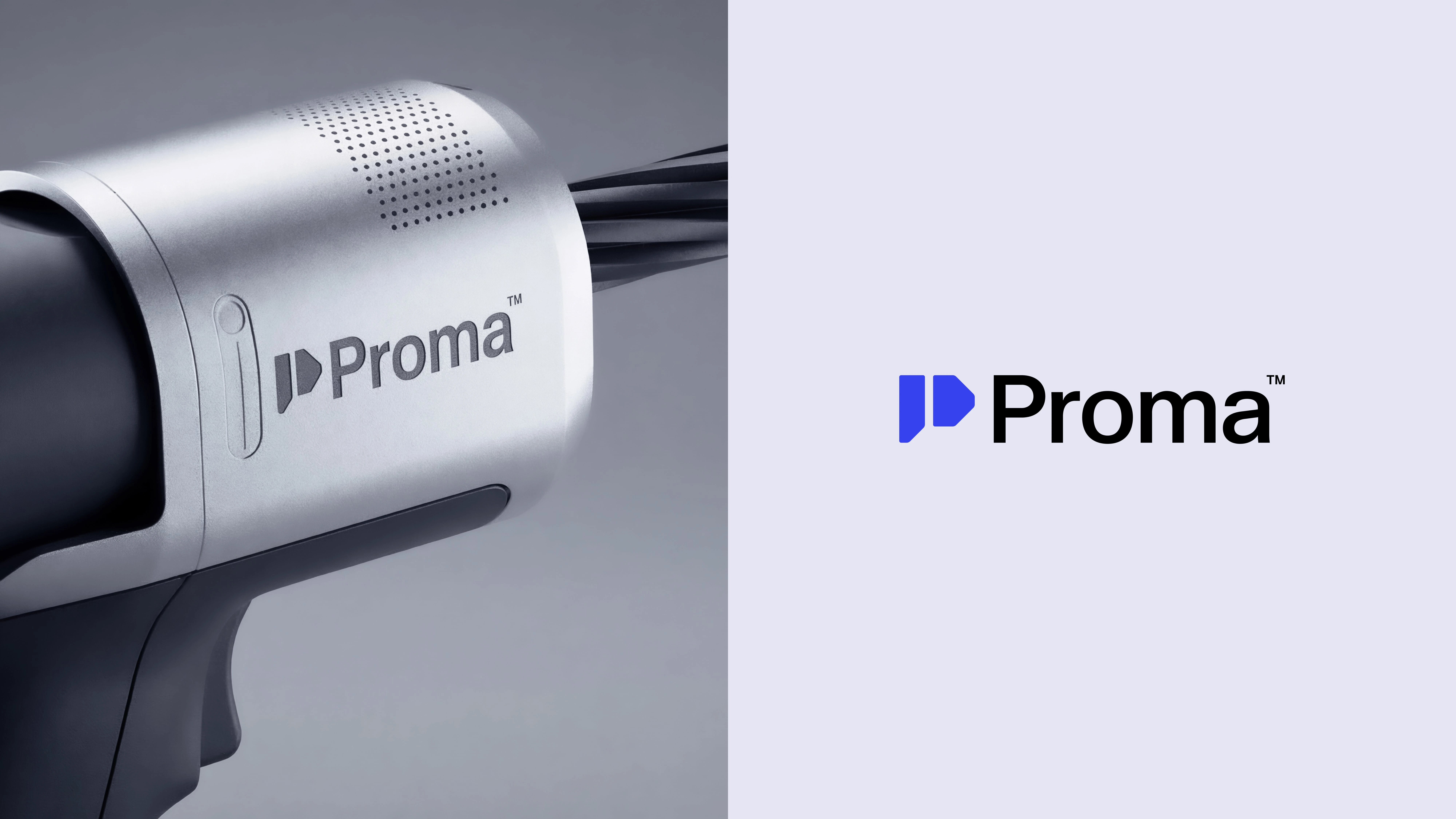
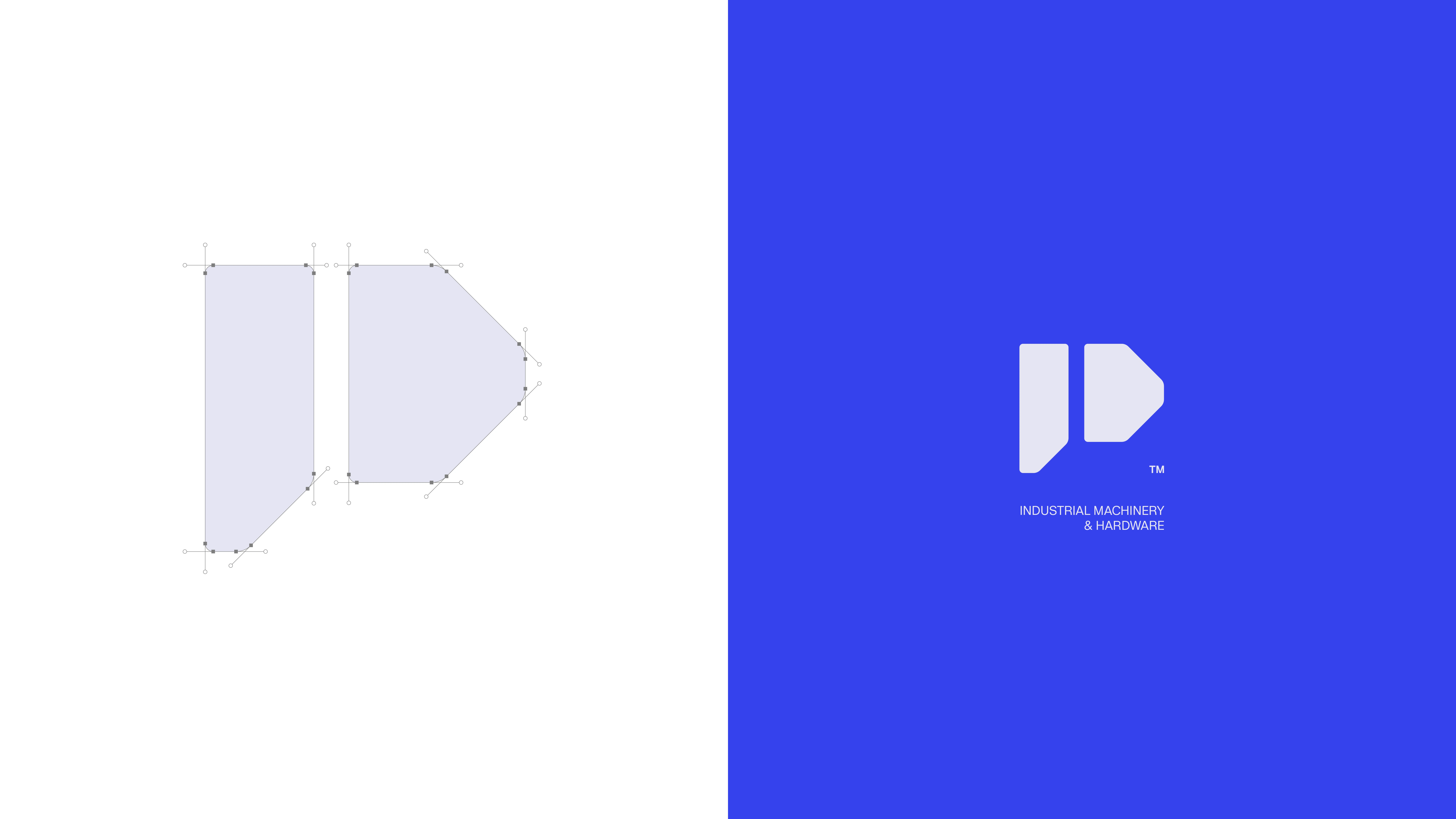
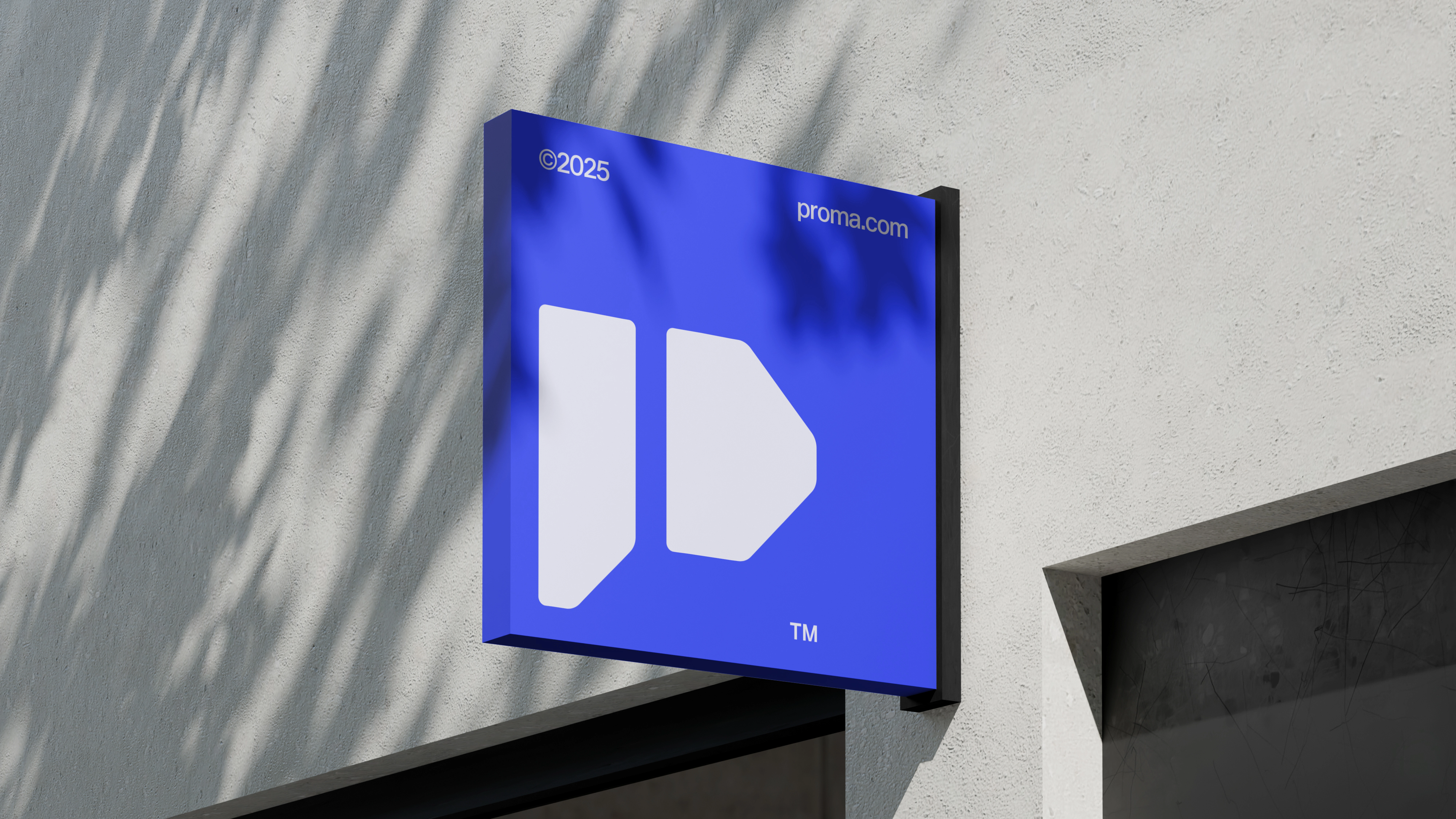
A geometric symbol derived from the letter “P” was developed as the core visual element. The symbol reflects mechanical movement and structural stability, referencing industrial engineering systems and machinery components.
This approach allowed the brand mark to communicate both technical reliability and forward momentum, aligning with the company’s focus on modern industrial solutions.
Visual Identity
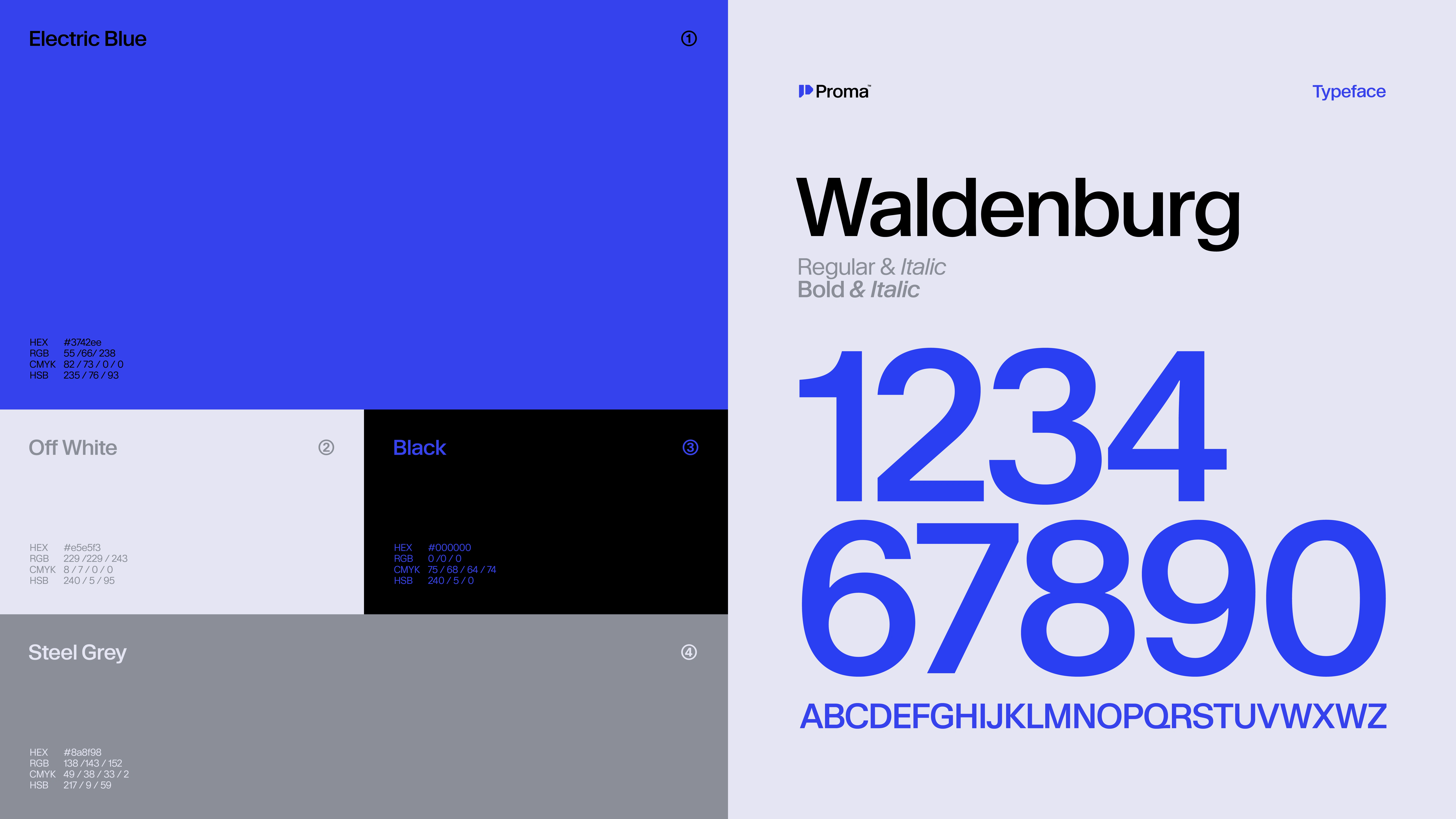
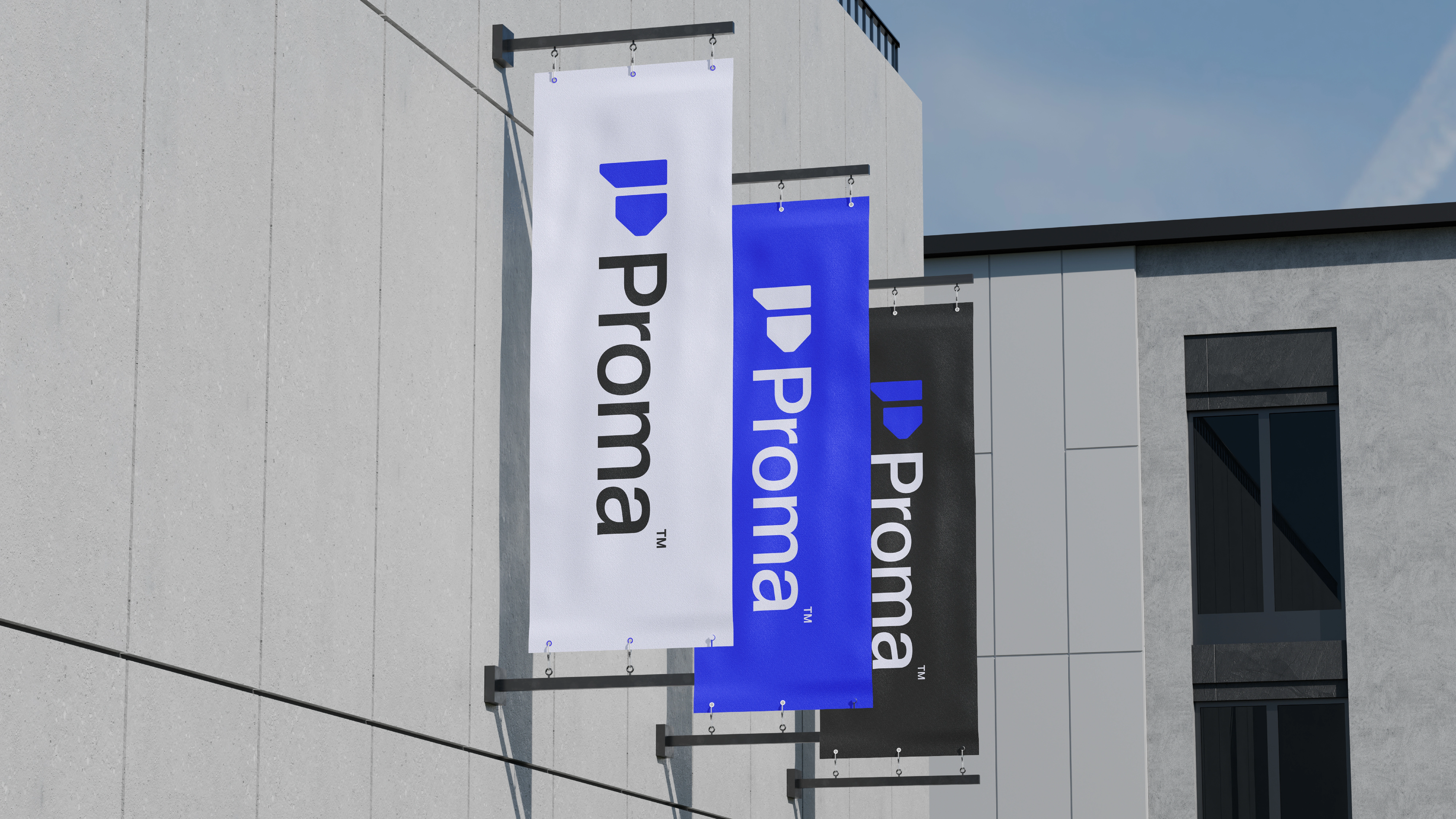
The brand’s visual language combines strong geometric forms with a bold industrial color palette.
Key design elements include:
A geometric logo symbol representing motion and mechanical precision
A bold electric blue color palette to express technology, innovation, and industrial power
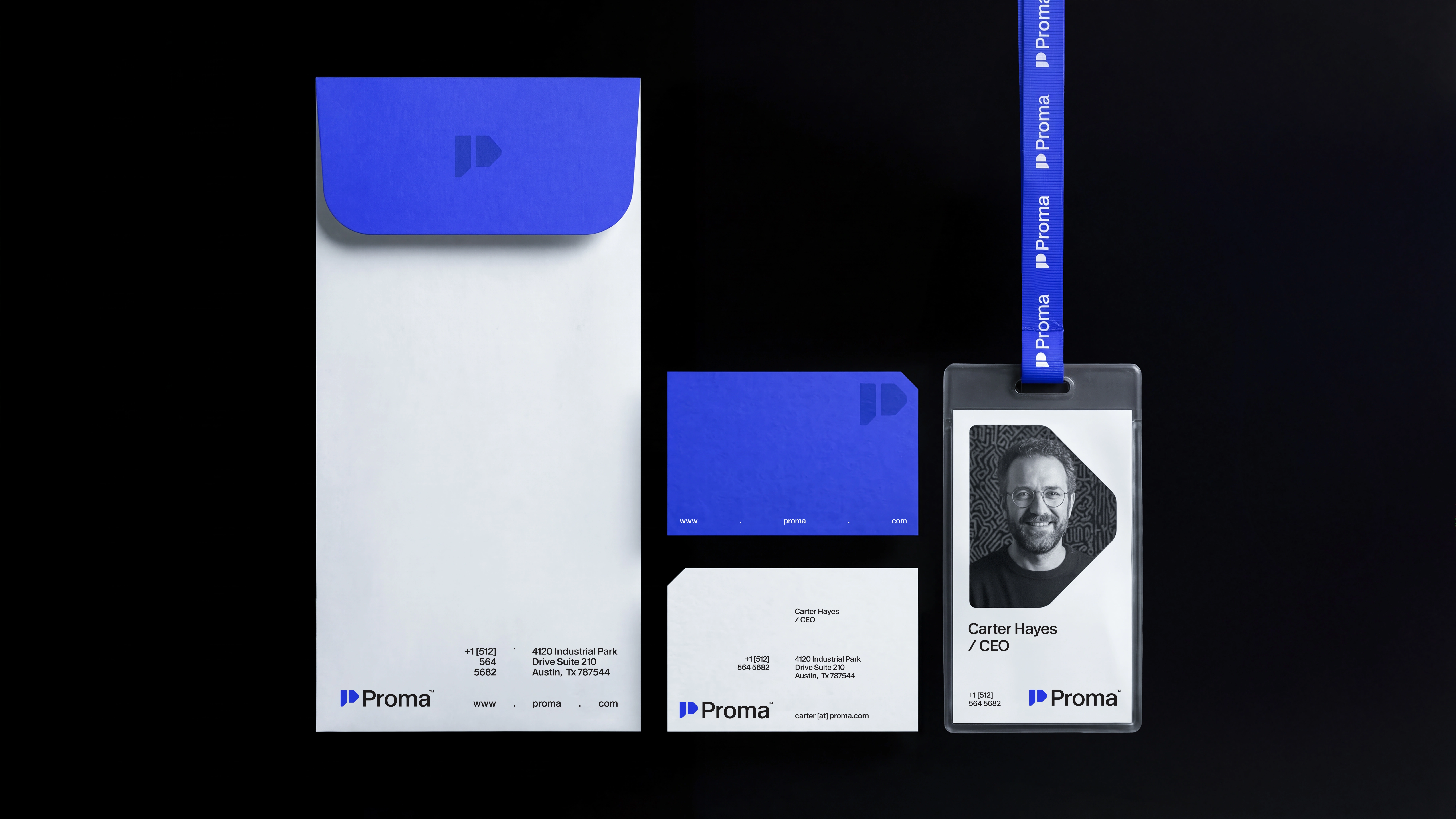
Clean and structured typography that reinforces clarity and professionalism
A flexible visual system adaptable across both digital and physical brand applications
Outcome
The final identity establishes Proma as a modern and technologically driven industrial brand.
The system balances engineering credibility with contemporary design, creating a visual identity that is clear, confident, and highly adaptable across multiple touchpoints.
The new branding strengthens Proma’s presence across industrial environments while ensuring long-term scalability for future growth.
Deliverables
Logo design
Brand symbol design
Color palette
Typography system
Visual identity guidelines
Brand application system

Like this project
Posted Mar 16, 2026
Proma is an industrial machinery and hardware company. I created the full brand identity including logo, symbol, color system, typography and visual language.
Likes
4
Views
10
Clients
Proma