T-Brush Logo and Packaging Design
Katman Studio
Overview
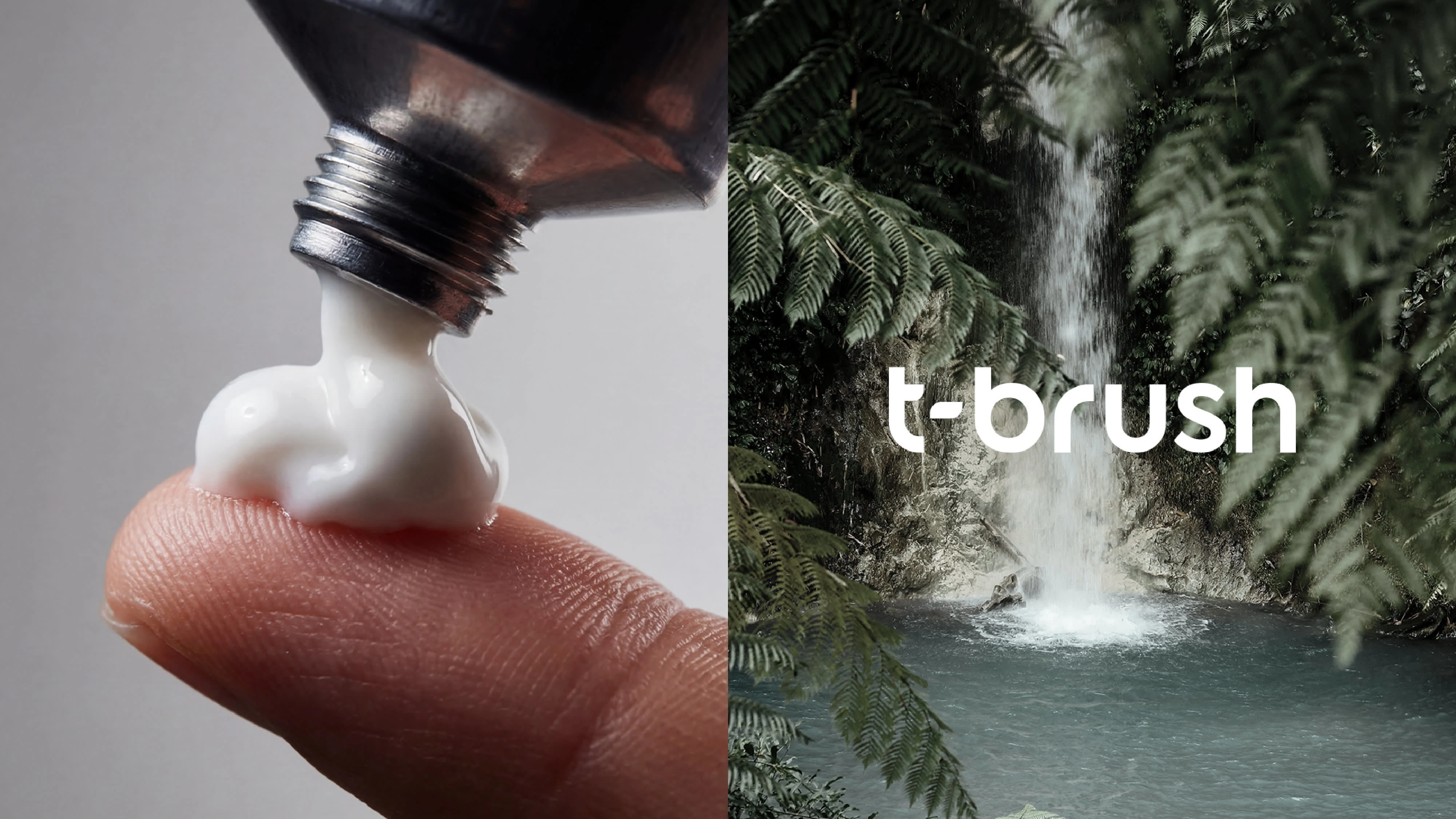
T-Brush is a modern oral care brand built around simplicity, freshness, and clean design.
The objective of this project was to develop a distinctive brand identity and packaging system that communicates clarity, hygiene, and premium quality while standing out in the competitive oral care market.
I designed the logo, visual language, and packaging system, creating a cohesive identity that works across product packaging, digital platforms, and retail environments.
The Challenge
Most oral care brands rely on visually crowded packaging and overly commercial aesthetics.
The challenge was to design a brand that feels minimal, refined, and contemporary, while still clearly communicating freshness and whitening benefits.
The design needed to:
stand out on shelves
communicate cleanliness instantly
remain simple and memorable
scale easily across product extensions
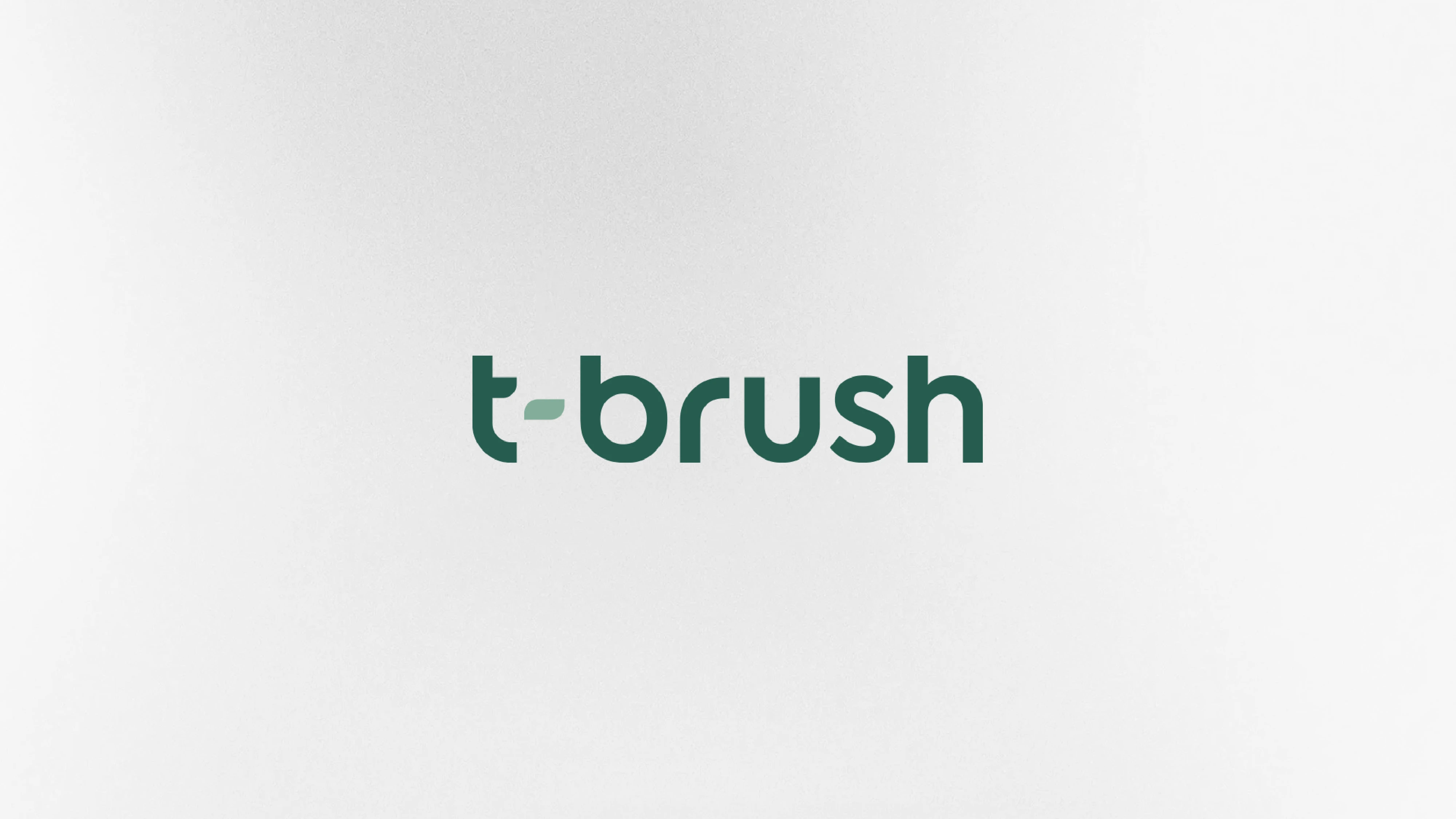
Main Logo
Design Strategy
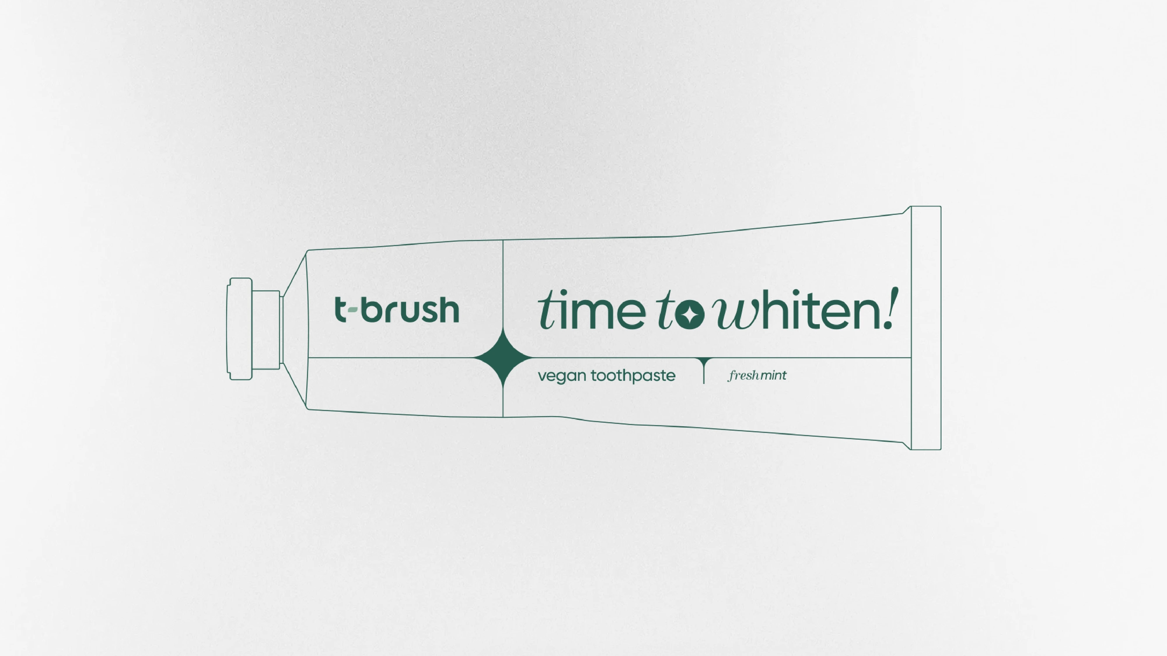
The visual identity was built around clarity and geometric precision.
A subtle star-like graphic element became the central visual symbol of the brand, representing brightness, purity, and whitening. This element also acts as a structural anchor within the packaging layout.
The typography was designed with a strong vertical rhythm to enhance recognition and maintain clarity across different formats.
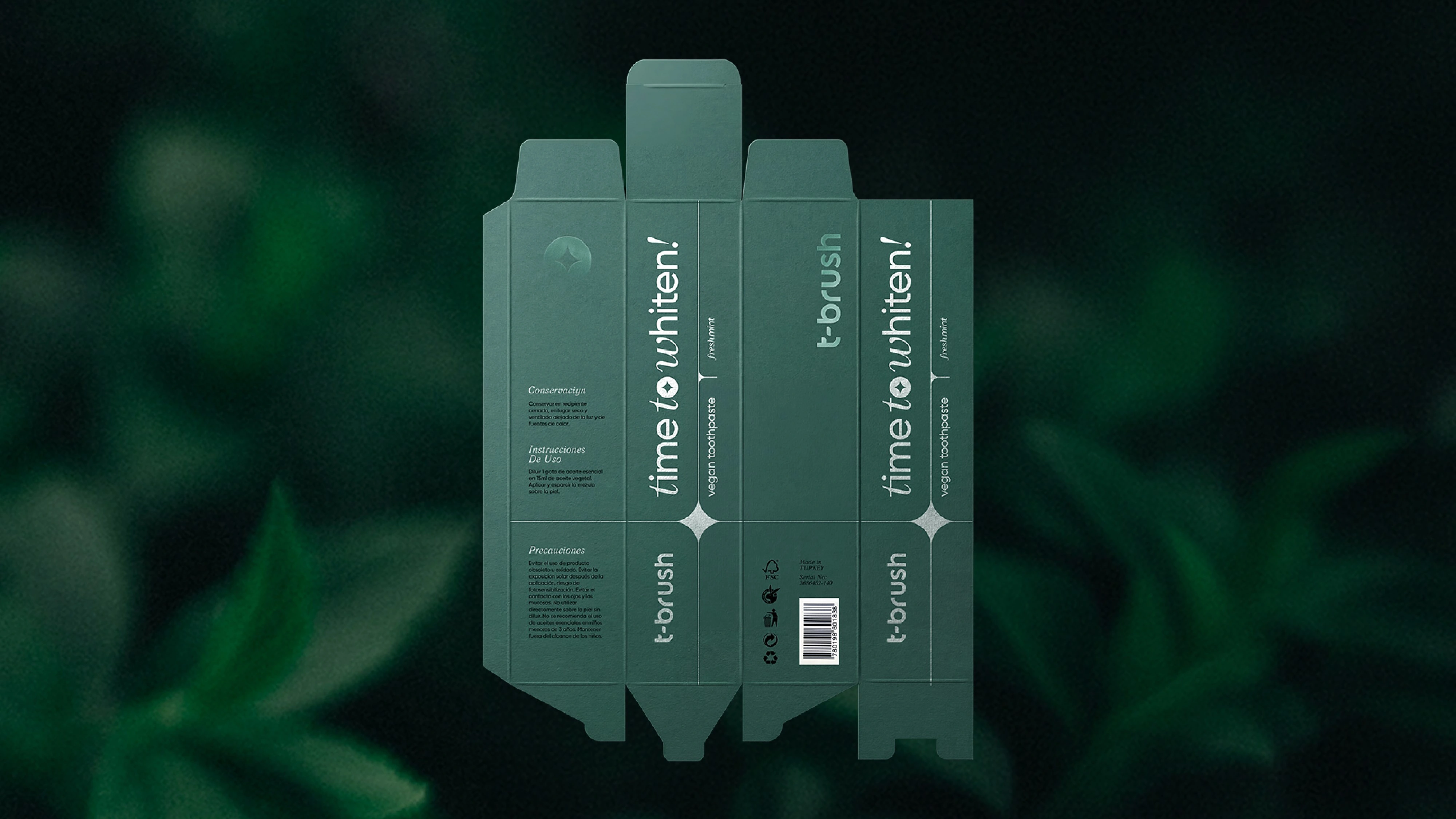
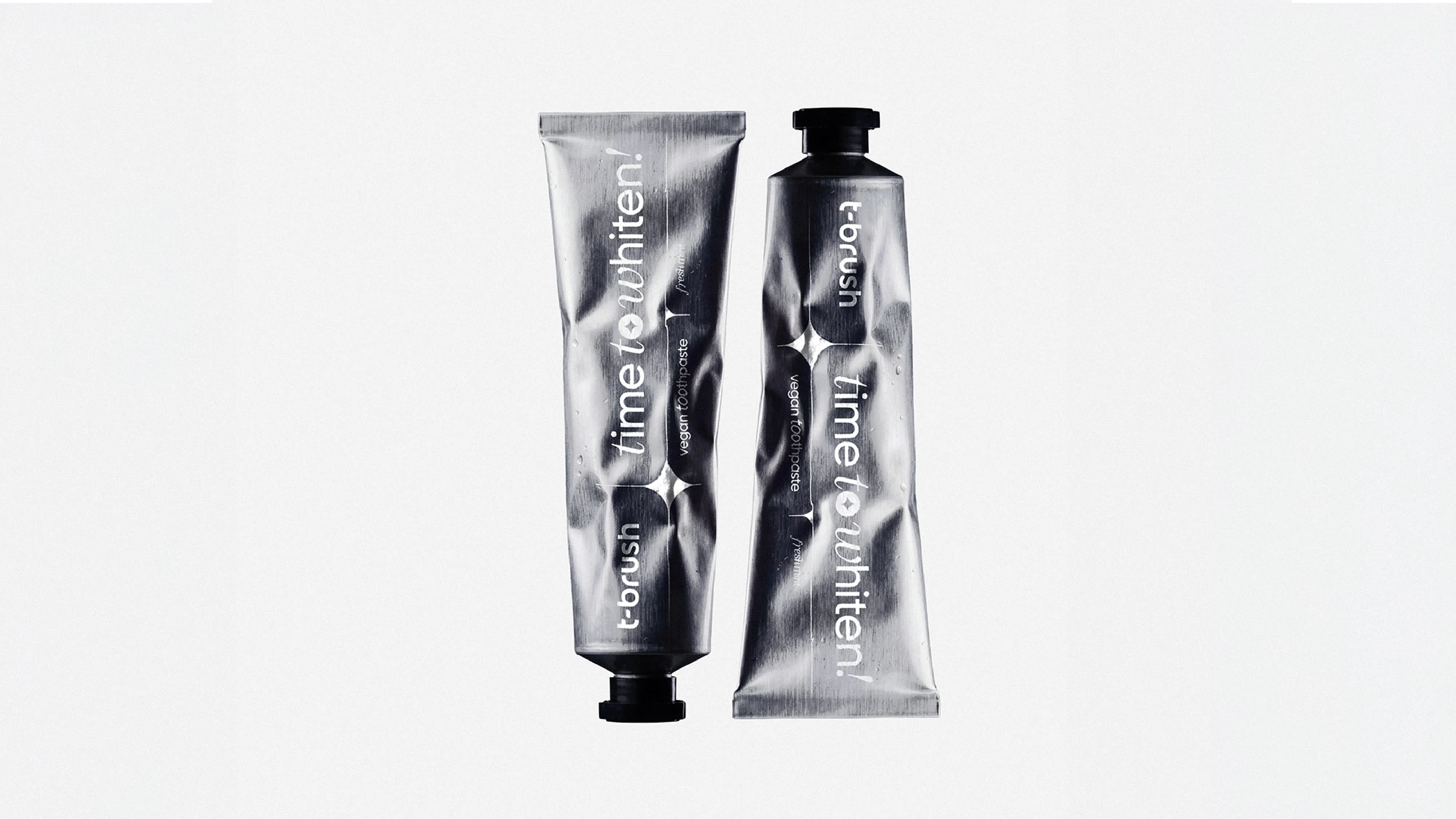
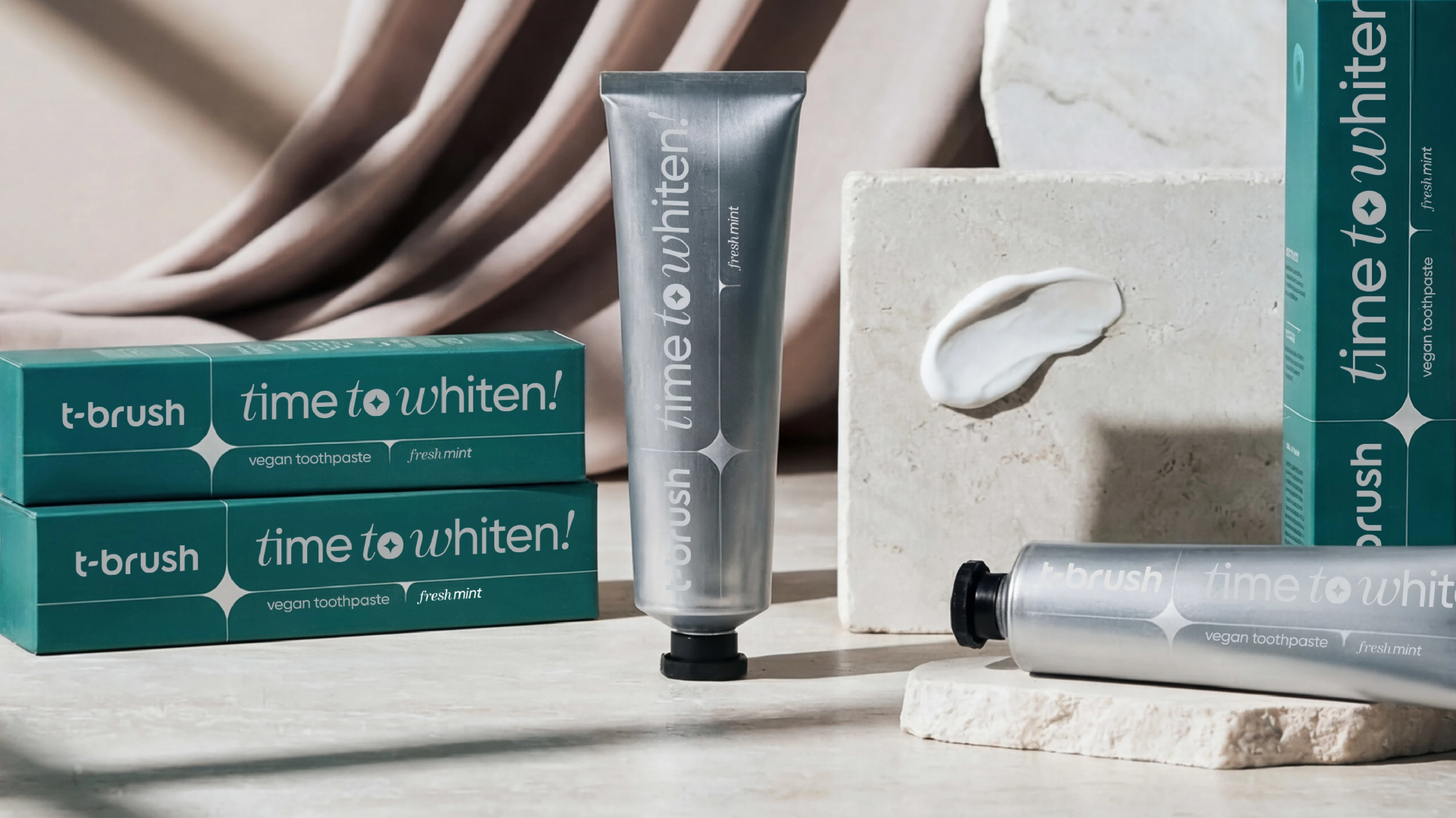
Packaging Design
The packaging system was created with a minimal and modern aesthetic that reflects the brand’s clean philosophy.
Key design elements include:
• A deep mint green color palette representing freshness
• Minimal typography to enhance clarity and trust
• Structured layout using the brand symbol as a visual anchor
• Balanced negative space to increase shelf visibility
The result is a packaging design that feels clean, calm, and premium, while maintaining strong visual recognition.
Outcome
The final result is a cohesive brand system that positions T-Brush as a modern, minimalist oral care brand.
The identity is scalable, flexible, and designed to support future product expansions while maintaining strong visual consistency.
Deliverables
• Logo design
• Brand identity system
• Packaging design
• Typography system
• Color palette
• Packaging layout structure
Like this project
Posted Mar 15, 2026
T-Brush is an oral care brand focused on simplicity and freshness. I designed the logo, brand identity, & packaging system to create a clean visual presence.