TL;DR: Brand Development for a Story-Driven Marketing Newsletter
The Vision
TL;DR is more than just a marketing newsletter—it’s a guide for creative entrepreneurs and brand builders who want to craft immersive brand worlds that resonate deeply and convert authentically. Hosted on Substack, TL;DR was born from the idea that impactful insights don’t need to be lengthy; sometimes, the best advice comes in digestible bites. My goal was to design a brand that felt both intellectually stimulating and delightfully easy to consume, reflecting the newsletter’s focus on storytelling and strategic brand-building.
Strategic Foundation
The identity of TL;DR is guided by three essential themes:
Clarity & Brevity: Every aspect of the design needed to reflect the newsletter’s promise—cutting straight to what matters without losing depth.
Storytelling Charm: With a focus on building brand worlds, the design had to evoke a sense of narrative and creativity, making readers feel like they’re part of a journey.
Strategic Sophistication: Although playful, the brand had to project authority in the fields of brand strategy and storytelling, giving readers confidence in the insights provided.
Visual Language
To align with TL;DR’s quick yet impactful format, the brand’s visual language was crafted to be memorable, clean, and engaging, blending retro charm with modern sophistication.
Logo & Iconography
The TL;DR logo combines a semicolon with a playful “thought bubble” shape, symbolizing both concise insights and storytelling. This logo isn’t just a mark; it’s a visual shorthand for the brand’s ethos—an invitation to dive into small yet powerful insights.
Color Palette
The color palette was chosen to balance vibrancy with approachability, creating a sense of intellectual playfulness:
Mustard Yellow: This primary color symbolizes curiosity and optimism, setting an inviting tone for each newsletter edition.
Soft Blue and Cool Neutrals: These colors create contrast, adding calmness and focus to the design.
Accent Neutrals: Black and white tones ensure that text remains legible and content visually organized, supporting the clarity TL;DR promises.
Typography
The fonts were selected to reinforce TL;DR’s balance between playful storytelling and strategic focus:
Serif Headings (Henriette): Adding warmth and a bit of flair, this font evokes a literary feel, reflecting the storytelling essence of the brand.
Slab Body Text (Servus Slab): A structured yet friendly typeface that maintains readability and aligns with the straightforward, bite-sized format.
Monospaced Accent (Azeret Mono): This typeface adds a subtle digital feel, lending a modern edge to the design and highlighting callouts or key insights.
Brand Implementation
The TL;DR brand identity flows seamlessly across the newsletter, social media, and other touchpoints, creating a cohesive experience for readers.
Substack Newsletter Design: Each edition is structured to be easily skimmable, with sections and insights clearly divided using color, typography, and icons. The design allows readers to quickly absorb valuable takeaways while enjoying a cohesive visual experience.
Social Media Presence: On platforms like Instagram and Twitter, TL;DR’s graphics echo the simplicity and charm of the newsletter, using concise text, semicolon icons, and color blocks to capture attention and drive sign-ups.
Landing Page & Substack Profile: The digital presence extends the brand’s personality, using the signature color palette and typography to create an inviting space where visitors can subscribe or learn more about the newsletter’s focus on storytelling-infused brand building.
Content Strategy & Iterative Growth
The content for TL;DR is designed to be concise but impactful, helping readers build their brands through bite-sized insights. By reviewing reader engagement and feedback on each issue, I continuously refine the content, adjusting the mix of storytelling techniques and strategic tips to align with what resonates most.
The Impact
The TL;DR brand identity has positioned it as a go-to resource for creatives and entrepreneurs who want to build brands that are not only strategically sound but also rich in narrative depth. Through a mix of brevity and insight, TL;DR provides:
Engagement & Retention: With a clear, inviting aesthetic and easily digestible content, TL;DR has built a loyal readership eager for consistent, actionable insights.
A Distinctive Brand Voice: By combining playfulness with strategic depth, TL;DR differentiates itself from typical marketing newsletters, offering a unique perspective that emphasizes brand storytelling.
Clarity in Complexity: The design and content work together to make complex brand-building concepts approachable, turning abstract ideas into actionable advice.
Through intentional design and a focus on digestible insights, TL;DR embodies the power of concise storytelling and strategy, empowering readers to transform their brands into worlds that captivate and convert.
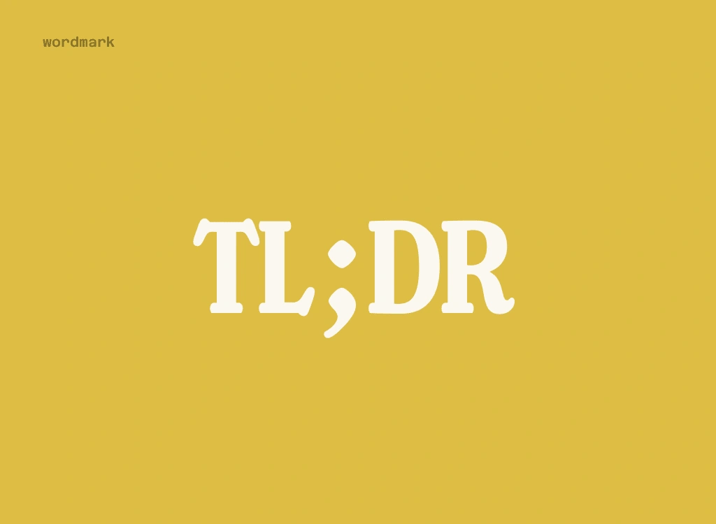
wordmark design
submark (icon) design
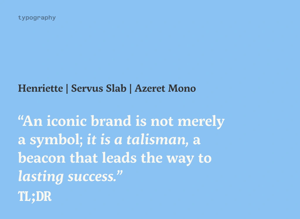
brand typography
brand colour palette
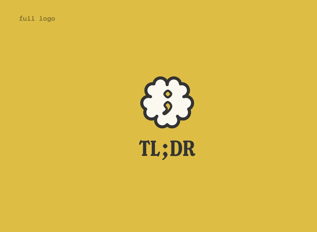
full logomark
Like this project
Posted Mar 21, 2024
Crafting a bold, playful brand identity for TL;DR on Substack, blending storytelling charm and strategic clarity for impactful, bite-sized marketing insights.
Likes
0
Views
313


