The Morrigan: Crafting Identity Through Ancient Wisdom
The Challenge
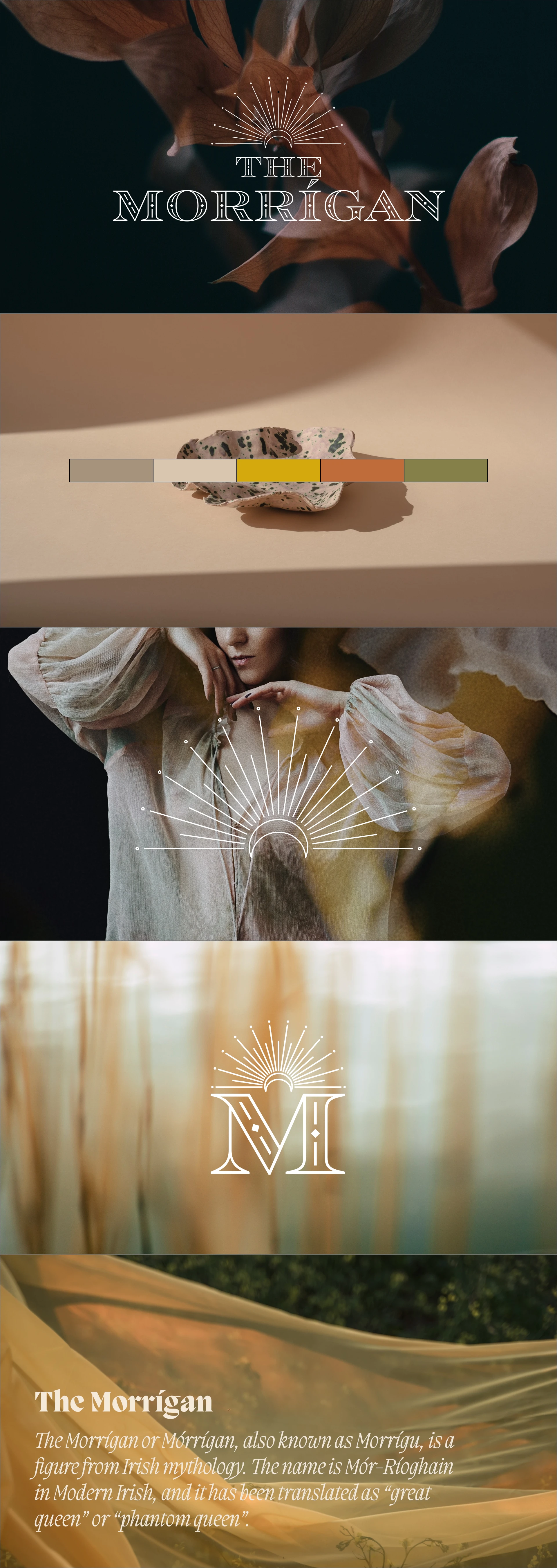
A transformational service provider sought to create a brand identity that would embody both ancient strength and modern sovereignty. The brand needed to command authority while maintaining an intimate connection to earth-based wisdom and feminine power.
Strategic Foundation
Drawing inspiration from Celtic mythology, where The Morrigan represented divine feminine strength, we developed a brand strategy anchored in three core elements:
Sovereignty and personal power
Earth-centered wisdom
Transformational guidance
Design Journey
Our design process focused on weaving together symbolic elements that would resonate with both the brand's heritage and its contemporary mission:
Visual Elements
A custom-crafted crown symbol, merging regality with spiritual authority
All-caps wordmark providing a foundation of unwavering strength
Balanced proportions reflecting both accessibility and elevation
Color Story
The palette draws from earth's natural wisdom:
Deep, grounding tones evoking ancient stones
Gentle neutrals suggesting healing and transformation
Rich accents reflecting nobility and power
Typography
The typographic system was carefully curated to:
Express elegance through refined letterforms
Maintain authority through deliberate weight choices
Balance traditional and contemporary influences
Impact
The resulting identity system successfully:
Communicates strength without intimidation
Honors feminine wisdom while maintaining universal appeal
Creates a visual language for transformation and growth
Through intentional design choices, The Morrigan's brand identity achieves the delicate balance of being both grounding and elevating—exactly what the client offers their own customers in their transformational work.

Like this project
Posted Oct 28, 2023
A brand identity system rooted in ancient wisdom and divine feminine strength, designed for a transformational coaching practice.
Likes
1
Views
200


