Bitezon — Logo & Brand Identity (Concept)

Shakil Hosen


Bitezon_Brand Identity & Packaging
© February 2026
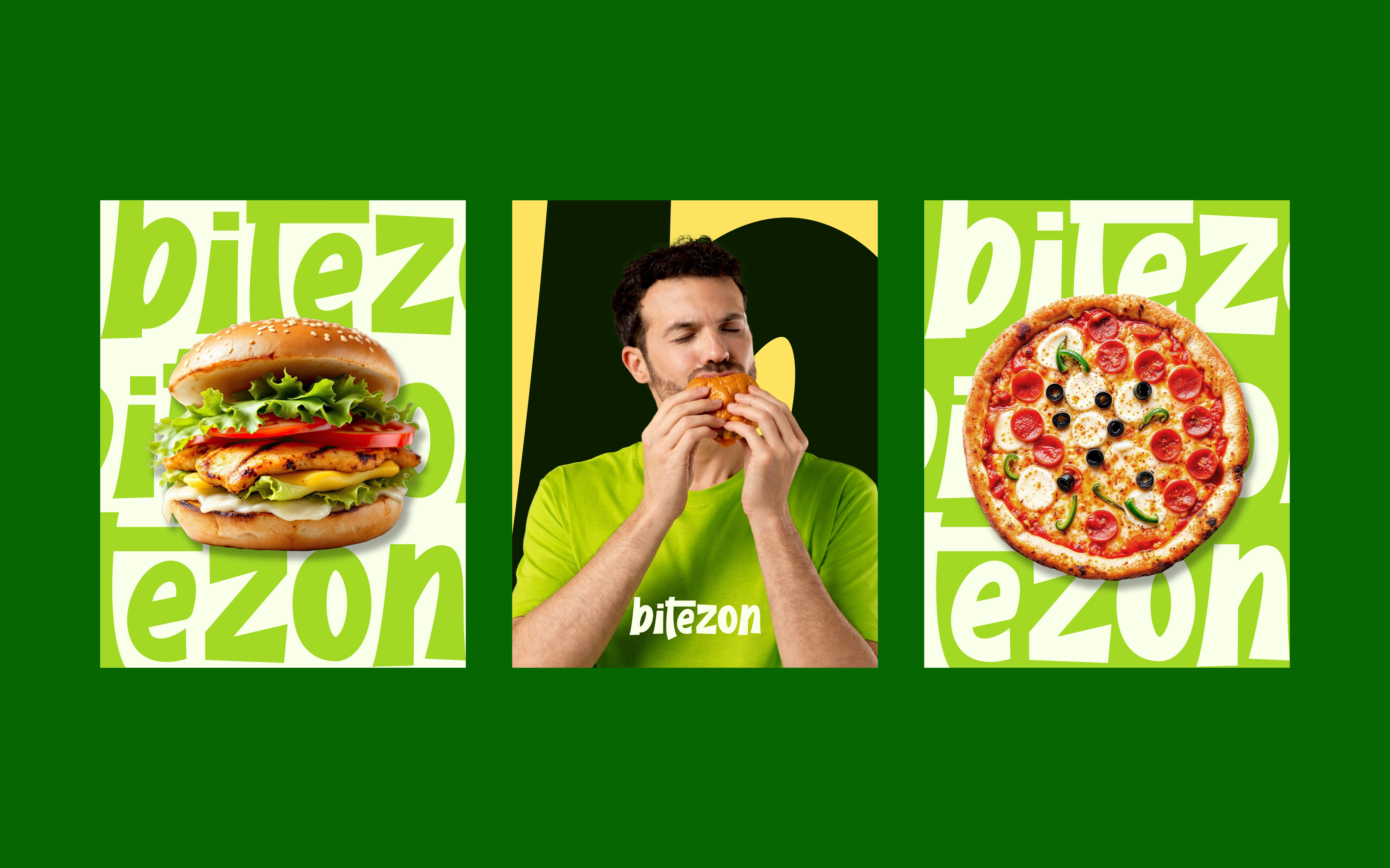
Bitezon is a self-initiated food-brand identity and packaging concept. The challenge is to make a compact name carry personality across moving content and small takeaway surfaces. Rather than giving every application a different graphic treatment, the presentation builds around lettering and a concentrated green palette.
TYPOGRAPHY THAT FITS THE FORMAT
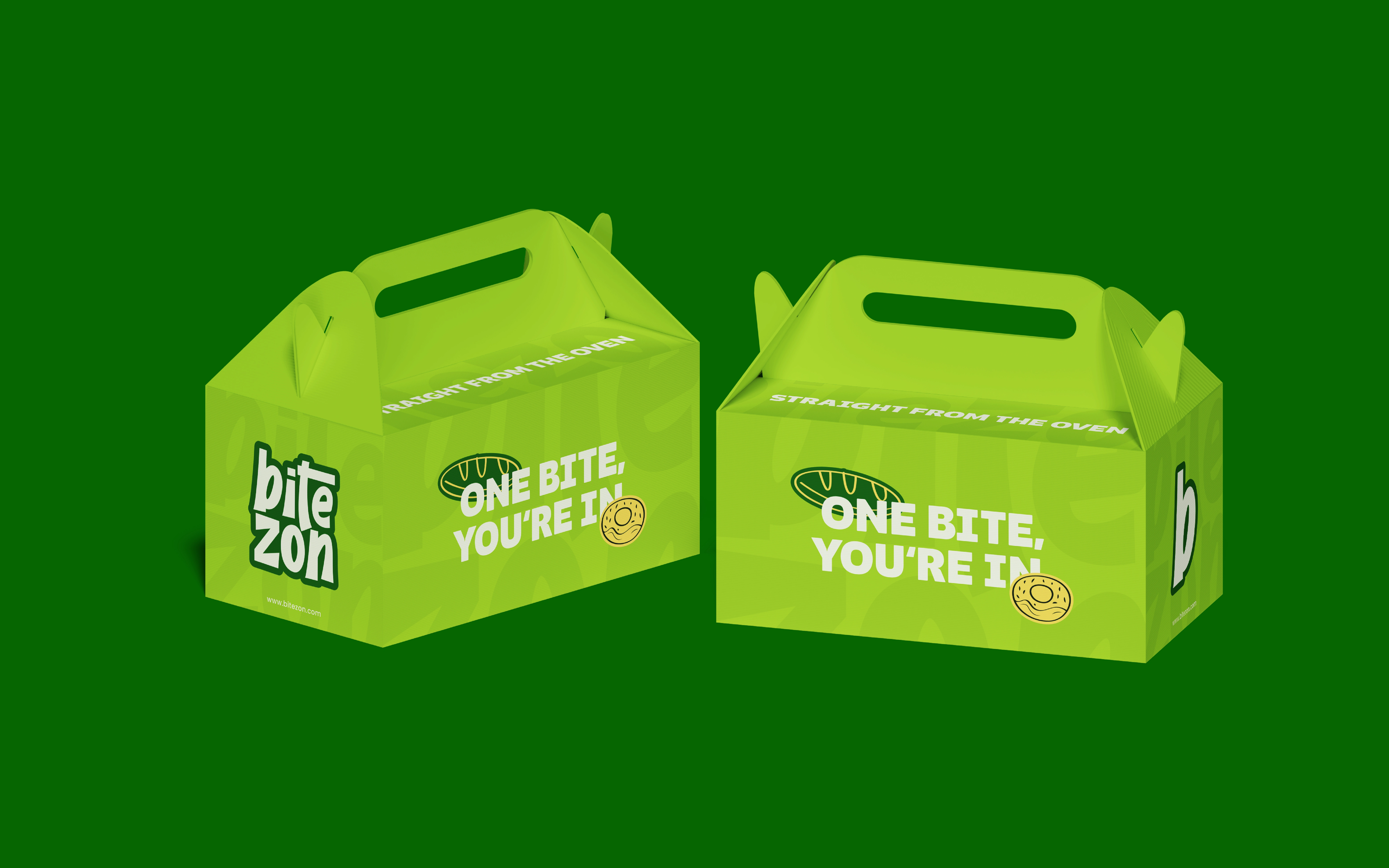
The stacked “bite / zon” arrangement creates a compact block on the fries carton. Thick, rounded letters and a contrasting outline give the name a distinct silhouette against bright packaging. The stacked format uses the carton’s narrow face without reducing the name to a thin line of text.
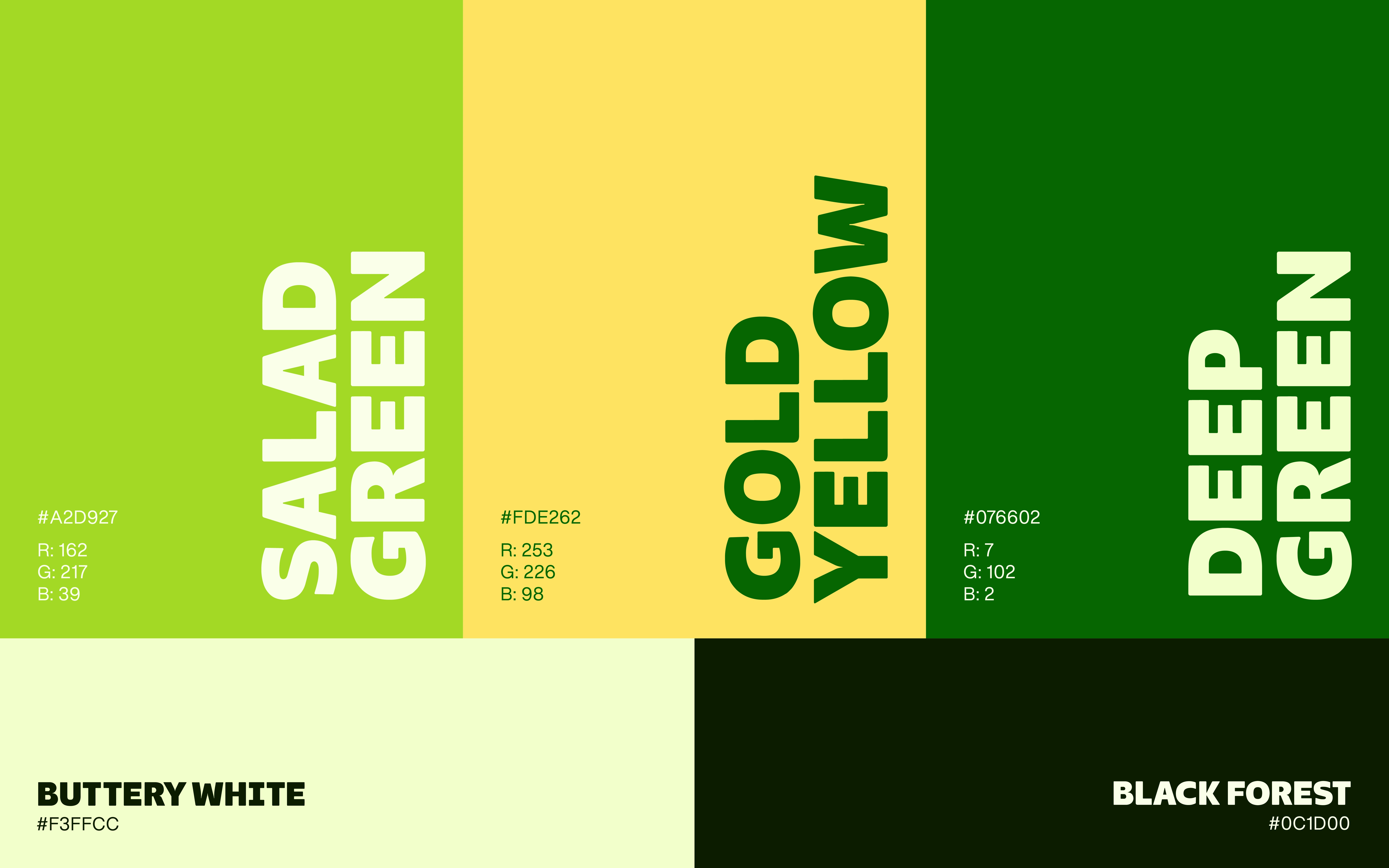
COLOUR AS A CONNECTING DEVICE
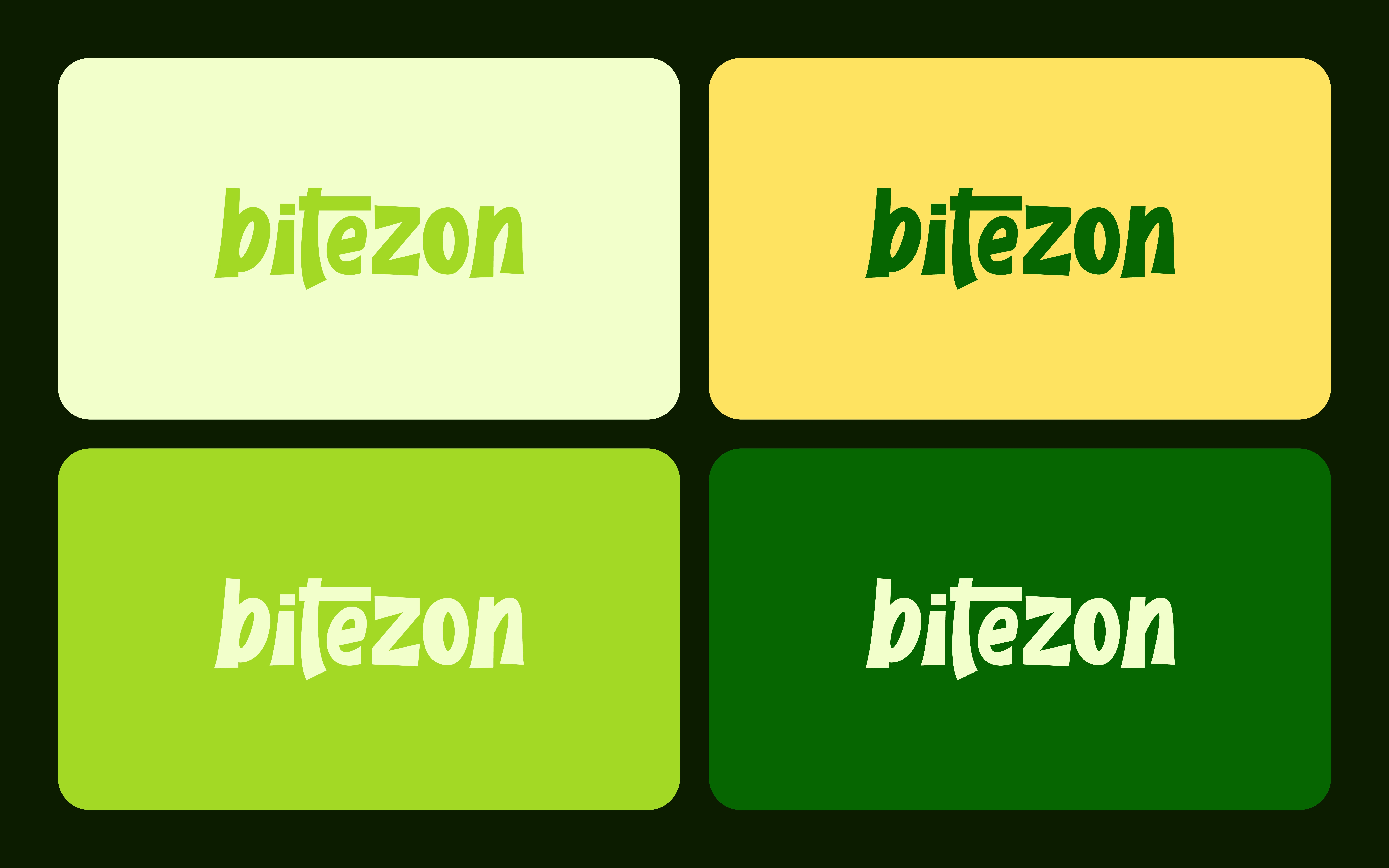
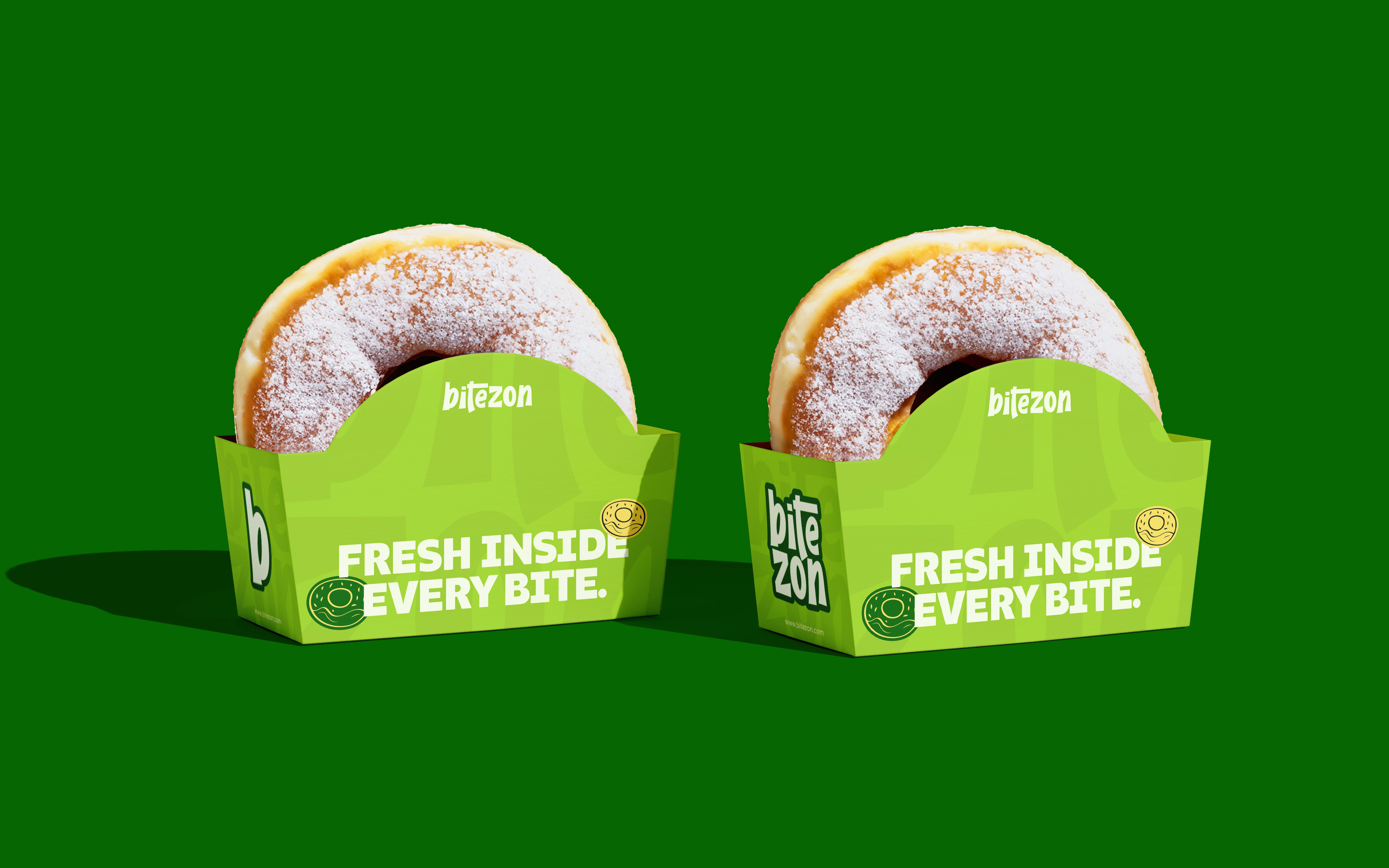
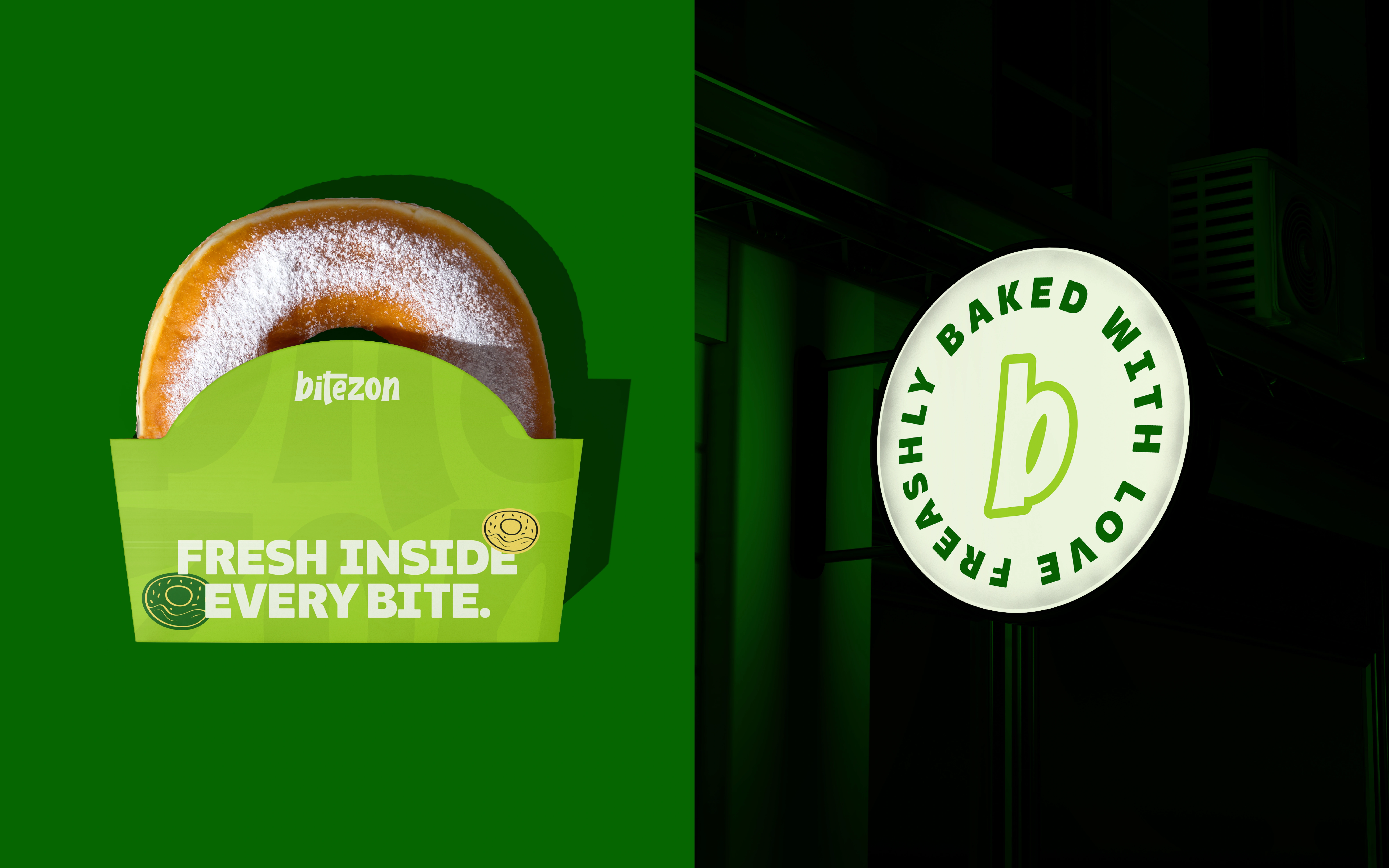
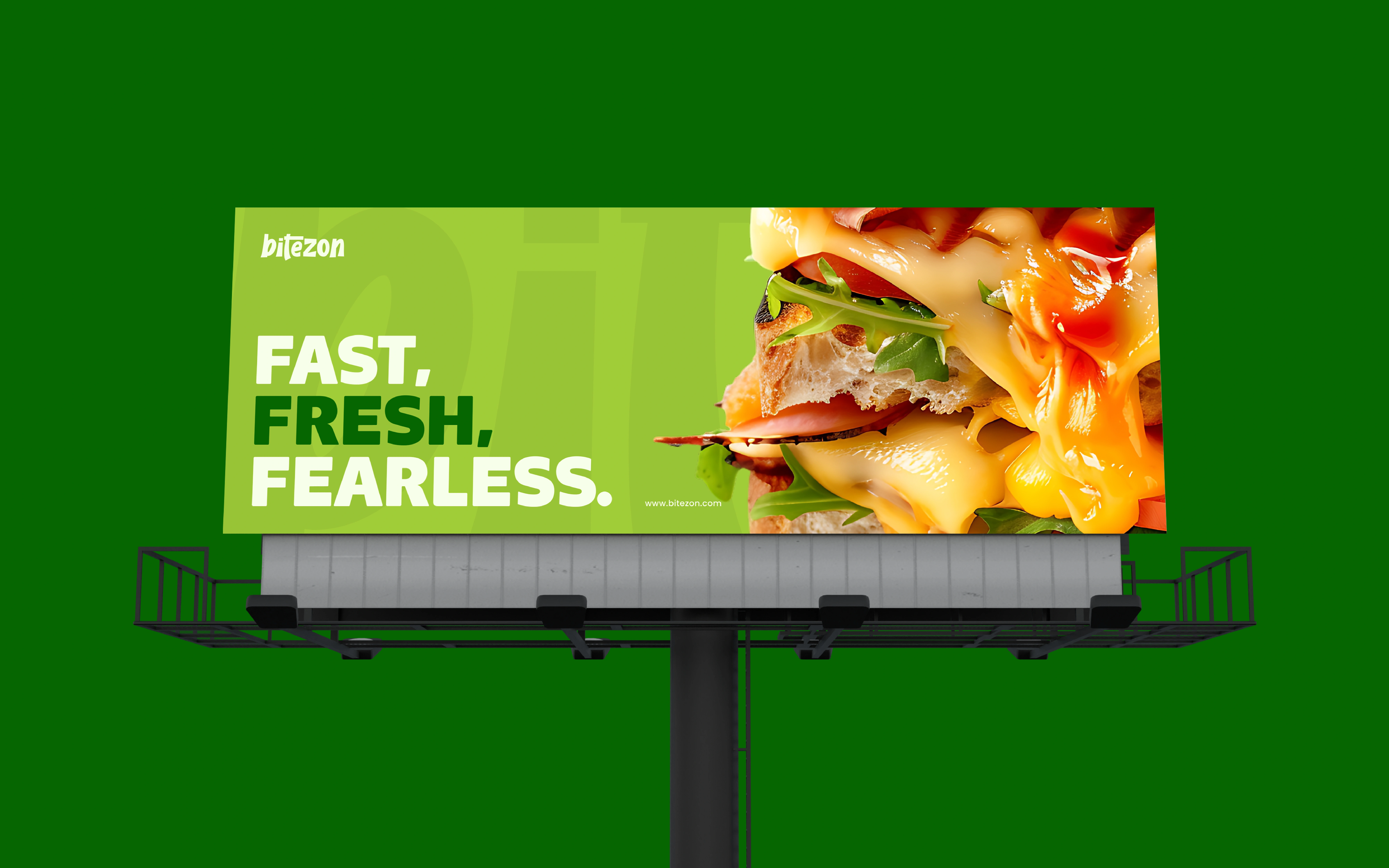
Bright lime packaging is set against deeper green surroundings. This creates separation between the product and its backdrop while keeping the presentation within one colour family. Light letterforms and dark edging add another layer of contrast around the wordmark.
FROM CONSTRUCTION TO PRESENTATION
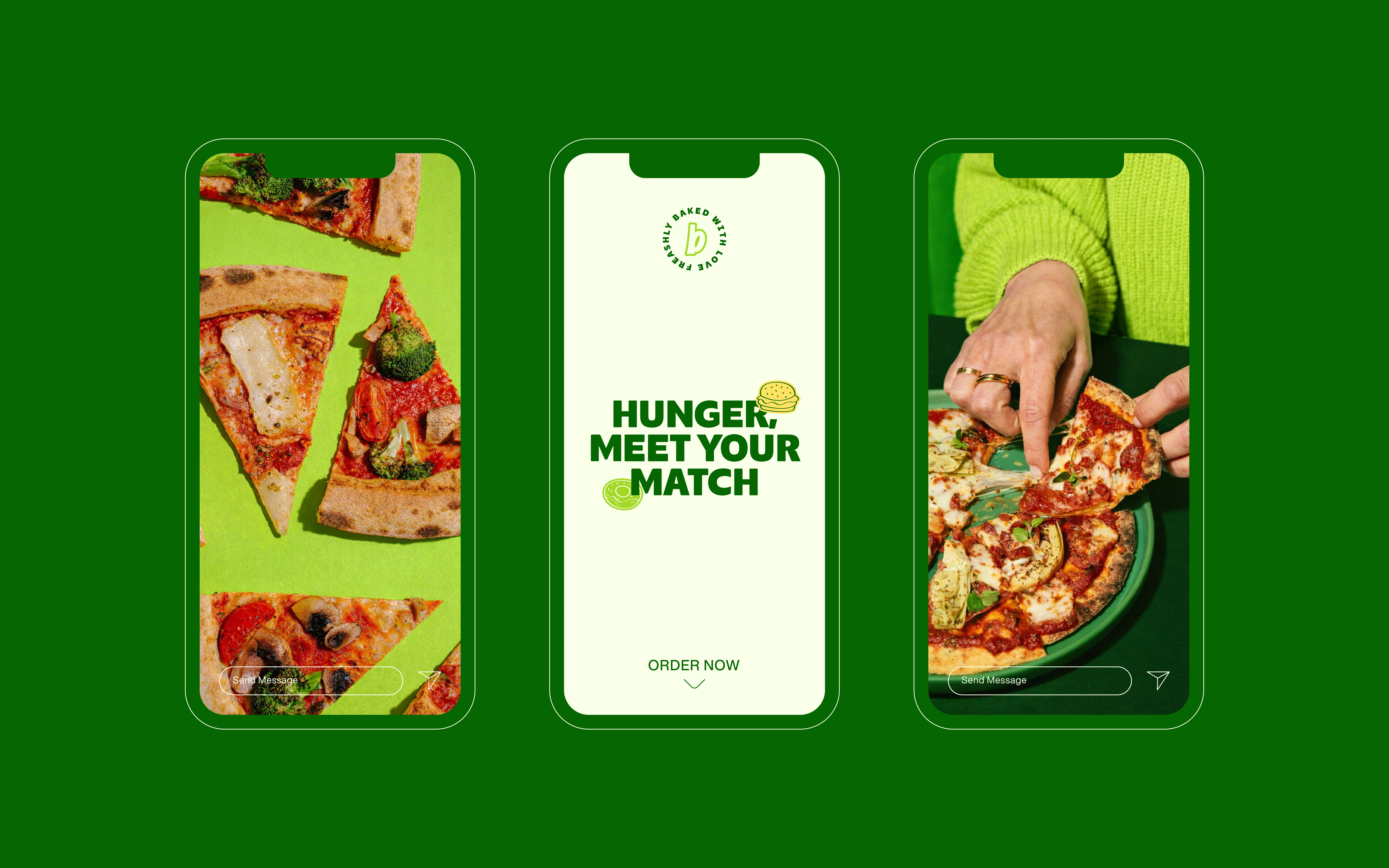
The motion content includes an outline-and-anchor-point view of the lettering, bringing attention to its construction. The packaging mockups then show how that same typographic asset behaves on a physical form. The sequence connects a design detail with its application.
The visual direction explores energy through substantial lettering, compact composition and contrast. These are design observations, not evidence of customer behaviour or faster service.
The outcome is a food-brand concept with a recognisable typographic centre and consistent packaging colour language.
Thank you for exploring the Bitezon branding project.
This identity was crafted to capture the joy, energy, and bold flavor of modern food culture, where every bite is an experience. From logo to motion and visual storytelling, Bitezon is designed to feel playful, confident, and instantly appetizing.
If you enjoyed this project, feel free to appreciate, share, or leave your thoughts.
Like this project
Posted Oct 16, 2026
A food-brand concept using stacked rounded lettering, outlined contrast and lime/deep-green packaging to create a compact visual signature.