Mobile Application Design for a Health and Wellness Brand
📌About
Mediplus is an mhealth mobile application concept that connects users to doctors and medical professionals through online therapy and appointments.

🎯Challenges/Goals
In as much as the future looks promising, some issues have been plaguing the health industry, among which are data privacy, user experience, security and patient engagement.
The goal then, was to improve user engagement and satisfaction.
🔎Research
Interview findings
5 respondents were selected for the interview based on the following criteria
a) Must have downloaded an mhealth app with over 60 days in device prior to the interview.
b) Must have successfully registered as a user.
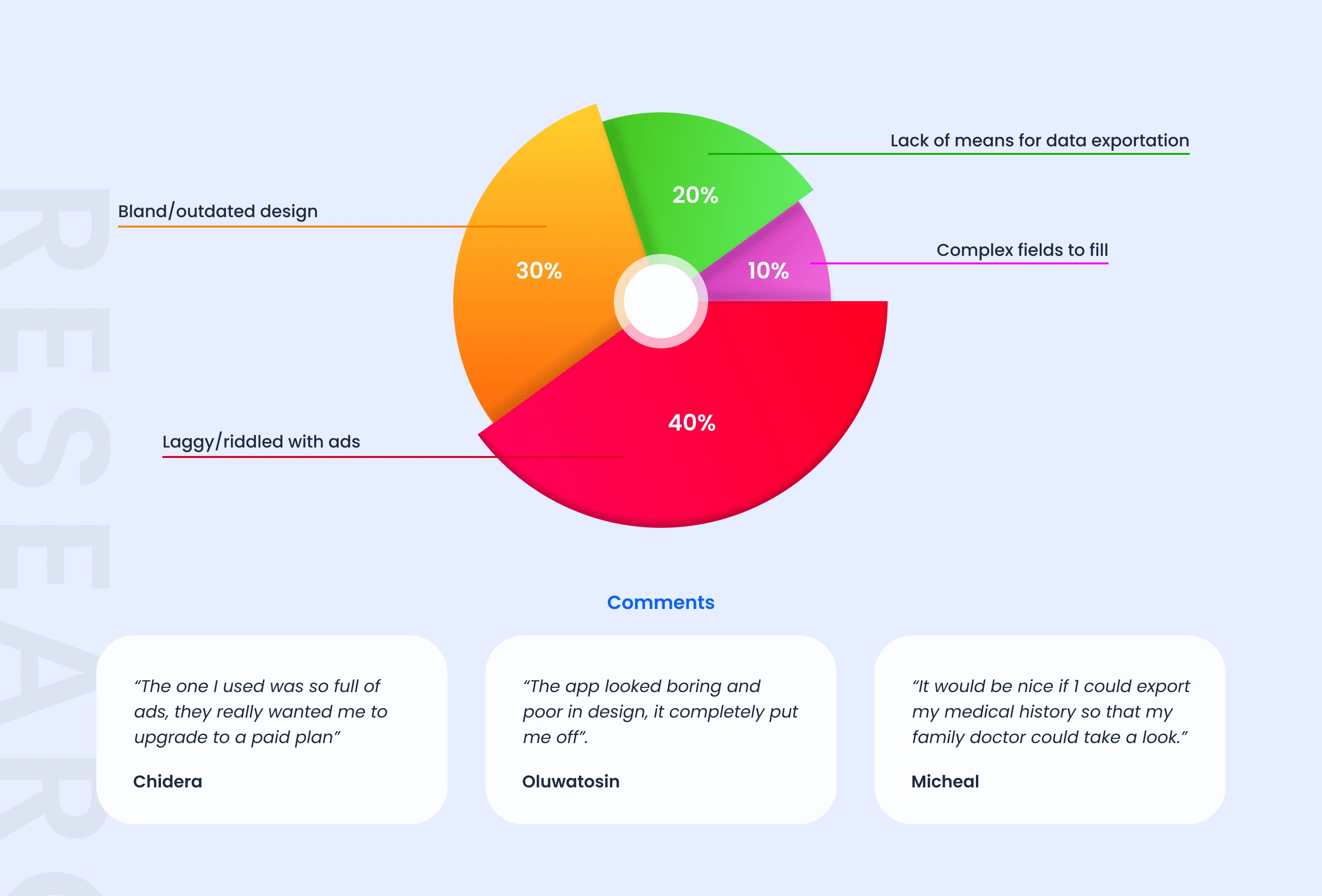
Only one question was asked, “What were your main challenges when using a medical app?”. These are their responses.
Archetypes
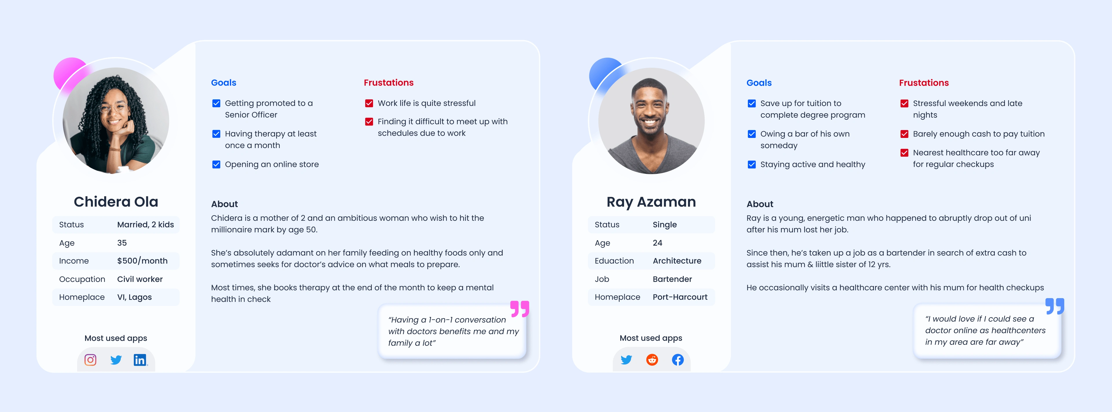
I then created personas which was driven by research data.
🛠Solution
User flow
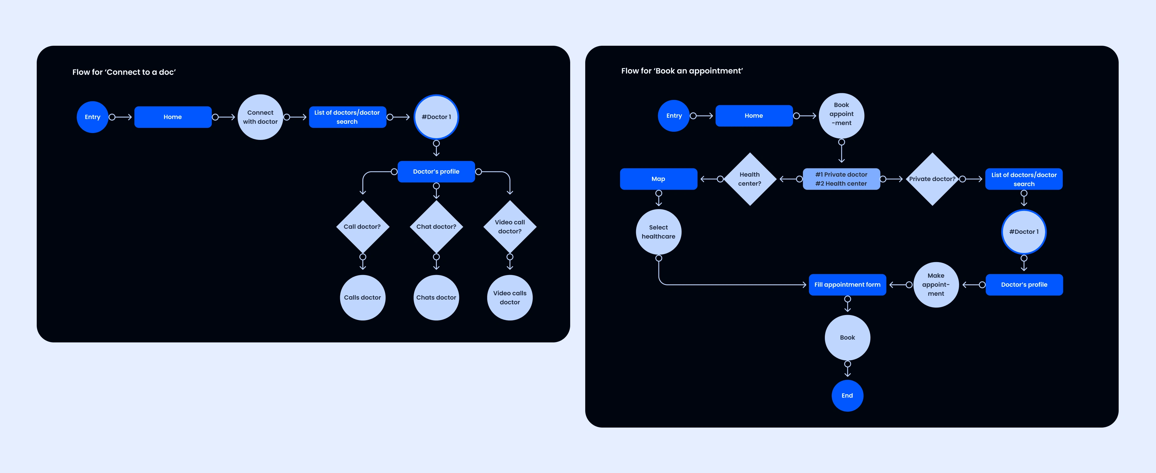
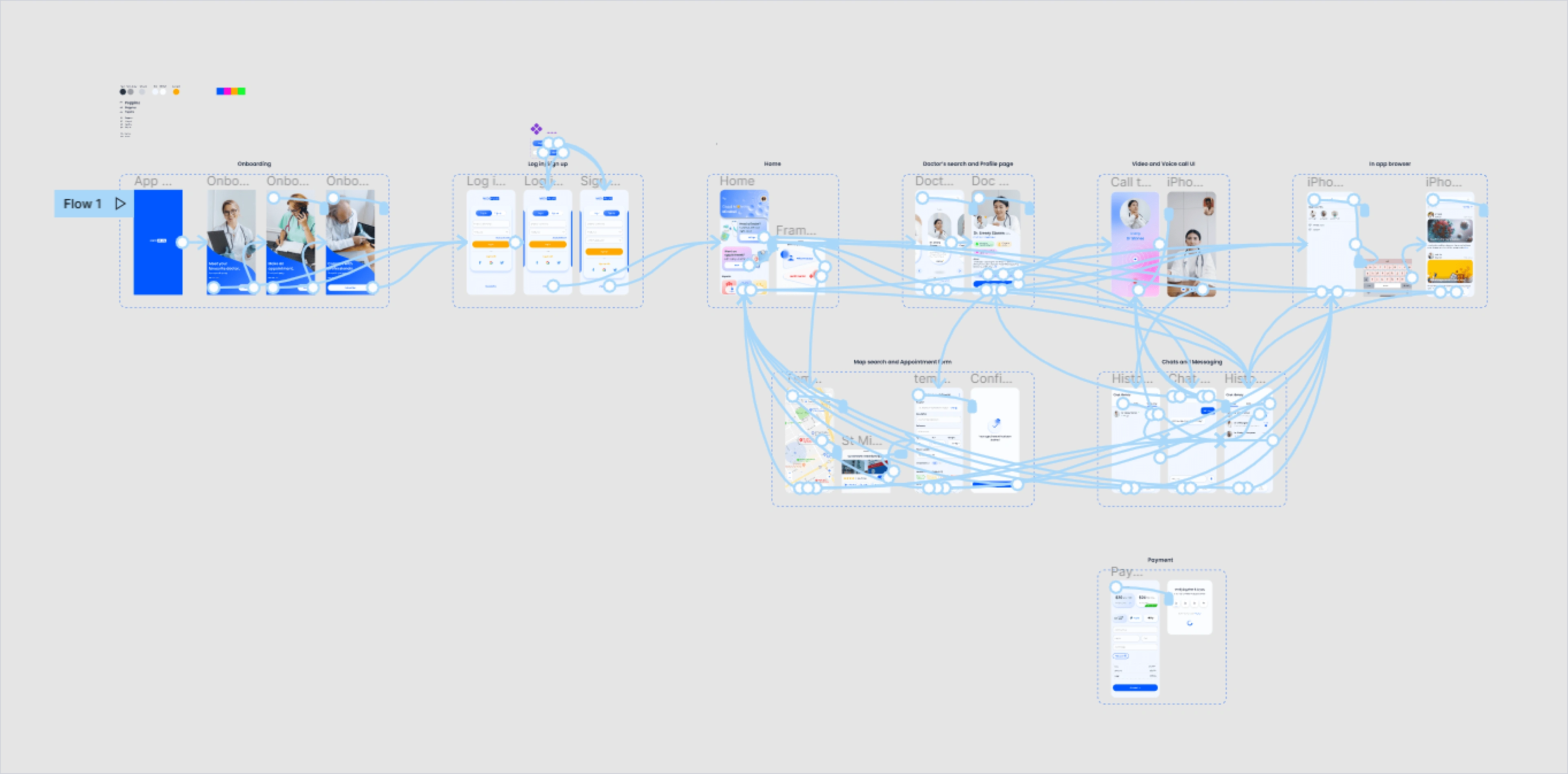
I drafted a basic flow diagram to show the user’s possible journey within the product.
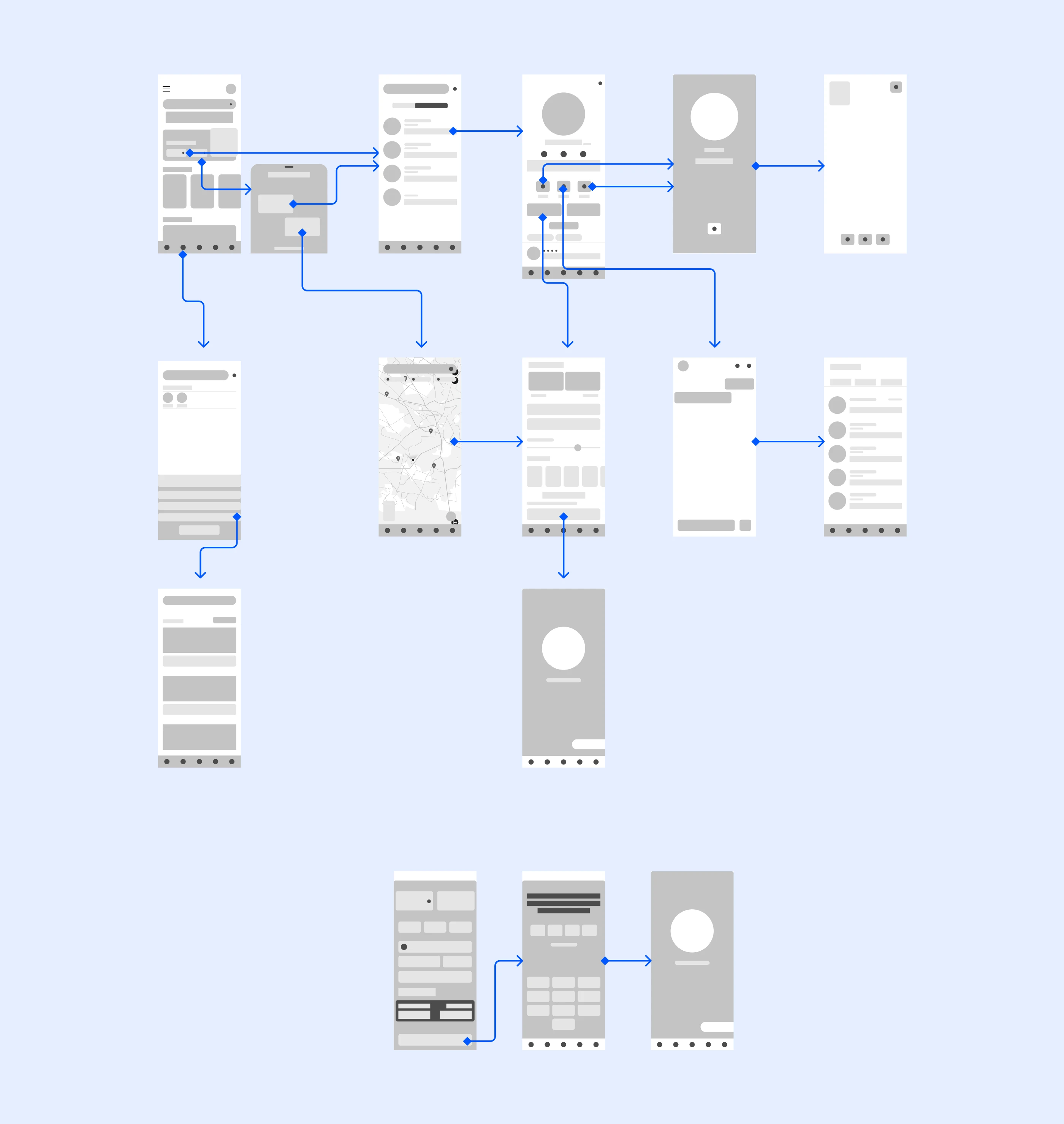
Wireframes
Logo design


Logo variants
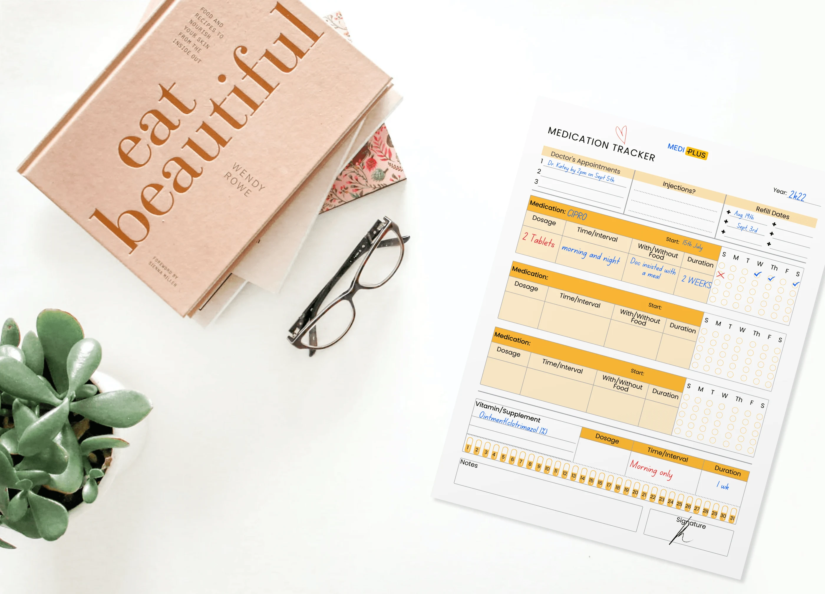
Mockup
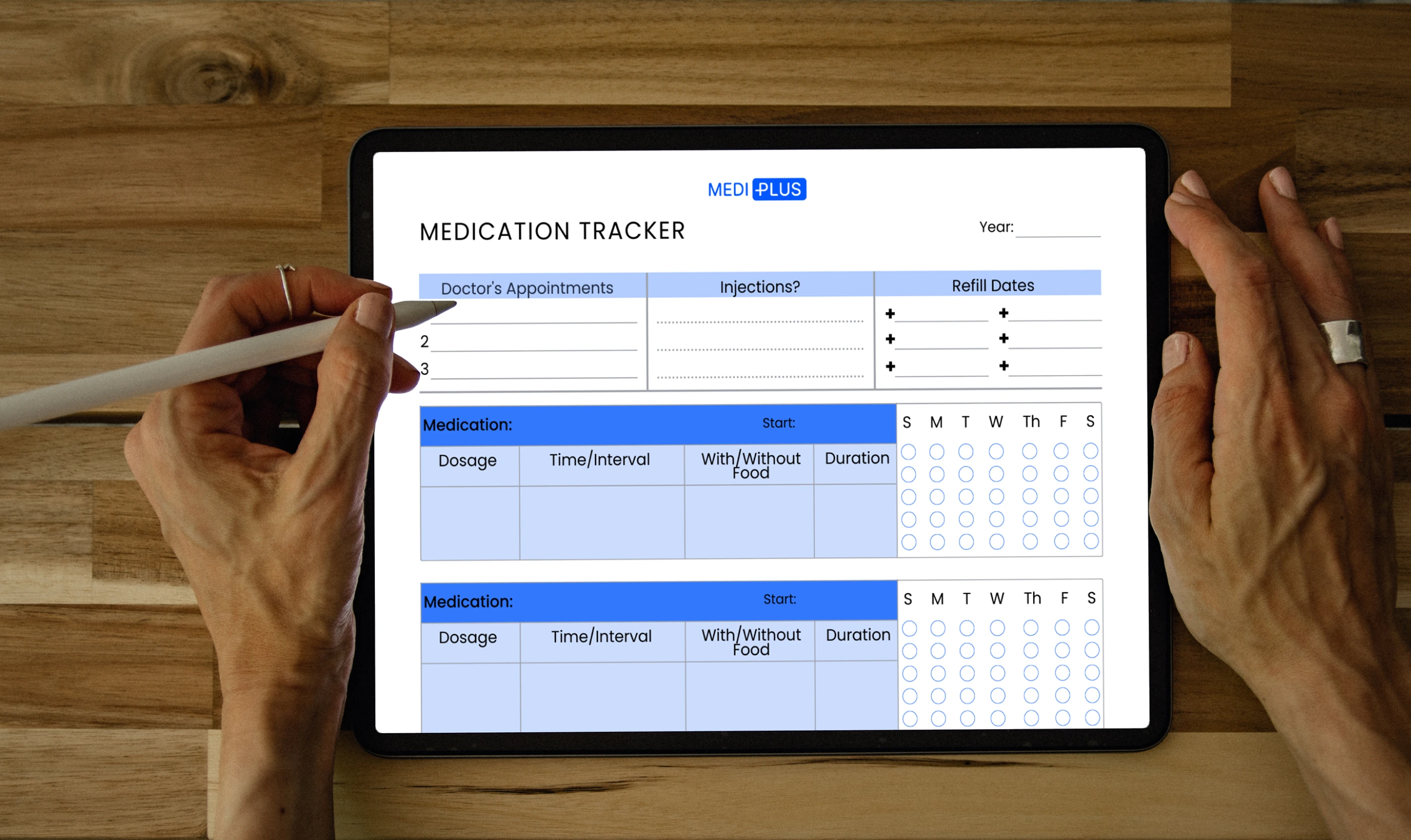
Mockup
📱Mobile UI
Onboarding
Users are welcomed for the first time, with the main features of the app been highlighted.
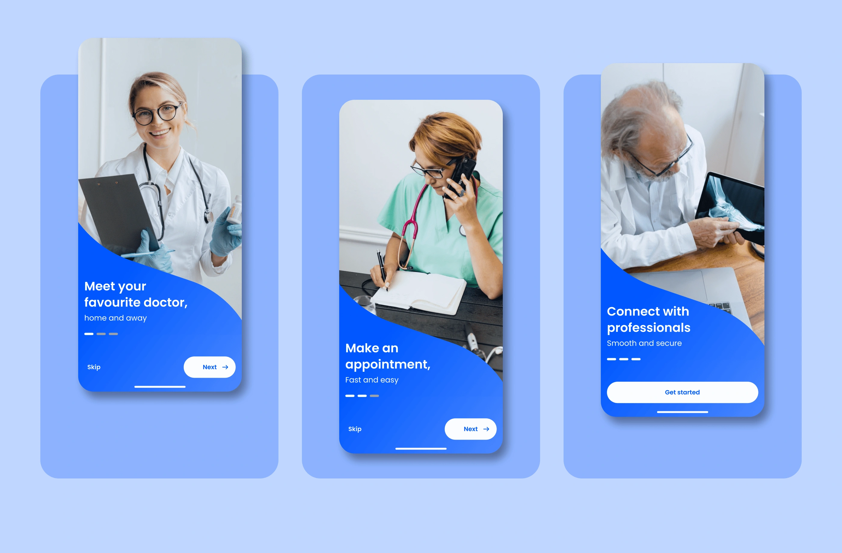
Onboarding screens
Sign up/Home
Users have the chance to register, sign up or skip the process for later.
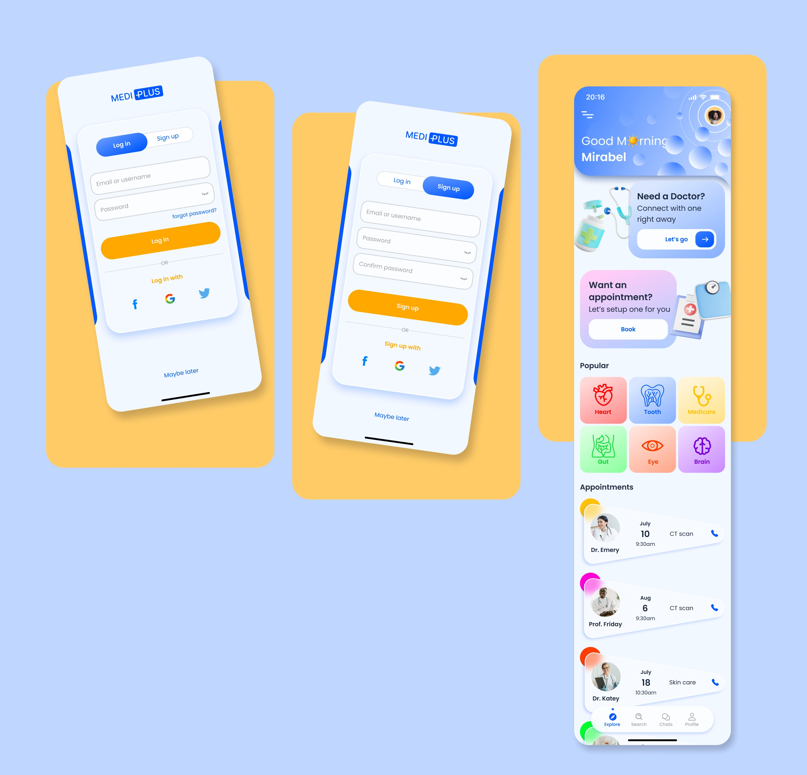
Sign/home screens
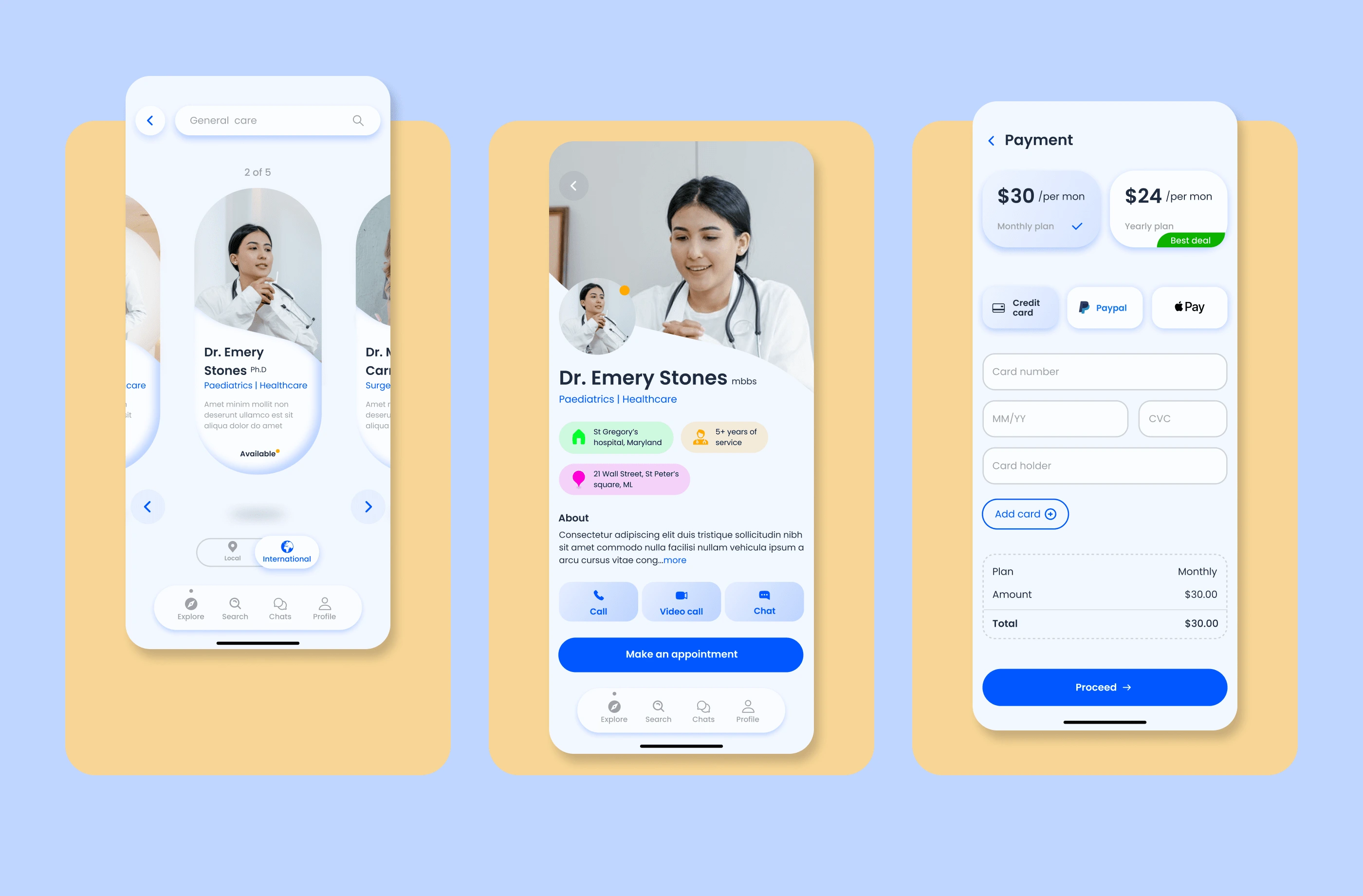
Doc search/Profile/Payment
Here, users have all available choices to tinker with. They can specifically search for a doctor or medical field, go local or international, and browse through doctors’ short bio. Once a choice is made, users can visit the doctor’s profile.
Users will be required to pay a full package subscription fee for unlimited sessions (of course, at a discount) or pay a premium to the doctor of choice before a session.
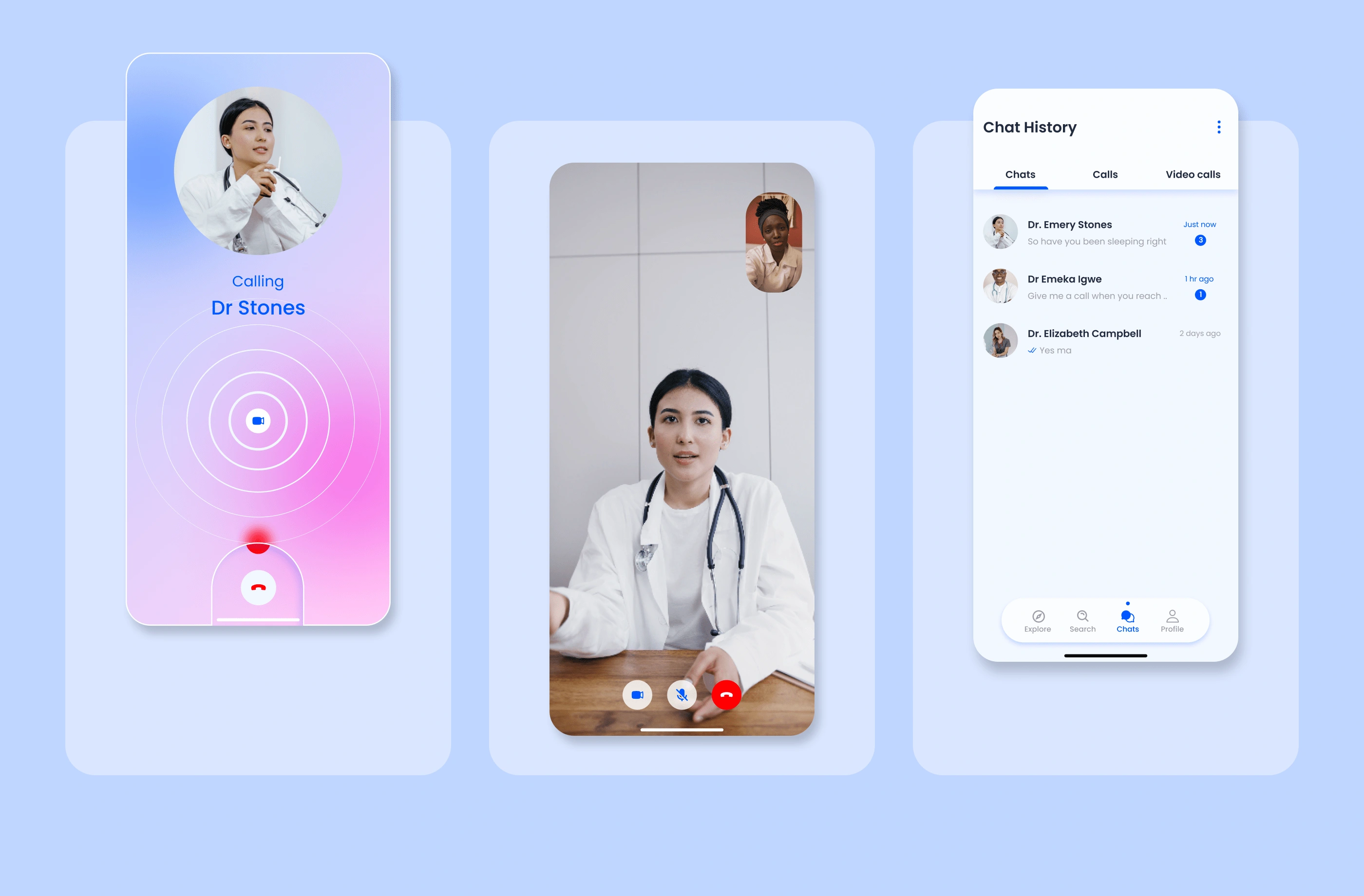
Video call/Chat
Once payment is made, users will be able to video chat, call or message the doctor of interest.
Appointment
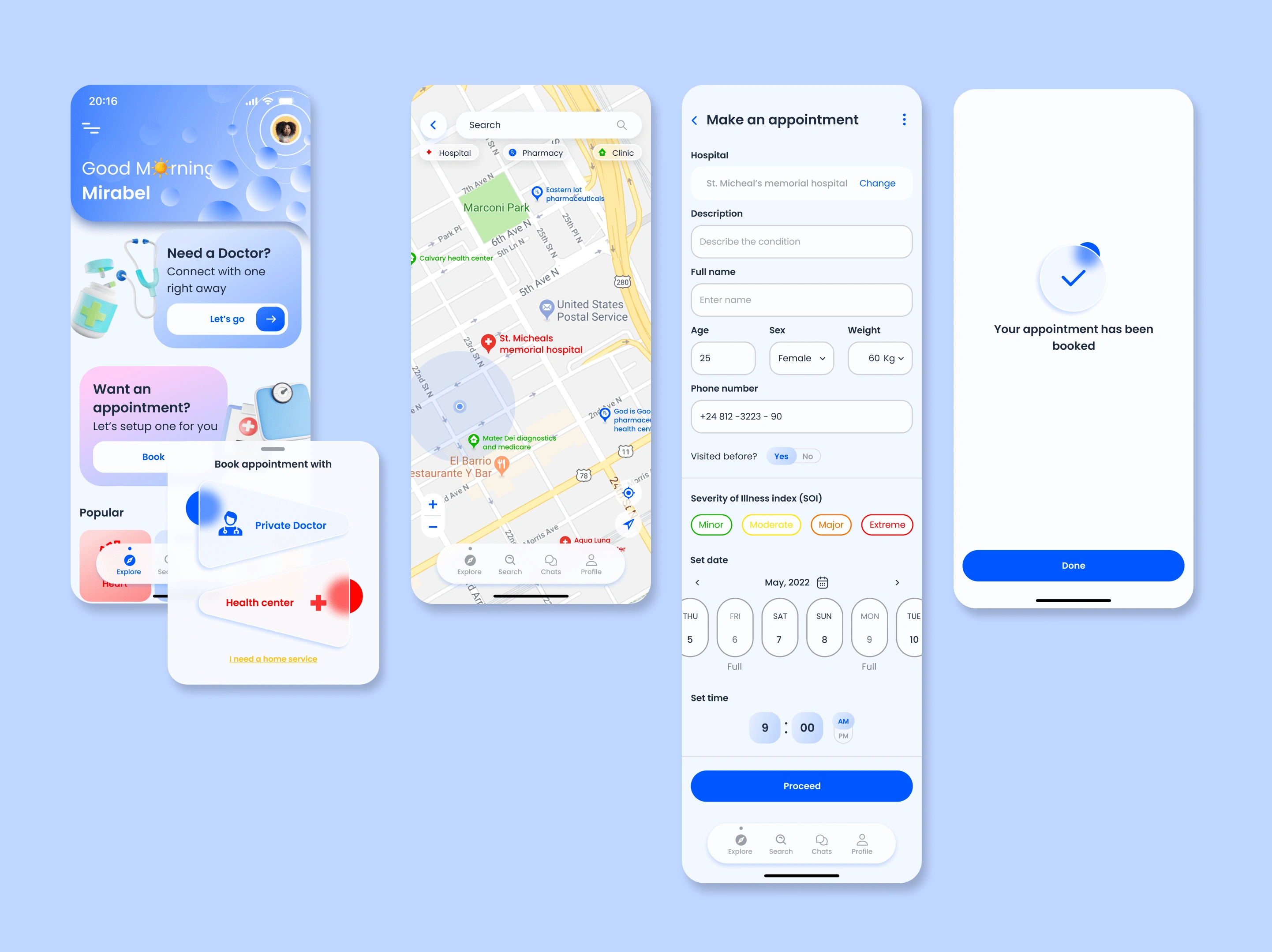
As one of the main features, users can conveniently book appointments online with any doctor or hospital of their choice, or search nearby healthcare via map.
Prototype
💻Desktop UI
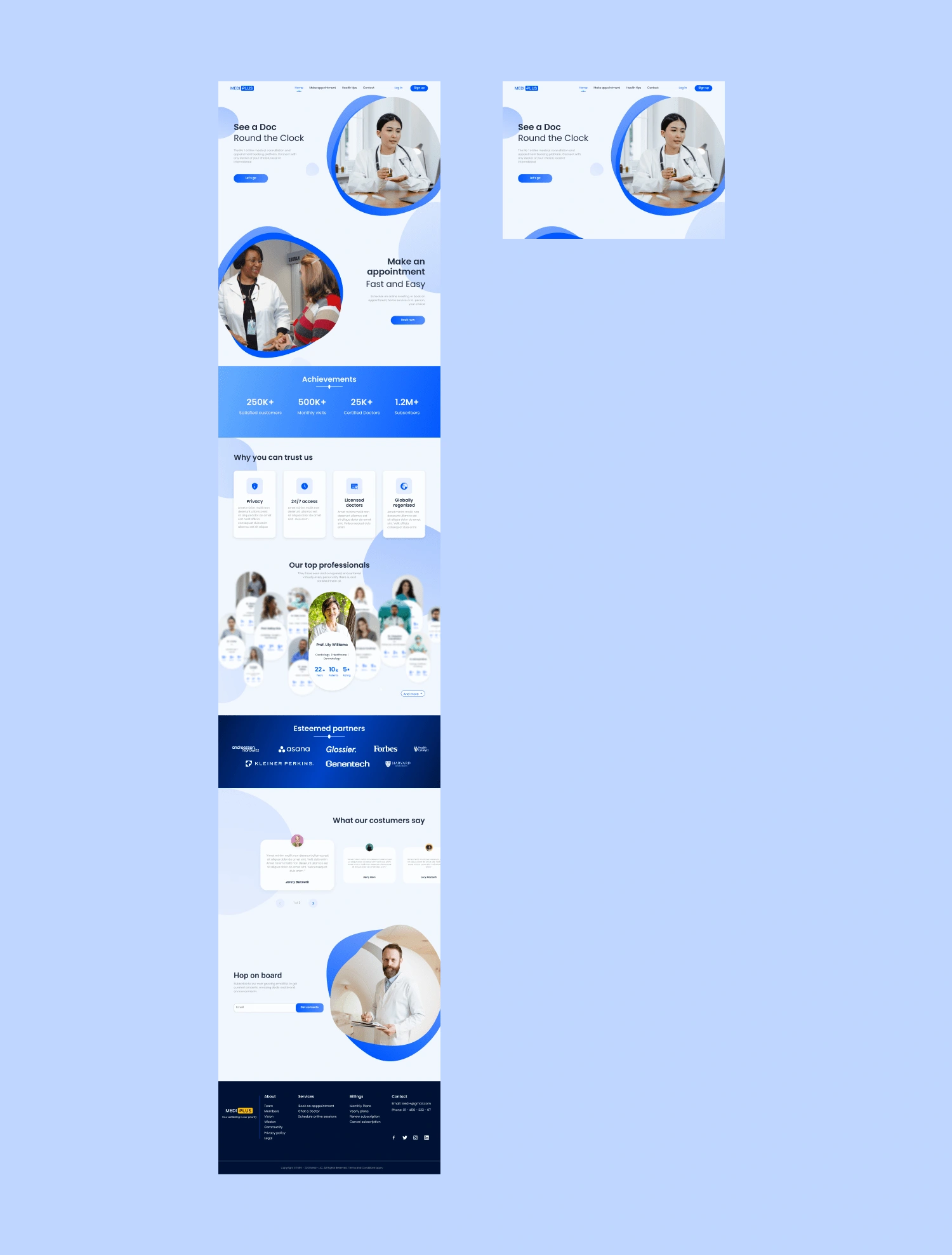
I designed a landing page for the product.
🎨Design system
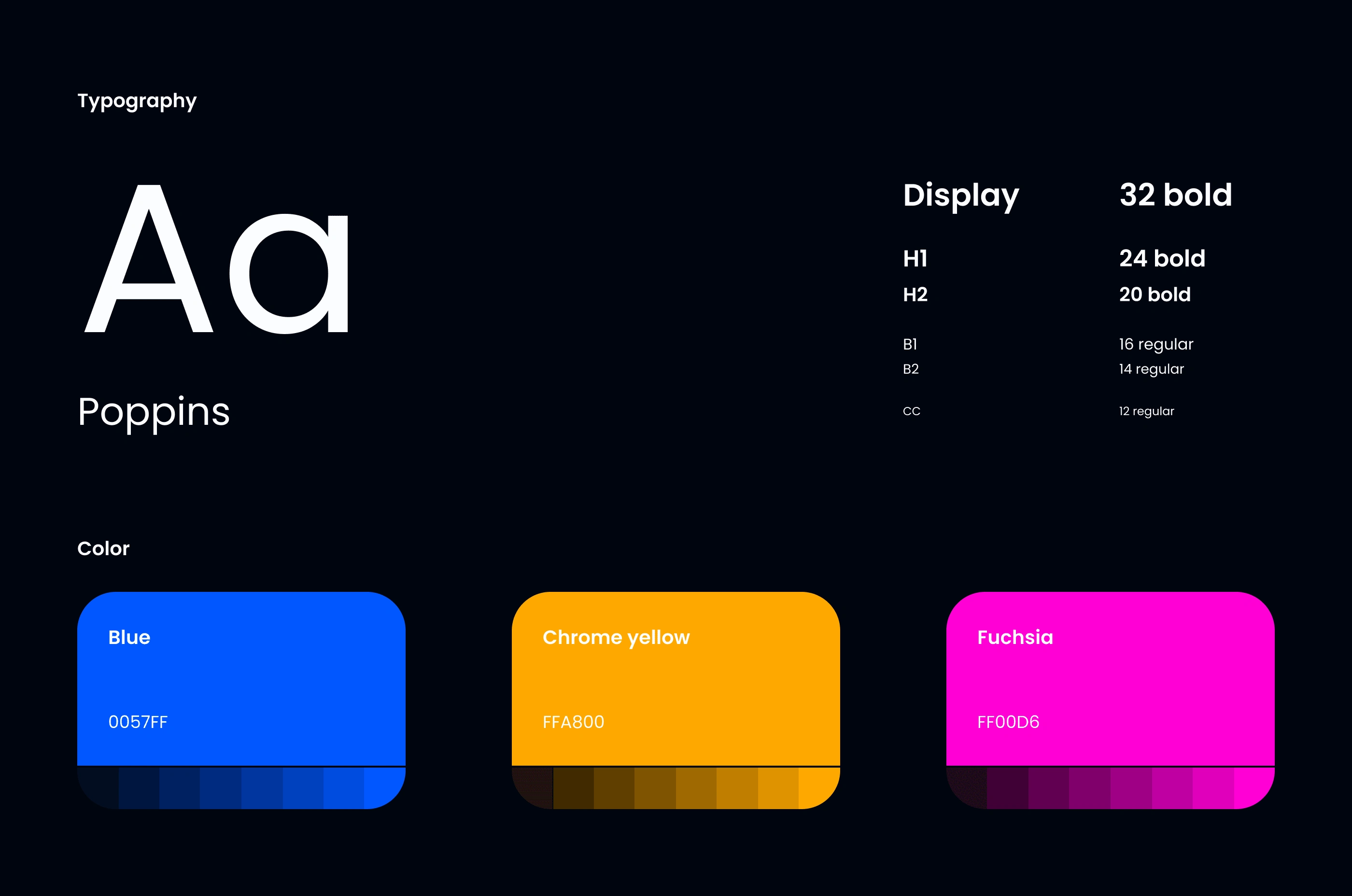
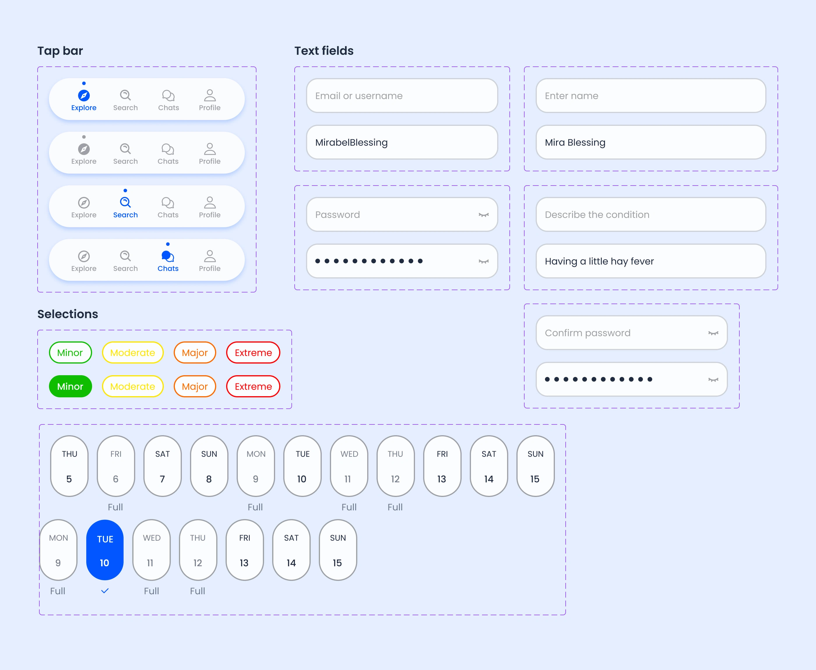
I made sure to organize and document my assets and components for a smoother developer handoff.
🧪Usability test
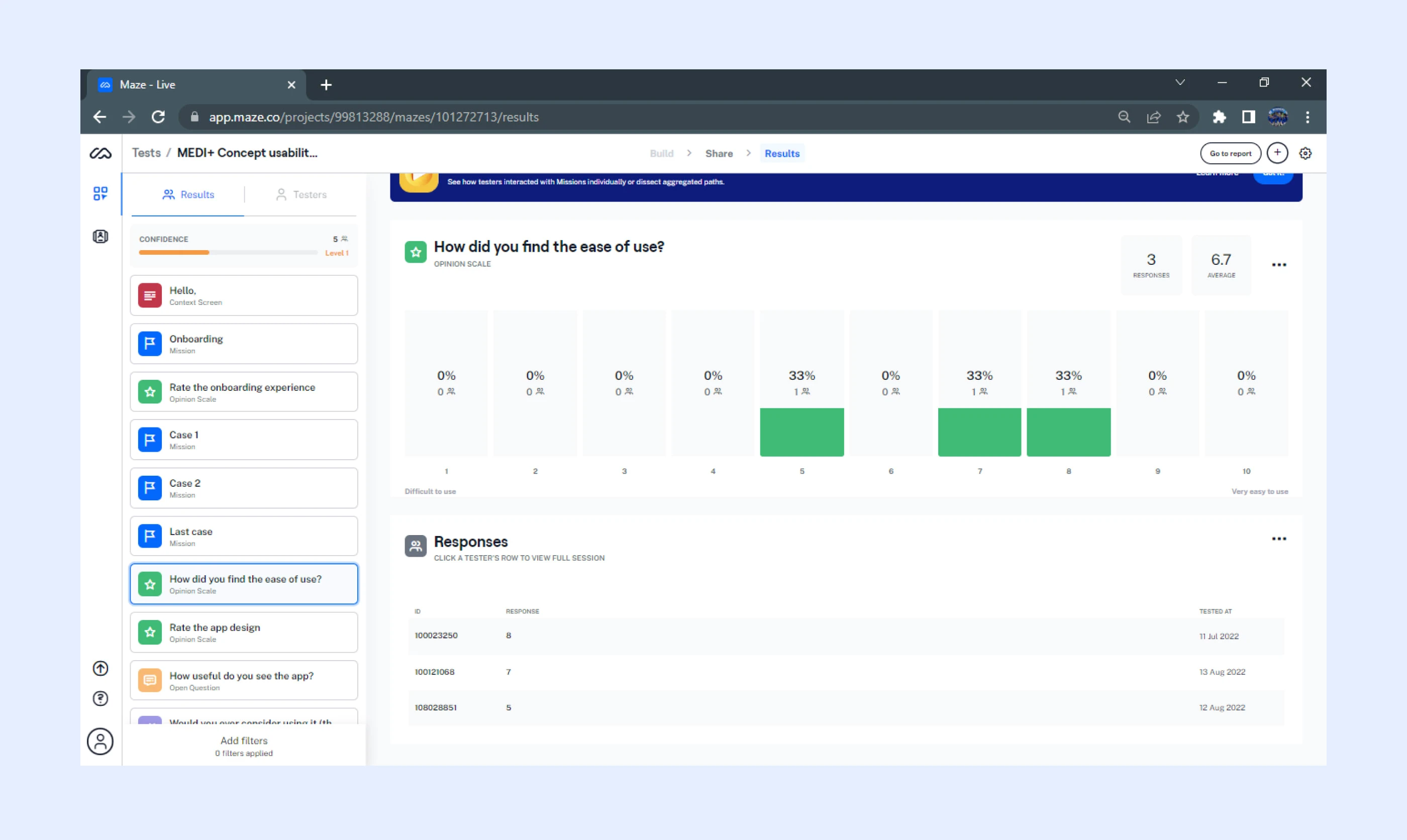
I conducted user testing using Maze, got results and iterated appropriately.
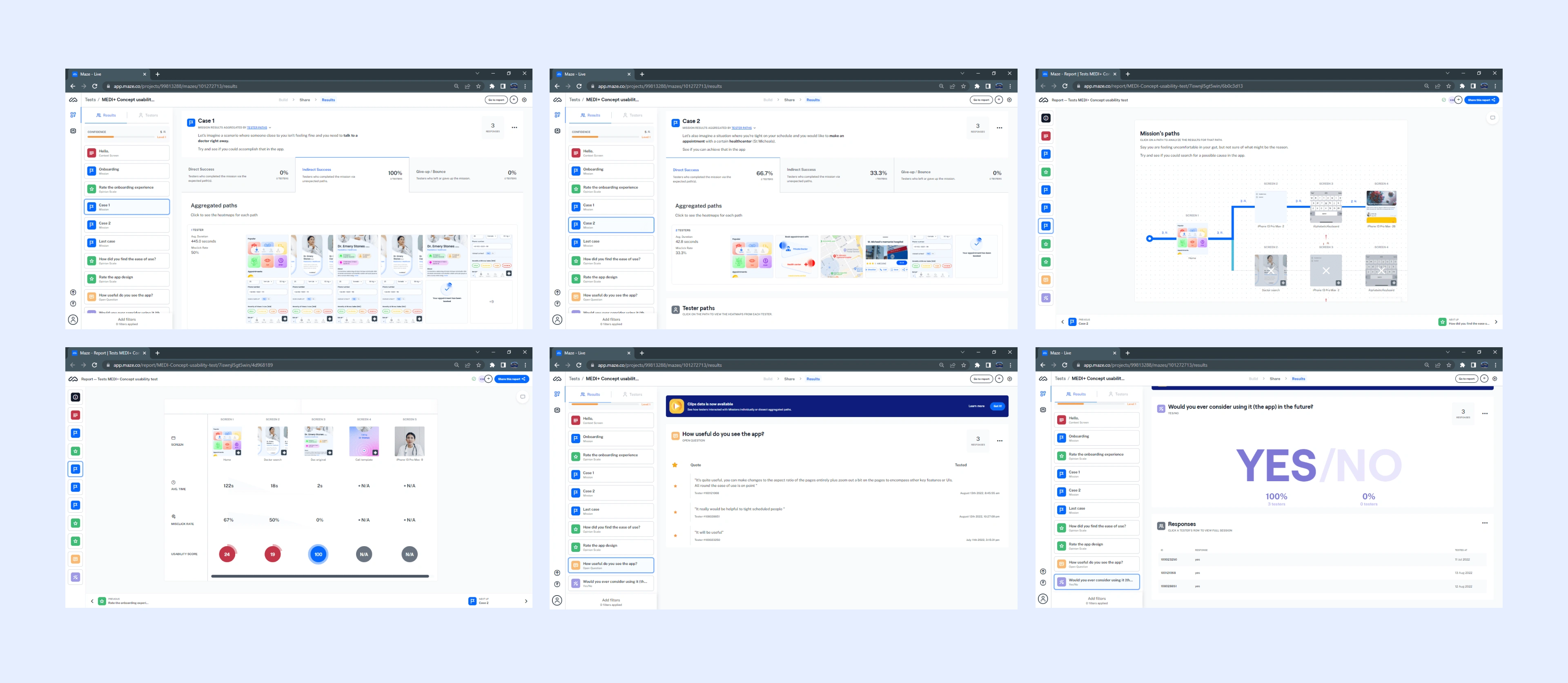
Screenshots of the tests carried out.
Conclusion
In all, It was an exciting project. One thing I would have explored more if time permitted would have been an AI assistant (similar to Siri or Bixby).
Check out the live prototype here.
Let's work together🤝.
Full project here👇🏽
Like this project
Posted Mar 21, 2023
Designed a mobile application that connects users to doctors and medical professionals through online therapy and appointments.

