Web Redesign of a Non-profit Website
📌About
Ceres is a non-profit organization that works with investors and companies to transform the economy and to build a sustainable future for the people and the planet. As a personal project, I decided to redesign their landing page, ceres.org.

Ceres.org

💭The reason behind...
I’ve always been a lover of nature🍃 and it’s been my desire for the world to move towards been carbon neutral, and our activities ecofriendly to the environment. These can’t be spoken loud enough as the advent of climate change & global warming hits us on our doorstep.
While doing some searches on nonprofits globally, I stumbled upon ceres.org and I immediately connected with their ideas, vision and purpose as it very well aligned with mine.
I took a stroll around the site and I felt it needed a bit of rework and redesign to make it look much more unified & professional, and to communicate the brand’s ideology well.
🎯Goals
To bring out:
1) Uniformity across the page
2) A professional look that communicates the brand’s ideology very well
💡Ideation
Brainstorming
Using a mood board, I began to piece elements, images and words that align with the brand and will clearly relay its message.
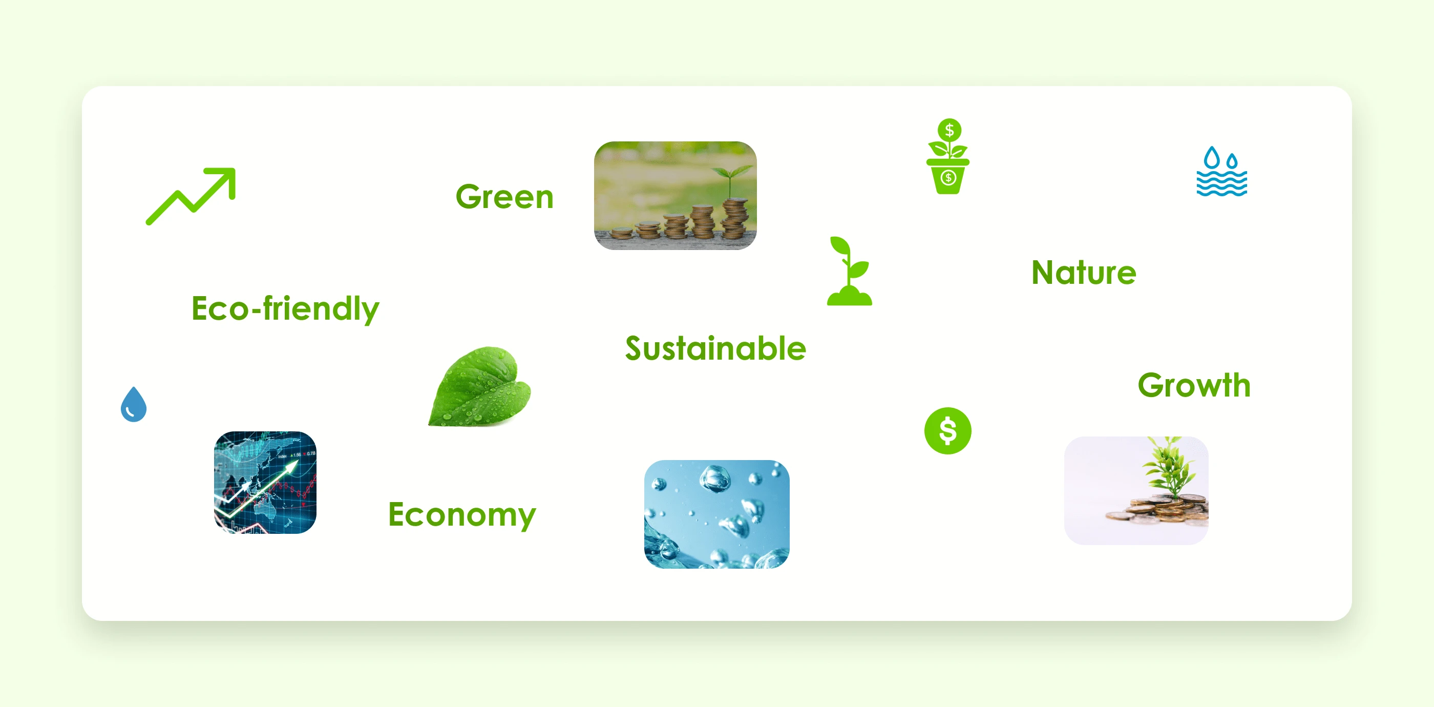
Mood board
Information Architecture
I derived and rearranged the IA (Information Architecture) from the front page to reflect a better hierarchy and climax of information.
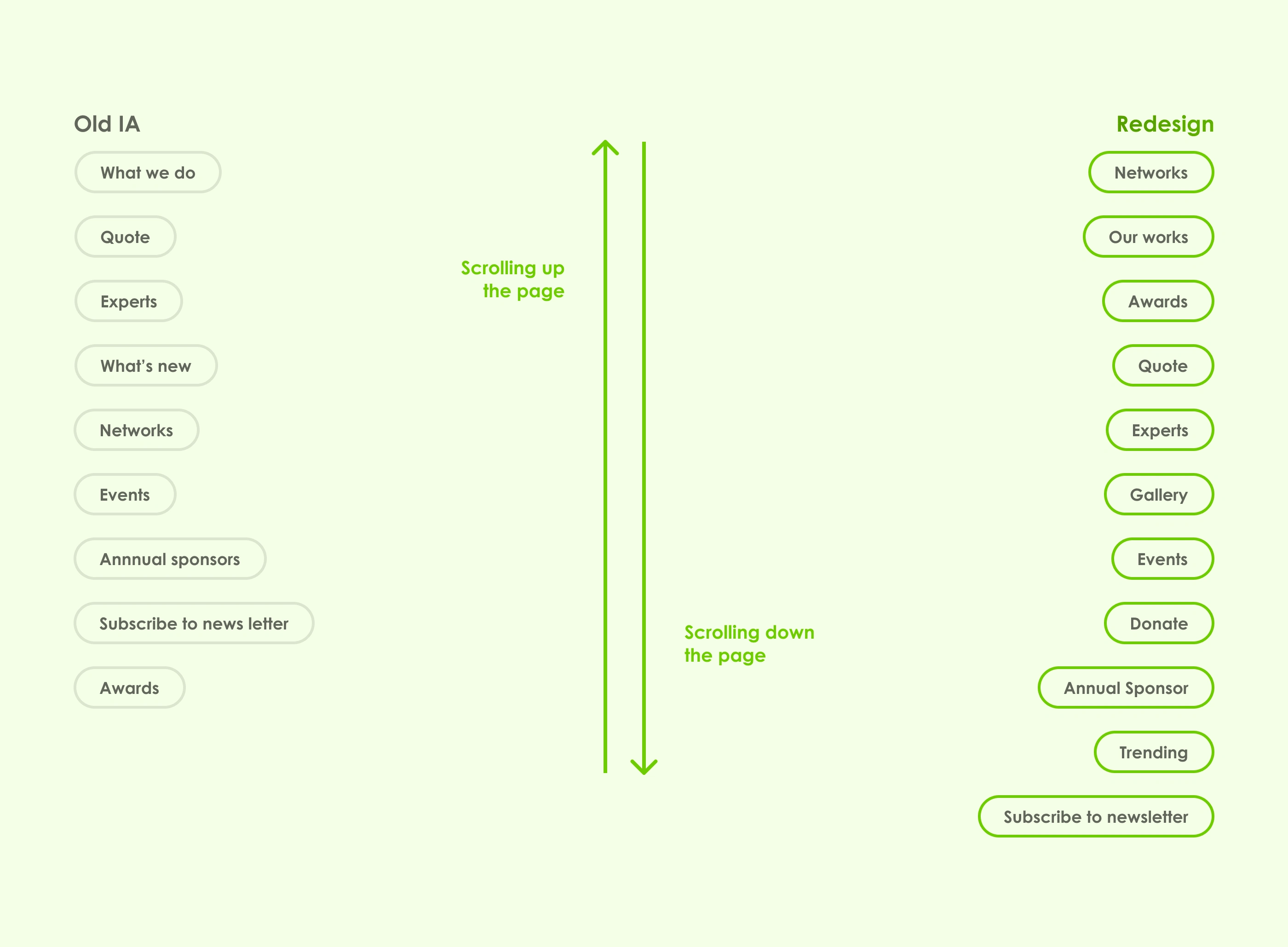
IA
Sketches
I sketched out my ideas on papers to see what fits where and make adjustments.
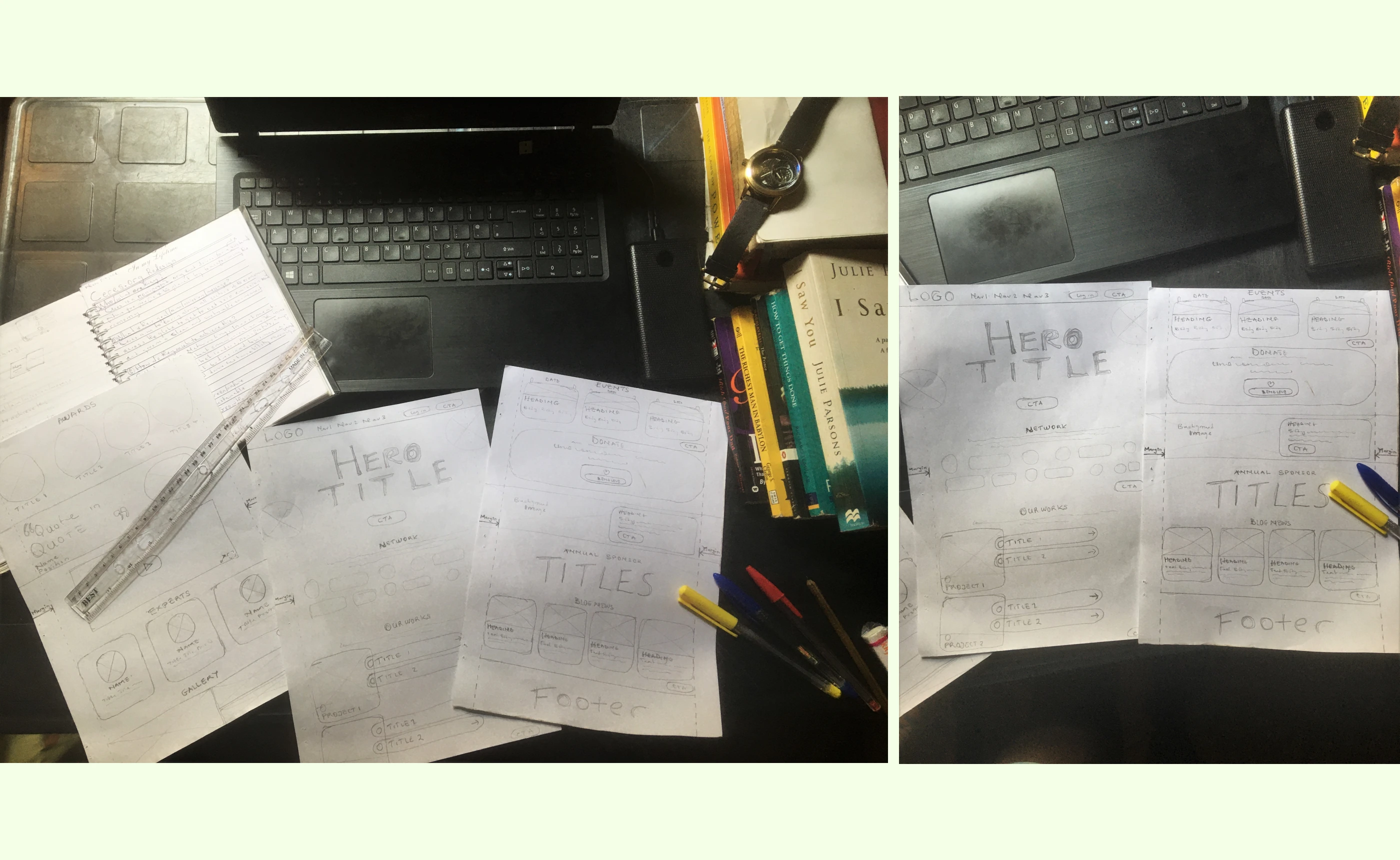
Wireframes
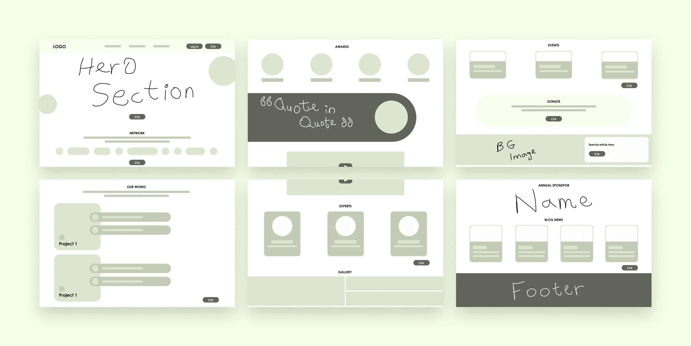
I then drafted out wireframes for the desktop landing page.
✨UI design
Desktop UI
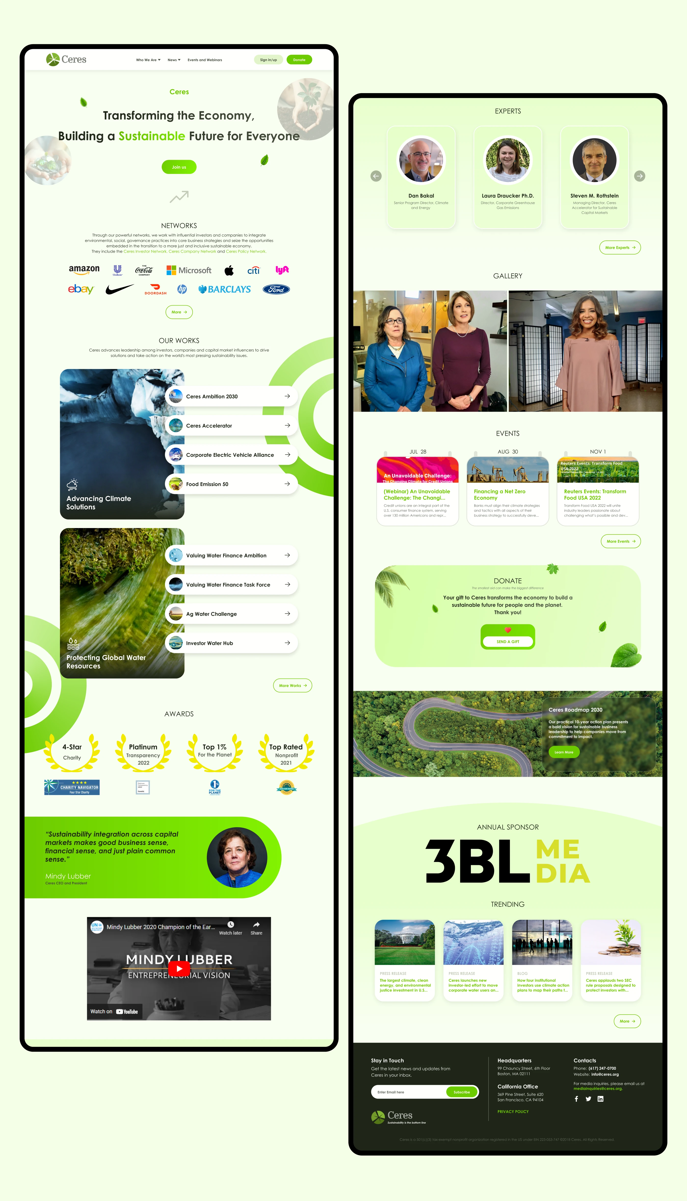
Desktop view port
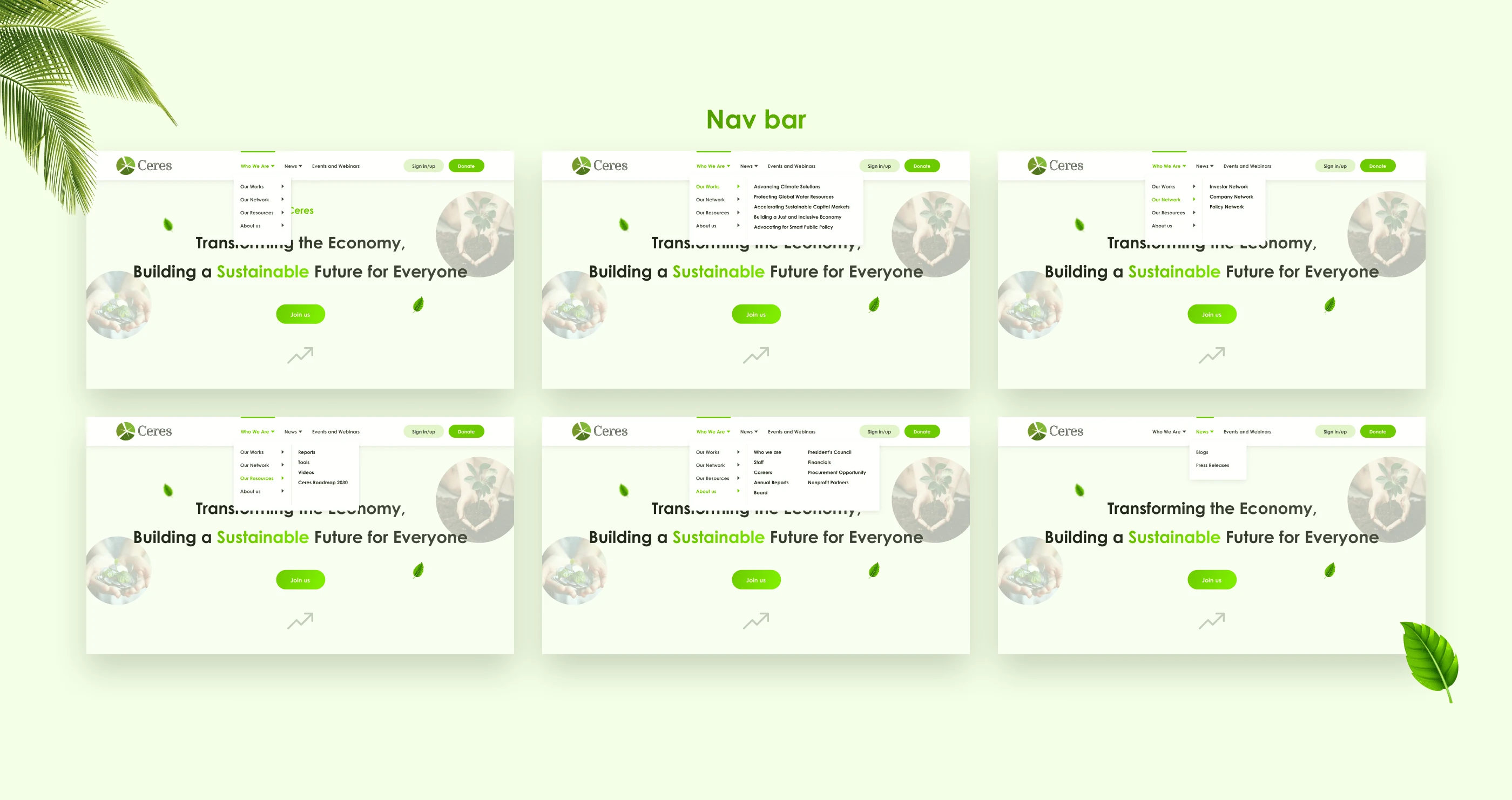
Navigation bar
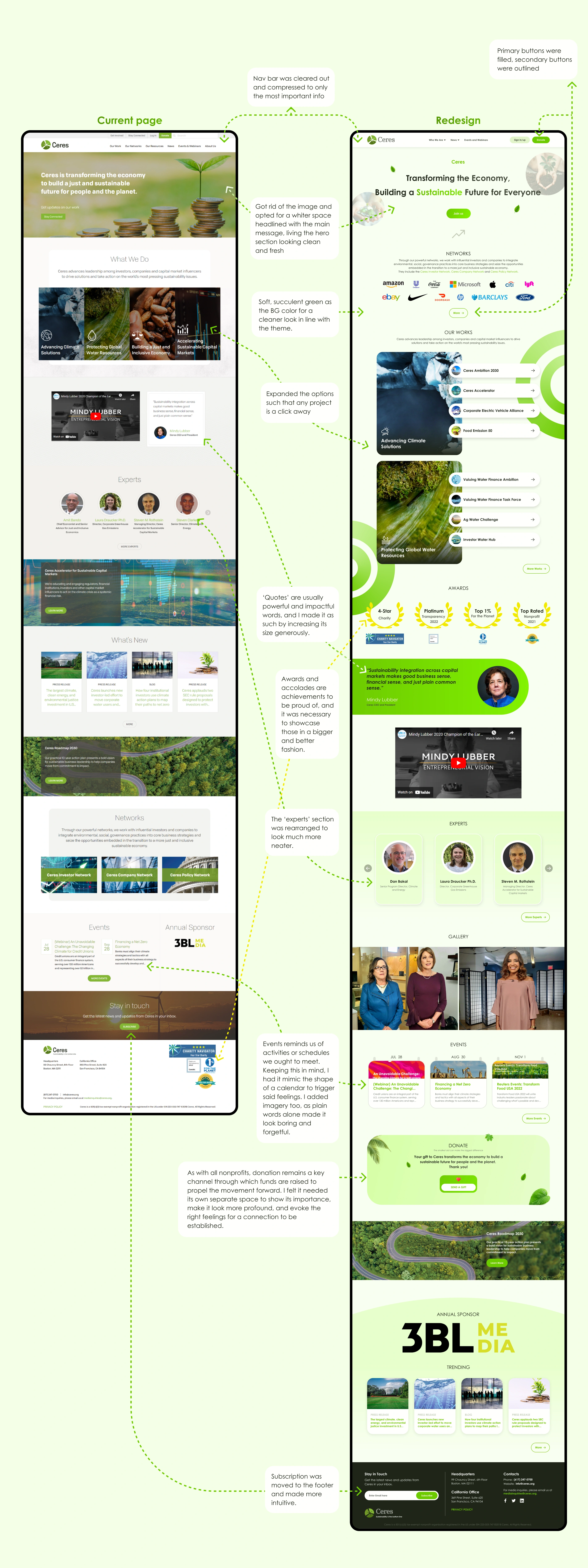
Side-by-Side comparison of the current and redesigned website
Tablet UI
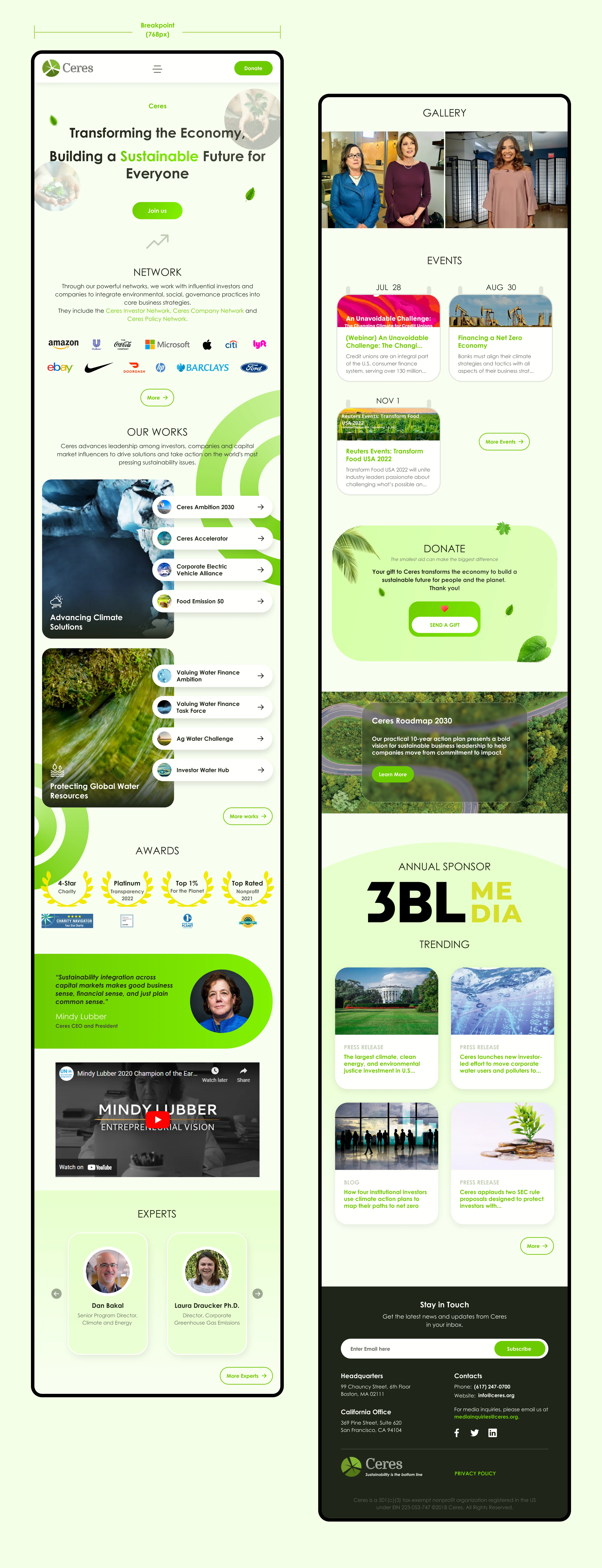
Tablet view port
Mobile UI
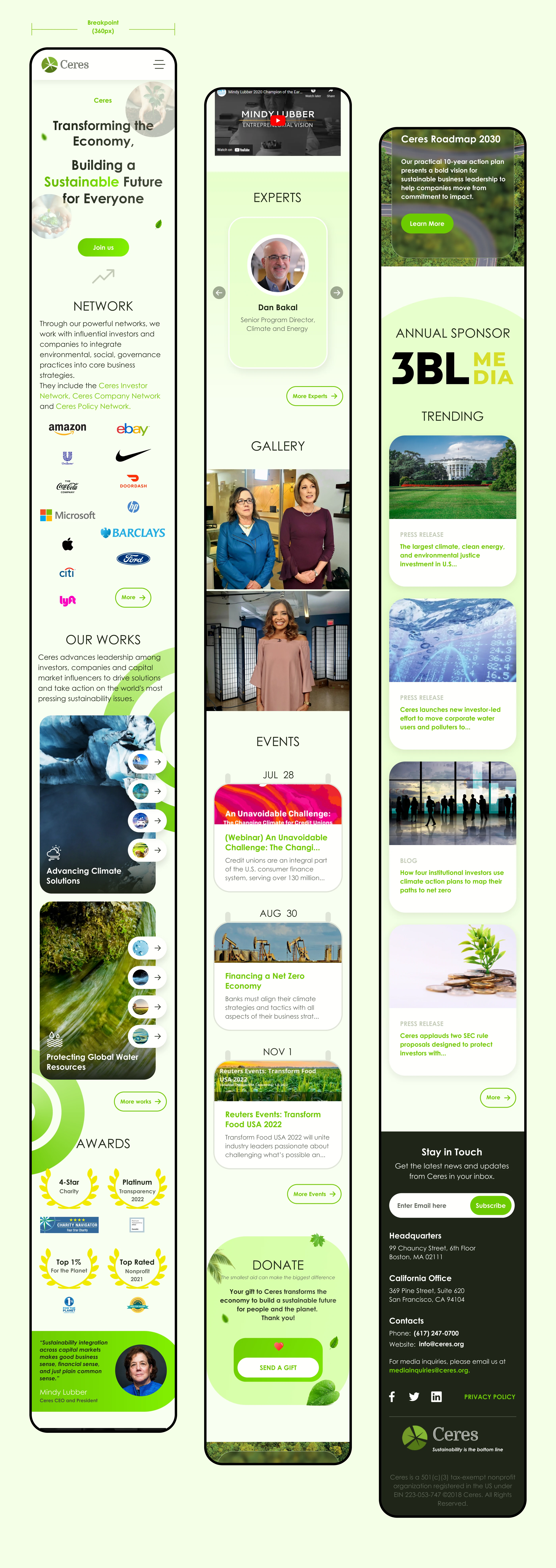
Mobile view port
🎨Style guide
Typography
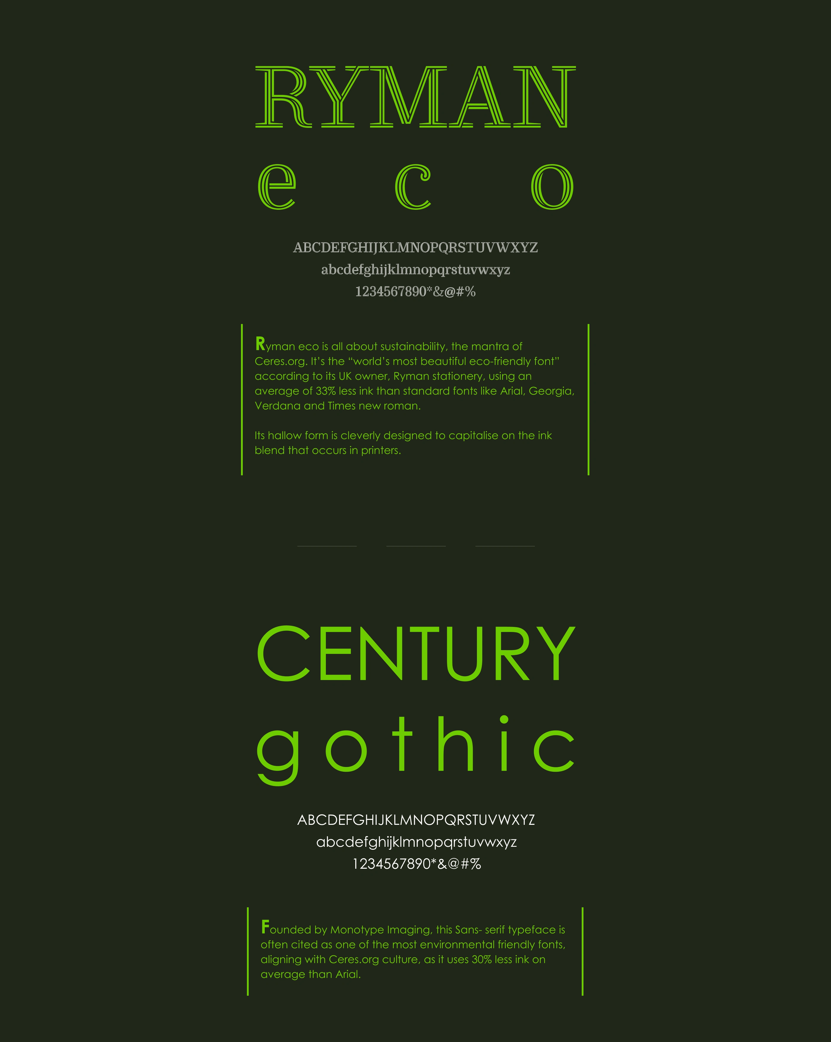
While I was working on this project, I made sure everything represented sustainability from top to bottom. That was why I chose Ryman eco and Century gothic as the project fonts.
Ryman eco is all about sustainability, the mantra of Ceres. It’s the “world’s most beautiful eco-friendly font” according to its UK owner, Ryman stationery, using an average of 33% less ink than standard fonts like Arial, Georgia, Verdana and Times new roman.
Founded by Monotype Imaging, Century gothic is often cited as one of the most environmental friendly fonts, aligning with Ceres culture, as it uses 30% less ink on average than Arial.
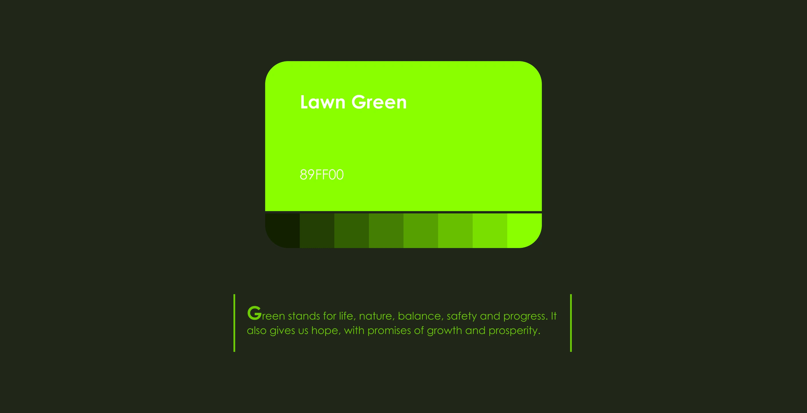
Color
I used Green as the primary color as it stands for life, nature, balance, safety and progress. It also gives us hope, with promises of growth and prosperity.
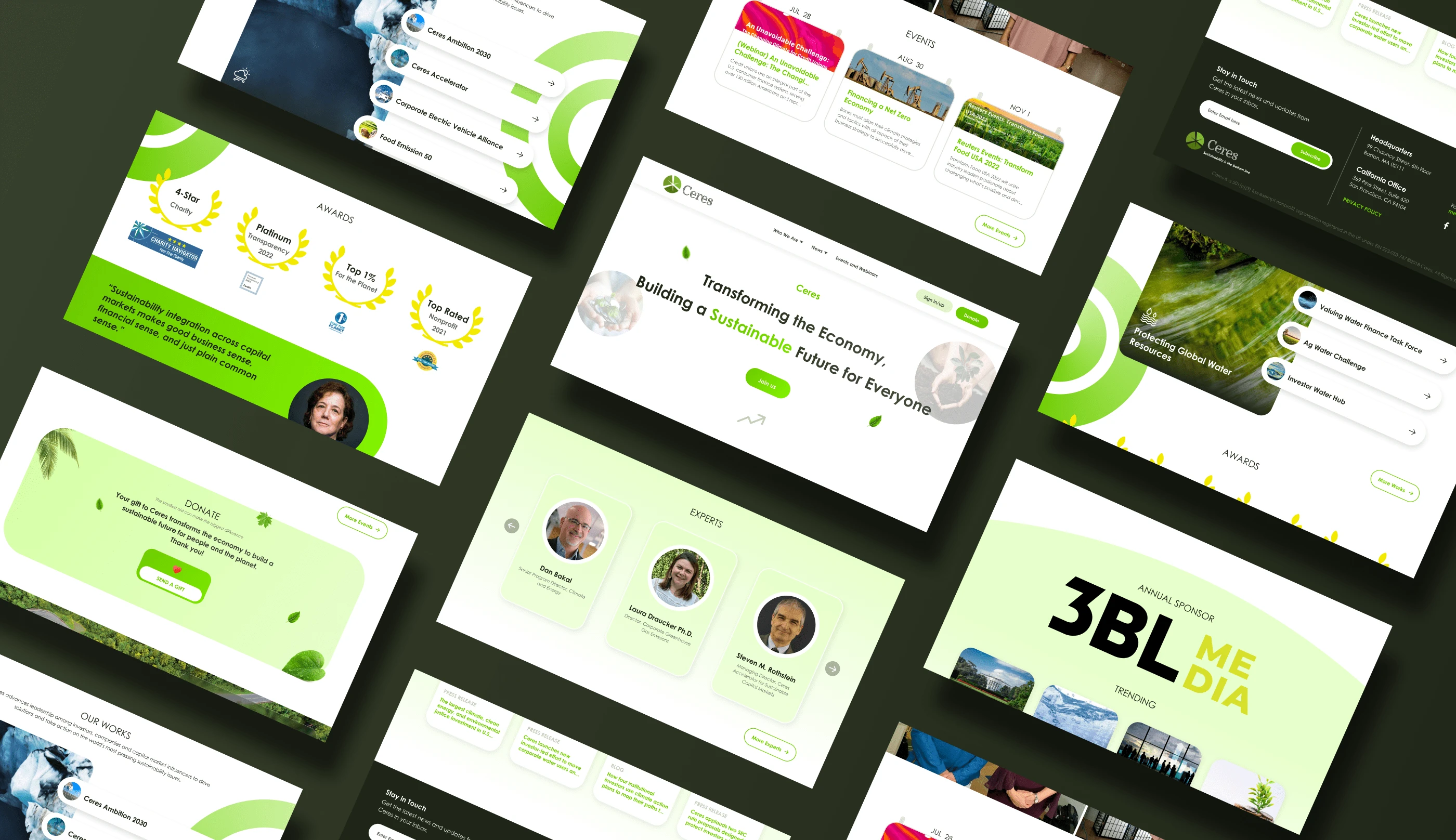
Gallery
Conclusion
I enjoyed every bit of this project and I trust that one day, we would be able hit net-zero emission in our dear planet.
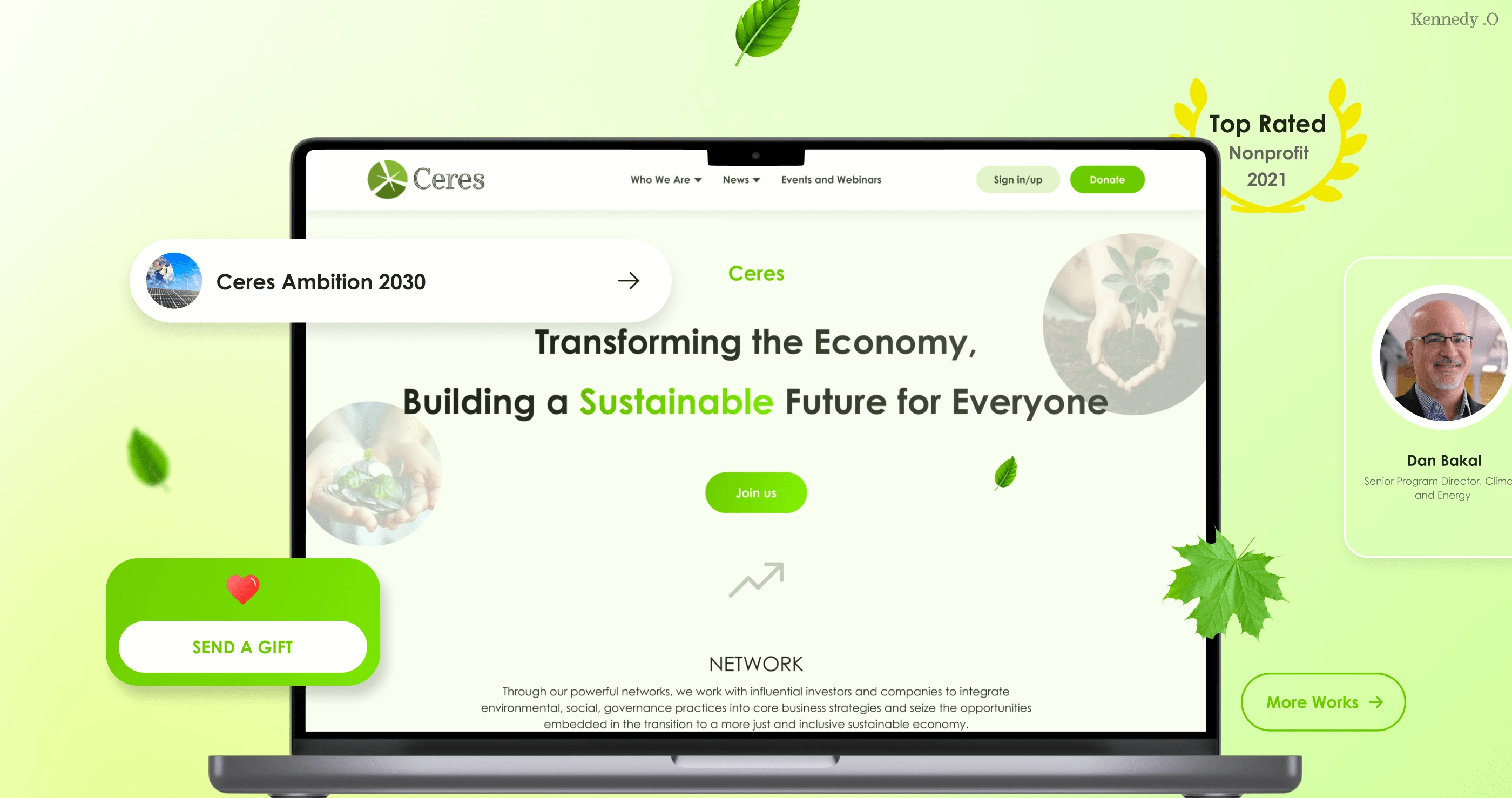
Check out the live prototype here
Let's work on your project🤝
Full project here👇🏽
Like this project
Posted Apr 21, 2023
Redesigned the landing page of a non-profit to portray the brand in a more professional and cohesive look.
Likes
0
Views
9
