UI/UX Case Study: VR Mobile app and Dashboard Design
📌About
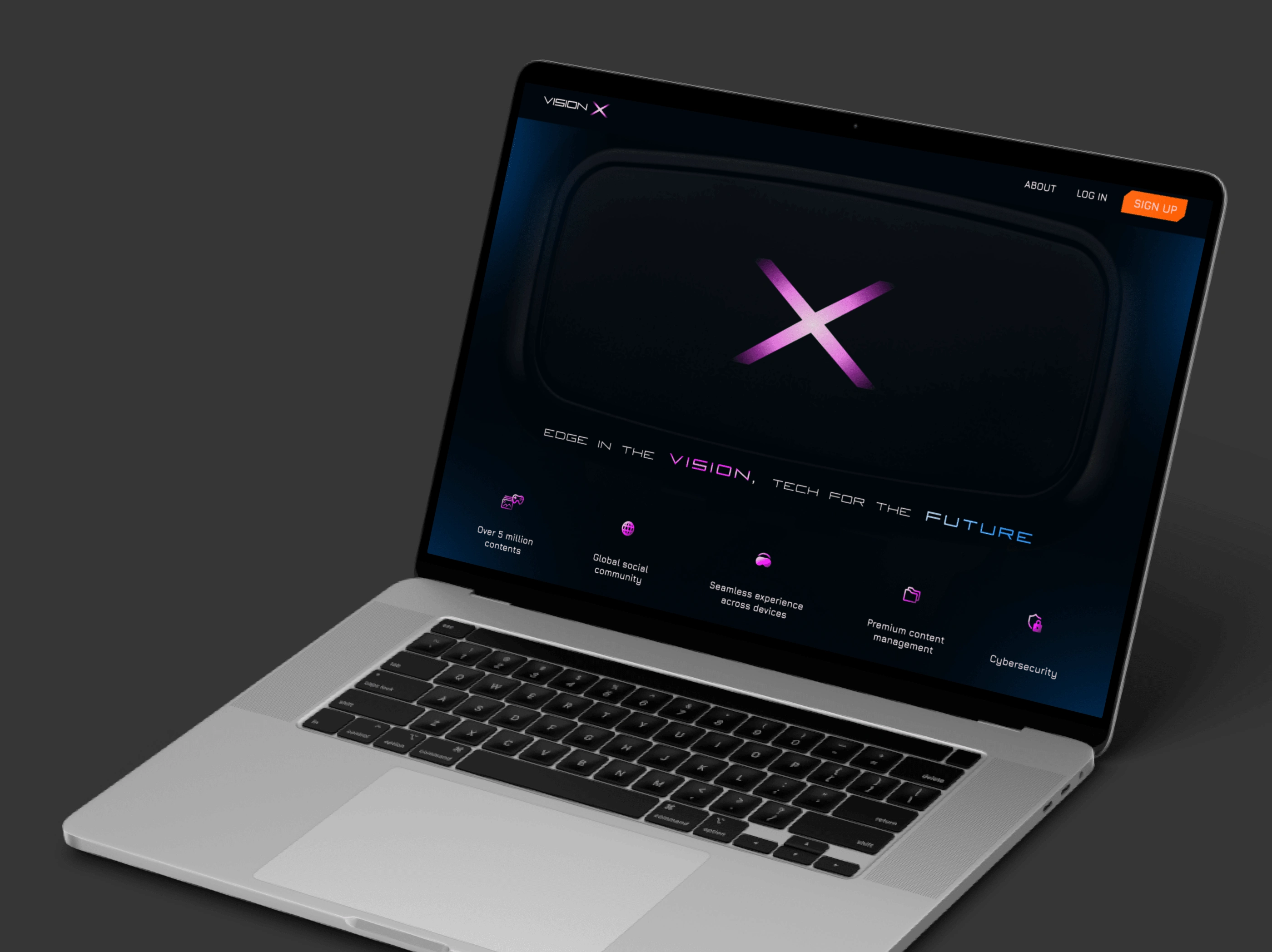
Vision X is a virtual reality app concept where users can access a plethora of virtual contents, chat, share and enjoy their experience with friends and colleagues worldwide, through a social medium.
Vision X

🎯Challenges/Goals
The VR industry is yet another exciting prospect in the tech world, having seen a steady rise in adoption and popularity. However, its young market is not devoid of setbacks, amongst many been the lack of social engagement in VR apps.
The goal then, was to Integrate social features, as well as increase social engagement in the VR app.
🔎Research
According to Greenlight insights, 77% of the 4,217 participants of a consumer survey who owns a VR headset, want more social engagement in VR and are interested in interacting socially with other people in VR.
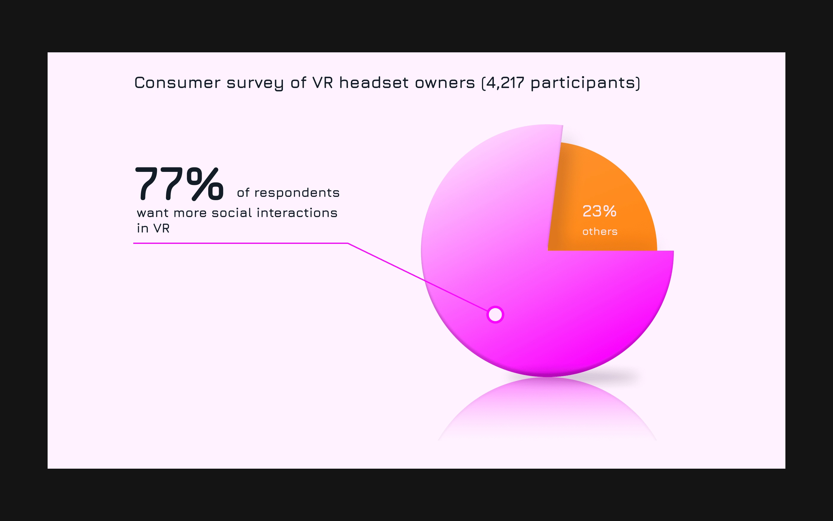
Source: Greenlight insights, 2018
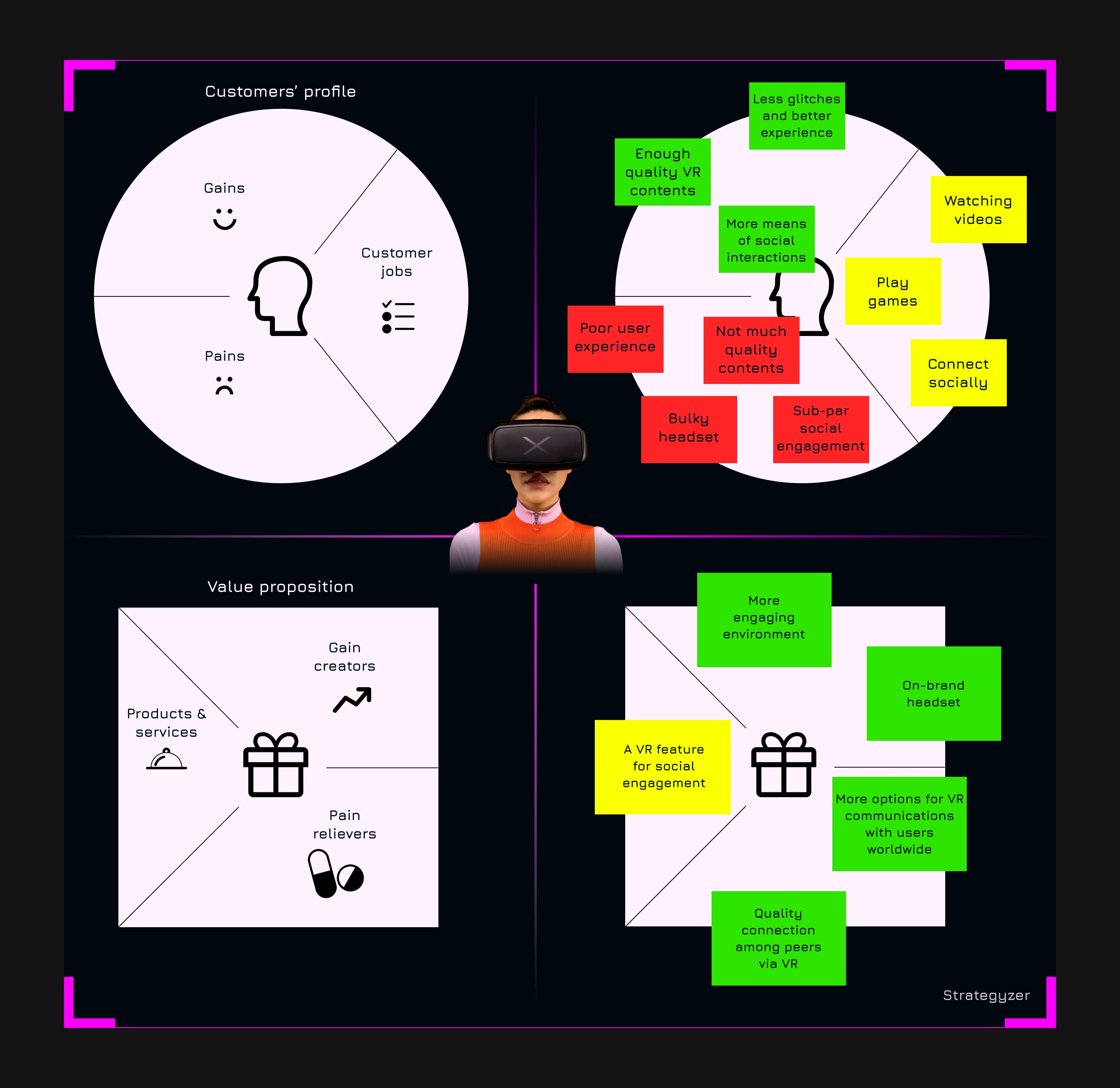
Customer profile and Value proposition
Using the data gathered, and based on information gotten from research, I deduced the customer’s profile and value proposition.
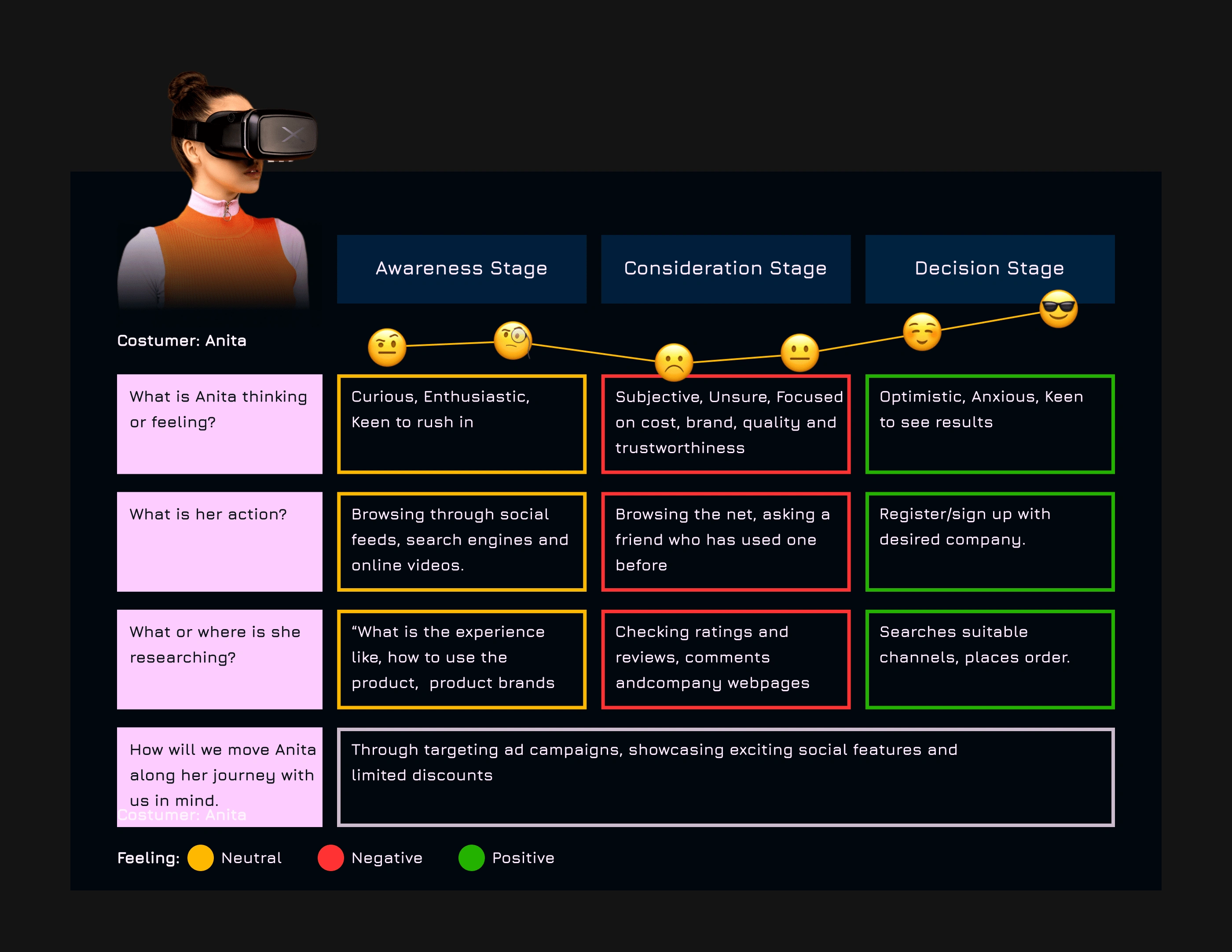
User journey map
🛠Solutions
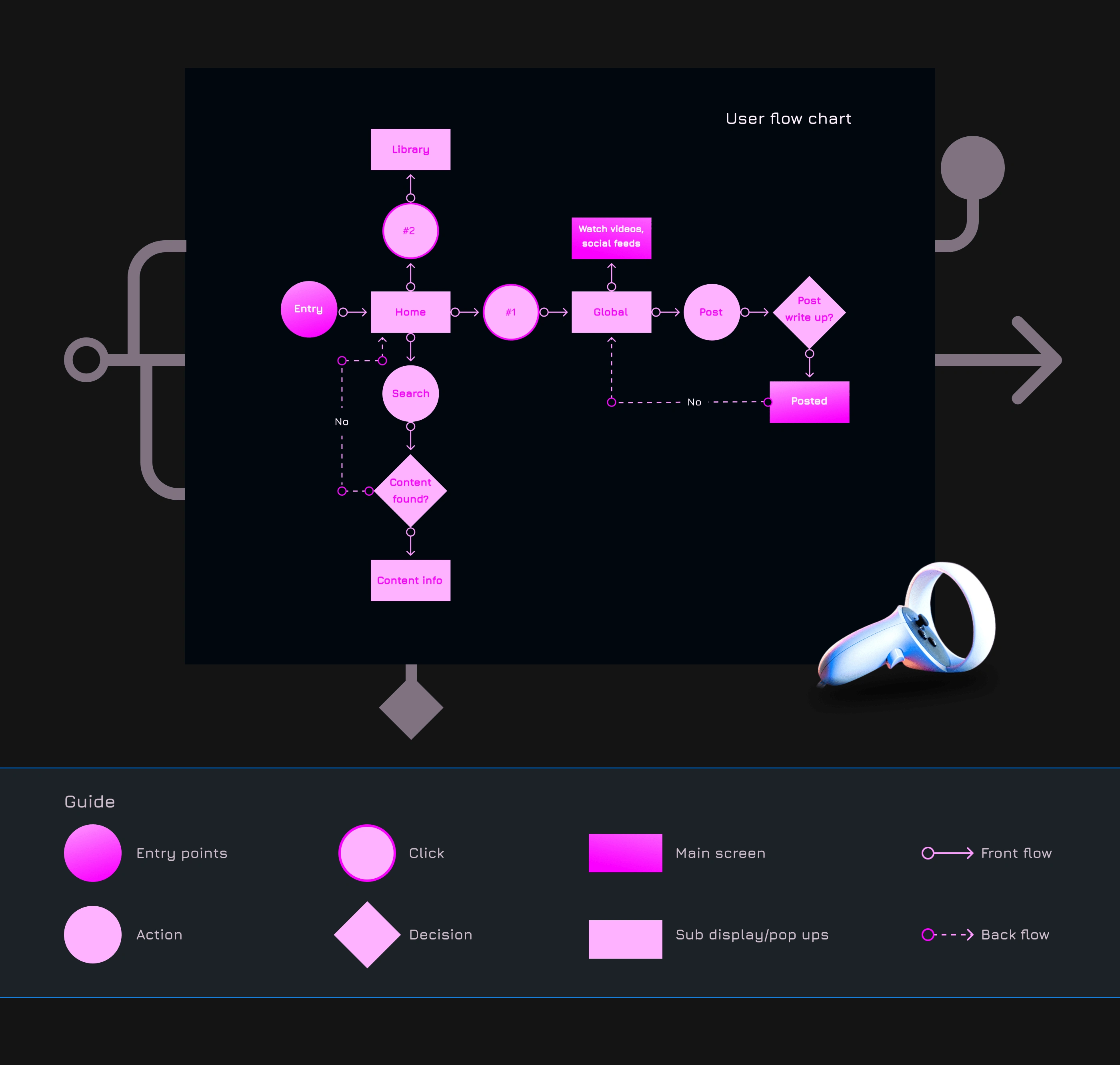
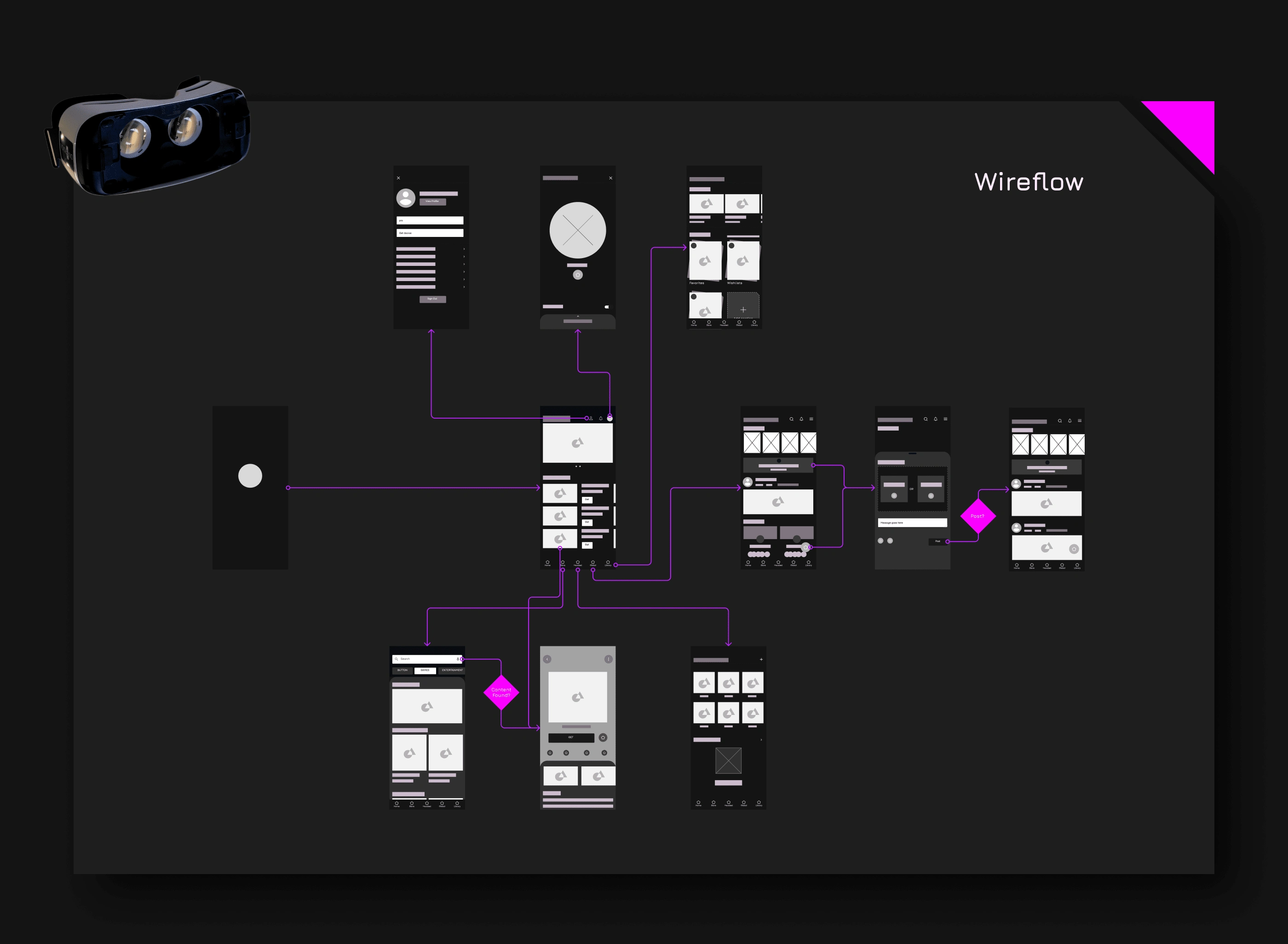
User flow
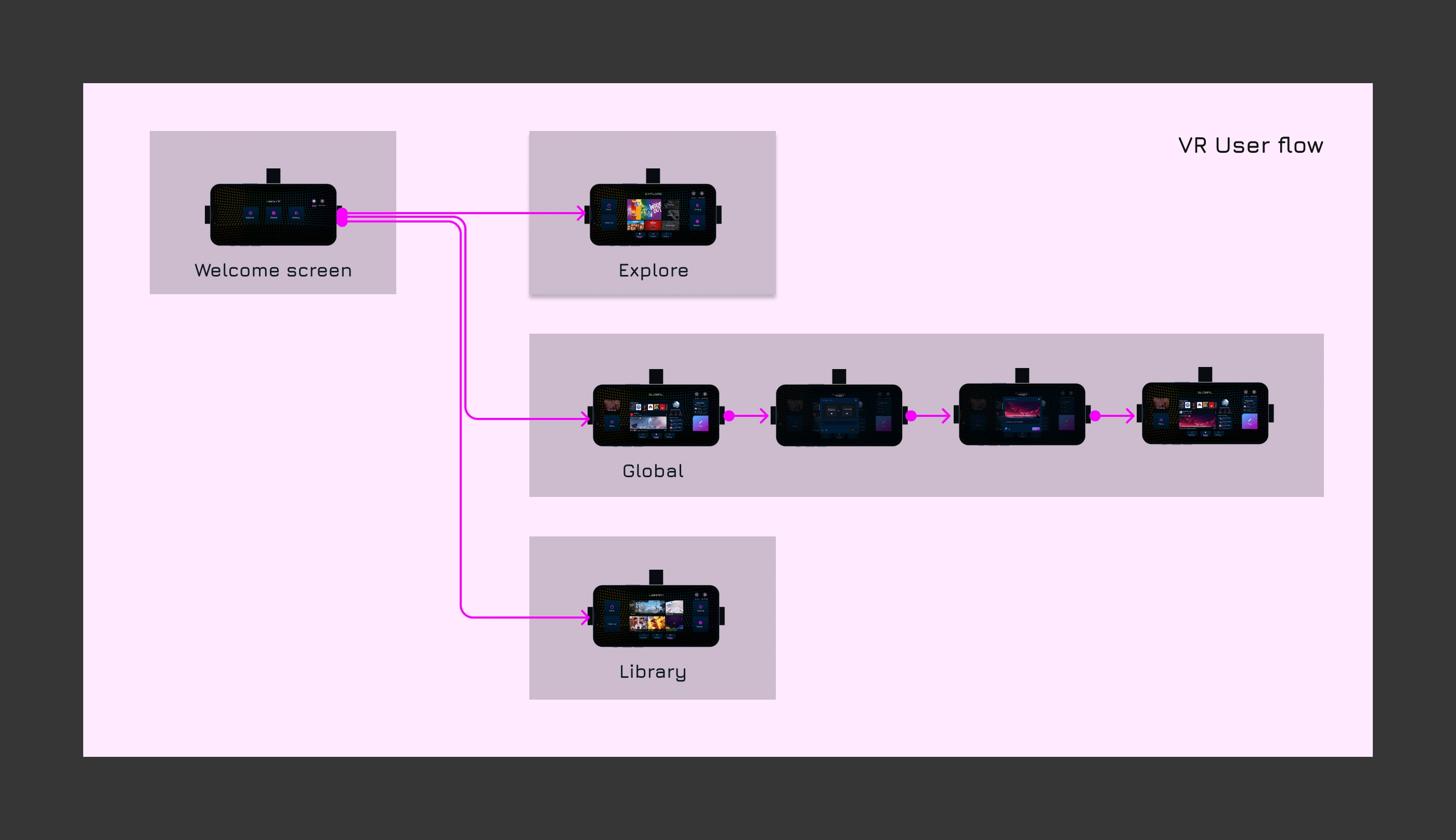
I designed the shortest possible path for users to accomplish their tasks.
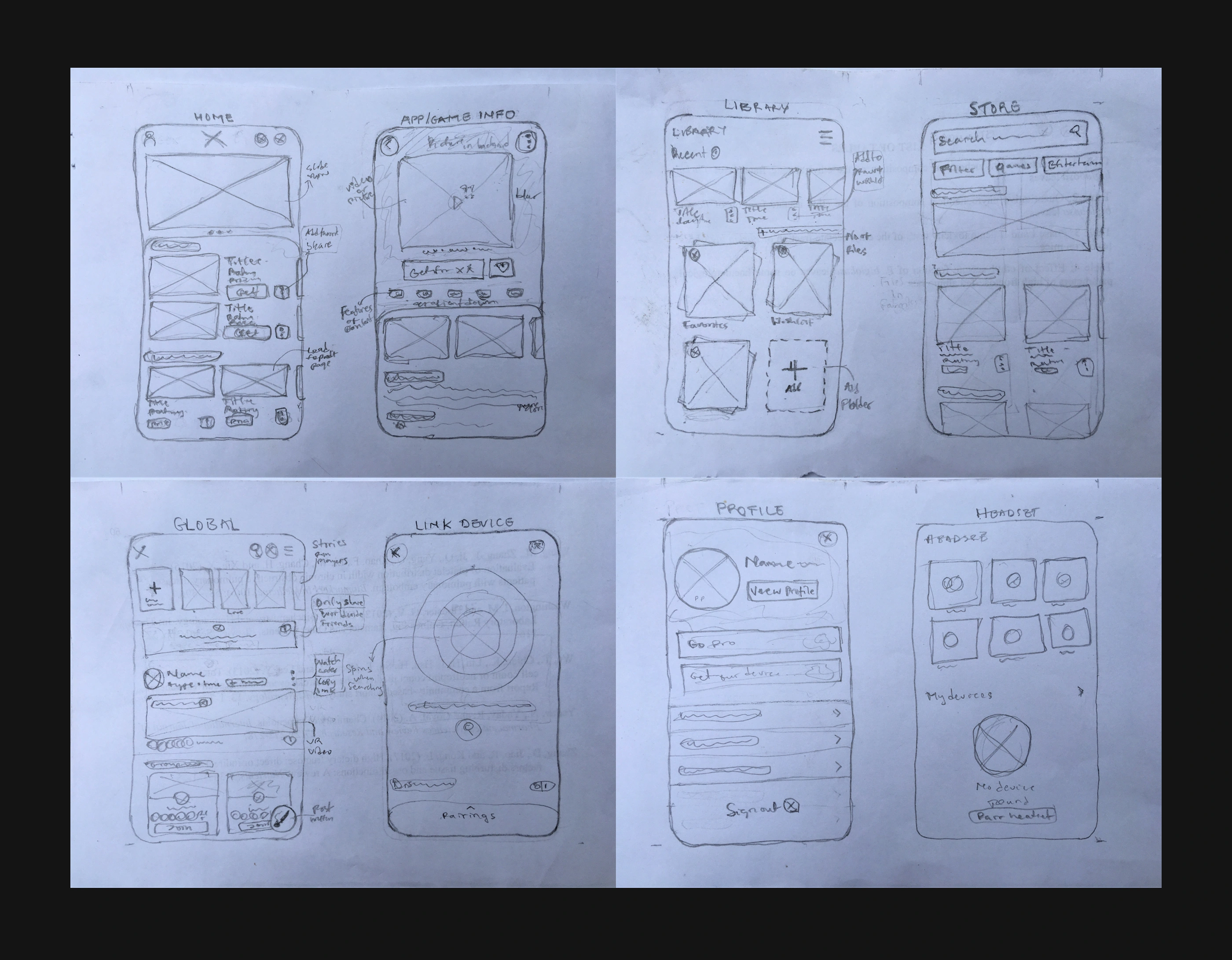
Sketches and Wireframes
I quickly sketched out ideas and layouts of the proposed product.
Lo-Fi wireframes were then developed (though this was subject to changes and iterations during the project.
✨UI Design
Mobile UI
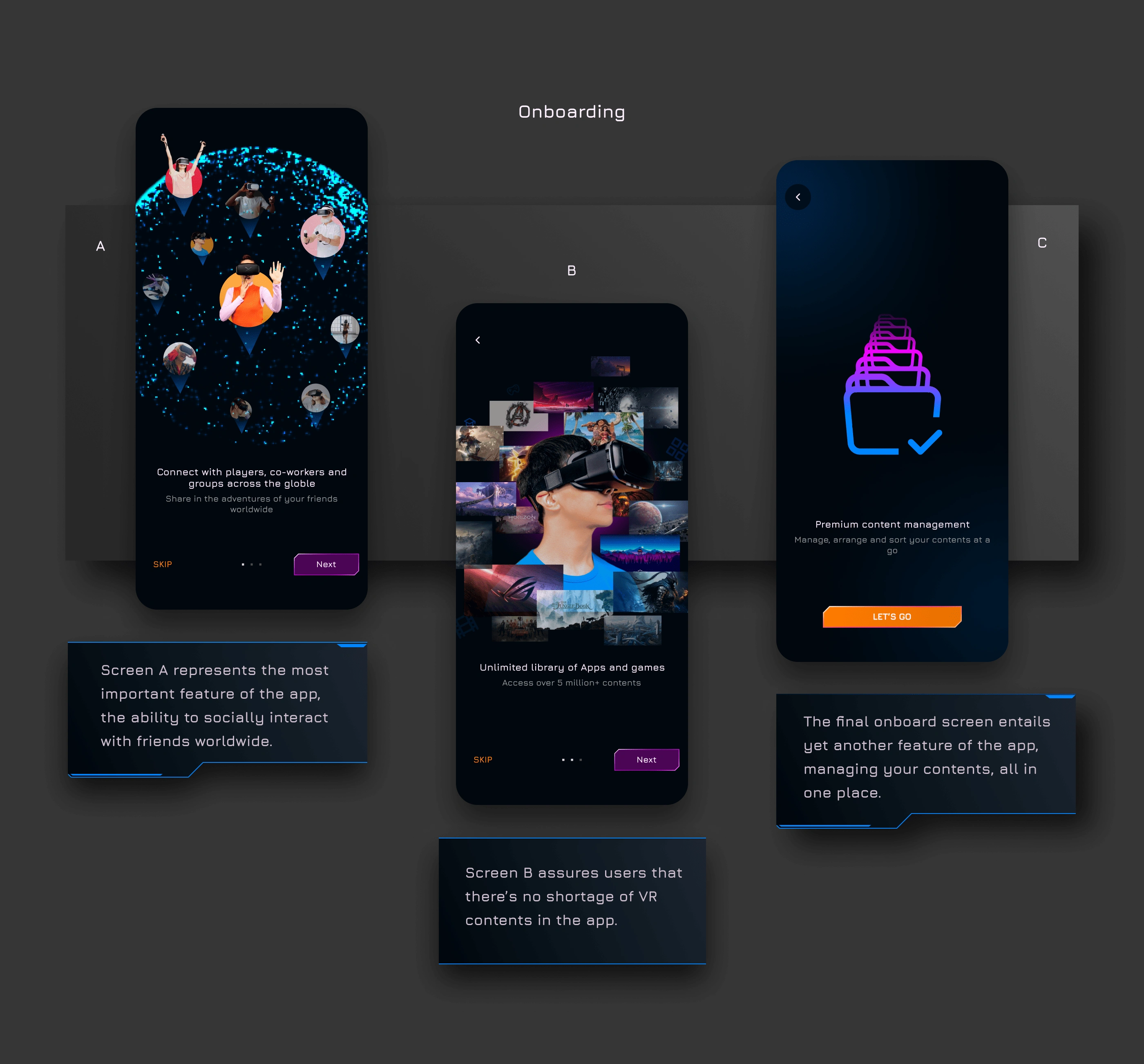
Onboarding screens
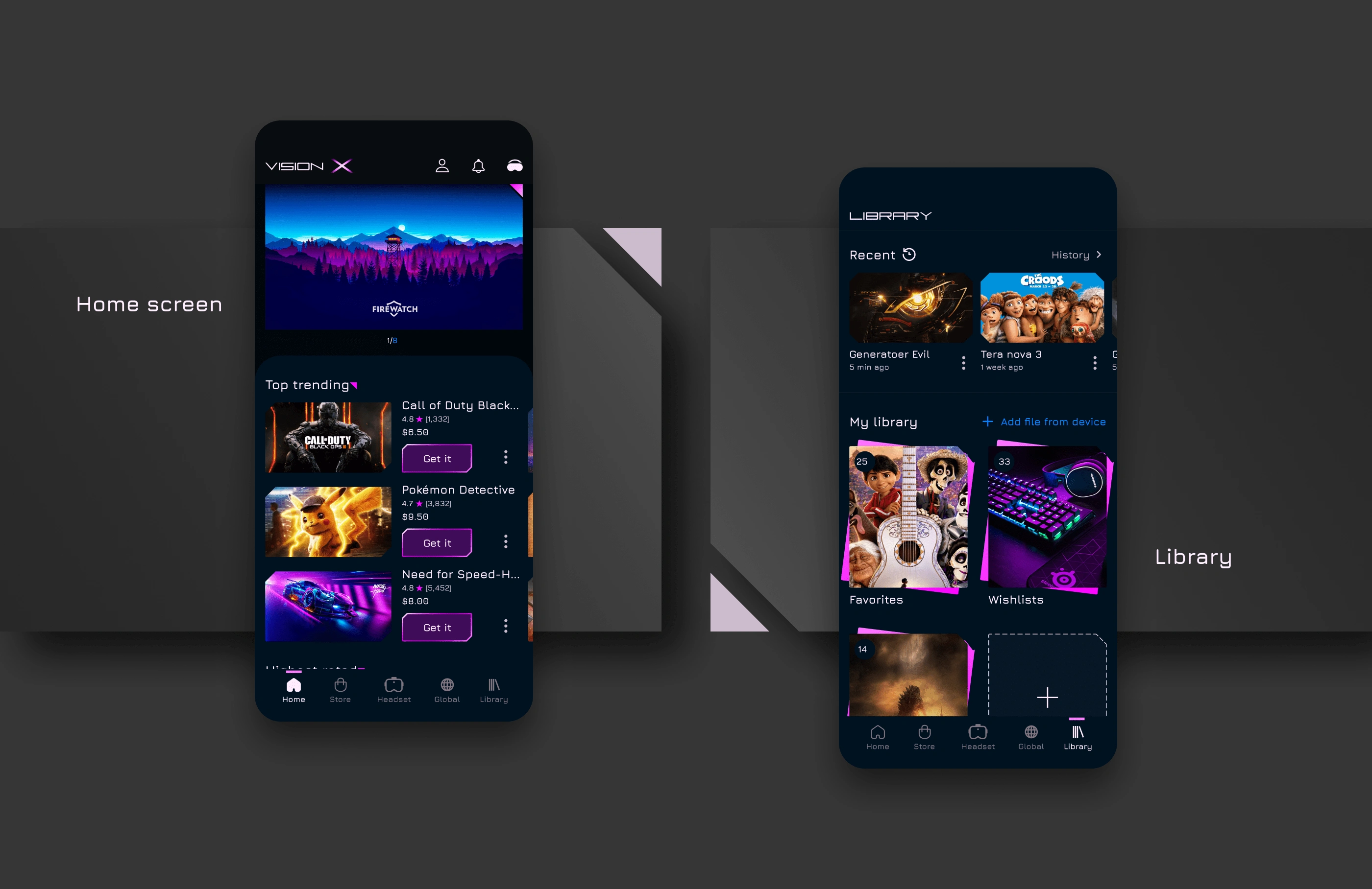
Home, Library
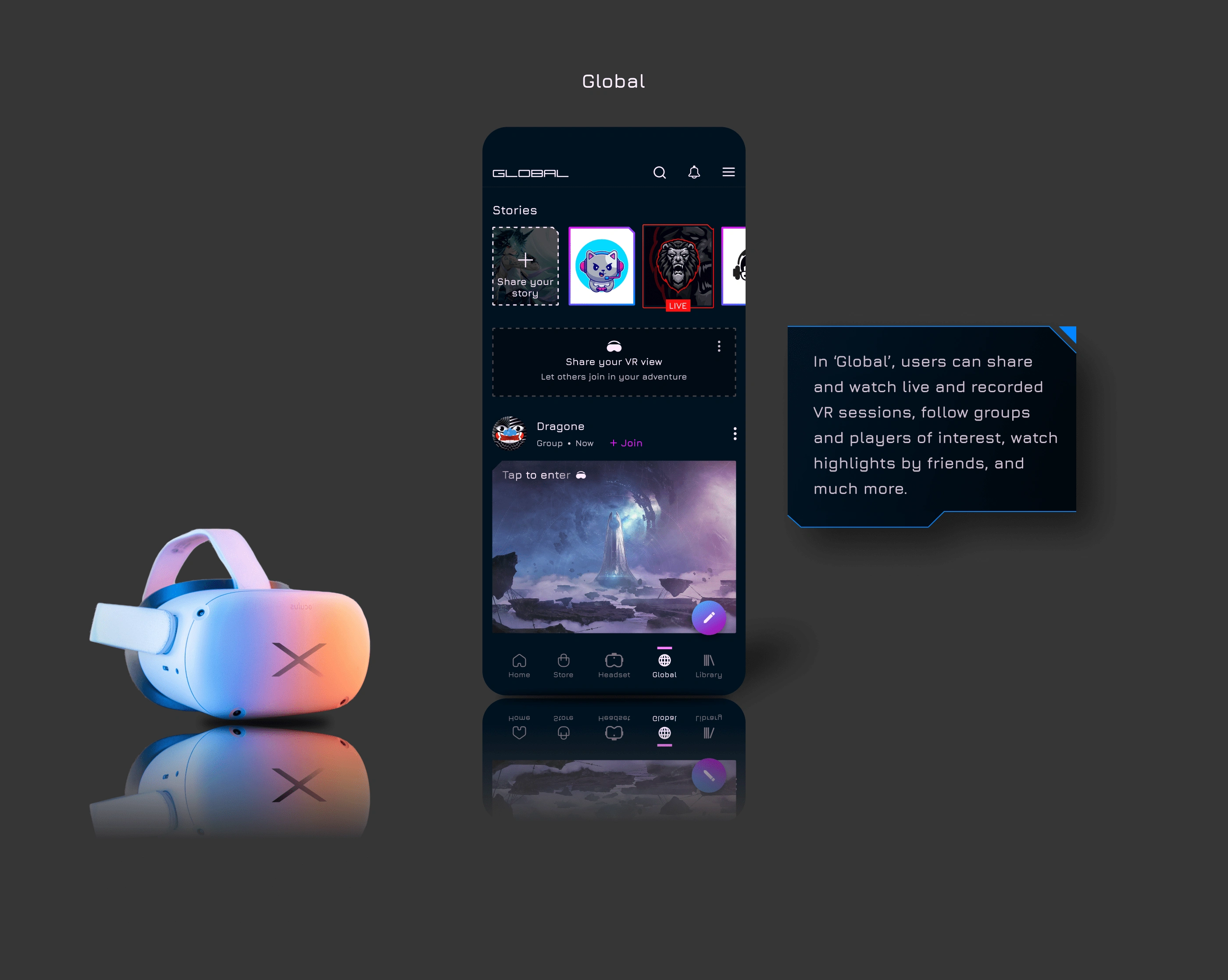
Global/Community
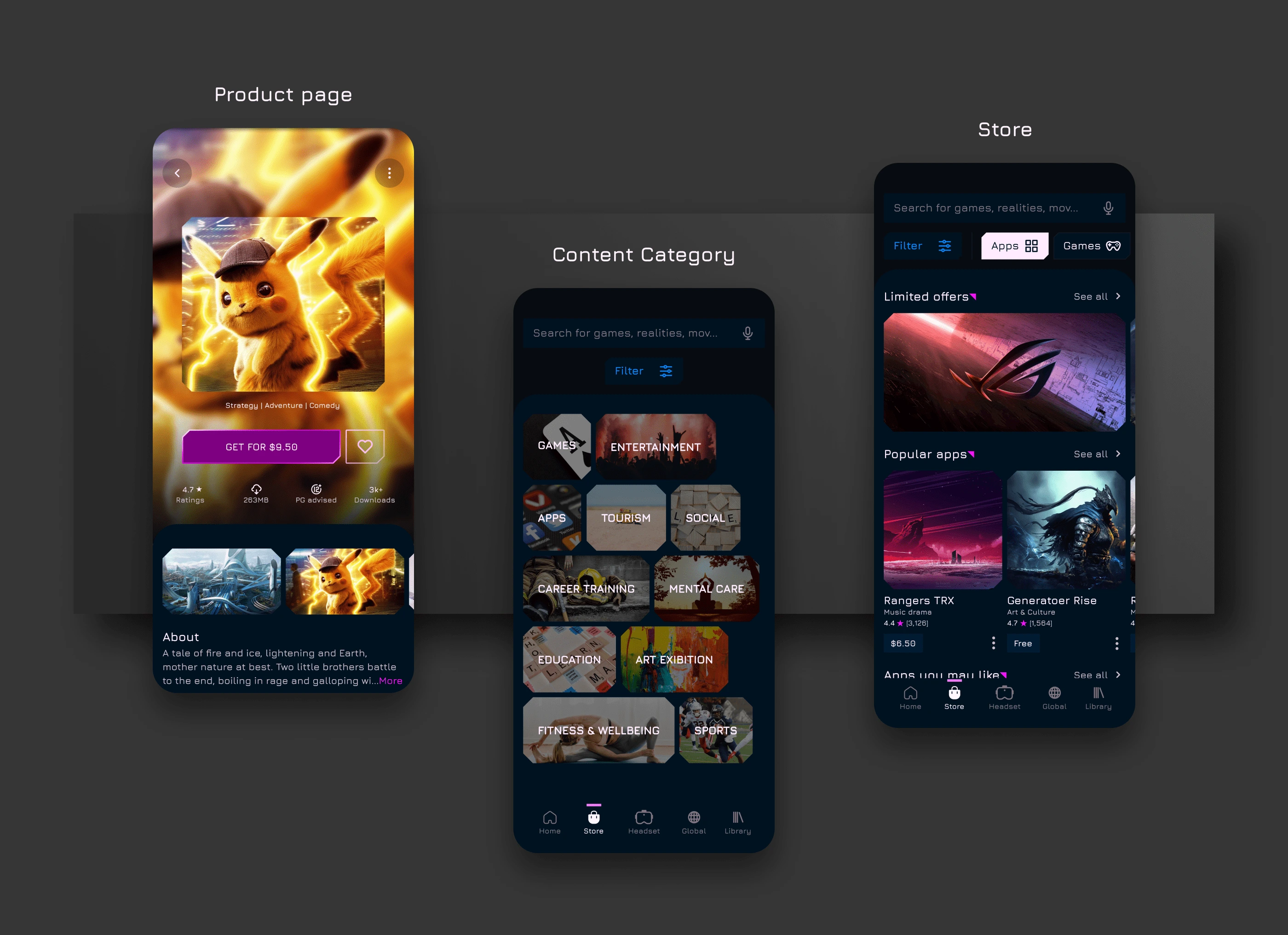
Product page, Content category and Store
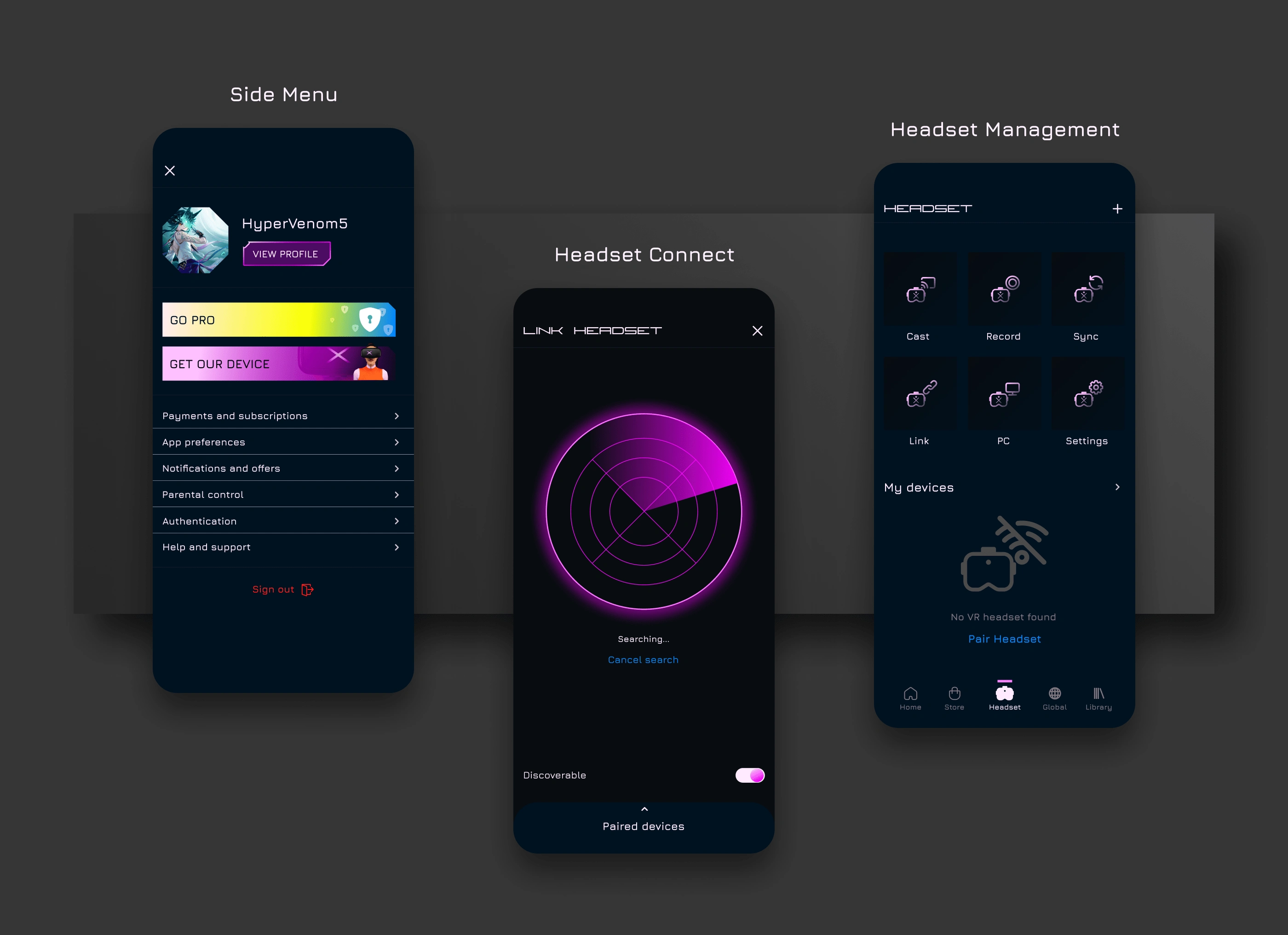
Menu bar, Headset connection, General device settings
Desktop app dashboard
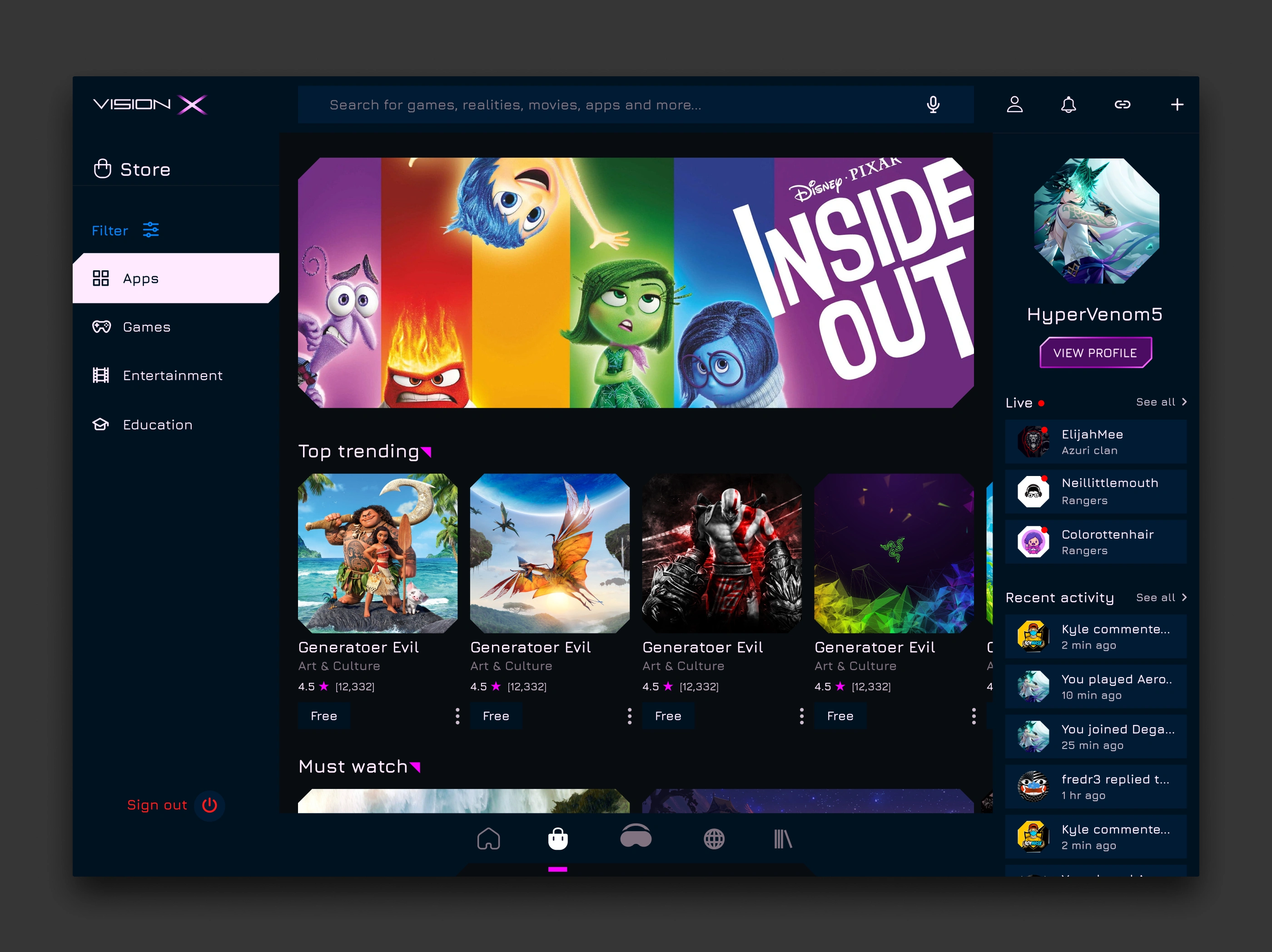
Landing page
🥽Designing for VR
Ergonomics and Constraints
Designing for a VR immersive environment required a different approach and set of techniques.
When viewing through a VR headset, there’s an optimum range of motion or viewing angle that must be kept in mind.
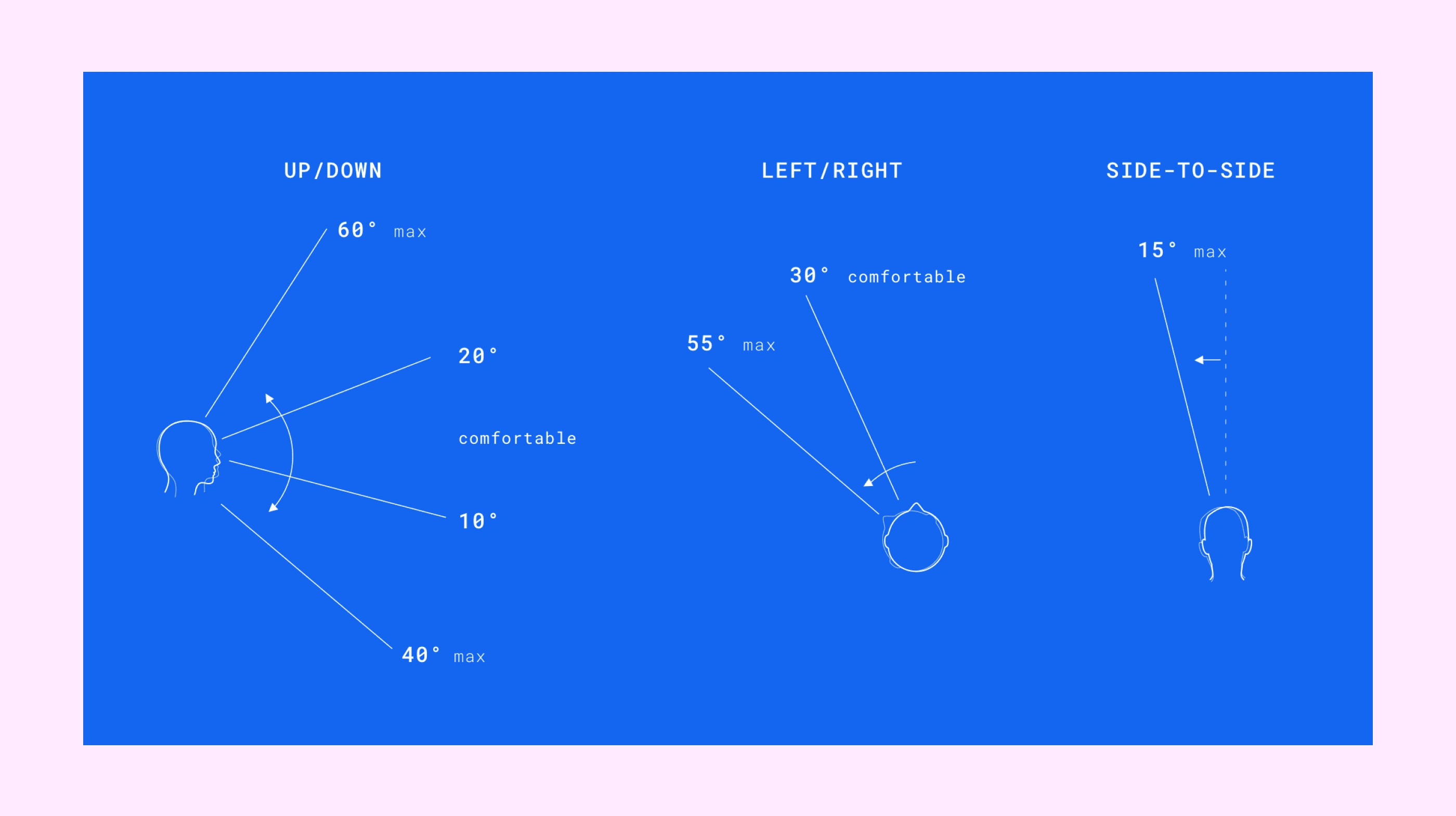
Source: Mike Alger, Alex Chu
Working area
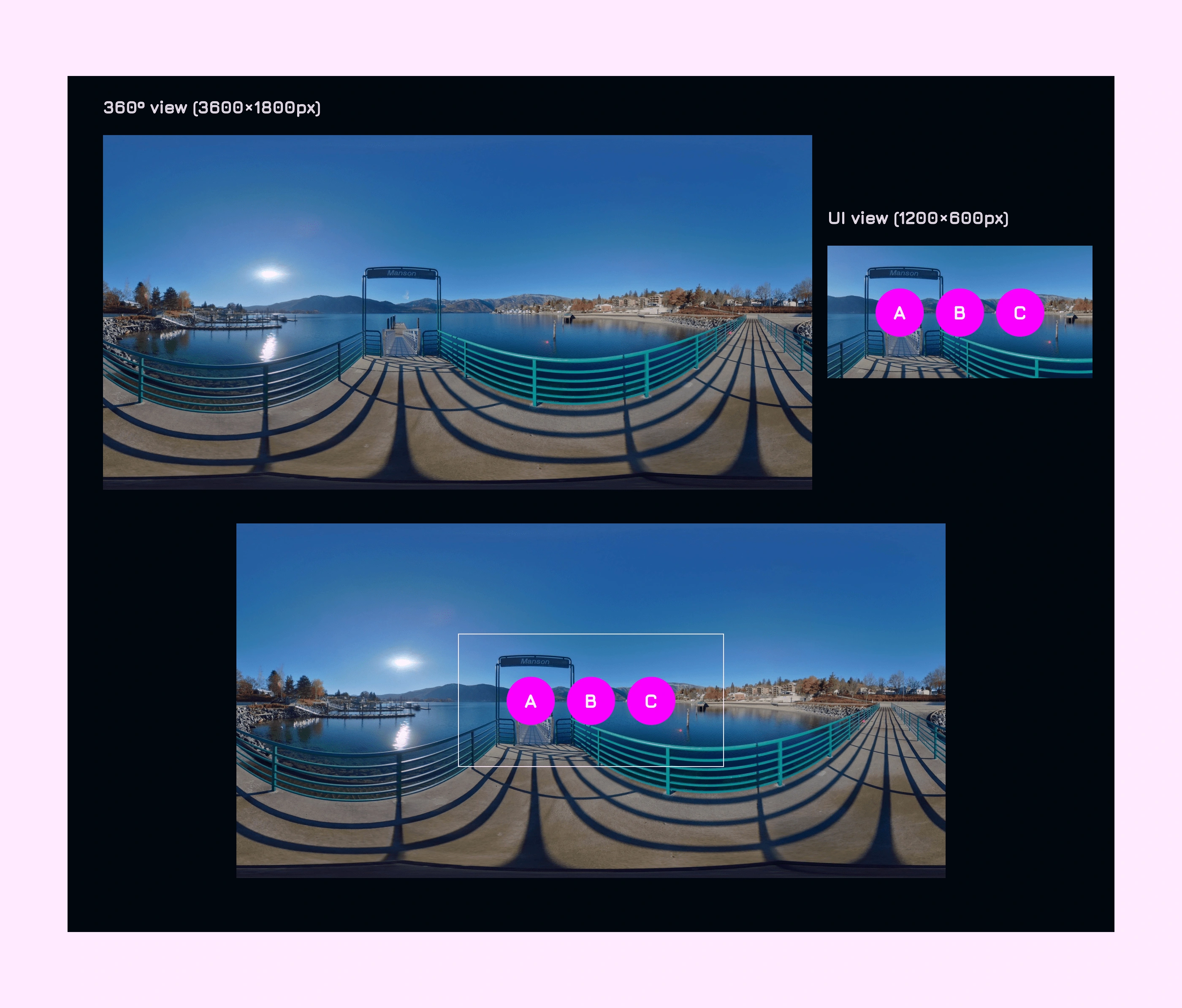
Taking into consideration VR is an immersive 360º world, the challenge was to find an appropriate work area/section where UI designs can be layered.
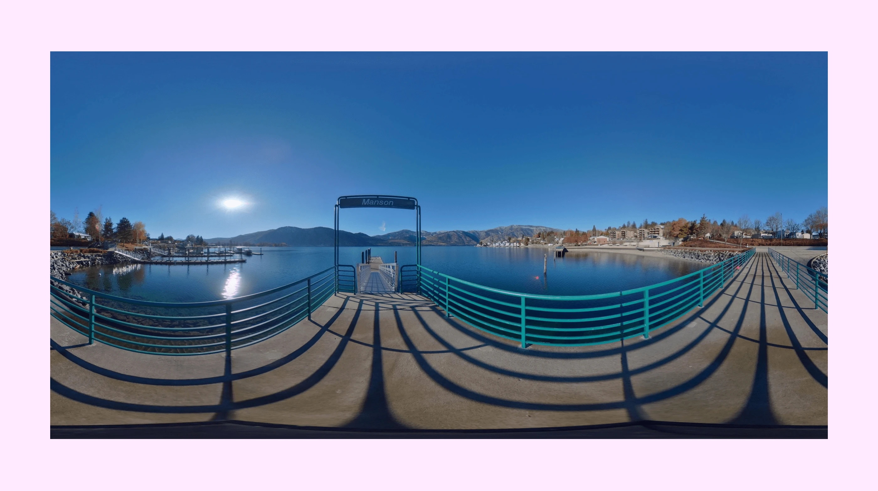
Flattened 360º view
Above is what a flattened 360º view looks like. The full perimeter of this view will be 360º horizontally and 180º vertically. Changing those to pixel units, we have 3600×1800px.
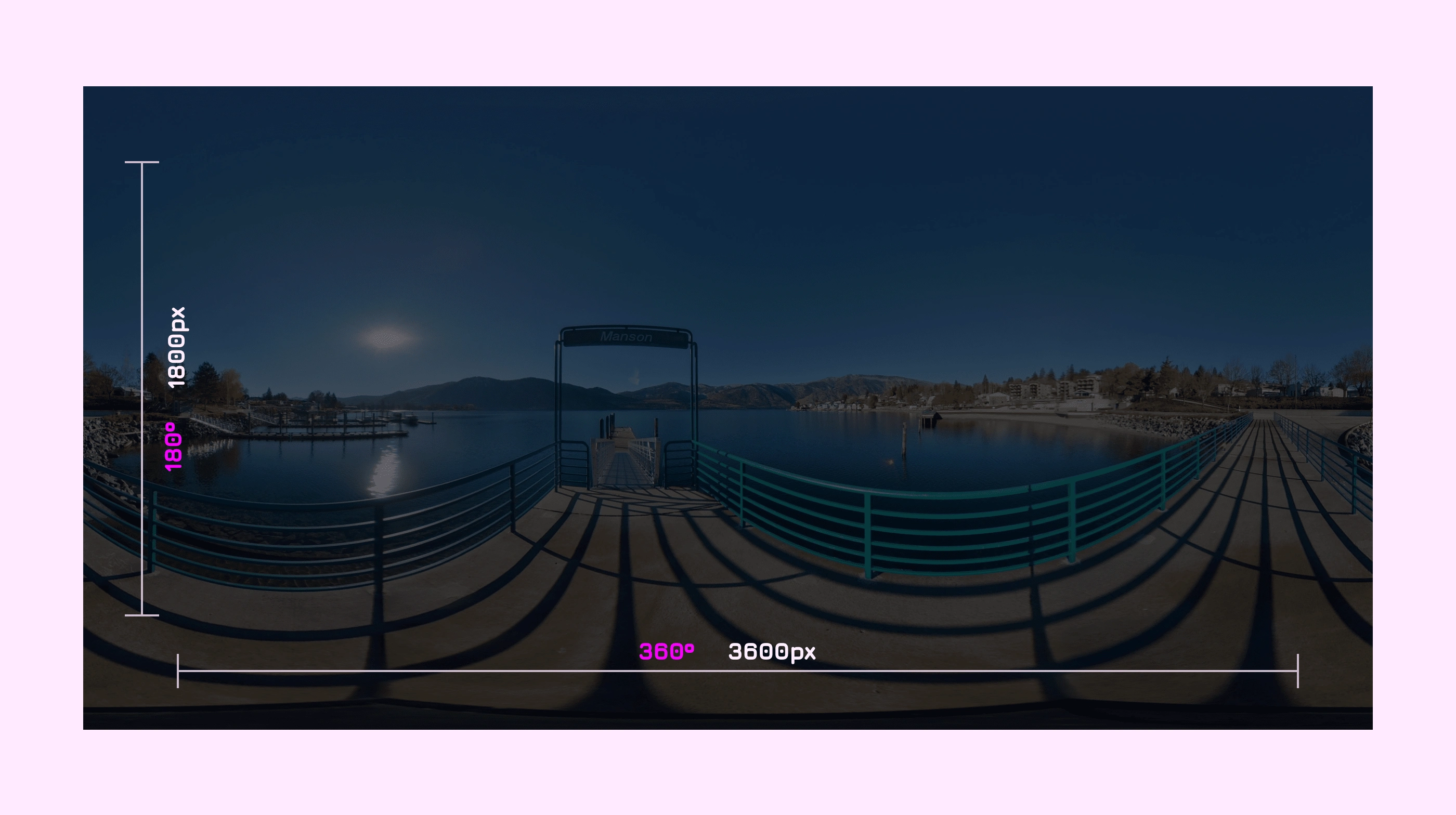
But what we're in search of though, is a work area to layer our designs.
Drawing from the early works of Mike Alger (Image above), we therefore deduce the area of interest to represent 1/9 of the entire view, positioned right at the center of the flattened 360º environment, with size of 1200×600px.
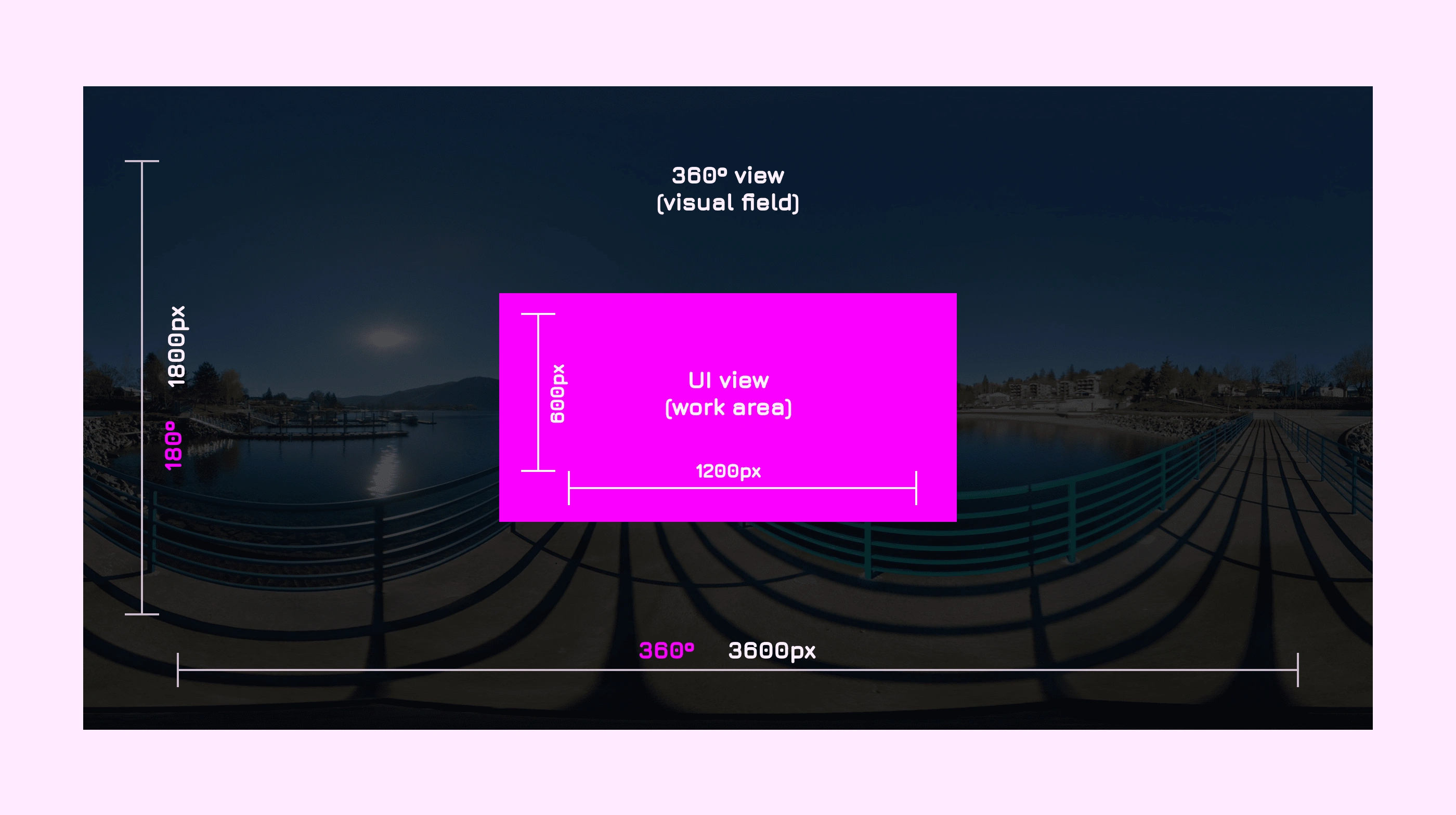
360º immersive view with work area (1200x600px) at the centre
VR user interfaces
These are the interfaces I designed for the VR immersive view.
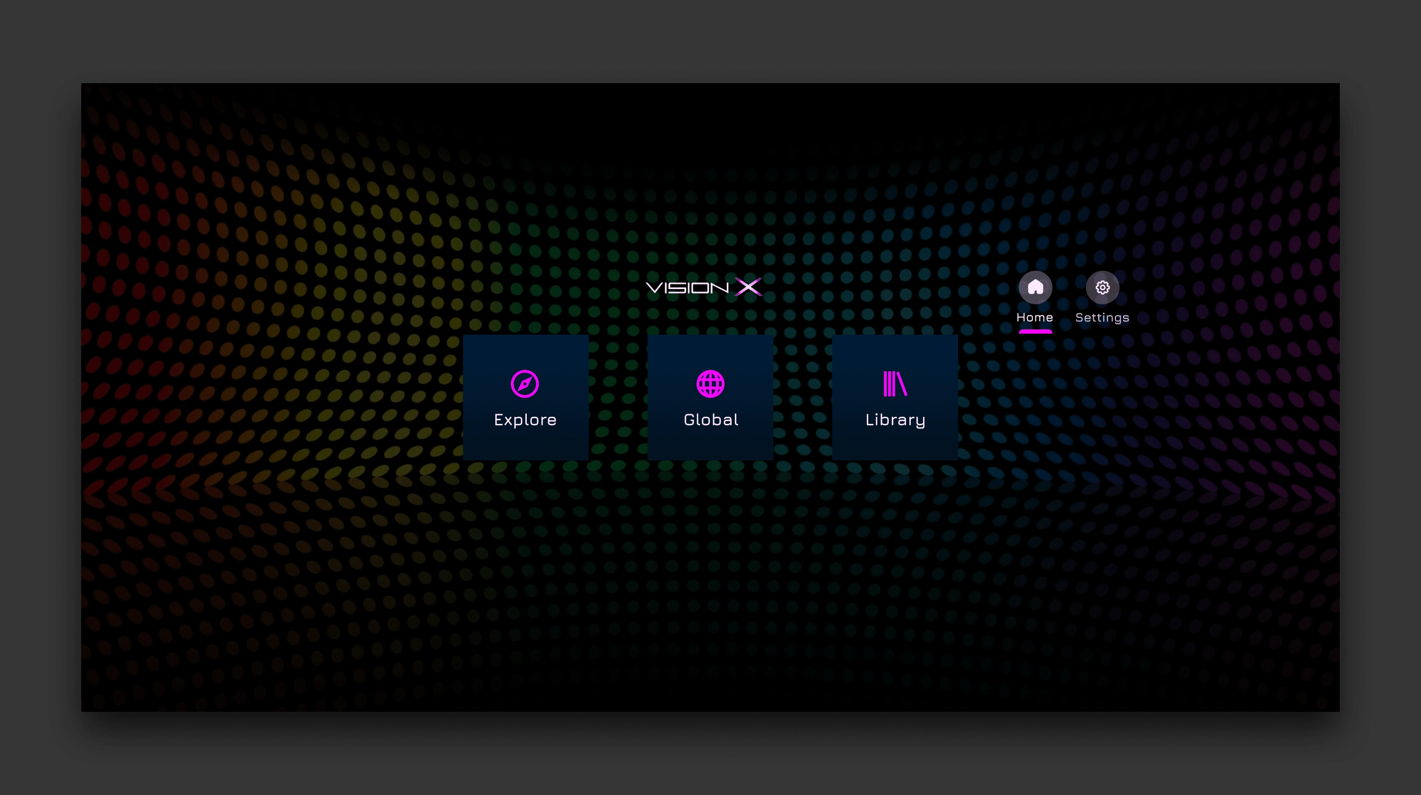
Home
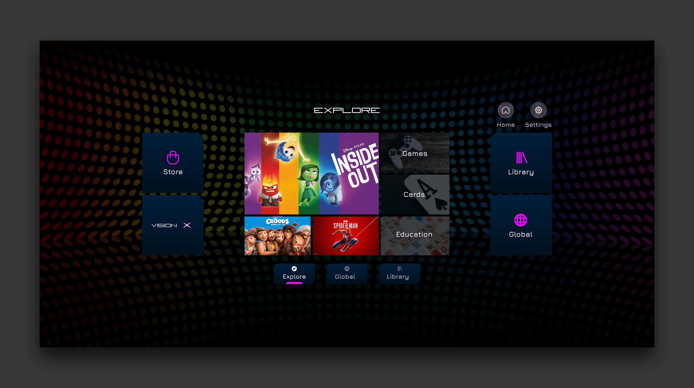
Explore/Store
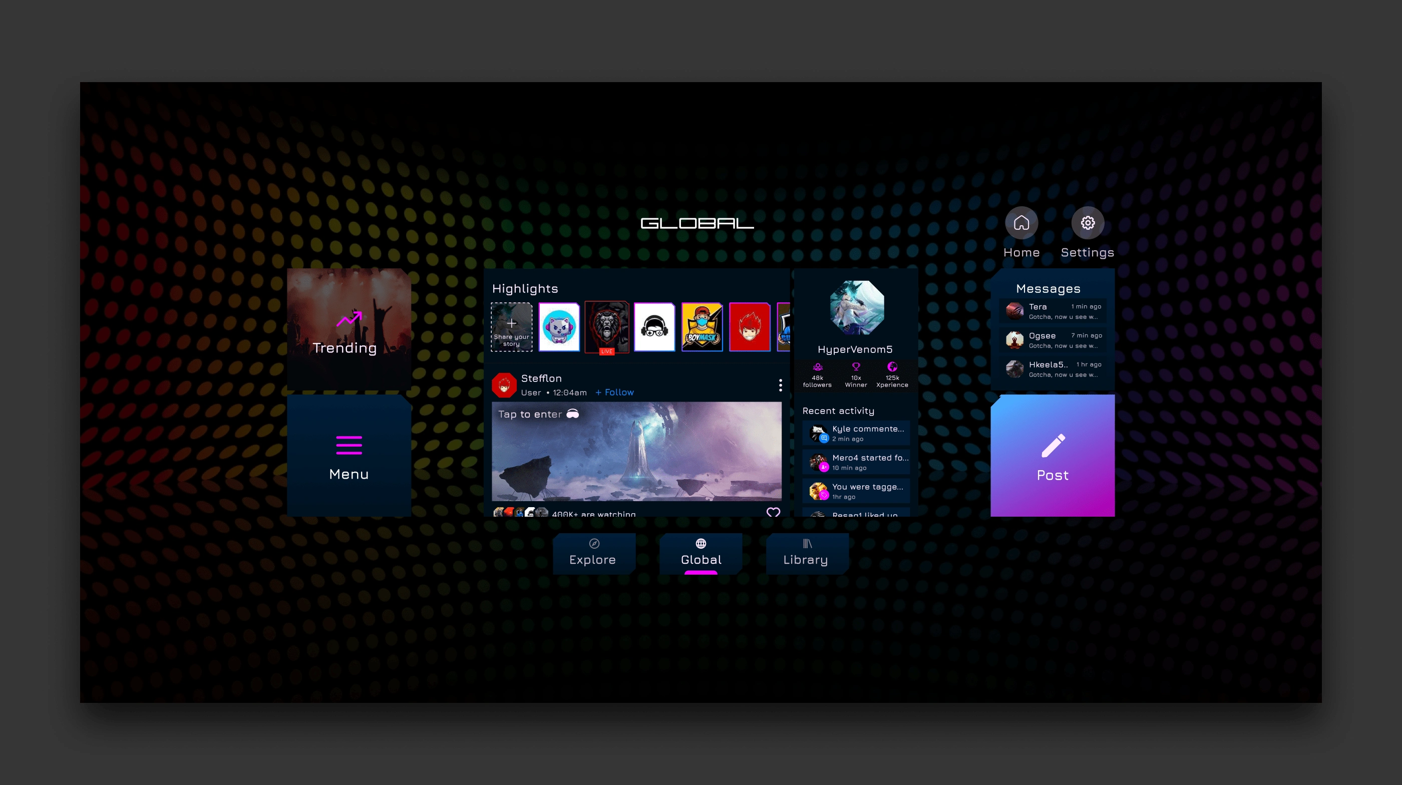
Global/Community
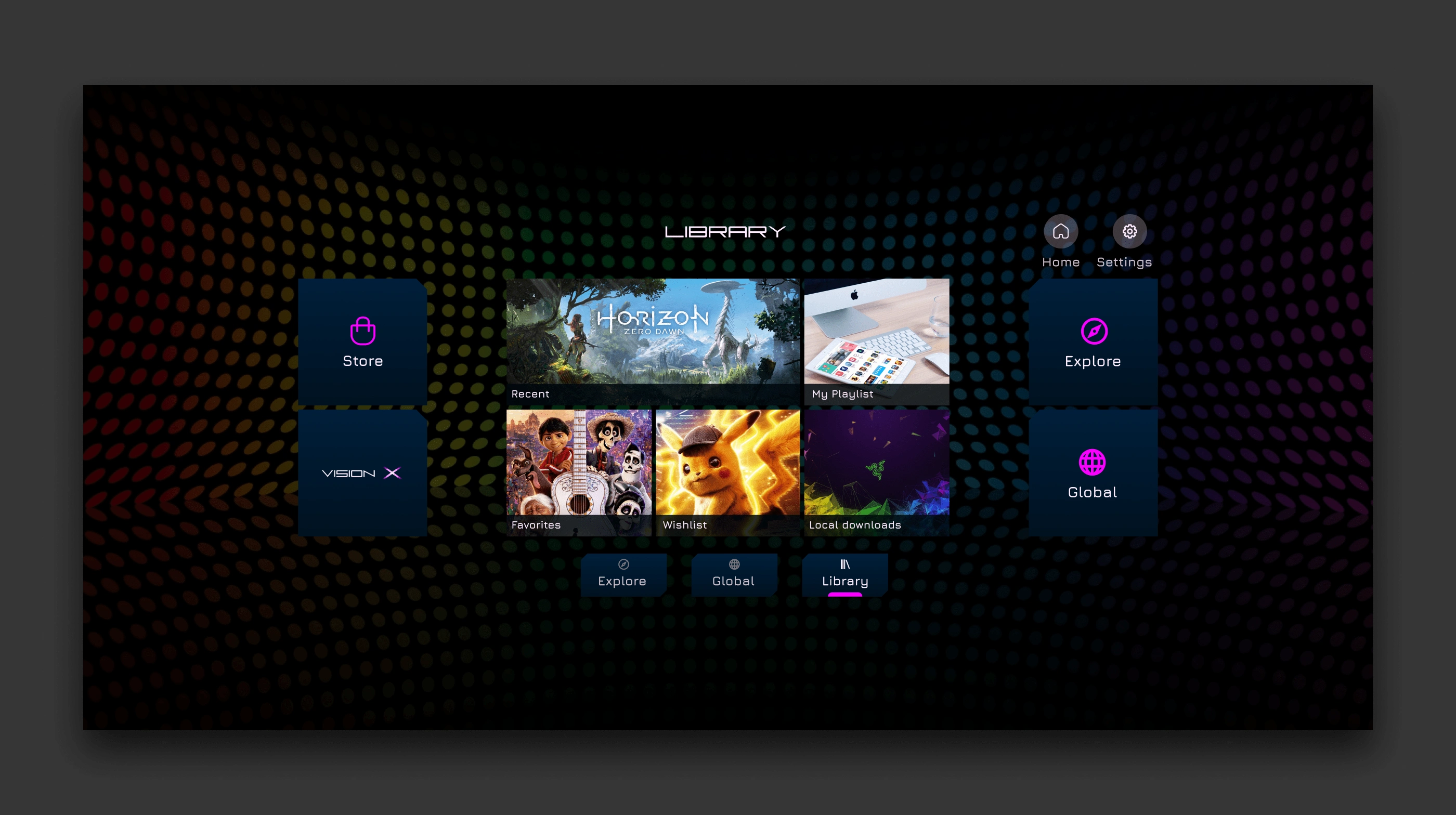
Library
VR UI user flow
🎨Design System
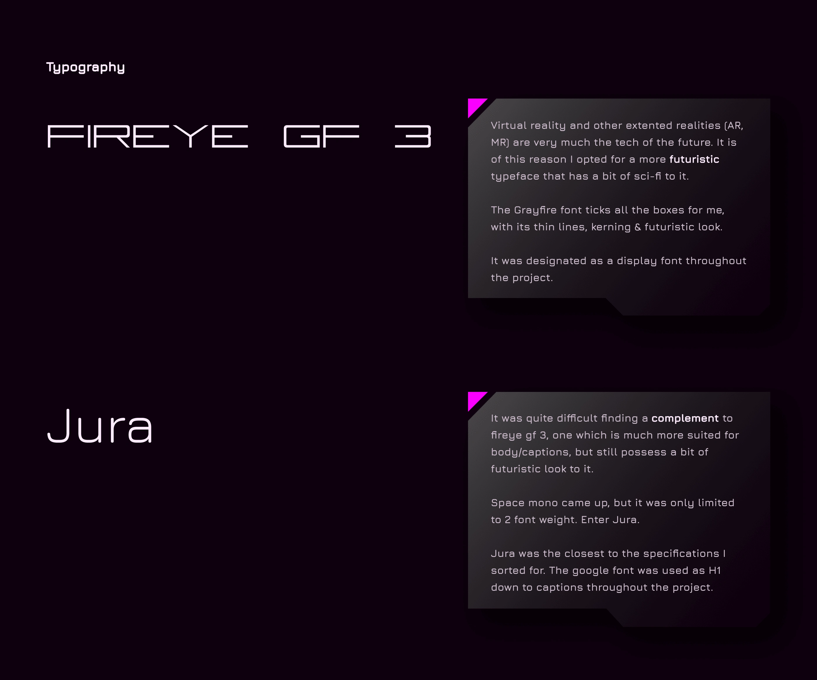
Typography
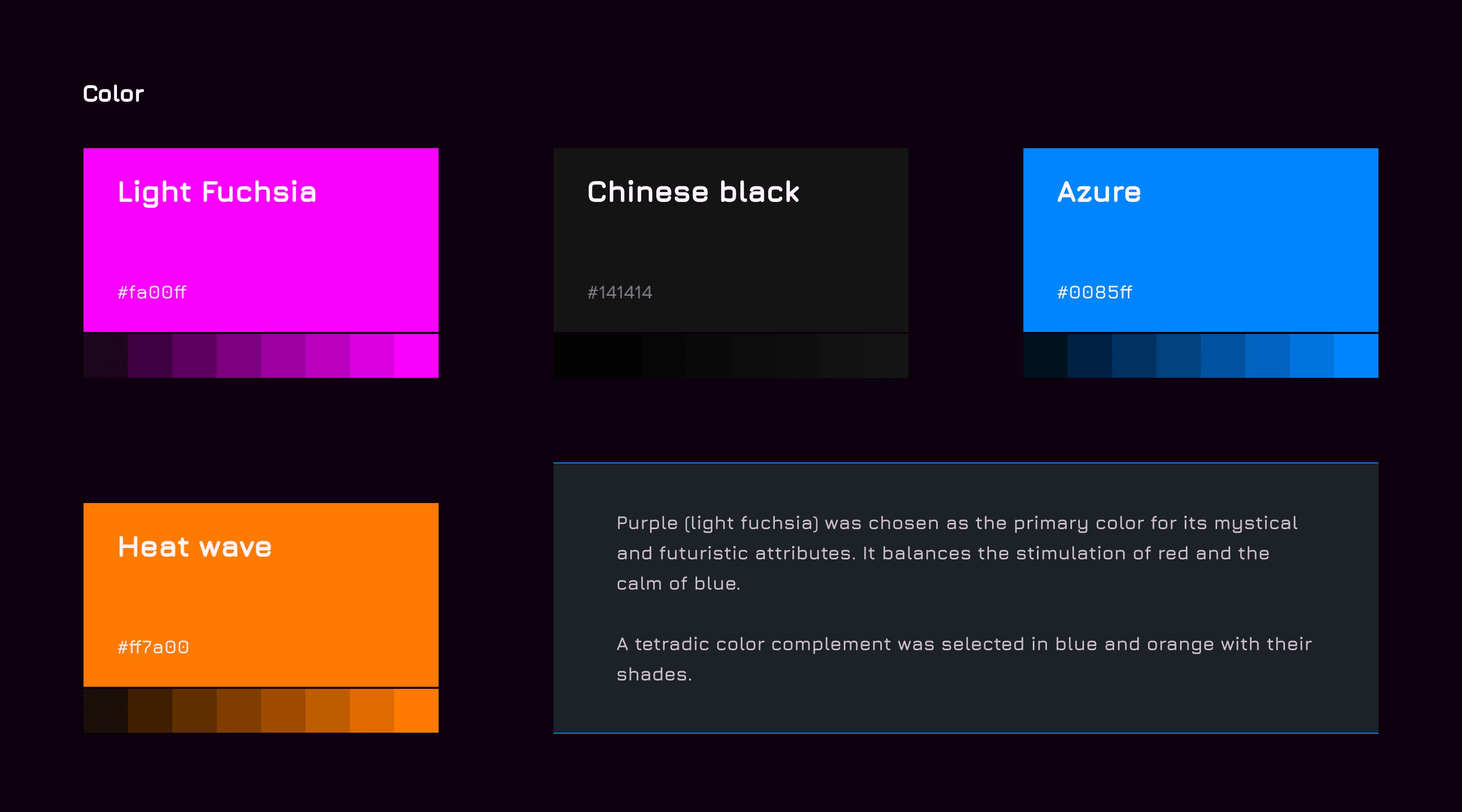
Color
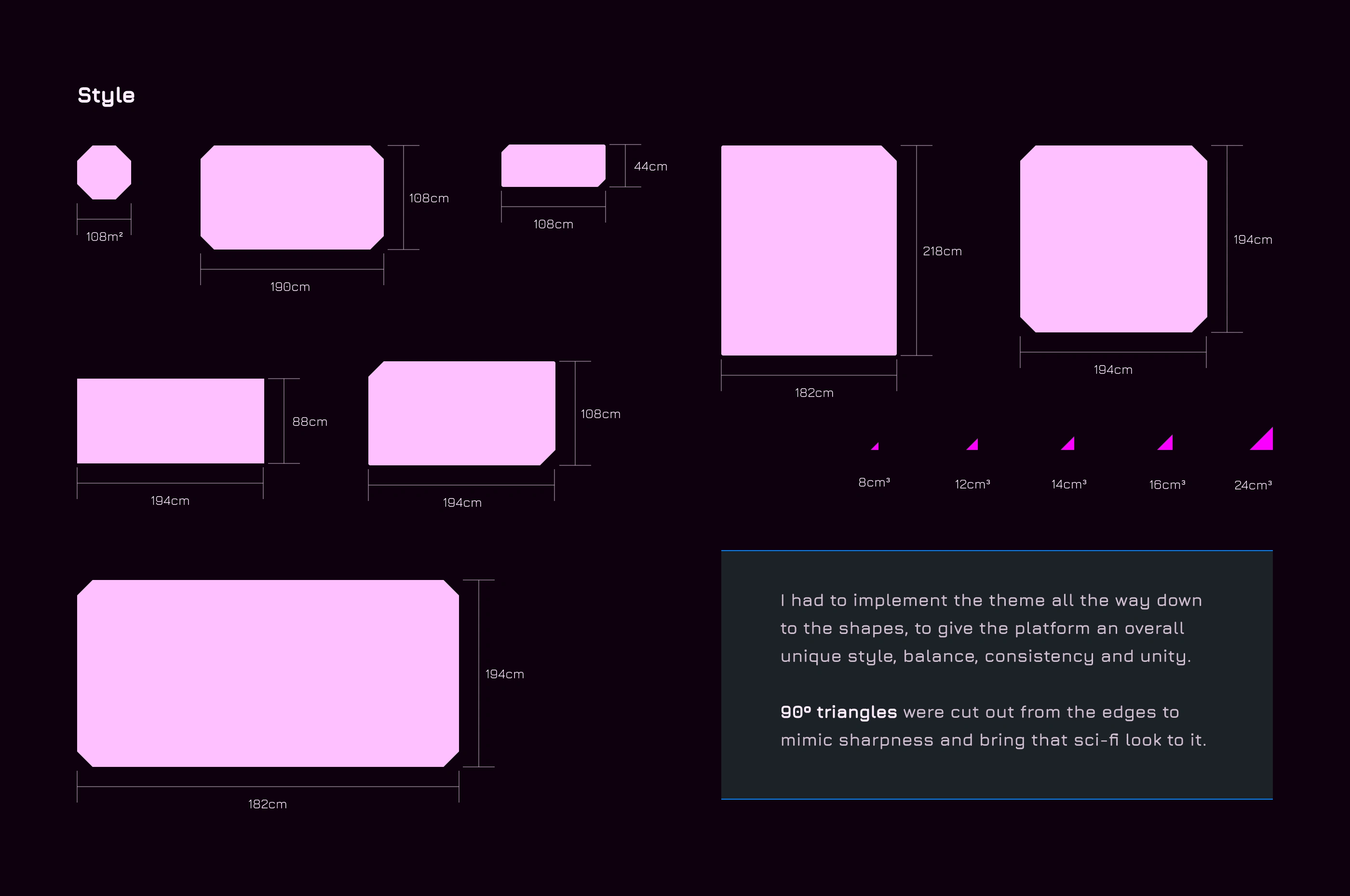
Style
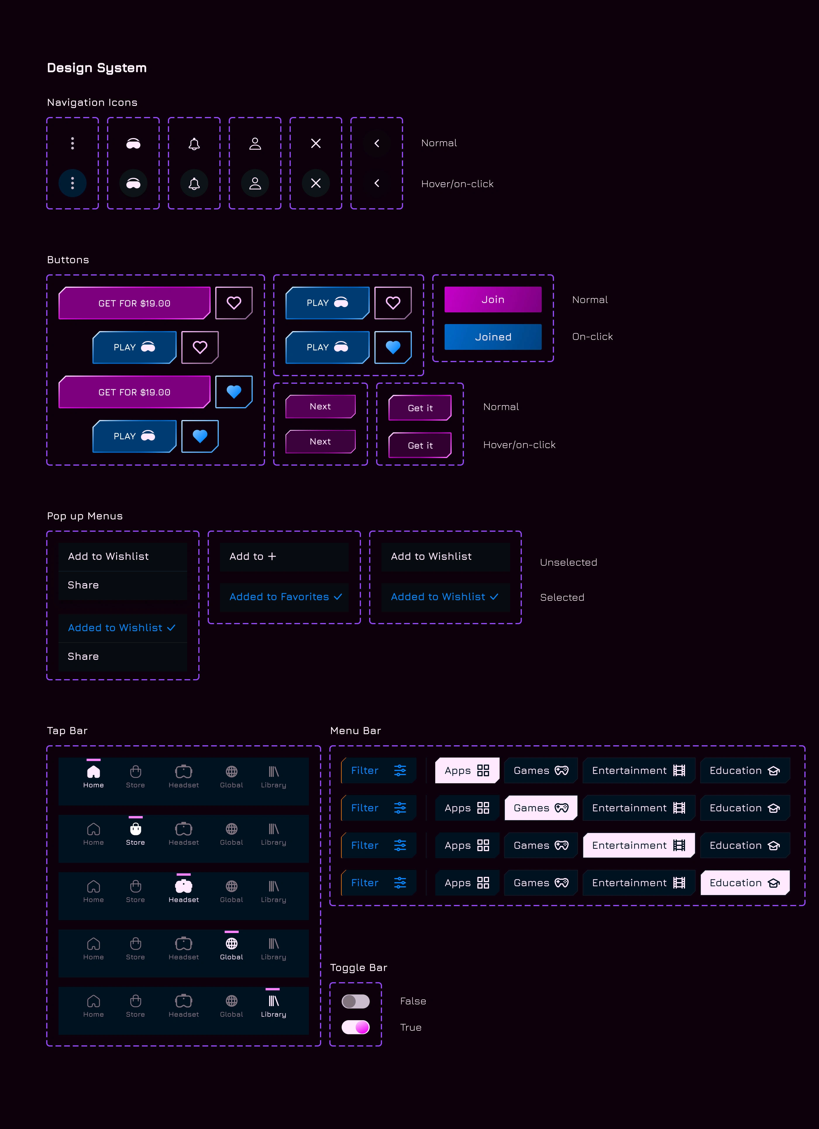
Components
🧪User Testing
A usability test was conducted with Maze, on the first batch of designs.
There were 4 main task/mission to complete;
Task 1) Manage contents: add a section in library.
Task 2) Social engagement (1): Browse through posts and feeds in ‘global’.
Task 3) Social engagement (2): Join any group in ‘global’.
Task 4) Get contents: Navigate to ‘store’ and select a category you would like to explore.
Below are the results.
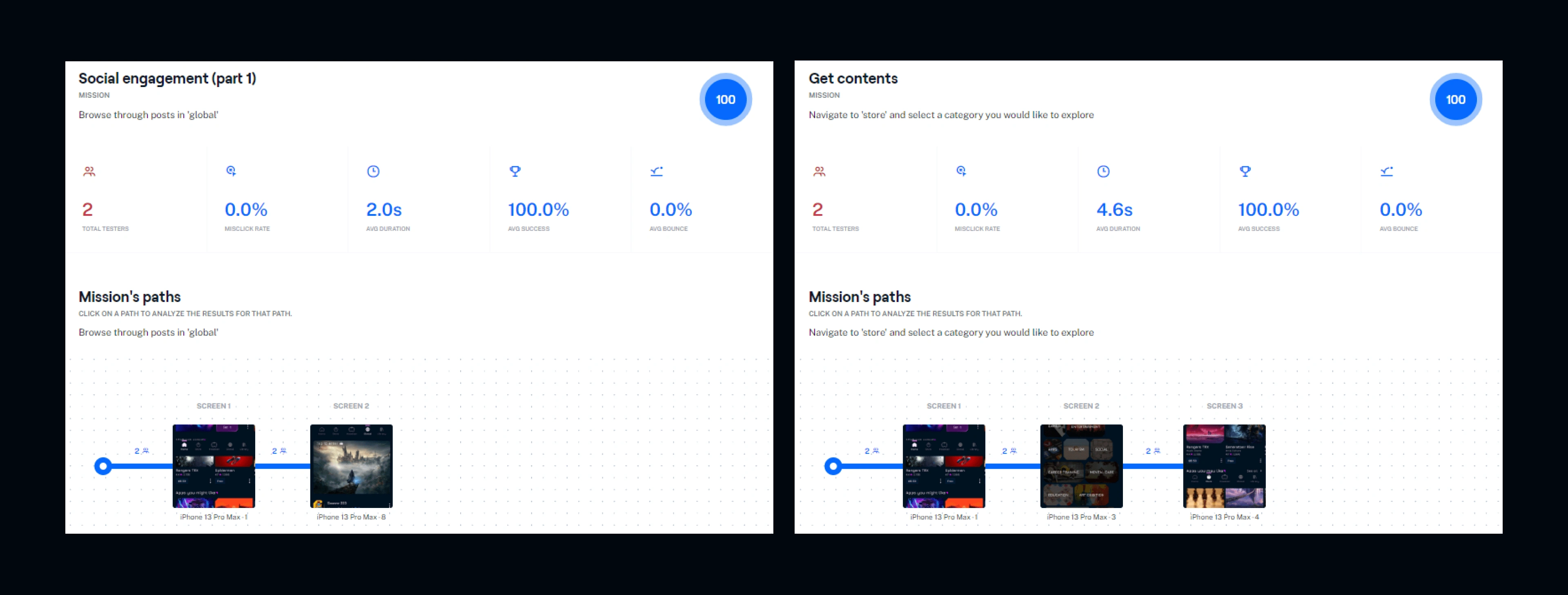
Task 2 and 4 were the smoothest for users with both having a direct success rate and usability score of 100%
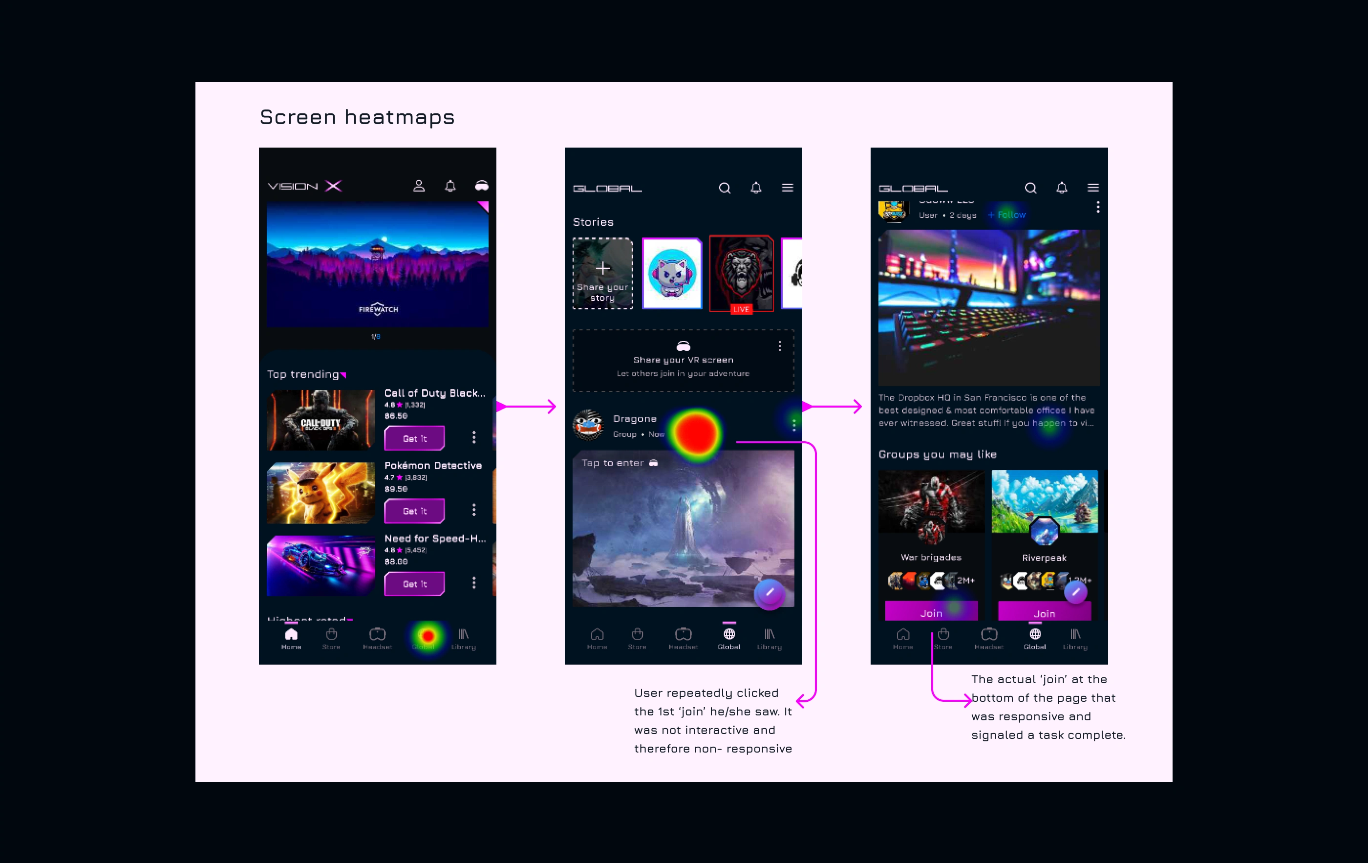
However, users had the most difficulty in task 3, with 48 to 29 misclicks respectively.
Apparently, a user wasn't comfortable with the navigation, while surprisingly, most users didn’t rate the app’s interface.
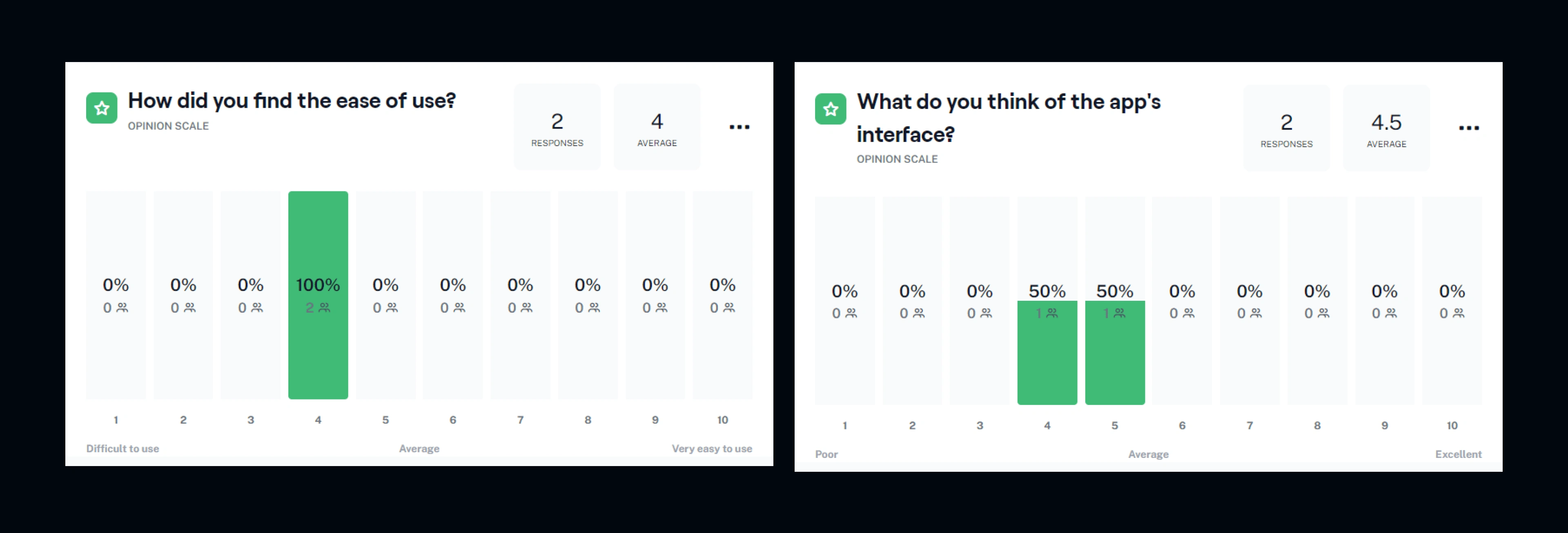
The test results placed things into perspective for me.
I interviewed the participants and their major complaint was how overwhelming the navigation (and to some degree, the test questions) were.
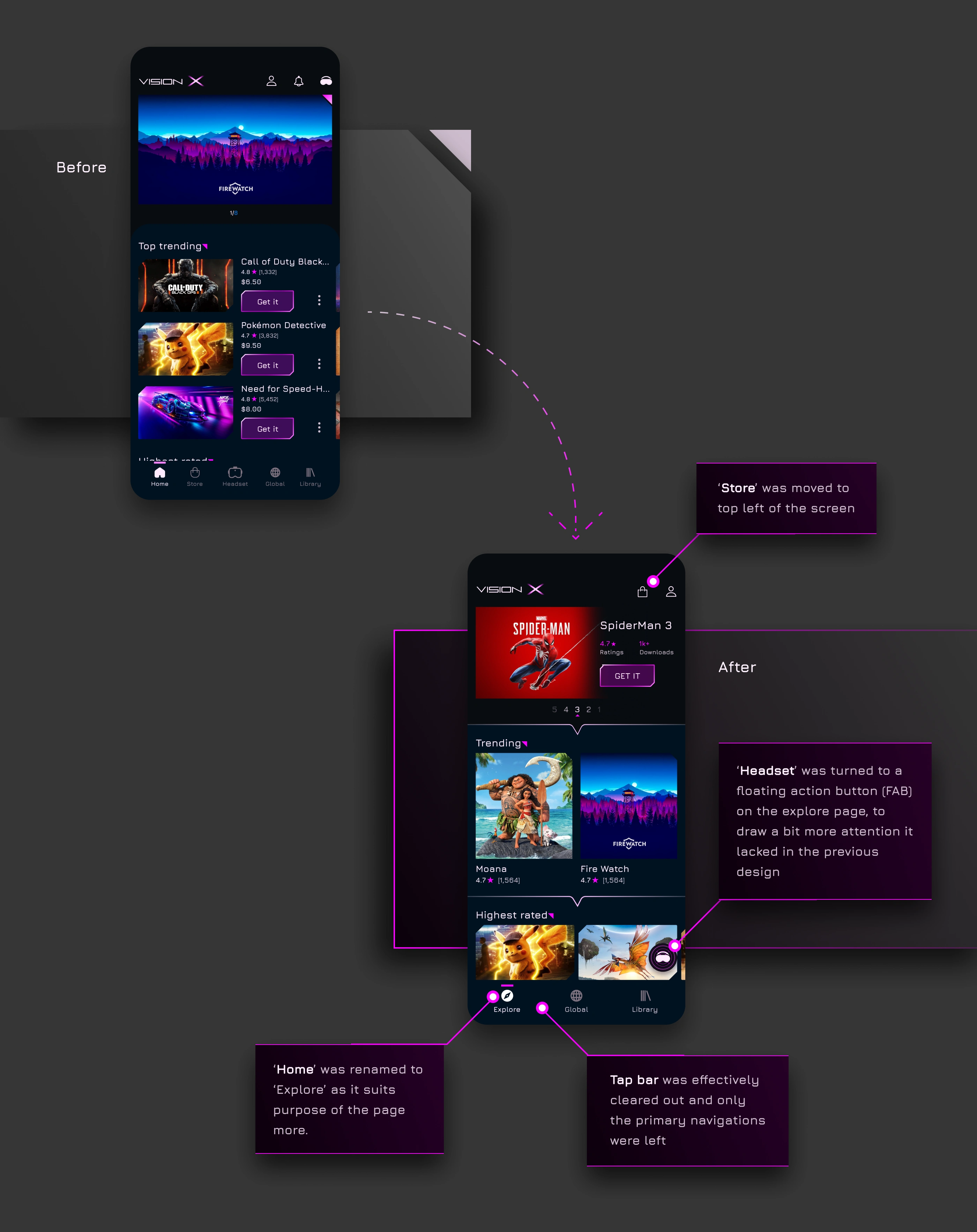
Judging from the responses and results, I knew I had to redesign the navigation/user flow and touch up the UI a bit.
💫Itineration and Redesigns
I quickly went back to the drawing board and began to work on the necessary changes.
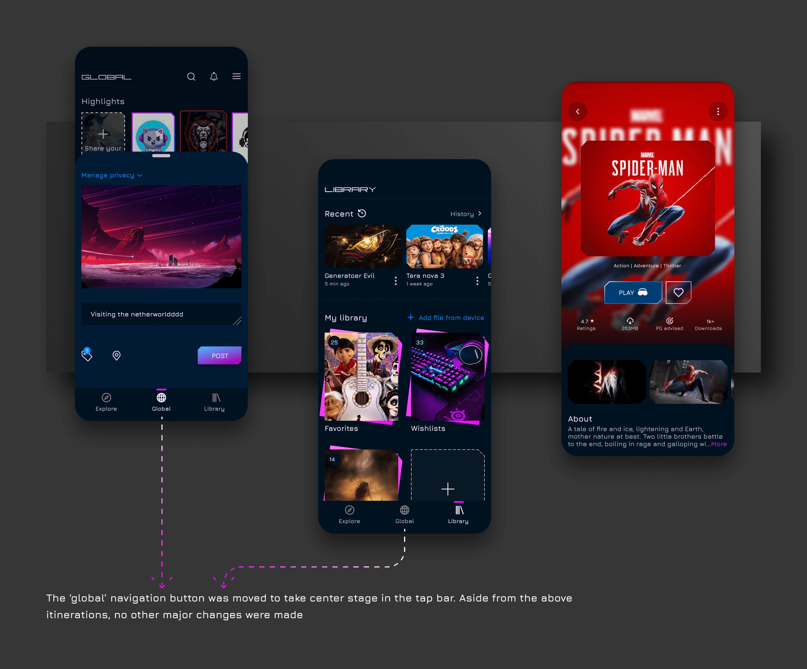
These are the final designs as compared to the previous set.
Conclusion
Challenges
The technology of VR took me quite some time to figure out. At first, I was designing the concept in the wrong direction. I had to research a bit more to finally get the insights I was after and immediately U-turned.
Finding niche participants for the usability test was especially difficult as not many I know have used a VR headset before.
If time permitted, I would have explored AR (augmented reality) integrations, but that’s a project for another day.
Check out the live prototype here.
Let's work together🤝.
Full project here👇🏽
Like this project
Posted Mar 21, 2023
Created a virtual reality platform where users can access and enjoy varieties of content, and share their experience with friends and colleagues worldwide.
Likes
0
Views
190


