Flow & Go | Visual Identity Design
Lisette D. Brown
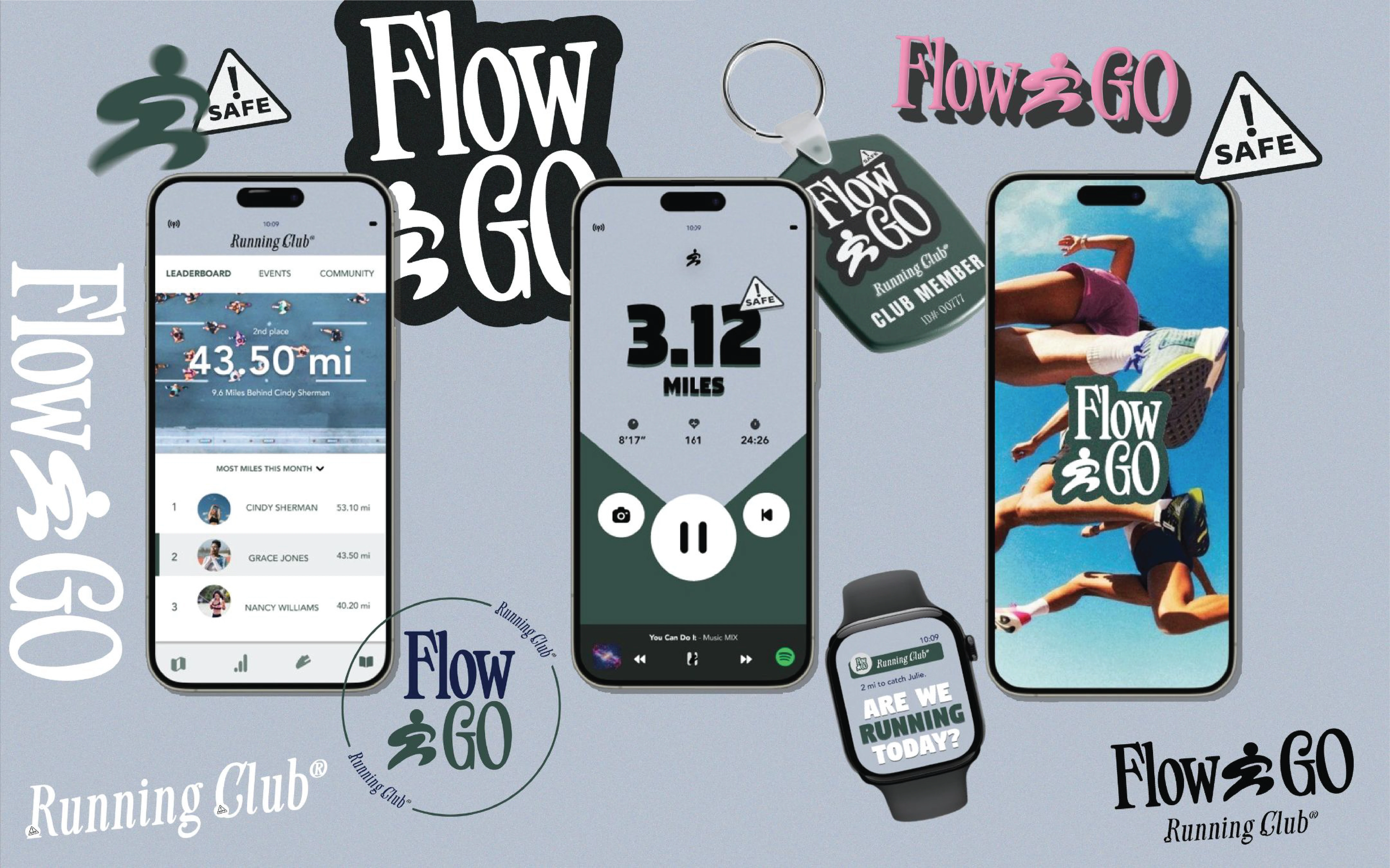
Flow & Go | International Women’s Day Campaign
Client: Conceptual
Industry: Running Club
Scope: Brand Identity, App assets, Product Mockups, Copywriting
01 — Project Goals
The goal was to create a brand identity that captured the spirit of Flow & Go; a running club for women and gender-expansive individuals built on safety, empowerment, and community.
The objective was to design a visual system that felt strong yet fluid, encouraging runners to move confidently and feel part of something larger than themselves.
02 — What I Wanted To Achieve
I wanted to build a brand that represented more than running; one that embodied freedom of movement, safety in numbers, and the emotional connection of shared experience.
Every design element needed to reflect motion, inclusivity, and authenticity.
My 10 STEP work flow process creating the logo & visual brand identity:
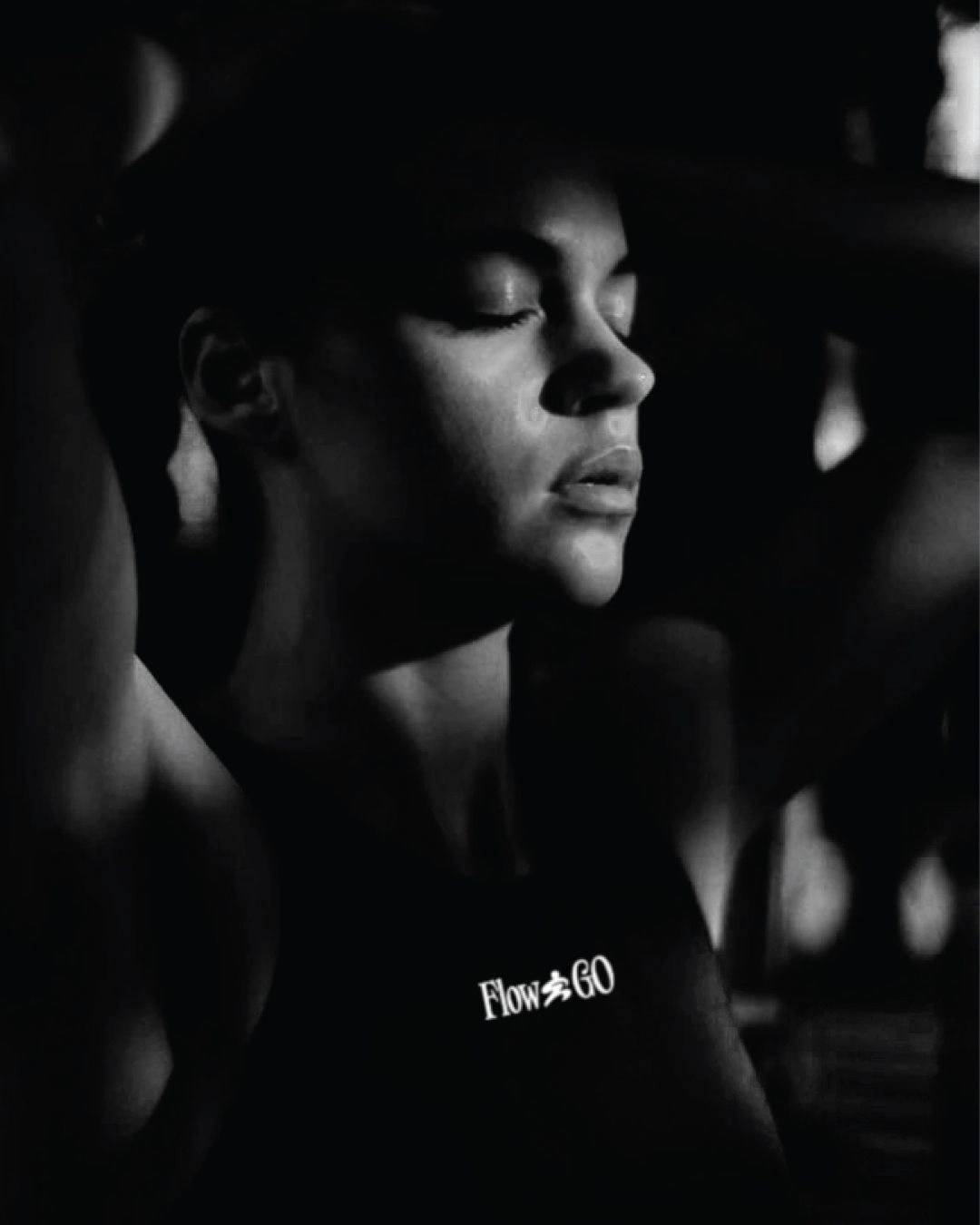
Dynamic Logo Concept
The dynamic logo system adapts fluidly just like the runners it represents, allowing for variations that reflect strength and individuality.
A dynamic logo is a flexible visual identity that evolves across contexts while maintaining brand recognition.
Unlike static logos, this system embraces motion and diversity. It can shift in style, texture, or form while preserving the core identity, ensuring consistency without uniformity.
This approach makes the brand feel versatile, modern, and engaging. Which represents well for a running club built around movement and inclusivity.
Each variation echoes the energy of its members: bold, free, and in motion. Whether used on apparel, digital platforms, or event signage, the dynamic logo icon captures the essence of Flow & Go. A living mark that grows with its community.
03 — Creative Challenges
The biggest challenge was balancing strength and softness creating visuals that felt empowering without leaning too sporty or overly corporate.
I also needed to integrate safety cues (like reflectivity and visibility) into a design language that still felt stylish and inviting. Ensuring that the identity appealed to both seasoned runners and those just beginning.
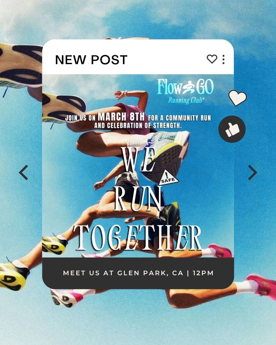
Instagram Post:
04 — Key Takeaway
Flow & Go’s brand identity brings together motion, safety, and empowerment through thoughtful design.
Ready to bring clarity to your own brand?
Whether you need a confident logo or a full identity system, Brandingby𝓔𝓵 helps startups and small businesses show up with consistency and confidence.
Like this project
Posted Apr 15, 2025
Designed a dynamic visual identity for Flow & Go, a running club promoting inclusivity + International Women's Day promo assets.