Built with Kittl
Visual Brand Identity for NUMA Skincare
Lisette D. Brown
✦ NÜMA | Visual Brand Identity Design
Client: Conceptual
Industry: Beauty/Skincare
Scope: Brand Identity, Packaging Design & Campaign Direction
01 — Project Overview
NUMA; for mindful routines, minimal aesthetics, and products that feel as refined as they are effective.
02 — The Challenge
The identity had to communicate:
Ingredient integrity
Calm confidence
Modern minimalism
Premium positioning
All while remaining visually soft and approachable.

03 — Brand Strategy
Positioning:
Elevated skincare rooted in bio-innovation.
Target Audience:
Consumers who prioritize intentional living and thoughtful self-care.
Brand Personality:
Minimal • Calm • Refined • Honest • Intentional
Core Message:
Skincare for beautiful skin.
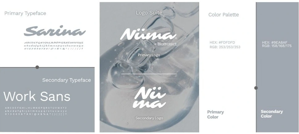
04 — Visual Identity
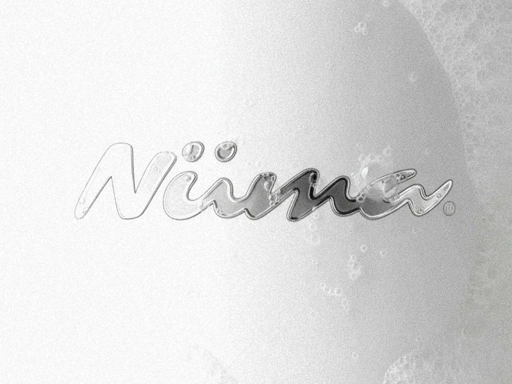
Logo Design
The NUMA wordmark is clean, balanced, and structured with subtle softness in its letterforms. The spacing and geometry create a sense of calm, reflecting both science and serenity.
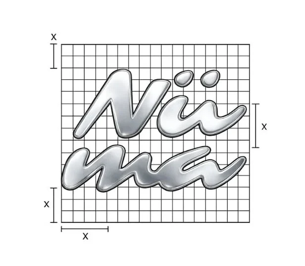
The simplicity of the logo allows it to live beautifully across packaging, digital, and physical environments.
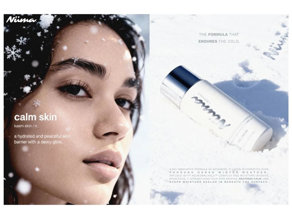
Packaging Design
The packaging system embraces negative space and minimal layouts. Product names are given breathing room, reinforcing the brand’s philosophy of simplicity and intention.
Design choices include:
Clear ingredient hierarchy
Clean typographic alignment
Subtle graphic details (i.e Silver caps)
Matte-inspired finishes for tactile luxury
The overall feel is quiet with a little playful confidence.
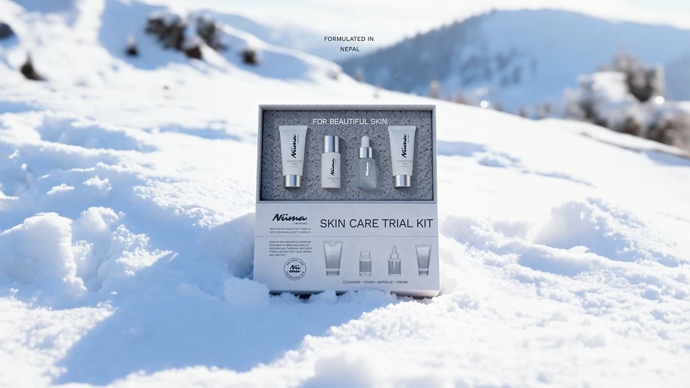
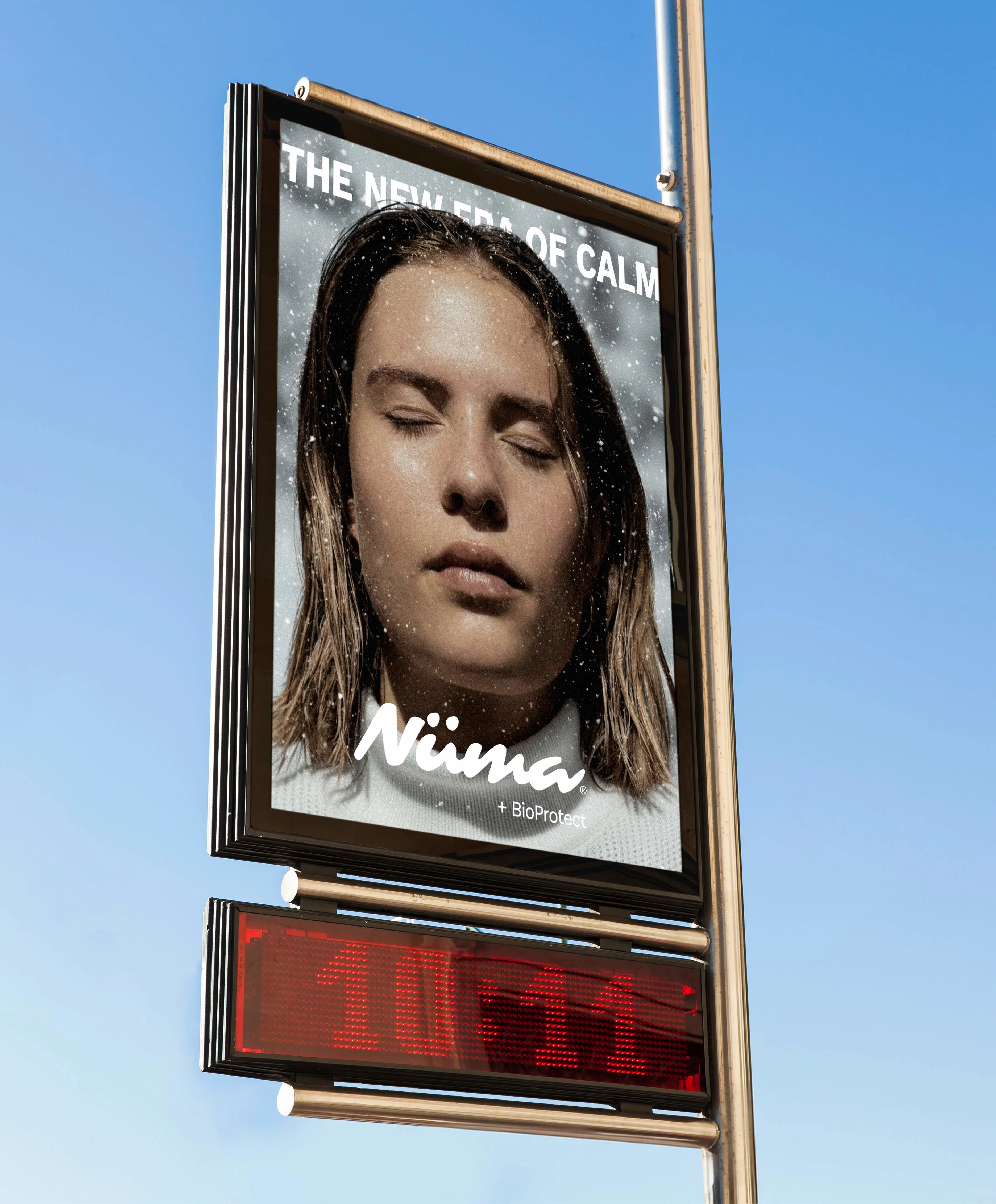
05 — Winter Campaign Direction
The winter campaign's strategic decision was to focus on the product and brand messaging.
Instead of relying only on lifestyle imagery or model-driven visuals, the campaign centered around the tactile presence of the packaging itself; allowing the textures, tones, and typography to carry the story.
Winter naturally evokes:
Stillness
Quiet
Soft light
Intentional care
This aligned perfectly with NUMA’s philosophy of skincare as a calming daily use product.
The campaign setting embraced:
Cool, wintery backgrounds
Soft shadows and diffused lighting
Minimal composition with a playful edge
Close-up product framing
By reducing visual noise, the product became the hero, reinforcing trust, clarity, and premium positioning.
The winter environment wasn’t loud or festive. It was serene. Clean. Almost meditative.
This approach allowed the packaging design to shine while strengthening NUMA’s identity as a brand rooted in calm confidence and seasonal adaptability.
06 — What I Learned
This project reinforced that restraint can be powerful. Not every brand needs loud visuals to stand out, sometimes clarity, spacing, and quiet confidence create deeper impact.
Ready to bring clarity to your own brand?
Whether you need a confident logo system or a full identity system, Brandingby𝓔𝓵 helps startups and small businesses show up with consistency and confidence.
Like this project
Posted Mar 5, 2026
Developed a visually cohesive brand identity for NUMA, emphasizing calmness and minimalism within a winter campaign.
Likes
1
Views
21
Clients
Conceptual