Built with Kittl
Serotonin Toronto | Logo & Brand Identity Development
Lisette D. Brown
✦ Serotonin Toronto | Logo Design & Brand Identity Development
Client: Serotonin Toronto
Industry: Wellness · Holistic Lifestyle · Natural Self-Care
Deliverables: Logo System, Brand Identity, Icon Suite, Visual Direction, Packaging Design
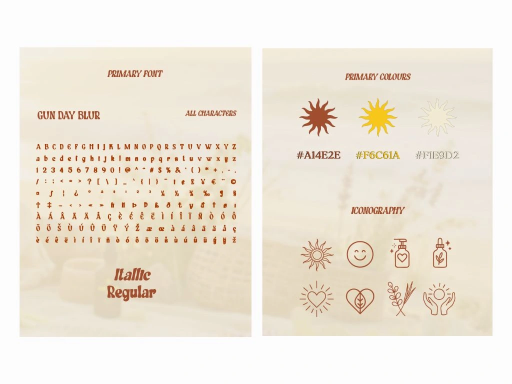
Brand Board
01 — The Brief
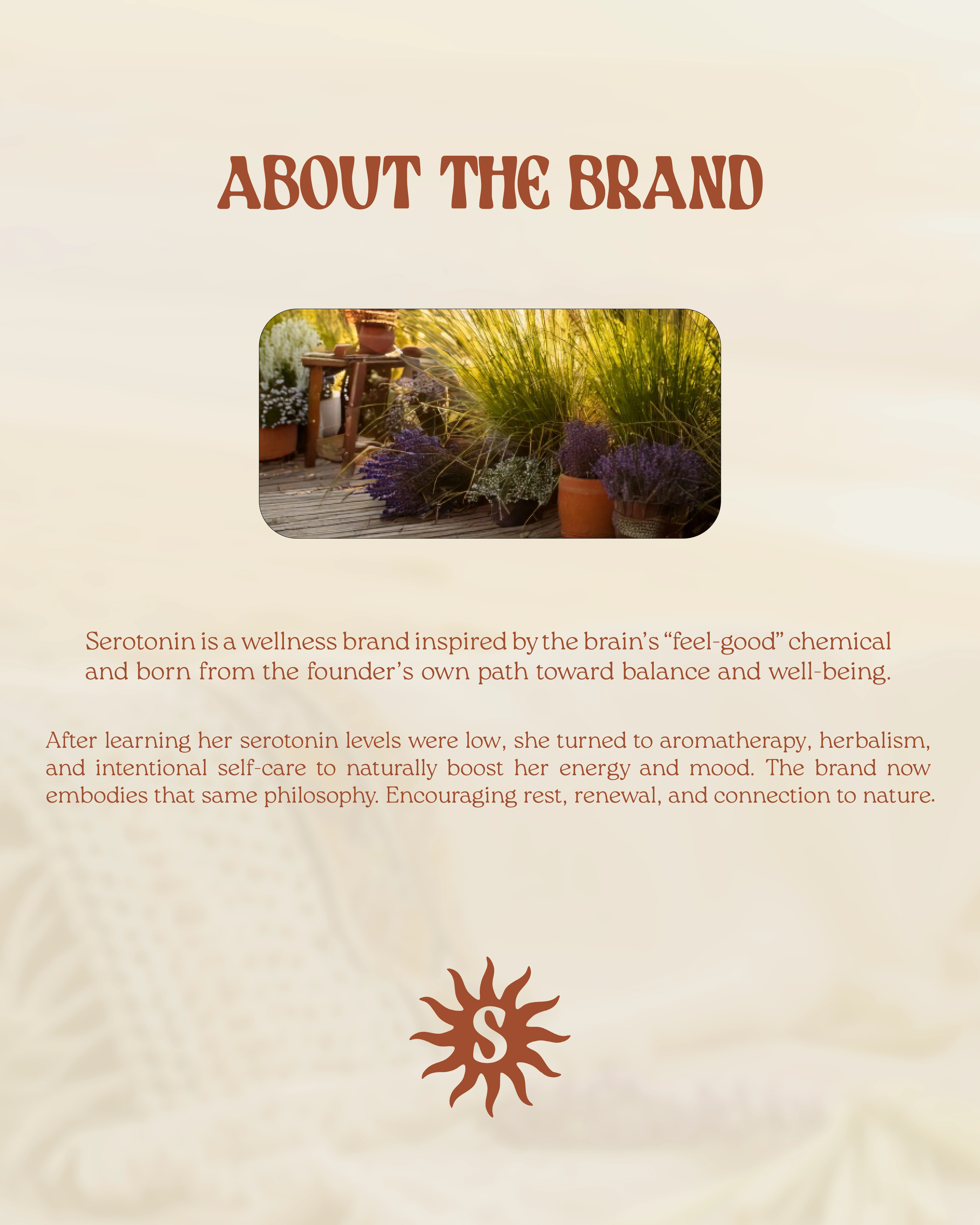
Serotonin Toronto came to me at a pivotal moment. Founded by Sarah, a Toronto-based social worker with Filipino and Ghanaian heritage, the brand grew out of her own experience with burnout, anxiety, and low serotonin levels. After working with a naturopath and finding balance through aromatherapy, herbalism, and mindful living, Sarah started handcrafting natural wellness products from her home studio.
She had the products. She had the story. What she didn't have was a visual identity that matched the depth of what she was building: a woman-of-color-owned wellness brand rooted in cultural healing traditions, sustainability, and community. Sarah needed a brand system that could carry all of that, from packaging to social media to an eventual storefront, without feeling clinical or generic.
The goal was clear: create a cohesive identity that honors the cultural roots of holistic wellness, feels warm and human, and positions Serotonin Toronto as a trusted, elevated brand in a crowded self-care market.
01 — Overview
Serotonin Toronto is a wellness brand rooted in holistic living, mindfulness, and the power of nature. Every product is handcrafted with 90-100% natural ingredients and packaged in eco-friendly materials that are compostable, recyclable, reusable, and even plantable. The brand exists to make aromatherapy and herbal wellness accessible, not as a replacement for professional care, but as a meaningful layer of support for everyday balance.
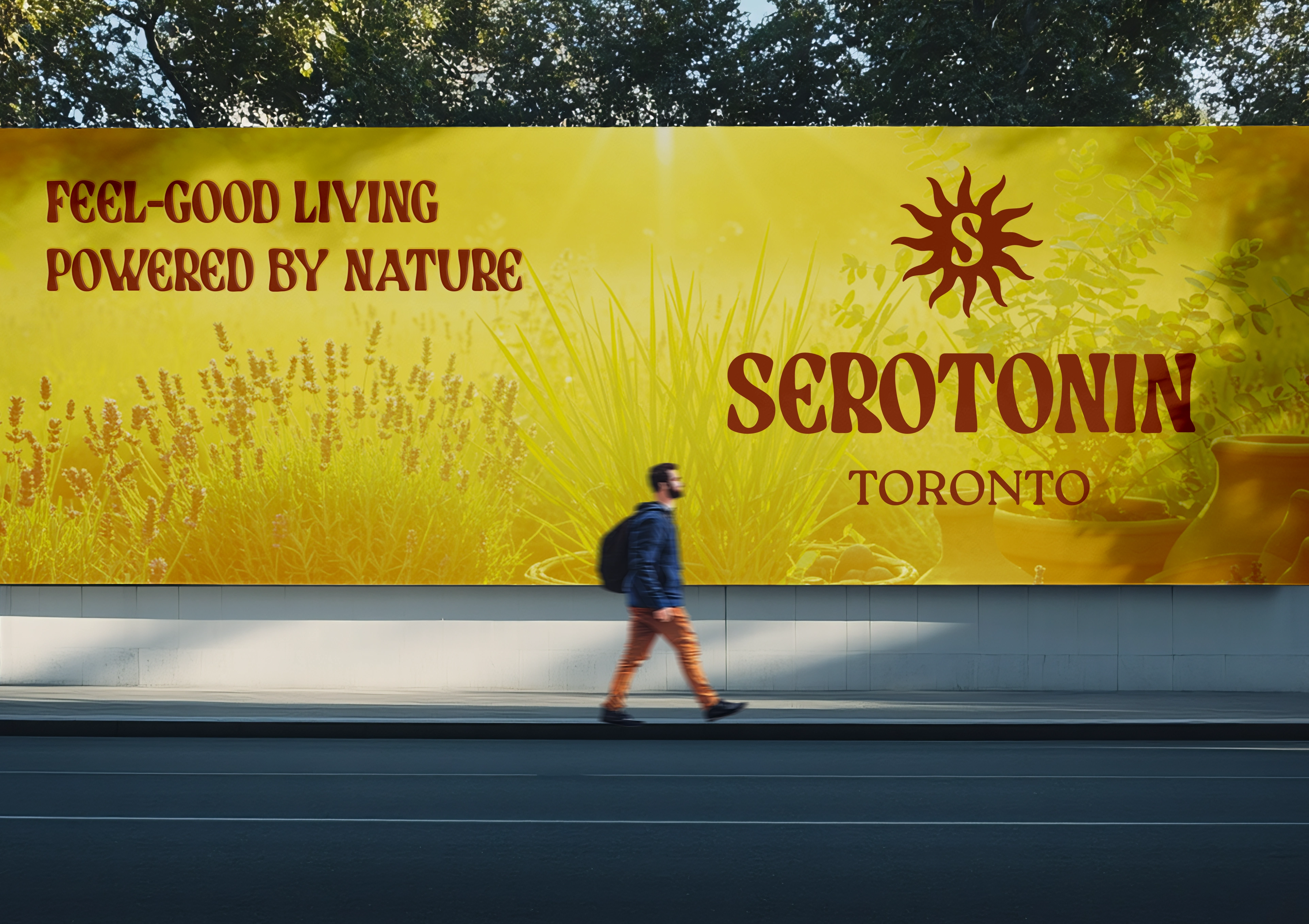
The tagline, "Inspired by the Sun," connects directly to serotonin itself: the feel-good chemical our bodies produce naturally through sunlight. That became the conceptual anchor for the entire identity system.
Brand Identity
02 — What I Wanted to Achieve
My aim as the brand designer was to craft a visual identity that:
Captures the serotonin tagline "Inspired by the Sun".
Blend organic textures with modern minimalism.
Establishes a cohesive tone across the logo, typography, color palette, and iconography.
Feel instantly recognizable.
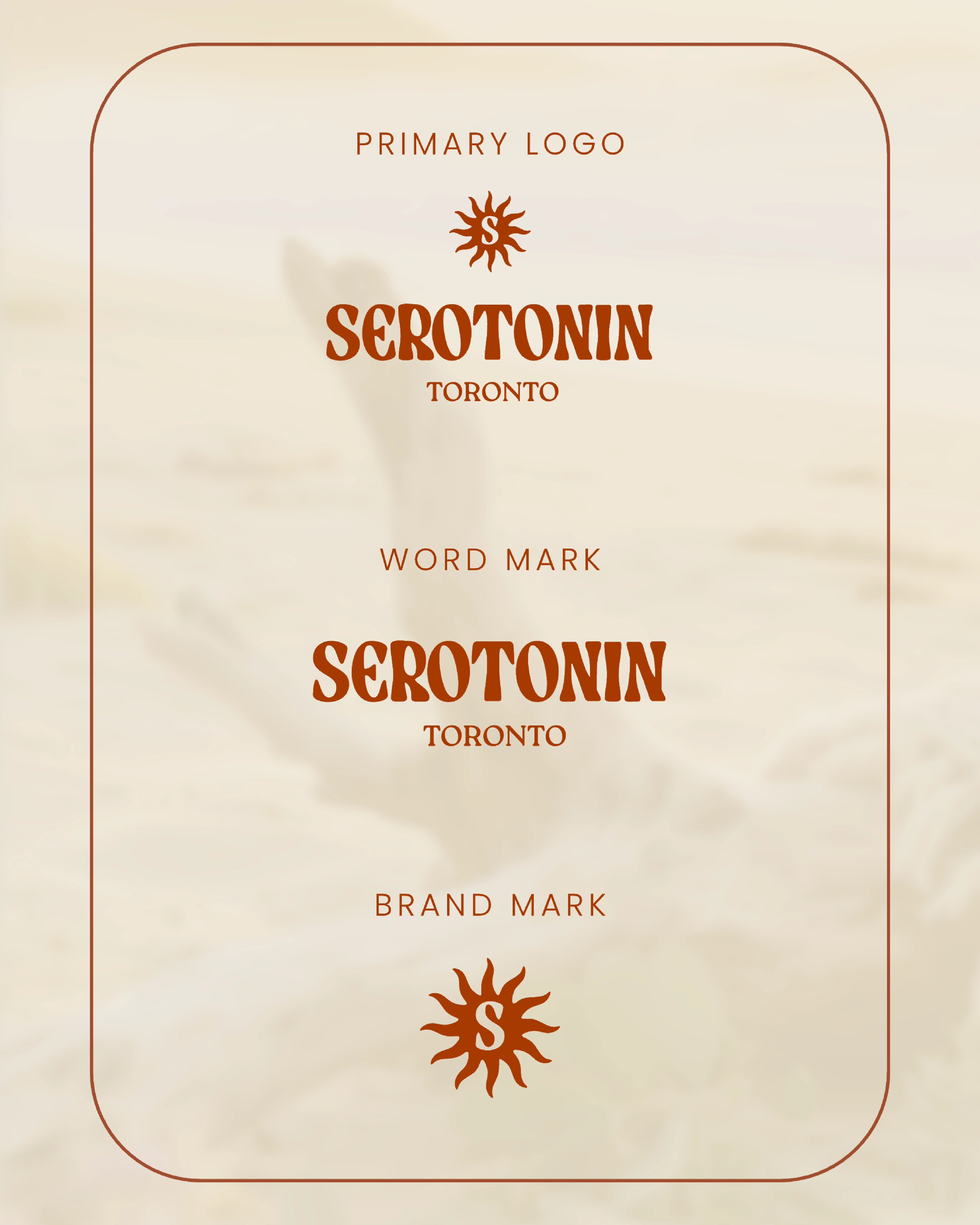
Logo Suite
03 — Challenges
One of the main challenges was balancing:
The brand needed to feel scientifically inspired (like wellness with purpose), but also warm and human.
Visually, I needed to combine the vibrant energy of the sun with the grounded calm of botanicals without one overpowering the other.
Creating icons that felt hand-drawn, while remaining scalable and modern for digital use.
Challenges
04 — Solutions & Outcomes
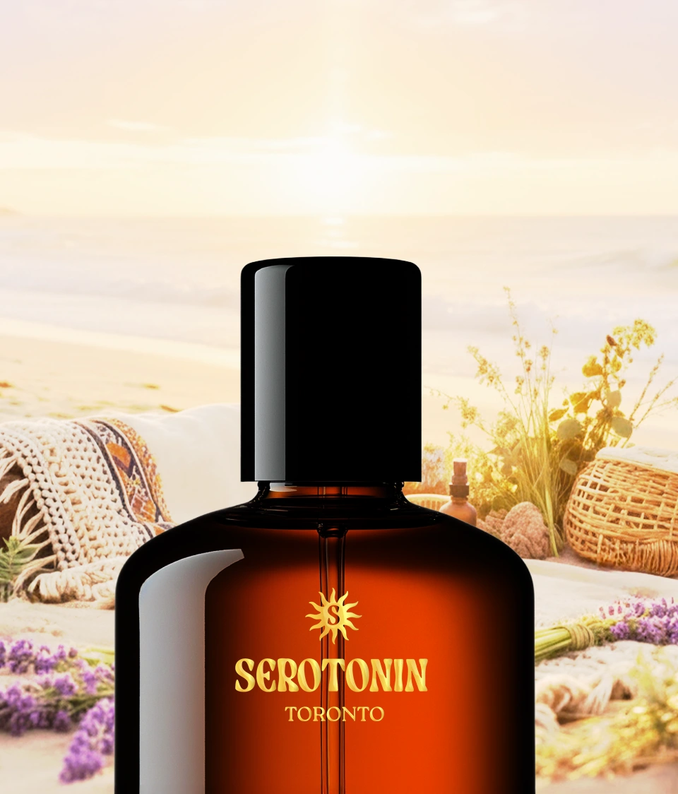
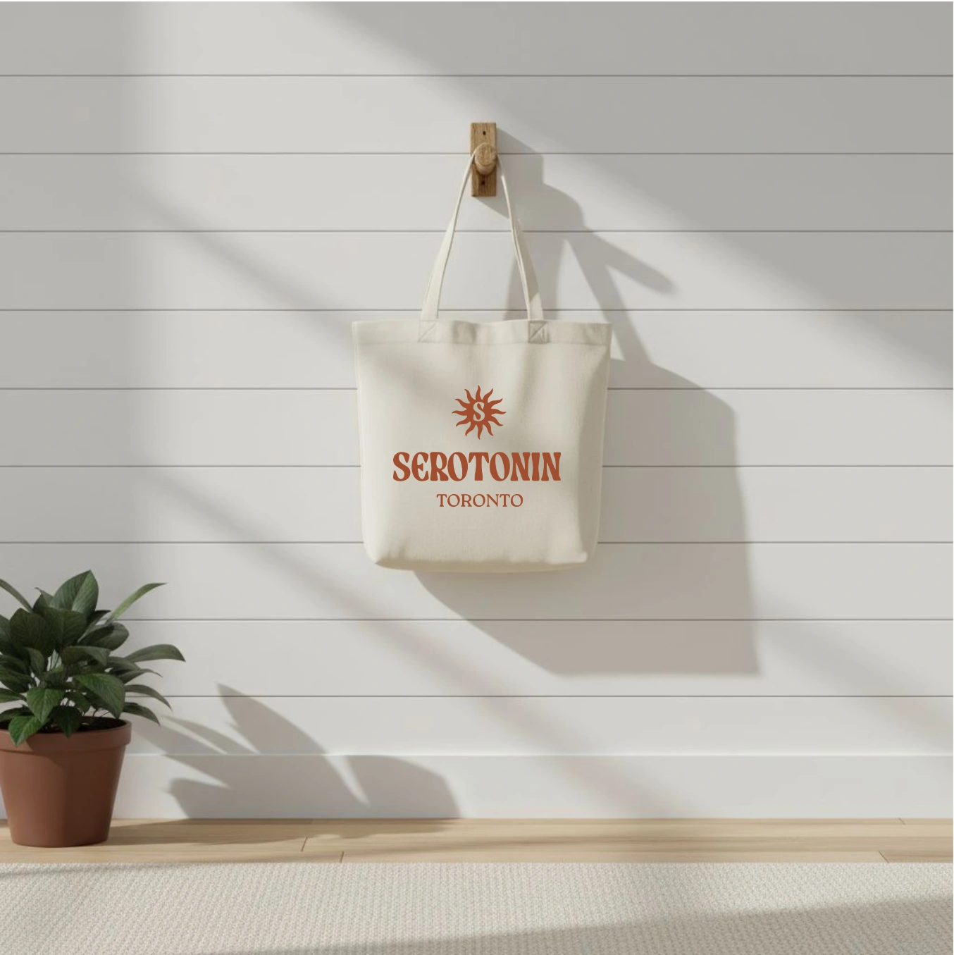
To bring the vision to life, I developed a sun-centered logo system symbolizing growth, renewal, and the natural serotonin we get from the sun. Every design decision traced back to Sarah's story and the brand's dual nature: scientifically grounded but deeply personal.
The primary logo icon features a sun with organic, flowing rays. I initially explored a more geometric sun mark, but it read too clinical for a brand built on handcrafted care and cultural healing traditions. The final direction uses softer, hand-drawn movement that feels warm and intentional.
The color palette blends amber, terracotta, and soft cream with herbal greens. The warm tones reflect the sun and Sarah's Ghanaian and Filipino heritage, while the greens ground the palette in the botanical ingredients she works with daily.
Custom boho-style icons (sun, herbs, hands, heart, and rest motifs) were designed for packaging, web, and Instagram highlights. These needed to feel hand-drawn and personal while remaining scalable for digital use. I built them at multiple sizes to ensure consistency across platforms without losing the organic quality.
Outcome:
The final identity captures the brand's ethos: holistic living and natural ways to boost serotonin levels. The cohesive visual language positions Serotonin Toronto as a trusted, elevated wellness brand that stands apart from the minimalist-clinical aesthetic dominating the space. Sarah now has a system that works across her handcrafted product labels, her social presence, and the future storefront she's building toward.
Solutions
05 — What I Learned
This project reinforced the importance of designing for feeling, not just function.
Serotonin Toronto challenged me to think about emotional resonance, and how colors, spacing, and texture can influence mood and perception. I learned that simplicity, when paired with strong storytelling, creates timeless branding.
Learnings
06 — How It Benefited the Business
The visual brand identity gave Serotonin Toronto:
A clear, recognizable visual system that reflects Sarah's mission of accessible, inclusive wellness, not just another clean-beauty look.
Stronger brand recall through consistent iconography and tone across packaging, social media, and customer touchpoints.
A foundation for expansion into new product lines, retail packaging, web design, and the in-store experience Sarah is working toward.
A brand story that connects with the community Sarah is building: people who care about what they put on their bodies, where it comes from, and supporting small, woman-of-color-owned businesses.
Phase 1 → Phase 2: The BBE Workflow in Action
The Serotonin Toronto project marks the completion of Phase 1: Foundation in the BBE (Brand, Build, Expand) workflow, where strategy meets design. From the initial Clarity Call through brand exploration, logo development, color system, and visual language, this phase focused on building a clear logo system and visual identity that could carry the brand's story.
As we move into Phase 2: Build, the focus shifts toward applying the identity across the full brand experience: packaging for Sarah's handcrafted products, digital touchpoints, and social strategy. This next step transforms Serotonin Toronto from a visual concept into a living, breathing brand that connects, communicates, and radiates purpose across every platform.
This is where design evolves into experience and the glow of Serotonin Toronto truly begins to shine. ✨
Ready to bring clarity to your own brand?
Whether you need a confident logo or a full identity system, Brandingby𝓔𝓵 helps startups and small businesses show up with consistency and confidence.
Like this project
Posted Oct 29, 2025
Developed a logo system and clear visual brand identity for Serotonin Toronto, capturing holistic living and natural serotonin boosting.