YOTTA / Solar Company Brand Identity
Dmytro Dzandzava
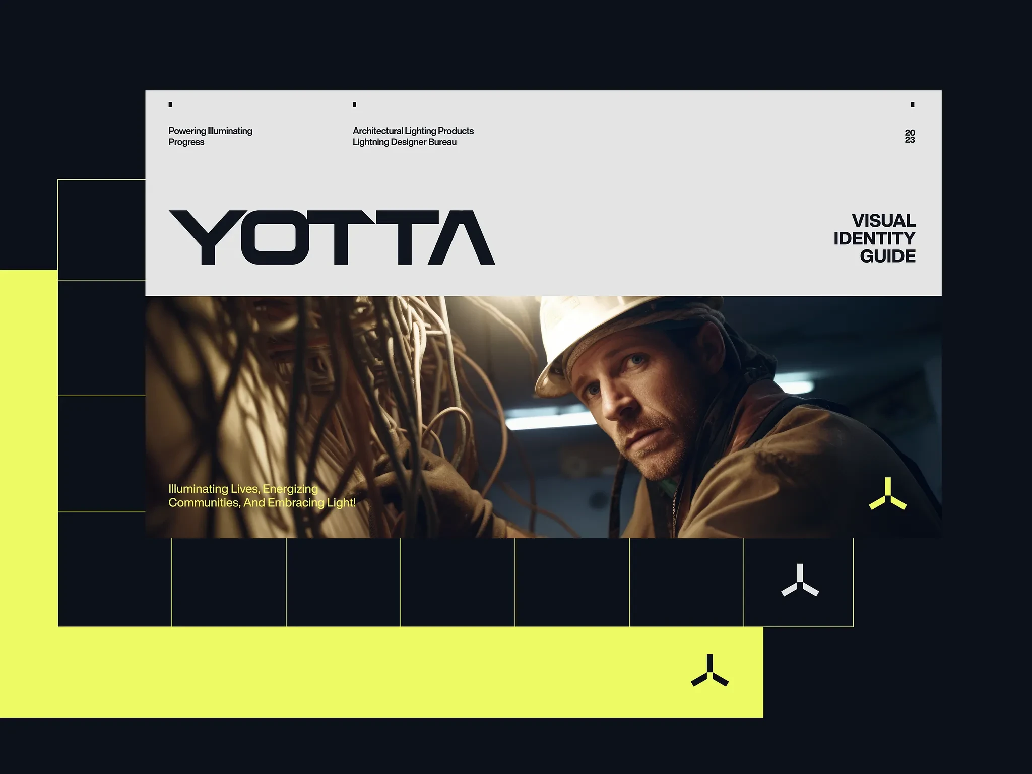
YOTTA Brand Identity
Company at the forefront of green energy generation through windmills
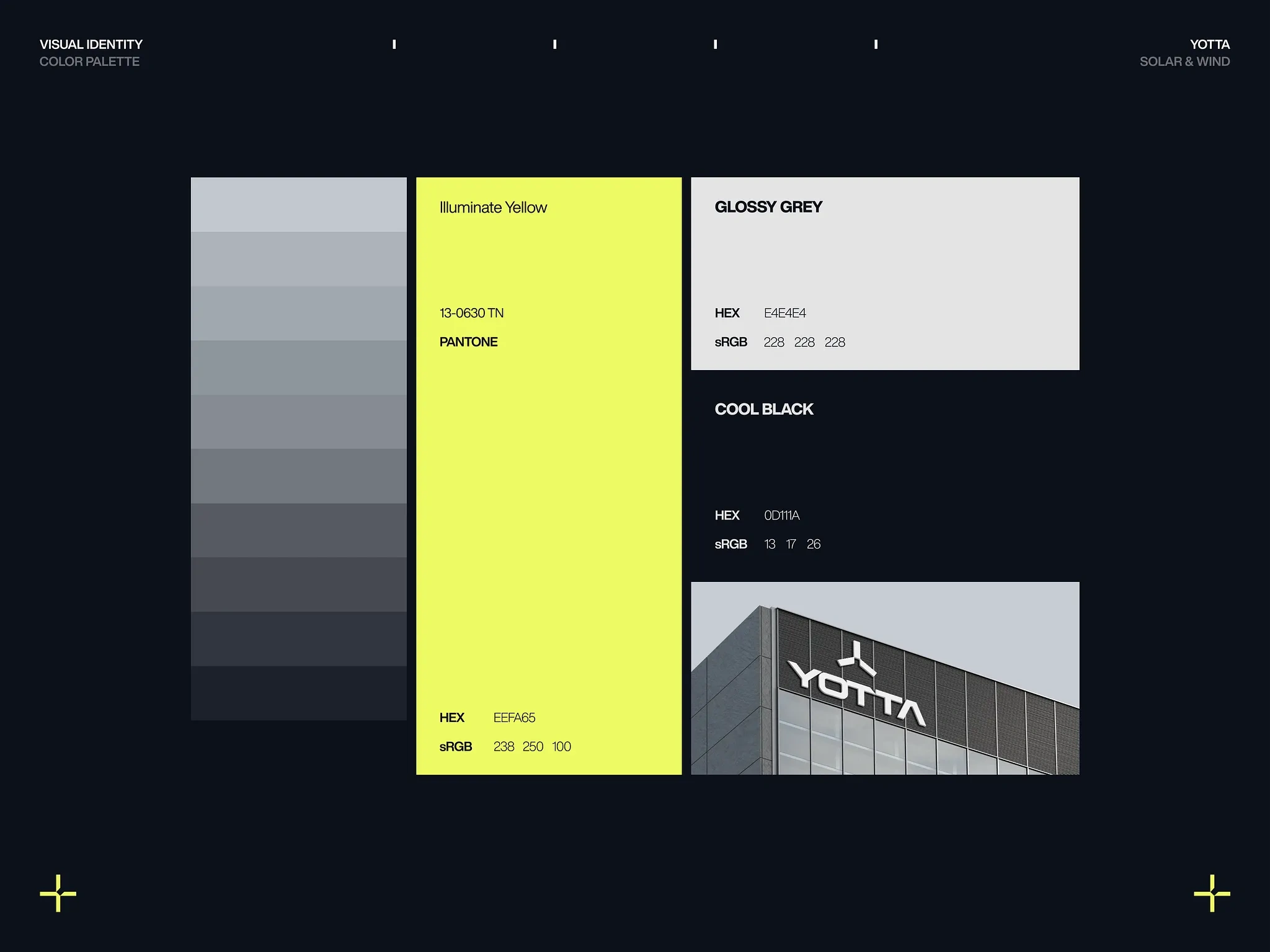
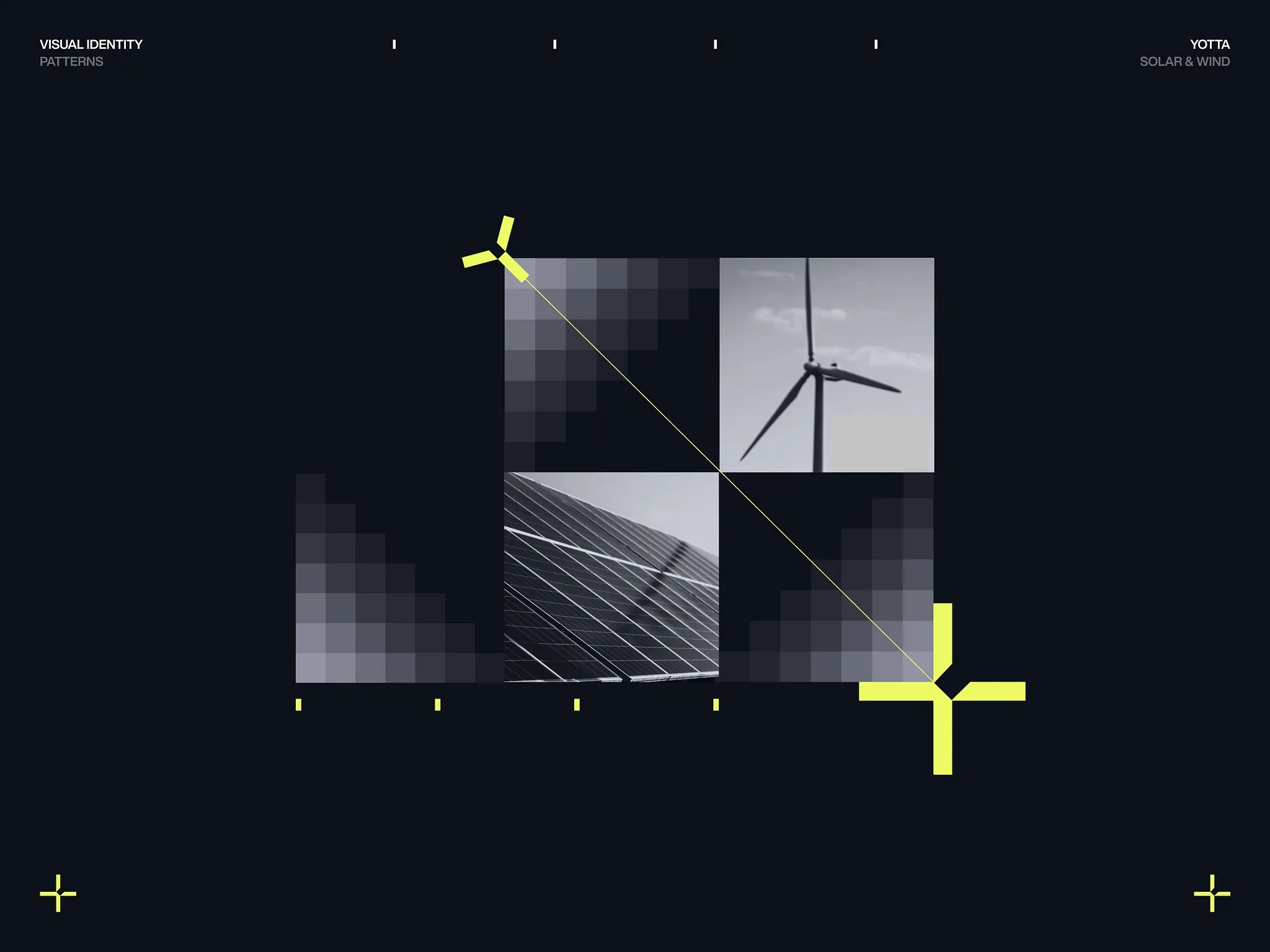
The YOTTA design concept encapsulates the cutting-edge essence of a company at the forefront of green energy generation through windmills. The modern and sleek design, primarily using a monochromatic palette punctuated by vibrant yellow highlights, reflects the innovative and clean energy solutions that Yotta promises. The minimalist layouts, characterized by sharp geometries and clean lines, resonate with the precision and efficiency inherent in wind energy technologies.
The YOTTA logo and typography reveal a thoughtful approach to design, which harmoniously aligns with the company's innovative essence.
The Yotta logo comprises an icon with the letter "Y" reflecting windmill blades or a turbine's rotation. The icon's symmetry and geometry exude balance and stability. Its compact and bold design provides versatility, making it suitable for varied applications, from digital platforms to physical branding.
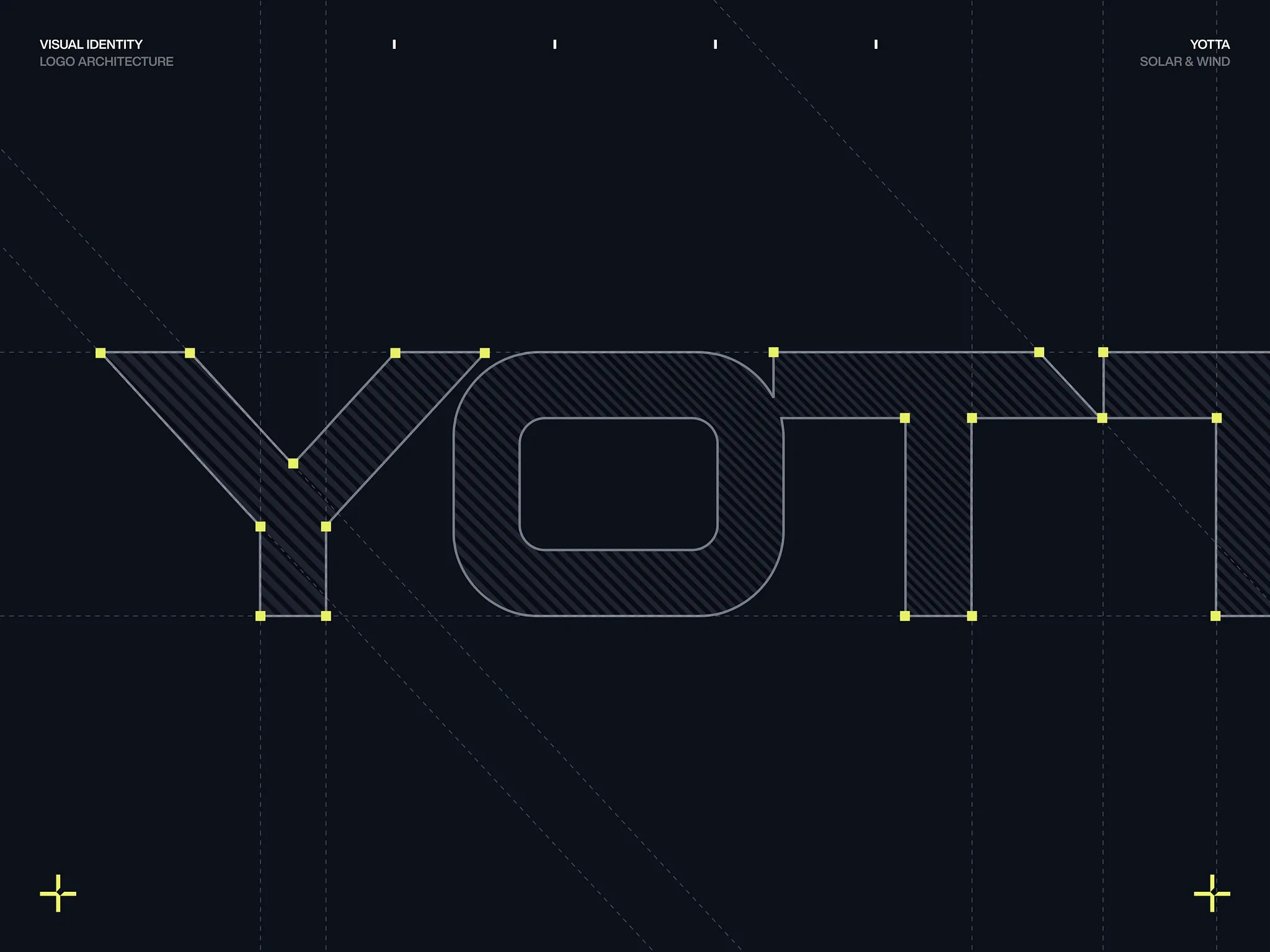
The linear and straightforward nature of the font aligns well with the brand's identity as a reliable and efficient green energy provider.
The seamless blend of abstract designs with tangible images paints a comprehensive picture of a technologically advanced and environmentally conscious brand.
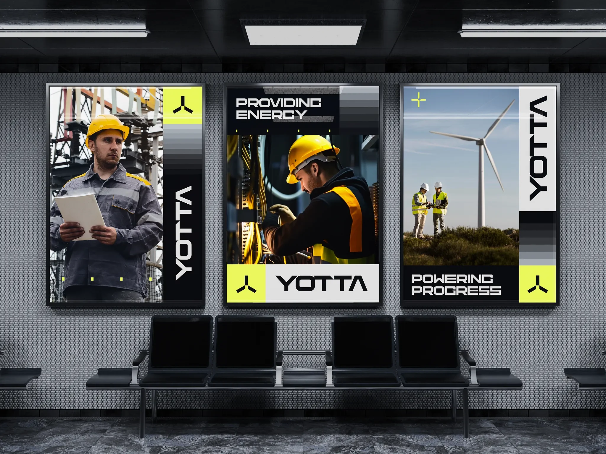
The Yotta brand showcases the epitome of design versatility, effortlessly adapting its distinguished identity across diverse mediums. From the towering billboards that narrate tales of technological advancement to the storefront displays that resonate with promise, every touchpoint is a testament to Yotta's adaptable and resonant design language. It's not just a brand; it's an experience, transcending beyond digital realms, and establishing a tangible connection with its audience.
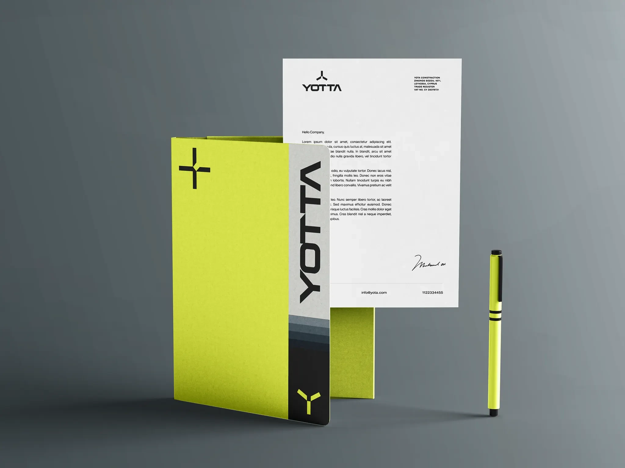
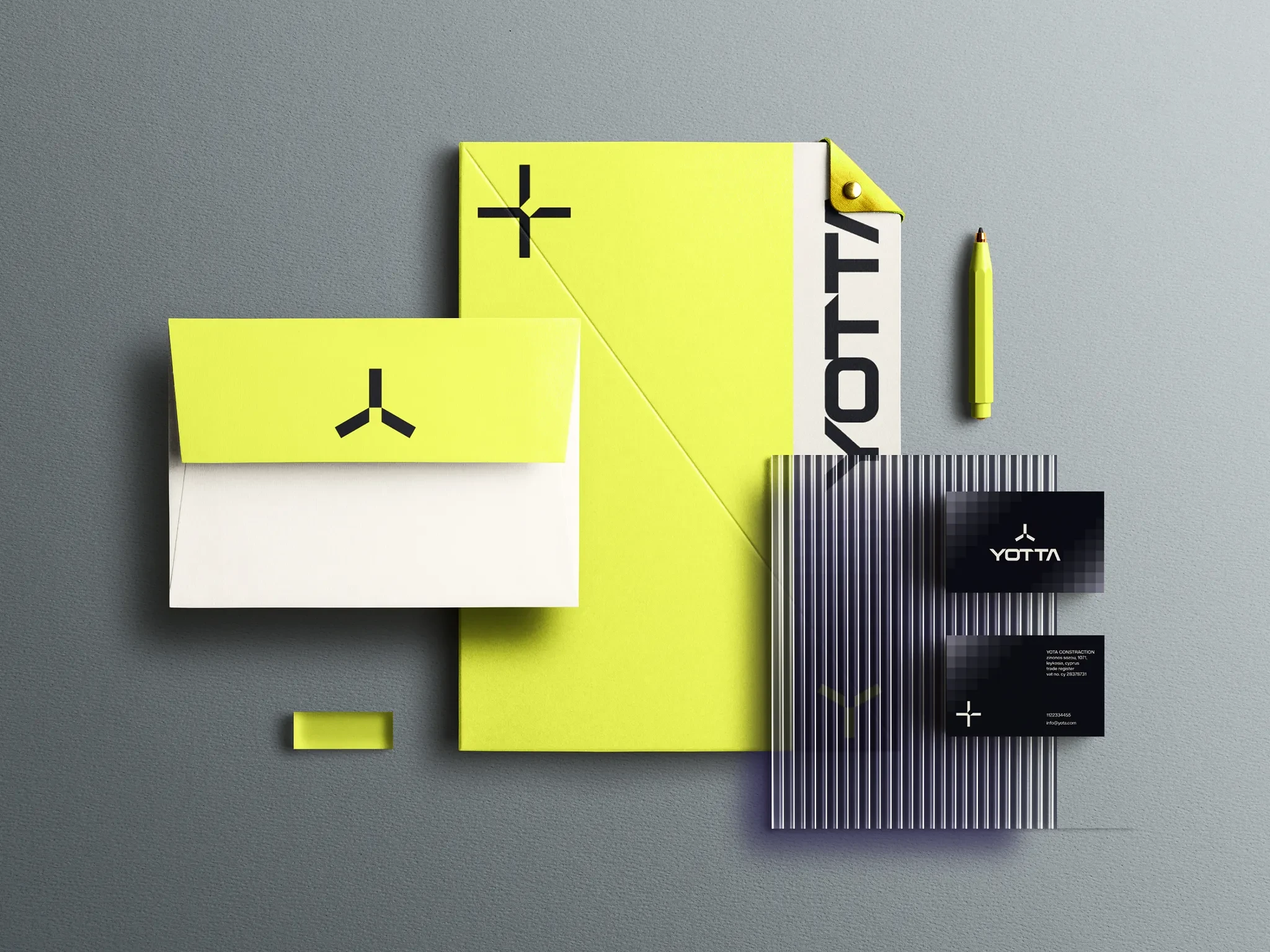
Diving deeper into Yotta's branding arsenal, we encounter meticulously designed elements. The business cards, stationery, and other corporate paraphernalia, marked with the bold contrasts of black and neon yellow, speak volumes of Yotta's precision. They echo a brand that is both contemporary and timeless, signaling its readiness to adapt and lead in an ever-evolving landscape.
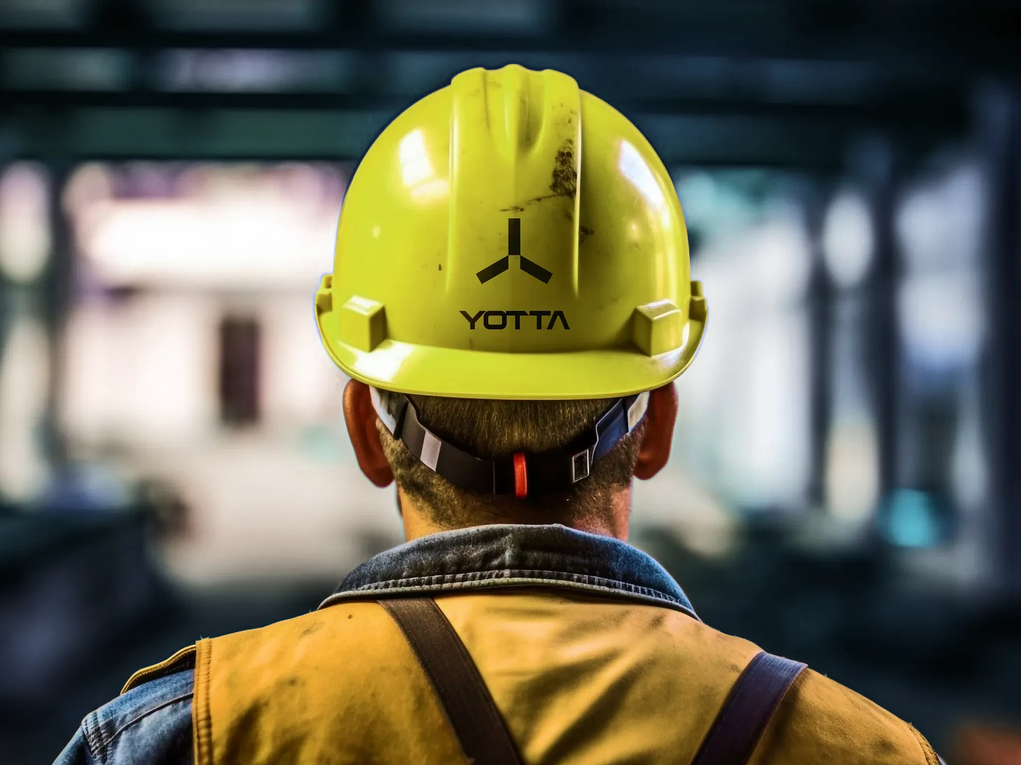
The extension of branding to safety gear, like the striking yellow helmet, further underscores Yotta's comprehensive approach. It speaks of a brand that prioritizes both aesthetics and functionality, ensuring that every touchpoint, whether it's a piece of safety equipment or a marketing billboard, is infused with Yotta's ethos. This is the power of universal design – a brand narrative that remains consistent, compelling, and relevant across all platforms and applications.
Website Design
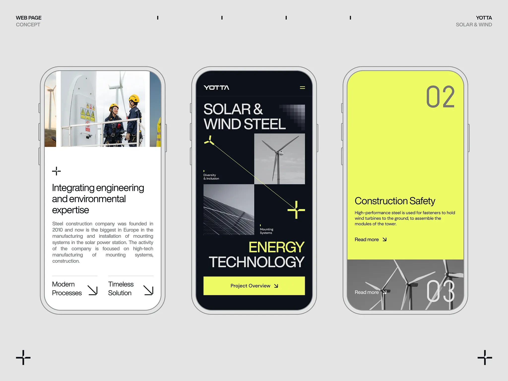
We present Yotta's sophisticated digital experience, where advanced design converges with the promise of renewable energy. The contrasting visuals of sleek wind turbines and cutting-edge solar panels evoke the brand's commitment to green solutions, while the sharp, minimalist aesthetic emphasizes modernity and forward-thinking. The platform features an intuitive user interface, highlighting Yotta's dedication to both environmental expertise and user engagement.
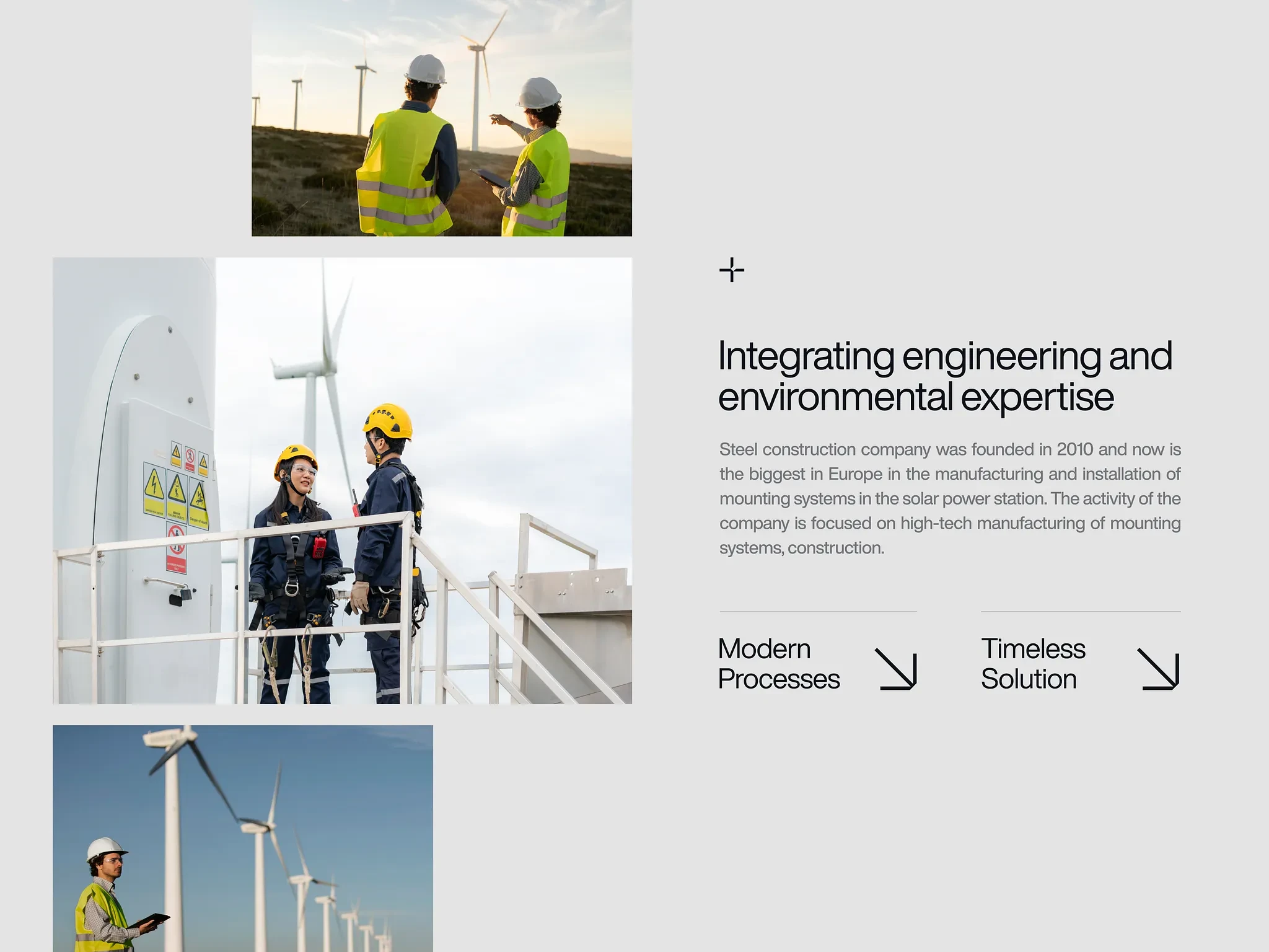
Our designs amplify the company's ethos of integrating high-end engineering with environmental diligence. The balanced color palette and seamless adaptability ensure that Yotta's message of sustainable energy resonates across all devices and platforms.
Like this project
Posted Jul 30, 2025
Company at the forefront of green energy generation through windmills.