Built with Framer

The whole project in one look.
NØRVA is a technical mountain apparel brand from the Rio de Janeiro highlands, launching with three pieces: a 3L Jacket, a Technical Tee and Trail Pants. The drawings were ready. I built the brand, and every image and page that sells it.
The Setup
Three pieces drawn from the terrain, a tech pack ready for quotes and no brand around them yet. NØRVA is made for people in Rio, São Paulo, Belo Horizonte or Curitiba who head up the range on weekends and read the spec sheet before they buy. The work had to cover the identity, the product images, the campaign and the pages that sell, all from one system.
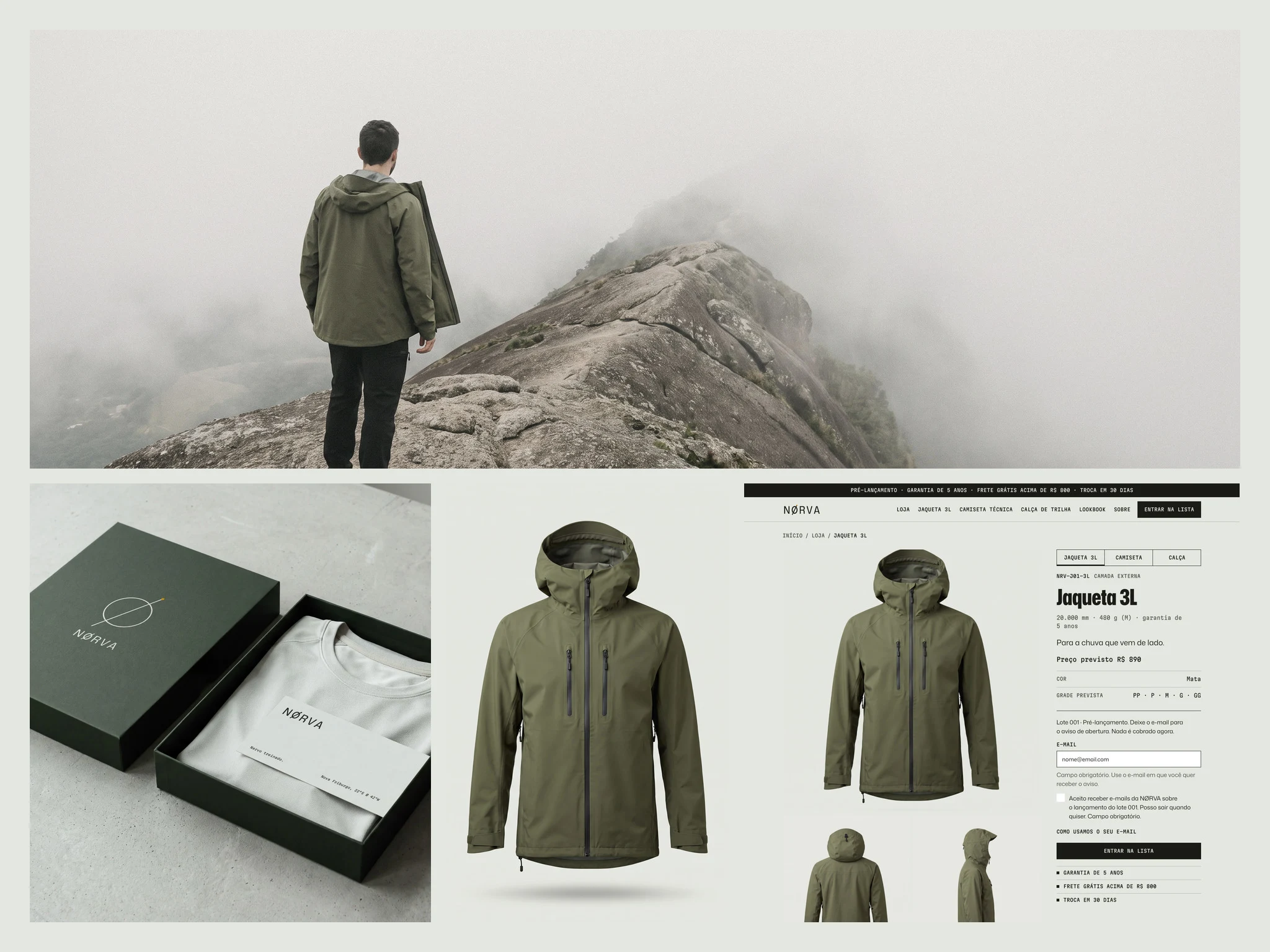
The brand, the product and the store in one view.
The Tension
There is no sewn sample yet, so there is nothing to photograph. People who already own an imported shell compare specs, fit and detail before they trust a new name. If the image does not answer those questions, they move on. Online, the image is what they touch.
The Decision
I started with the brand, then gave every image a job before it was made: main image on white, core benefit, details and specs, how to use, on the range, comparison and what comes in the box. The same seven jobs for each piece, so the three read as one range. The images came from the technical drawings, front and back as reference, and I checked each one against them pocket by pocket. The direction was written before the first generation: overcast light, a small figure, a body reading the terrain and never facing the camera, mineral and desaturated color. Scenes were made in Magnific, and the logo goes on as a vector.
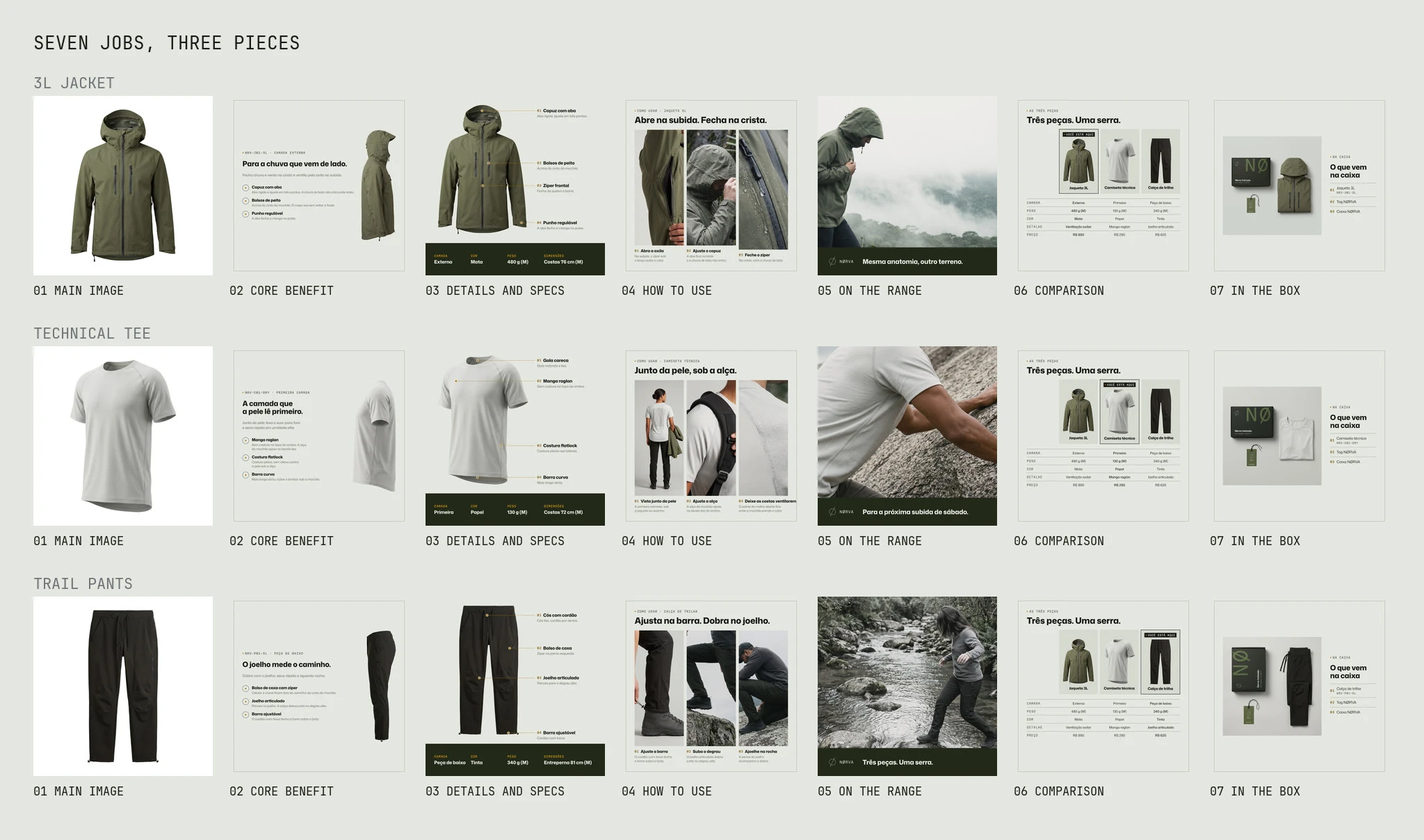
Seven jobs for seven images, for all three pieces.
The System
The logo is a ring cut by a stroke at 63° that runs past the edge on both sides, with an ochre dot where it exits, the same dot that marks every callout on the technical drawings. Six named colors come from the anatomy plate: Plate Paper, Ink, Moss, Night Moss, Nerve Ochre and Laterite. Mona Sans speaks and Martian Mono carries the data. The guidelines exist in English and Portuguese, and a Figma library holds the variables, styles and components.
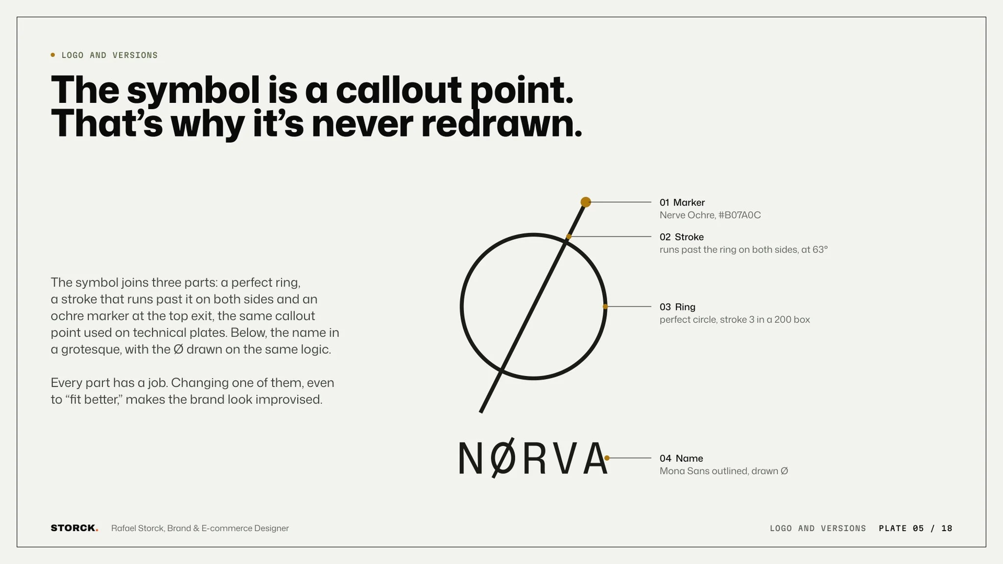
The symbol is a callout point, so it is never redrawn.
The logo drawn from its construction points.
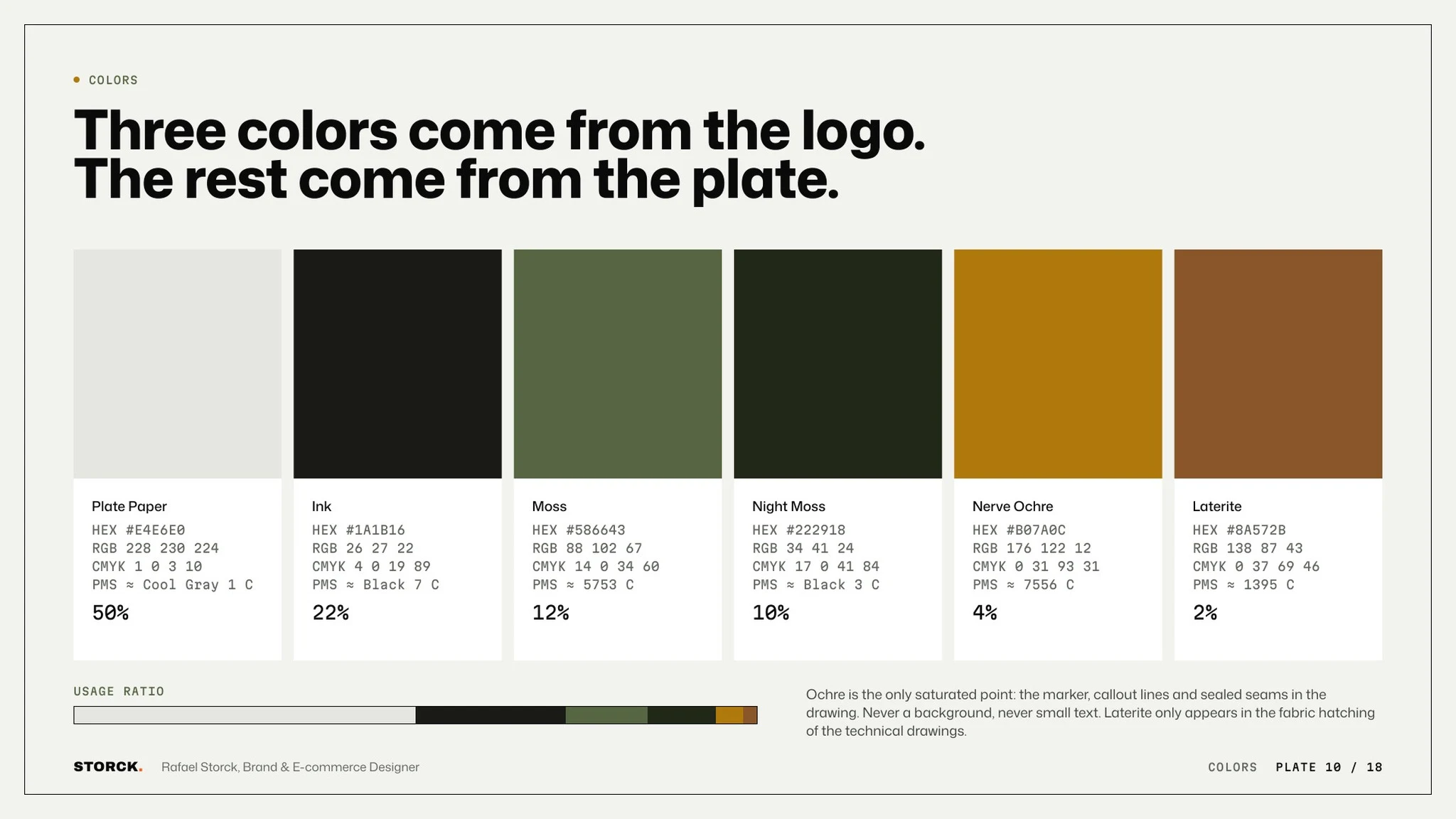
Six colors from the anatomy plate, each with its share of use.
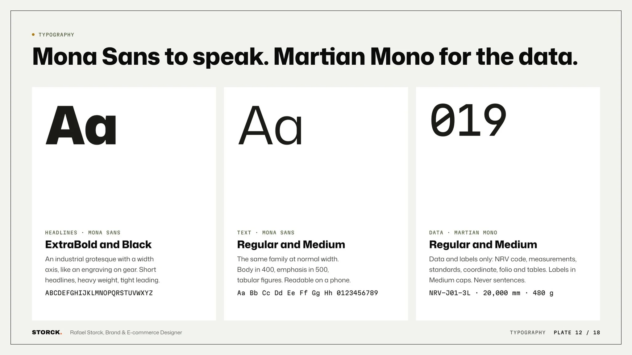
Mona Sans for the words, Martian Mono for the data.
The brand in the world
The label, the hang tag and the shipping box carry the same vector logo and the same greens. The store sign, the patch and the stationery come from the same drawing, so none of them looks like it belongs to another brand.
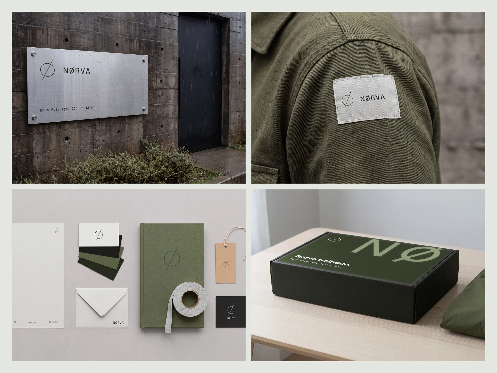
The same logo and greens on the sign, patch, stationery and box.
The Product
Twenty-one marketplace images, seven per piece, made with AI instead of a photo shoot. Studio views at the same scale and light, the pieces on the body for fit, and the details up close, like water on the jacket zip and the open-knit panel on the back of the Tee.
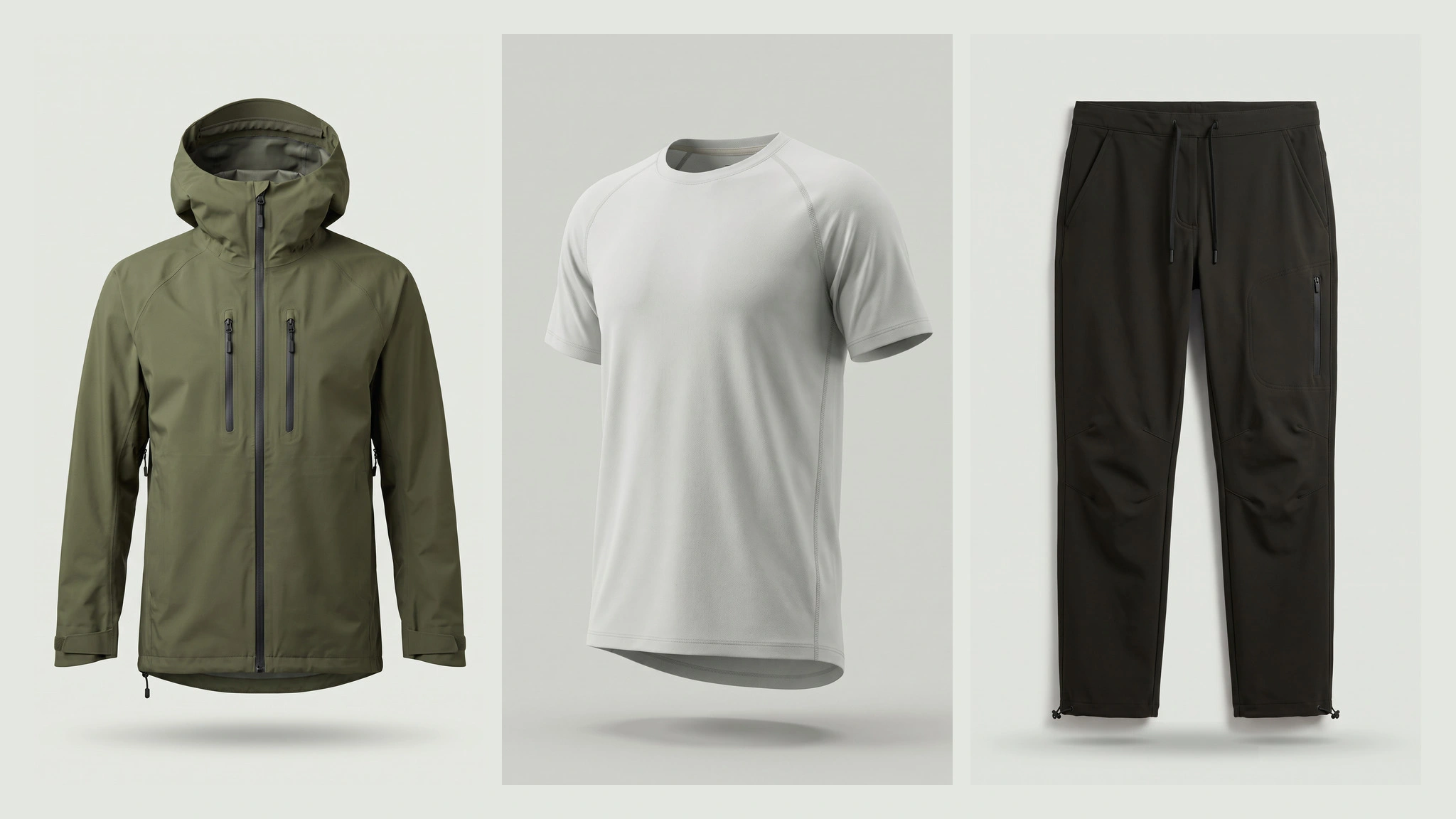
Three pieces, same scale and light.
Each piece with its code, weight and callouts.
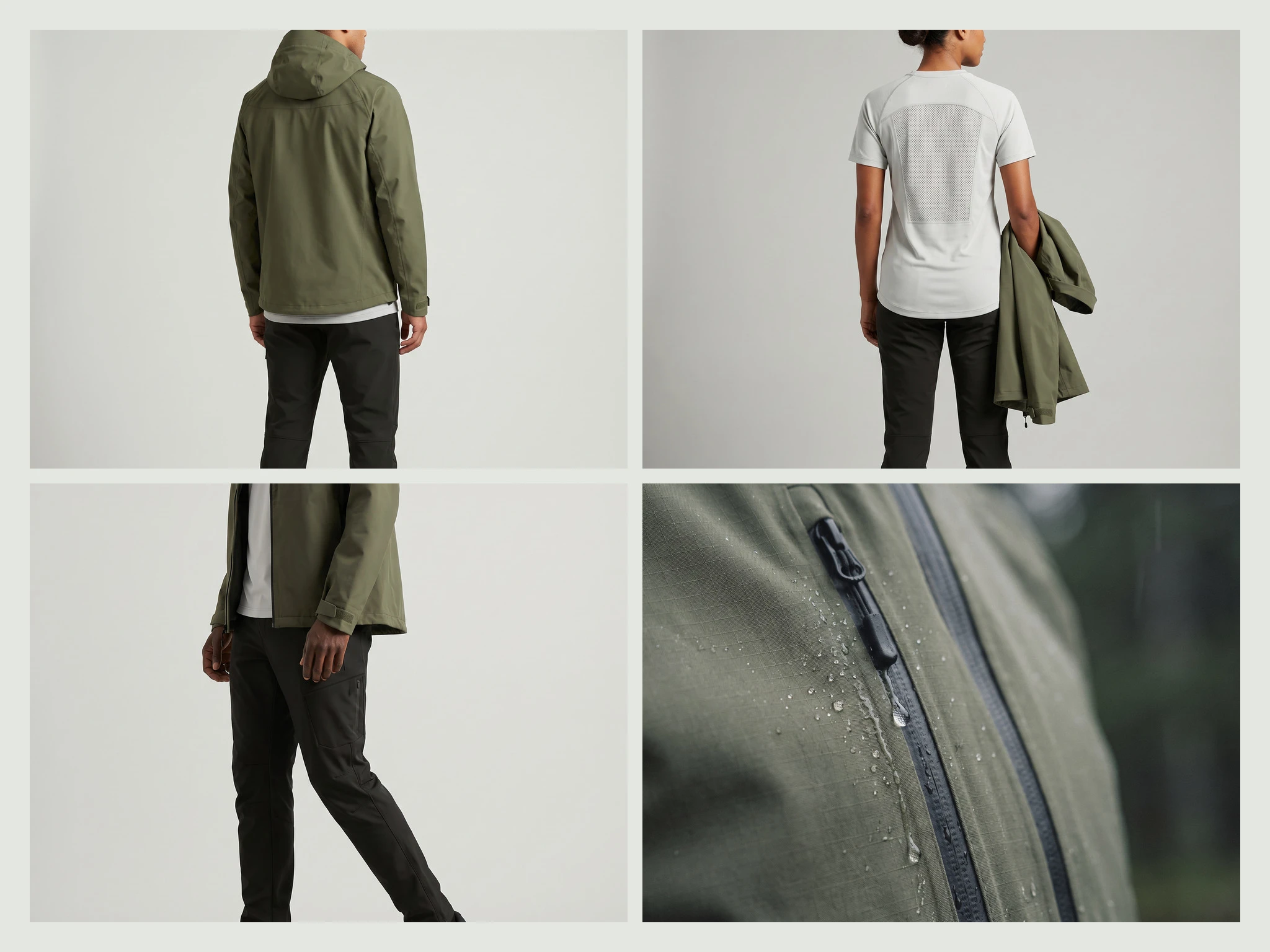
On the body for fit, and up close for the details.
The Launch
Nine static ads in three formats, with three openings: product formula, brand proof and a technical spec sheet. A 10-page lookbook, a launch email and a bus shelter poster carry the same line, Three pieces. One range.
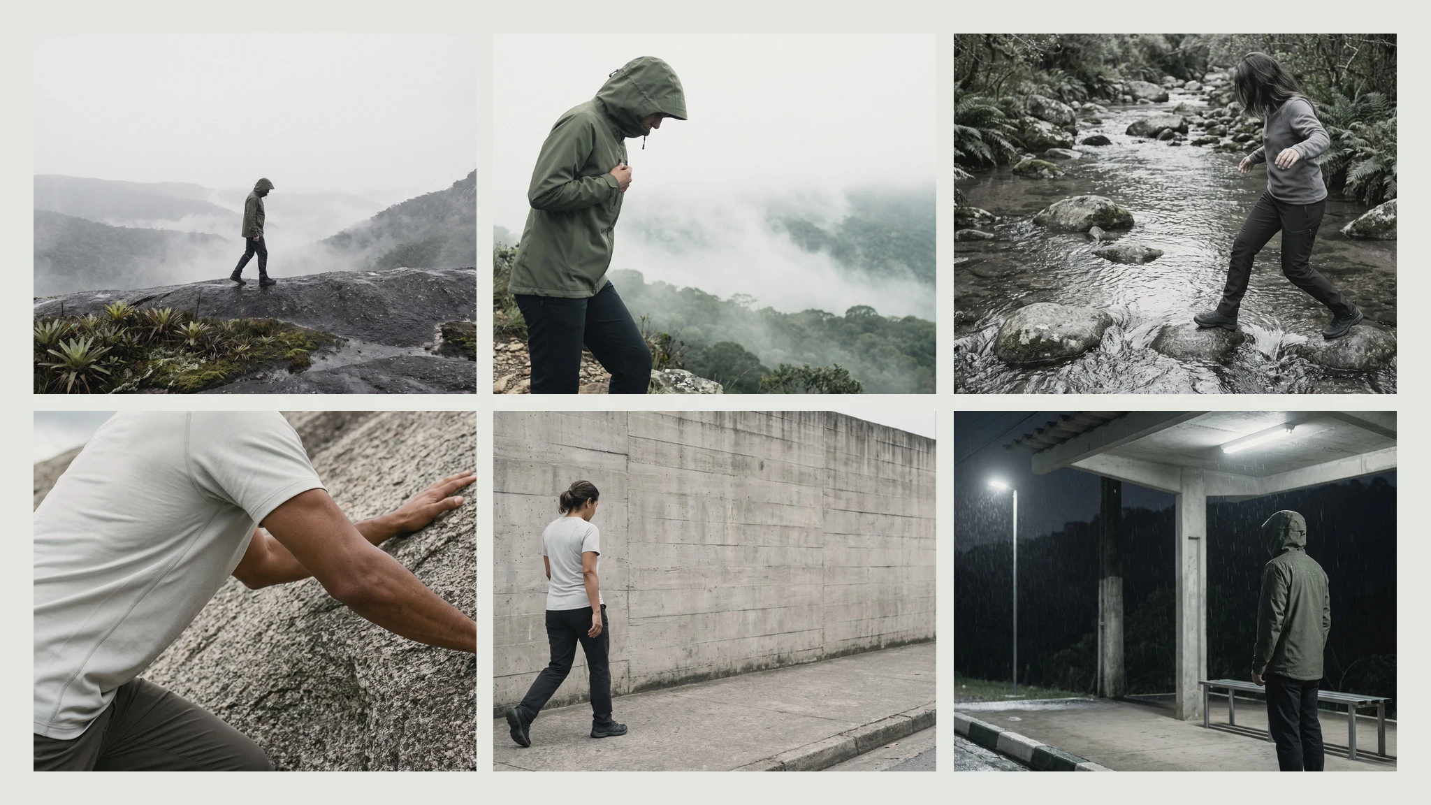
Launch scenes, from the range to the city.
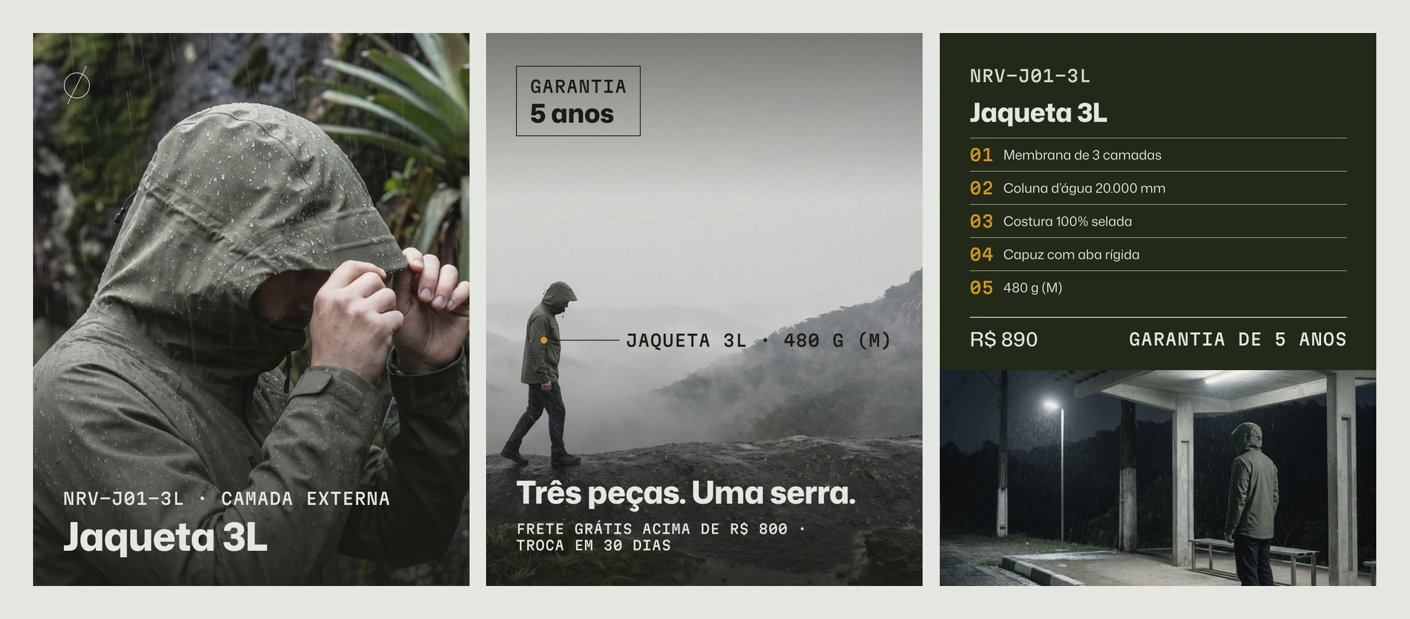
Three ad openings, one voice.
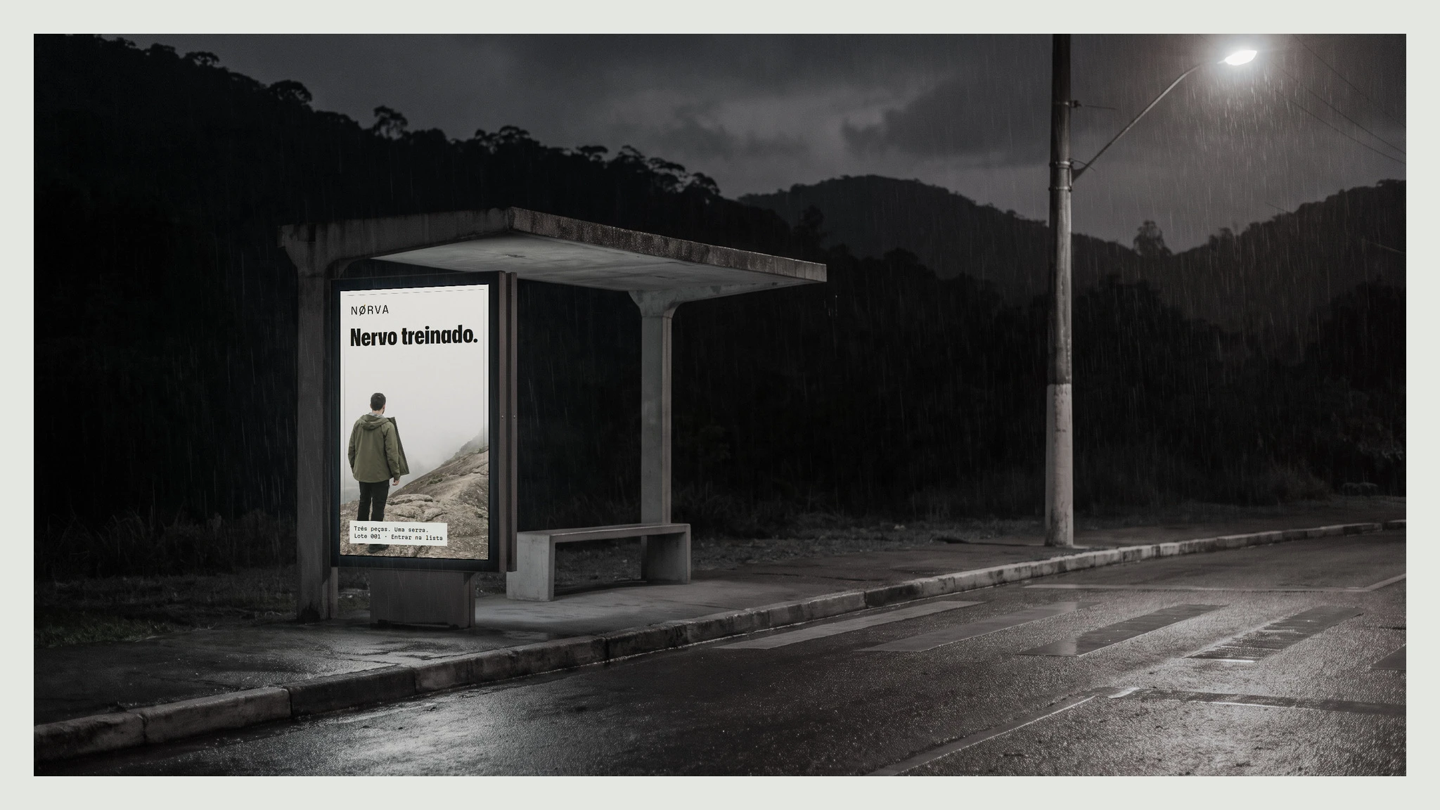
The launch line on a bus shelter at night.
The Store and Amazon
A product page built for the phone in Framer. The name, the expected price and the first image show without scrolling, and a waitlist takes the place of an empty cart until stock arrives. Products sit in a CMS mapped to Shopify fields, so the store can move to Shopify without a redesign. For Amazon, seven A+ modules and a Brand Store with a home page and one page per piece, on desktop and mobile.
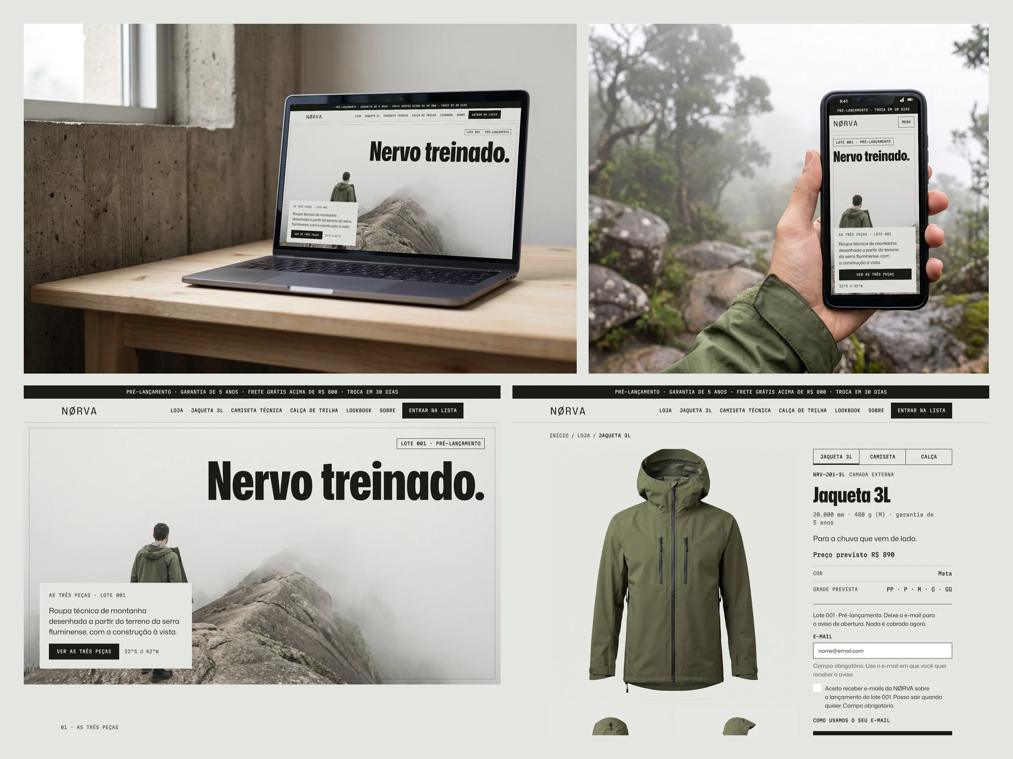
The store on laptop and phone, with the home and product pages below.
The store in use, from the home page to the product pages.
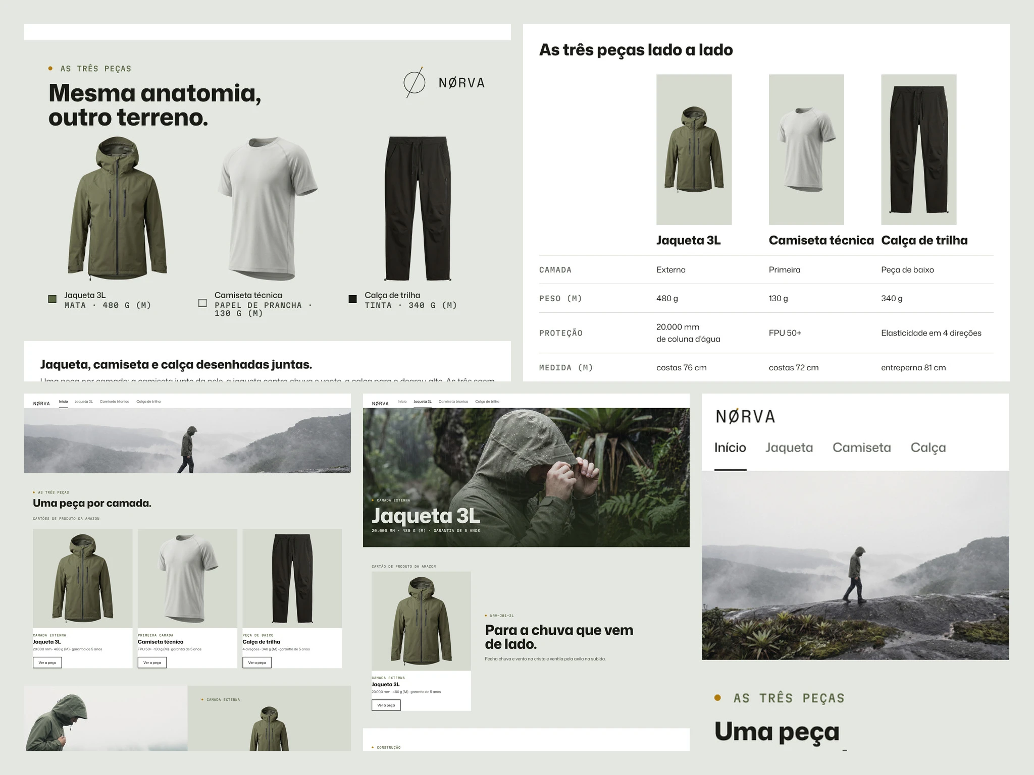
A+ modules and the Brand Store, for desktop and mobile.
What's in the box
Every item here is a finished file in the project folder, with nothing counted twice.
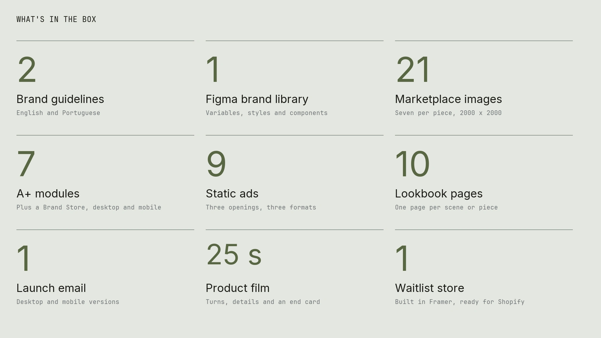
Every deliverable, counted.
The Takeaway
With no sewn sample, the image has to carry the proof. Decide what each one proves, then make it.
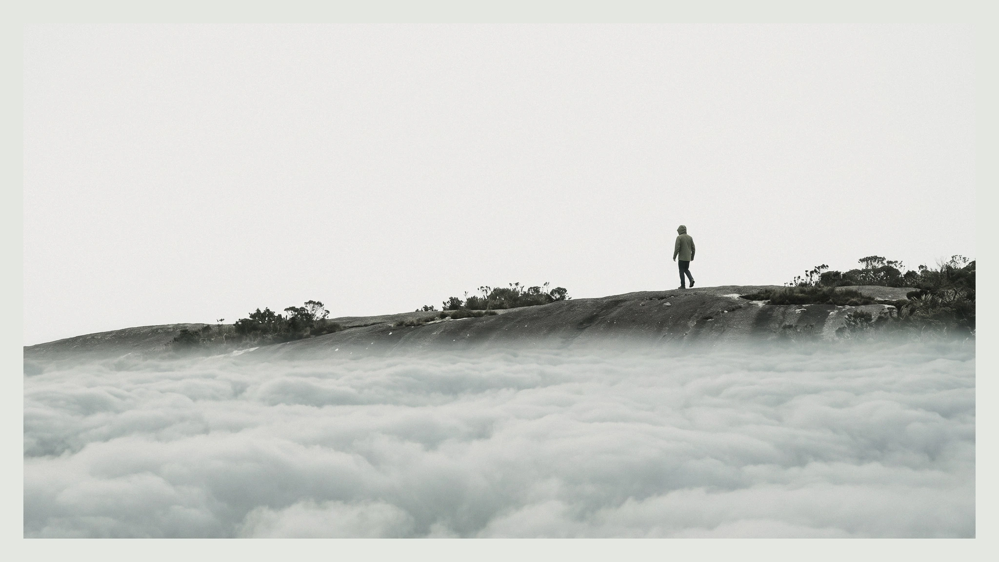
A figure on the ridge, above the clouds.
2 likes · 4 views · Nov 3, 2026
Identity, 21 product images, campaign, Amazon A+ and a Framer waitlist store for a DTC technical apparel brand with three pieces.


