Glass Fit E-Commerce
E-commerce UI/UX design project for glass fencing retailer in Australia
Initial designs provided to KILR Web Design Studio on a freelance basis. Final version of the website may differ.

Mockup of Hero Section on Homepage of Glass Fit
Key deliverables (Figma)
3x Initial Homepage Concepts
Illustrations & Imagery
UI/UX design of all web pages
UI Style guide
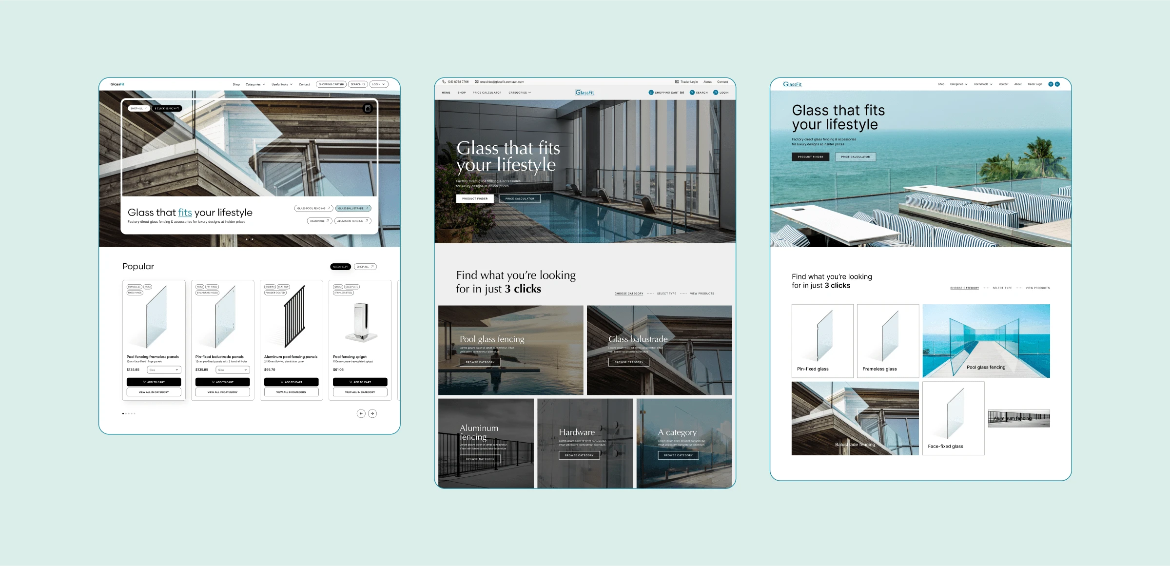
3x initial homepage concepts
Identifying the Problem
The old website was not selling the product.
Poor hierarchy and information layout
Homepage did not have e-commerce product cards
Difficult to understand product descriptions (even for professionals)
No chance of appealing to starting DIY enthusiasts
Poor user flow (too many steps until checkout)
Dated design
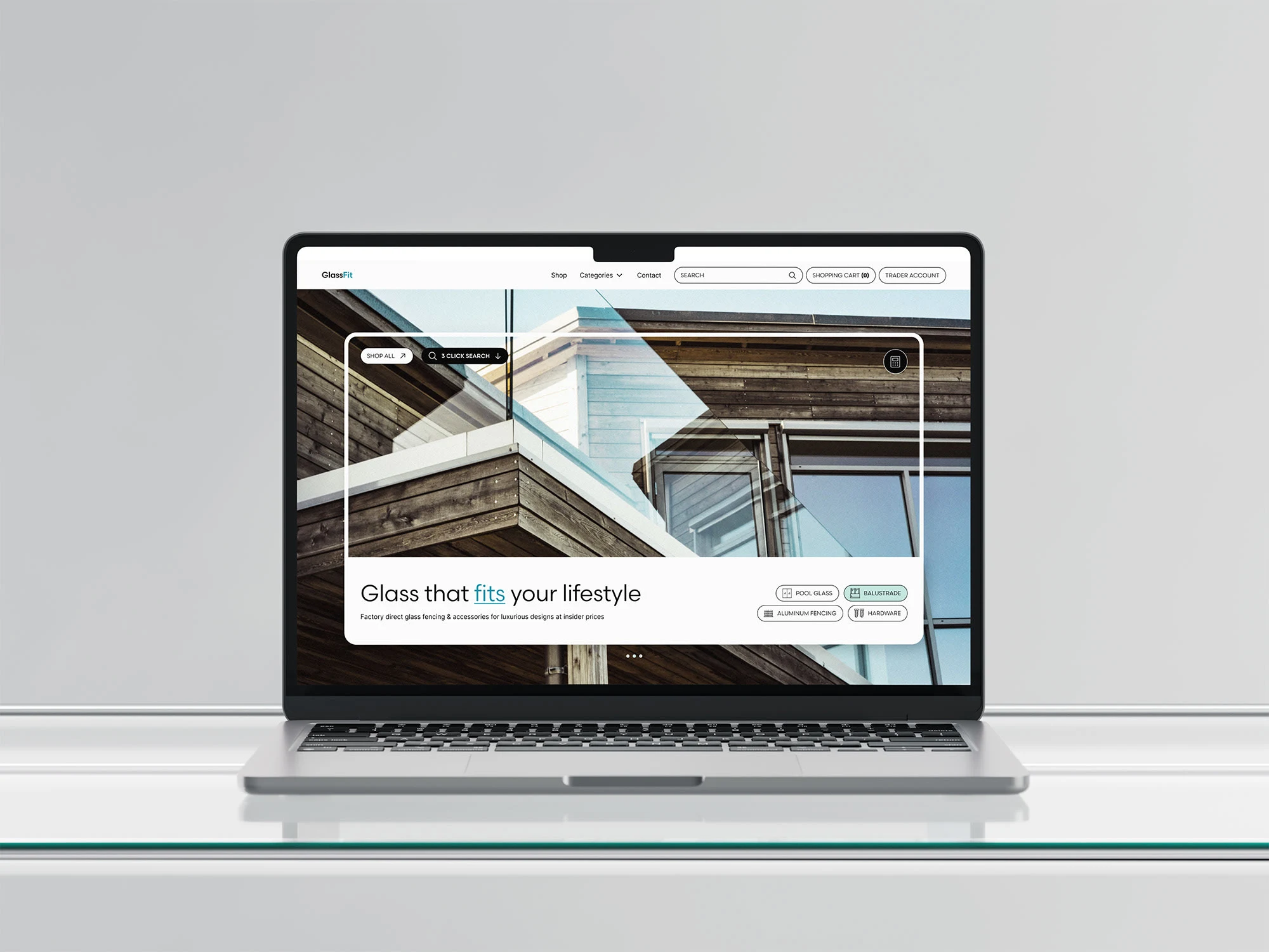
Hero Mockup
Visual Strategy (UI Design)
A modern, sleek feel was needed to convey the desired lifestyle to potential customers (especially the DIY sector). The over-abundance of information and product descriptions and categories needed to be presented in a digestable and welcoming manner.
Imagery
The old website was very much product-image focused, but the physical parameters of the product really don't feature the biggest selling point of glass fencing and balustrades. Luxurious imagery of how the products can be implemented became the main selling point and highlight of this project.

AI Generated Imagery as well as Stock Photography were used
Typography
A sleek, modern sans-serif was required to appeal to the average Youtube DIY starter. Overall, typography sizes are standard for classic e-commerce projects.

Color Palette
The palette was fully inspired by the imagery of the product and lifestyle. Though the overall design leans more to the greys and gentle tones to not distract from e-commerce aspects of the website, there are still delightful pops of color evident throughout the website.
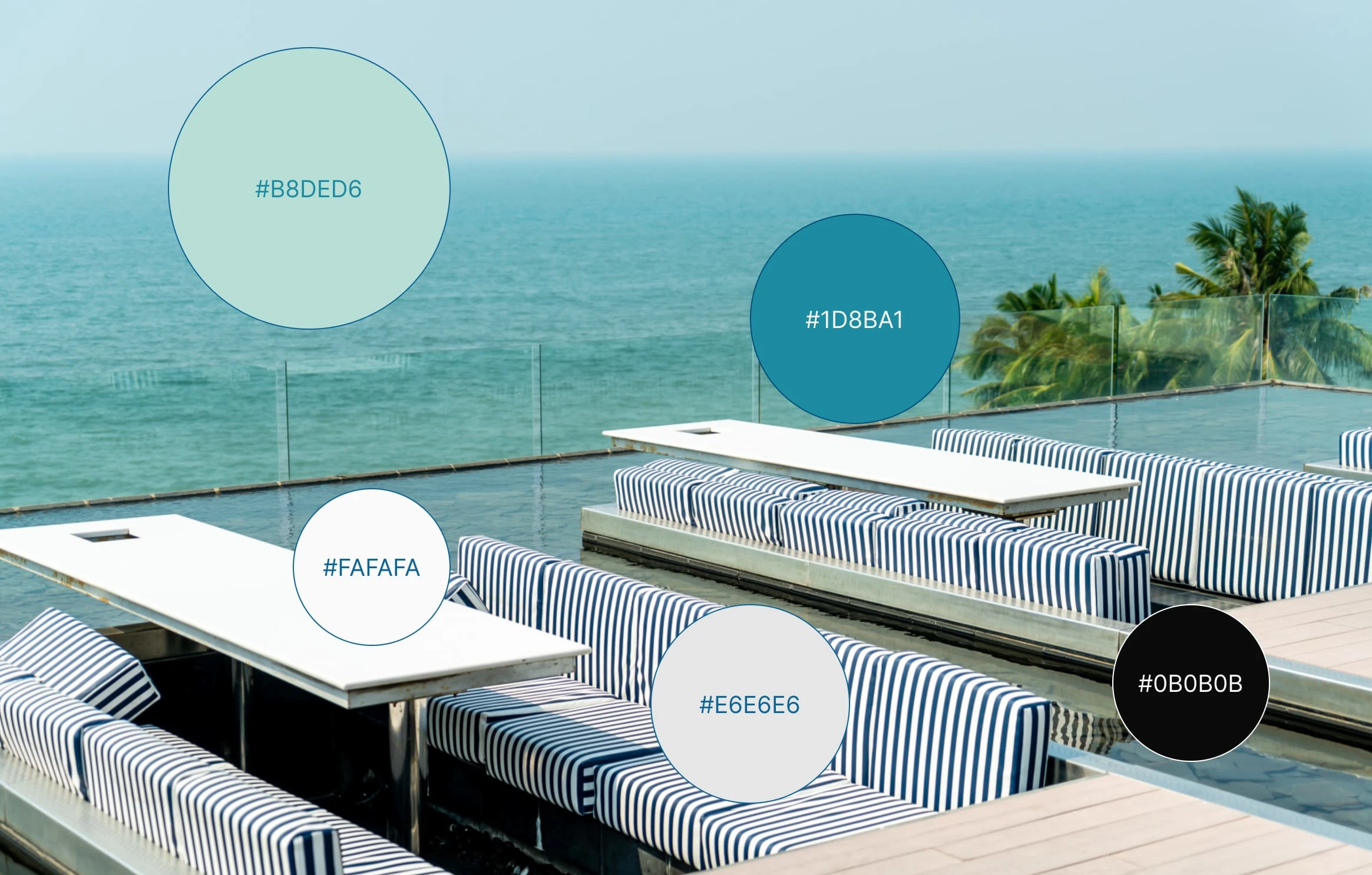
Color Hex Codes
Unique Graphic Elements
During briefing, the client stressed that Glass Fit already had an advanced online calculator widget that was built into the old website. However, few users utilized the feature and they needed it to be a main highlight on the re-designed website.
Upon hearing this, I started brainstorming how to highlight the Glass Fence Calculator frequently and subliminally, without overusing CTAs. This was when the hero style was born. It's very meta, sort of like a browser within a browser, urging you to see the website as a platform to interact and play around with.
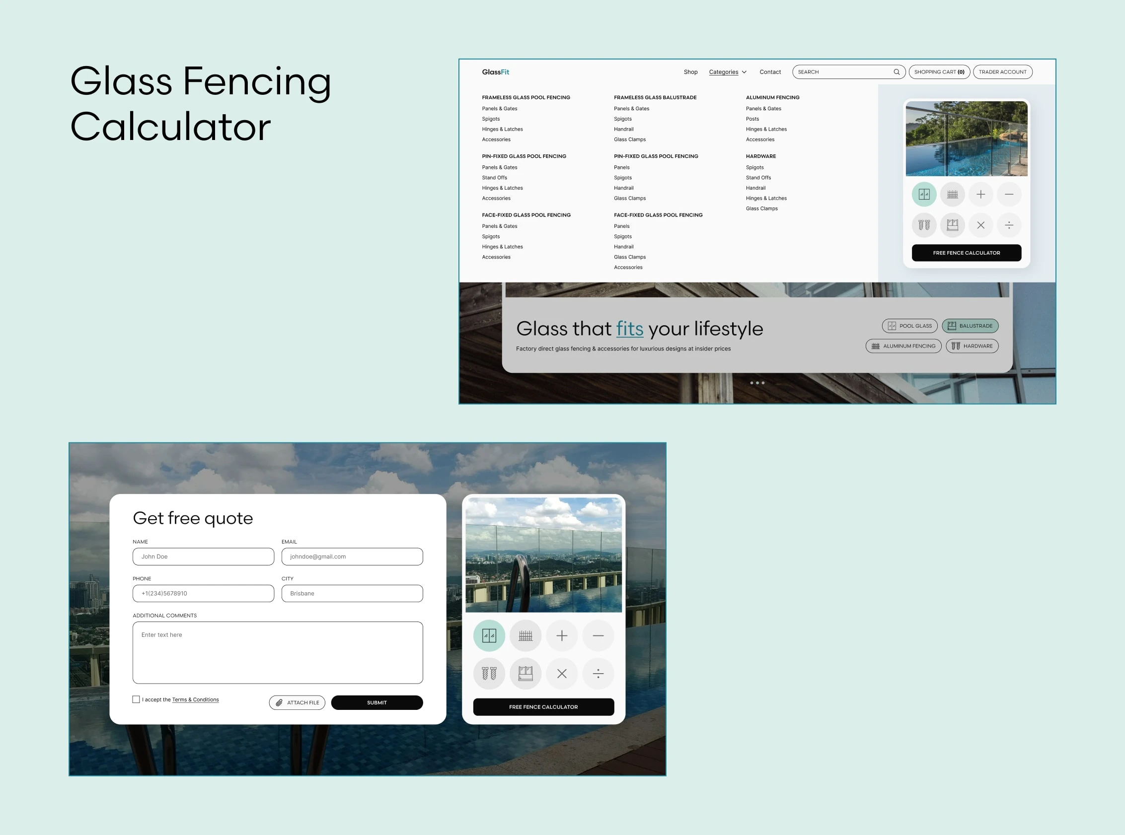
Calculator CTA UI
Smooth Sailing (UX Design)
While any e-commerce project is a huge UX undertaking, Glass Fit was a particular challenge due to the over-abundence of industry-specific terminology and desired functionality. My job was to simplify, simplify, and simplify some more. The main customer journey architecture was born under the art direction of KILR Web Design studio.
The 3 Click System (for the pros)
From virtually any page on the website, the client need only make 3 clicks to find exactly what they're looking for. Considering there are thousands little bits and bobs for sale, this feature really simplifies the journey for industry insiders, who know exactly what they're looking for and need to find it quick.
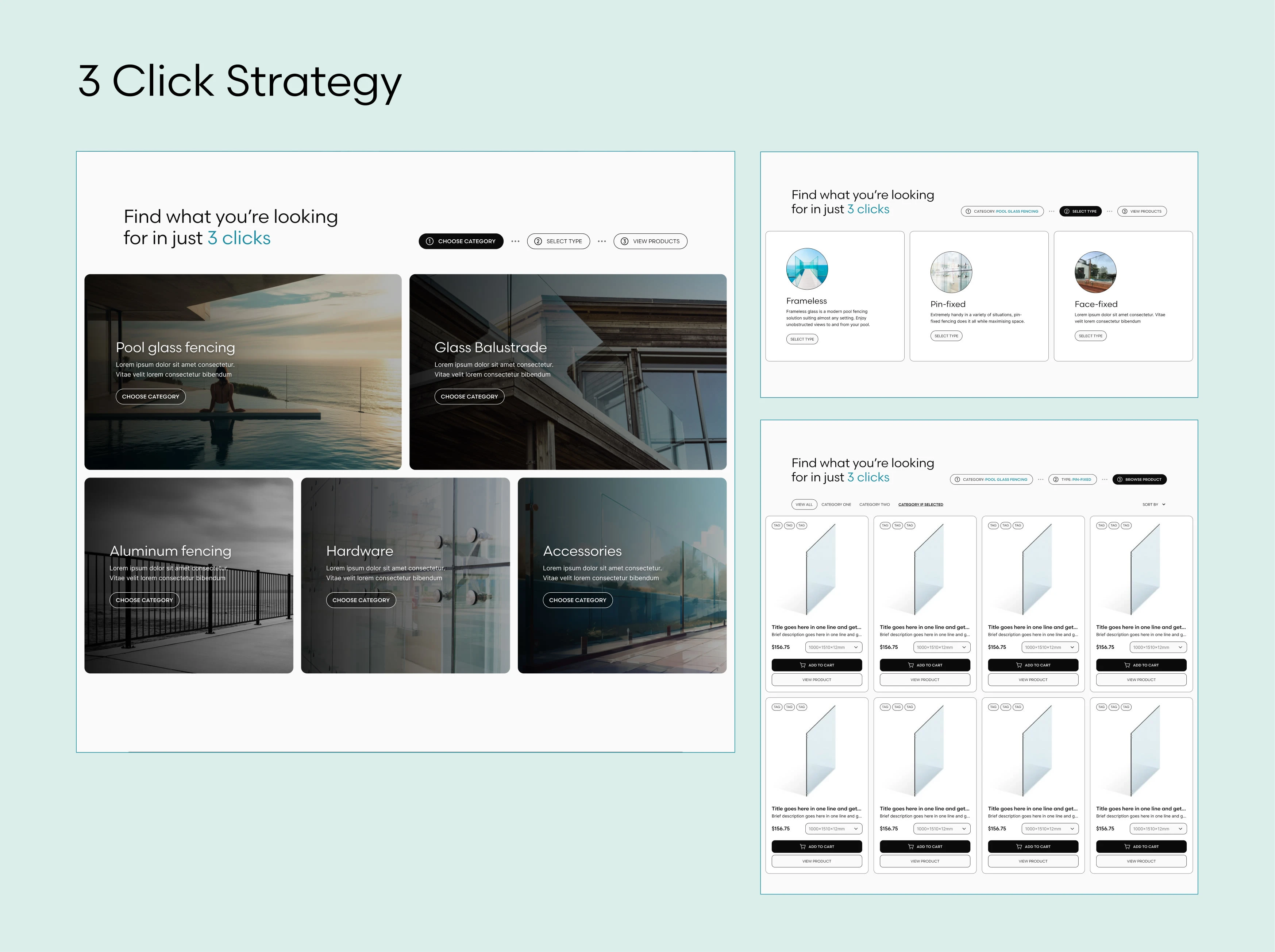
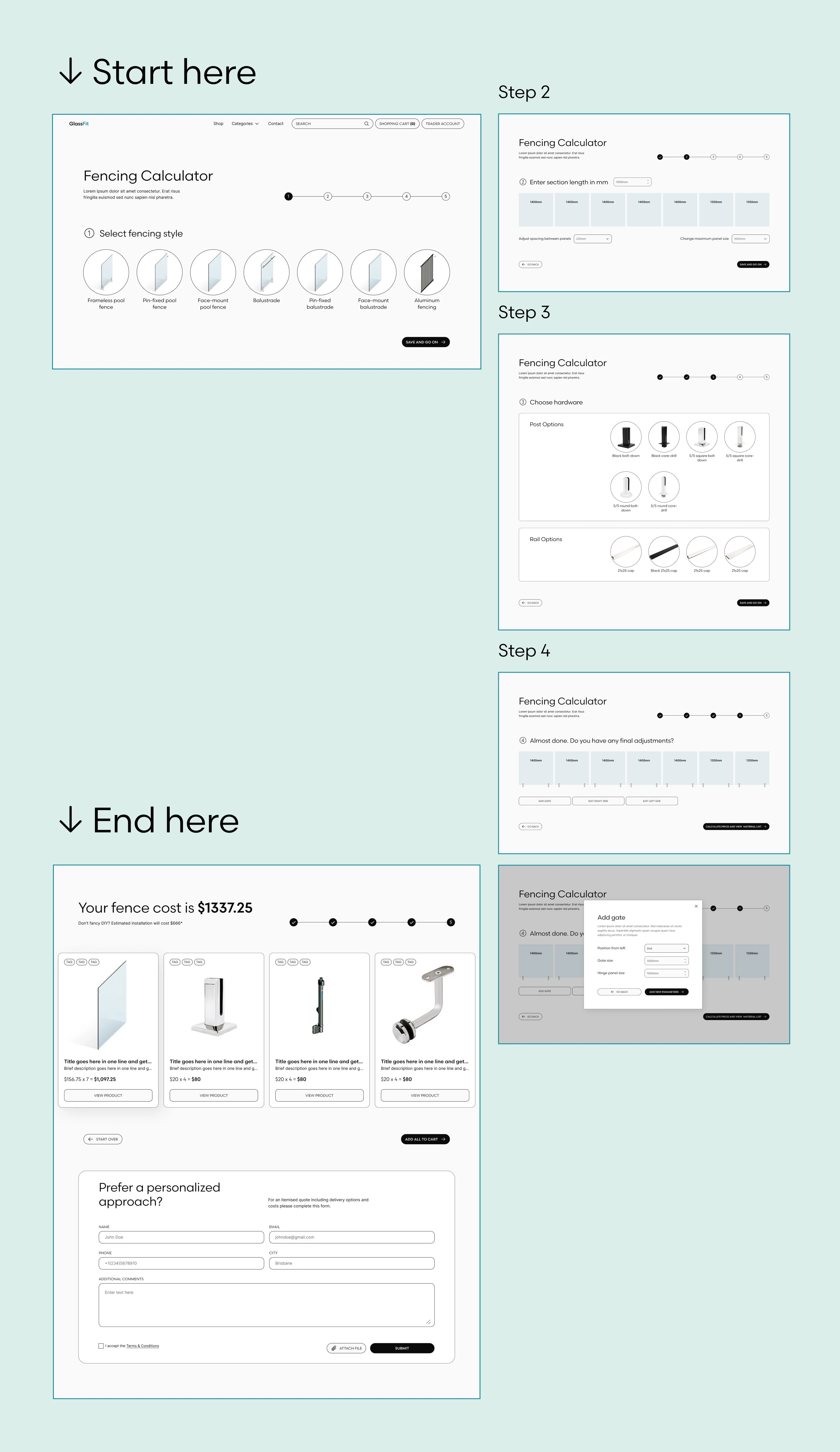
The Glass Fencing Calculator
Showreel of glass fence calculator
But what about the newbie DIY sector? They need their hand held every step of the way. They have no idea what they're looking for and how much it could cost, but they're trying to figure out if doing the work on their own would be significantly cheaper than hiring someone (spoiler: yes, it is!).
Results
All key pain points were addressed in the re-design:
Clear hierarchy structure and customer journey and pain points addressed
E-commerce elements and sales initiatives are present throughout the entire website, enticing users to engage and buy
Product descriptions are simplified and structured in an intuitive way
Site is more friendly for newbies just starting out in the DIY field
Interface is WCAG contrast compliant and accessible
The design is no longer dated and reflects current trends
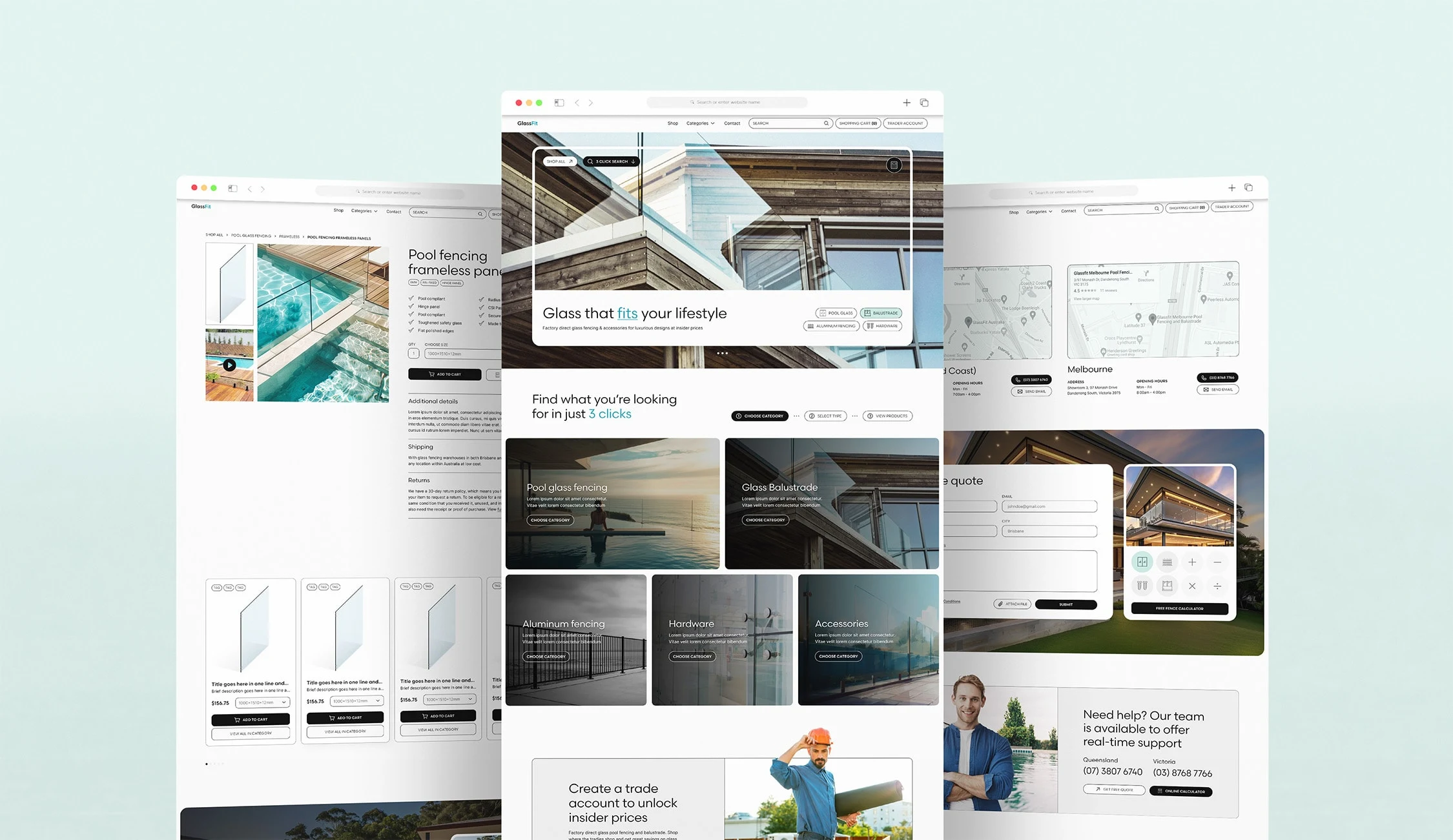
Desktop Mockups of Glass Fit website
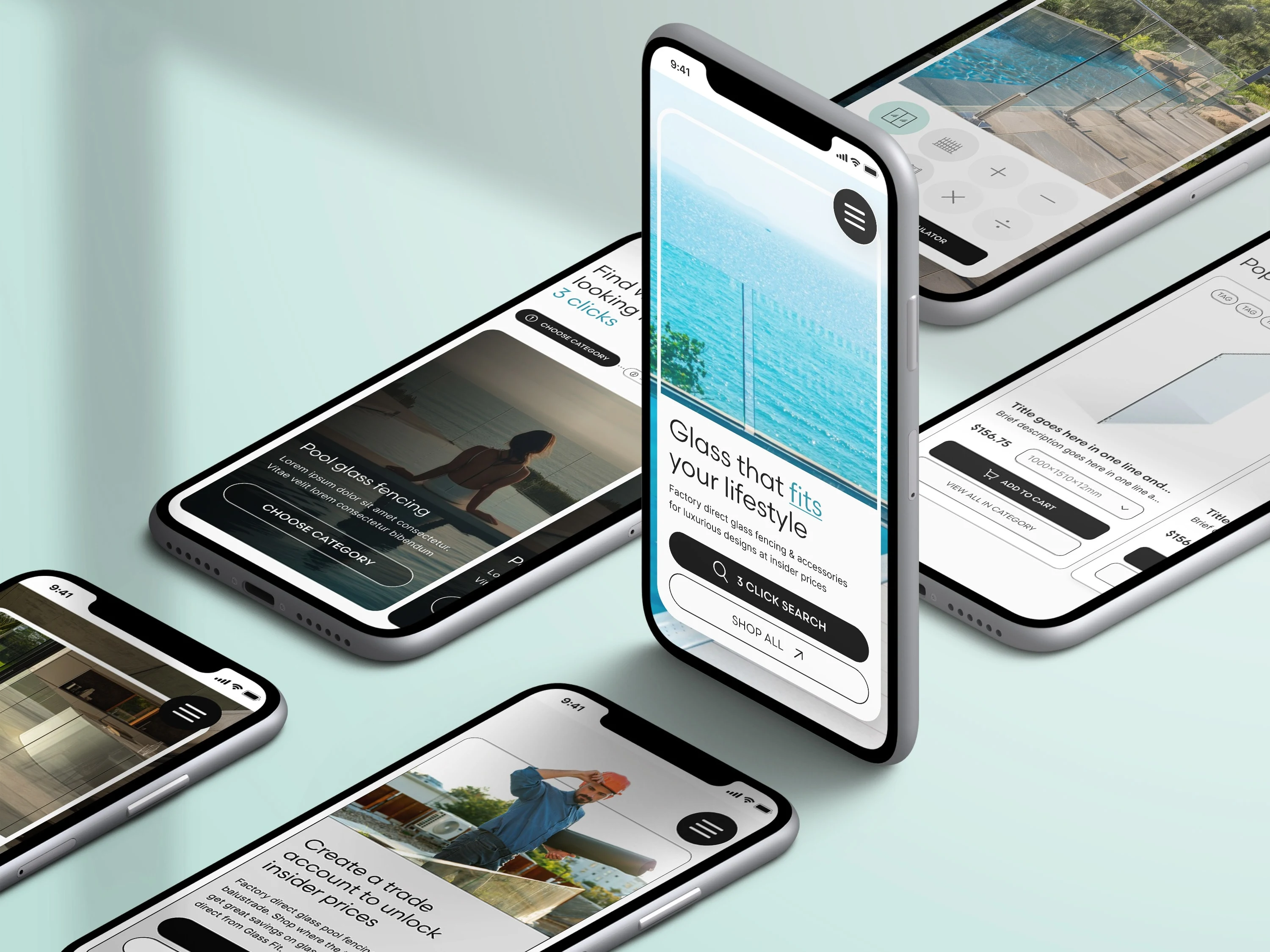
Mobile Mockups of Glass Fit Website
Like this project
Posted May 25, 2024
I created the UI Design, UX Design, and Graphic Design for a glass fence distributor in Australia. IN collaboration with KILR Web Design Studio.
Likes
1
Views
78


