Branding- Gowo Coffee and Space
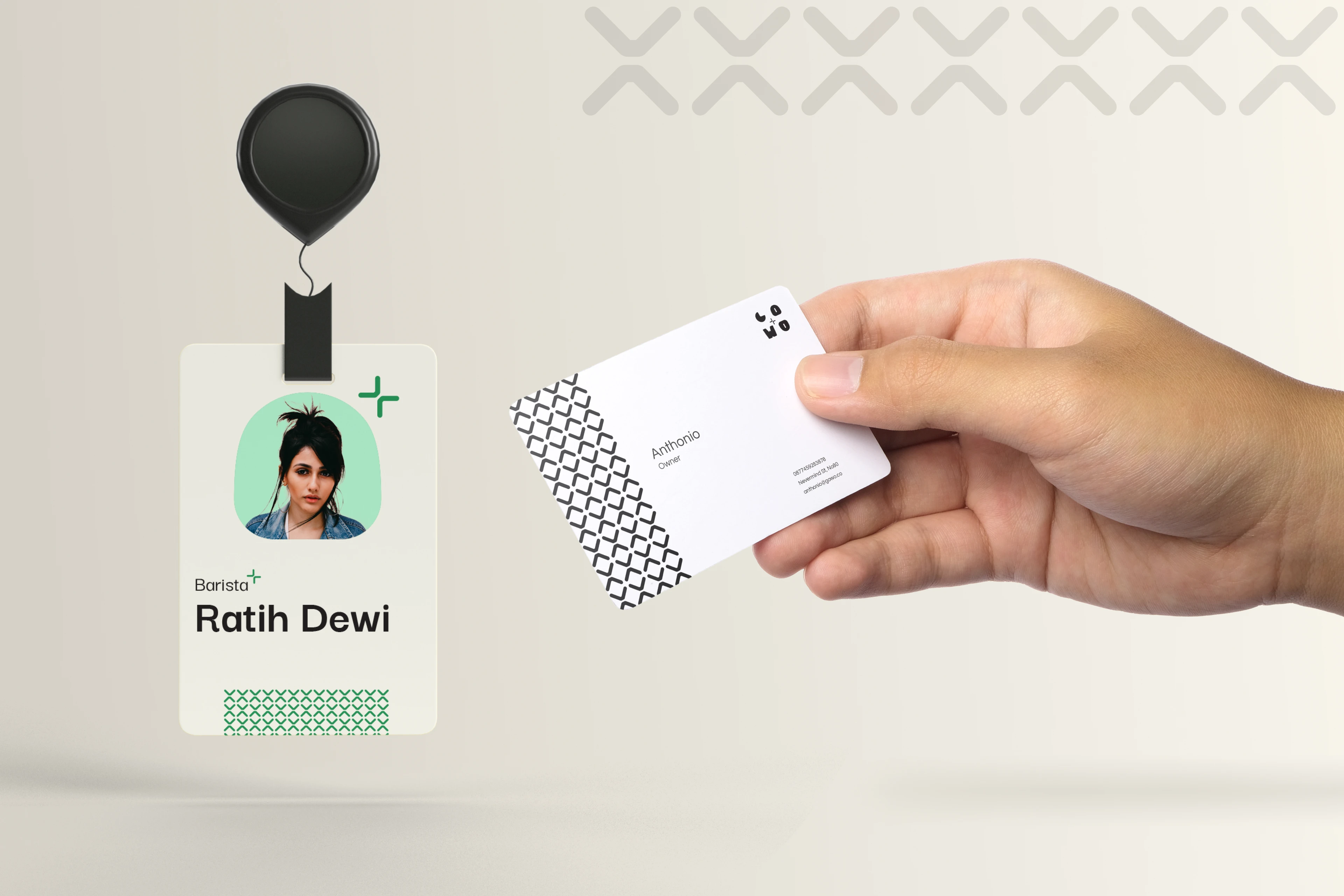
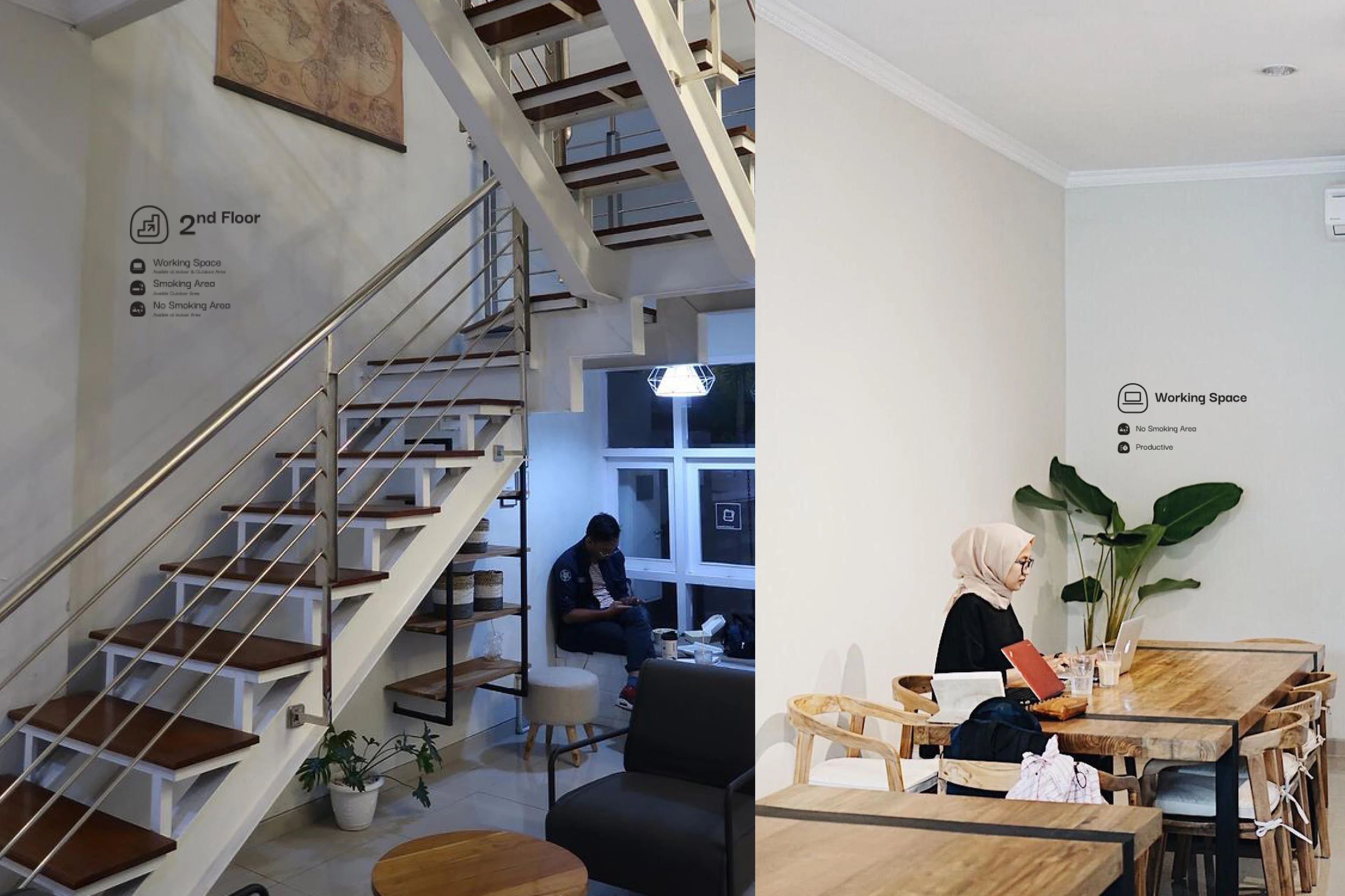
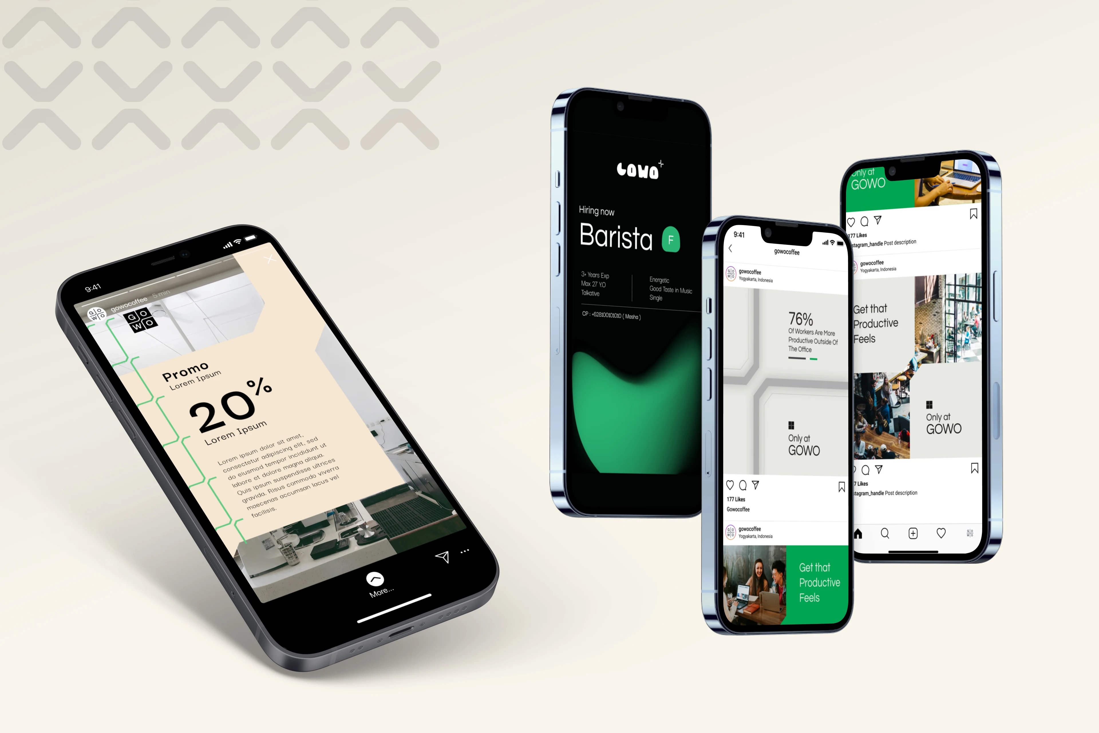
Gowo is a coffee shop that provides and supports daily productivity. People can rent the space to arrange meetings or set up an office. In post-COVID time they are keen to try different approaches that can provide local community to create activation inside the place.
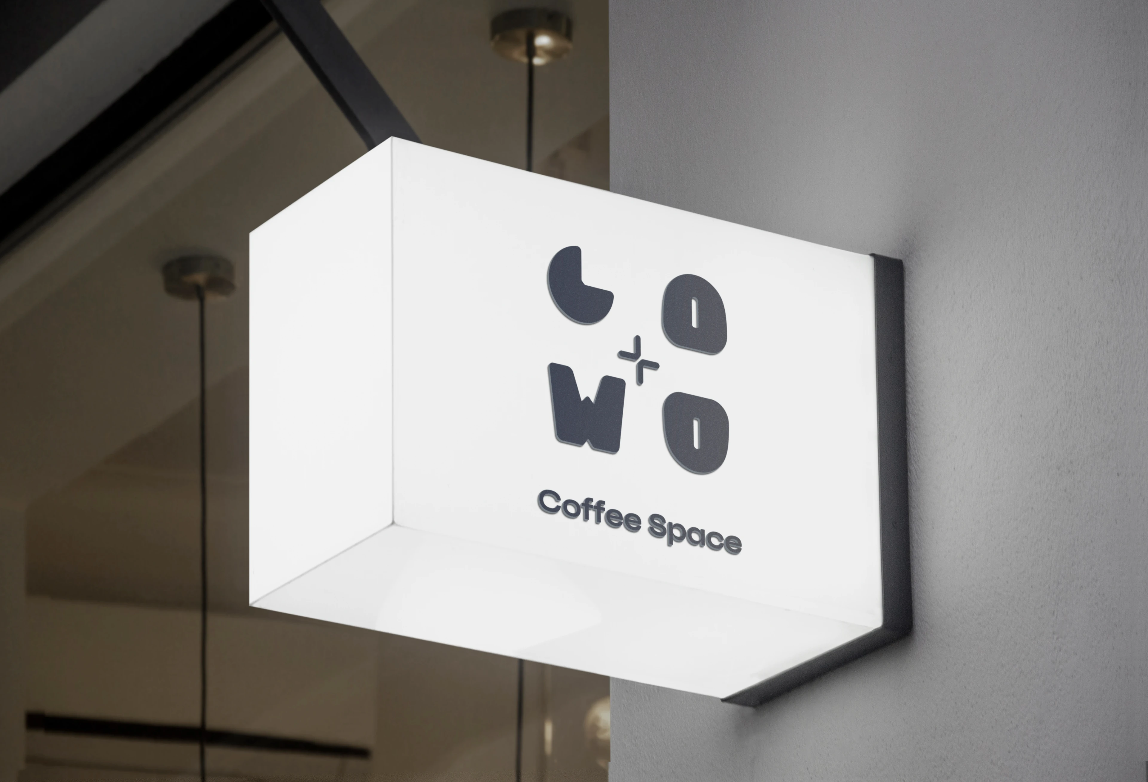

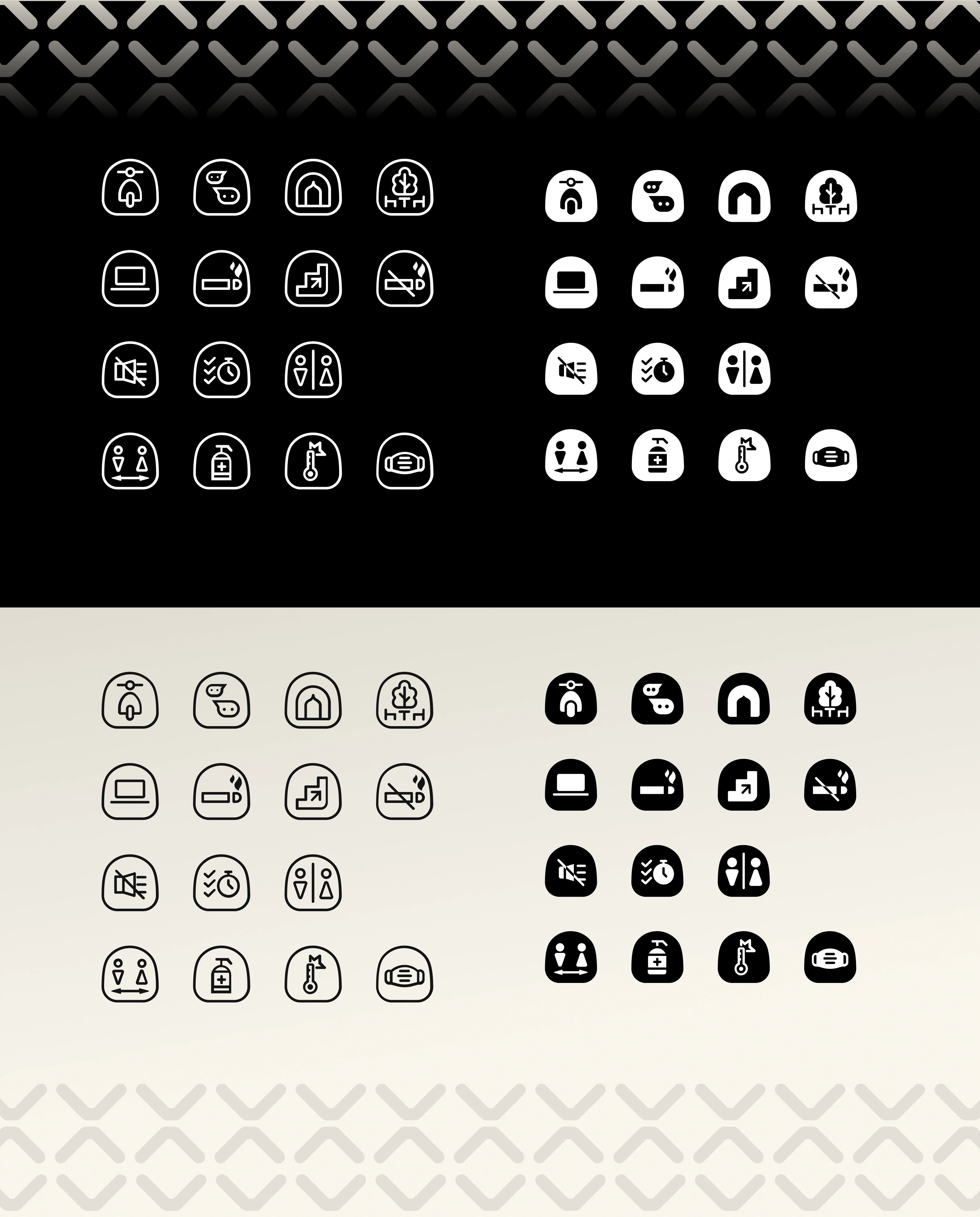
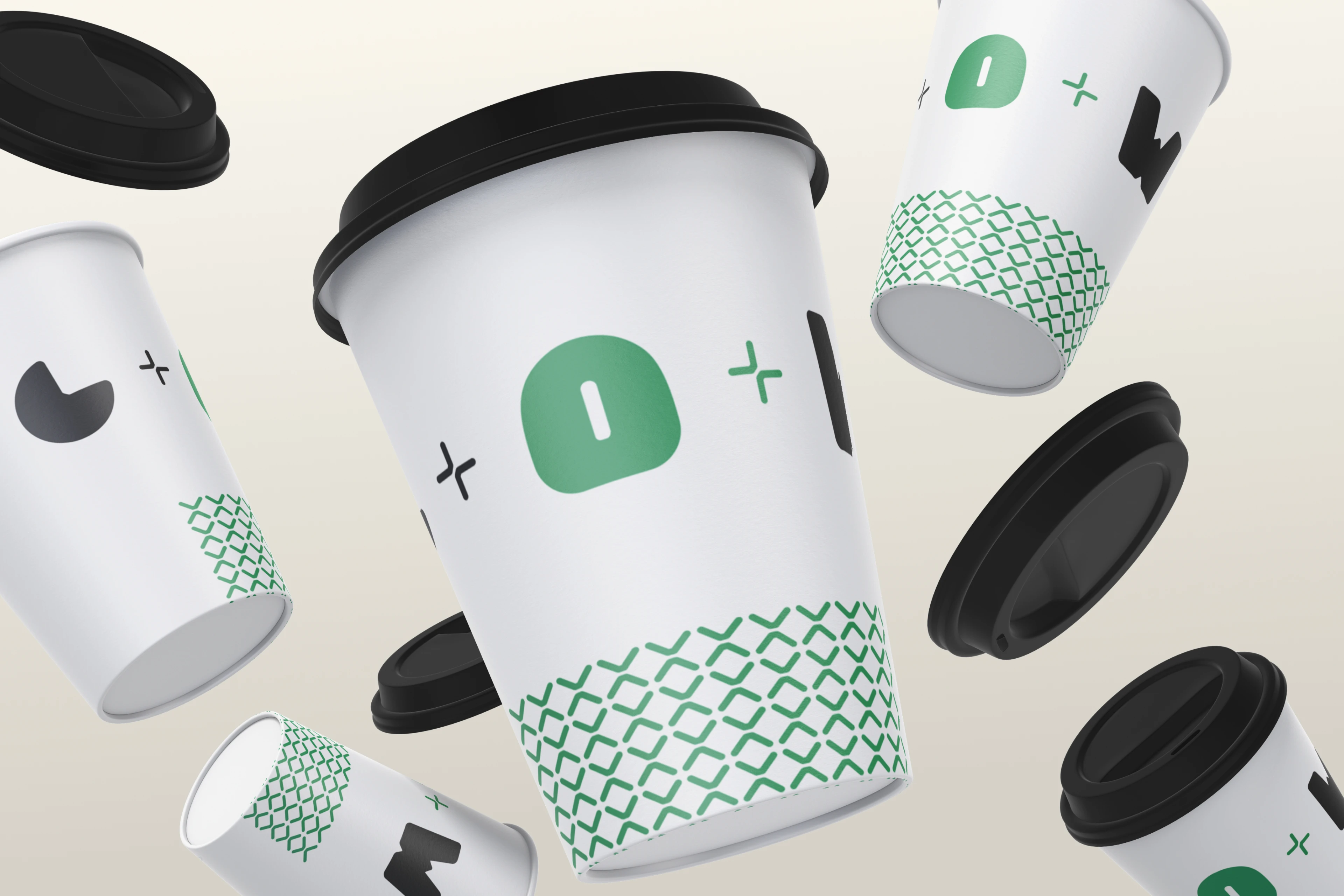
To symbolize friendly, open that becomes the main keyword and also a way of approaching new types of customers. By breaking down every type of new customer persona, and existing customer persona to look similarity between the two types, besides also enlarging the ideas of branding. The concept is to create with new addition with two keywords, but how to make sure old-type customers do not feel annoyed, disturbed by a new look, then the approachment is to create a logo, and visual assets with rounded, organic style with a combination of calm colors.

Like this project
Posted Oct 17, 2023
Graphic Design,Interaction Design,Art Direction,Adobe Photoshop,Adobe Illustrator,Figma,Figma, Adobe Photoshop
Likes
0
Views
2


