Branding-ExcelerationPro
Scott Schwarz, in the business of Lean Six Sigma management and training for over 25 years realized that, in this challenging time, an immediate transformation is needed, to win back the market he's been excelling at.

Year
2021 - 2022
Work
Branding, Website Design & Development
In the era where everything is forcibly shifted online, there's no going back that the future is digital. Discover how ExcelerationPro gains back control of their market and more than that, they're reaching out to the digital market with these re-branding processes and comeback. ExcelerationPRO is a training program based on a lean six sigma method, a method that relies on a collaborative team effort to improve performance by systematically removing waste and reducing variation.
After 25 years of having a steady business and crafting expertise in the business, Scott Schwarz, the CEO of ExcelerationPRO notice a new way of gaining his market share in the world that is turning into a digital era(2019-2021). His company is seeing a new kind of competition, which he never realized before, and it opened his eyes. He decided to gain back control of his industry and his expertise, by re-branding the company, and coming to us with an inquiry of his new target over the company’s digital touchpoint of which are websites, social media, etc.
What did we do for ExcelerationPro?
Company Re-branding
Logo Re-design
Brand Experience Development
Website Design & Development
What impacts did we bring for them?
Increased clarity over their target market in the digital touchpoints. Revamp visual clarity and consistency throughout the brand experience. Grasping all the digital touchpoints the company needs.
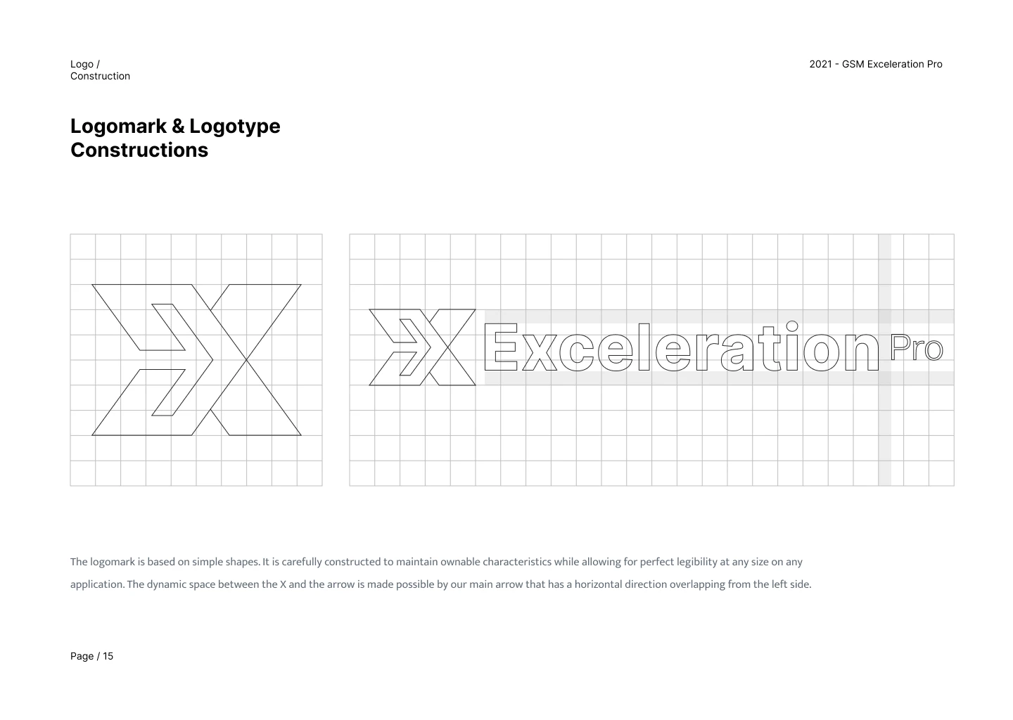
ExcelerationPRO required a mark to represent the global aspect of the brand, as an experience that transcends across countries, regions, and cultures and beyond linear: a platform-agnostic approach. The new logo is a truly global mark for ExcelerationPRO.
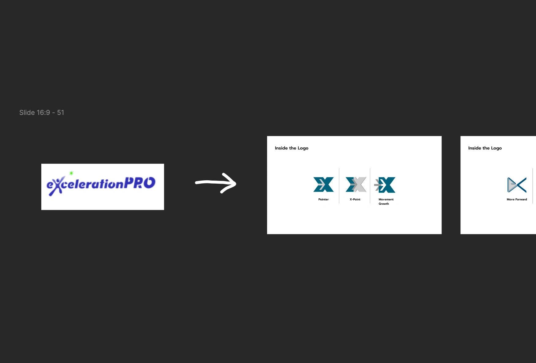
Solution:
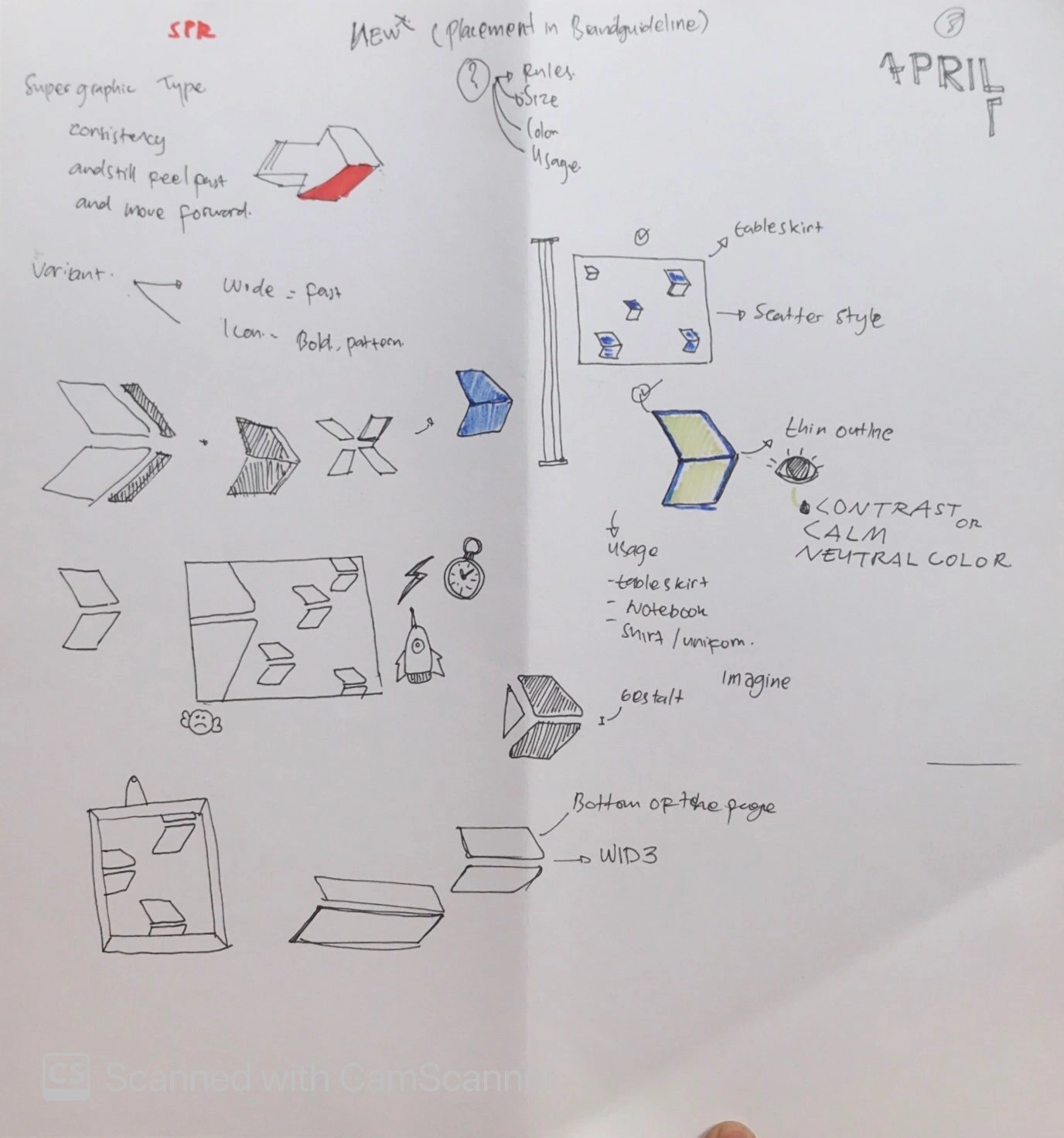
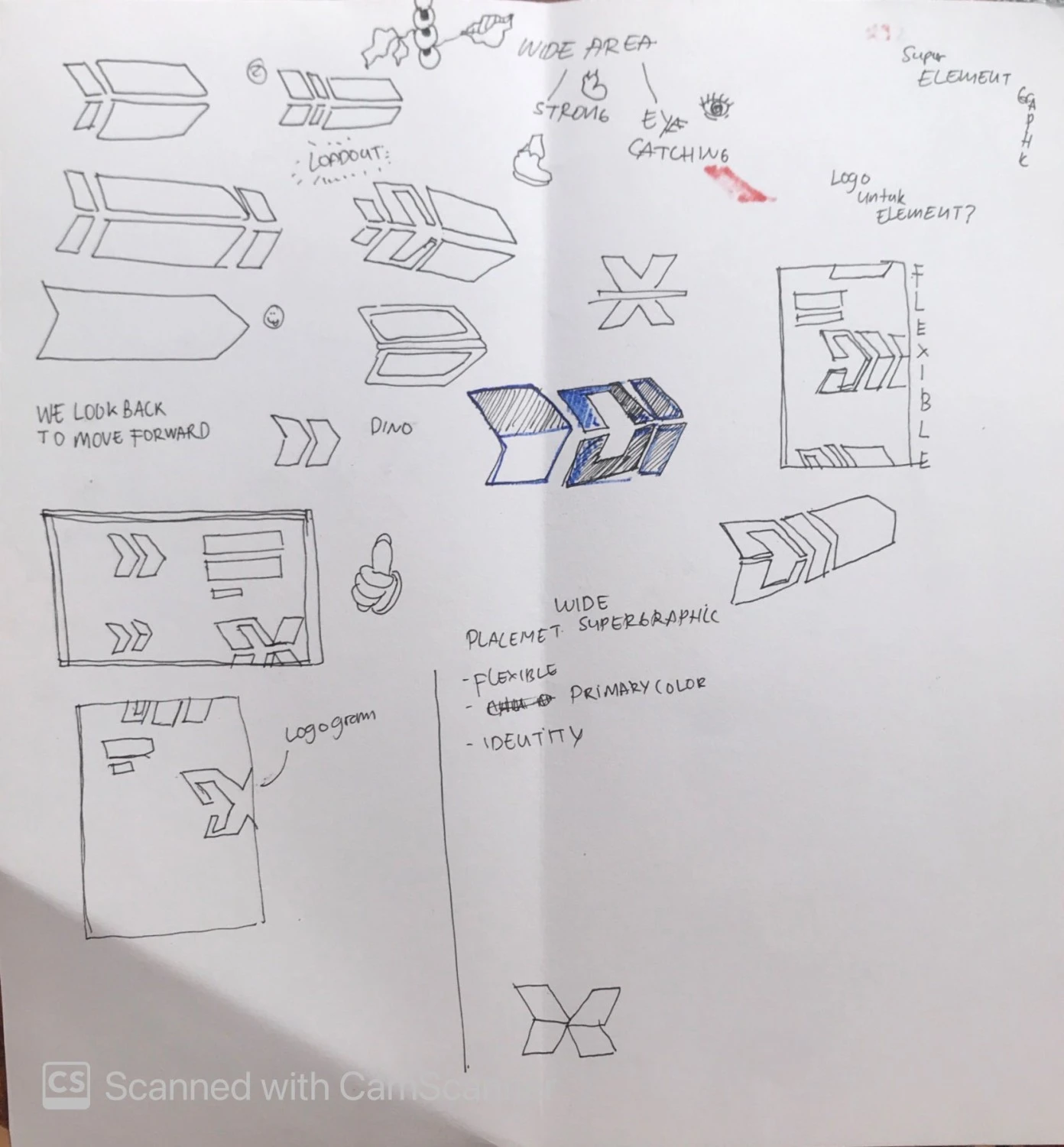
Witantra & Natajaya recreated a clean mark for ExcelerationPRO using a minimal and bold, coupled with a corporate and serious typeface. The old logo is trying to portray movement, motion, and speed. Thus holding onto the core concept, the new X rendition simply brings in energy, sturdiness, and seriousness. There was also a need for the logo to be easily reproduced and usable across multiple offline and online platforms. The new minimal logo provides this versatility.
We realize that transforming a brand from 25 years of expertise and identity in its own market would really require a strong factor in making sure that everyone in the community, stakeholders, customers are all onboard and taken into account when designing.
Armed with the knowledge of the direction for the brand itself we dissect and cultivate ideas and experience of what Scott had over the years, and making sure doing so without altering the brand personality and being true to himself and his tribe/community.

Seeing his industry of which is in the manufacturing sector, we are challenged by how every venue and situation for him would be different whenever a consulting project would come up to him, or even a 12 months training program and so on. So we decide to take a big step, making sure that every brand touchpoint is utilized to its limit.

DotDesign created the new ExcelerationPRO brand to tell a story of how the organization allows people to focus on what matters most.
ExcelerationPRO is loved by a devout client base, so care was taken to retain the spirit and charm of what existed while evolving the brand to appeal to a broader audience
The new visual system echoes the brand DNA of Sturdiness, Professional, Confident and Clear. Bold colors, professional language, and a modern illustrative and photography approach work together to create a brand system that’s cohesive and decisively.
This is my work under DotDesign.io
Like this project
Posted Oct 17, 2023
Scott Schwarz, in the business of Lean Six Sigma management and training for over 25 years realized that, in this challenging time, an immediate transformation…
Likes
0
Views
1


