Shopify Website & Brand Experience for CRAVO
Guoshuai Zhang
CRAVO — Shopify Website & Brand Experience for a Plant-Based Snack Brand
Project Overview
CRAVO is a bold plant-based snack brand created for modern Gen Z lifestyle consumers. The goal of this project was to design a Shopify-ready e-commerce experience that felt energetic, playful, memorable, and easy to shop.
The brand direction focused on bright colors, chunky typography, playful sticker-style graphics, bold packaging, and a clean conversion-focused store layout. Instead of creating a generic Shopify store, I designed a full consumer brand experience that connects packaging, product storytelling, website UX, and social-ready visual language.
The Challenge
The brand needed more than a simple online store. It needed a digital experience that could make the product feel exciting, trustworthy, and instantly understandable.
The main challenge was to translate a bold snack brand into a Shopify website that looked fun and youthful while still feeling structured, clean, and ready for real e-commerce use.
The site also needed to support fast product discovery, clear product benefits, mobile-first shopping, and flexible Shopify sections that could be updated easily by the brand team.
Goals
Create a bold and memorable Shopify landing page for a plant-based snack brand.
Build a strong visual connection between the packaging and the website.
Design a clean product page that makes the flavor, ingredients, and purchase flow easy to understand.
Use playful graphics, bright colors, and lifestyle-driven visuals to appeal to Gen Z consumers.
Keep the design conversion-focused, mobile-friendly, and easy to scale.
Design Direction
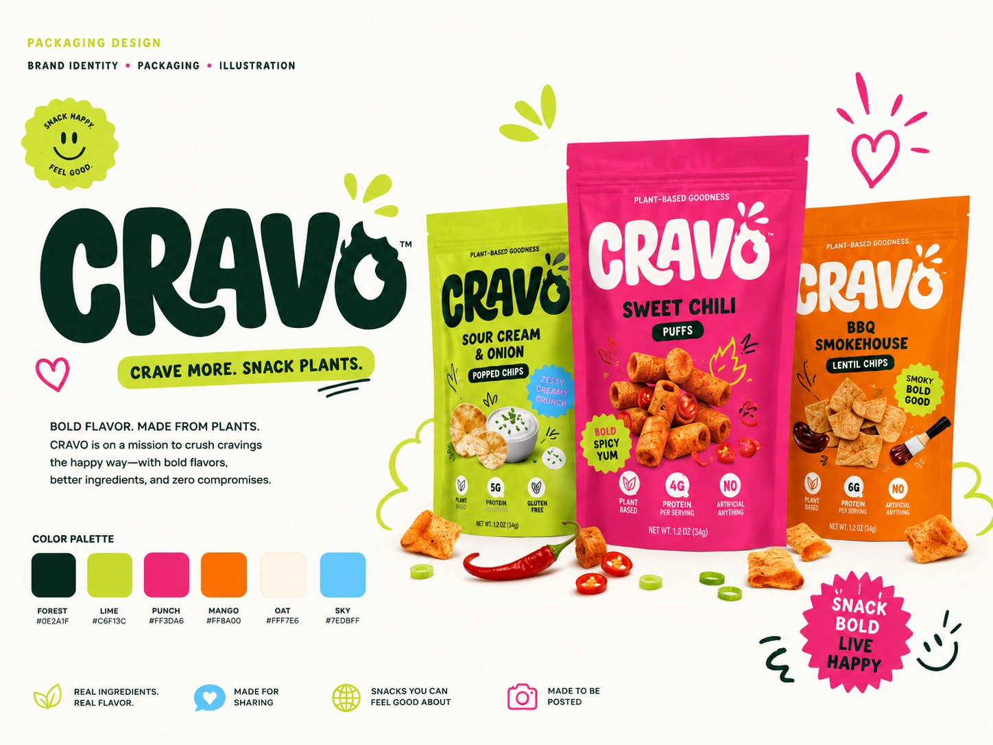
The visual system was built around a playful DTC snack brand personality: bold, fun, energetic, and social-media friendly.
The design uses hot pink, lime green, orange, cream, sky blue, and deep forest green as the core color palette. I paired chunky rounded typography with hand-drawn doodles, sticker badges, product cutouts, ingredient visuals, and expressive brand messaging.
The result is a Shopify experience that feels fresh, snackable, and instantly recognizable.
Key Pages & Sections
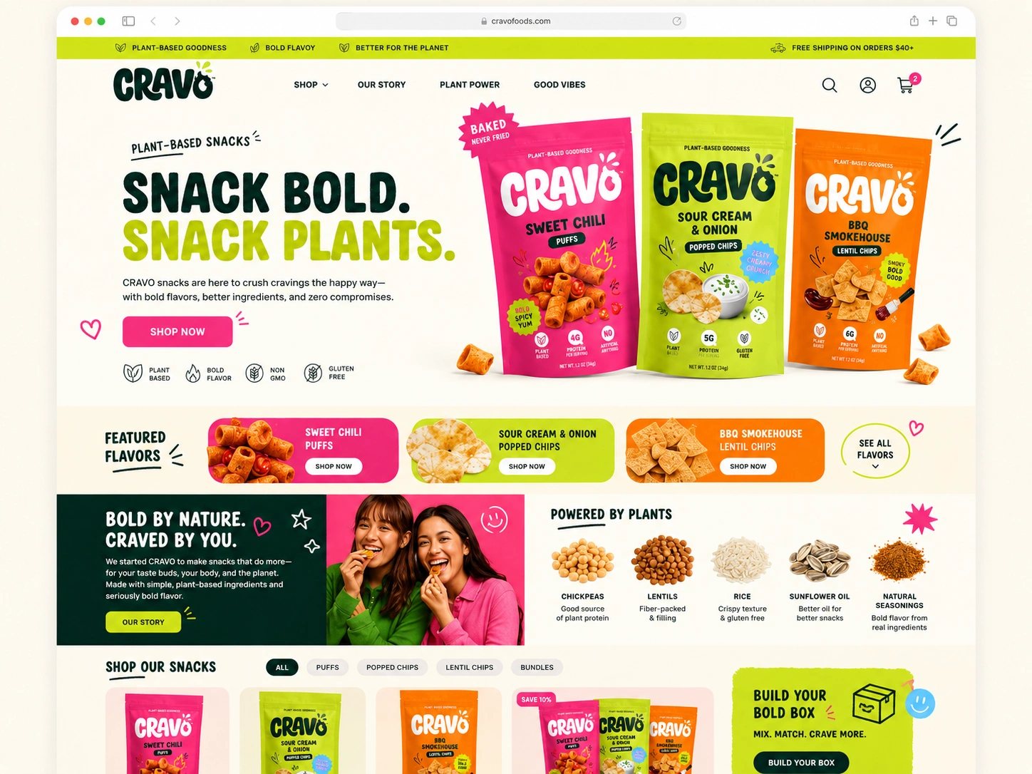
Homepage
The homepage was designed as a high-impact brand introduction. The hero section uses bold packaging visuals, a strong headline, and a clear call-to-action to quickly communicate the product and brand energy.
Key homepage sections include:
Hero section with product packaging
Featured flavors
Plant-based benefit icons
Brand story section
Ingredient highlights
Product grid
Build-your-box section
Social and lifestyle brand moments
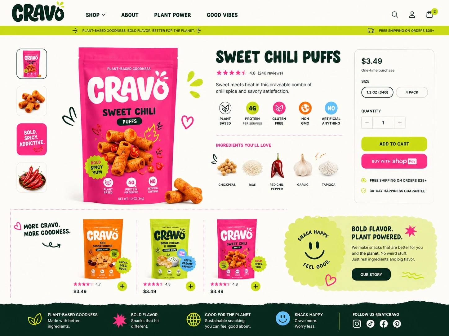
Product Page
The product page was designed to make the buying decision simple and enjoyable. I focused on large product imagery, clear flavor messaging, nutrition callouts, ingredient visuals, reviews, and a clean add-to-cart flow.
Key product page elements include:
Large product pouch display
Flavor description
Star rating and reviews
Plant-based benefit icons
Ingredient highlights
Size and pack options
Quantity selector
Add-to-cart button
Related products
Trust and shipping notes
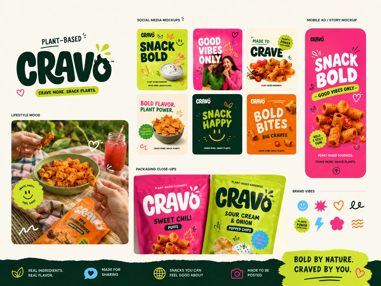
Brand & Packaging System
I also created a visual identity direction that could work across packaging, website, and marketing assets.
The brand system includes:
Logo direction
Color palette
Packaging mockups
Flavor color system
Sticker-style badges
Playful icon set
Social media post direction
Lifestyle mood board
Marketing visuals
UX Strategy
The store experience was designed to feel fun while still staying simple and clear. I kept the purchase path easy to follow, used strong contrast for CTAs, and organized product information into quick-scanning sections.
The design balances emotional brand storytelling with practical e-commerce needs, helping users understand the product, trust the ingredients, explore flavors, and move toward purchase.
Shopify Development Direction
The layout was planned with Shopify flexibility in mind. Each major homepage area was structured as a reusable section so the brand can update images, swap products, change promotional blocks, and build new landing pages without needing a developer every time.
The design supports:
Modular Shopify sections
Reusable content blocks
Mobile-first layout
Fast-loading visual structure
Flexible product cards
Easy flavor/category updates
Conversion-focused product detail pages
Deliverables
Brand identity direction
Packaging design concept
Shopify homepage design
Shopify product page design
Mobile-first e-commerce UX
Product showcase sections
Ingredient and benefit sections
Social media mockup direction
Conversion-focused purchase flow
Reusable Shopify section structure
Tools Used
Figma
Shopify
Liquid
HTML / CSS
JavaScript
Photoshop
Final Result
The final concept presents CRAVO as a bold, modern plant-based snack brand with a Shopify experience that feels playful, clean, and conversion-ready.
The project brings together brand identity, packaging, e-commerce UX, product storytelling, and Shopify design strategy into one cohesive consumer brand experience.
CRAVO feels memorable on the shelf, exciting on social media, and easy to shop online.
Like this project
Posted Jun 26, 2026
CRAVO's brand had personality but no home. I built a Shopify experience that turns first-time visitors into repeat customers.