To Himalaya: Cinematic Webflow Travel Experience
Guoshuai Zhang
To Himalaya — Cinematic Webflow Travel Experience
To Himalaya is an immersive travel website concept designed for a premium adventure brand offering curated journeys through the Himalayas. The goal was to create more than a standard travel landing page — the site needed to feel like a visual journey, guiding visitors from curiosity to emotional desire.
Overview
The project focuses on cinematic storytelling, strong visual atmosphere, and smooth Webflow interaction design. I built the concept around the feeling of entering the mountains: dark dramatic landscapes, sunrise-gold accents, refined typography, and large immersive sections that create a premium adventure mood.
The design uses both dark mode and bright mode to reflect different emotional stages of the journey. Dark sections create mystery, depth, and cinematic impact, while bright sections make the experience feel clean, calm, and easy to explore.
Design Direction
The visual system was inspired by:
Himalayan mountain landscapes
Snow, stone, mist, and forest tones
Sunrise light and gold accents
Premium expedition branding
Minimal editorial travel layouts
The brand direction uses a deep navy and charcoal foundation, paired with glacier white, soft mist tones, pine green, and warm sunrise gold. This gives the site a balance between luxury, adventure, and nature.
Website Experience
The website is structured like a journey instead of a normal page. Visitors move through key moments:
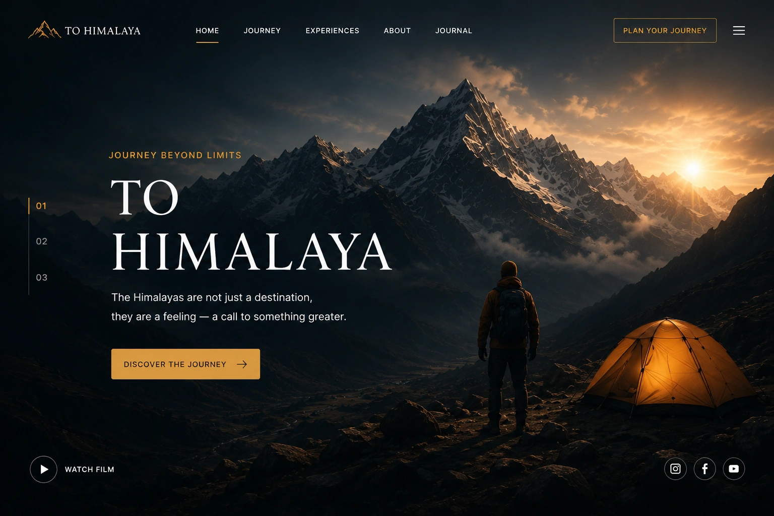
Hero Section
A cinematic full-screen mountain scene introduces the brand with strong typography and a clear call to action.
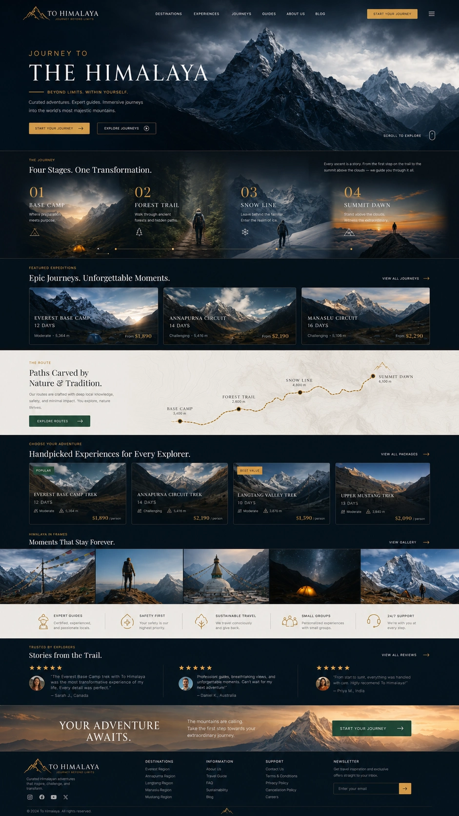
Pinned Scroll / Sticky Storytelling Section
The journey section is designed around a sticky scroll experience, where the background stays fixed while the content changes step by step. This creates the feeling of moving through different stages of the Himalaya journey.
Bright Experiences Section
A clean bright-mode section presents trekking, culture, adventure, and nature experiences using image cards and soft spacing.
Final CTA Section
The closing section returns to a dramatic dark mountain scene with a strong emotional call to action: “The mountains are calling.”
Key Features
Cinematic hero section
Dark and bright visual modes
Pinned scroll storytelling concept
Fixed background effect
Premium travel brand identity
Editorial-style typography
Experience card system
Strong CTA structure
Responsive Webflow-ready layout direction
Interaction Concept
The site was planned with Webflow interactions in mind. The most important effects are:
Pinned Scroll Storytelling
A sticky journey section where the mountain background remains fixed while the journey stages update.
Fixed Background Sections
Large mountain visuals stay in place while content moves above them, creating a cinematic depth effect.
Smooth Section Transitions
Dark-to-bright and bright-to-dark transitions help the site feel like a real journey from night to sunrise.
Result
The final concept presents To Himalaya as a premium, memorable travel experience instead of a generic tour website. The design combines brand identity, visual storytelling, and Webflow interaction thinking to create a portfolio piece that feels emotional, high-end, and conversion-focused.
This project shows my ability to design immersive Webflow websites with strong visual direction, modern layout systems, and interactive storytelling sections.
Like this project
Posted Jun 22, 2026
A cinematic travel site that makes you feel the altitude before you book the trip. Built in Webflow with immersive scroll and rich visuals.