Cashmax - Finance Dashboard
Cansaas Agency
The Problem
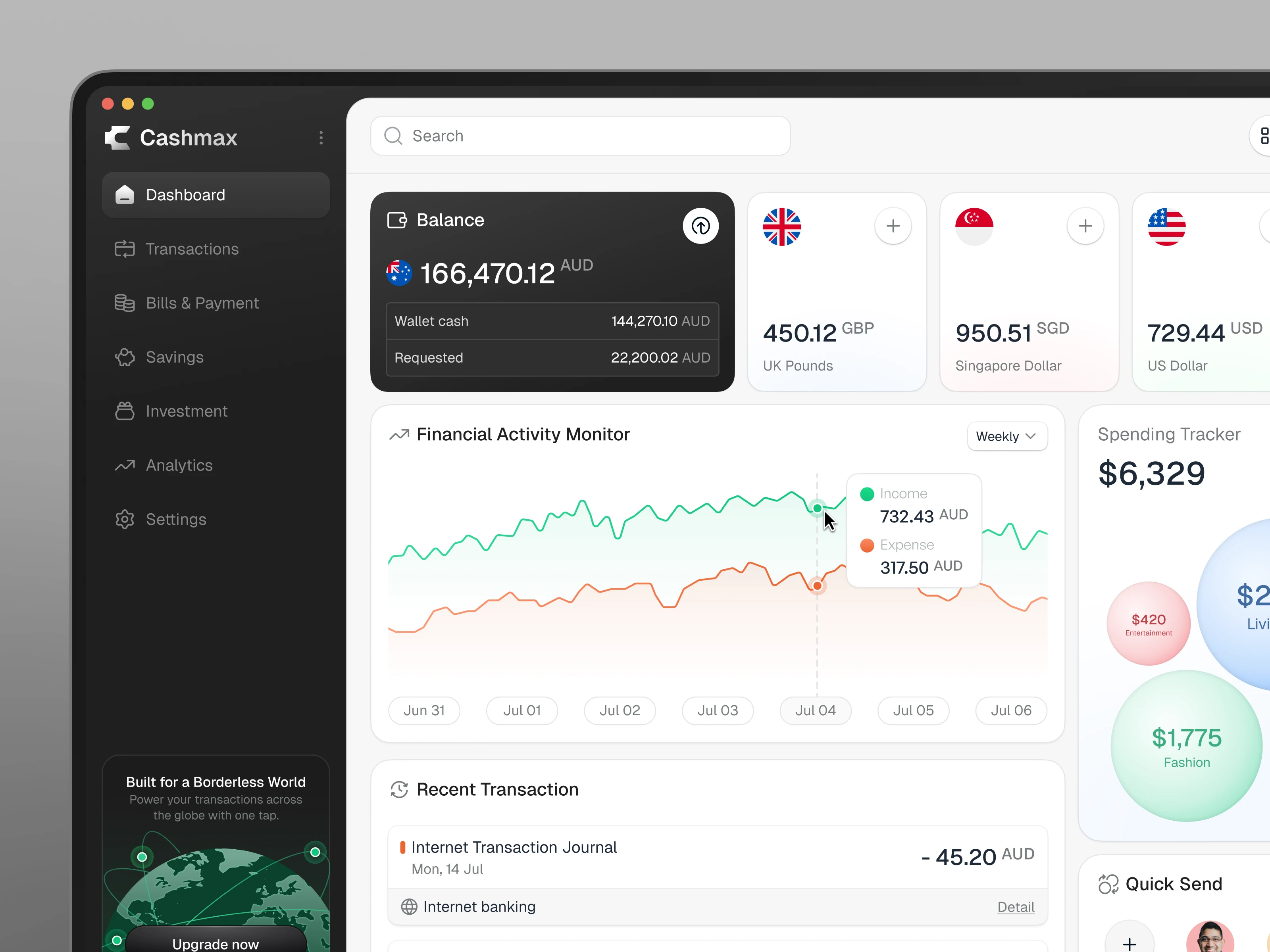
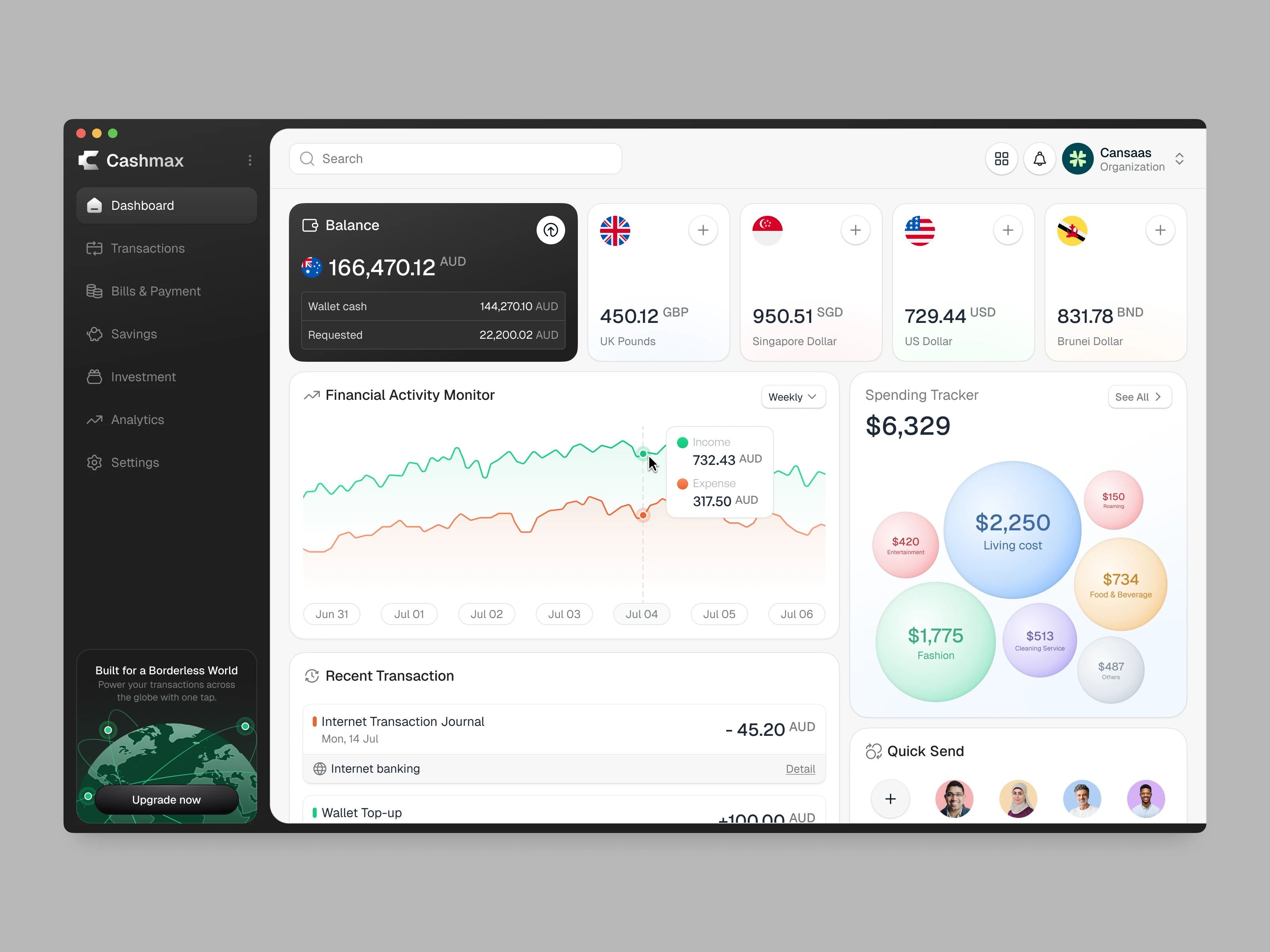
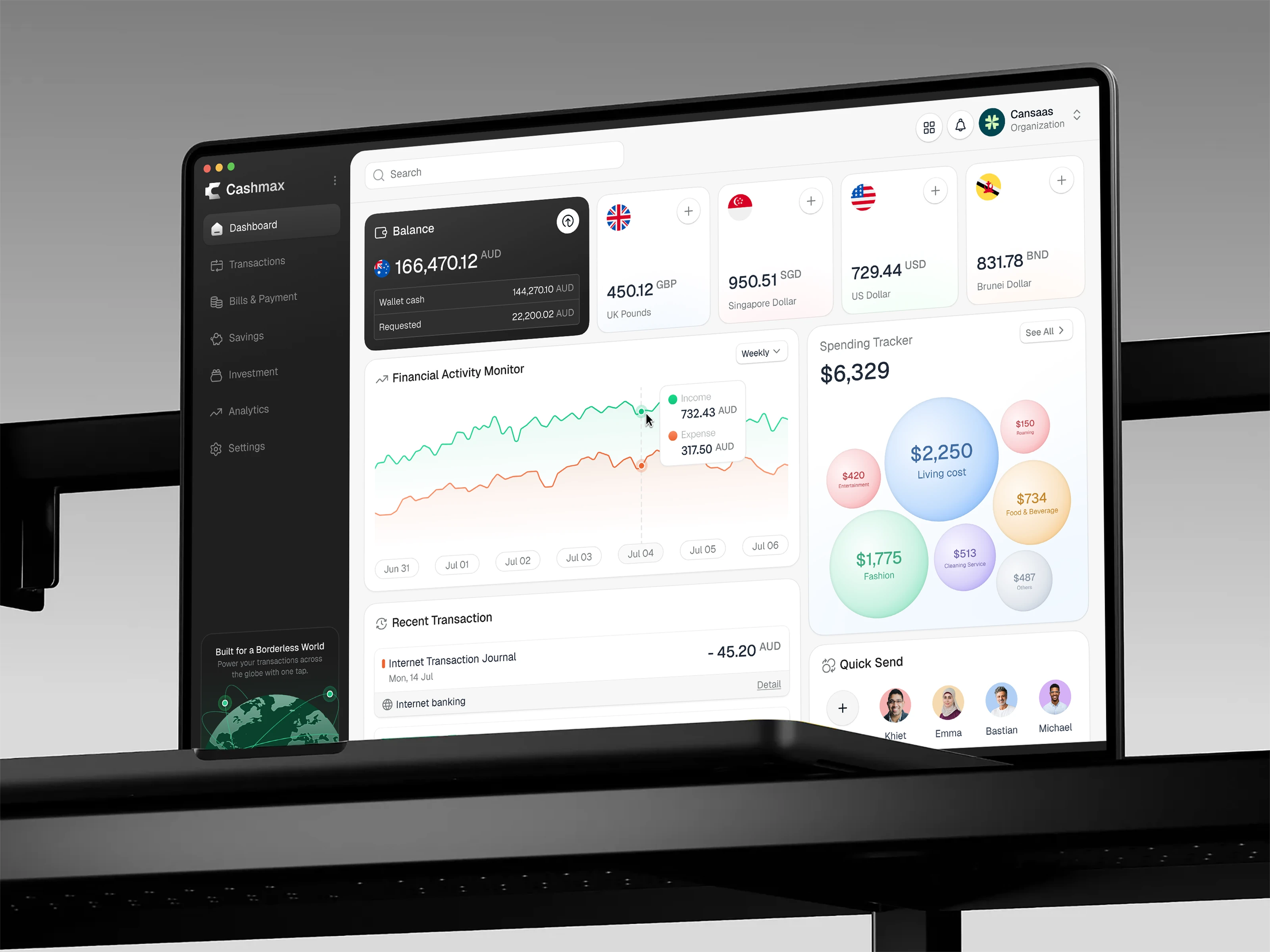
Users managing finances across multiple currencies often face cluttered, hard-to-understand dashboards with fragmented views. Most existing solutions prioritize functionality but lack clarity in how financial data is presented. Cashmax needed a unified, elegant design that could simplify financial tracking, reduce cognitive overload, and improve data readability without sacrificing advanced features or analytics.
The Approach
The design followed a modular and scalable layout, starting with a sidebar for structured navigation and a clean top bar for search and shortcuts. We prioritized visual hierarchy, using clear contrast, soft cards, and intuitive iconography to guide user attention. Each financial widget from activity graphs to currency summaries was designed to be self-contained yet connected, helping users build a full-picture view at a glance. Accessibility and responsiveness were also considered to ensure usability across devices and screen sizes.
The Result
The final dashboard design provides a clear, engaging view of personal finances with zero friction. It successfully blends utility with clarity making it ideal for both casual users who want a high-level overview and power users looking for detailed insights. The design's calm aesthetic, combined with high data accuracy and responsiveness, encourages frequent use and builds trust with users.
Like this project
Posted Jul 17, 2025
Finance dashboard designed to help users track multi balances, monitor realtime income and expenses, and manage personal finances.
