Conferra - Video Conference Responsive Landing Page
Cansaas Agency
Overview
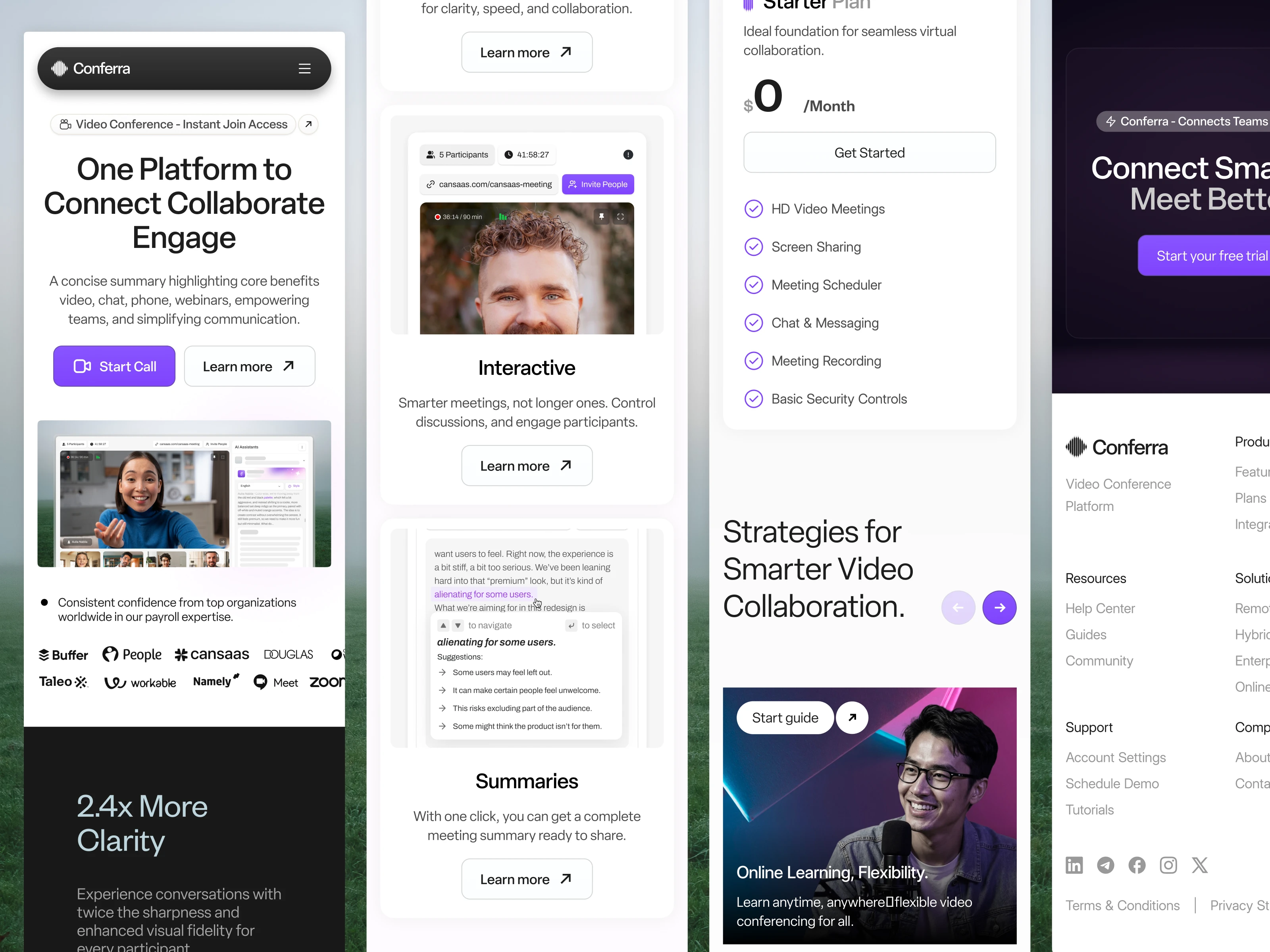
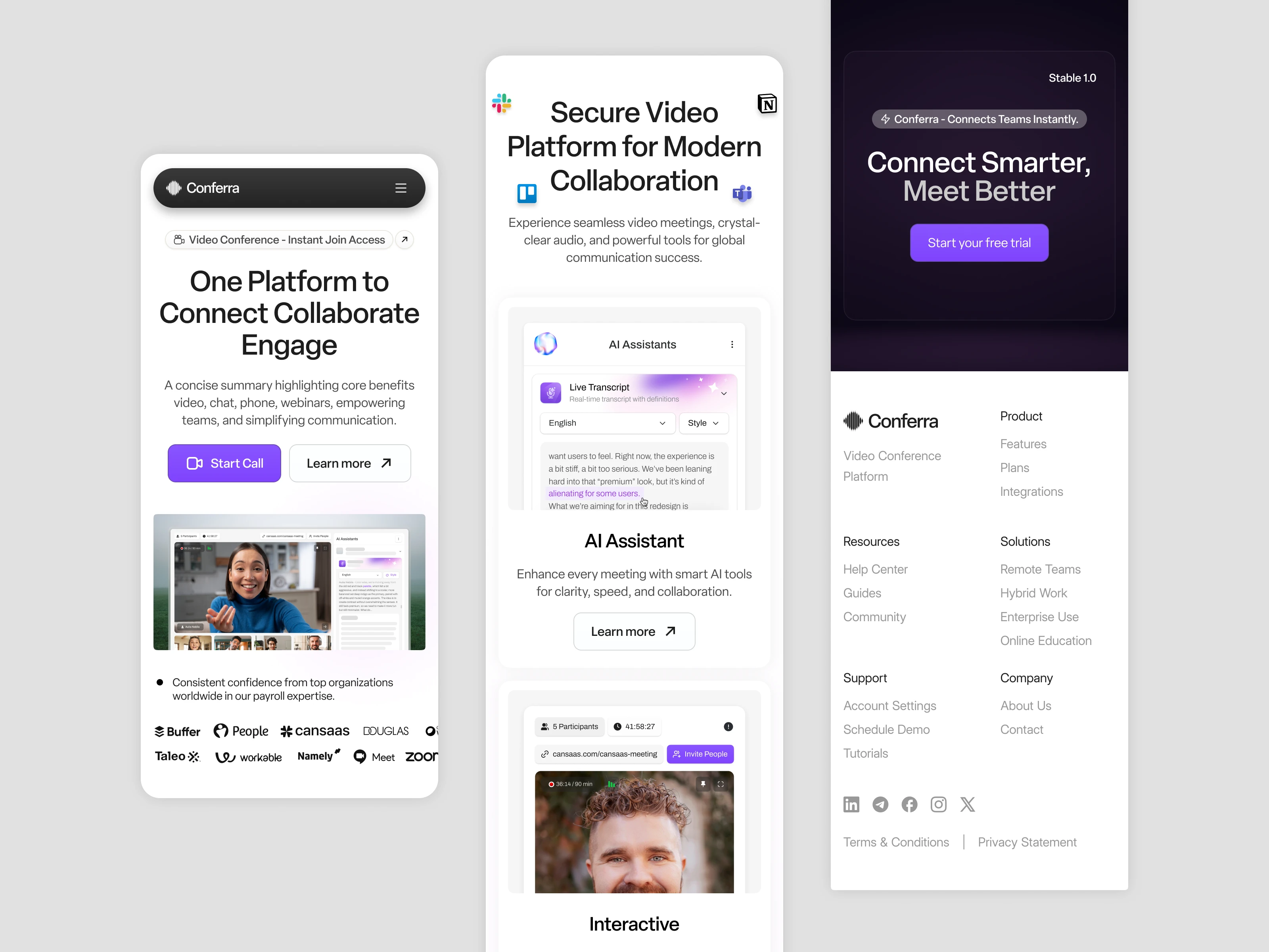
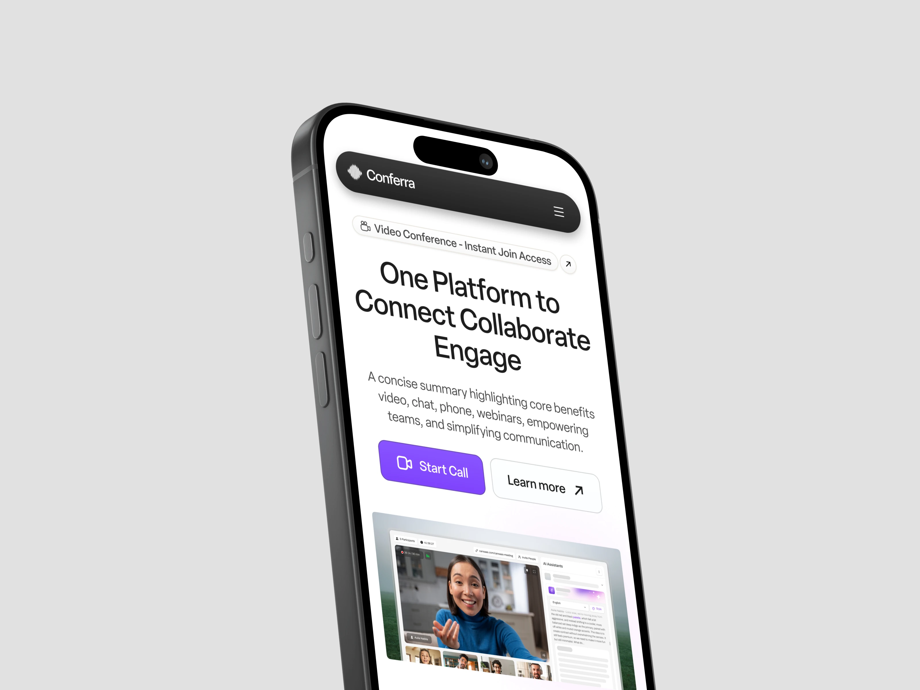
This case study highlights the design of a Video Conference Responsive Landing Page for Conferra, a video conferencing platform built for seamless, smarter collaboration. The objective was to create a mobile first, scalable layout that maintains clarity and user engagement across devices. The design combines modern typography, structured content flow, and purposeful interactions to encourage product exploration and user sign up.
The Problem
As video conferencing tools become more feature-rich, their landing pages often struggle with content overload, poor mobile performance, or lack of conversion-focused design. Many platforms fail to deliver a compelling narrative on smaller screens, resulting in user drop-offs. Conferra needed a landing page that could communicate its value instantly, showcase core features clearly, and remain fully functional and visually appealing on mobile and tablet breakpoints.
The Approach
We adopted a mobile-first design strategy, ensuring every component was readable, tappable, and logically stacked on smaller screens. Using a modular system of cards and sections, the layout adjusts seamlessly across breakpoints while keeping CTAs (like “Start Call” or “Learn More”) always within thumb reach. Attention was given to visual rhythm, whitespace, and hierarchy—especially in sections like pricing, feature highlights, and client trust indicators. Icons and imagery were scaled properly to support readability and minimize cognitive load on mobile.
The Result
The responsive landing page achieved a balance between brand storytelling and mobile usability. The content felt light, modern, and informative, while conversion elements remained front and center across viewports. Usability testing confirmed that users could navigate effortlessly, complete sign-up flows, and understand Conferra’s value even without desktop access
Like this project
Posted Jul 17, 2025
The use of bold visuals, smart AI assistant previews, and integrated social proof instantly builds credibility while maintaining lightning-fast readability.
