Mr Vulnerable - An Explosive Brand Identity Project
⭐️ A Short Brief - Austin's Aim
Austin’s gym focuses on fitness and boxing, providing a dynamic mix of traditional gym services along with boxing training. Austin wanted a brand identity that reflected strength, movement, and discipline, while staying modern and approachable. The logo needed to balance the energy of boxing with the overall fitness journey his gym offers.
☝🏽 First Step - Design Requirements
Austin chose my Brand Identity package, which included a detailed strategy workshop that explored his gym's mission and audience. During our initial discussions, we identified key design elements that were essential to capture the spirit of his gym:
A strong, bold logo that represents both fitness and boxing
Use of elements like boxing gloves or rings without making it feel too niche
A color palette that exudes energy, motivation, and strength
A modern, clean typeface to appeal to all types of gym-goers
✍🏽 Second Step - Brand Personality
We worked together to define the personality of Austin’s brand. The gym caters to people who are driven and passionate, seeking to better themselves both physically and mentally. To embody this, we created a personality for his brand in the strategy workshop meeting. A few important aspects of the brand personality were the following,
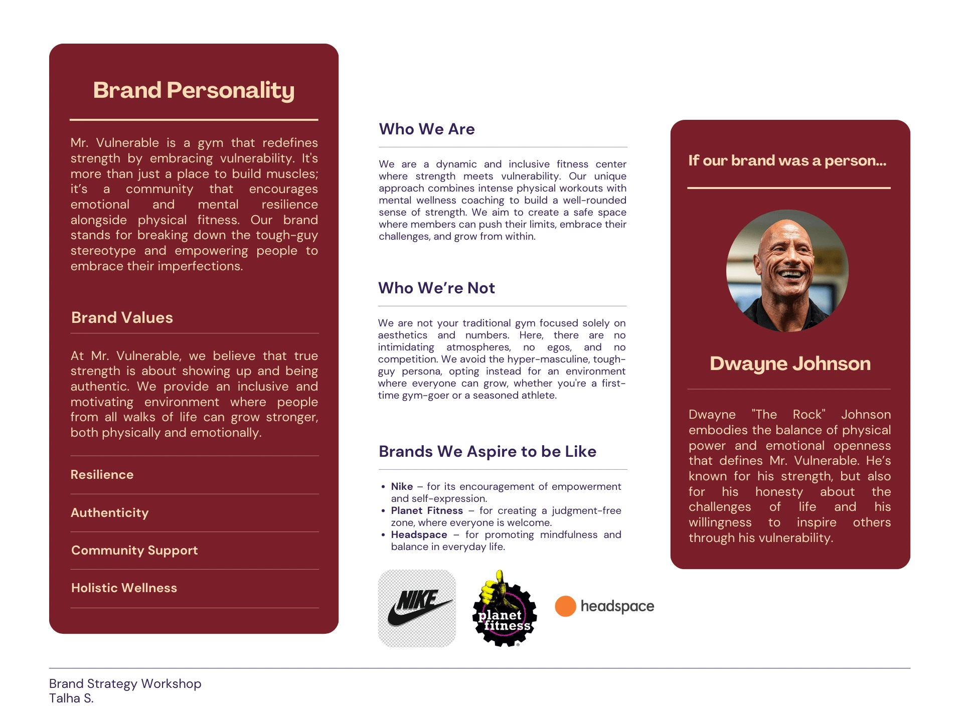
Austin's gym wasn’t just for seasoned athletes or boxers; it was for anyone willing to challenge themselves, and that needed to come across in the brand.
✏️ Creating Initial Sketches
The design process started with several hand-drawn sketches to explore how boxing and fitness could be symbolically represented. I experimented with incorporating boxing gloves and silhouettes of movement. Additionally, I played with the gym's name, exploring how it could blend with graphic elements. These sketches helped Austin visualize his ideas early on in the development.
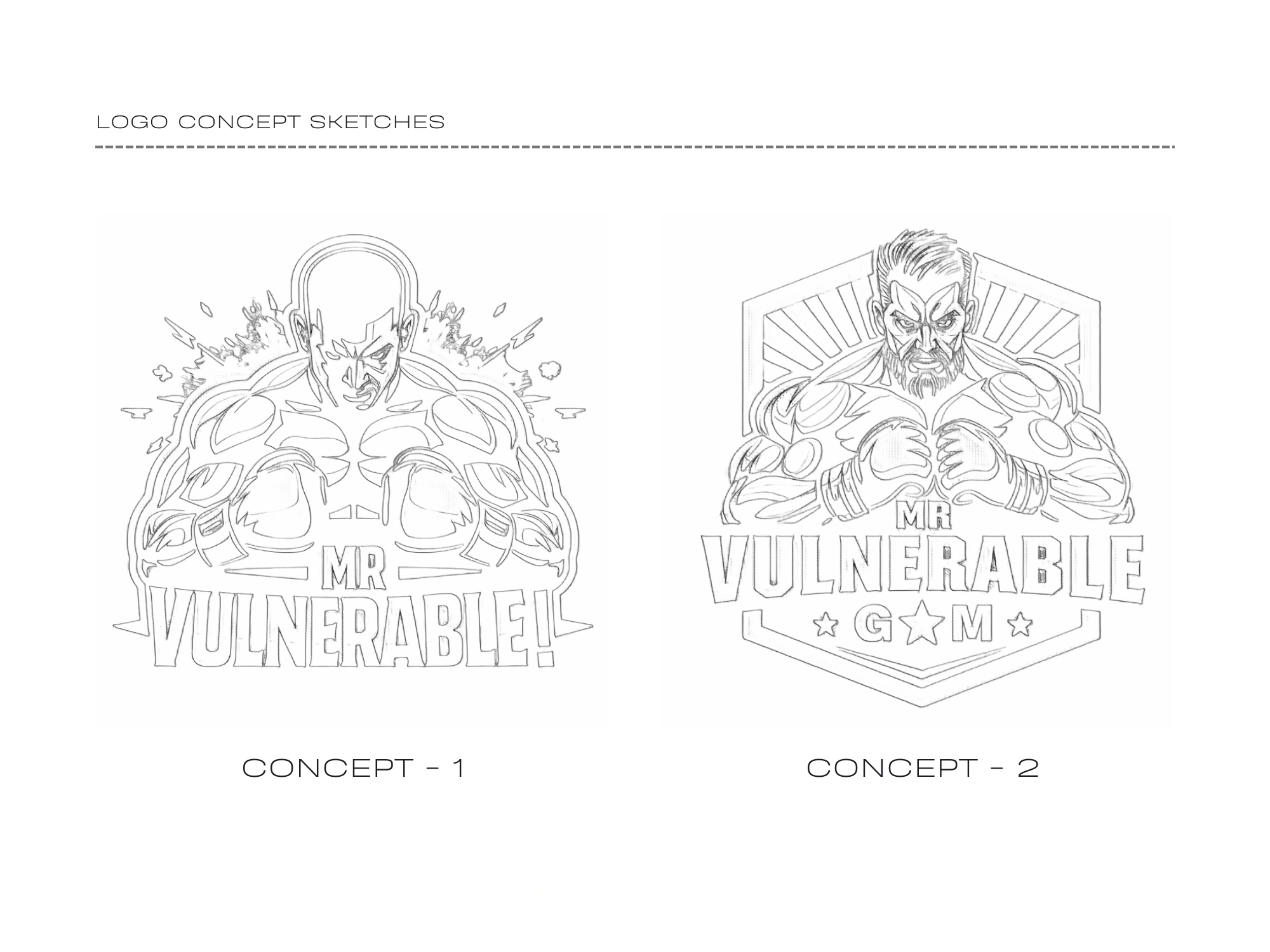
Austin was drawn to Concept - 1 the most, as it merged a boxing man with bold typography, giving it the perfect blend of boxing and gym-related energy. After deciding on the initial sketch, I went on to make the final logo design for Austin's Gym.

👏🏽 Supporting Graphics
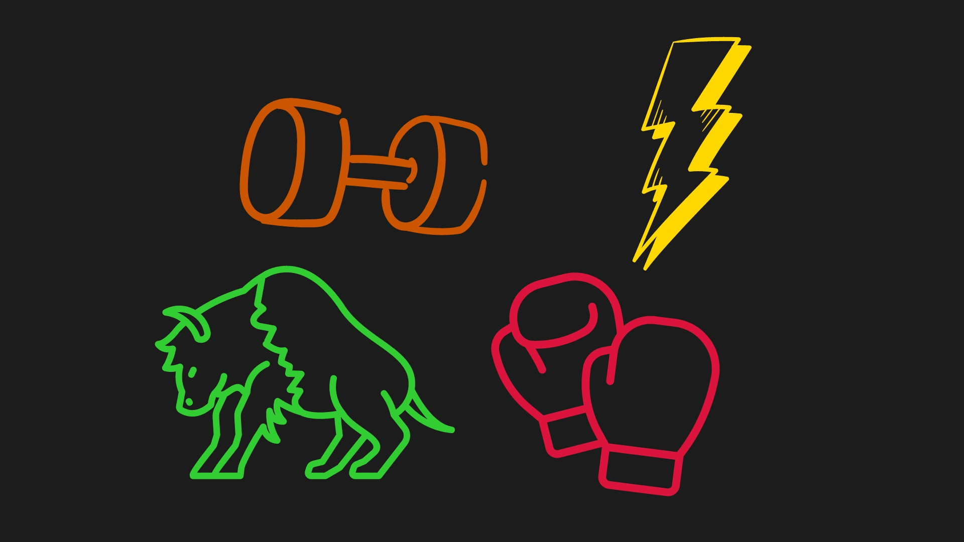
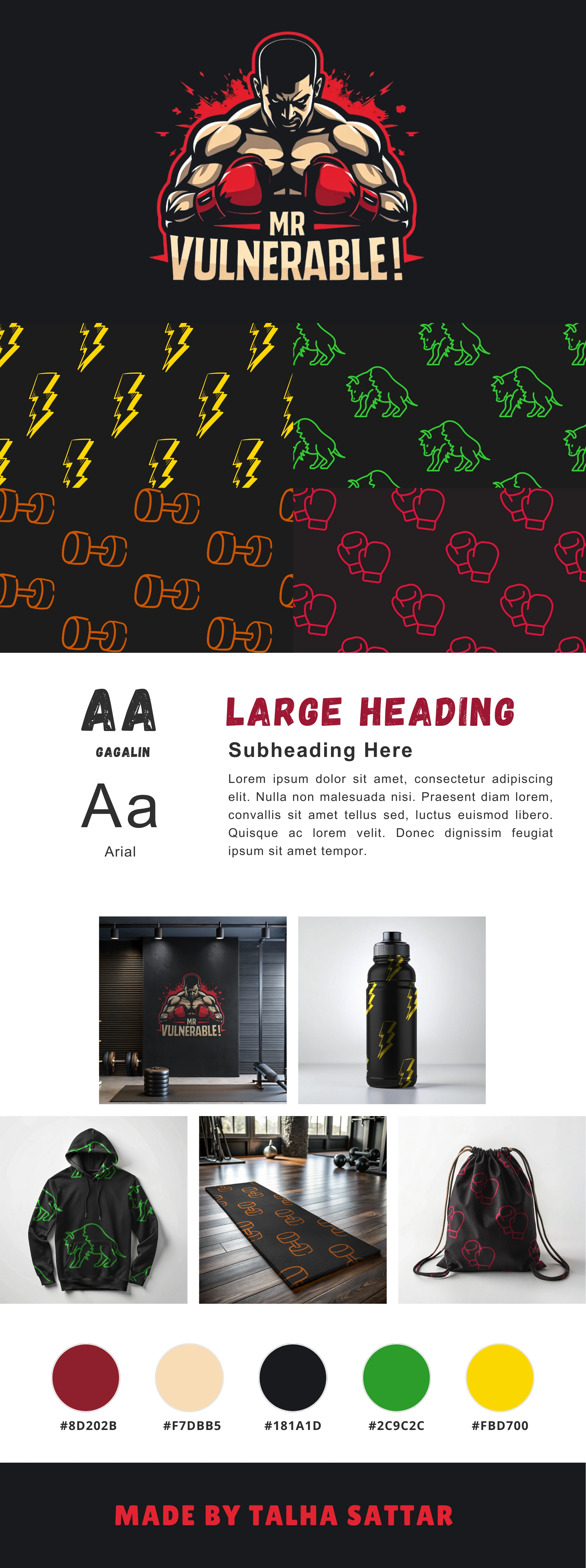
Once the logo was finalized, I developed a range of supporting graphics to build out Austin’s brand identity. These graphics included boxing and gym related imagery, and elements that could be used across social media, merchandise, and gym interiors. The supporting graphics maintained the same high-energy, determined feel as the core logo.
🎨 Patterns
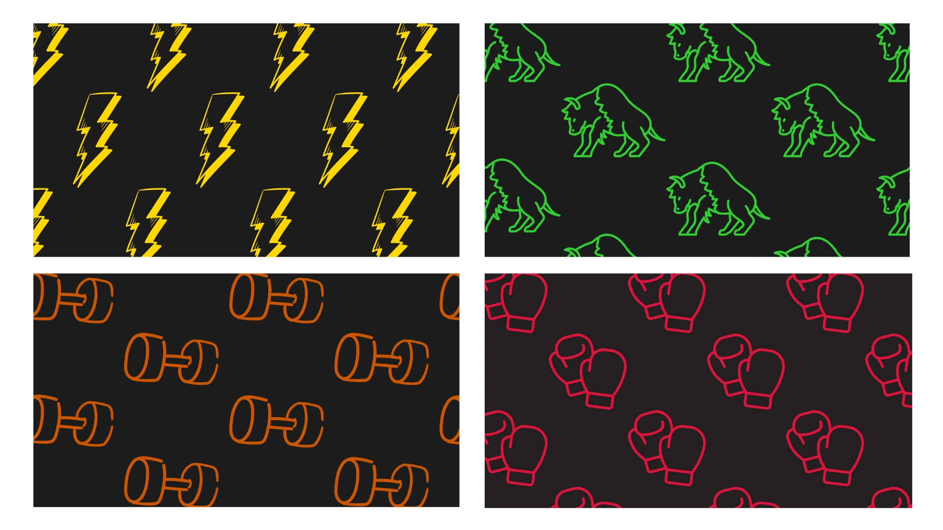
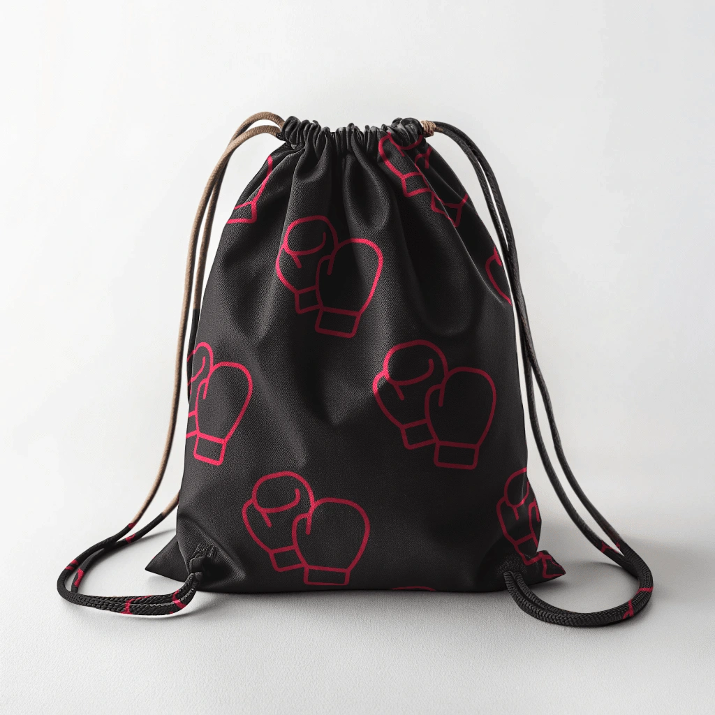
To extend the branding, I created patterns using the above illustrations. These patterns added a cohesive and energetic vibe to the brand without overwhelming the core designs.
📷 Mockups
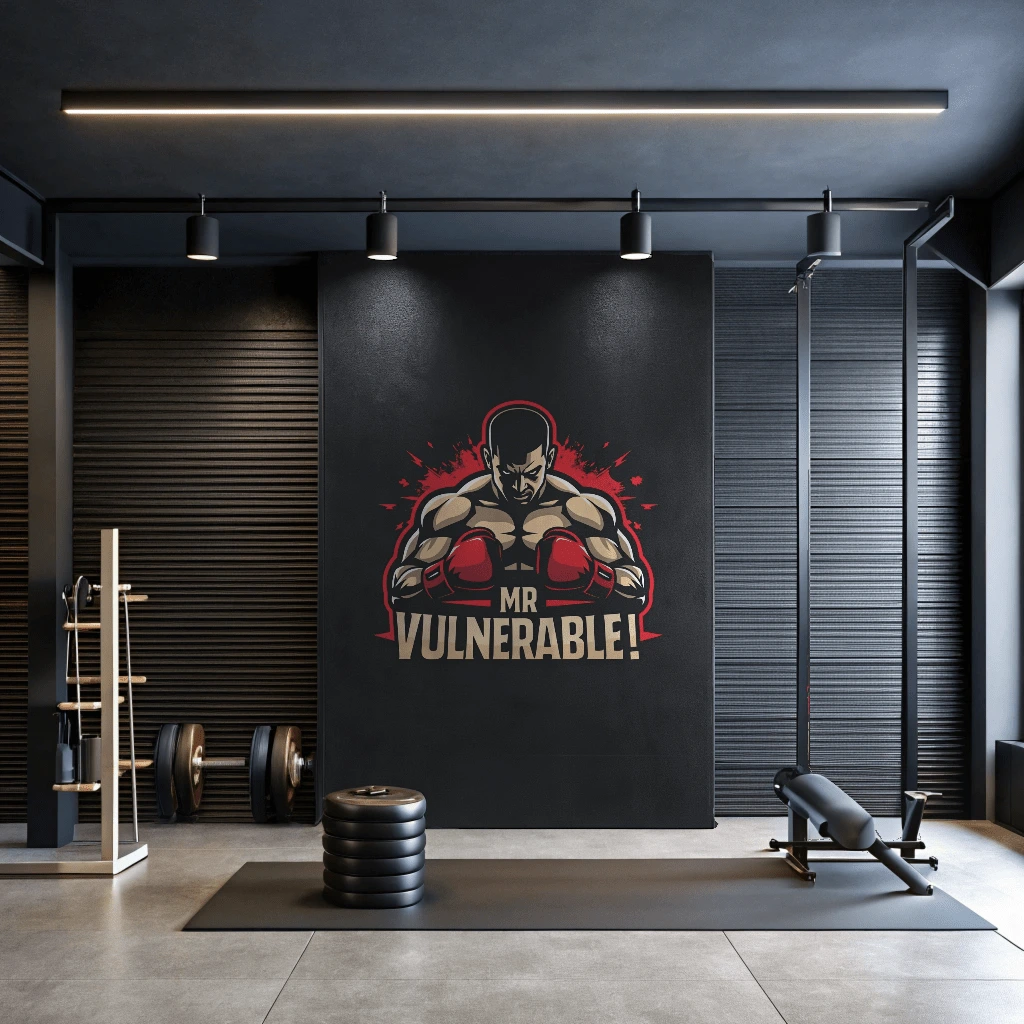
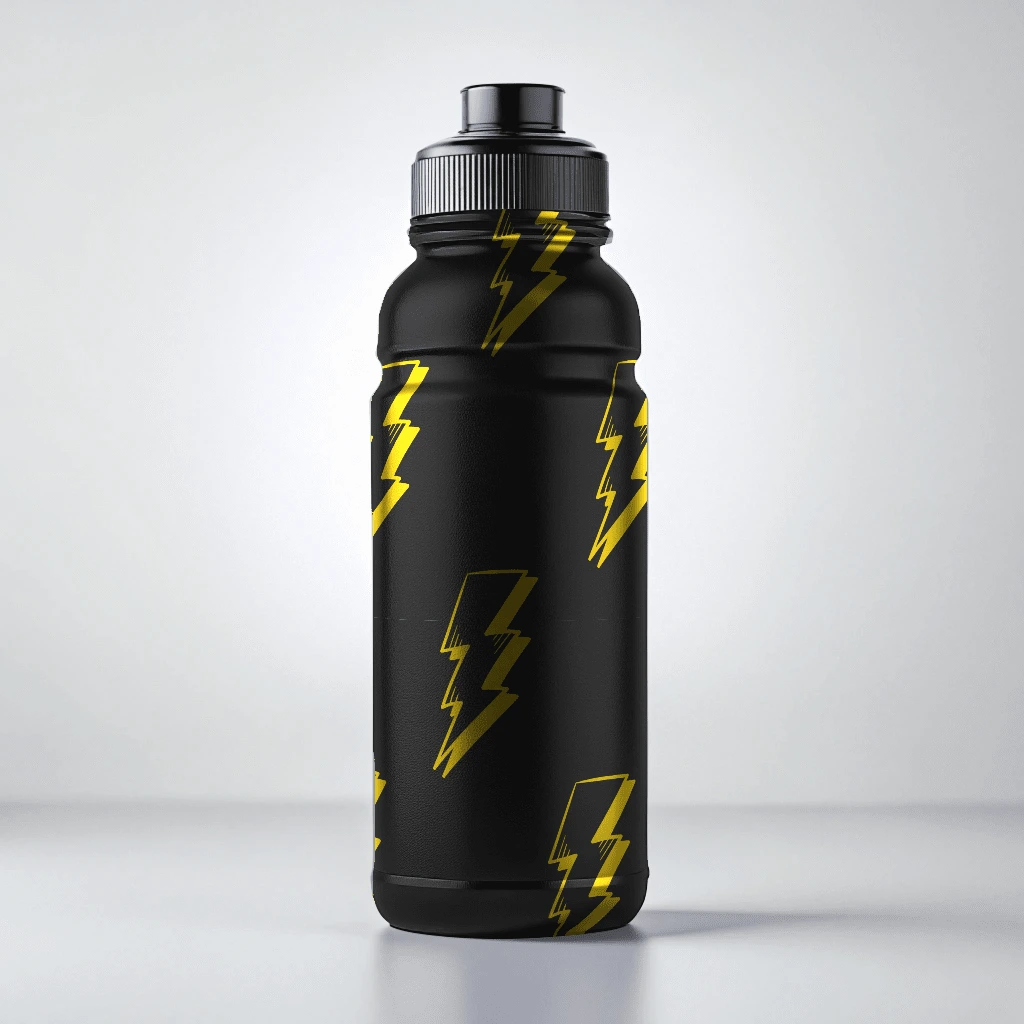
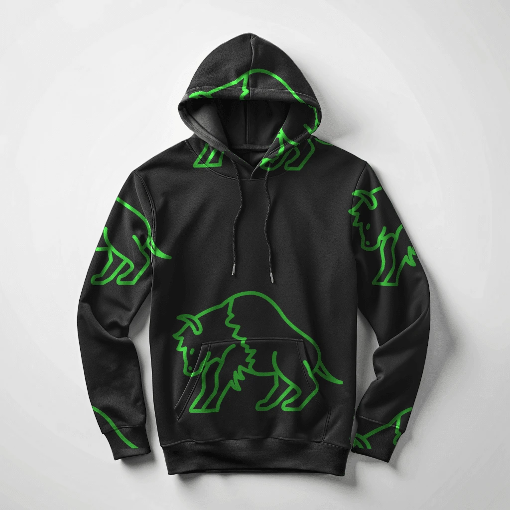
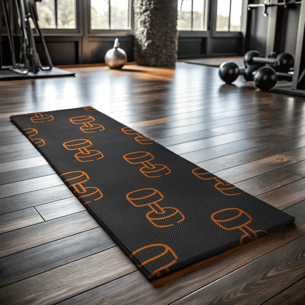
✨ A Brand Board - The Final Designs
💬 Final Thoughts
Working on Austin’s gym project was an incredible journey. The mix of fitness and boxing brought an exciting challenge to the design process, and I loved crafting an identity that balanced toughness with approachability. I’m excited to see Austin’s gym grow, knowing the brand identity will inspire gym members to push themselves harder every day.
Like this project
Posted Oct 3, 2024
A bold and energetic branding project for a gym that offers fitness and boxing services, designed to inspire strength, discipline, and motivation.


