Zoe's Dough - A Casual, Family-Friendly Brand Identity Project
⭐️ A Short Brief - Zoe's Vision
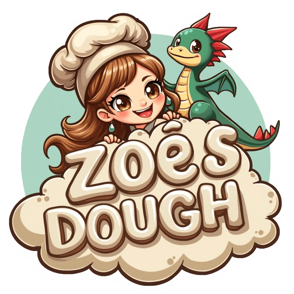
Zoe's Dough is a whimsical bakery dedicated to serving delicious, handmade baked goods to its customers. Zoe, the founder, wanted a brand identity that not only reflected her fun and quirky personality, but also connected with her love for fantasy and imaginative creatures.
☝🏽 First Step - Design Requirements
Zoe selected my Brand Identity package, which included a comprehensive Brand Strategy Workshop. During this workshop, we delved deep into understanding Zoe's vision for the bakery. We discussed the core values of her business and clarified the design requirements for the project.
Mascot resembling Zoe
Cute dragon companion
Clouds incorporated into the design
Soft off-white and brown color palette
Casual, quirky vibe
✍🏽 Second Step - Brand Personality
During the Workshop, we also discussed the personality of her brand. At the start, she was unsure about the personality she wanted her brand to have, but after answering a few of my questions, she was able to create a solid, concrete personality. A few things that were covered during the discussion were the following:
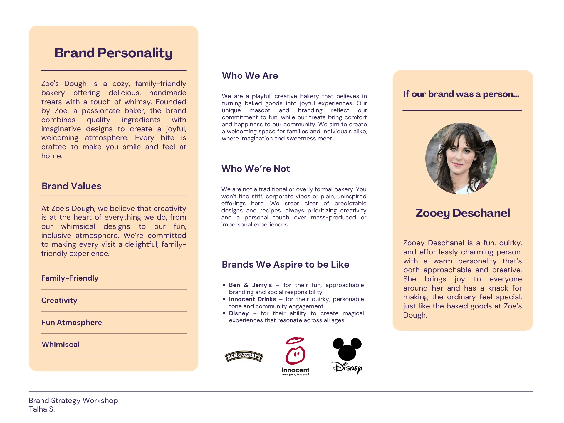
At the end of the Workshop, Zoe and I were able to clarify what exactly she wanted her brand to be. We gave the brand a concrete personality that would set it apart from the competition. Zoe was delighted by how much value the strategy workshop brought to the project. It helped her make up her mind and brought her brand one step closer to a reality!
✏️ Creating Initial Sketches
The design process began with hand-drawn sketches to bring Zoe’s vision to life. I explored different ways to incorporate the mascot and dragon, playing with playful poses, cloud shapes, and typography. These initial concepts allowed me to refine the whimsical and quirky style that embodies the heart of Zoe’s Dough.
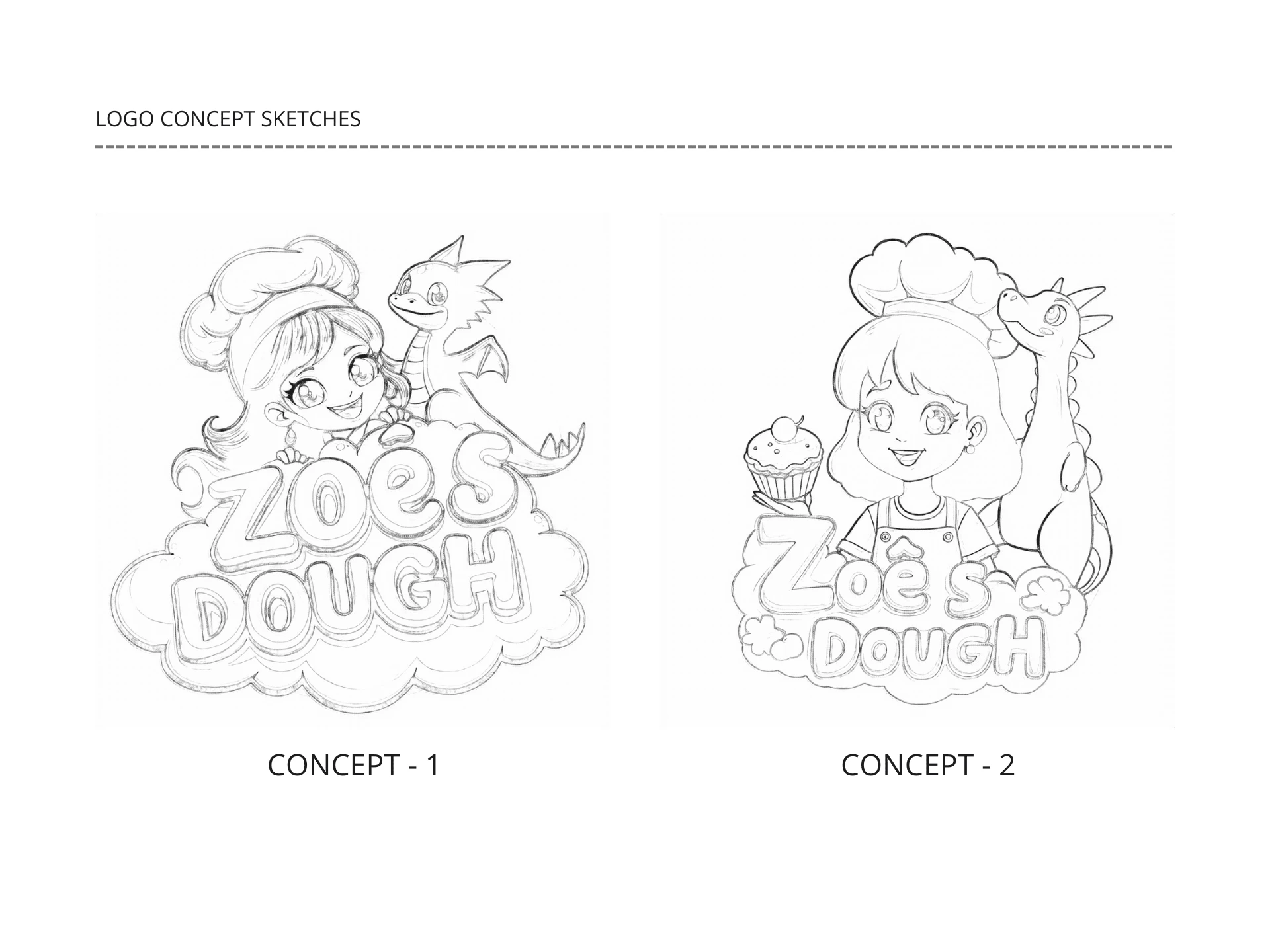
Zoe really liked both of them, so she was having a hard time deciding which one to go with. But after discussing it with me, she decided to go with the Concept - 1 sketch for the logo.
👏🏽 Supporting Graphics
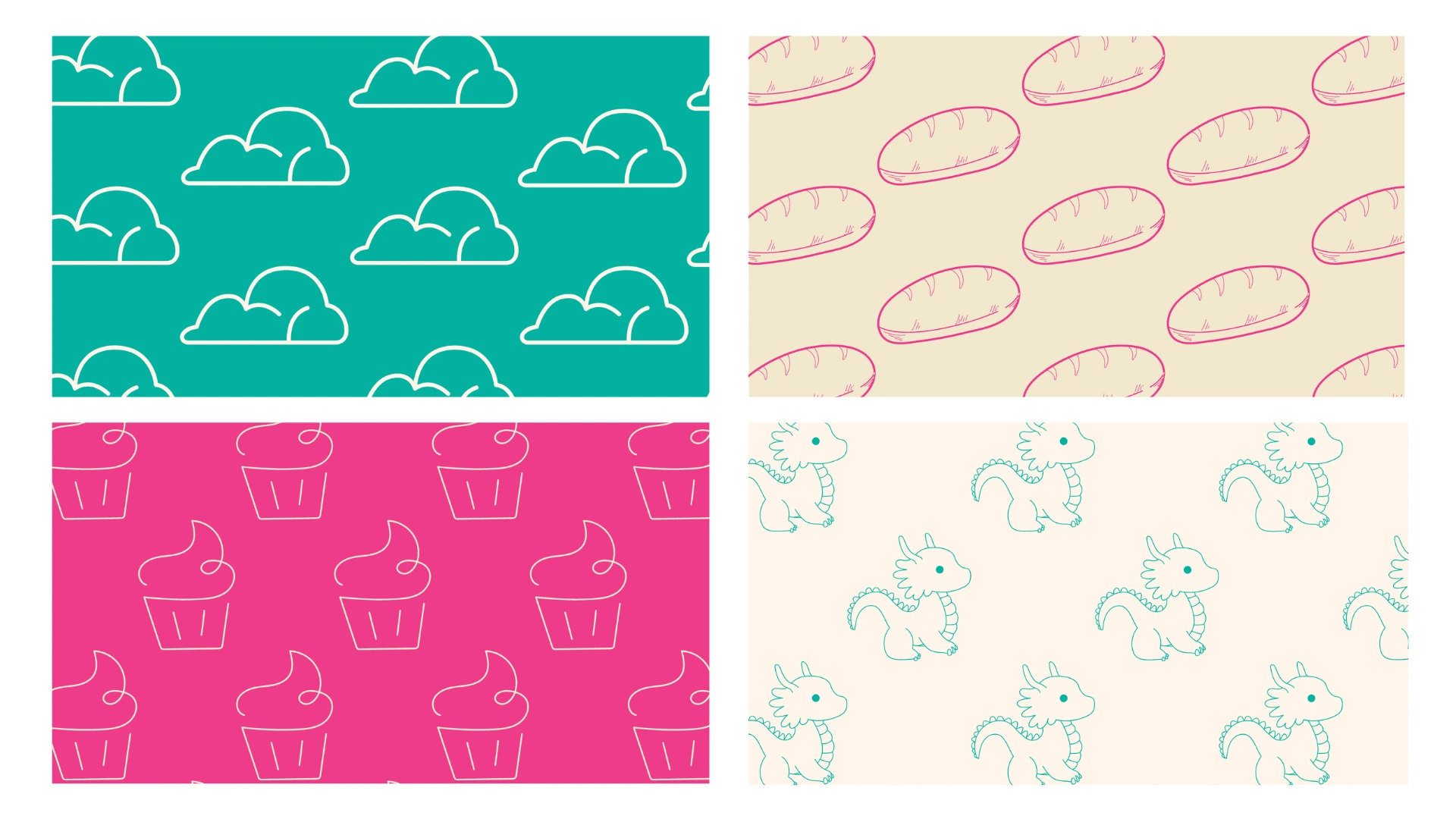
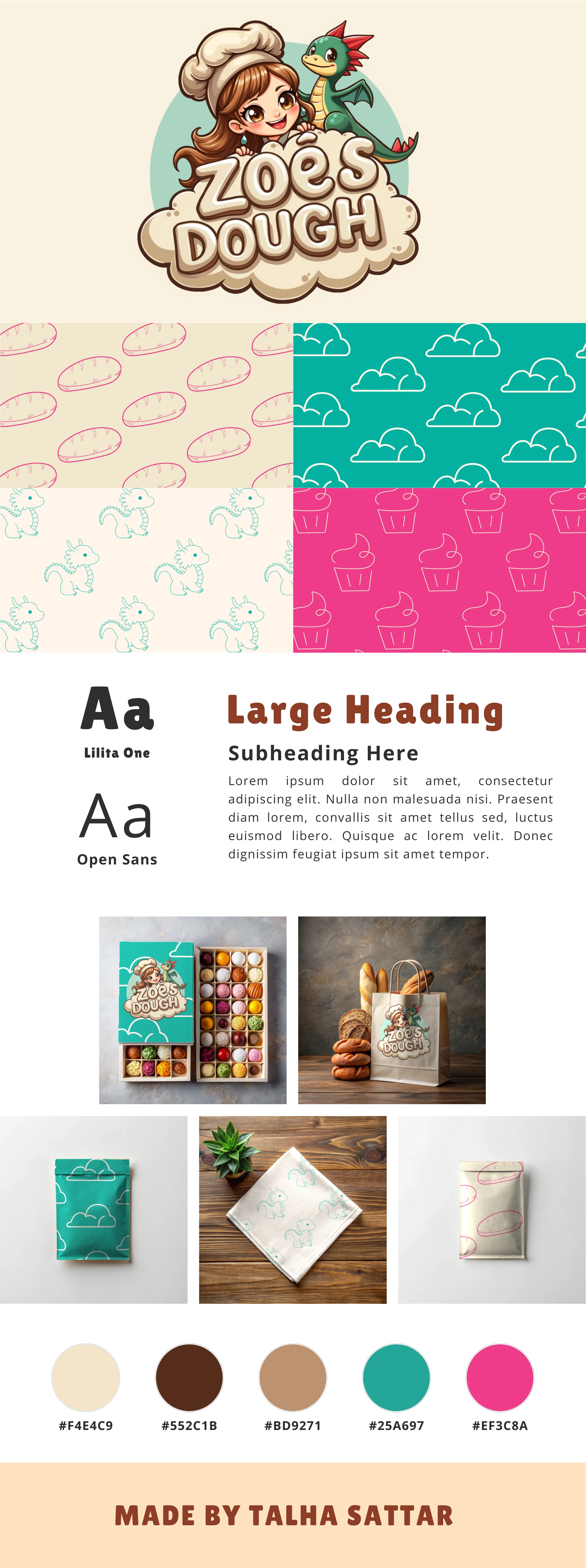
After finalizing the logo, I extended the branding with supporting graphics, including additional elements and patterns. These assets were designed to complement the brand's visual identity without overpowering the bakery's core offerings. The dragon and Zoe were featured on the bakery's packaging, social media, and in-store signage, creating a cohesive and lively brand presence.

🎨 Patterns
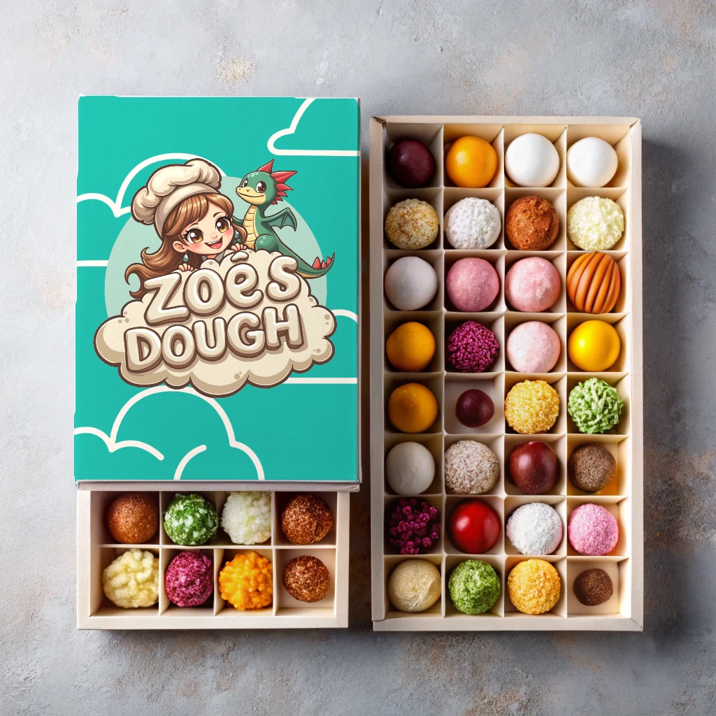
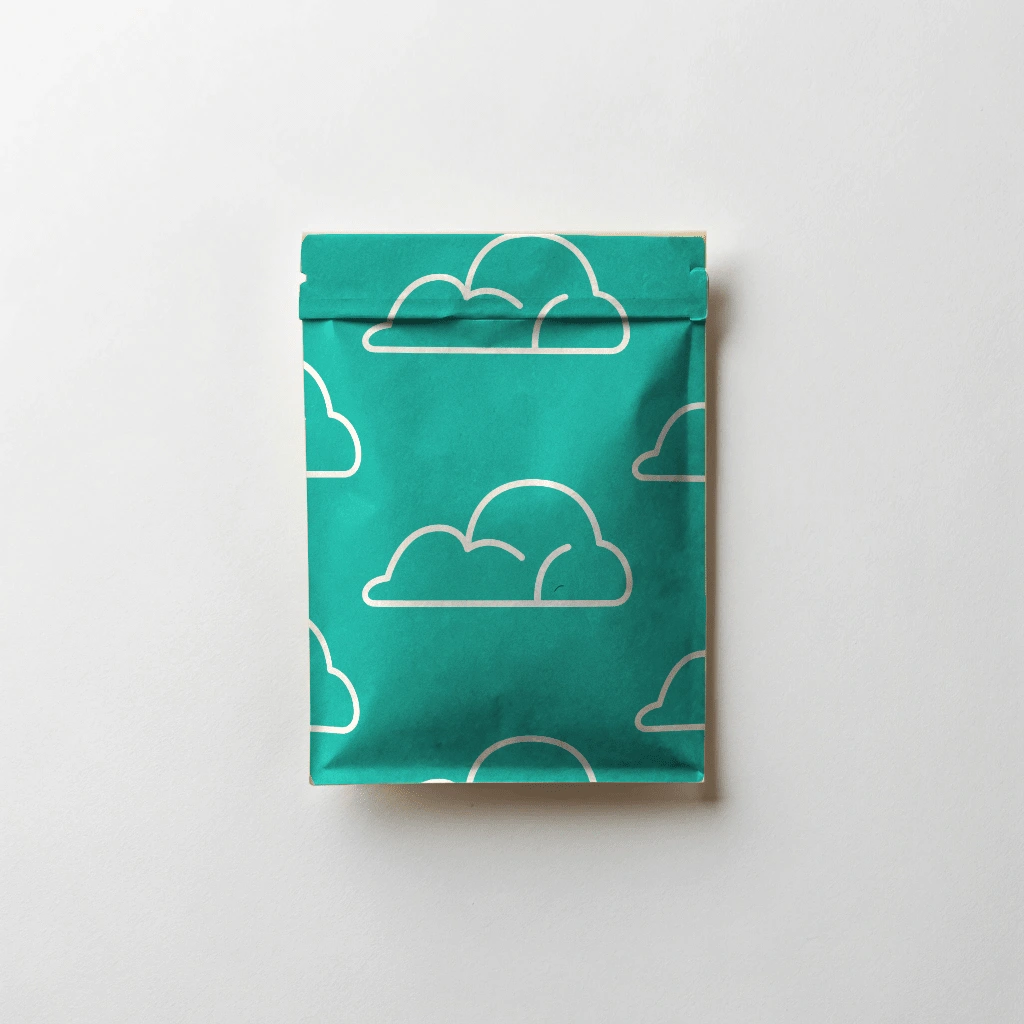
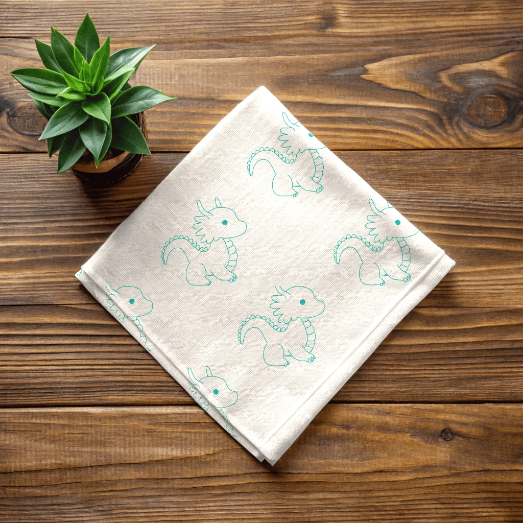
The illustrations from above were used to create patterns that could be used in other brand materials, like bakery boxes, tissue paper, and promotional materials. It gave the packaging a sense of whimsy feel, while keeping the overall design grounded in a cozy, home-baked atmosphere that Zoe envisioned for her bakery.
📷 Mockups
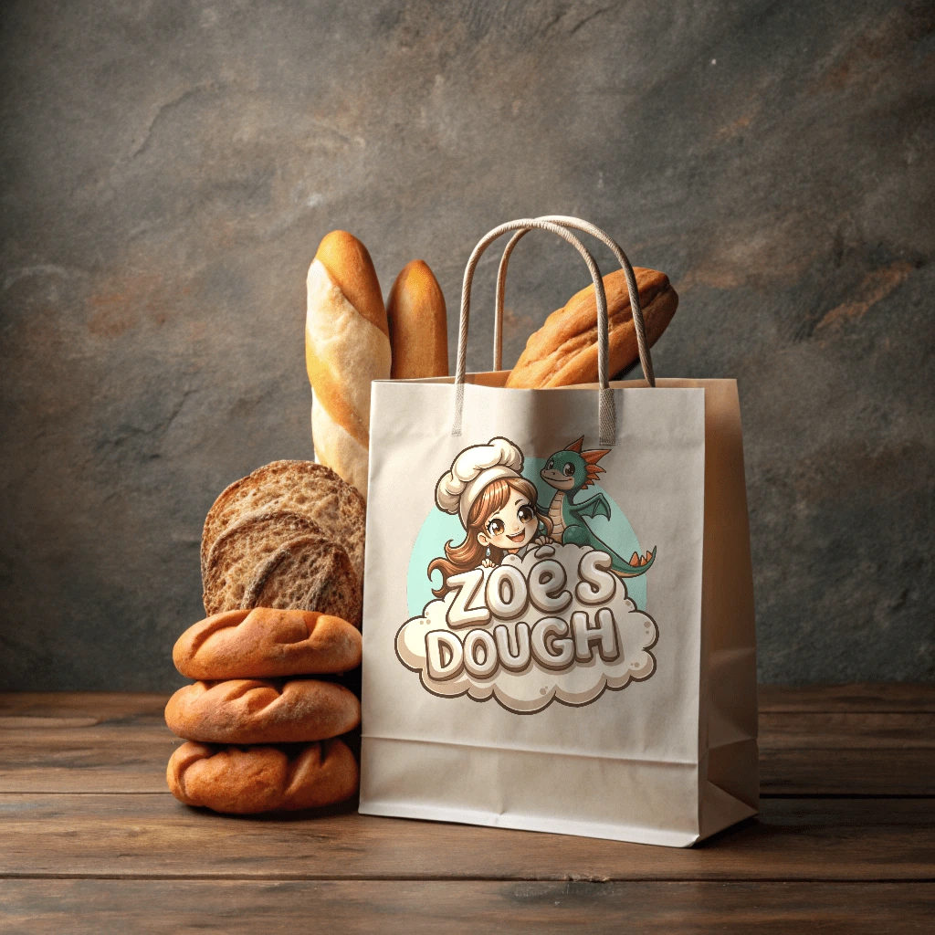
I created several mockups to showcase the new branding, including pastry boxes, custom paper bags, cookie wrappers, and store handkerchiefs. These mockups helped Zoe visualize how her brand identity would be brought to life in various customer touchpoints.
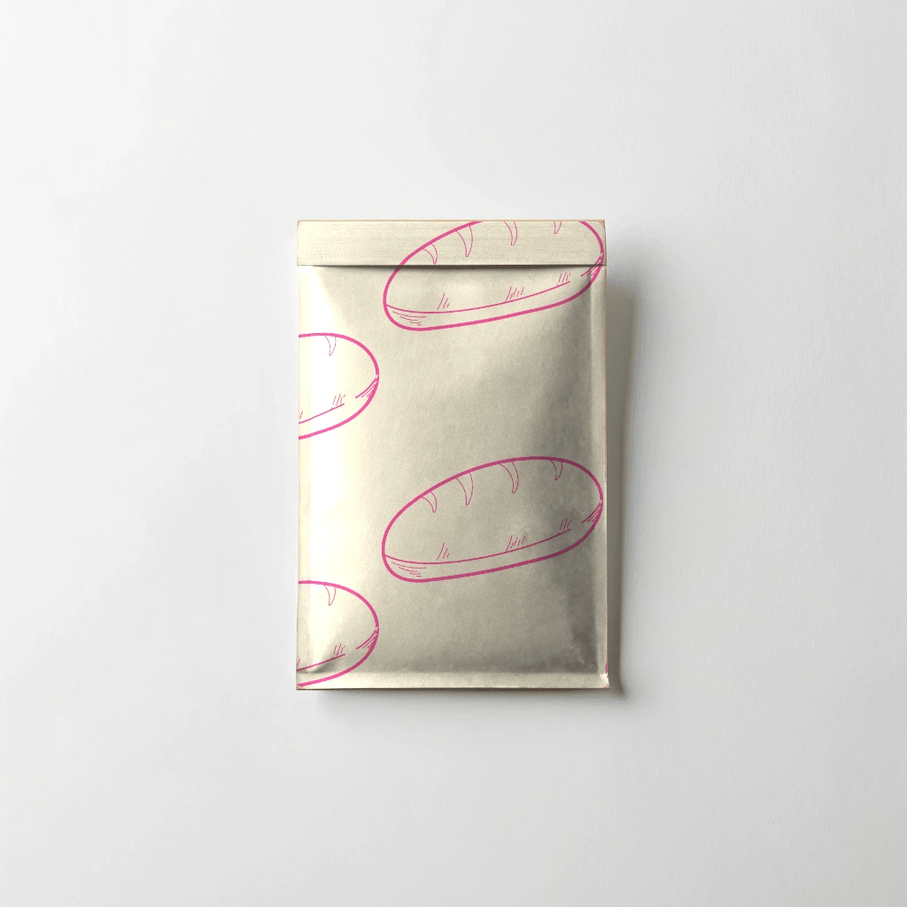
✨ The Final Designs
💬 Final Thoughts
Working on Zoe’s project was a delightful experience. From the start, Zoe’s passion for her bakery and the playful vision she had in mind made this project incredibly fun. I loved combining the elements of fantasy with the cozy warmth of a bakery, creating a brand identity that perfectly encapsulates the bakery’s personality. Zoe's bakery will open in the coming months, so you may see Zoe’s Dough come to life before your eyes!
Like this project
Posted Sep 30, 2024
A welcoming and family-friendly branding project for a bakery that aims to connect with its customers on a personal level.


